|
| Group |
Round |
C/R |
Comment |
Date |
Image |
| 36 |
Mar 26 |
Comment |
Thanks for your feedback Grace. I like your edit however the sky in the raw image had little color but lots of texture. I did redo the white balance for the sky and tone it down a bit. |
Mar 21st |
| 36 |
Mar 26 |
Reply |
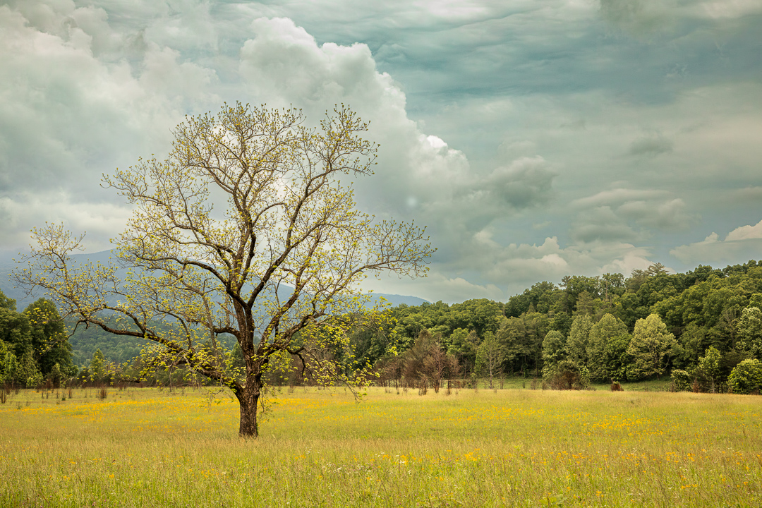
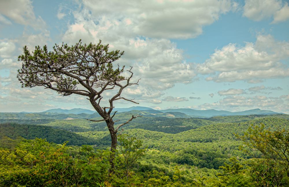
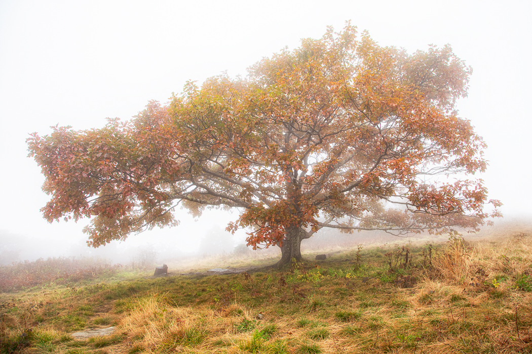
Thanks Larry. The sky and the tree is what drew me in. I checked the sky's white balance toned it down. |
Mar 21st |
| 36 |
Mar 26 |
Reply |
Thanks for your feedback Bill. |
Mar 21st |
| 36 |
Mar 26 |
Reply |
Thanks Adi I'll look at the image again. |
Mar 21st |
| 36 |
Mar 26 |
Reply |
Thanks Michael. I rechecked the white balance in the sky. |
Mar 21st |
| 36 |
Mar 26 |
Comment |
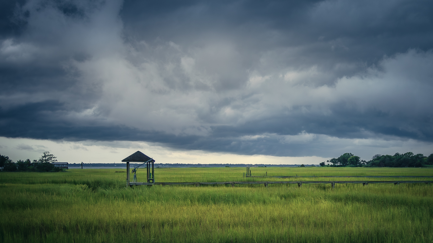
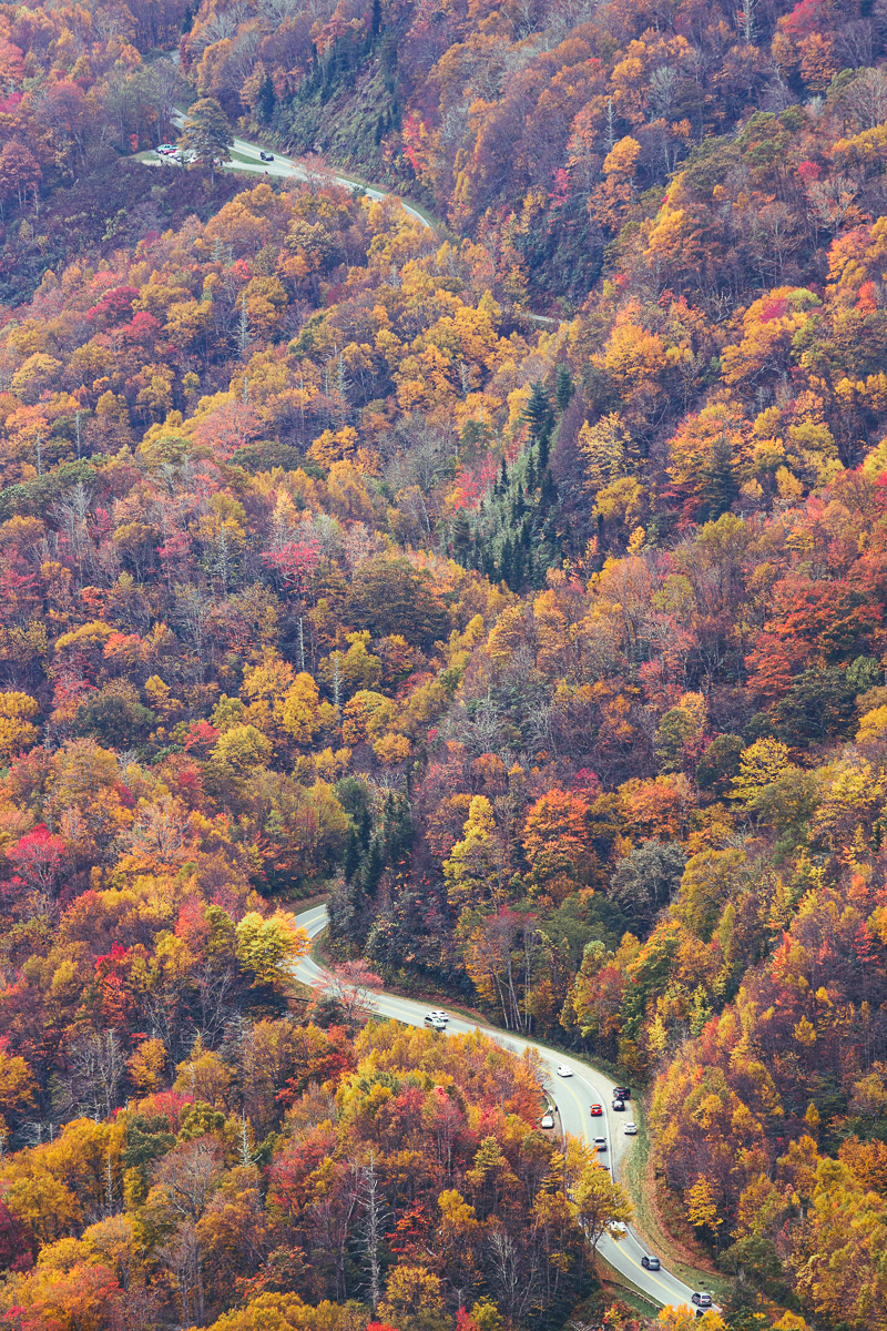
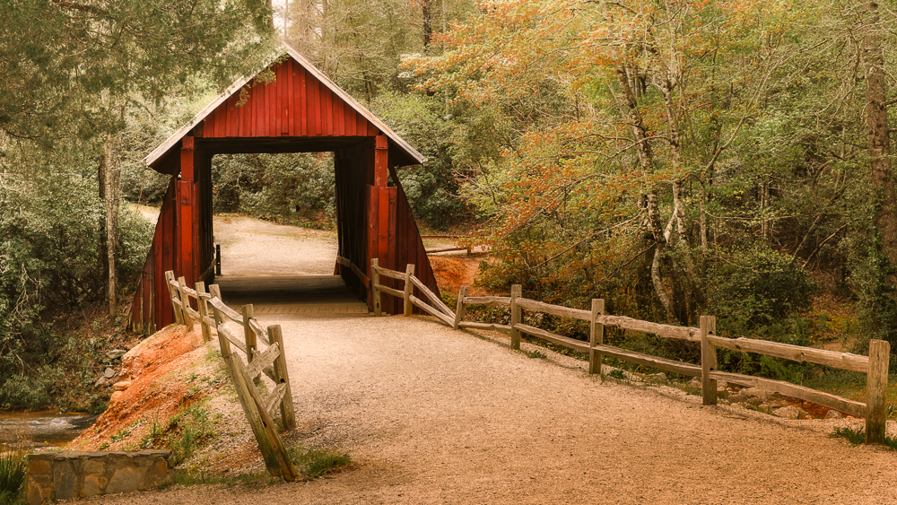
Hi Adi. The road creates a nice compositional path that draws me into the scene. The car doesn't overpower the image so it works fine. What really stands out for me is the contrast of the yellow and orange leaves while the rest of the trees remain green. I actually like the small pocket of color. Larry mentioned wishing for a muddy country road, but for me, I wish for an old, weathered 1950s red Chevy pickup! |
Mar 19th |
| 36 |
Mar 26 |
Comment |
Hi Bill. Impressive work on the post-processing. The colors are really nice - natural feel. As Michael mentioned, I'd lift the shadows on the house a bit to help show it off more. Great job!
|
Mar 18th |
| 36 |
Mar 26 |
Comment |
Hi Grace. I really like the revised version - it feels stronger, especially with the pop of color. I'm drawn to these chaotic urban rooftops scenes. There's so much going on with colors, textures, angles, etc. Definitely fun to look at and tell an interesting story. |
Mar 18th |
| 36 |
Mar 26 |
Comment |
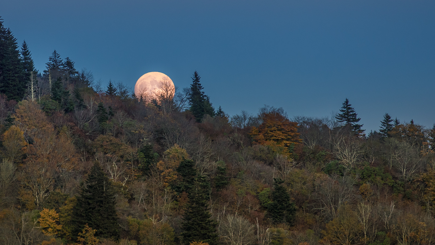
Hi Michael. As Bill mentioned, there is a beautiful dreamy feel to this image and the color really draws me in. The lighting is exceptional, and that tiny barn adds just the right touch to the scene. Wonderful image. |
Mar 17th |
| 36 |
Mar 26 |
Comment |
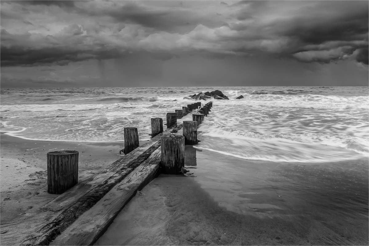
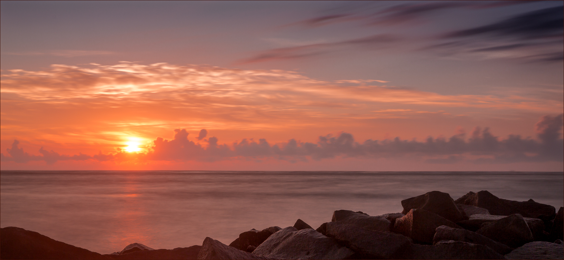
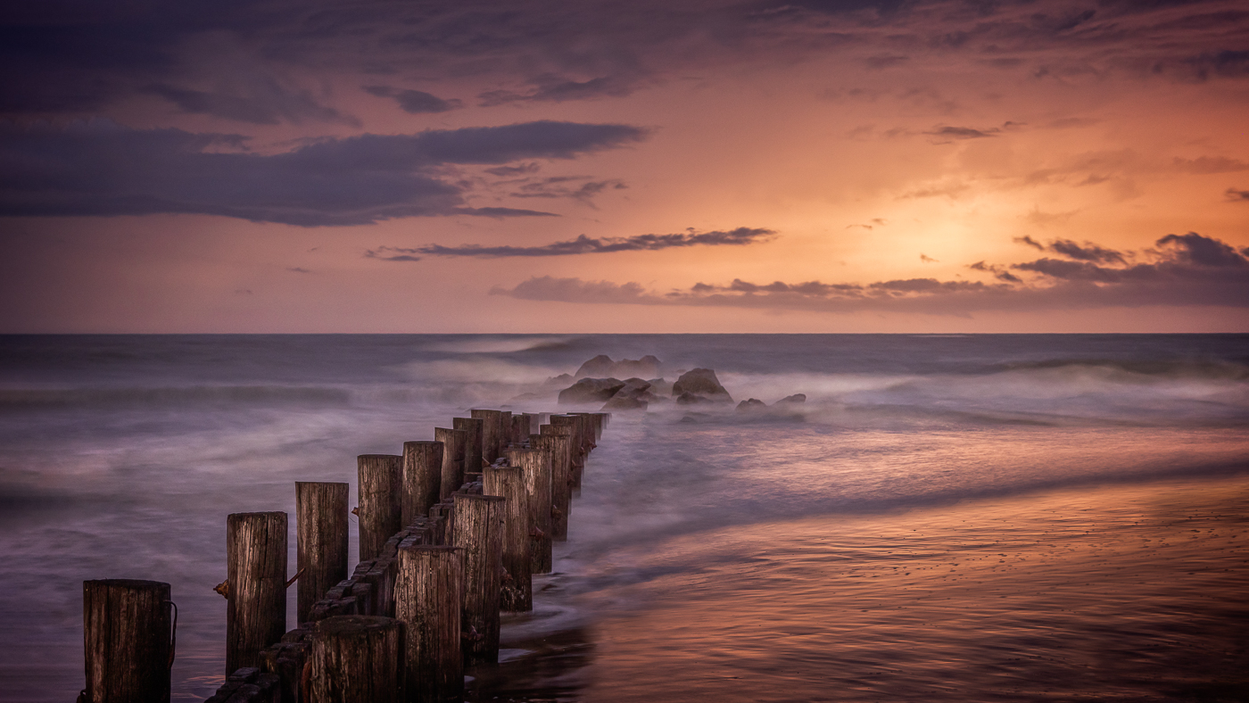
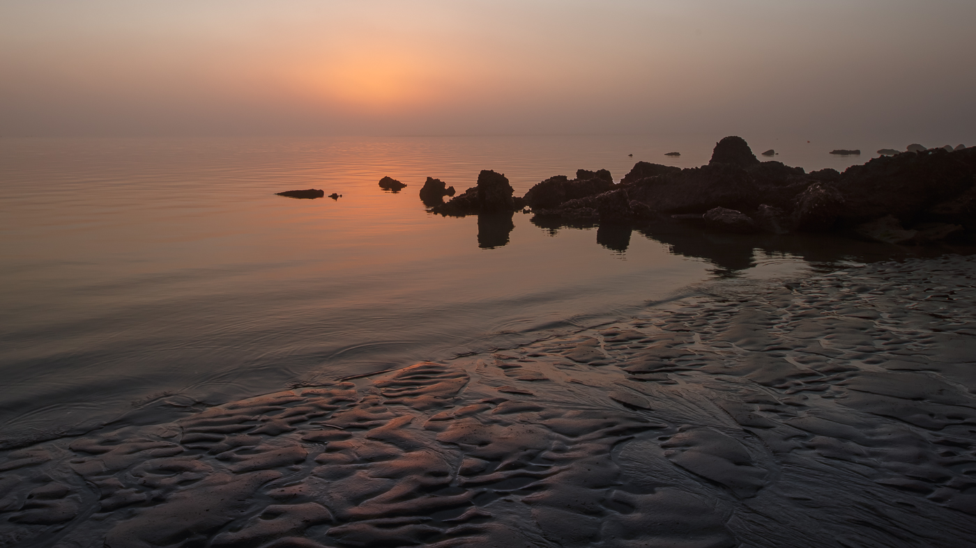
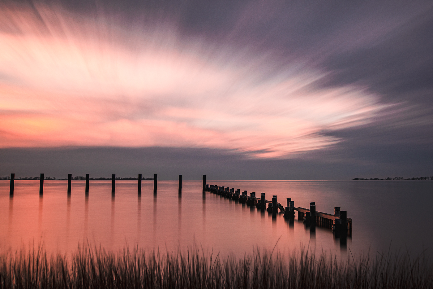
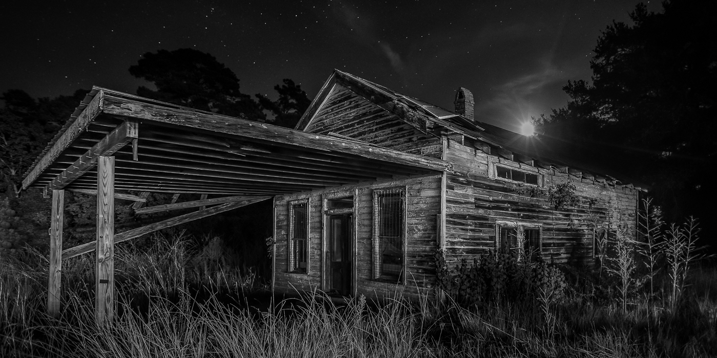
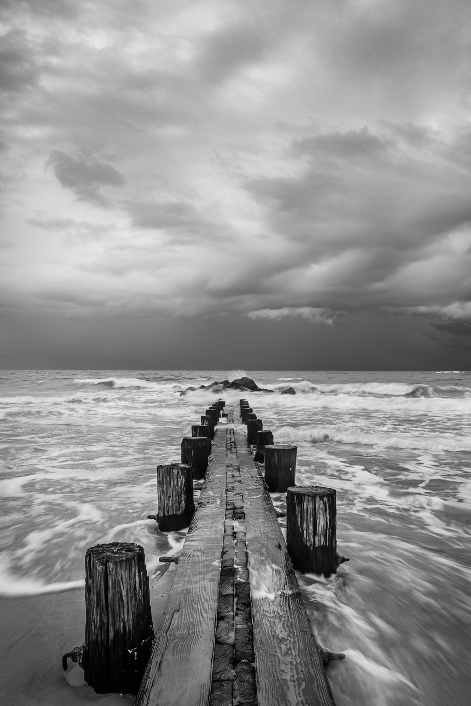
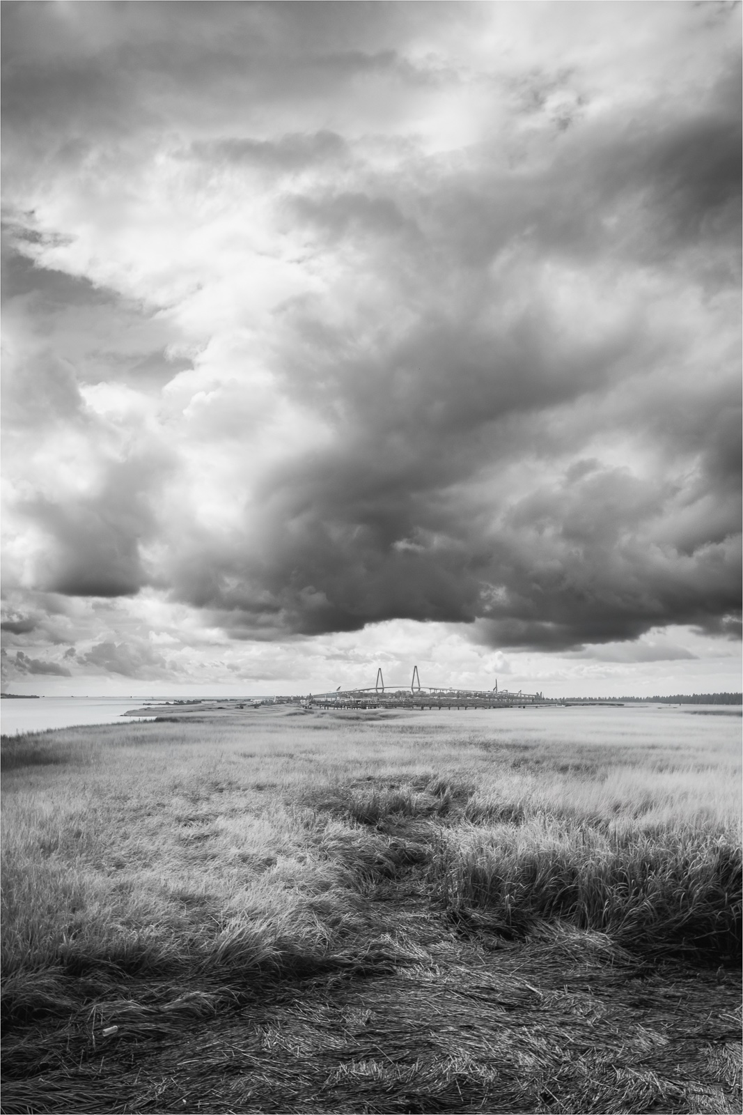
Hi Larry. The low-lying fog really transforms this sunset scene. The composition feels nicely balanced with the grasses and pier in the foreground playing well against the reflection in the water. The color is rich without being overdone. Feels very natural. Not sure why the sky and its reflection don't quite match-maybe the fog has something to do with it. Wonderful image. |
Mar 17th |
6 comments - 4 replies for Group 36
|
| 47 |
Mar 26 |
Reply |
Thanks for your detailed input. I will definitely create a virtual copy and modify with the suggestions given as I'm curious to see how the image will look. Many thanks! |
Mar 23rd |
| 47 |
Mar 26 |
Reply |
Thank so much Ed. Photographing ruins is always interesting. |
Mar 21st |
| 47 |
Mar 26 |
Reply |
Thanks Douglas. When I saw the posted image, I thought the same about the floor. |
Mar 21st |
| 47 |
Mar 26 |
Reply |
Thanks Robert. I'm always hesitant using too much vignetting but for this image I didn't mind the heaviness. I will take your suggestions and look at the image again to see if it works. |
Mar 21st |
| 47 |
Mar 26 |
Reply |
Thanks so much Kirsti. The village is filled with ruins and so many things to photograph. |
Mar 21st |
| 47 |
Mar 26 |
Comment |
Hi Albert. What a fun encounter. The marmot's expression grabbed my attention along with the whiskers and the nice texture in the fur. I like the rugged rock as it fits the scene and compositionally the off center marmot gives the image a nice natural feel. As Ed mentioned, a brighter eye would be nice. |
Mar 21st |
| 47 |
Mar 26 |
Comment |
Hi Kirsti. Very cool image-well worth the effort you put into it. This kind of work opens the door to so many ideas and interpretations. I actually thought the background was smoke. Well done! |
Mar 21st |
| 47 |
Mar 26 |
Comment |
Hi Robert. I really like this architectural image, especially the stark white building set against the black sky. The wispy clouds are a nice touch, but because they're so soft and faint, I'd consider cropping some of the sky, since tightening the crop would help focus attention on the structure. Also, to make the building stand out even more, you might want to consider increasing the contrast to deepen the shadows and give the white façade a bit more drama. Nice job. |
Mar 21st |
| 47 |
Mar 26 |
Comment |
Hi Douglas. One of the hardest things about a portrait is the pose as people tend to tense up in front of a camera. Compositionally, Scott's pose feels natural and comfortable - nicely done. The textured grass in the foreground adds interest and the background blur works well. Regarding the lighting, the side light comes across a bit harsh, creating a line on Scott's face. Not sure if you have a circular diffuser, but it would have softened the light nicely. For me, the midtones feel a bit dominant. A little separation as Ed mentioned would really enhance the image. |
Mar 20th |
4 comments - 5 replies for Group 47
|
10 comments - 9 replies Total
|