|
| Group |
Round |
C/R |
Comment |
Date |
Image |
| 36 |
Feb 26 |
Reply |
Thanks so much Bill. |
Feb 21st |
| 36 |
Feb 26 |
Reply |
Many thanks Adi. |
Feb 21st |
| 36 |
Feb 26 |
Reply |
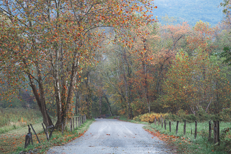
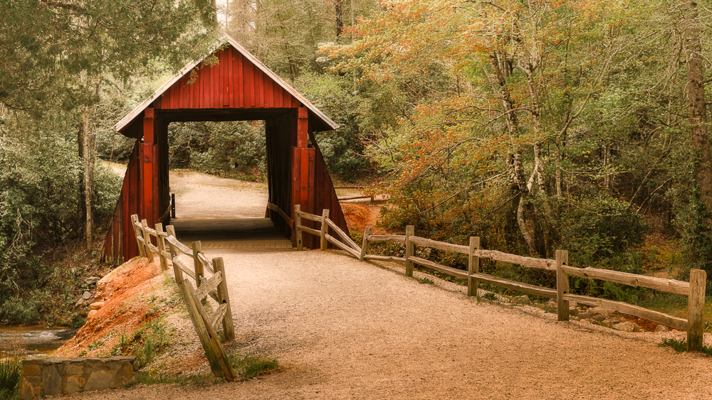
Thanks so much Larry. I went back and forth between color and B/W but felt the muted colors evoke that late fall feeling -- similar to where you can almost hear the crunch of leaves under your feet. |
Feb 21st |
| 36 |
Feb 26 |
Reply |
Thanks for your comments Michael. |
Feb 16th |
| 36 |
Feb 26 |
Reply |
Thank you Grace. I also tried a black and white edit but I thought this image cried for some color so I chose muted to emphasize the late fall vibe and old covered bridge. |
Feb 16th |
| 36 |
Feb 26 |
Reply |
Hi Larry. Your thought process makes total sense. Little bits of foreground like this usually don't feel very intentional to me but I had to wonder...does that strip of land quietly anchor the right side so the water doesn't feel too empty? Or, does it add a counterweight to the left side even though it's much smaller. Would taking it out make the image stronger? In the end I decided to leave it to the maker. If it were my edit, I would have taken it out or made it bigger. |
Feb 16th |
| 36 |
Feb 26 |
Comment |
Hi Adi. What can I say - such a great shot! It's well composed and perfectly timed. There's so much beauty in that location and the photo captures it. Maybe just a little extra clarity or contrast on the mountains could make it pop even more. |
Feb 15th |
| 36 |
Feb 26 |
Comment |
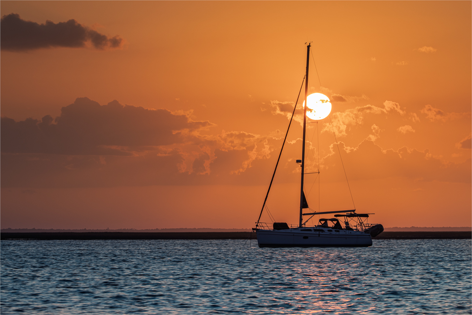
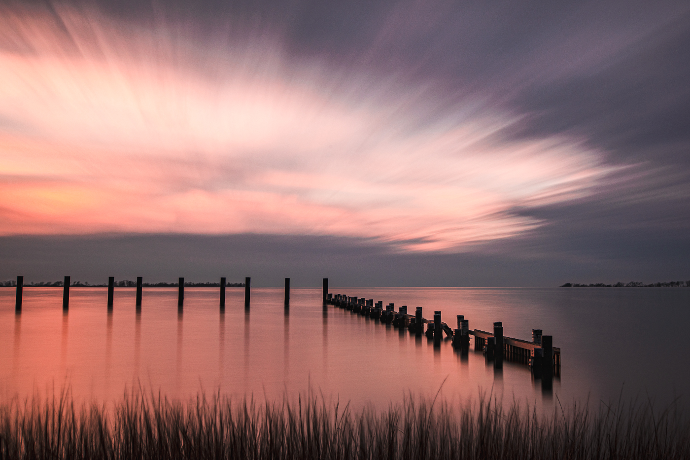
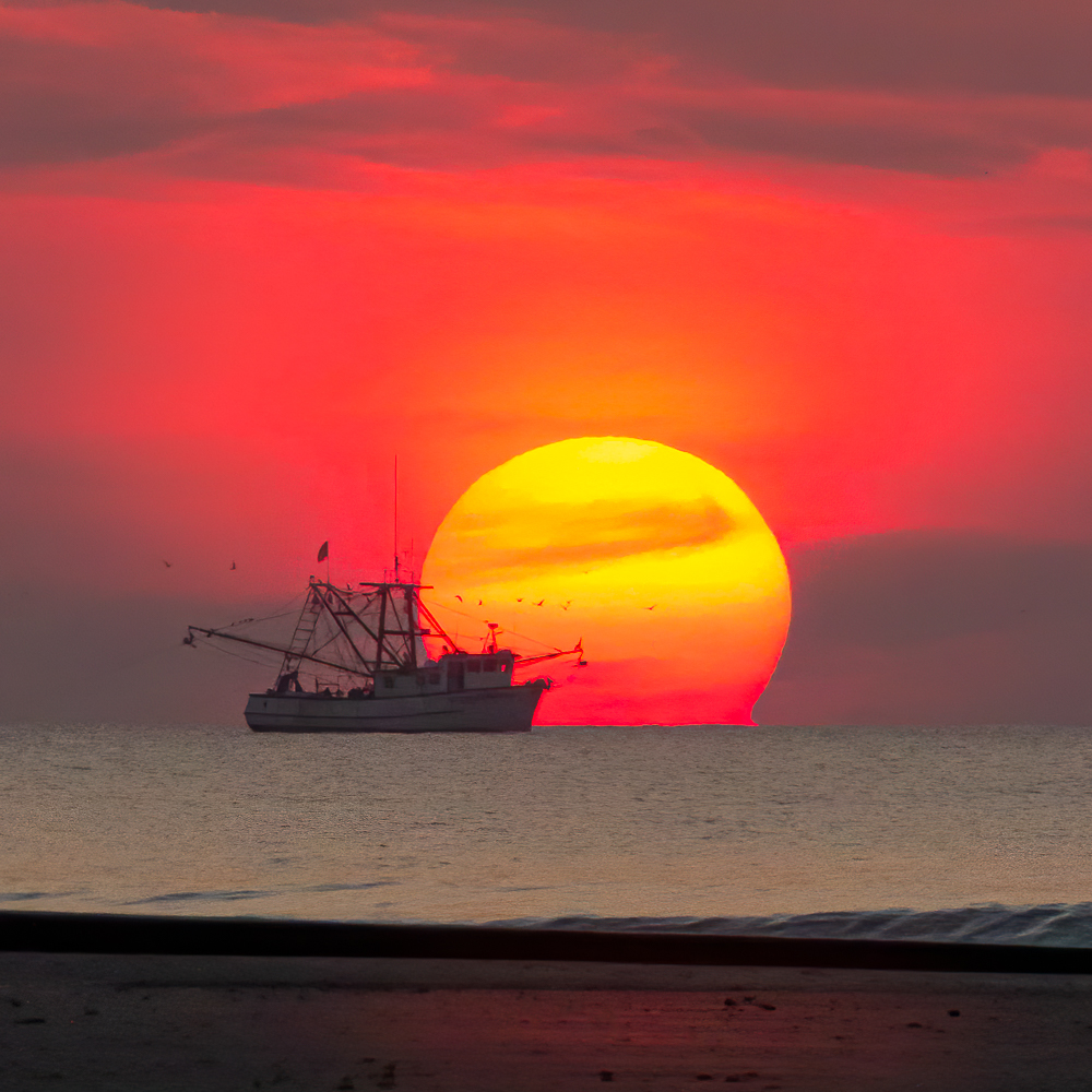
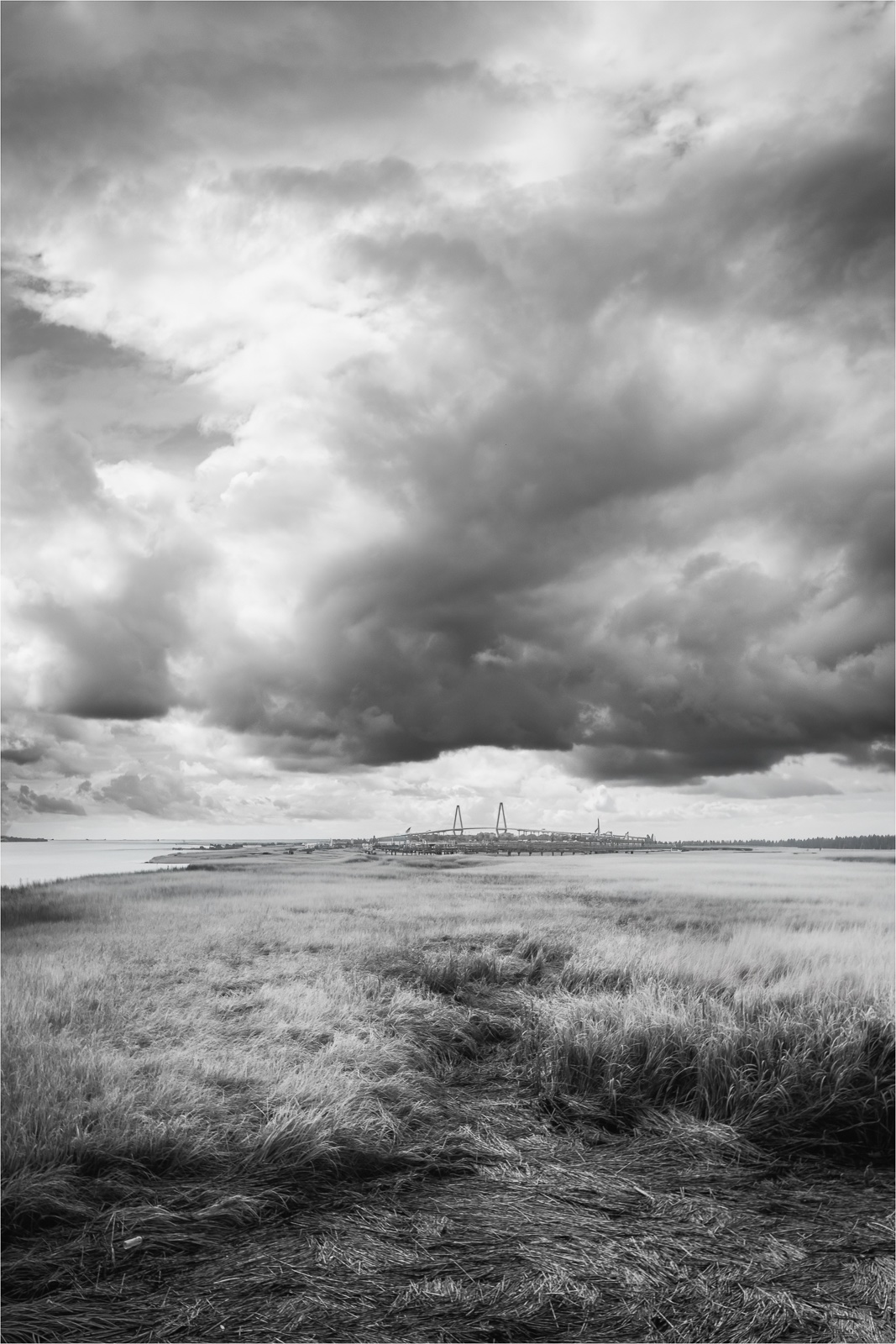
Hi Bill. Great pano shot of the area -- it really creates a beautiful sense of openness and the boats helps to show scale. Grace's edit effectively removes the blue cast. I'm undecided about the narrow strip of grass in the foreground. One minute I like it and the next I'm thinking to remove it and crop in from the bottom. Either way, nice image. |
Feb 15th |
| 36 |
Feb 26 |
Comment |
Hi Grace. Both photos are nice travel images. I think I prefer the original to the cropped version. When I look at the two, the tower or steeple in the original feels more balanced and somewhat intentional in the frame than the cropped version.
I do like having the pigeons on the roof as they add a nice touch of realism. I think Michael's suggestion for the flat lighting is a good one. |
Feb 15th |
| 36 |
Feb 26 |
Comment |
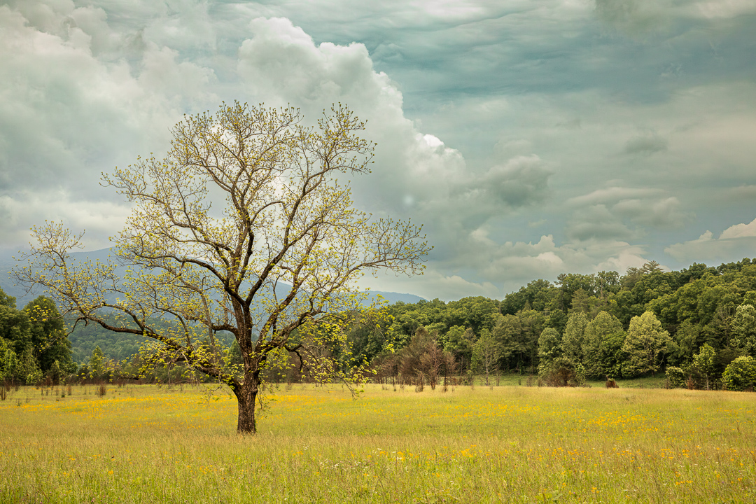
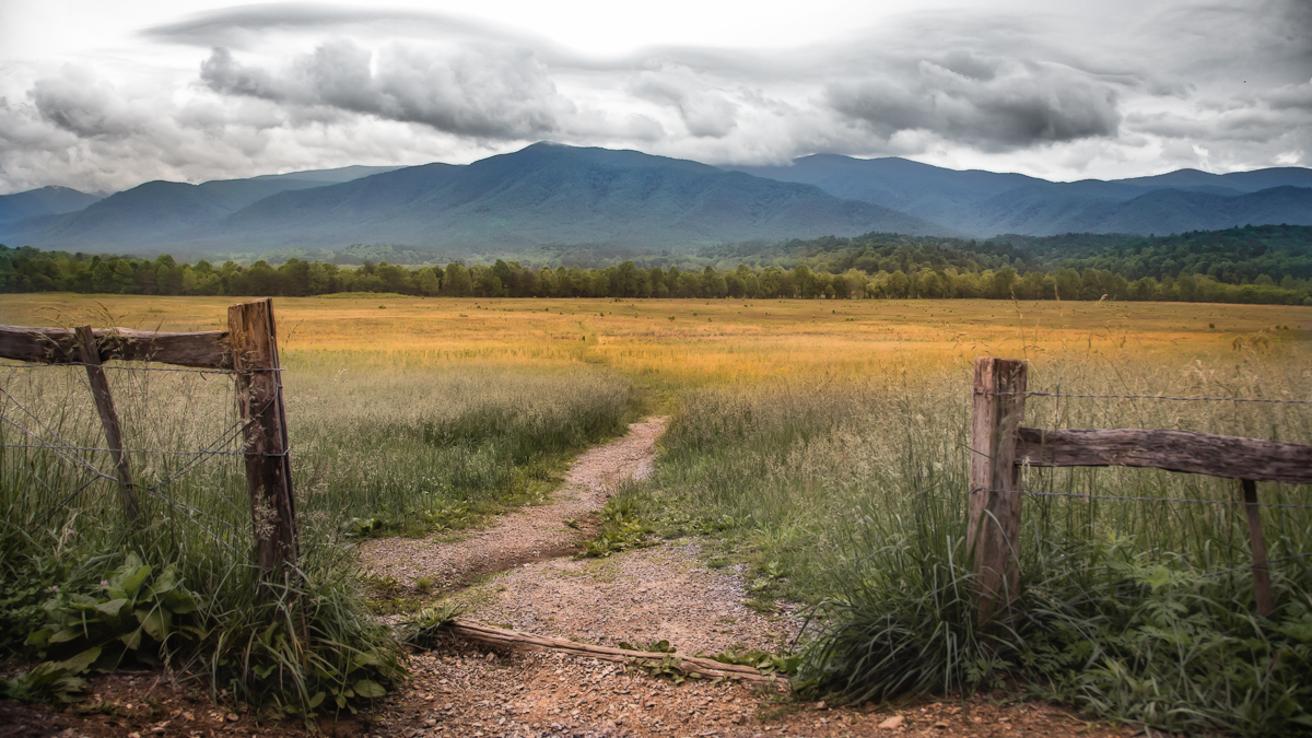
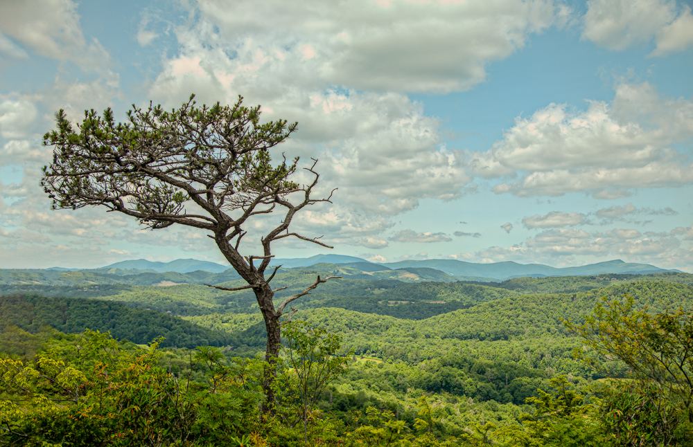
Hi Michael. Whenever I see photos from this area they never disappoint. The area is beautiful with the rolling hills, colors, farms or a lone tree. The rolling hills create an almost geometric effect. For me, it has a minimalist abstract effect. Very nice. BTW, what was the journal date for your article. I would like to read it. |
Feb 15th |
| 36 |
Feb 26 |
Comment |
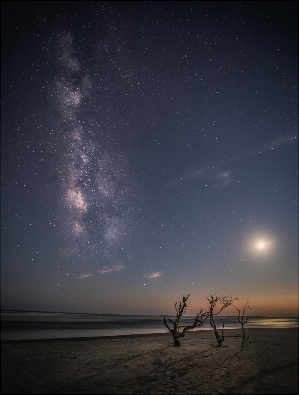
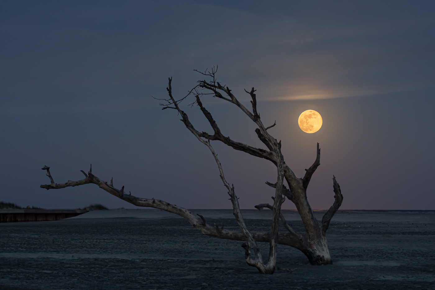
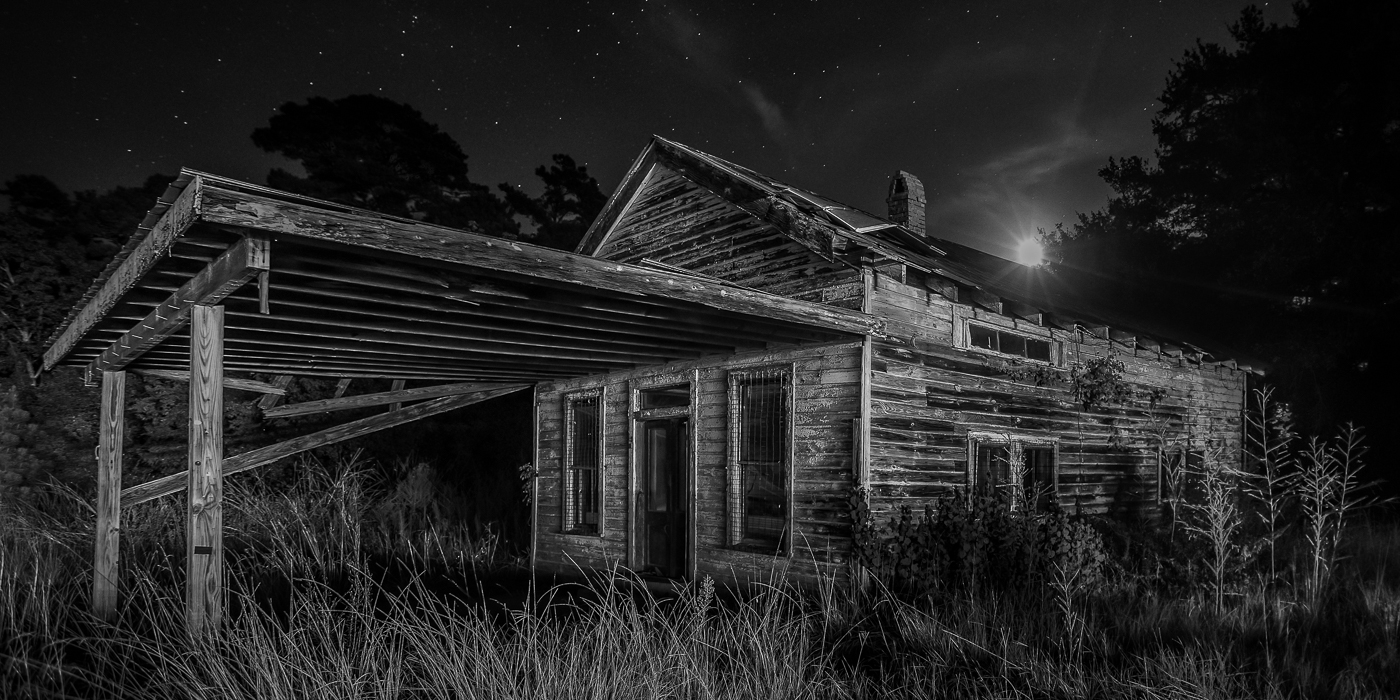
Hi Larry. The color and reflections look great against the black background. The bit of shrubbery in the foreground and the causeway give the building a solid anchor. I'm not sure I'd want to wander in the dark in gator country, but I'd have taken my chances for this shot. Great photo. |
Feb 10th |
5 comments - 6 replies for Group 36
|
| 47 |
Feb 26 |
Reply |
I'm a believer to always stand by one's own artistic approach. Whether is realism or an alternative aesthetic each photographer has to create their own unique and creative identity. |
Feb 15th |
| 47 |
Feb 26 |
Comment |
Hi Kirsti. I really like how you're willing to experiment with creative ideas. For me I prefer the original. When I view the blue toned effect I find that it pulls me away from the natural atmosphere of the scene and I'm looking more at the effect than on the scene itself and the feeling it conveys. I feel a stronger sense of solitude and peace in the original..thinking about what the fisherman is experiencing. I might consider a 16:9 crop, placing the fisherman closer to the upper rule of thirds intersection to give the image a bit more strength. Overall, it's a nicely seen and well-composed image. |
Feb 14th |
| 47 |
Feb 26 |
Comment |
Hi Al. This image is all about texture (fitting title), but what stands out to me is the positioning. The iguana's expression and placement of its front limbs gives it a strong presence. The detail in the skin also reinforces that strength giving the image a rugged feel. For me, the dark background blends a bit too much with the iguana's body. Don't know if adding a bit more light or separation is possible but it could help to have the lizard stand out more. Nice image. |
Feb 13th |
| 47 |
Feb 26 |
Comment |
Hi Ed. Great timing and title! The composition works with your daughter nicely framed. For me, the bit of shoreline up front and the darker water (churned up sand, shells, etc.) on the left gives me a sense of place and pulls the story together. My eye goes straight to her face. Her intense expression matches the energy of the water and tells me she's ready to be slammed forward by the wave. My only thought is possibly brightening her face a bit to pop the details. Fun shot! |
Feb 13th |
| 47 |
Feb 26 |
Comment |
Hi Robert. I like everything about this image. The scene feels balanced by the mountains and the light leads my eye from the water, through the fjord, and up into the sky. The light also creates a nice sense of depth and lastly, the low contrast suits the mood. Very nice. |
Feb 13th |
| 47 |
Feb 26 |
Comment |
Hi Douglas. Very creative approach. It took me a moment to understand what I was seeing, and I found myself studying the image closely. The centered composition is strong, and the contrast between the bright subject and dark background works well. I also like how the stone's texture comes through clearly. To my eye, especially for this type of photo, I tend to focus on precision. For me the photo appears nearly symmetrical though there is a slight misalignment on the lower left side. Overall it's well done and creative! |
Feb 13th |
| 47 |
Feb 26 |
Reply |
Thanks Douglas. I appreciate and agree. |
Feb 9th |
| 47 |
Feb 26 |
Reply |
Hi Al. Thanks for your input! I totally agree, her pose and expression don't quite match the classic film noir vibe. I went through my portraits but couldn't find the right image, so I used this one to try out a more minimalist take with less darkness and grain. I'm experimenting with a few personal filters, but your feedback's a good reminder that true noir starts at the shoot, not just in the edit! |
Feb 9th |
| 47 |
Feb 26 |
Reply |
Thanks Kirsti! I really appreciate your feedback. I was playing around with a minimalist noir look for this shot. Totally agree about the contrast and darker background or vignette which would bring more tension to the image. I'll keep your ideas in mind when I make more filters. |
Feb 9th |
5 comments - 4 replies for Group 47
|
10 comments - 10 replies Total
|