|
| Group |
Round |
C/R |
Comment |
Date |
Image |
| 36 |
Dec 25 |
Reply |
Thanks so much Adi. Yes, Virginia's countryside is incredibly beautiful and full of charm. |
Dec 21st |
| 36 |
Dec 25 |
Reply |
Thank you Bill for your feedback. It's greatly appreciated.
|
Dec 21st |
| 36 |
Dec 25 |
Reply |
Hi Larry. I really appreciate your feedback. I only wish these country roads had more spots to park my jeep so I wouldn't have to stop on the road and could take a bit more time for photos..but I guess that's part of their charm. I might have another shot from a lower angle though probably not much different. |
Dec 21st |
| 36 |
Dec 25 |
Comment |
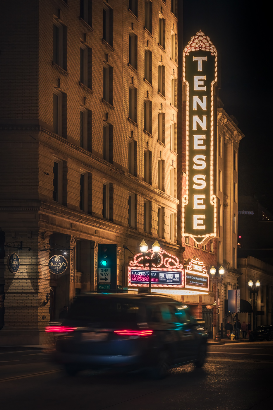
Hi Adi. Definitely worth the effort for this shot - it's a real takeaway image. What can I say...it's a competition winner!! I love how the smoke rises from the church and how the rays lead to the church. The fog, soft blue sky and the hint of yellow in the foreground are all elements that add to this image. Beautiful image. |
Dec 17th |
| 36 |
Dec 25 |
Comment |
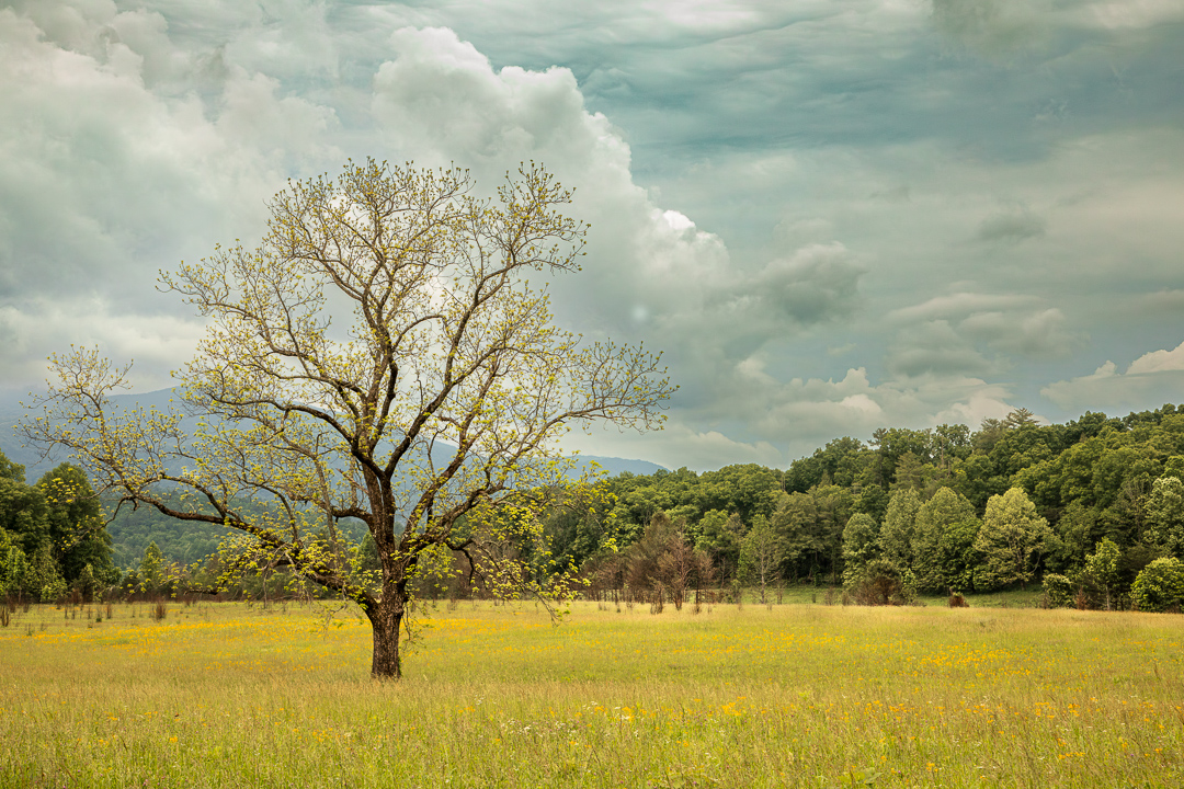
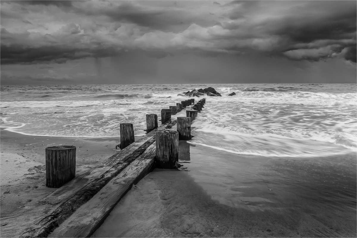
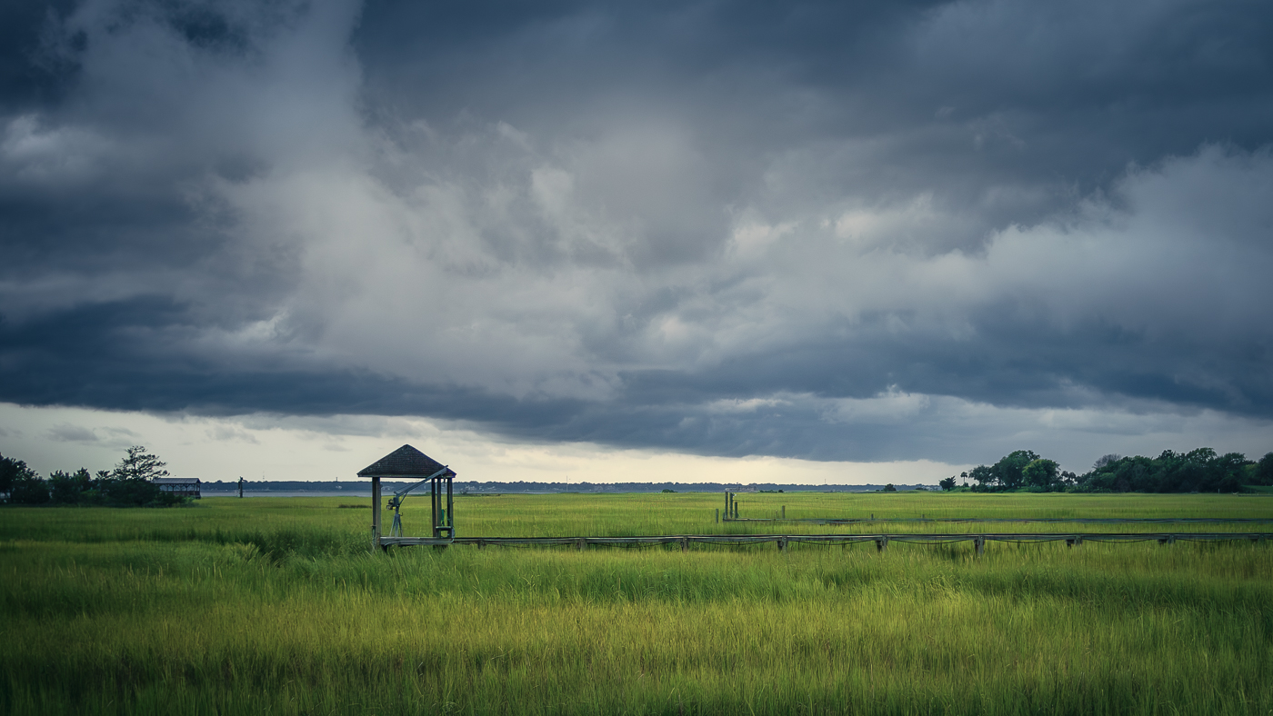
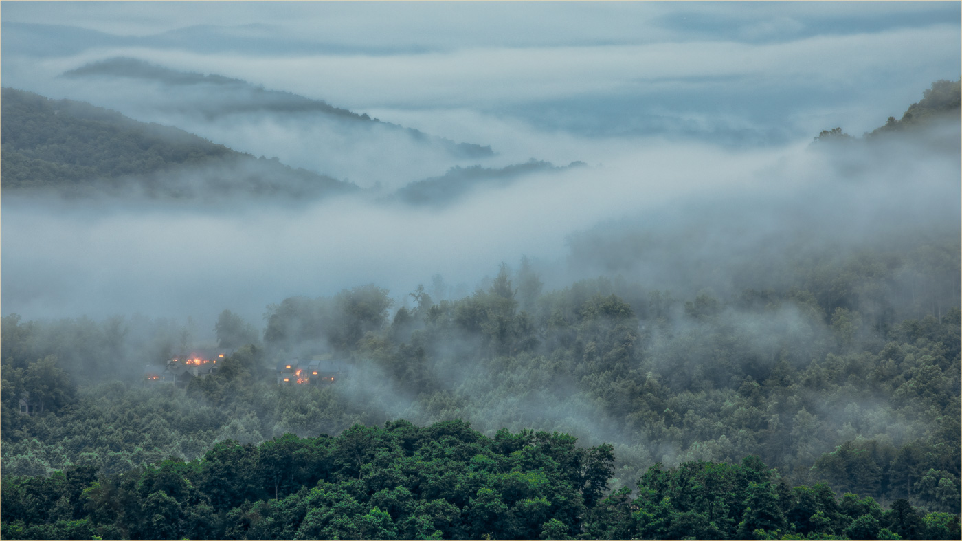
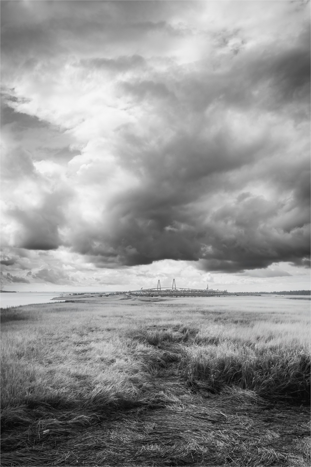
Hi Bill. This area must have been amazing to see in person. The sky has nice texture, and I can really feel the sense of place here. Personally, I think I prefer the original version with the extra texture in the foreground. At the same time, I have to agree with Larry as there isn't an obvious focal point to hold my attention. I don't think every image needs a single clear subject to be engaging, but it helps when there's something in the composition such as moodier light, complimentary colors, or leading lines to draw my eye in and keep my interest. Glad you had the opportunity to visit and appreciate the location. |
Dec 17th |
| 36 |
Dec 25 |
Comment |
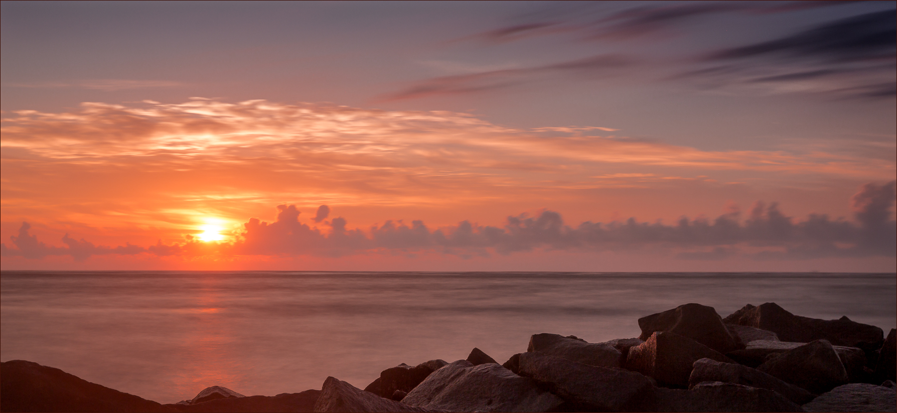
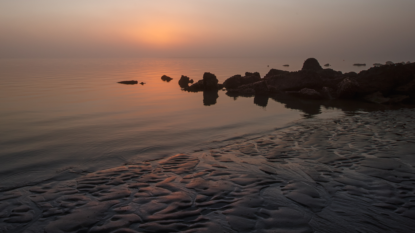
Hi Michael. Great effort for a beginner photo! This image captures a beautiful serene moment with the sun rising gracefully behind the rocks. The colors give a sense of tranquility and balance. From my perspective, reducing the amount of sky could further enhance the overall composition. Nice job! |
Dec 10th |
| 36 |
Dec 25 |
Comment |
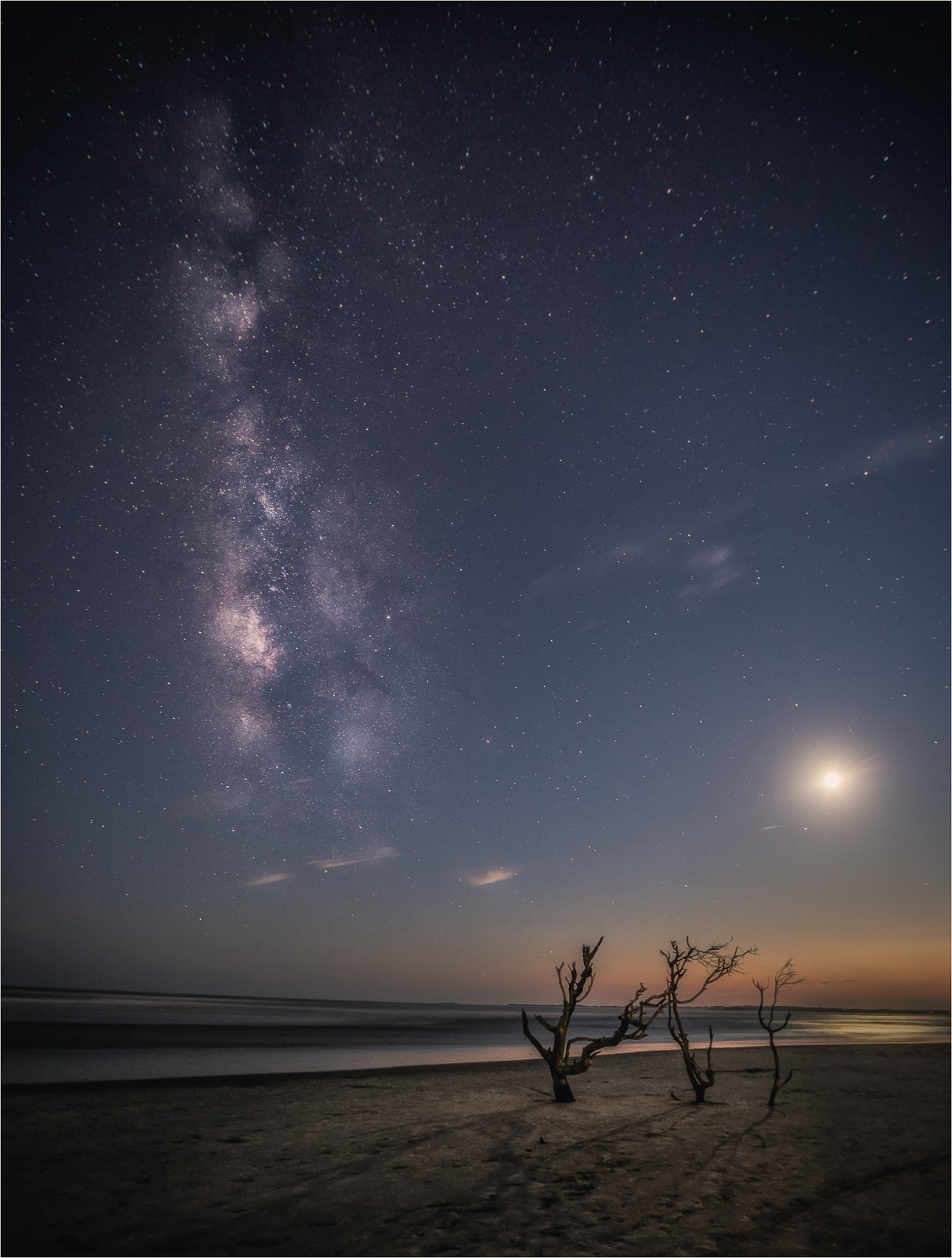
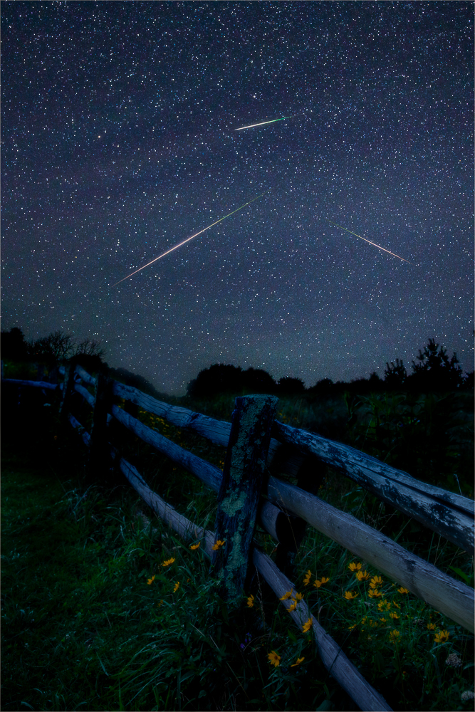
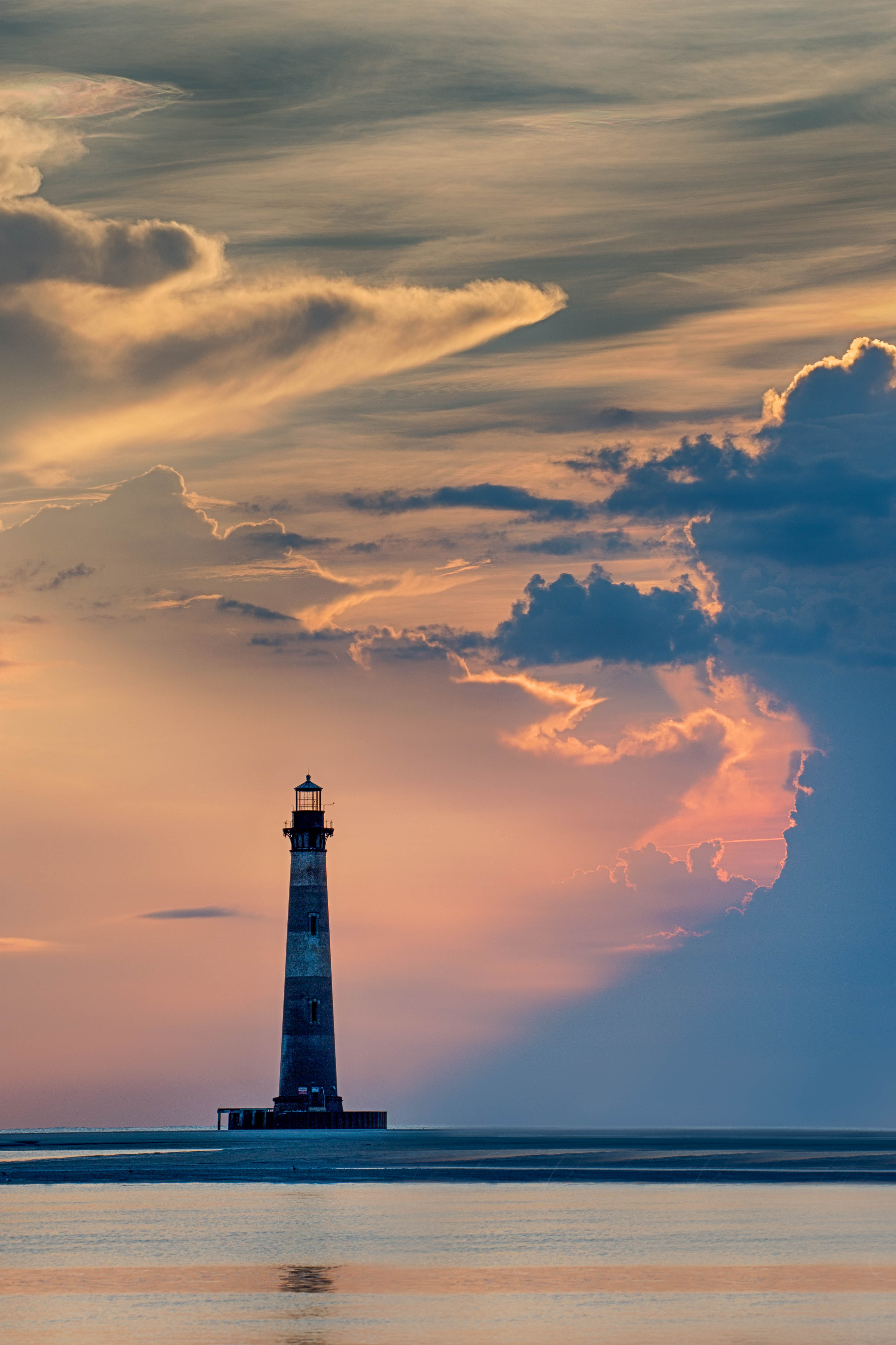
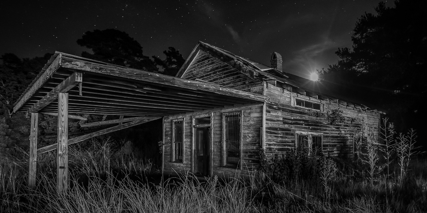
Hi Larry. Normally, I'd position the MW either parallel or slightly off to the side when framing it with a vertical subject (especially when the galactic center is bright and higher in the sky}. That said, I really like your approach of shooting from this angle and centering the lighthouse. With the MW starting its descent below the horizon, and to better frame the lighthouse, using the Platypod was a smart choice ( I have one and rarely use it). The longer lens nicely compresses the scene creating a balanced composition. The sky is star dense and sharp. Well done! I did notice a bit of color noise when I look closely but that's a small thing overall. Also, don't know if you can do anything with the overexposed lighthouse light. Regardless, great image. |
Dec 10th |
4 comments - 3 replies for Group 36
|
| 47 |
Dec 25 |
Reply |
Thanks Robert. Your feedback is greatly appreciated. |
Dec 21st |
| 47 |
Dec 25 |
Comment |
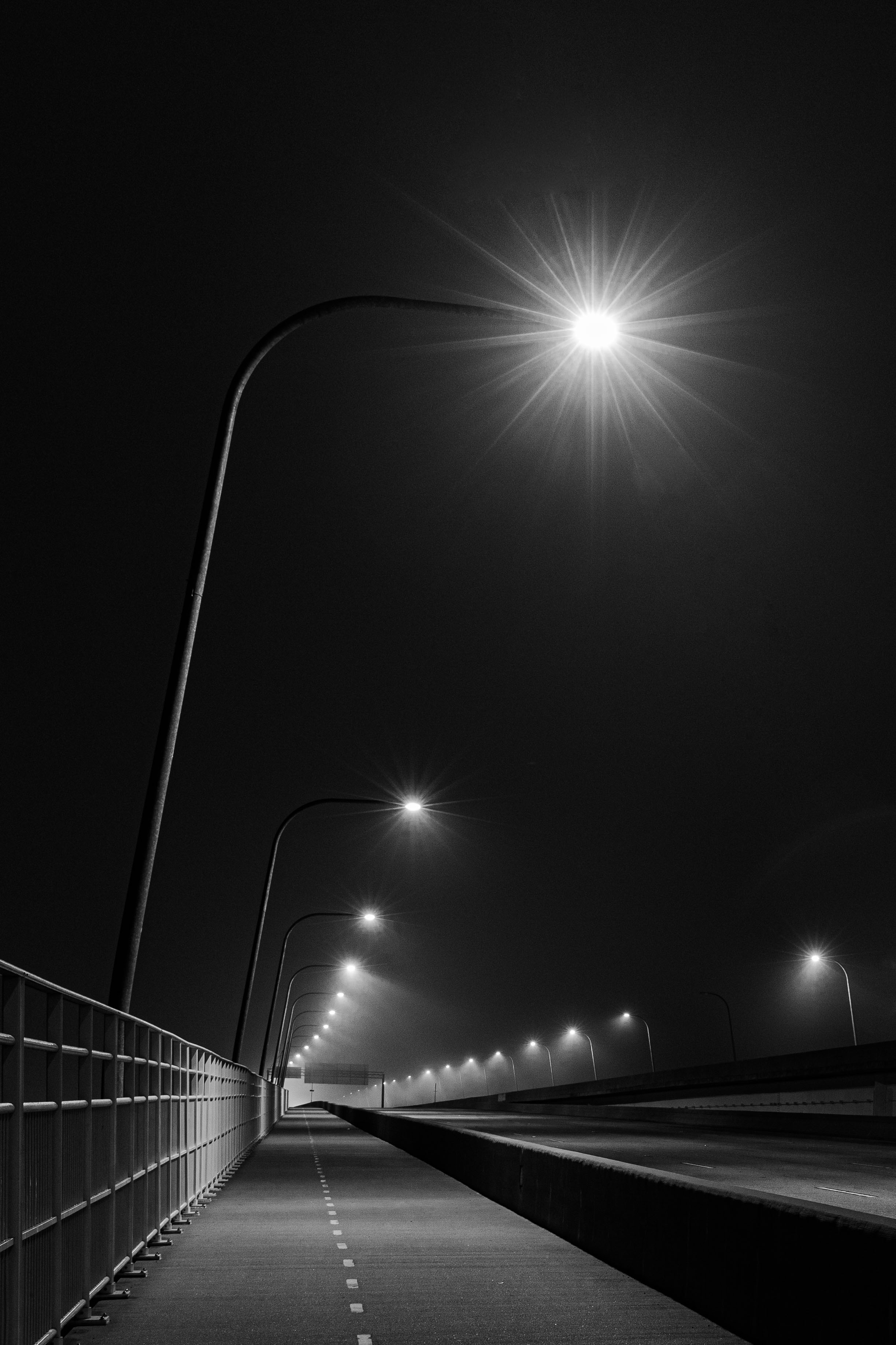
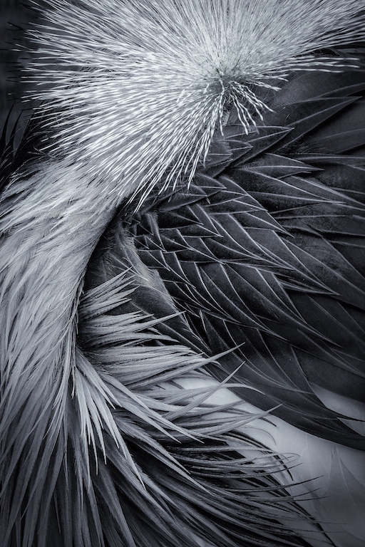
Hi Al. This is a great subject for an abstract image and you've handled it nicely. Since I don't have a tilt shift lens, using one here was a smart choice to avoid distortion and the effect you achieved looks very nice. |
Dec 21st |
| 47 |
Dec 25 |
Comment |
Hi Douglas. The white background does a great job of making the physique pop and focusing on the back pose featuring the lats, traps, and arms works. I just wish the frame was a bit wider so the handles, cable, and glutes weren't hugging the edge so much. For me, the light on the back feels a little too soft for a muscle shot. A harder light with stronger shadows would give the image a more dramatic, shredded look. Also, I agree with Robert about the dark shadow on the left. |
Dec 21st |
2 comments - 1 reply for Group 47
|
6 comments - 4 replies Total
|