|
| Group |
Round |
C/R |
Comment |
Date |
Image |
| 36 |
Aug 25 |
Comment |
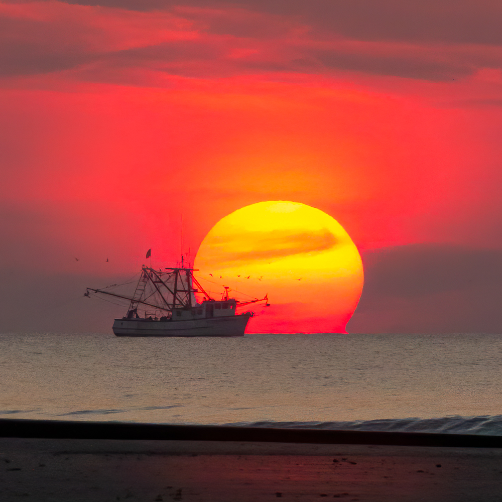
Thanks Bill. I have some long exposure shots of the water and when I combined them with a short exposure I didn't like the result. I think I'll try to merge them again and see if I like it now. |
Aug 23rd |
| 36 |
Aug 25 |
Reply |
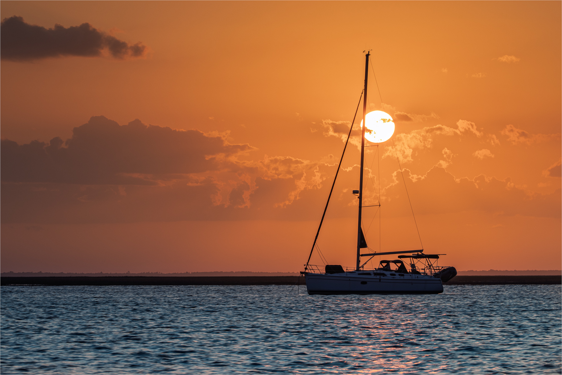
Thanks Larry. I took several long exposures also, and as you mentioned, the boat was blurry. I tried combining a long and short exposure in PS but wasn't happy with the outcome. |
Aug 23rd |
| 36 |
Aug 25 |
Reply |
Thanks for your feedback Michael. I have several photos where the sun is clear of the mast but haven't been processed. |
Aug 23rd |
| 36 |
Aug 25 |
Reply |
Thanks so much Grace. I also tried various crops before settling with this one. |
Aug 23rd |
| 36 |
Aug 25 |
Comment |
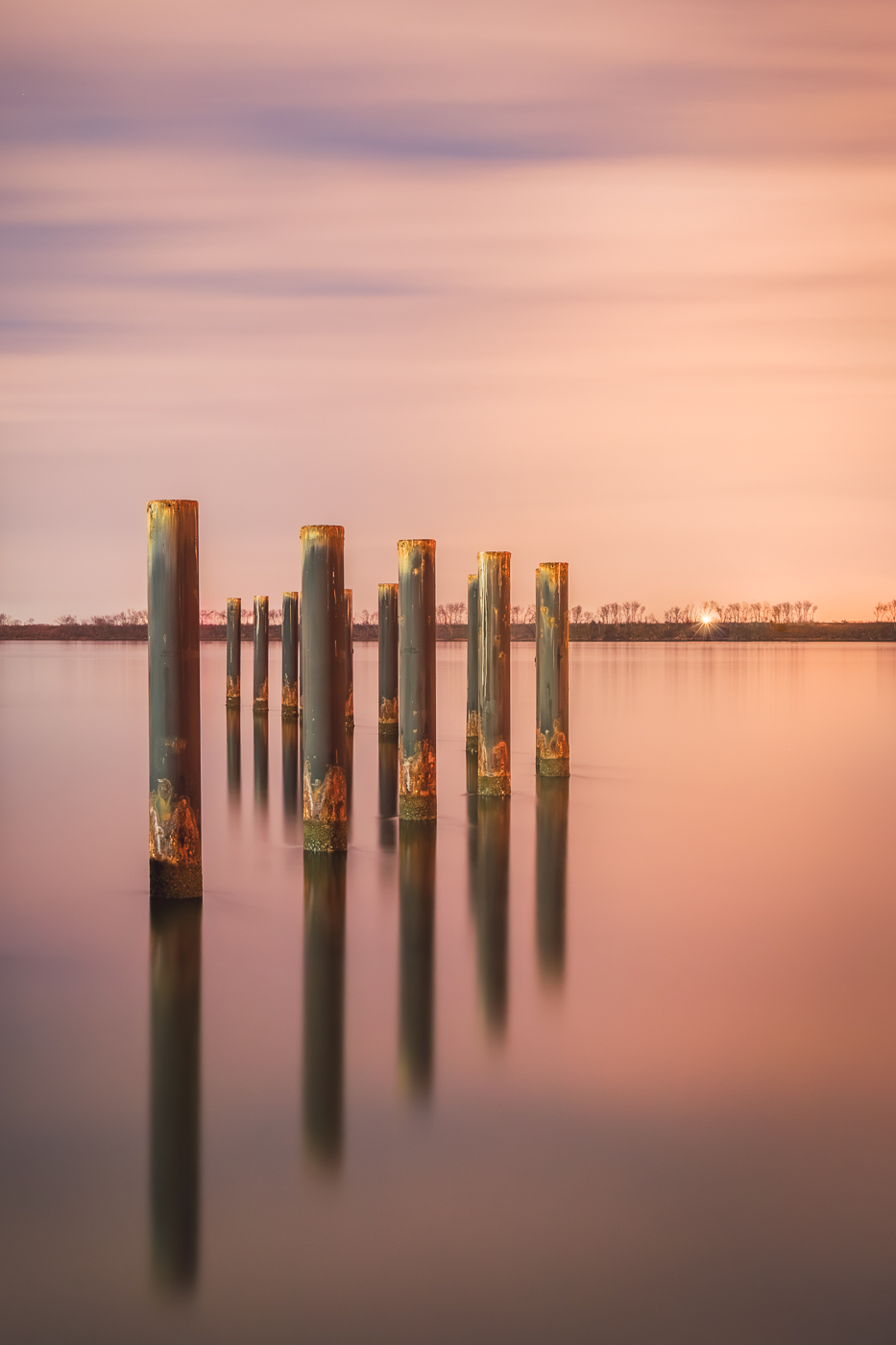
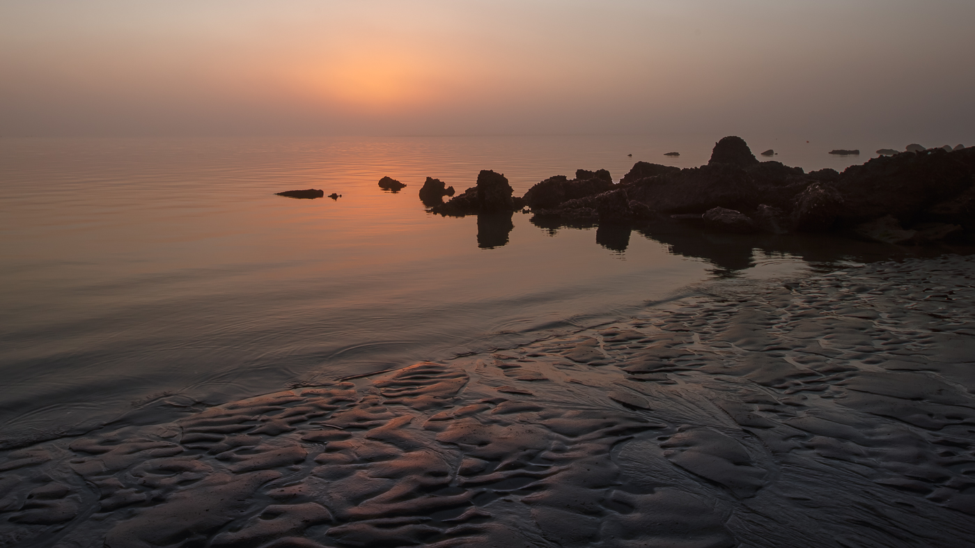
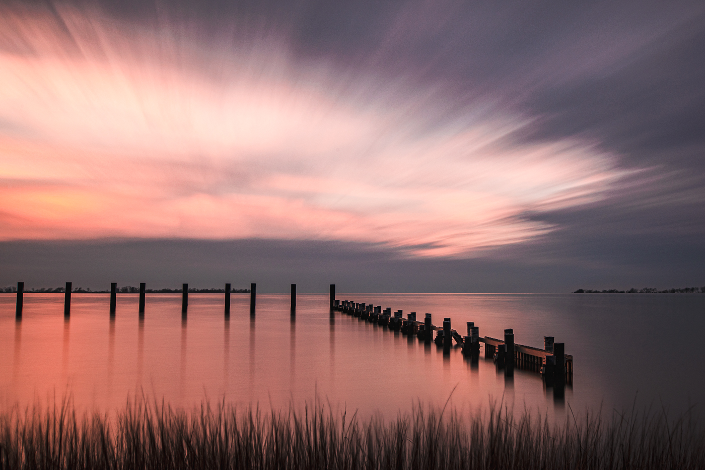
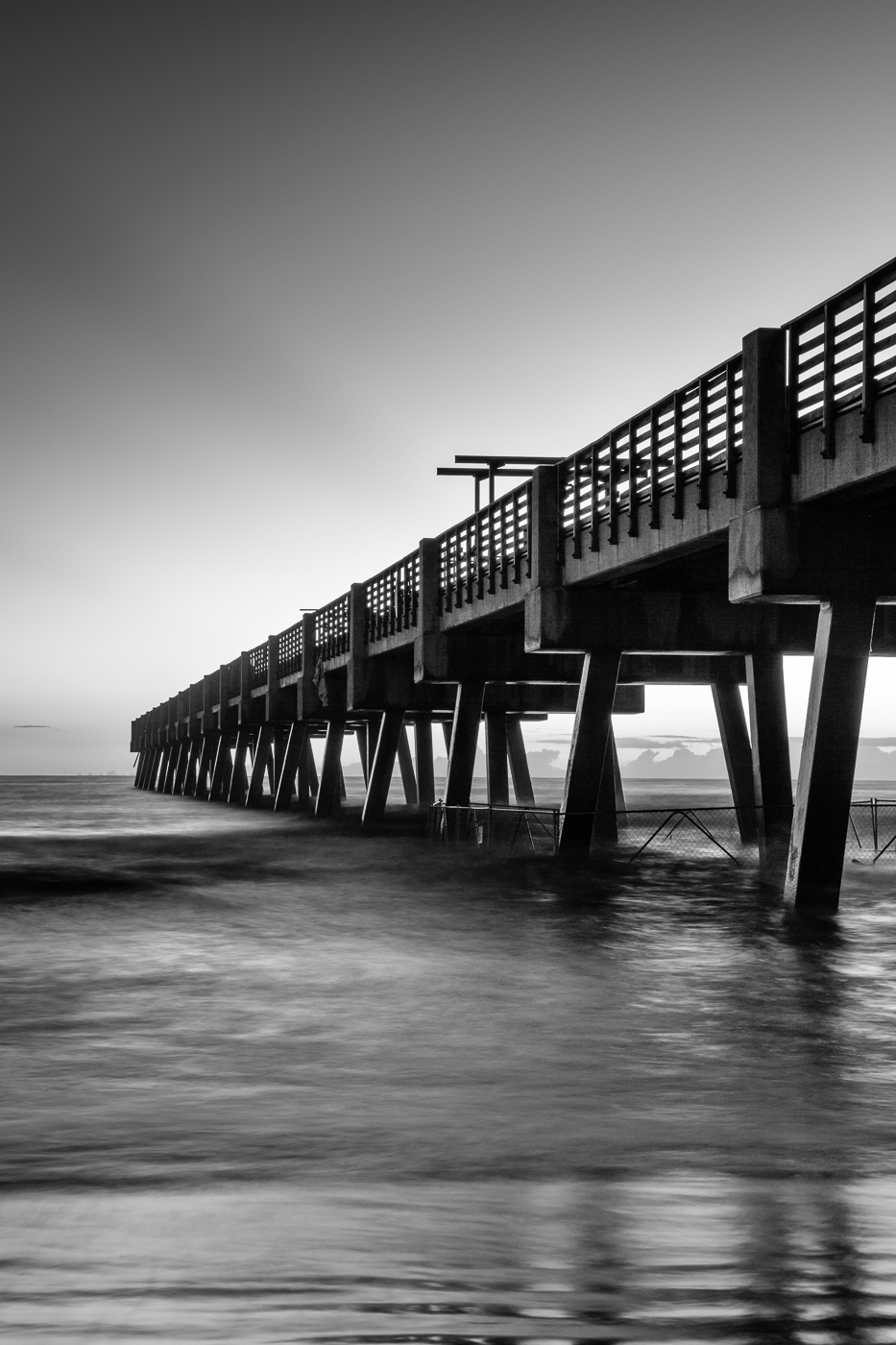
Hi Bill. This is a stunning location to watch the sunset. The composition works well, with the dock leading my eye to sunset. The lighting nicely illuminates the dock and water. For me, the branch on the left and the iron railing on the right feel somewhat distracting from the beautiful scene. Possibly enhancing the saturation or vibrance a bit could help the colors in the sky pop more. Nicely done! |
Aug 23rd |
| 36 |
Aug 25 |
Comment |
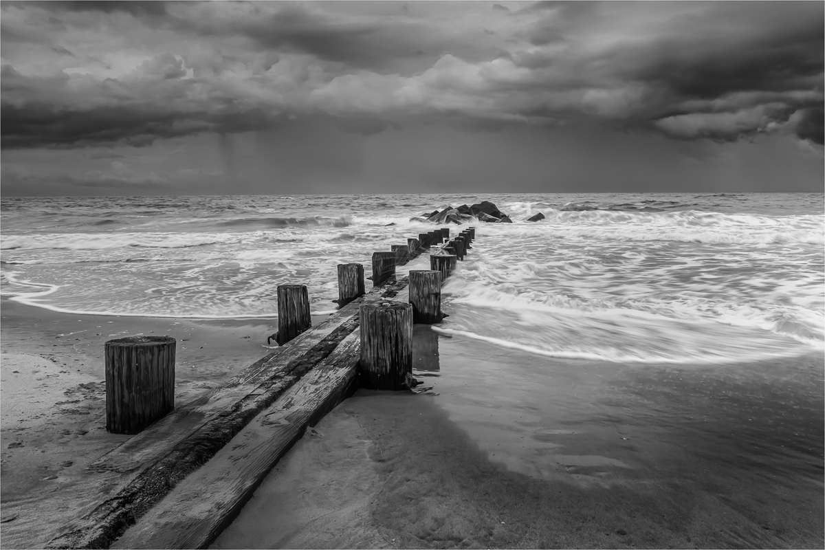
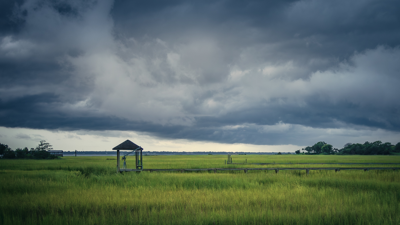
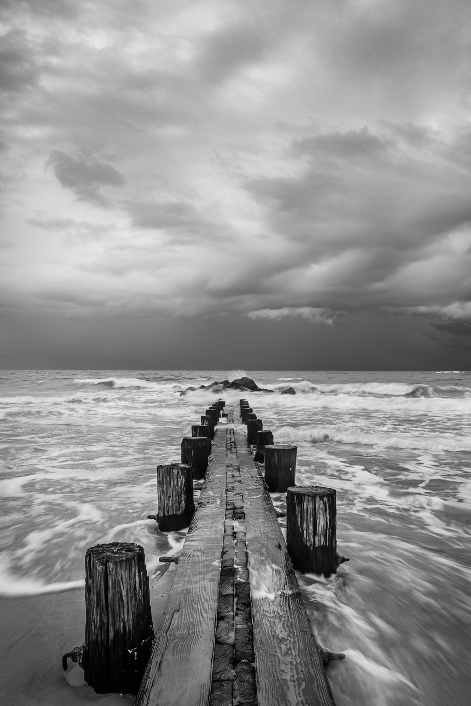
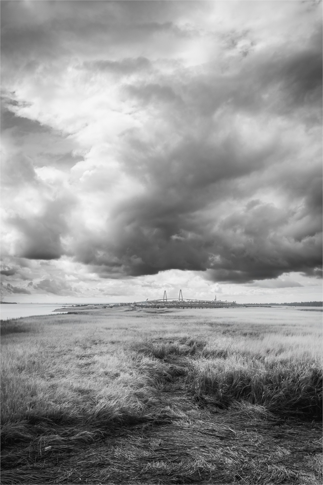
Hi Gokul. So glad you were able to be outside to photograph and see these clouds. As Grace mentioned about the Gulf Coast, I'm also familiar with heave storm clouds like these from my time living along the east coast of South Carolina, US. For me, the photo evokes a moody atmosphere but feels underexposed despite the settings appearing appropriate. I've found that very dense clouds are especially challenging because of the limited and often flat lighting. I would have liked to see more detail, texture, or layering in the storm clouds. From a composition standpoint, the sky is the story, so reducing the amount of foreground (as shown above) could make the photo more compelling. |
Aug 14th |
| 36 |
Aug 25 |
Comment |
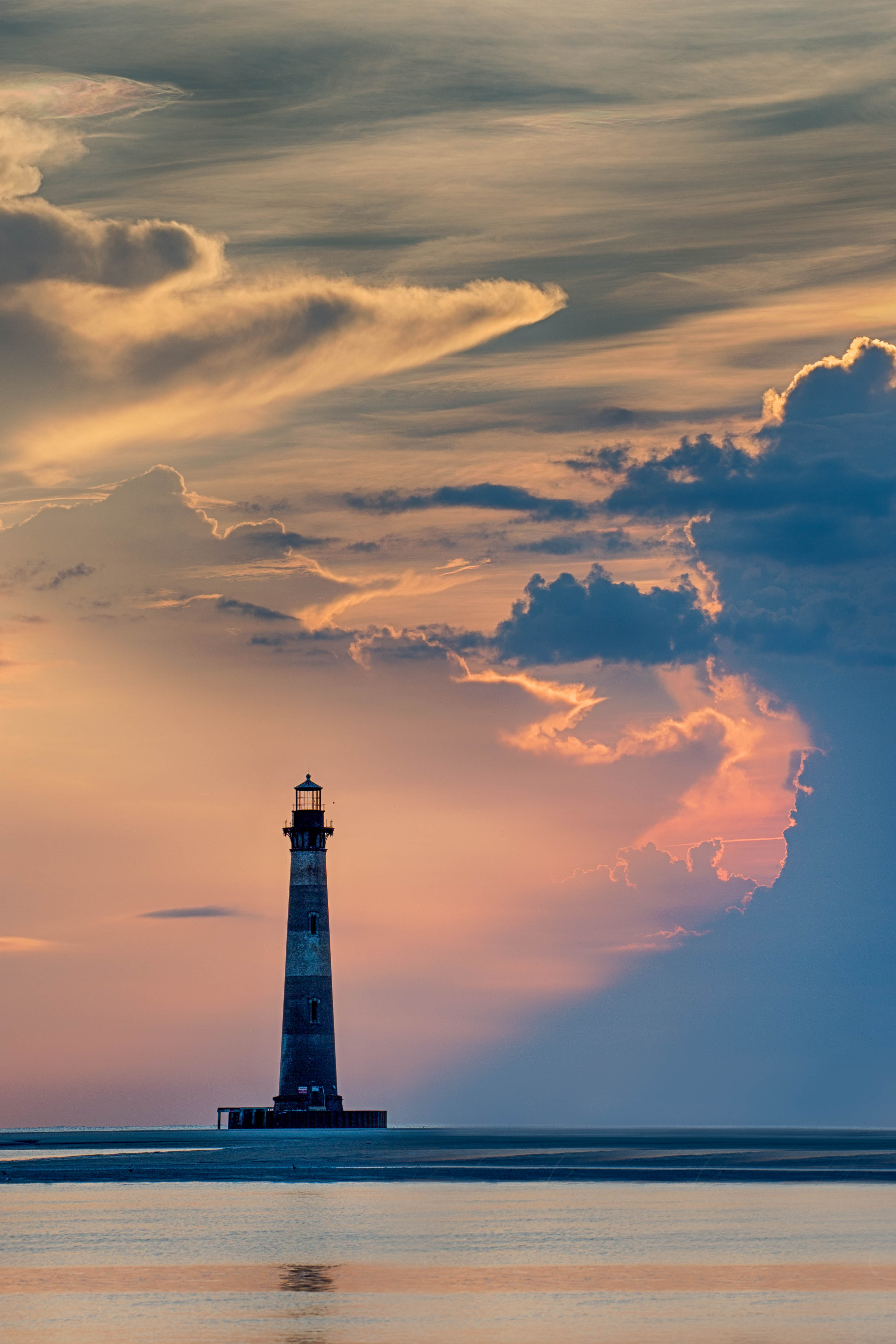
Hi Grace. What a fantastic spot for photographing fireworks. I'm surprised a bank roof was accessible given security concerns. But it is a small town....lol. The image is sharp, and the inclusion of the mountain and town provides a nice environmental setting. The moon is a great addition! While a narrower aperture might make it more prominent, I think its current presentation suits this image. My only suggestion would be to leave more space at the top of the frame to give the smoke and fireworks more room to showcase their beauty against the night sky. Nicely done! |
Aug 14th |
| 36 |
Aug 25 |
Comment |
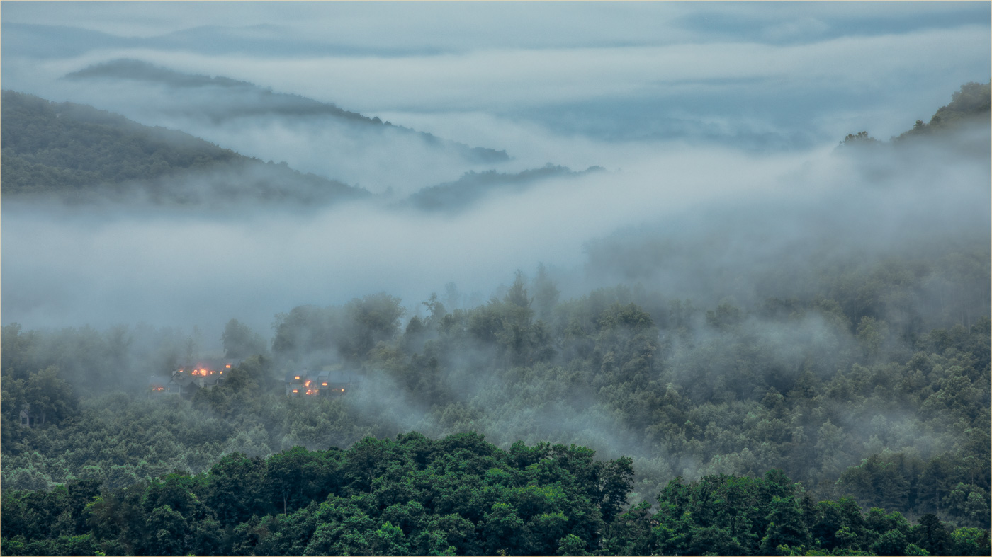
Hi Adi. I used to love extending my work trips to explore the area and glad you found some down time to go to the park. This is such a great spot for photographing this scene. Nice job capturing the distant falls, textured mountains, and their reflections. Was a vertical crop considered to emphasize the height and focus more on the subject? I experimented with a crop just to see, but then, what do I know? In the end it's always the maker's vision. |
Aug 5th |
 |
| 36 |
Aug 25 |
Comment |
Hi Michael. The Smoky Mountains - my home away from home. I like the warm hues blending nicely with the subtle cool tones in the distant peaks and the composition showcases the expansive mountain range. Typically, the large evergreens near the Newfoundland Gap parking area can pull focus away from the distant view, but here they work well without overwhelming the scene. The clouds add some texture to the sky, though for me, I wish there was a bit more detail or color. Nicely done. |
Aug 3rd |
| 36 |
Aug 25 |
Comment |
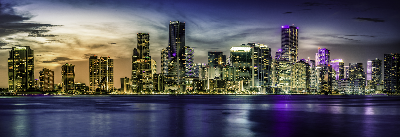
Aww Miami...money, money, money! It's crazy how expensive parking and tolls have become, only to end up stuck in road traffic or parking congestion. Anyway, about the photo, I haven't been there in a while, but this skyline shot looks postcard worthy as Grace mentioned. The colors are nicely shown throughout the photo and the silky water balances the architecture and wispy sky. The billboard is a bit bright, but hey, it's Miami. I don't even mind the billboard reflection in the water. I did try to see if I could soften it a bit and I found that using the remove tool in PS helped to tone down the brightness. Just a thought.. Overall, it's a great photo and definitely worth every penny! |
Aug 3rd |
 |
7 comments - 3 replies for Group 36
|
| 47 |
Aug 25 |
Reply |
Jeff, you captured the essence of the moment which is what matters most!
|
Aug 14th |
| 47 |
Aug 25 |
Reply |
Thanks so much Al. I think I will print this one. |
Aug 14th |
| 47 |
Aug 25 |
Reply |
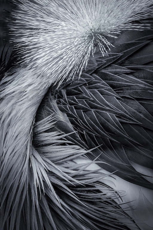
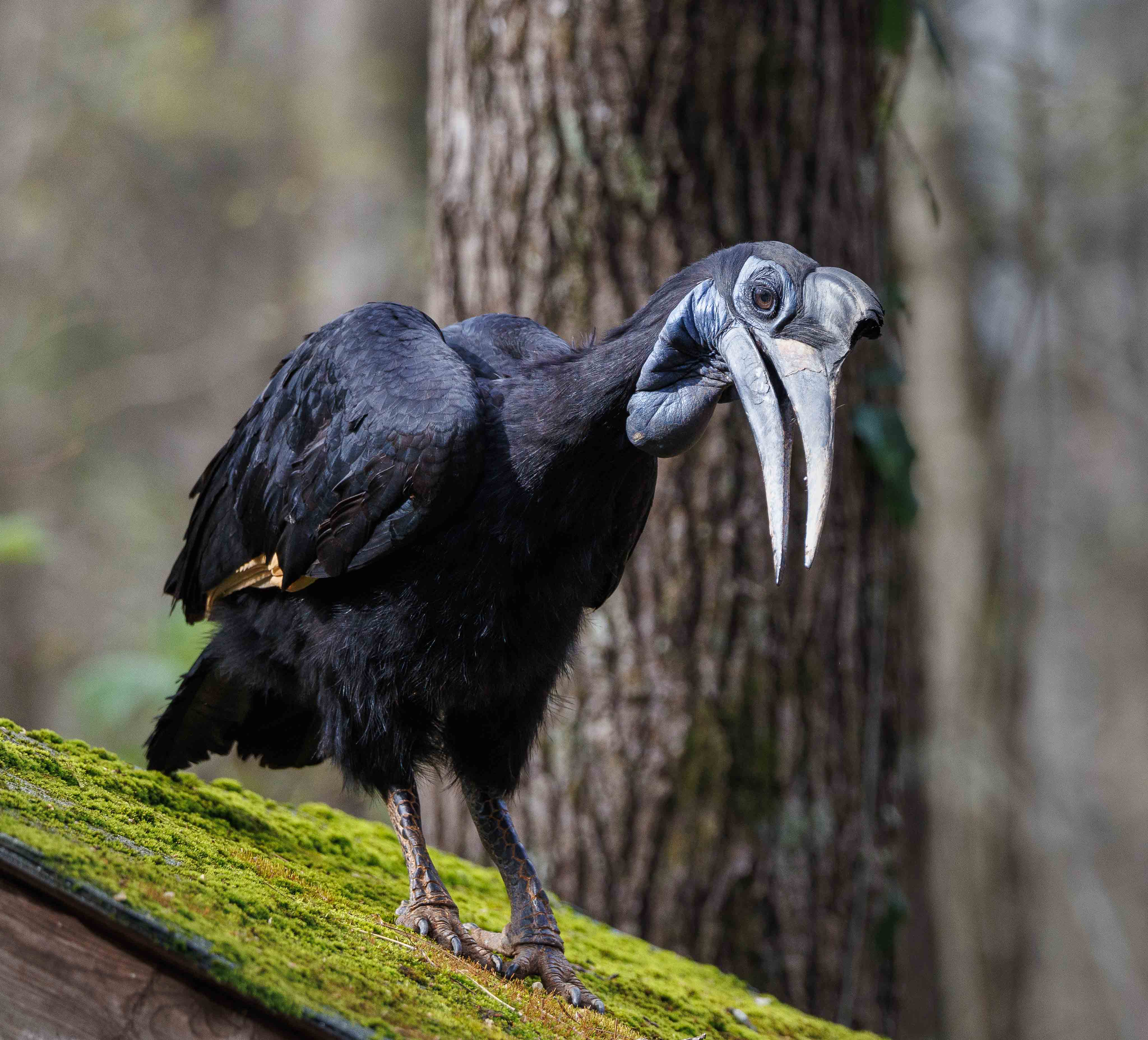
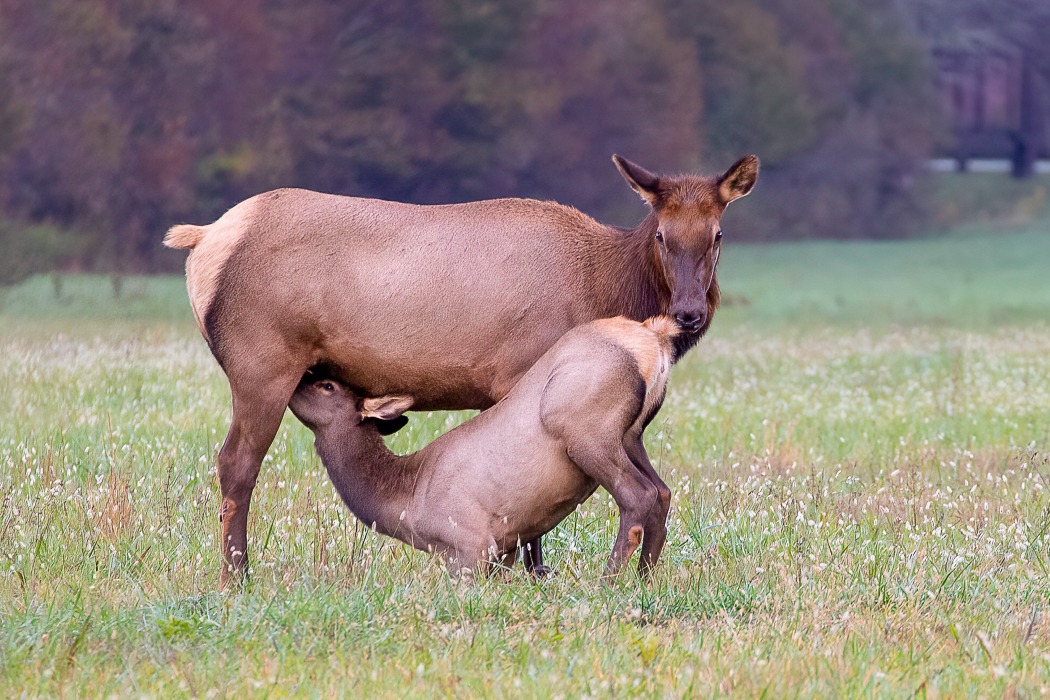
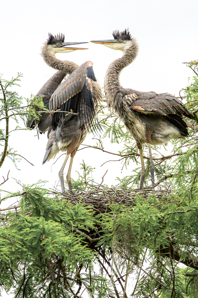
Thanks so much Jeff. The flow of the feathers caught my eye when I took the shot. |
Aug 14th |
| 47 |
Aug 25 |
Reply |
Thanks so much for your feedback. I've attached the original photo. |
Aug 14th |
 |
| 47 |
Aug 25 |
Reply |
I agree. I think the rays have a more subdued color. |
Aug 14th |
| 47 |
Aug 25 |
Comment |
Hi Al. Moroccan architecture never gets boring to look at. I like how this image reveals the multiple levels of the building's character. As the others have mentioned, to enhance the storytelling, I would also suggest lifting the shadows slightly to make the people more visible. I wasn't sure where the edge of the frame ended at the top and on the right side. Is it possible to raise the shadows in these areas? |
Aug 13th |
| 47 |
Aug 25 |
Comment |
Hi Jeff. What a striking and dramatic image. The lighting throughout perfectly brings out the details. I really like the tight composition, the sharpness and texture, the catchlight in his eye, and the emphasis on the two pair of hands. My only preference is that I wish there was a little more space between the left hand and edge of the frame, but it's just a personal choice. Excellent image and outstanding b/w conversion. |
Aug 13th |
| 47 |
Aug 25 |
Comment |
Hi Robert. I love photographing woods or forests but sometimes find it challenging to find a sense of order within the natural chaos. I like how this image is composed as I assume the sun rays are the subject of this photo. The grassy foreground nicely frames the scene, adds depth, and guides my eye through the trees straight to the sun rays. The light is pleasing across the frame and the tonal range is good. Although the sun rays are fairly bright, given you were grilling and taking photos simultaneously, you did great. I would have loved to see the color version, as I prefer color for woods/forests as it adds vibrancy and mood however personal preference is the key. |
Aug 13th |
| 47 |
Aug 25 |
Comment |
Hi Douglas. The image is both straightforward and striking. The subject is sharp and occupies the frame nicely, complimented by the blurred background. Kirsti's suggestion is spot on and your edited image is great. |
Aug 13th |
| 47 |
Aug 25 |
Comment |
Hi Kirsti. Very cool image. What a great subject and wonderful idea to add the circuit board because it instantly evokes a sense of the futuristic or sci-fi to the portrait. Compositionally, the centered subject works well. For me, the lighting is a bit flat and the eyes appear to be a bit soft - probably due to the slow shutter speed even with a tripod. For me, I wish there were more visual elements, depth, or creative effects, ie., textures or overlays to create a more impactful image. I think this image is powerful, creative, but could handle more drama. Nice work! |
Aug 13th |
5 comments - 5 replies for Group 47
|
12 comments - 8 replies Total
|