|
| Group |
Round |
C/R |
Comment |
Date |
Image |
| 36 |
Jun 25 |
Comment |
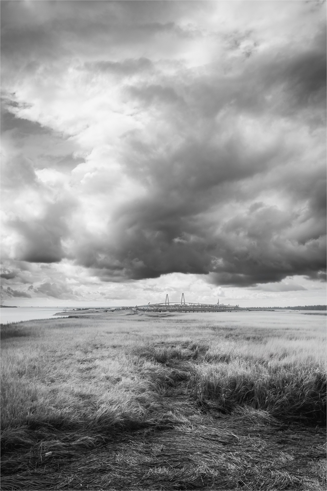
Thanks for your feedback Grace. After considering your suggestions and revisiting the image, if I were to crop it, I would only remove a bit from the bottom. For me the lighter clouds add contrast making the darker clouds stand out more. I'm on the fence about cropping this image too tightly as it could make the scene feel cramped. But what do I know.... I have several other images still waiting to be edited and I will definitely keep your suggestions in mind as I edit them. |
Jun 25th |
| 36 |
Jun 25 |
Reply |
Thanks for your feedback Gokul.
|
Jun 25th |
| 36 |
Jun 25 |
Comment |
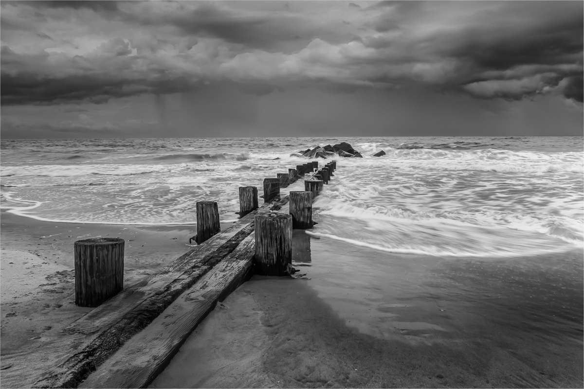
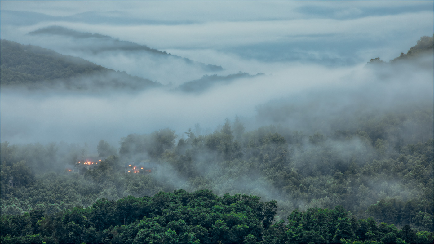
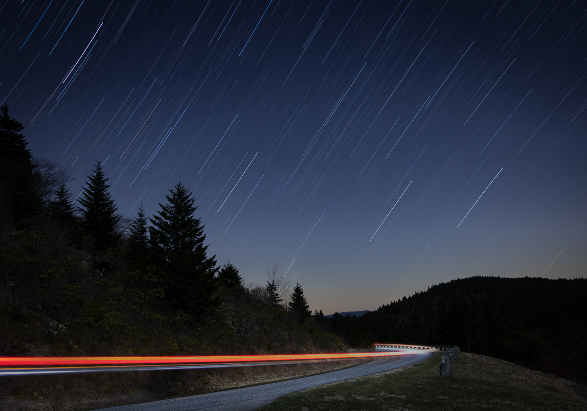
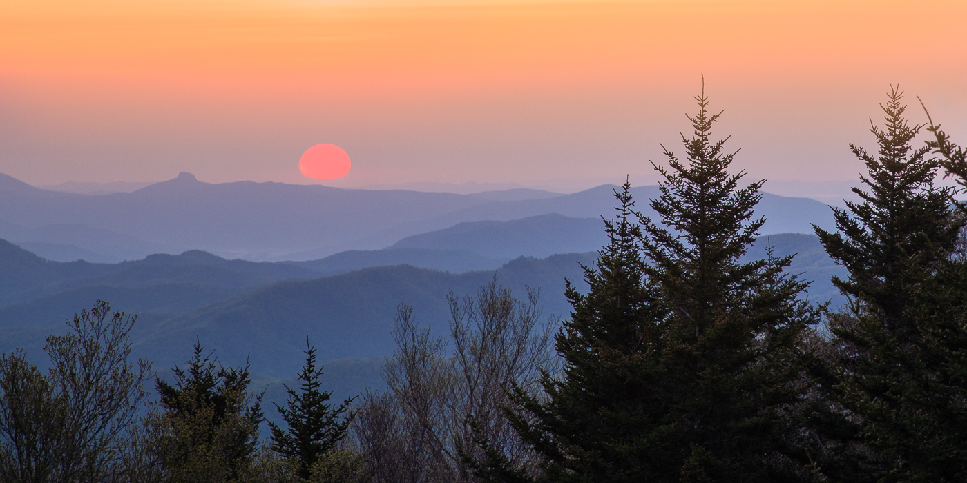
Hello Gokul. This is a stunning mountain range. There are a lot of different
elements - the misty fog over the lower slopes, the bright starburst, and the white structure in the foreground. The image is sharp, and the colors are not overly done. From a compositional standpoint I find the main point of focus a bit unclear. The angle of the horizontal white structure and what appears to be a red roof, blocks my view of the mountains while the bright sun draws my attention upward. My favorite aspect is the low mountain fog but both the sun and the white structure compete for attention and somewhat overpower it. I wonder if there's a different vantage point from which to photograph the mountain where the white structure could serve as a leading line to toward the mountain. |
Jun 17th |
| 36 |
Jun 25 |
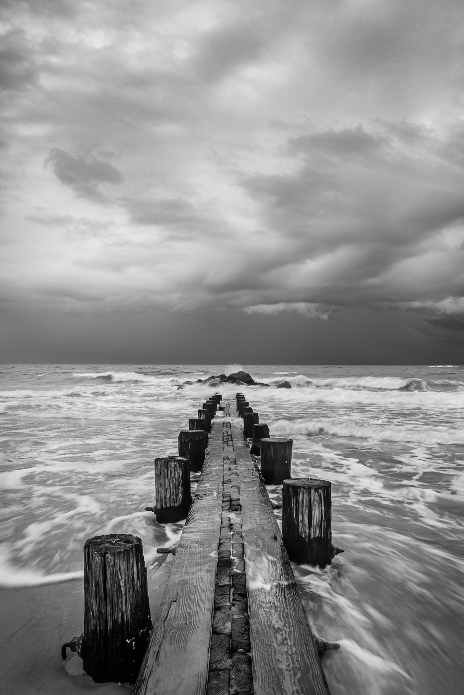
Reply |
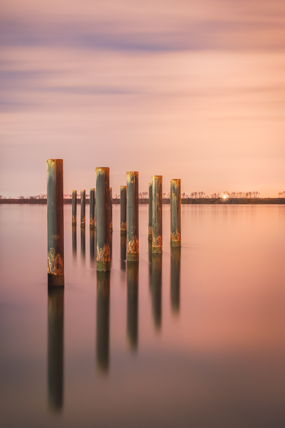
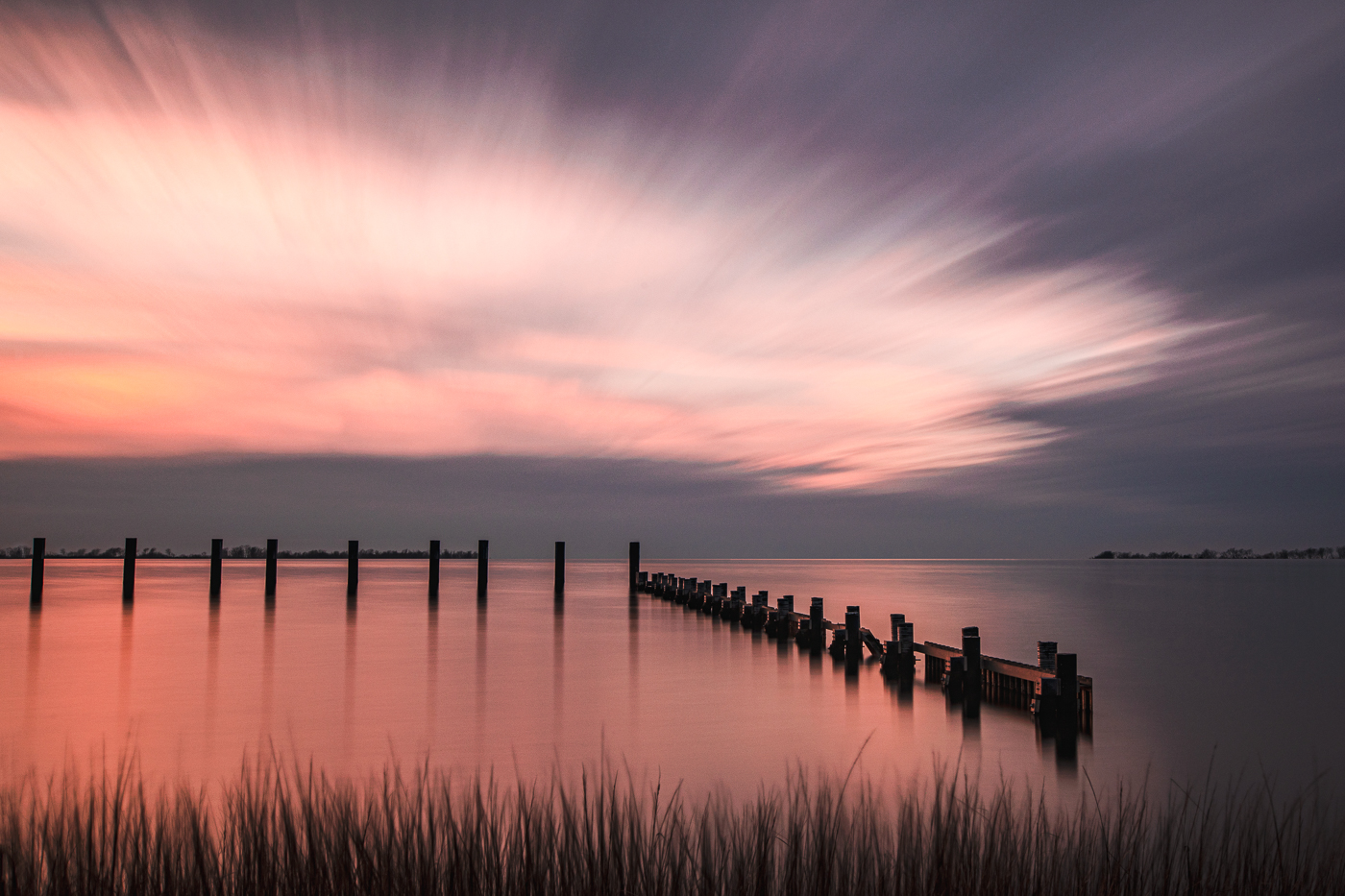
Thanks for your comments Michael. While there is some separation with the left post and tree line, looking back at the image I will see how it looks if I shave off a bit of the post to enhance the separation. |
Jun 6th |
| 36 |
Jun 25 |
Reply |
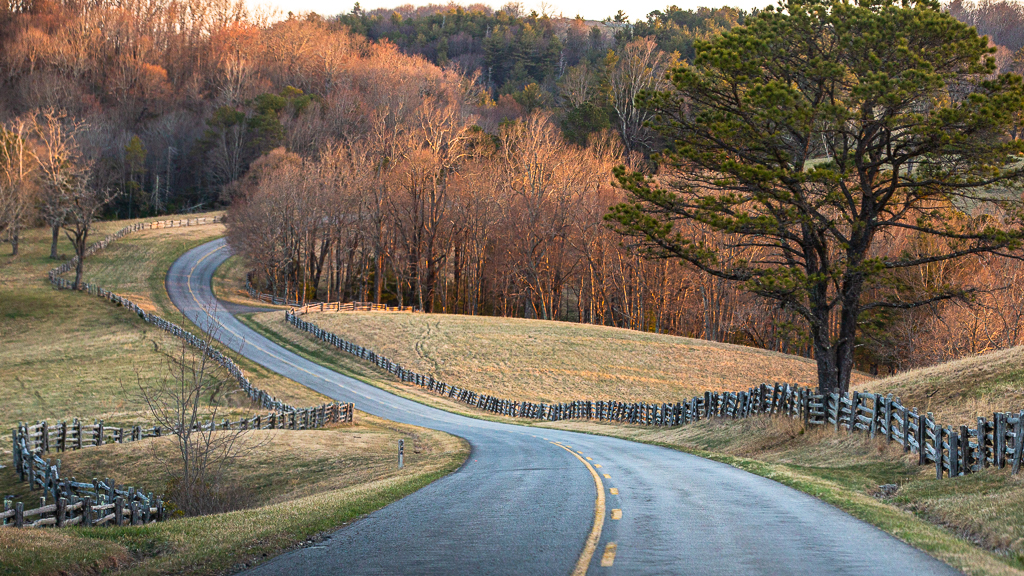
Hi Larry. Thanks for your feedback and I love the fences in the park. Looking back at the photo I think I would prefer a bit more separation from the top of the left post to the tree line. |
Jun 6th |
| 36 |
Jun 25 |
Comment |
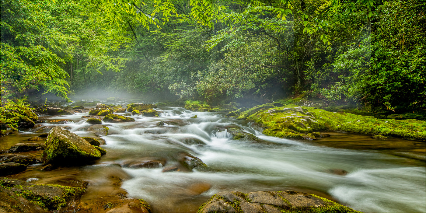
Hi Adi. I need to make a trip to the WV and photograph in this park. The waterfall is beautifully framed by the greenery. The swirling water at the base of the falls was captured with good detail and the flowing motion of the falls gives the image a pleasing effect. It was worth getting your feet wet! Nicely done. |
Jun 6th |
| 36 |
Jun 25 |
Comment |
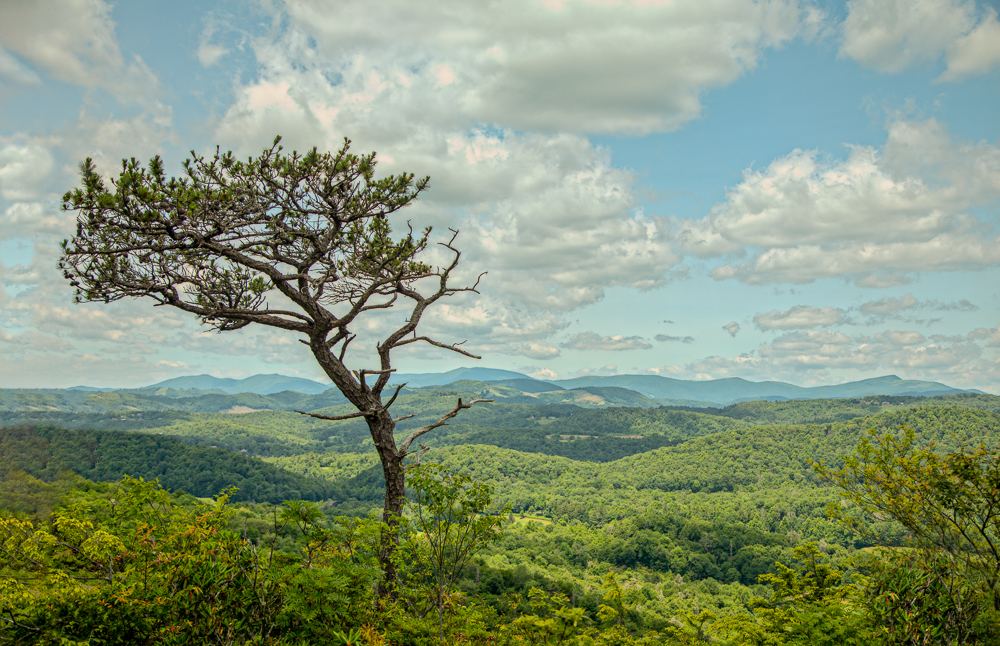
Hi Grace. What a great spot for photography; especially with your new RF lens. The image is sharp and I like the way the foreground slopes downward as well as the use of the 2 trees. The sandstone formations and the 2 foreground trees are the highlights in the image. For me, with the tones and colors being more muted, the image doesn't quite pop as much as it could. I personally love overcast lighting but it can be tricky for landscapes making it look flat. I agree with the others about cropping up for a stronger composition. Have fun with your new lens and enjoy your next visit there. |
Jun 6th |
| 36 |
Jun 25 |
Comment |
Hi Michael. I love when a scene catch my eye. In this image the vibrant warm leaves stand out nicely against the crisp white snow highlighting the beauty of both elements. The snow makes the leaves pop while giving the image a serene mood. The image is sharp and the crop works for me. Nice job! |
Jun 5th |
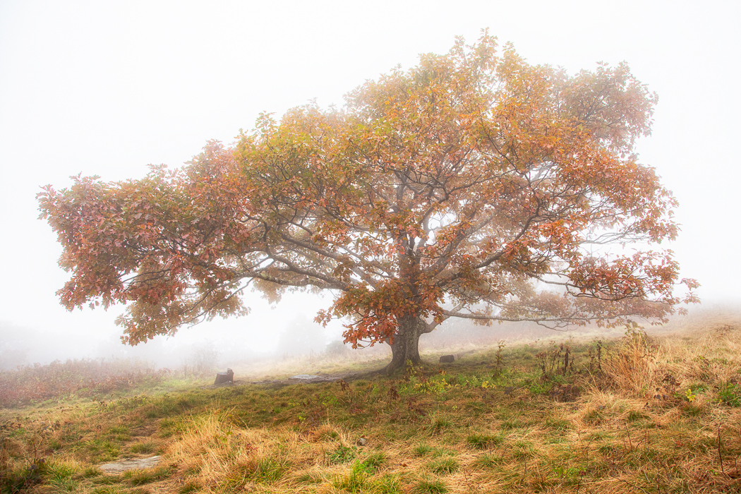
| 36 |
Jun 25 |
Comment |
Hi Larry. This scene is captivating - the fog transforms the landscape and draws me in emotionally. I like how the mist softens and isolates the trees allowing them to stand out with a quiet presence. My only thought would be to see how this image looks cropped to a 16:9 ratio. Lovely image. |
Jun 5th |
6 comments - 3 replies for Group 36
|
| 47 |
Jun 25 |
Comment |
Hi Al. I really like this image. The textured wall, the 2 women gazing at it, and the brick walkway all add visual interest. For the b/w conversions, in my view, the darkest areas lack visible detain, shape, or texture. I'd recommend raising the shadows or, as Kirsti mentioned run the image through NIK. It's just my personal preference, but I always appreciate more space in the direction the subjects are facing/walking as it helps to create a stronger sense of movement within the frame. |
Jun 29th |
| 47 |
Jun 25 |
Comment |
Hi Kirsti. Nicely done. The b/w conversion, combined with the artistic elements gives the image a cohesive and serene feel. Everything works so well together. To my eye, the darker lower left corner feels dense and somewhat disconnected from the rest of the composition. My only suggestion is to consider brightening a bit to blend with the rest of the image. |
Jun 29th |
| 47 |
Jun 25 |
Comment |
Hi Ed. Great action shot and the image looks well-focused. For me, the photo appears a bit underexposed causing the dancer in the air to blend into the background. In the original, his colorful outfit really helps him stand out. You may want to consider brightening the entire image or using selective dodging/burning to make him pop more. |
Jun 29th |
| 47 |
Jun 25 |
Comment |
Hi Robert. I really like this image. The arrangement of 2 people facing different directions, one reading and the other emptying her bag has a juxtaposition feel for me. The different positions naturally highlight their individuality and differences. The brick arch and wall in the background add depth and visual interest. Nicely done. |
Jun 29th |
| 47 |
Jun 25 |
Comment |
Hi Douglas. Interesting perspective. The direct eye contact and sharp focus really draw me in. I don't mind the hair being cropped at the edge; I sometimes use a similar approach in my own portraits. Filling the frame works well, but for me, I would prefer a bit more visual breathing room in the foreground especially since the head is slightly cropped at the top. The composition feels tight with the right hand almost touching the edge of the frame. For the bright spot, consider using content aware fill for a quick fix. Nicely done. |
Jun 29th |
5 comments - 0 replies for Group 47
|
11 comments - 3 replies Total
|