|
| Group |
Round |
C/R |
Comment |
Date |
Image |
| 36 |
Apr 25 |
Comment |
Hi Larry. I love when a photo outing aligns with my expectations, but I also enjoy when it doesn't, as it allows me to think and see things from a different perspective. You did that and your photo shows your creativity. The colors from the reflective light are beautiful and the crop works for the positioning of the statue. However, for me, the flag and the bushes are slightly distracting. Additionally, Michael's suggestion about using the guided editing tool is a great idea. |
Apr 18th |
| 36 |
Apr 25 |
Reply |
Thanks for your suggestions Michael. It wasn't Old Car City but a local junkyard with acres of cars. |
Apr 18th |
| 36 |
Apr 25 |
Reply |
Thanks Larry. Never thought of sepia but will give it a try. |
Apr 18th |
| 36 |
Apr 25 |
Comment |
Hi Adi. I love the sense of solitude this image conveys. The soft pastel hues of the sky nicely tints the snow, while the orange and blue cottage provides a pleasing contrast. The path draws my eye into the scene creating a serene winter landscape. As lovely as it looks...BRRR! |
Apr 18th |
| 36 |
Apr 25 |
Comment |
Hi Gokul. This composition presents a challenge for me in establishing a clear focal point as the multiple elements compete for my attention. For me, there is no dominant subject. I like the idea of the story and intent behind the image, but the geese and family feel disconnected emotionally. The ducks appear distracted or resting, while the group is focused on each other. To strengthen the story, maybe a ducks's gaze directed toward the family and a mutual glance from the child or group at the duck would create visual interaction and the intended connection. |
Apr 18th |
| 36 |
Apr 25 |
Comment |
Hi Grace. Before reading your description, the flag and tree trunk felt a bit out of place for me. I agree that the flag plays an important role in the story, but I wish it had a little more breathing room from the edge of the frame. For me, the tree trunk doesn't add to the story so I would suggest removing it. I appreciate both b/w and color versions. |
Apr 18th |
| 36 |
Apr 25 |
Comment |
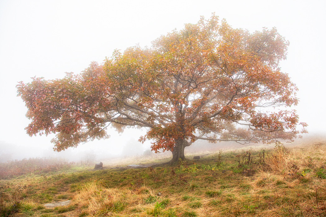
Hi Michael. This is a wonderful serene black and white image. I like the variety in the shapes and sizes of the trees and how they are laid out in the image. The dark lines in the foreground echo the arrangements of the trees which adds to the image. Nicely done! |
Apr 18th |
5 comments - 2 replies for Group 36
|
| 47 |
Apr 25 |
Reply |
Douglas, thanks so much for your comments!
|
Apr 16th |
| 47 |
Apr 25 |
Reply |
Thanks Jeff. I appreciate your input on this image. |
Apr 16th |
| 47 |
Apr 25 |
Reply |
Thanks Kirsti. I tried different angles but this one seemed to work best. |
Apr 16th |
| 47 |
Apr 25 |
Reply |
Thanks so much Robert. I appreciate your feedback. |
Apr 16th |
| 47 |
Apr 25 |
Comment |
Hi Al. What a wonderful nature photograph capturing this special moment. Removing the small elephant on the right was a good decision and the dust is an added plus for interest. However, I prefer the color version. For me, the subtle tonal differences between the elephants are lost in the black and white. |
Apr 16th |
| 47 |
Apr 25 |
Comment |
Hi Kirsti. Your concept is strong and the execution is well done. The props you selected were effective and contributed to realizing your vision. I especially appreciate your choice to feature the angel with the halo, as it highlights the story and "the end" for me. One suggestion for enhancement - consider lowering the black levels and increasing the contrast. It could help the angel stand out more against the ruins and convey a glimmer of hope. Just my thoughts...of course, editing choices are always up to the creator. |
Apr 16th |
| 47 |
Apr 25 |
Comment |
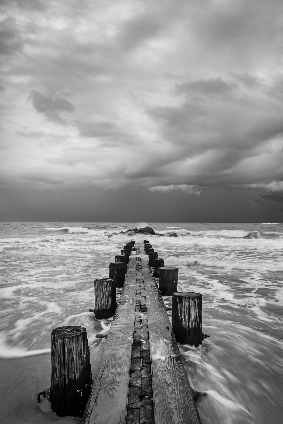
Hi Jeff. Beautiful image. Your black and white conversion is excellent, capturing a full range of tones that show off the details in both highlights and shadows. I like the soft effect of the foreground grass on the right side of the frame as it complements the rugged terrain. I'm a bit undecided about the bush in the left corner - I'm not sure if it was intentionally included or if it was unavoidable due to the location. Nonetheless, it's a wonderful image. |
Apr 16th |
| 47 |
Apr 25 |
Comment |
Hi Robert. I'm not sure whether the image was photographed through aquarium glass or using underwater photography, but either way, the image captures the graceful movements and delicate tentacles nicely. I like the stark black and white contrast which works well for abstract interpretation - emphasis on lines and shapes. However from a naturalist perspective, the original better reveals the jellyfish's intricate nature. I like them both. |
Apr 16th |
| 47 |
Apr 25 |
Comment |
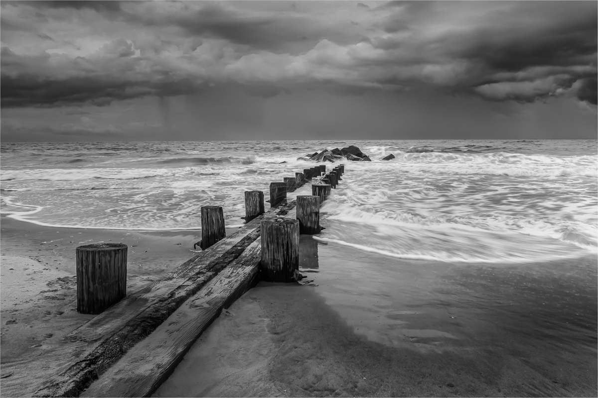
Ah, hiking - my favorite pastime! And welcome! I like the idea behind this image and how the subject is composed. The use of 3 poles and their placement is effective. I'm curious whether your intention was to isolate the subject, as the foreground log appears slightly blurred. For me, I prefer having a bit more focus in the foreground to add depth and naturally guide my eye toward the subject. The texture in the other logs is captured well. The background is nicely blurred, which draws attention to the poles. As Robert mentioned, reducing the overall brightness in the background could help to keep the focus on the poles. |
Apr 16th |
5 comments - 4 replies for Group 47
|
10 comments - 6 replies Total
|