|
| Group |
Round |
C/R |
Comment |
Date |
Image |
| 36 |
Mar 25 |
Reply |
Thank you Michael. I never thought about duplicating the layer. I will definitely try this. |
Mar 16th |
| 36 |
Mar 25 |
Reply |
Thanks Adi. I appreciate the tip and will relook to see if more drama can be added.
|
Mar 16th |
| 36 |
Mar 25 |
Reply |
Larry, your feedback is appreciated. I did struggle a bit to make the squall stand out a bit more without making it look like a blob of darkness. I'll take another look at the image. |
Mar 16th |
| 36 |
Mar 25 |
Comment |
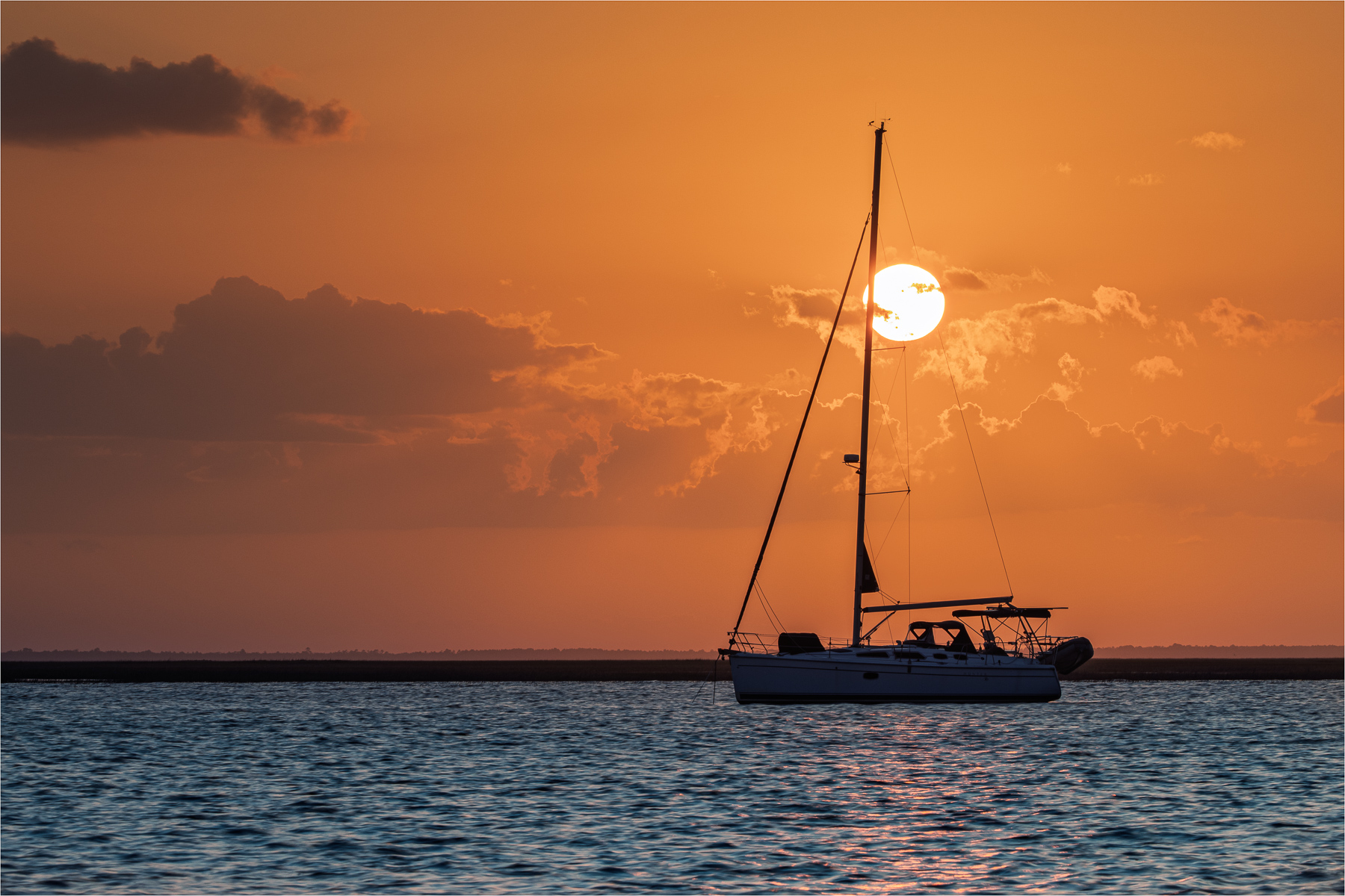
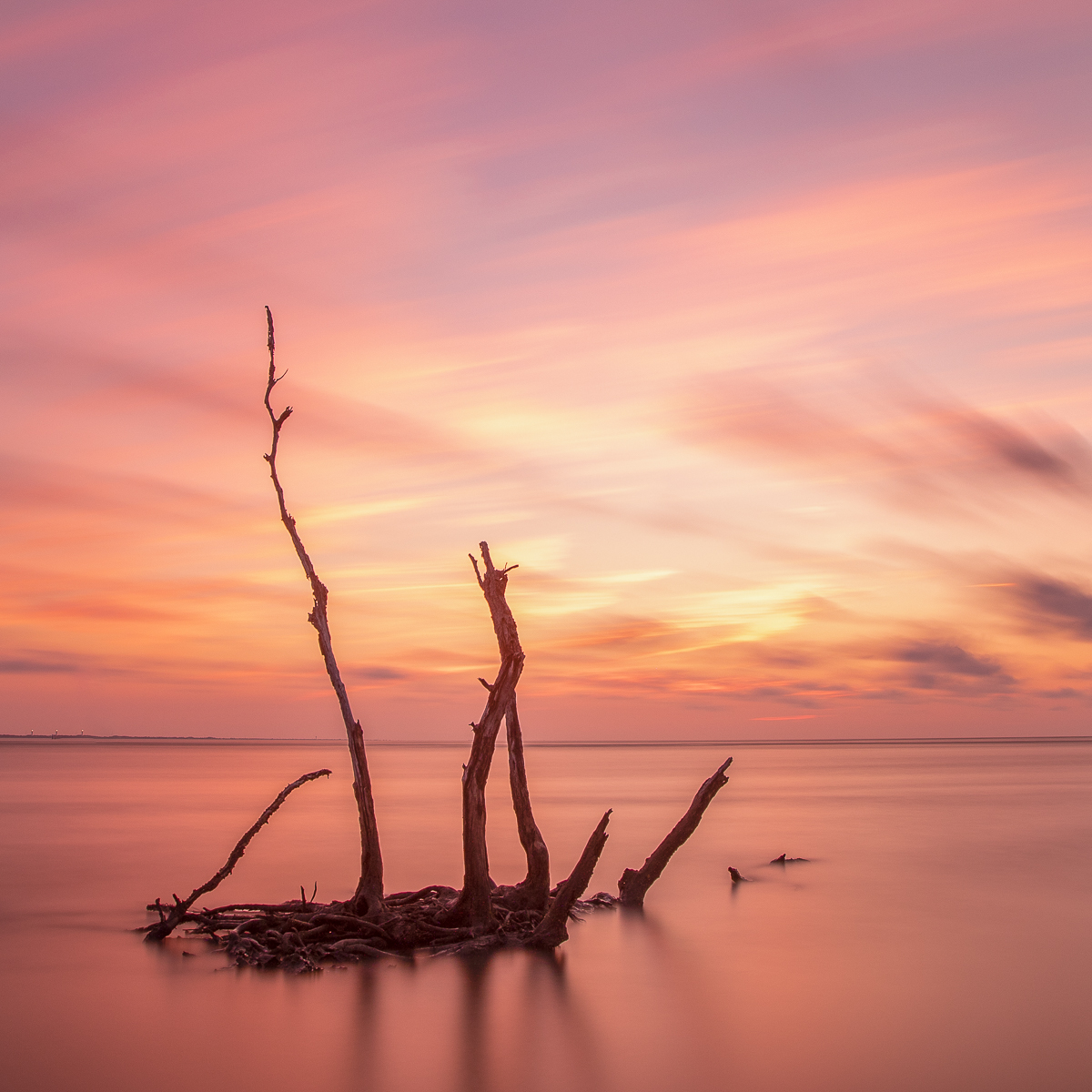
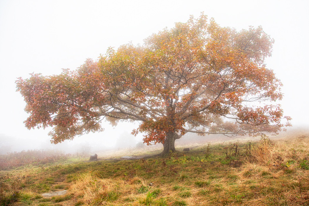
Hi Adi. What a stunning silhouette. Jekyll Island has so many great compositional opportunities and you've captured one here. The positioning for the sun and its reflections on the water nicely complement the trees creating a good balance. The rich colors and the sun's brightness are managed well. One suggestion I'd offer is to refine the halo effect around the right tree trunk. |
Mar 16th |
| 36 |
Mar 25 |
Comment |
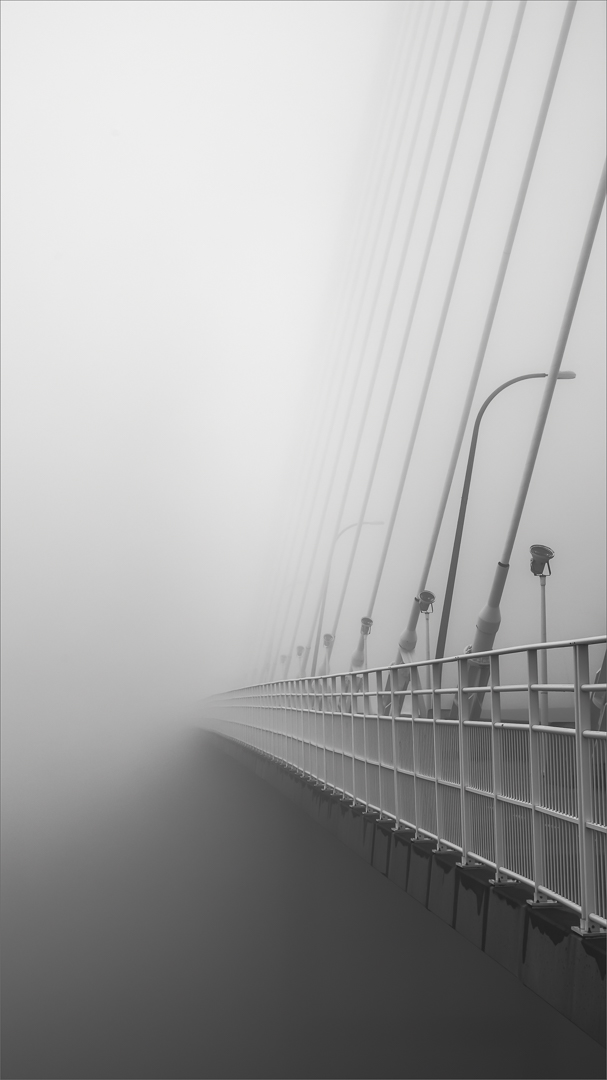
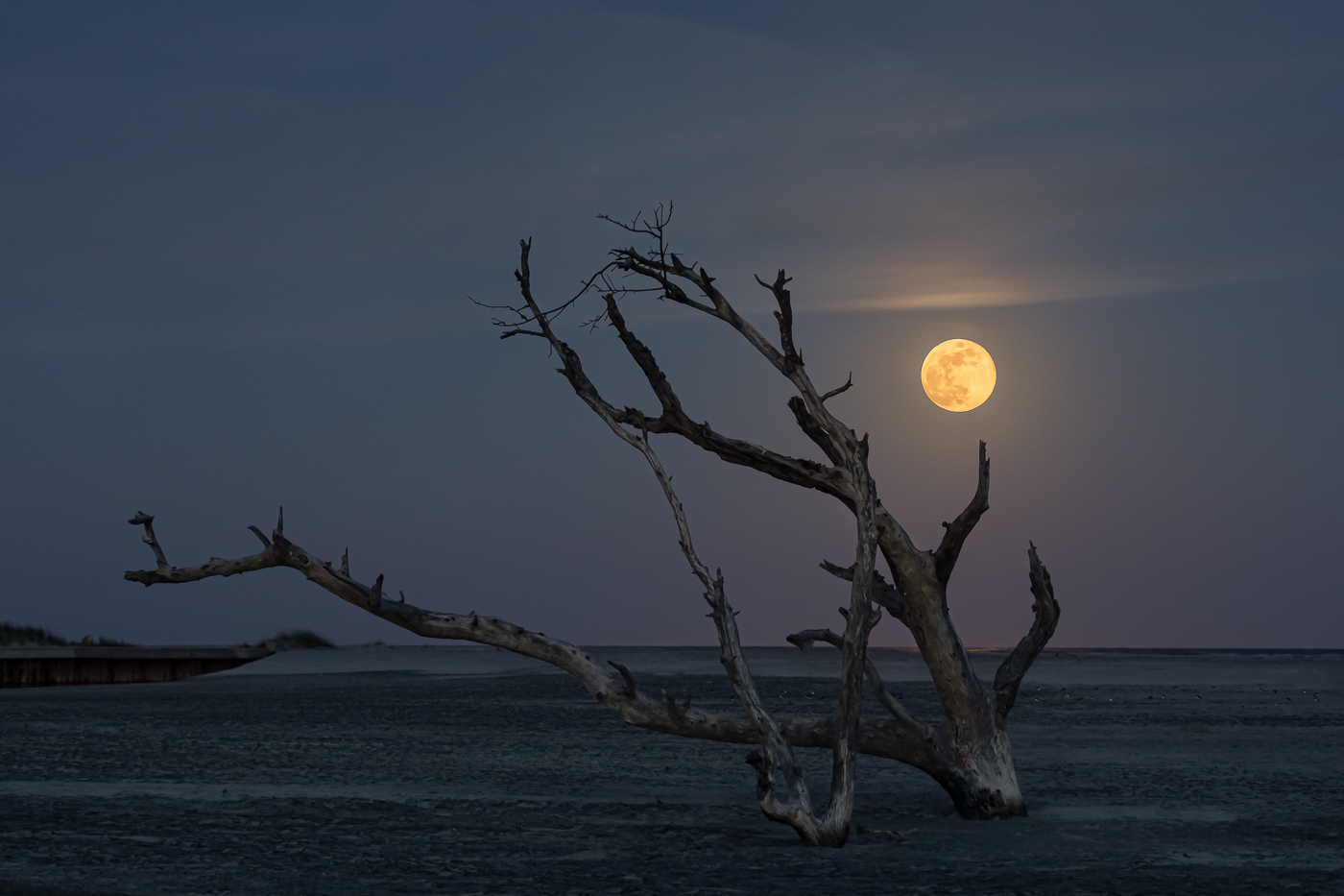
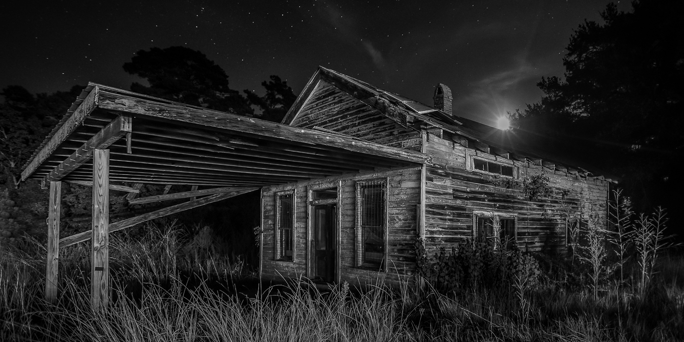
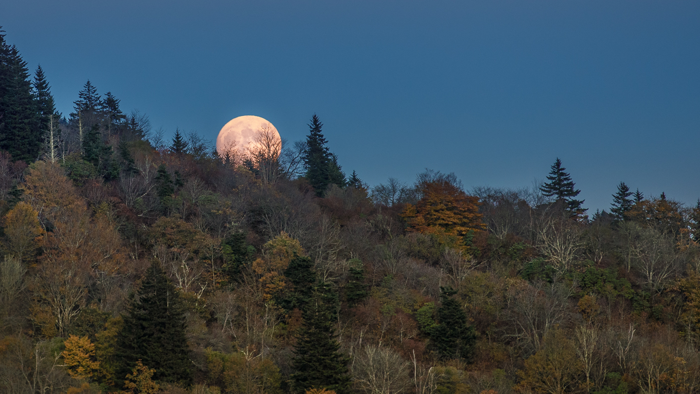
Hi Bill. I really like the vantage point from which you captured this photo as it provides a sense of the location and it gives me many things to look at. The moon's natural appearance is well done, but for me it appears somewhat small against the vast sky. Similar to Michael's comment, I find the transition between the shadowed and sunlit areas a bit abrupt. |
Mar 13th |
| 36 |
Mar 25 |
Comment |
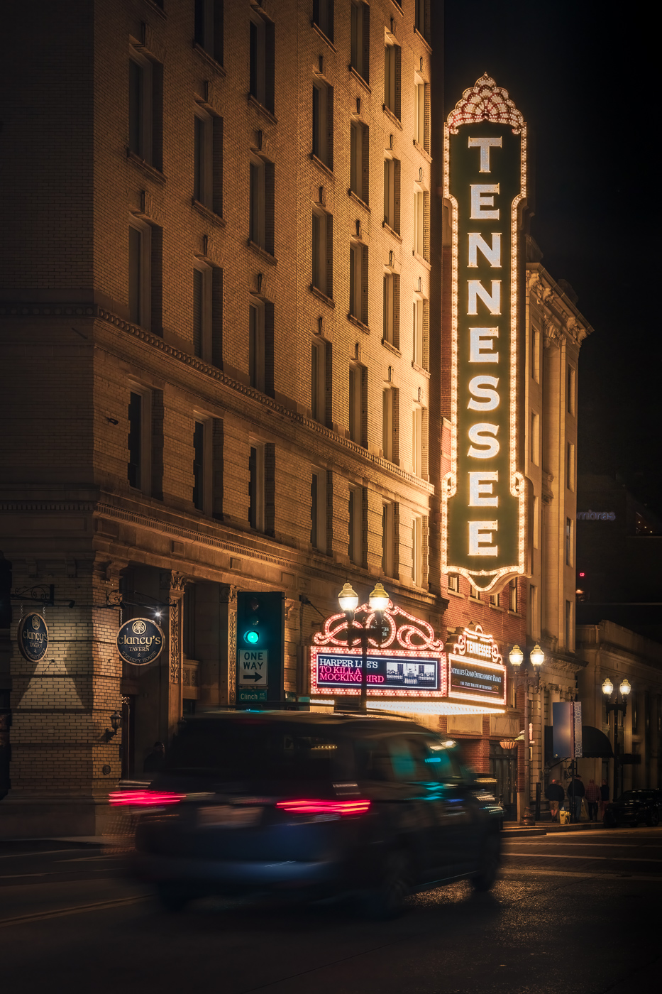
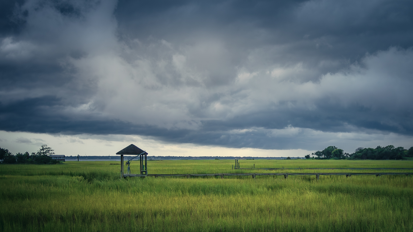
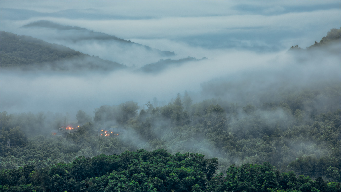
Hi Gokul. I like how the buildings are positioned on the side of the hill, surrounded by trees. On my screen, the photo has a green color cast on the buildings. It's possible that the green from the trees is reflecting on the buildings as the light hits them. Or, perhaps there's just a lack of magenta. I also like the concept of the reflected light on the building but for me, it would be more effective if the aperture was smaller - f16 or higher. |
Mar 13th |
| 36 |
Mar 25 |
Comment |
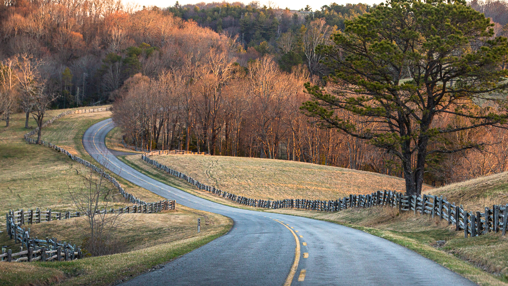
Hi Grace. Nicely done pano! The colors in this image are well-captured, but I'm sure they were even more stunning in person. Shooting landscapes when the sun is high in the sky can be challenging, as it often results in a lack of detail and visual depth. Using hyperlocal distance as Michael mentioned will give the sharpness from front to back. I agree with Larry about the sky. It might be worth considering if it adds enough to the scene to keep it in the frame. |
Mar 12th |
| 36 |
Mar 25 |
Comment |
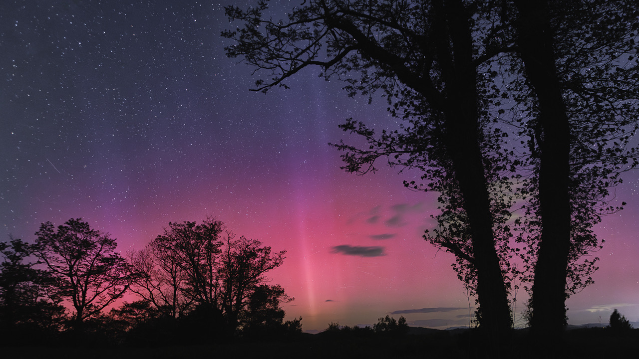
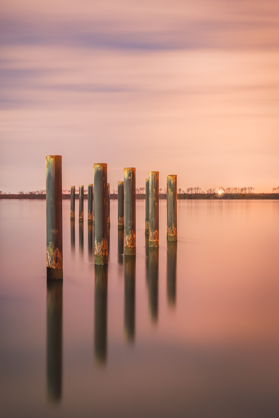
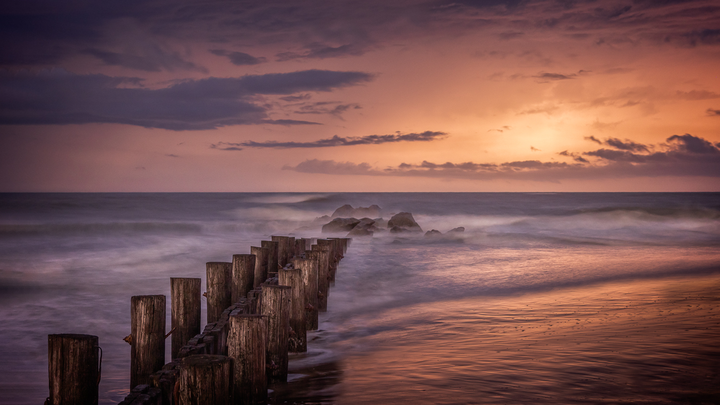
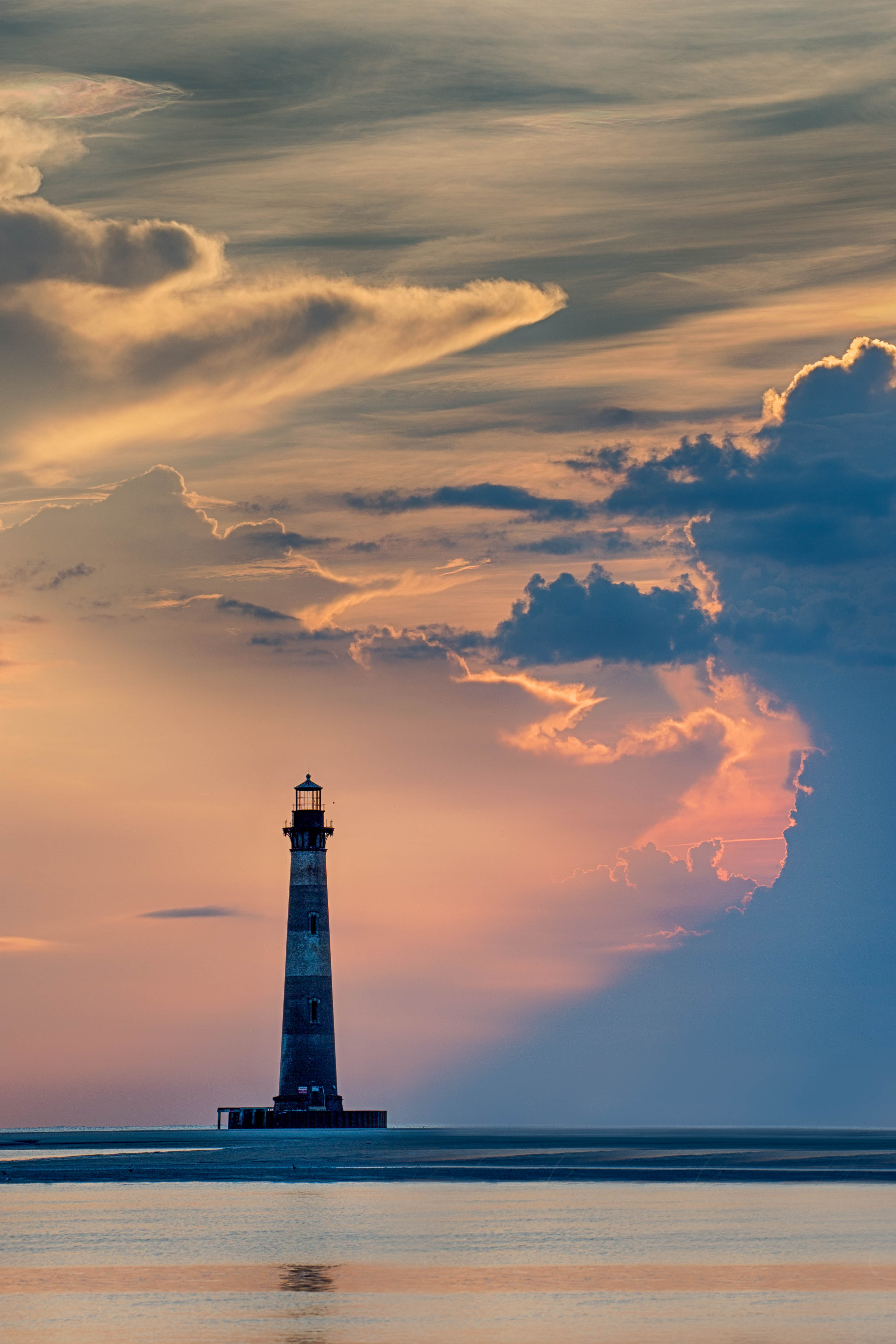
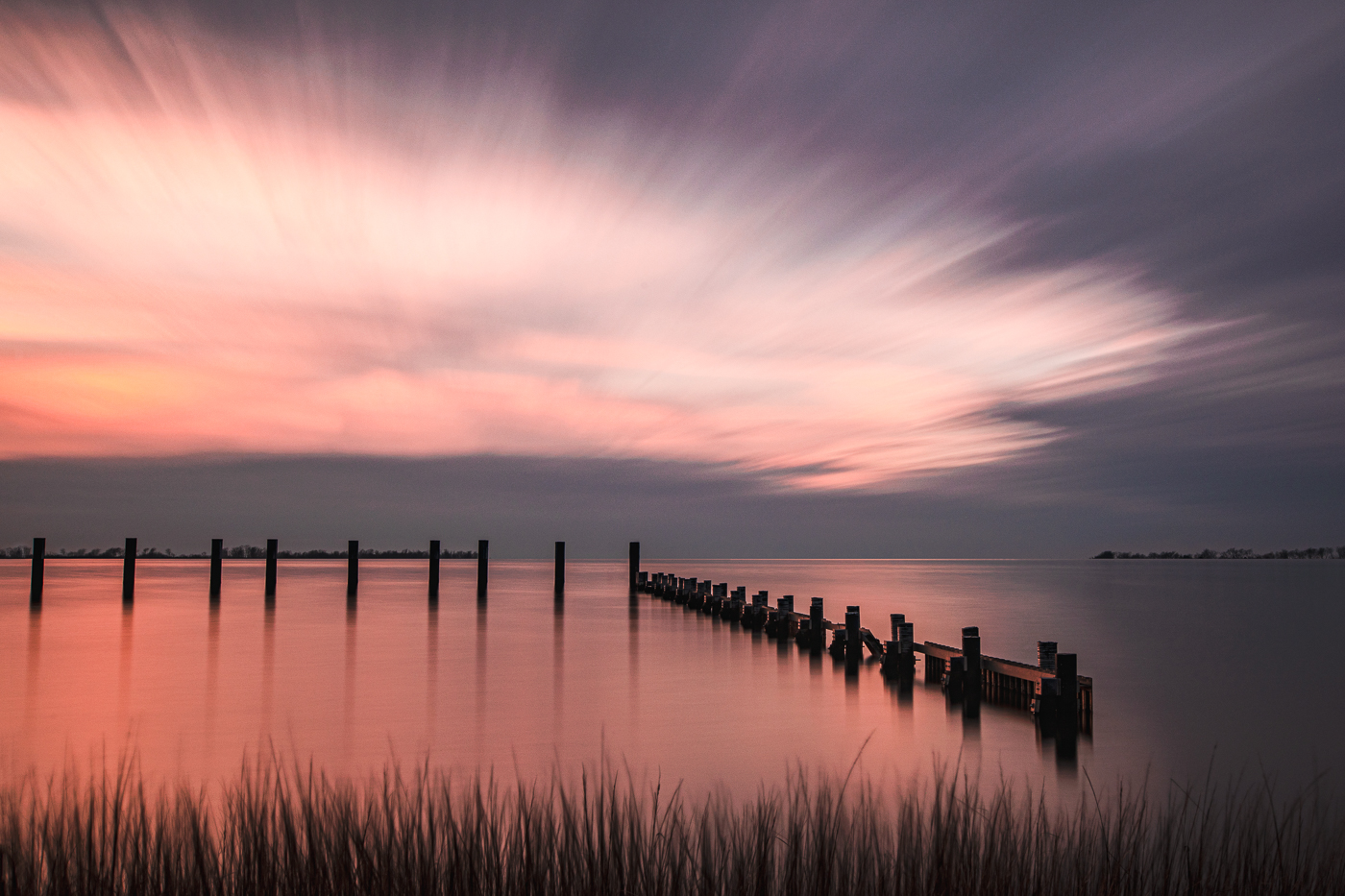
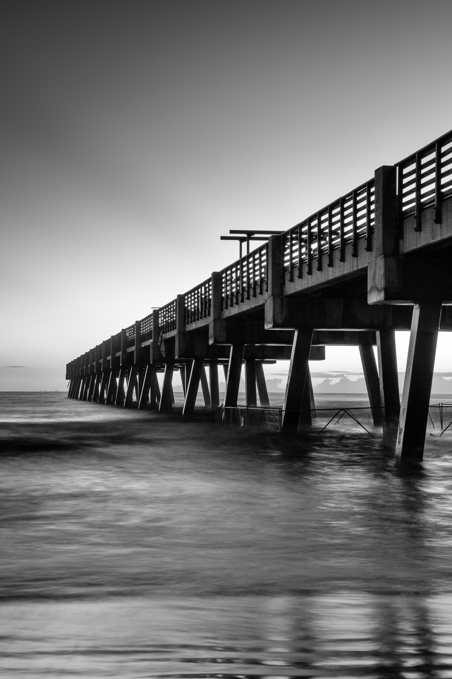
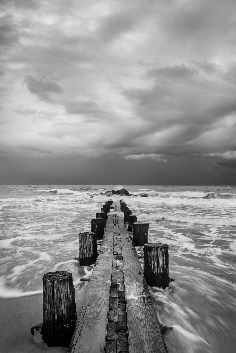
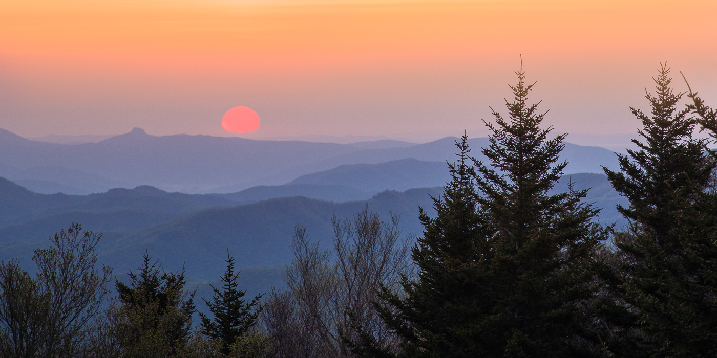
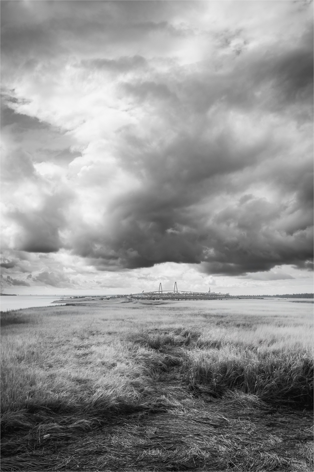
Hi Michael. After looking at both images together, each photo conveys a distinct mood for me. The February image suggests a scene showing winters harshness while March presents a more peaceful, soothing and welcoming location even though it was taken in 14 degree weather. For me, the calming and serene atmosphere created by the cool blue tones is nicely complimented by the vibrant reds, purplish-pink sky and stark black pier. Also, the pop of green gives off a nice visual contrast for me. |
Mar 12th |
| 36 |
Mar 25 |
Comment |
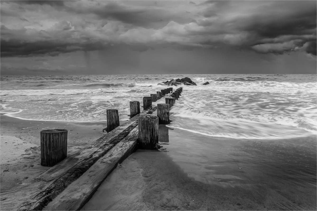
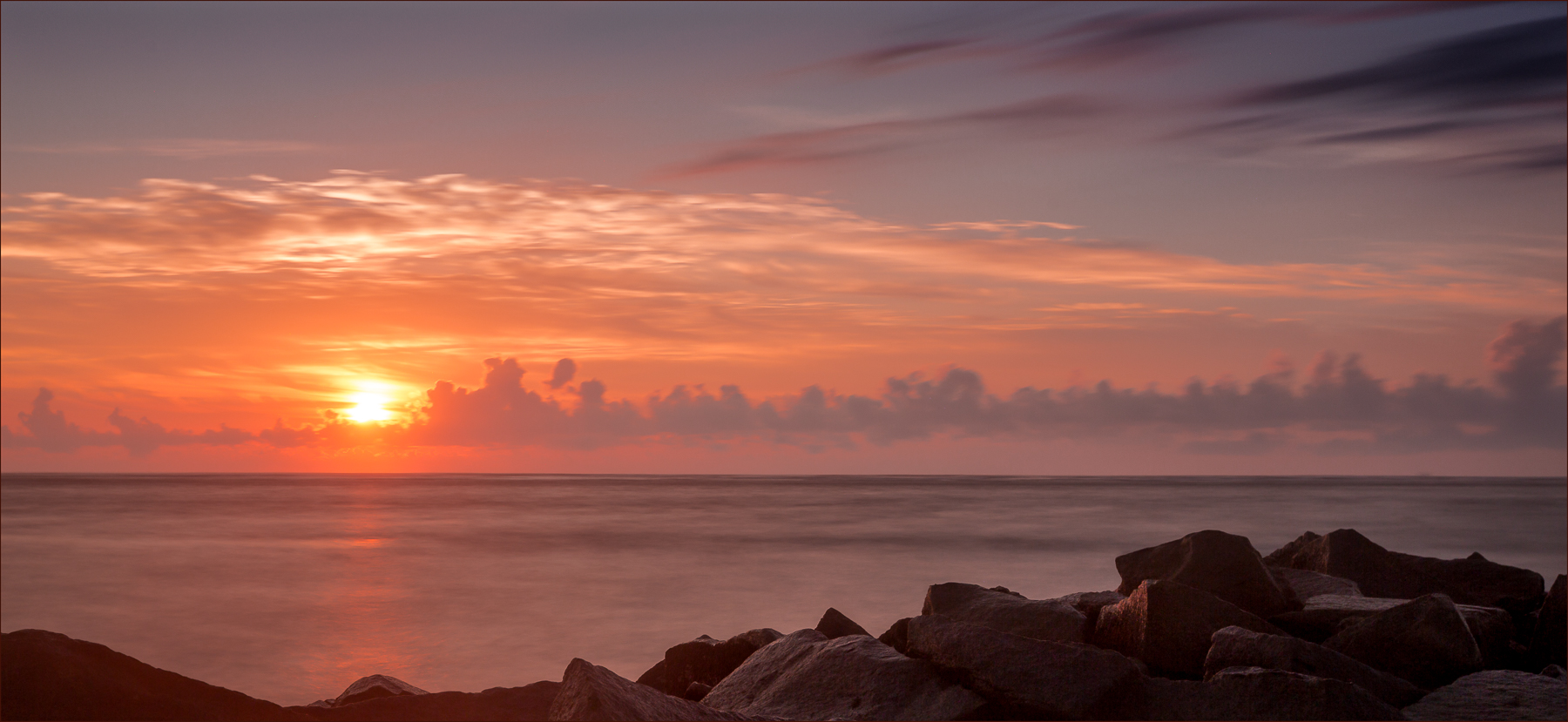
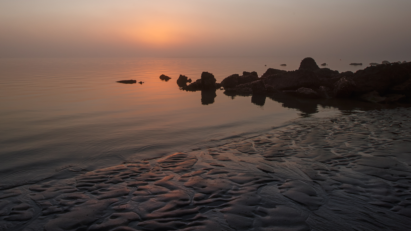
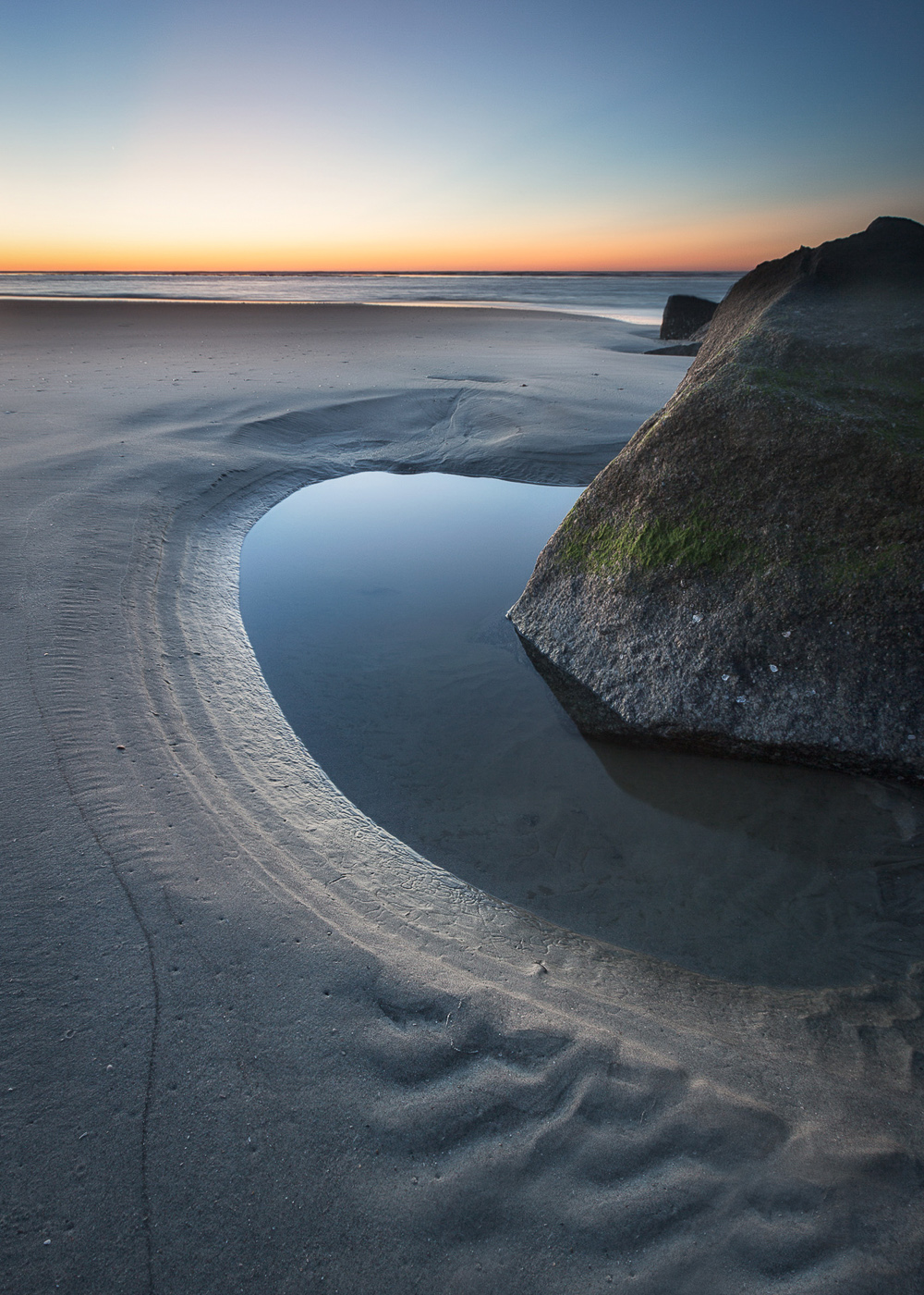
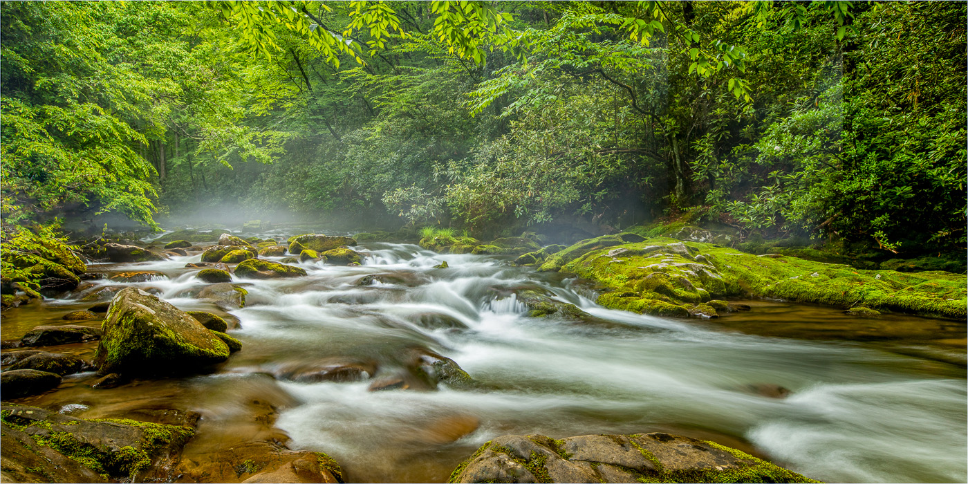
Hi Larry. This image is very soothing, both in terms of composition and effect. I like how the curve of the rocks in the left foreground area guides my eye toward the sun. It seems almost as if the sun is aligned with the farthest rock. The cloud cover is perfect for controlling the bright sun and giving off a warmth to the image. The rocks are nicely lit and have a subtle sheen from the ocean water. The horizon does appear slightly bowed almost reminiscent of looking at the edges of the Earth. I always find the heavy fog near a horizon plays tricks on the mind lol. Great capture. BTW, thanks for mentioning the raincoat. I will be heading to Folly Beach, SC in a few weeks for MW and beach shots and will definitely bring my rain cover. |
Mar 12th |
6 comments - 3 replies for Group 36
|
| 47 |
Mar 25 |
Reply |
Thanks so much Jeff. Appreciate your feedback. |
Mar 11th |
| 47 |
Mar 25 |
Reply |
Thanks for your feedback Kirsti. I will take a look at the image again. |
Mar 11th |
| 47 |
Mar 25 |
Comment |
Hi Al. The image is nicely composed with the blending of the city, mountain, and sky. I particularly like the flow between the lightest parts of the city and the clouds in the sky. The darker mountains provide a nice balance to the scene. I agree with the others that the almost black foliage in the foreground could be improved. I would suggest either lightening it or possibly removing it to enhance the overall visual appeal. Additionally, the image appears to lean slightly down to the right. Very nice. |
Mar 11th |
| 47 |
Mar 25 |
Comment |
Hi Kirsti - I prefer to study an image before reading a description, as it allows me to form a connection and understand what the image conveys to me. Upon examining the B/W image, several thoughts emerged such as disruption, fragmentation, vulnerability, or perhaps just discarded junk. Without knowing the intended meaning, it allowed me to look beyond the broken glass. For me, the red image evokes a sense of toxicity or danger similar to the intended vision. In contrast, the black and white version enabled me to focus on textures and tones. Both are creative and the post processing was well executed. Nice job. |
Mar 11th |
| 47 |
Mar 25 |
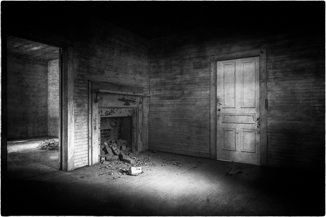
Comment |
Hi Jeff. Well I have nothing to say but wow. The image is mesmerizing. The strategic placement of light draws me in, allowing my eye to explore the scene without leaving. It's truly stunning.
|
Mar 11th |
| 47 |
Mar 25 |
Comment |
Hi Robert. What I appreciate about this image is the face-to-face stance of the horses and the contrast between their coats. Converting to black and white was beneficial due to the harsh lighting. For me, I agree with the distractions mentioned by both Jeff and Kirsti. These can be easily eliminated to allow the horses to become the central focus which I find enjoyable. |
Mar 11th |
 |
4 comments - 2 replies for Group 47
|
10 comments - 5 replies Total
|