|
| Group |
Round |
C/R |
Comment |
Date |
Image |
| 36 |
Jan 25 |
Comment |
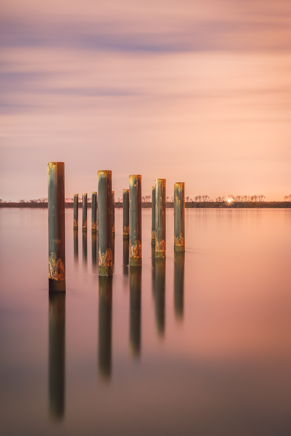
Hi Adi. What a stunning location and the leaves are so colorful. The reflections in the water are beautifully captured. I share the sentiment of others that the image feels heavy on the right side. I love the touch of fog on the left and wish there were more of that section visible. I wonder if a 16:9 crop might help to alleviate some of the heaviness. As for the blown-out area in the sky, today's AI tools could assist, or you could carefully clone the sky and its reflection. Thanks for sharing! |
Jan 19th |
| 36 |
Jan 25 |
Reply |
Hi Michael, how do you retain the texture when you paint in the color? |
Jan 19th |
| 36 |
Jan 25 |
Comment |
Hi Bill. Good capture. The newer phones have the capabilities for great photos and offer so many creative possibilities. This photo has good color, textures, shapes, light and shadows. Just a thought, consider focusing on a single element and convert to black and white which could help simplify the composition. |
Jan 19th |
| 36 |
Jan 25 |
Comment |
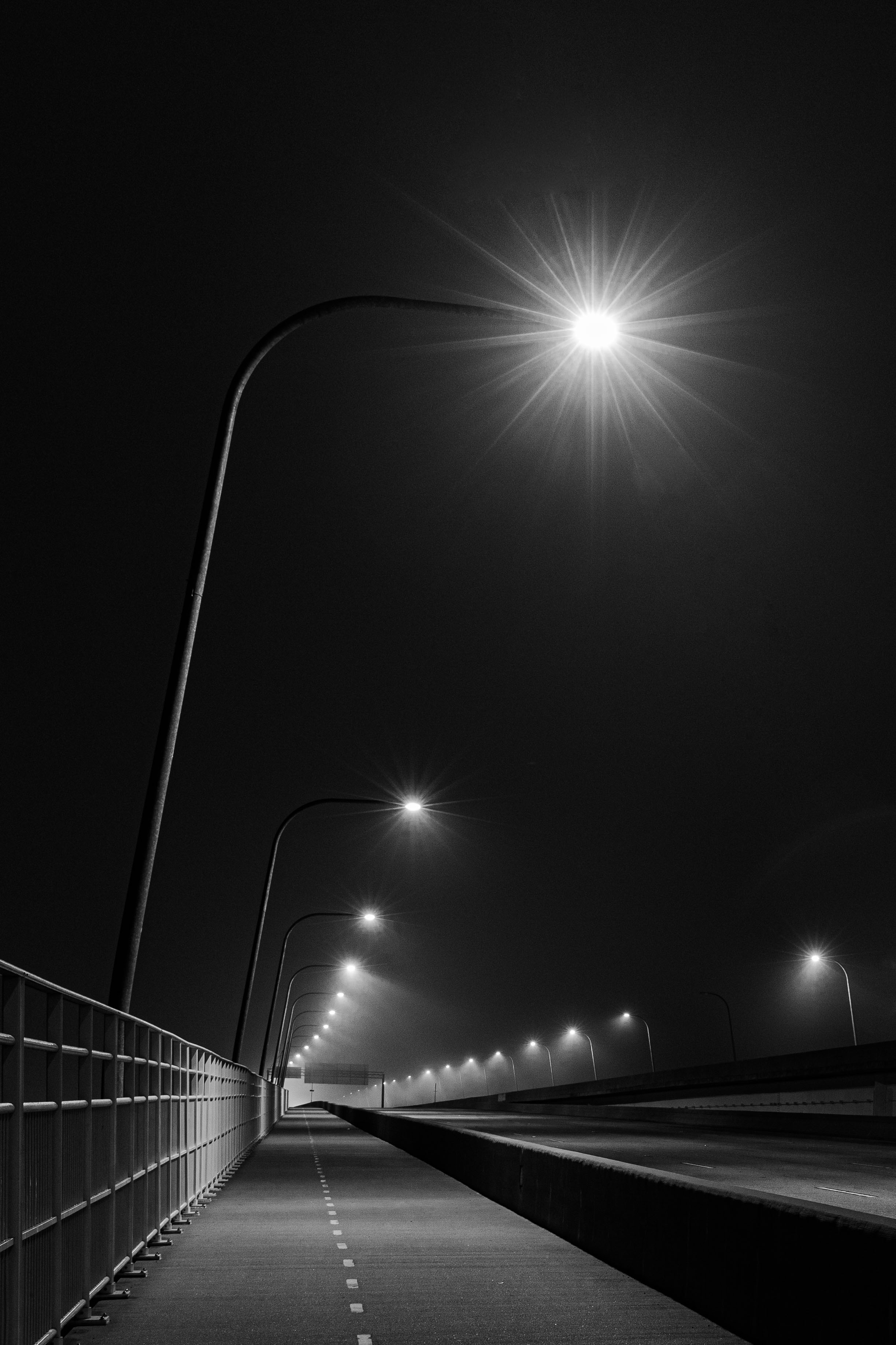
Hi Gokulanda. I really like your idea for the photo. When looking at it, my initial reaction was that it appeared underexposed. A 4-second exposure at ISO 100 can be tricky with the absence of any light sources resulting in much of the photo appearing quite dark. I also wondered if using a longer focal length might help to capture the lights and high wire structures more clearly, thereby simplifying the subject and drawing more attention to it. Ultimately, the choice of focal length is up to the creator. As Arne suggested, capturing a photo during the twilight phase could be an excellent option. |
Jan 19th |
| 36 |
Jan 25 |
Comment |
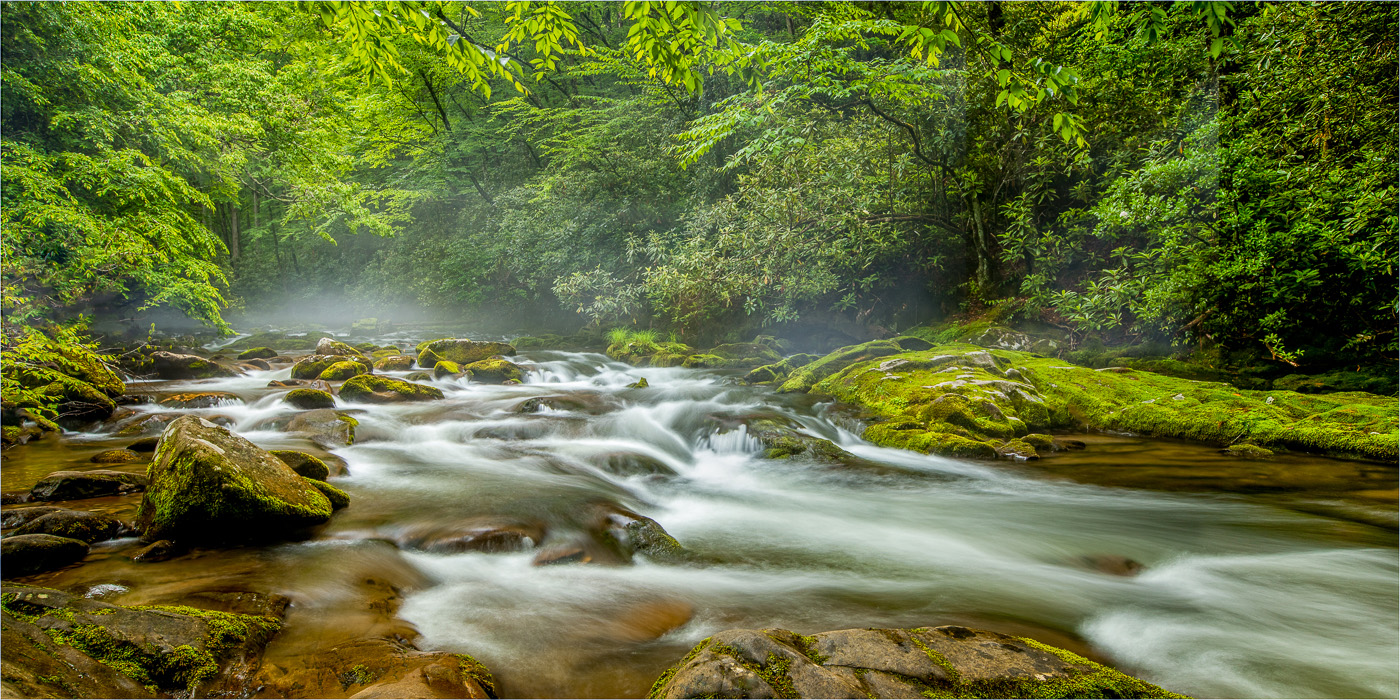
Hi Arnie. The rugged mountainous terrain compliments the swift, turbulent waters of the falls. Good choice with keeping the fast moving water. The soft greens, fog, and the powerful waterfall work well together. I particularly appreciate how the 2 falls are divided by the rock formation in the center. While I wish there was a bit more of the waterfall on the left side of the frame, its still a beautiful image. |
Jan 19th |
| 36 |
Jan 25 |
Comment |
Hi Michael. The road and the wall to the right (with the black line) draw me into the image. The vibrant colors, textures of the buildings, and interesting roof tiles keep my attention. The city's architecture and craftsmanship is beautiful. Nice capture. |
Jan 19th |
| 36 |
Jan 25 |
Comment |
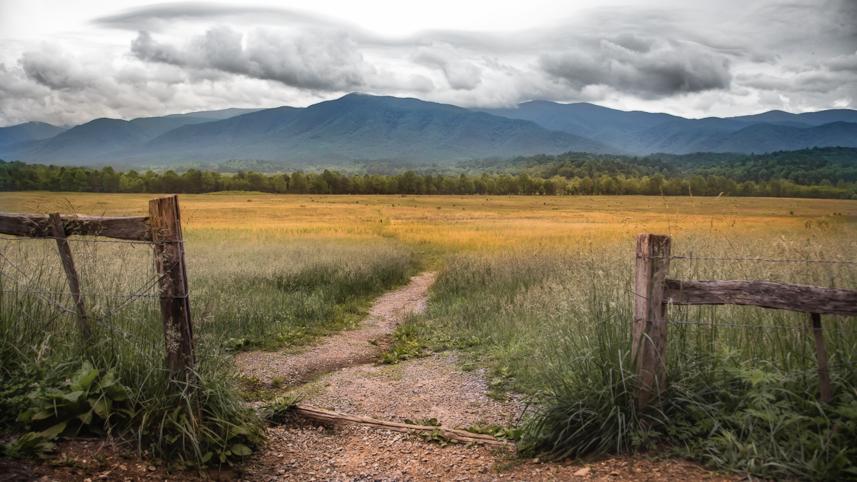
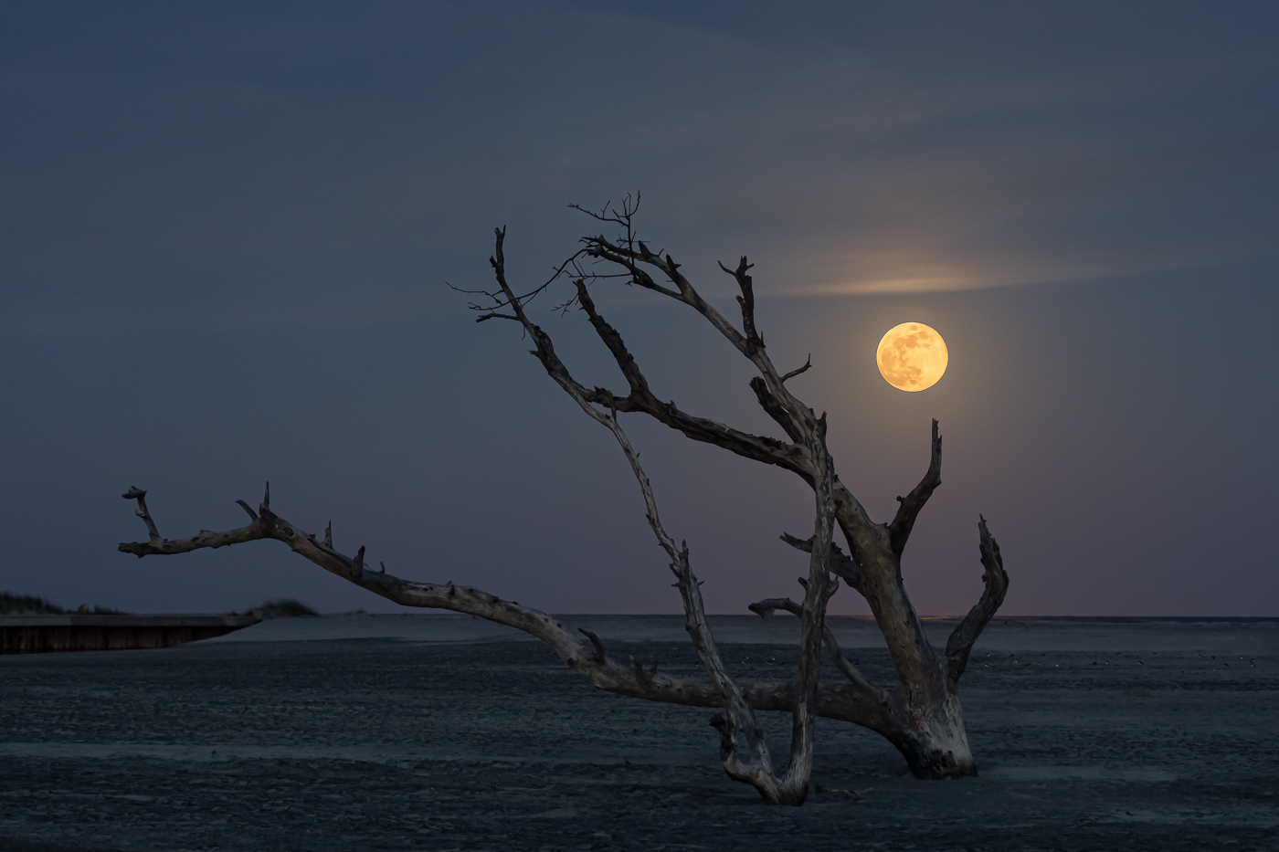
Hi Larry. In South Carolina I used to like photographing the salt marshes during the fall because of the subtle color changes in the grasses. While the Everglades may not be a salt marsh, the native grasses and cypress trees add their own seasonal transformation. For this image, I was drawn to the reflection of the anhinga on the tree stump while the real bird blended into the surrounding vegetation. It's a unique presentation which works for me. The sunlight adds to the vivid colors. For me, this scene serves as a good environmental portrait. |
Jan 19th |
6 comments - 1 reply for Group 36
|
| 47 |
Jan 25 |
Reply |
Thanks Rob. I'm looking forward to participating in this group and appreciate your feedback! |
Jan 14th |
| 47 |
Jan 25 |
Reply |
Thanks so much Kirsti. |
Jan 14th |
| 47 |
Jan 25 |
Reply |
Thanks for the feedback Al. I will definitely try it. |
Jan 14th |
| 47 |
Jan 25 |
Comment |
Hi Al. Based on the photos I've seen of Iceland (never been), the country showcases some of the most dramatic landscapes. I appreciate your positioning for this shot as it effectively captures the scene. The melting glacier serves as a nice leading line that draws my eye into the frame. Well done. However, I'm not sure if the horizon line in the center truly benefits the composition. The foreground and middle ground seem to dominate my attention when I look at the photo. In post, I feel the image crunchiness detracts from its beauty and overall impact. Given the landscape's raw and rugged texture, I wonder if applying selective sharpening and contrast might help with a more subtle tonal gradation. Great work overall. |
Jan 14th |
| 47 |
Jan 25 |
Comment |
Hi Kirsti. Great capture. This photo caught my eye and made me look more closely. While footprints in the sand are a familiar sight, they don't always draw a viewer in. For me, the sand "vein" linking the two different footprints provides an interesting element which makes me want to explore the connection between them - my favorite part. You did a good job with the post processing however I envision adding clarity to enhance the sand texture and slightly increasing the blacks. Also possibly adding a vignette will further emphasize the subject. Just my thoughts but ultimately creator's choice. |
Jan 14th |
| 47 |
Jan 25 |
Comment |
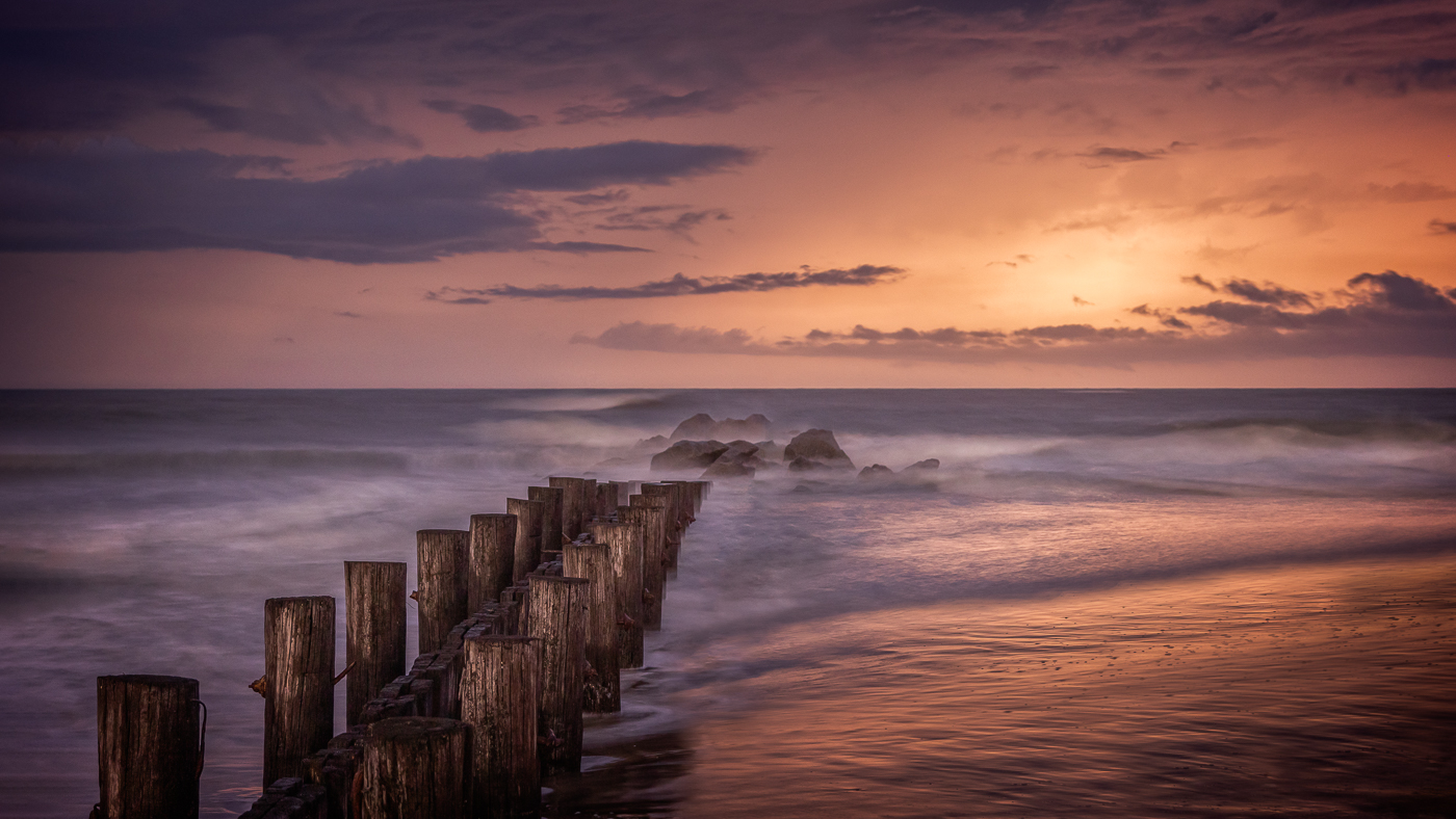
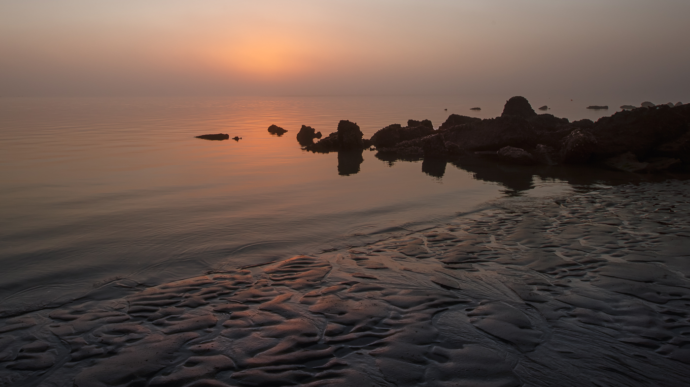
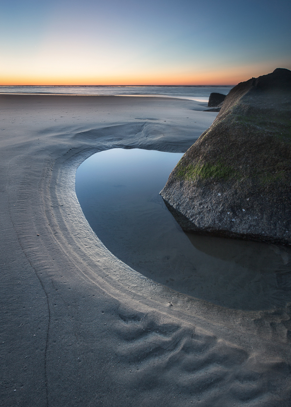
Hi Jeff. I appreciate the simplicity of this image. The overcast sky and hint of fog create an otherworldly atmosphere. Great job minimizing distractions. I did notice some slight banding in the sky. The composition and crop are effective. The inclusion of 3 rock formations and 2 distinct tide pools, combined with the movement of water flowing up the beach on the right creates a good visual. One suggestion, if possible, would be to lift the shadows slightly on the rock in the lower left corner and add a bit more texture to the large rock on the right. Nice job. |
Jan 14th |
| 47 |
Jan 25 |
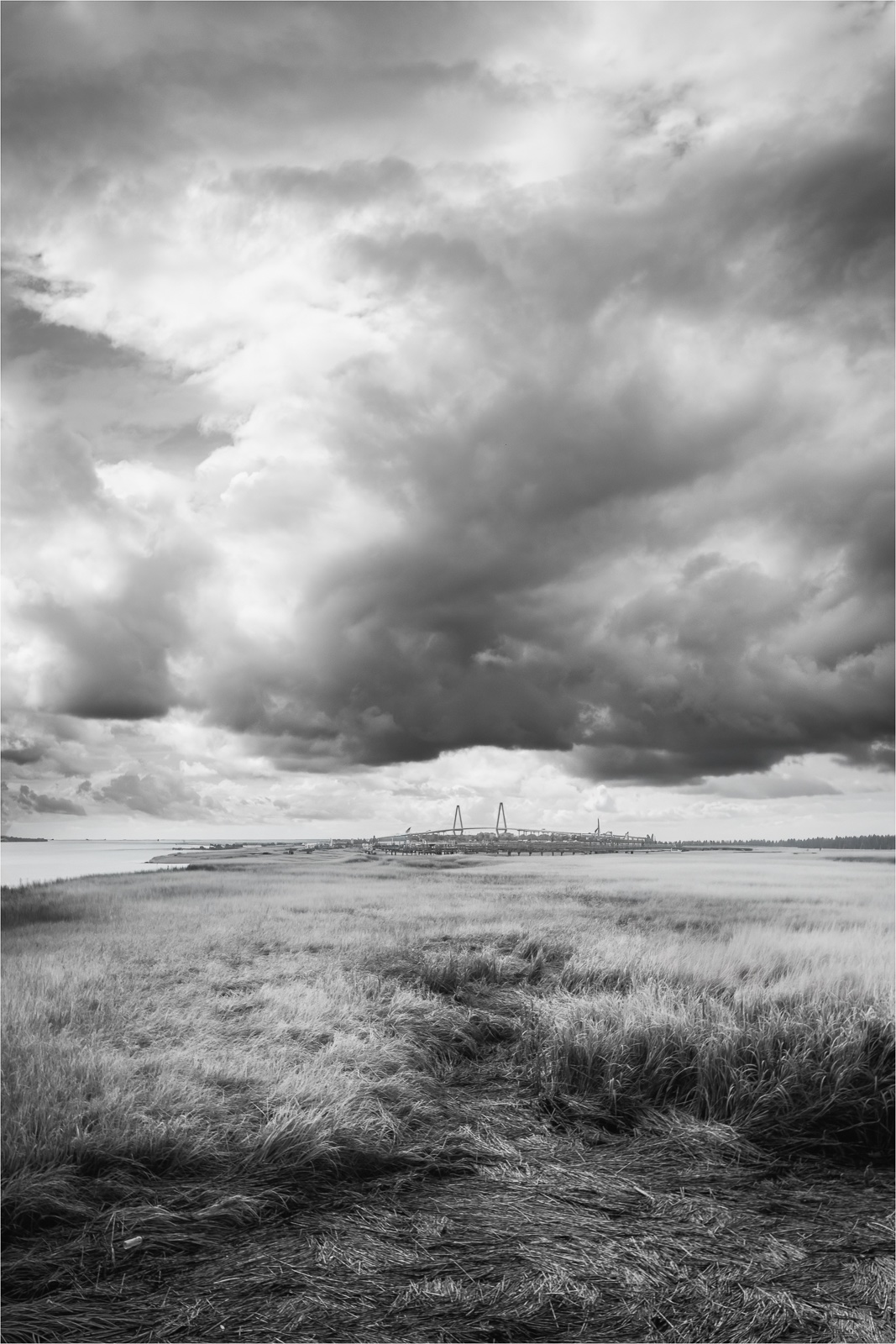
Comment |
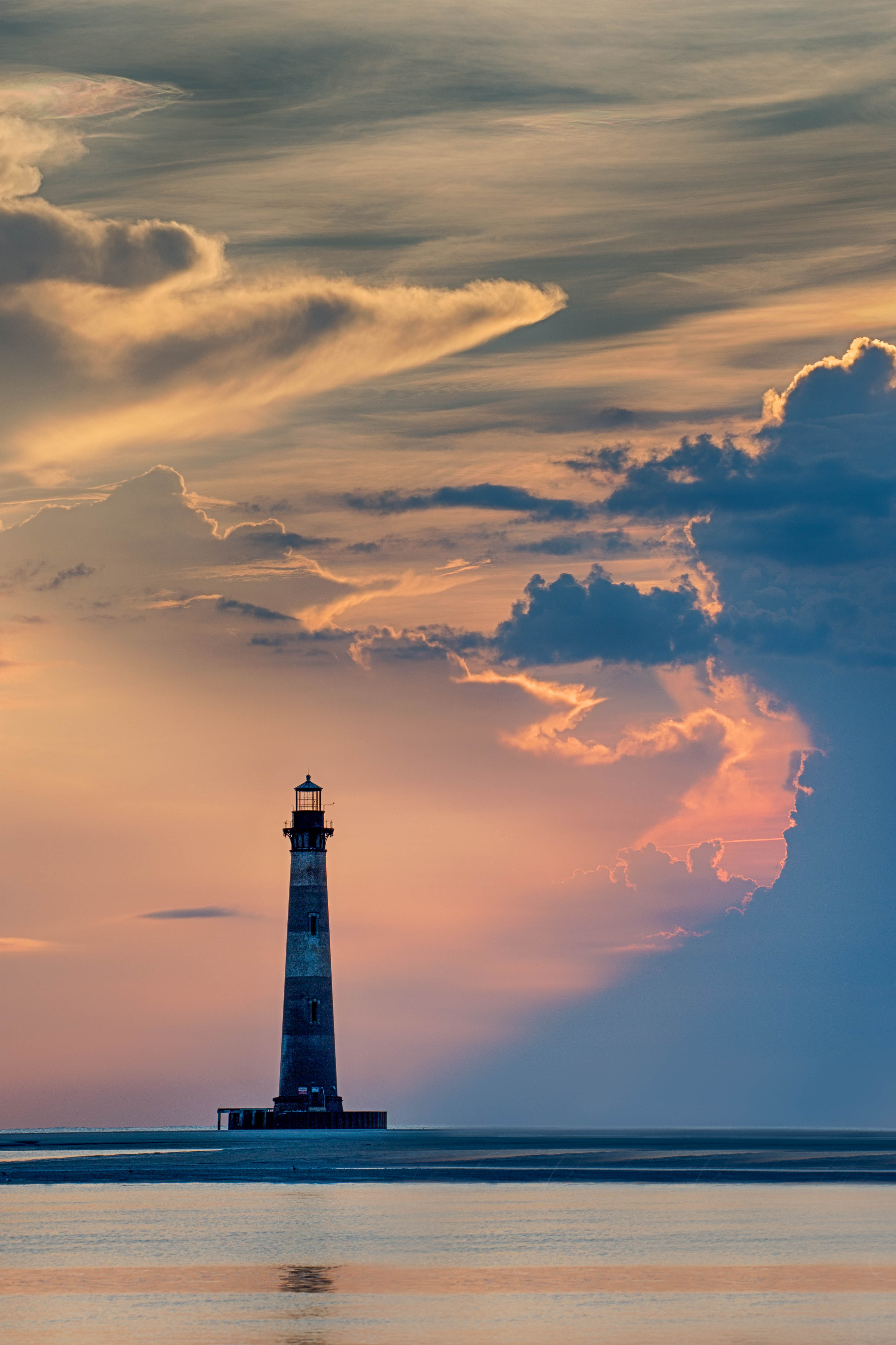
Hi Ed. I think changing the sky was a great idea. The stormy backdrop really enhances the drama of the subject and the camera's position provides a strong perspective. One suggestion I have is to create a bit more space between the concrete corner and the left edge of the frame as it feels a little tight to me. I do have a question about the backlighting in the processed image. I notice some backlit areas in the original, but I'm wondering if that same bright lighting would be present with the stormy sky. |
Jan 13th |
| 47 |
Jan 25 |
Comment |
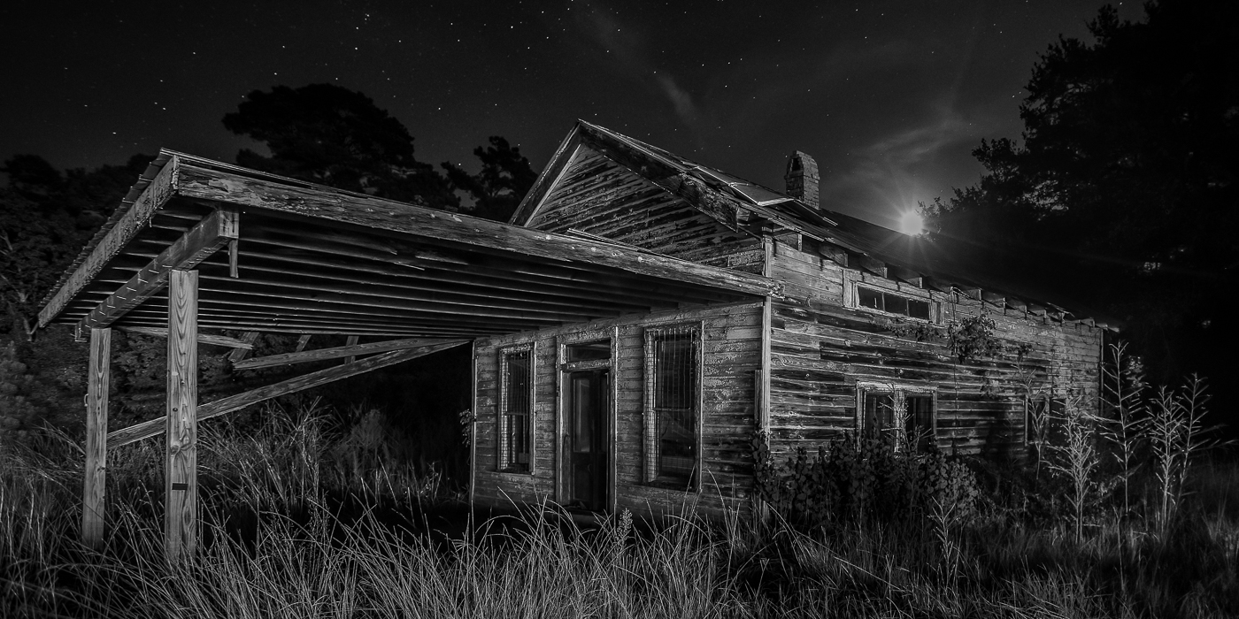
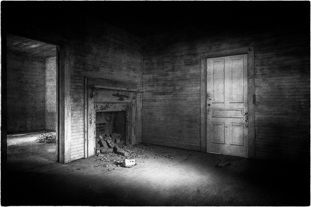
Hi Robert. Old ruins always grab my attention. You've done a great job conveying a sense of abandonment and coldness in this photo. The varying shades of gray enhance the image nicely. While old structures can appear crooked due to shifts in foundations, for me, I'm always looking to straighten anything when it comes to architecture. I agree with the others about the tunnel-like appearance on the right side of the frame and think cropping it in would give the image more balance. However, I find the bright white section of the arch stand out more to me. Thanks for sharing. |
Jan 13th |
5 comments - 3 replies for Group 47
|
11 comments - 4 replies Total
|