|
| Group |
Round |
C/R |
Comment |
Date |
Image |
| 36 |
Jul 24 |
Reply |
Haha, not a pro Larry. I gave it up because it required a significant amount of effort, yet the compensation was quite limited. However I still love architectural photography. |
Jul 23rd |
| 36 |
Jul 24 |
Reply |
Thanks Arne. I'll take a look at your suggestions. |
Jul 23rd |
| 36 |
Jul 24 |
Reply |
Thanks for your comments Michael. |
Jul 23rd |
| 36 |
Jul 24 |
Reply |
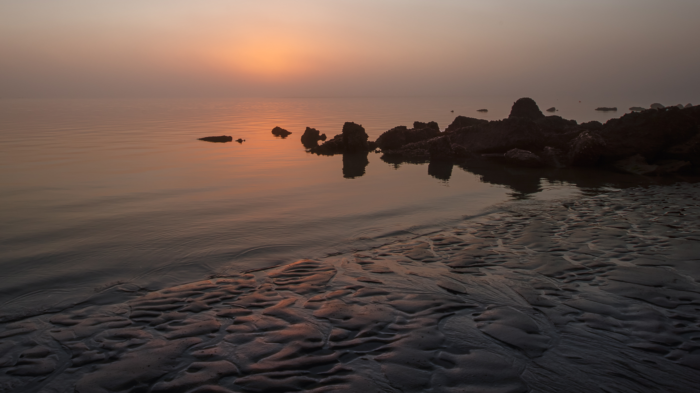
Thanks for your comments Larry. The left lower corner is sand which can easily be toned down. |
Jul 23rd |
| 36 |
Jul 24 |
Comment |
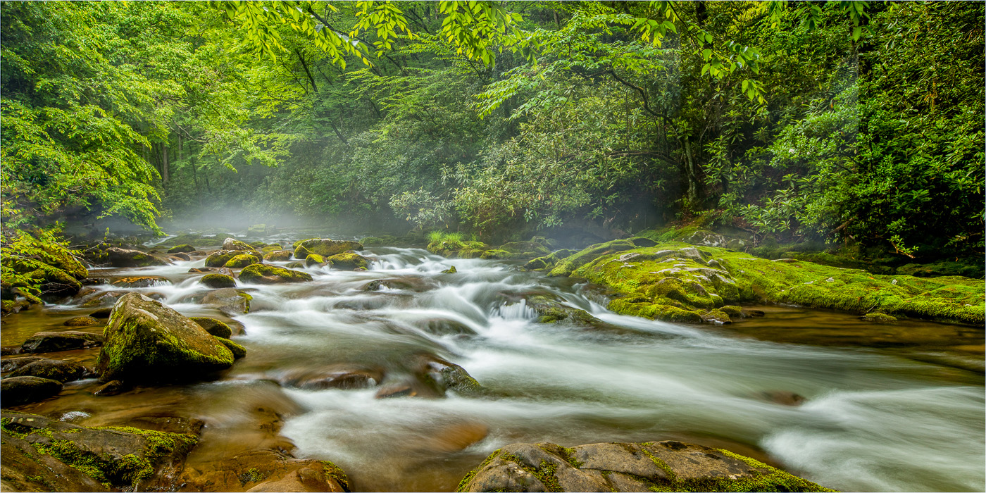
This a good vantage point for capturing the creek as the water guides my eye through the frame. I particularly like the arrangement of the rocks along the water's edge on the right side, as it adds nice structure. In contrast, the left side of the creek is filled with greenery, creating a nice balance. The image is sharp, and the long exposure of the water adds a nice smooth effect. The brownish/orange water in the foreground seems a bit overpowering to me. While Larry noted that the image feels somewhat bright, I find it acceptable. Very nice. |
Jul 23rd |
| 36 |
Jul 24 |
Comment |
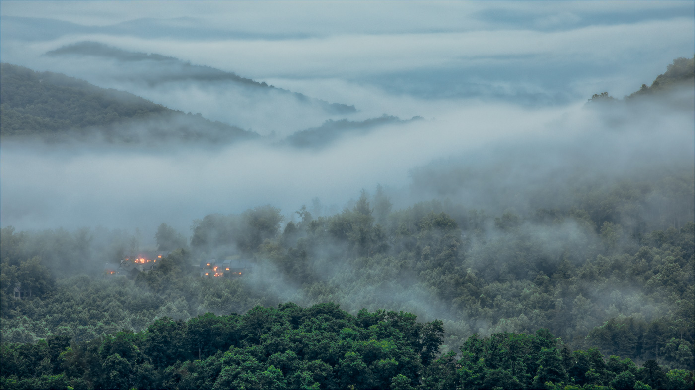
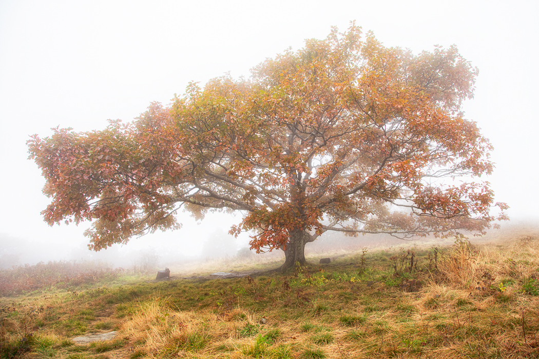
What a beautiful image, Diane! I really appreciate the frame within a frame in your composition. The vibrant golden colors are striking, and the soft light hitting the clouds and valley effectively highlights those features. As others have mentioned, removing the white areas on the left side of the frame would enhance the overall impact of the image. Great job! |
Jul 23rd |
| 36 |
Jul 24 |
Comment |
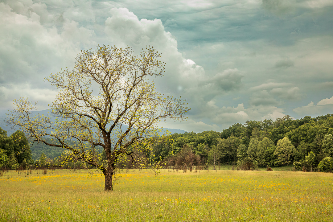
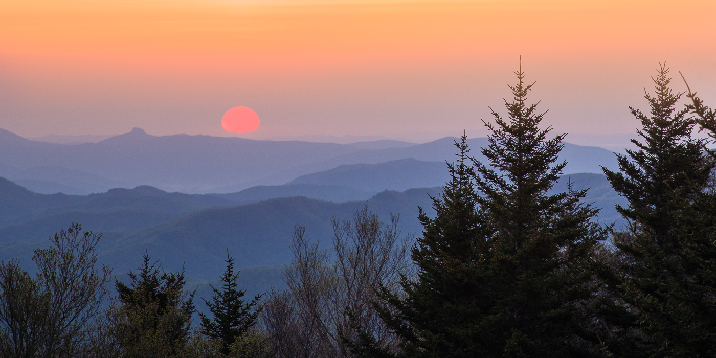
What a breathtaking scenic view! For me, the warm earth tones create a calming atmosphere, while the rapids in the water inject a sense of dynamic energy. This location has the power to uplift anyone after a tough day. I love how the mountains frame the river, leading my eye through the valley and up to the sky. I also agree with the others regarding the title; the cows were not the first thing that caught my attention in the image. Excellent job with the editing! |
Jul 23rd |
| 36 |
Jul 24 |
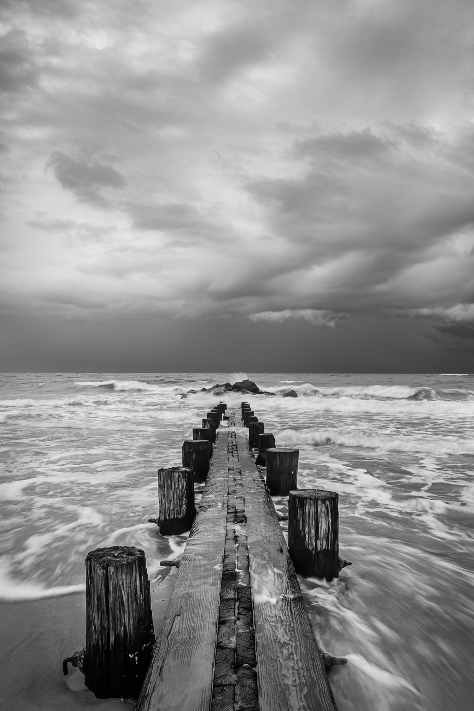
Comment |
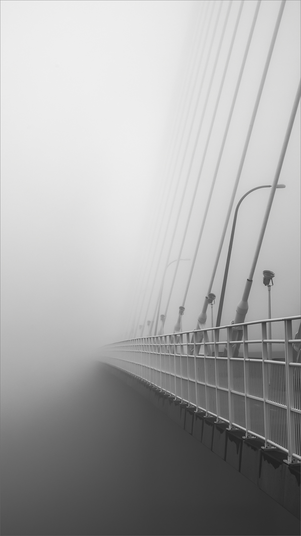
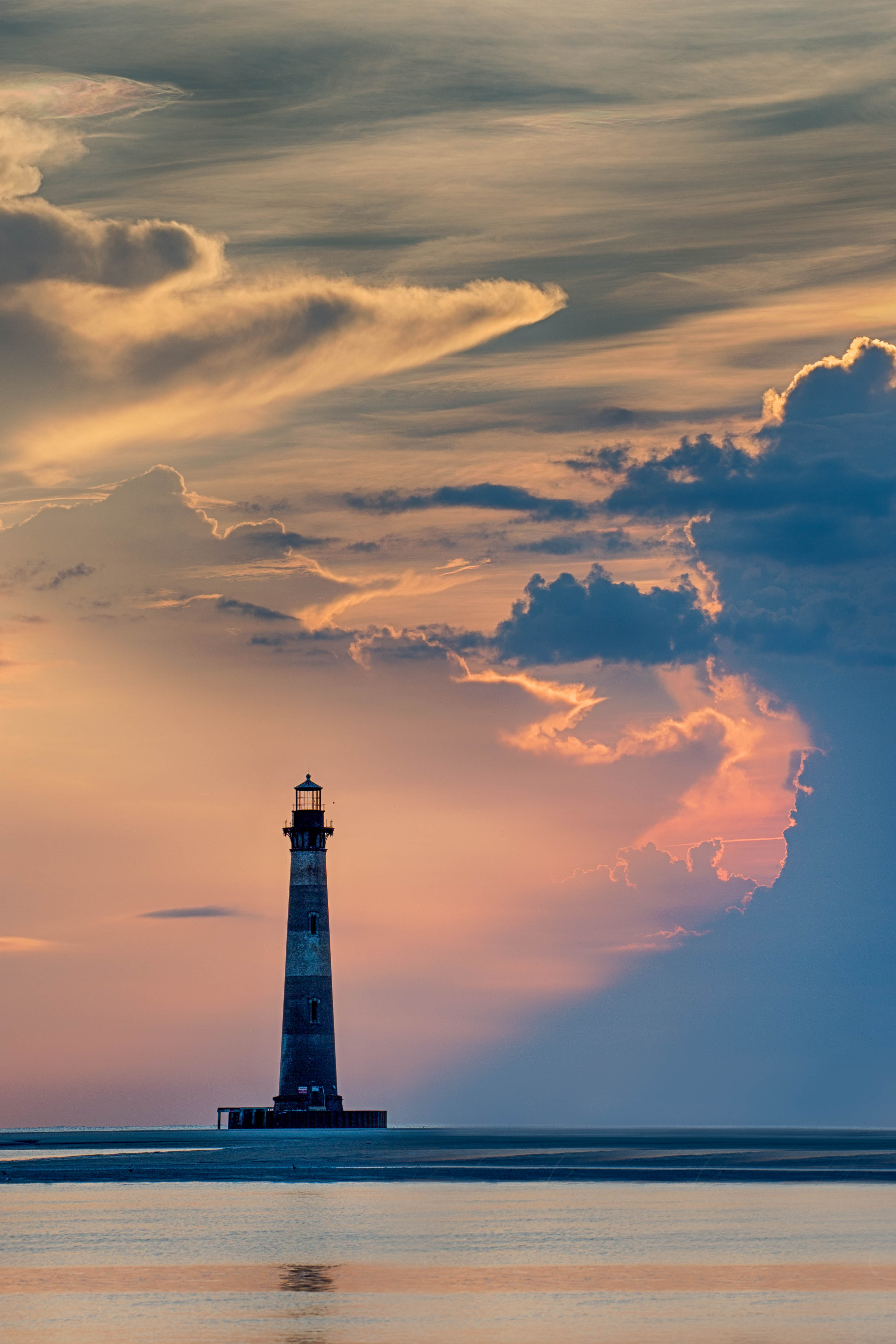
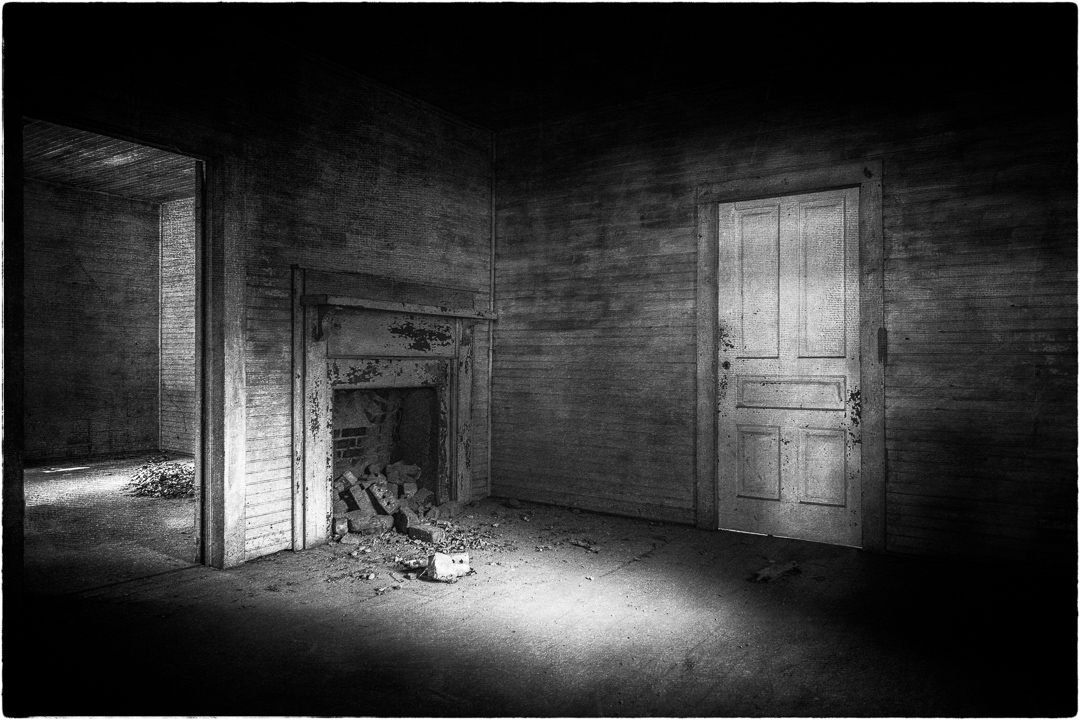
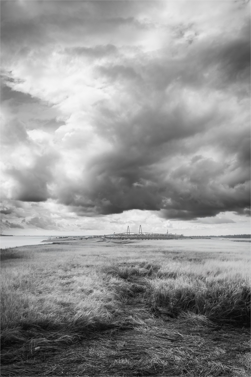
Very nice composition. The curved leading line and the dynamic cloud movement truly highlight the lighthouse. Converting the image to black and white effectively emphasizes the path leading to the lighthouse, its shape, and the textures in the rocks. Nicely done. |
Jul 23rd |
| 36 |
Jul 24 |
Comment |
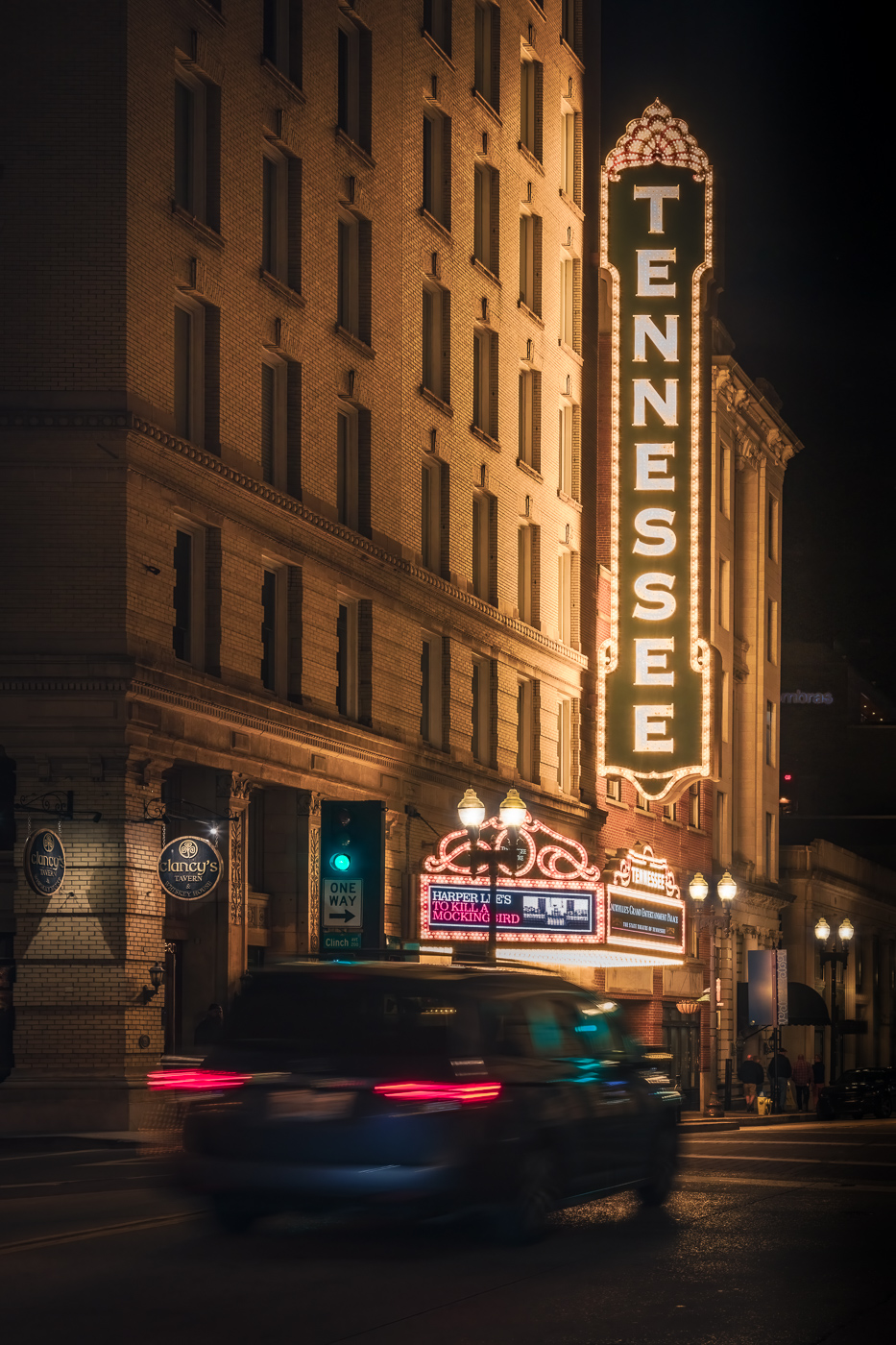
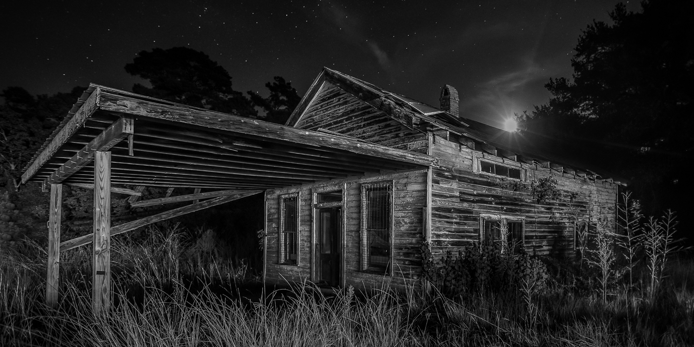
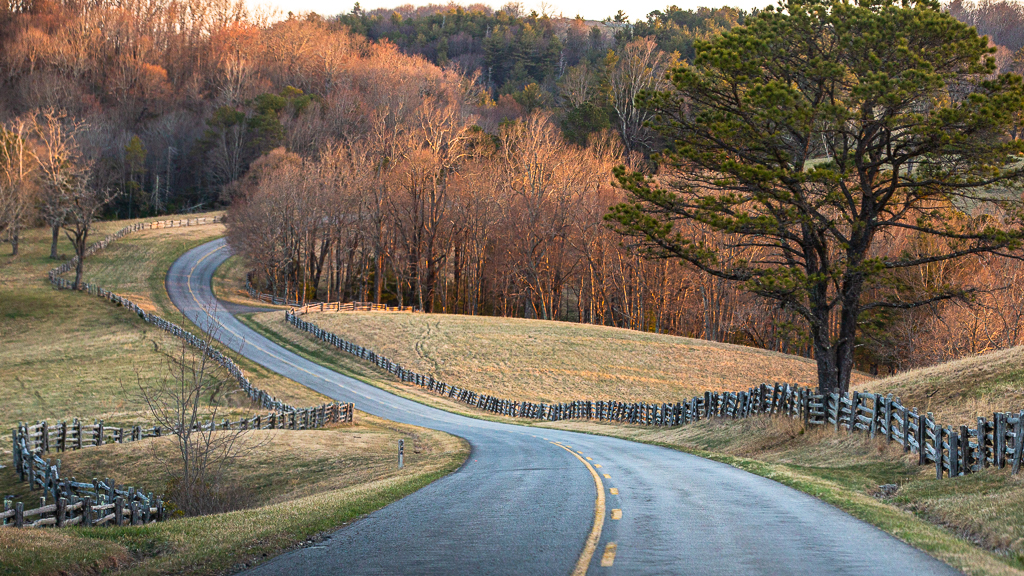
Several years ago I dabbled in real estate photography, and I have to say you nailed this shot. The perspective showcases the house nicely. The lighting enhances the curb appeal of the house. The editing is natural adding to the visual appeal. Very nice! |
Jul 23rd |
5 comments - 4 replies for Group 36
|
| 72 |
Jul 24 |
Reply |
Thanks for your comments Heather. |
Jul 22nd |
| 72 |
Jul 24 |
Reply |
Thanks Maria. |
Jul 22nd |
| 72 |
Jul 24 |
Reply |
Thanks Isaac. I adjusted the color of the bee. |
Jul 22nd |
| 72 |
Jul 24 |
Comment |
Hi Isaac. I like the original natural color image and the black and white interpretation. I wonder if the gorilla is using the stick in his nose to help clear his nostril. The crop is good bringing more attention gorilla. For me there is an overuse of highlights making the image feel harsh. Maria's version provides more richness to the image. Nice capture. |
Jul 22nd |
| 72 |
Jul 24 |
Comment |
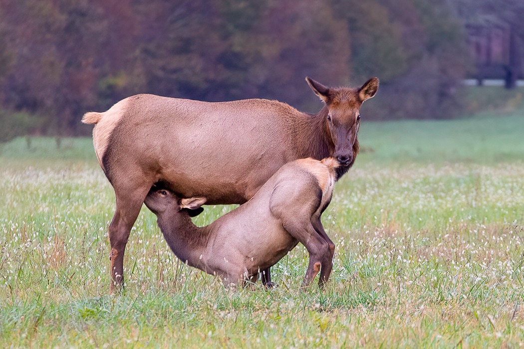
Hi Adrian. The Grebe chick's excitement as it prepares to eat is nicely delivered. For me, I really like the mother's intense gaze as it is similar to any parent watching their young to ensure they're properly fed. The composition is good, and the reflection adds some depth and visual interest. The color is rich and natural. Nice capture. |
Jul 21st |
| 72 |
Jul 24 |
Comment |
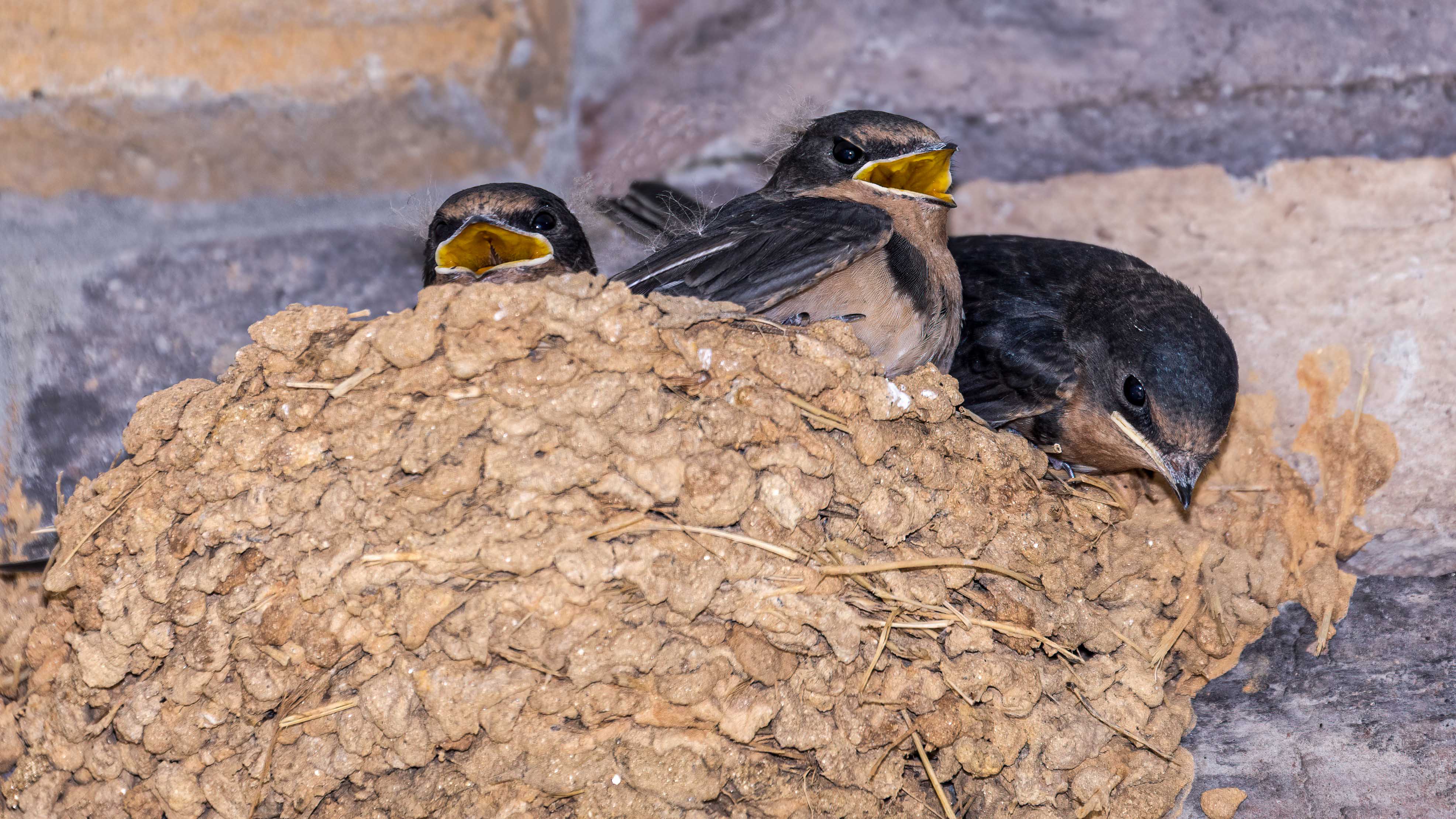
Hi Heather. I prefer the original composition because it provides more space for the third turtle. The triangular arrangement is visually appealing, and the third turtle's focus does not detract from the overall image. You've done a great job removing distractions and enhancing the details and colors of the foreground turtles. Although the colors appear slightly muted, they suit the scene well. Nice job. |
Jul 21st |
| 72 |
Jul 24 |
Comment |
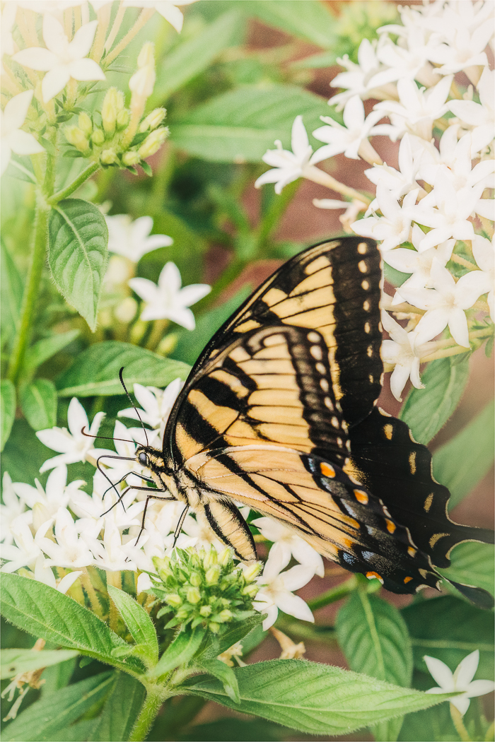
Hi Chris. I like the vertical composition of this image as it's showcasing the position of the bird and the flower while accentuating their natural form. There is nice separation between the bird/flower and the background allowing them to stand out. The green and yellow colors are appealing. The decision to remove the branch on the left side of the frame as suggested by Maria gives the image a cleaner, more focused composition. For me, I would brighten the bird a bit also. Very nice.
|
Jul 21st |
| 72 |
Jul 24 |
Comment |
Maria, nice job getting down low! The chosen angle highlights the crab's details allowing me to appreciate its unique features. I like the soft, natural hues as they nicely represent the environment. The DOF effectively separates the subject from surroundings however for me, I find the foreground blur competes with the crab. I wonder if the camera angle was elevated slightly to create a more gradual transition between the crab and foreground. Or, for a more elongated view a 16x9 or 18x9 crop brings more attention to the crab as mentioned by Isaac and Bruce. |
Jul 18th |
| 72 |
Jul 24 |
Comment |
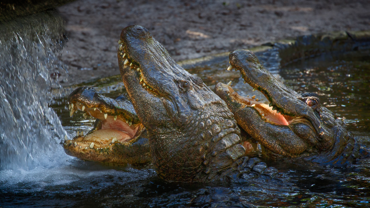
Bruce, what a wonderful photo of a brown bear leaping through water. This frozen moment shows a raw, natural energy which is captivating. There is good clarity, capturing detail of the bear's fur and the water droplets. The angle of the bear's extended body adds visual interest and motion. The visible claws, and the extended leg are a nice element to the action shot. The color palette is true to the environment. I do agree with the others about extending the left side a bit to allow more space. |
Jul 18th |
6 comments - 3 replies for Group 72
|
11 comments - 7 replies Total
|