|
| Group |
Round |
C/R |
Comment |
Date |
Image |
| 36 |
Jun 24 |
Comment |
Thanks for your feedback Diane. Already adjusted the crop! Black and white is a possibility, I'm not sure there will be enough contrast but I will try! |
Jun 22nd |
| 36 |
Jun 24 |
Reply |
Thanks you Michael. |
Jun 22nd |
| 36 |
Jun 24 |
Reply |
Thanks for your feedback Larry. When I saw the image posted I immediately went to the file and cropped down. Sometimes I just need to see an image in a different setting.
|
Jun 22nd |
| 36 |
Jun 24 |
Comment |
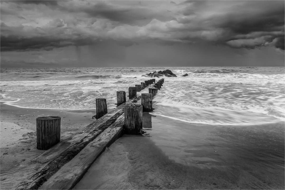
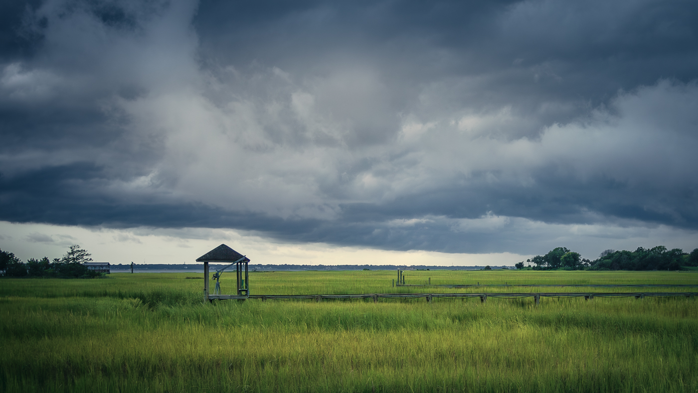
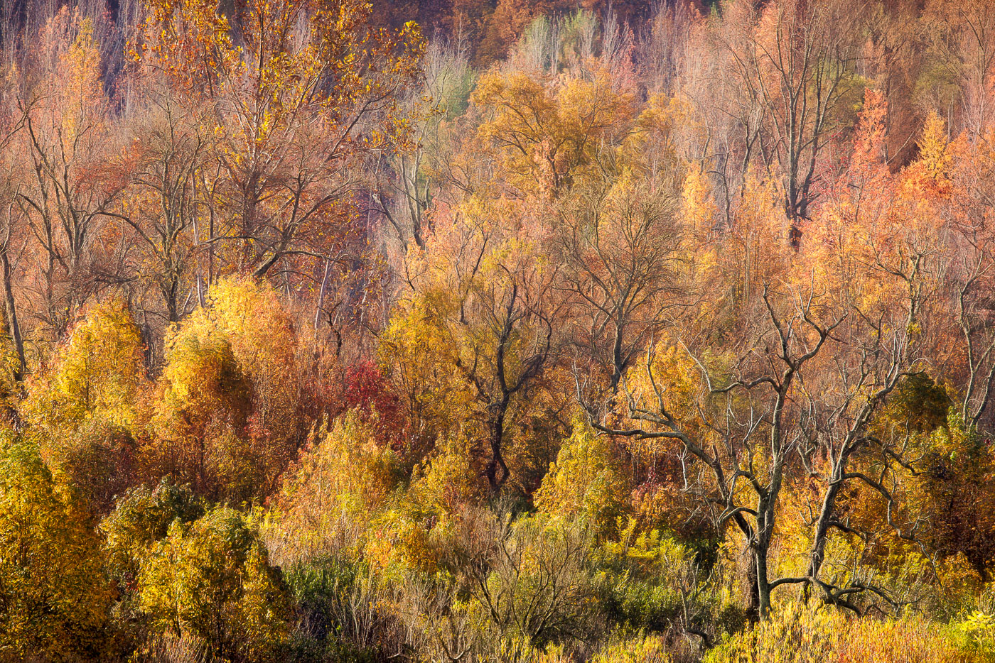
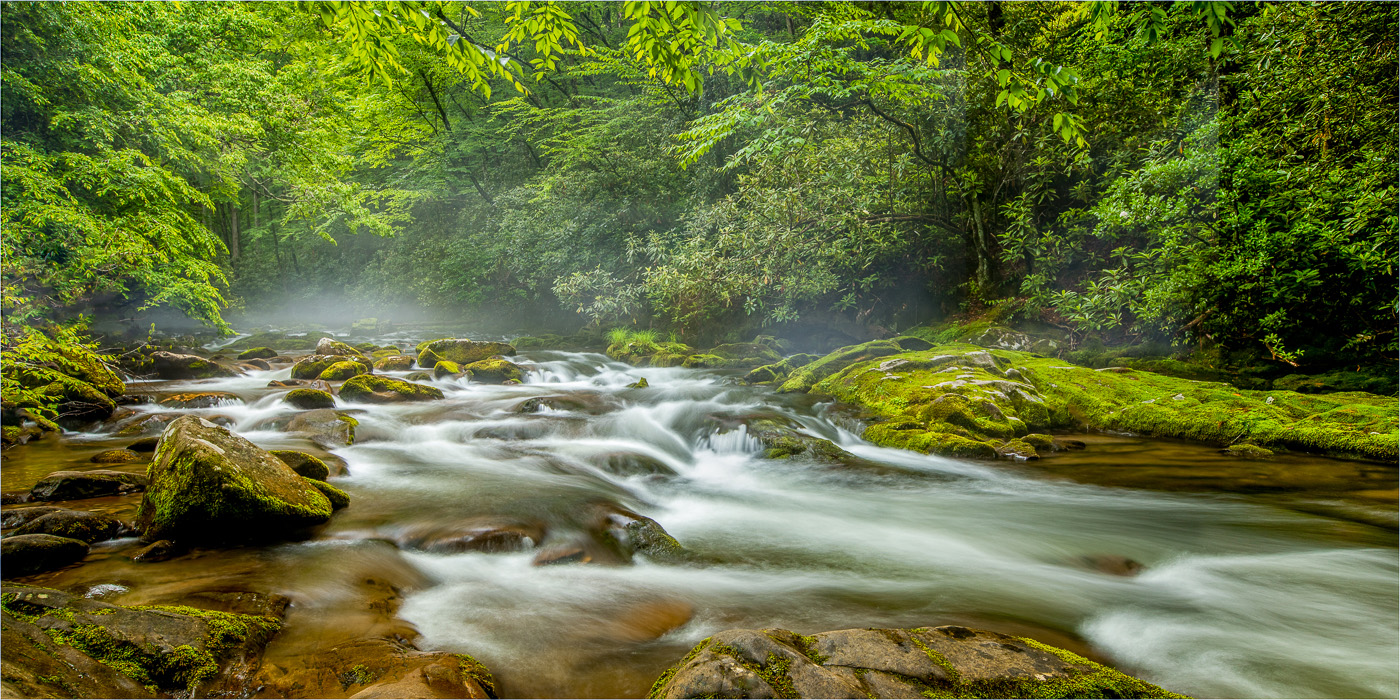
Well done composition! The image looks sharp. The smooth flowing water adds a nice contrast to the landscape. My eye gets drawn to the orange/brown water in the lower left corner. If so desired, using LR or PS point color will help reduce the brown a bit. I always find green to be the most challenging color to edit in landscape. When there's a lot of green it's hard to achieve an appealing visual balance between cool and warm. For me, I like the cooler green tones near waterfalls especially in shadowed areas. However I would agree with Diane and possibly adjust the color balance to add a bit more magenta to neutralize some of the green. Great image and it would also look good as a black and white! |
Jun 22nd |
| 36 |
Jun 24 |
Comment |
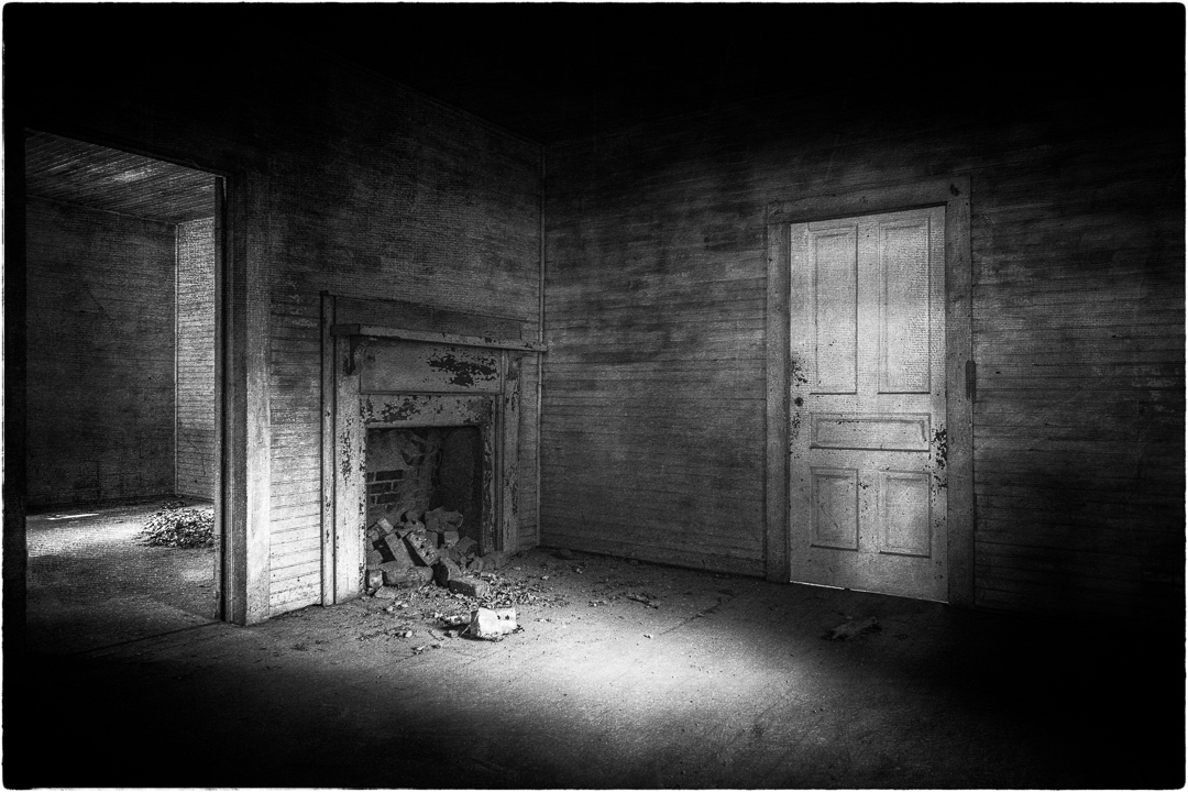
Nicely done. Ruins are such a great place to photograph interesting angles and perspectives. The wide angle lens helped to capture the expansive view and details of the ruins. The exposure is good and the image looks sharp. I'm on the fence about the crop. I wonder if a 16:9 would work better? |
Jun 22nd |
| 36 |
Jun 24 |
Comment |
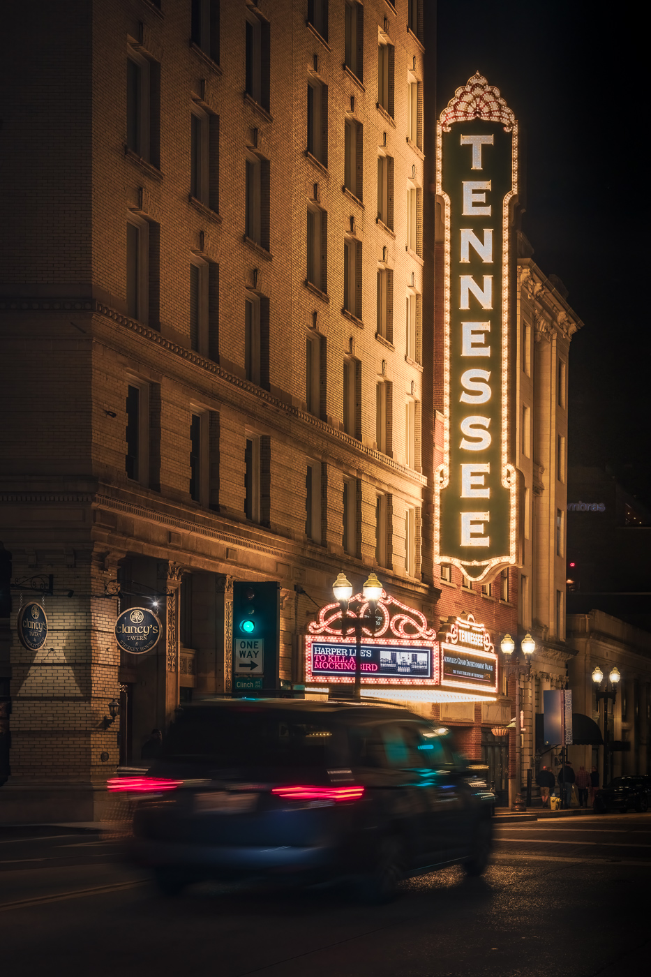
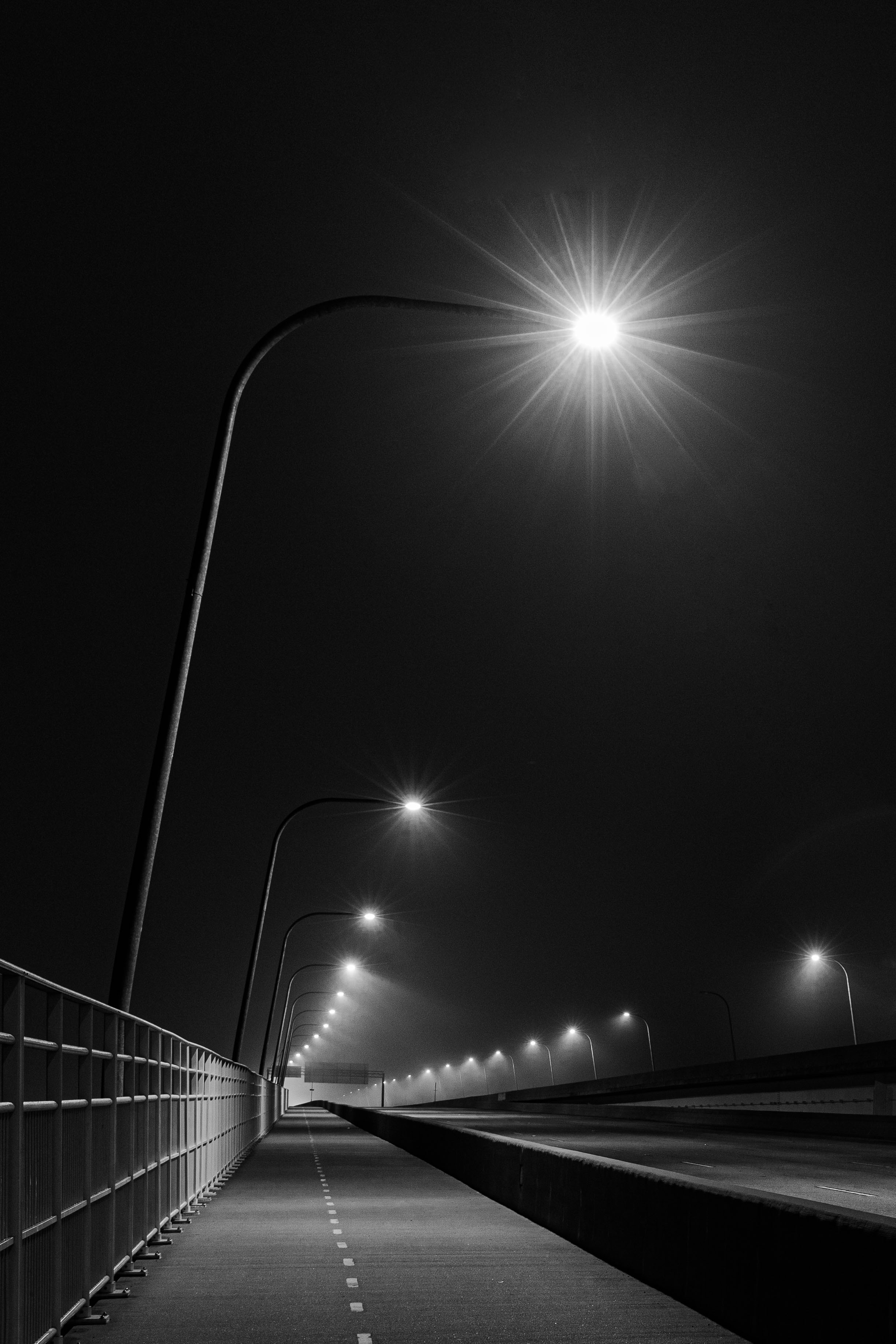
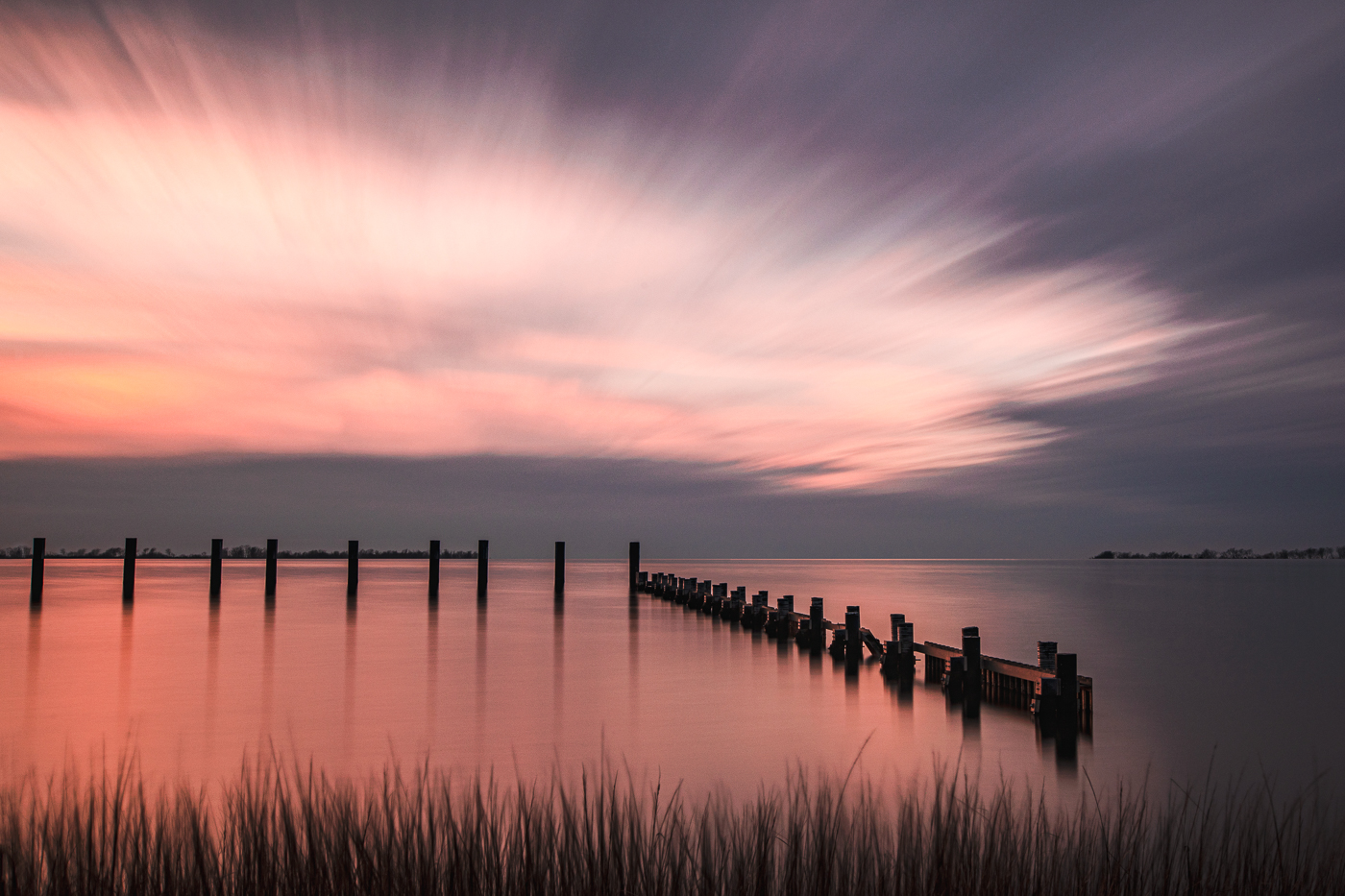
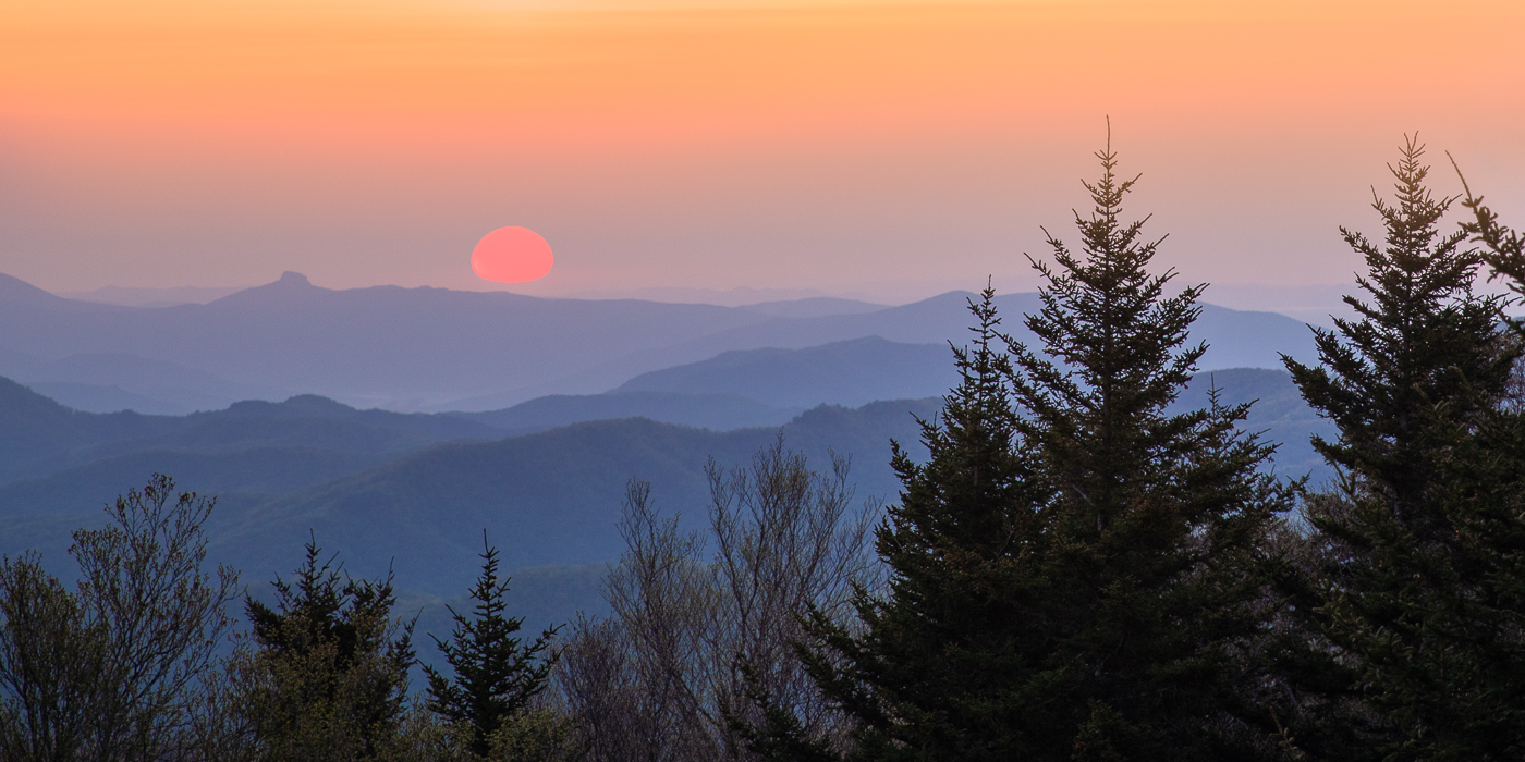
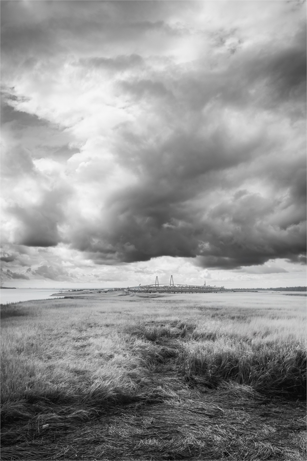
The things we do to catch a sunset. The 30 sec exposure created a slight blur to the clouds showing movement and adding a dynamic element to the sky. The sky colors are nicely done and the addition of the street lights give me a sense of place. Good job with street light exposure. To me, the horizon doesn't seem level but it could just be the perspective. |
Jun 22nd |
| 36 |
Jun 24 |
Comment |
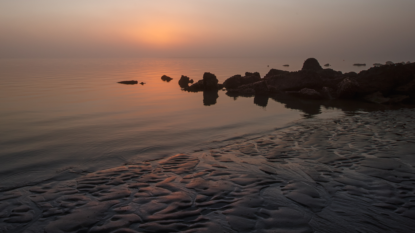
I can hear the thunderous roar of the waterfalls from your image. Nice job capturing the movement and true characteristics of the falls. The surrounding rocky landscape and green trees showcases the falls nicely. The bridge adds an interesting element to the image, but for me, the angle makes the image a bit tense. I don't know if you were able to stand further away or not when taking the image. Also, as others mentioned the white sky doesn't add to the image. Glad you were able to visit and experience this location. |
Jun 21st |
| 36 |
Jun 24 |
Comment |
The beach and the water as foreground adds context and depth. The colors are vibrant and the light quality highlights the homes nicely and helps to capture some of the architectural details of a beach home. In this image the color of the ocean works with the varied colors of the homes. As a resident of North Carolina I wish the ocean was this color lol. |
Jun 20th |
| 36 |
Jun 24 |
Comment |
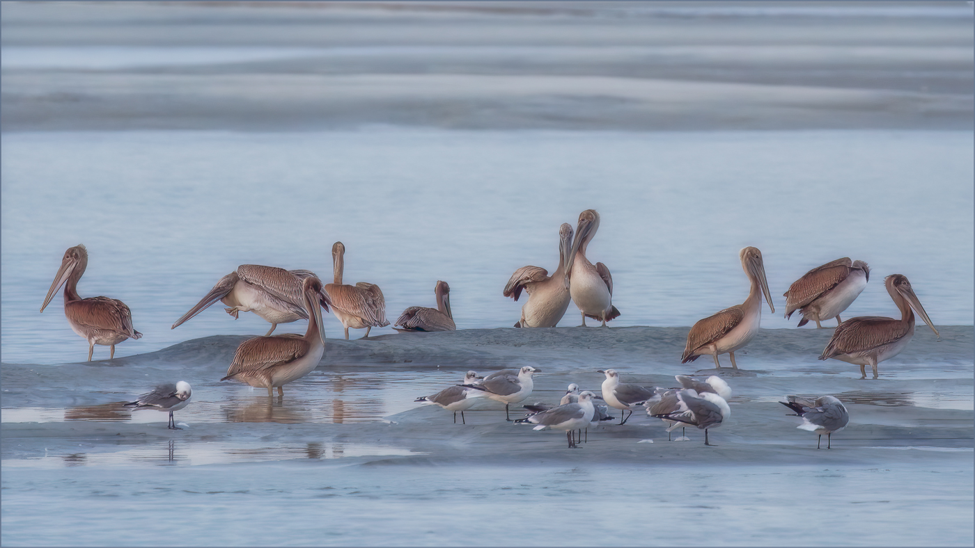
The still waters did their job to act like a mirror, nicely reflecting the building and sky. There is a nice visual balance and depth to the image and the colors add a nice pop to the image. The reflection of the cloud looks fine and the building pressing the right edge doesn't take away from the image. Nicely done. |
Jun 20th |
7 comments - 2 replies for Group 36
|
| 72 |
Jun 24 |
Reply |
Thanks Heather. |
Jun 23rd |
| 72 |
Jun 24 |
Reply |
Thanks Adrian. |
Jun 23rd |
| 72 |
Jun 24 |
Reply |
Thanks Chris. |
Jun 23rd |
| 72 |
Jun 24 |
Reply |
Thank you Maria. |
Jun 23rd |
| 72 |
Jun 24 |
Reply |
Thank you Isaac. |
Jun 23rd |
| 72 |
Jun 24 |
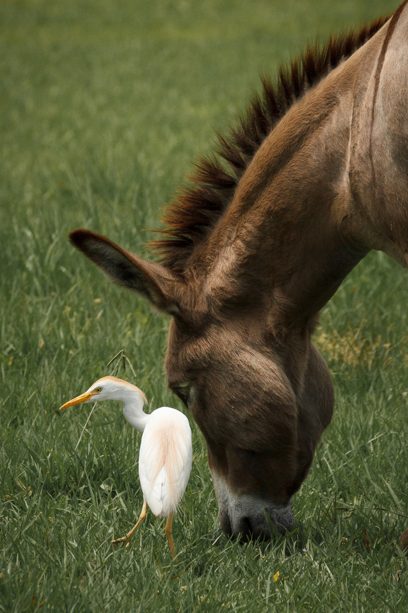
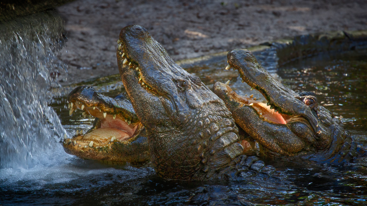
Comment |
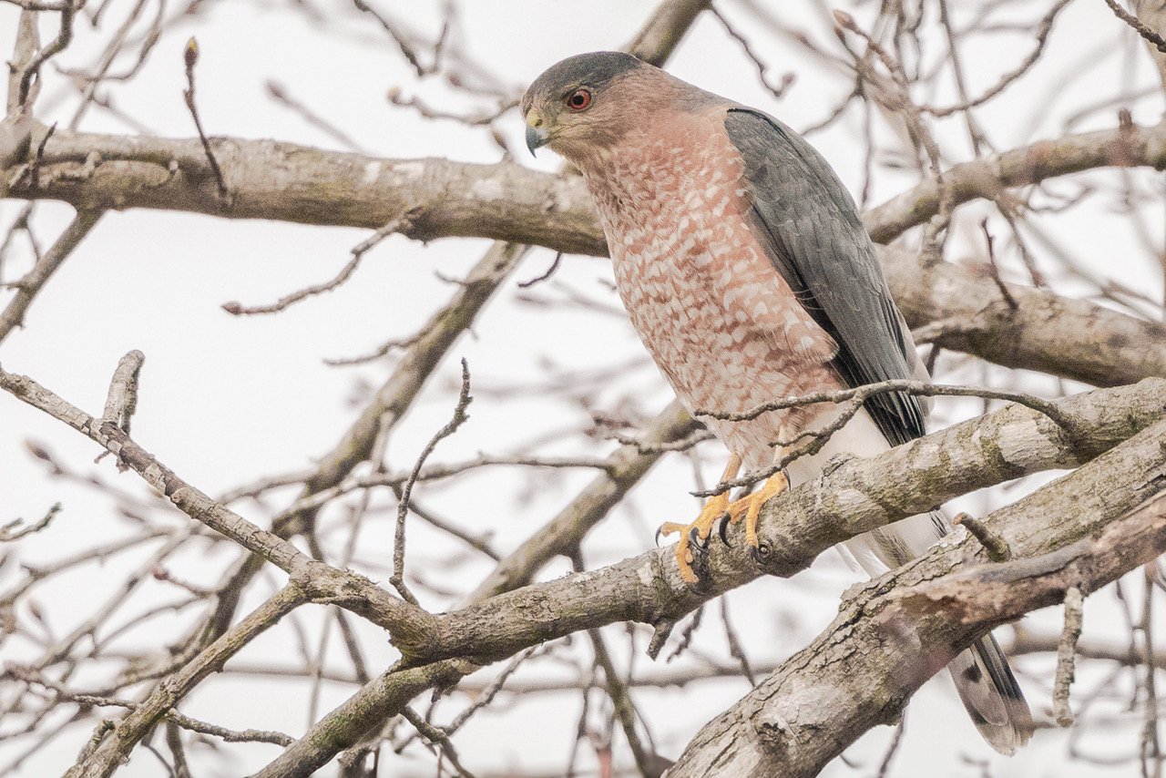
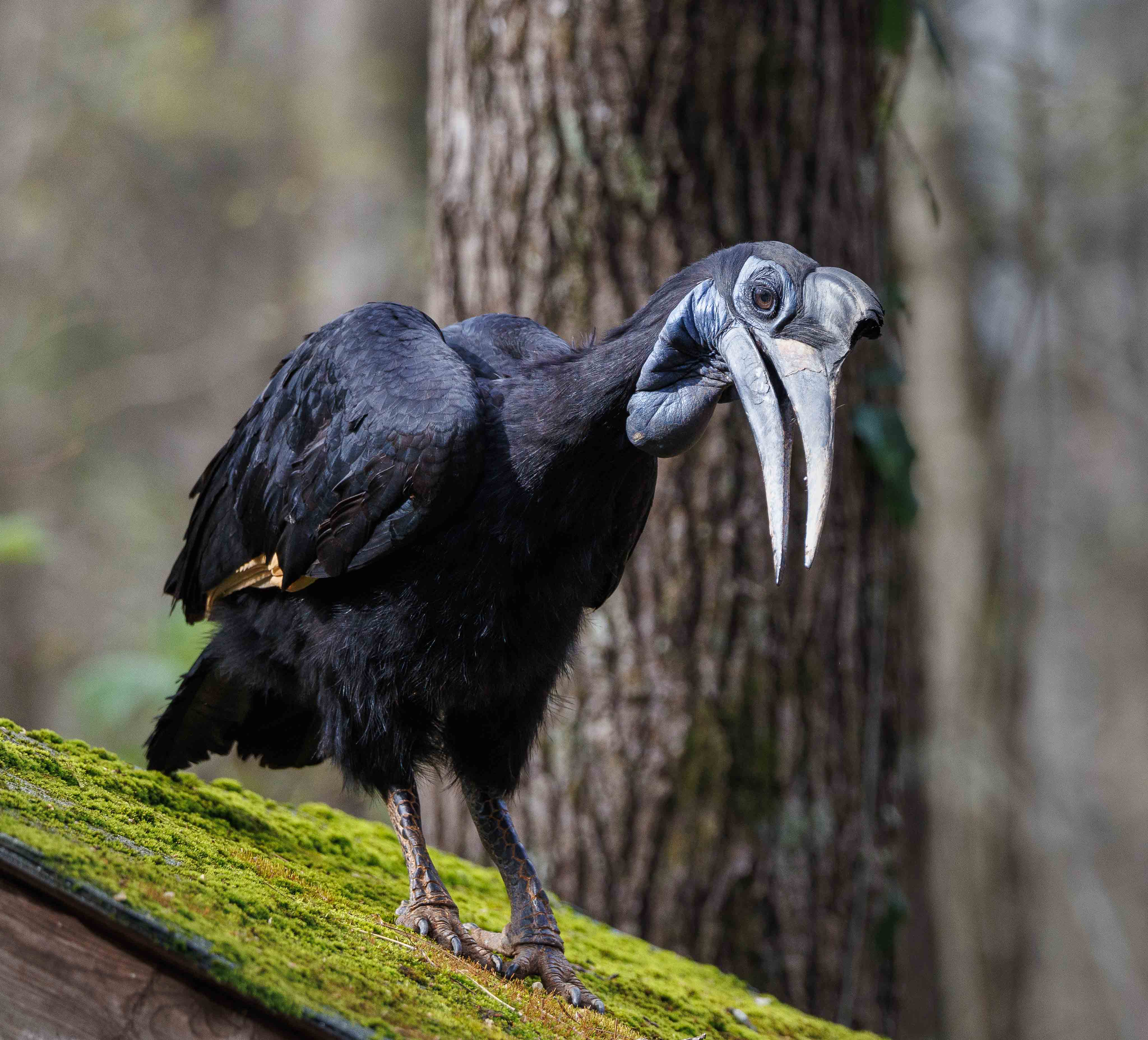
Hi Isaac, the diagonal line of the water's edge with the elephants adds visual interest to the image. The image looks sharp showing detail in the elephants body. While harsh lighting sometimes presents its challenges, the post processing looks good. For me, the capture of the croc swimming close to the water's edge adds to the reality of the wildlife story. Nicely done. |
Jun 19th |
| 72 |
Jun 24 |
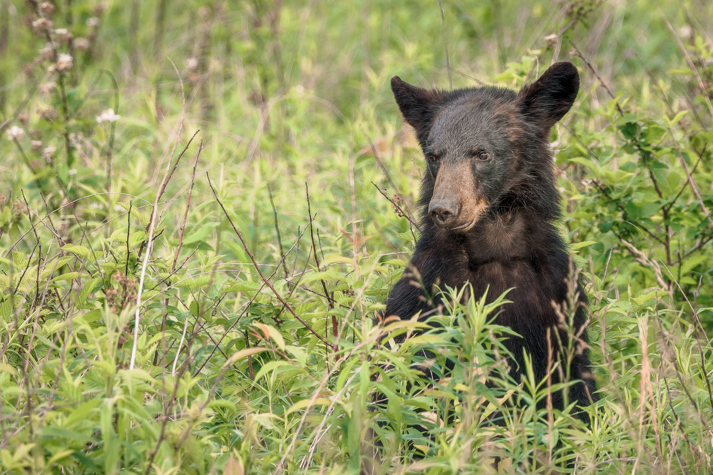
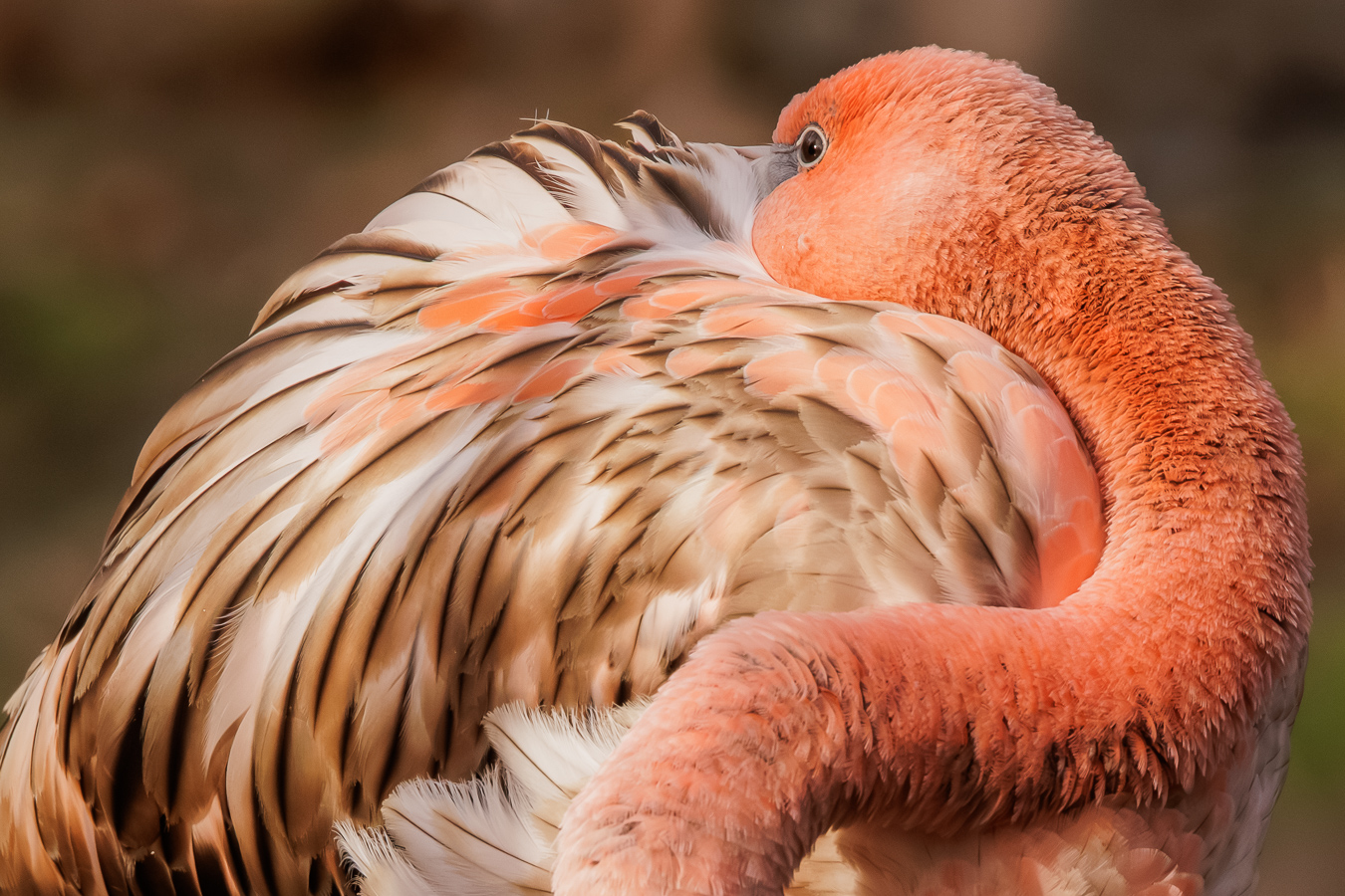
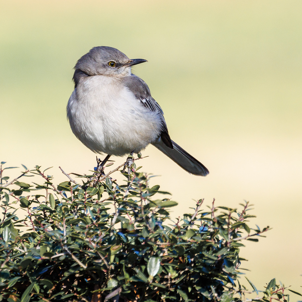
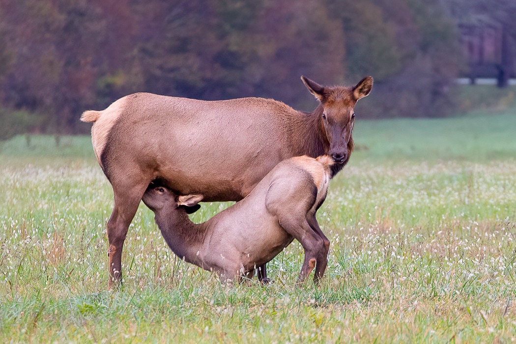
Comment |
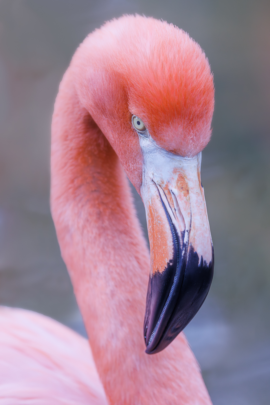
The sharp eyes of the baby capture my attention as they express awareness making the image feel more alive and engaging. The orange and green colors stand out from one another and provide a nice contrast. Very nice image. |
Jun 19th |
| 72 |
Jun 24 |
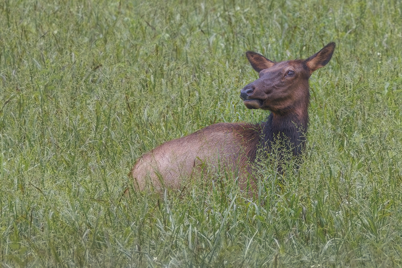
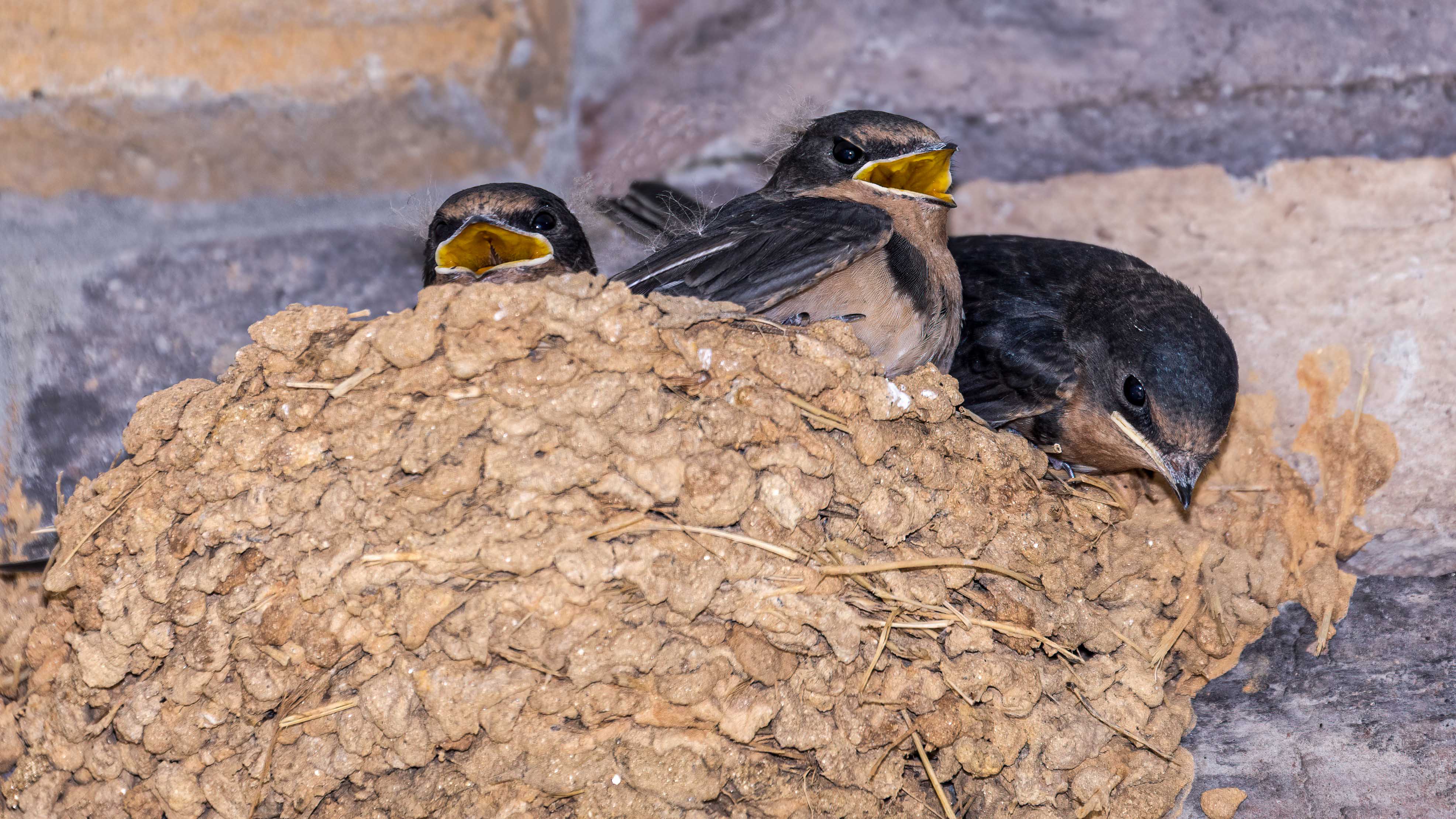
Comment |
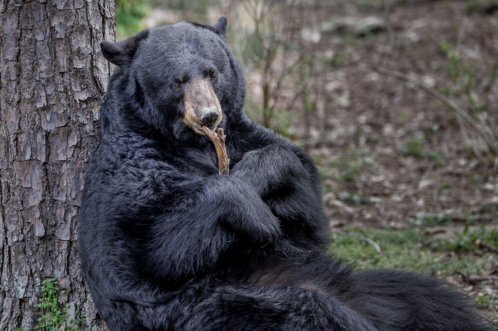
Hi Chris. The focus stacking paid off with the maximum DOF. The natural color combinations in the scene are nicely processed and very pleasing to the eye. The log is a strong foreground element which leads my eye into the image and through the scene. Beautiful image. |
Jun 19th |
| 72 |
Jun 24 |
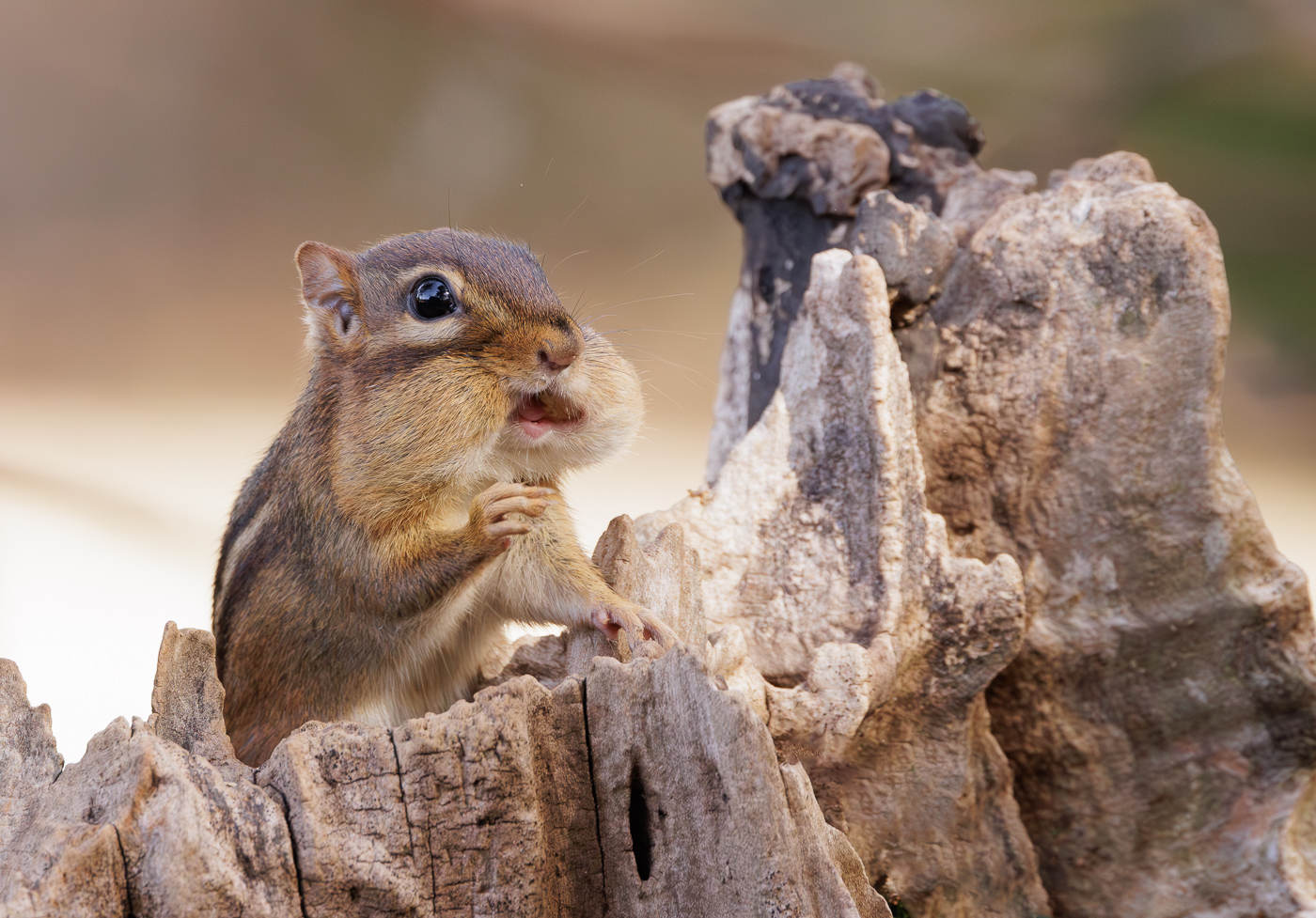
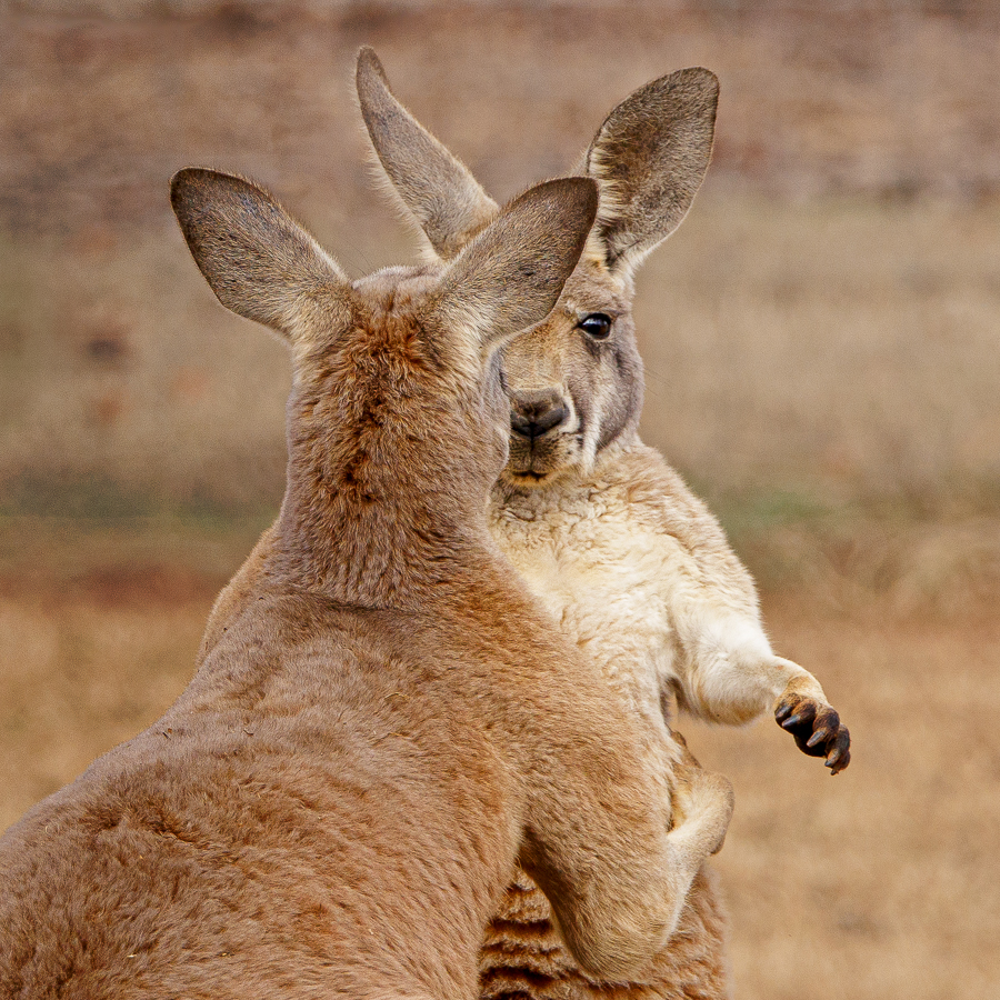
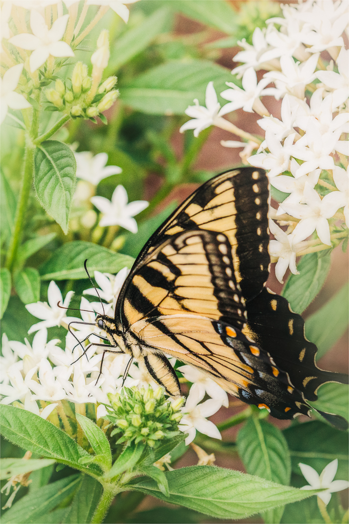
Comment |
Maria, I enjoy seeing your images and how you present wildlife creatively. The crop presents a nice angle of the plant which leads my eye to the moth and the soft background eliminates distraction from the moth. The delicate nature of the plant and the fragile life of moth works well together for me. Very nice image. |
Jun 19th |
| 72 |
Jun 24 |
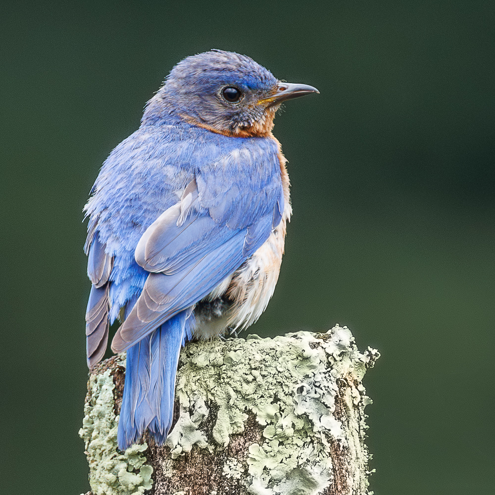
Comment |
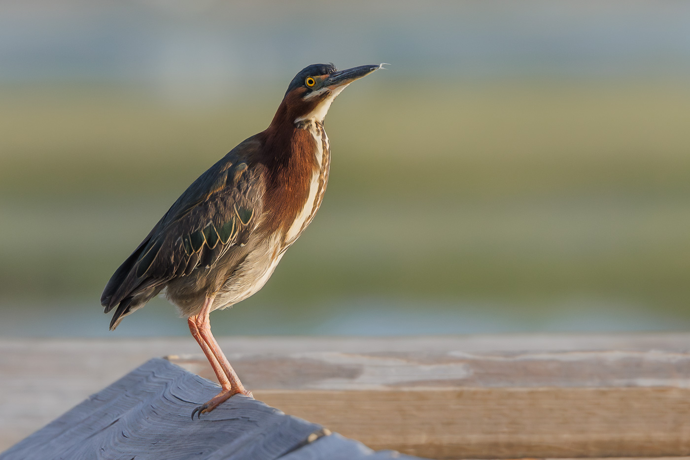
Very nice image Bruce. By making eye contact with the fox, it grabs my attention and makes the image more intimate for me. The image is sharp and the placement of the fox in the frame works. The background is a nice compliment to the fox. |
Jun 18th |
5 comments - 5 replies for Group 72
|
12 comments - 7 replies Total
|