|
| Group |
Round |
C/R |
Comment |
Date |
Image |
| 36 |
May 24 |
Reply |
Thanks Michael. I see your point about the sign. |
May 25th |
| 36 |
May 24 |
Reply |
Thanks for you comments Bill.
|
May 25th |
| 36 |
May 24 |
Reply |
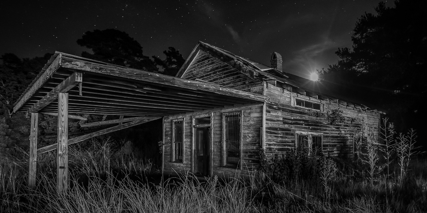
Thanks so much for commenting Butch. It's definitely a photographic building. I don't usually have time to scan other groups but will definitely start to do it.
|
May 25th |
| 36 |
May 24 |
Reply |
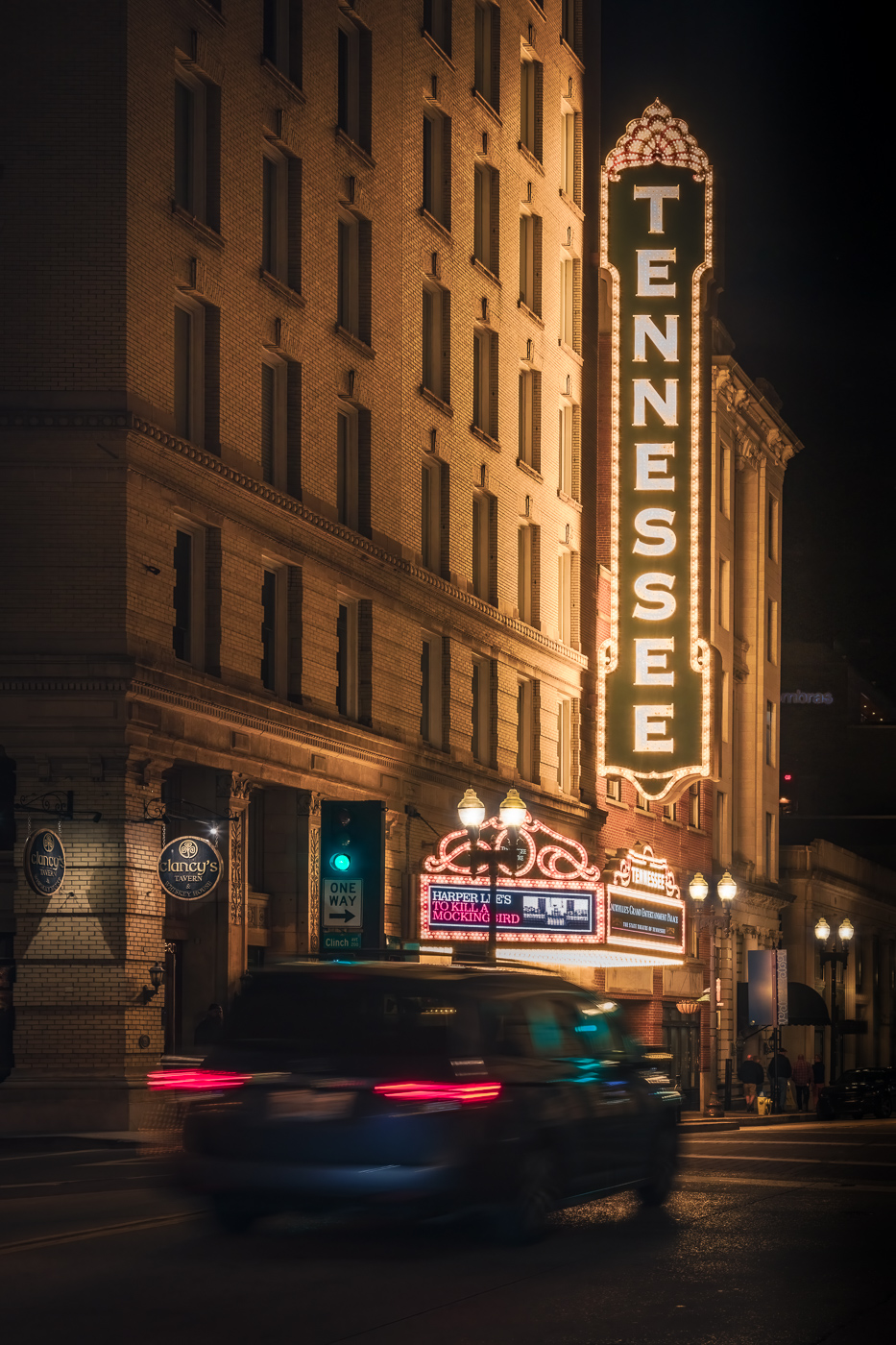
Thanks for your comments Larry. I do have photos of just the building however I wanted to vary the conditions a bit by adding the vehicle. |
May 25th |
| 36 |
May 24 |
Comment |
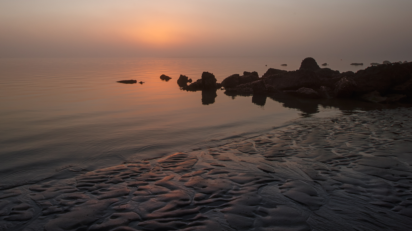
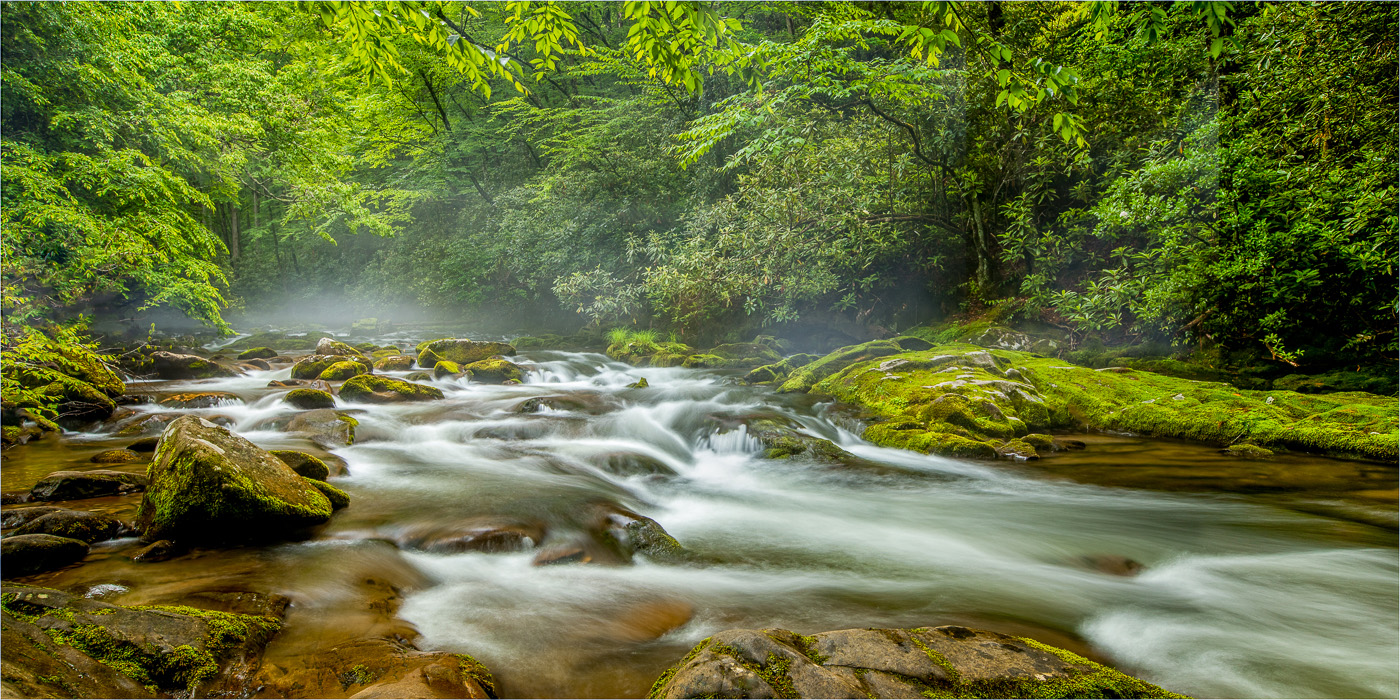
Adi, the image appears to be sharp and it's nicely composed. I did notice one person in the lower left corner (I think its a person). I don't believe it adds anything to the image. As others have mentioned the loss of detail in the silky water and shadows is noticeable but it doesn't distract me. I do find the overly bright falls against the vibrant bluish water a bit unnatural. BTW, I like your black and white version! Nice job capturing 3 different stories. |
May 24th |
| 36 |
May 24 |
Comment |
Nicely composed image Bill. The trees to the left and right of the church balance the height of the church. Good job removing some of the people/distractions. What catches my eye are the 2 people with the hats, the white sign, and the patch of white in the lower right corner. I would recommend removing. I don't see the over-sharpened church on my screen. |
May 24th |
| 36 |
May 24 |
Comment |
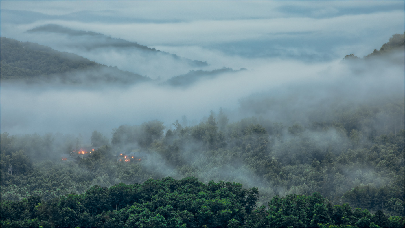
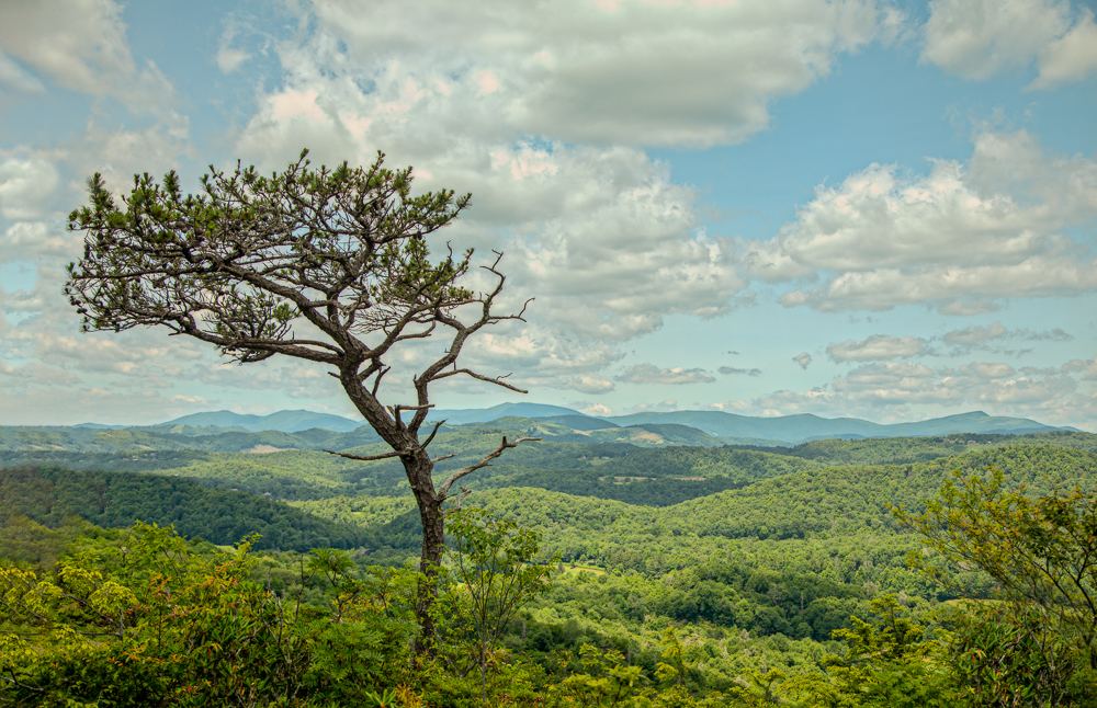
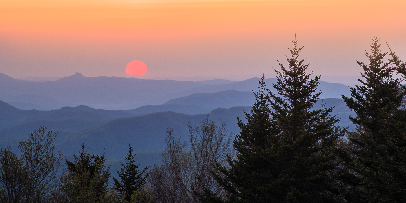
What a perfect view from your porch! I'm with Larry...when are we coming to visit lol. I love how the image is framed showing the valley and layers of mountains. The warm tones work nicely for me. Nice job. |
May 24th |
| 36 |
May 24 |
Comment |
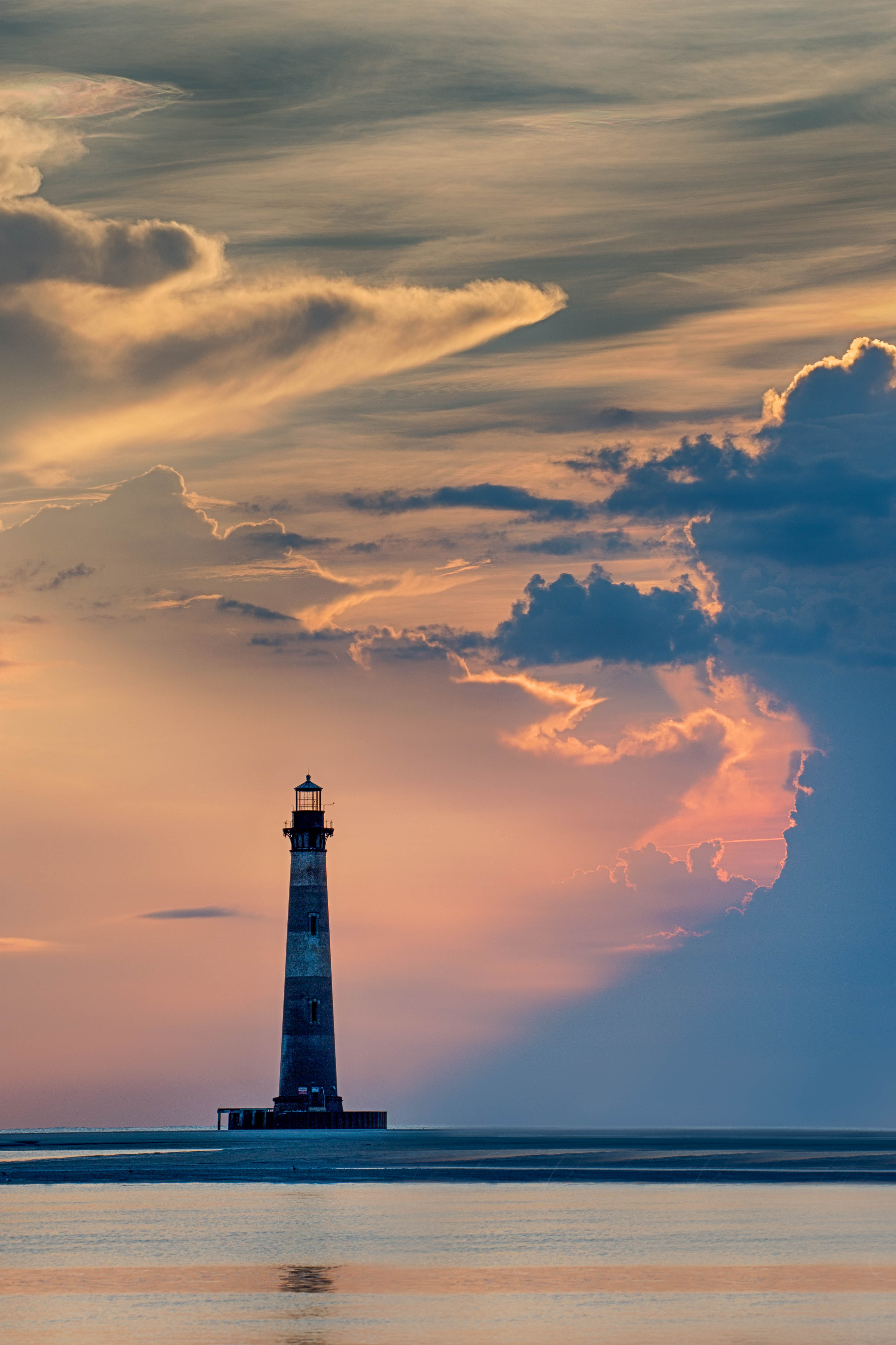
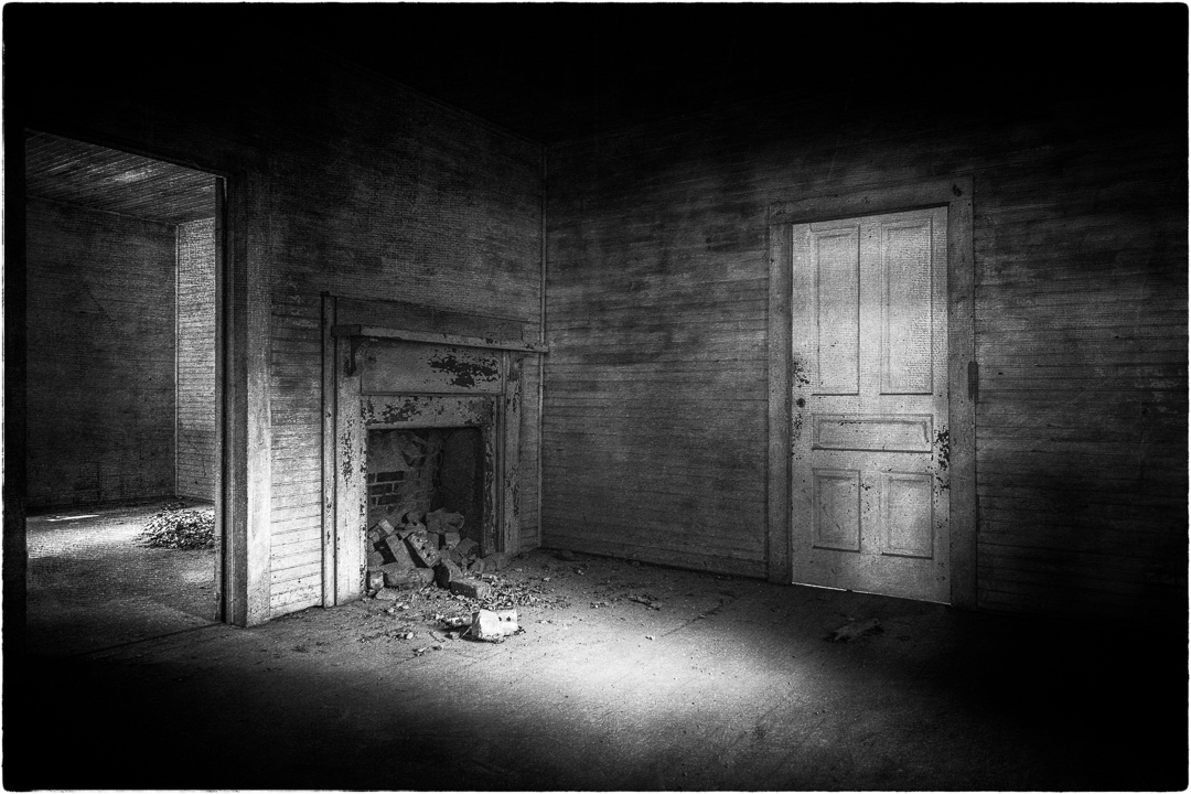
What a great image. There is so much depth in this image and the lone photographer adds a nice sense of size and grandeur. Very nice B/W. |
May 24th |
| 36 |
May 24 |
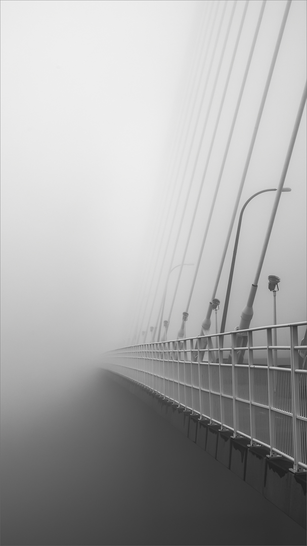
Comment |
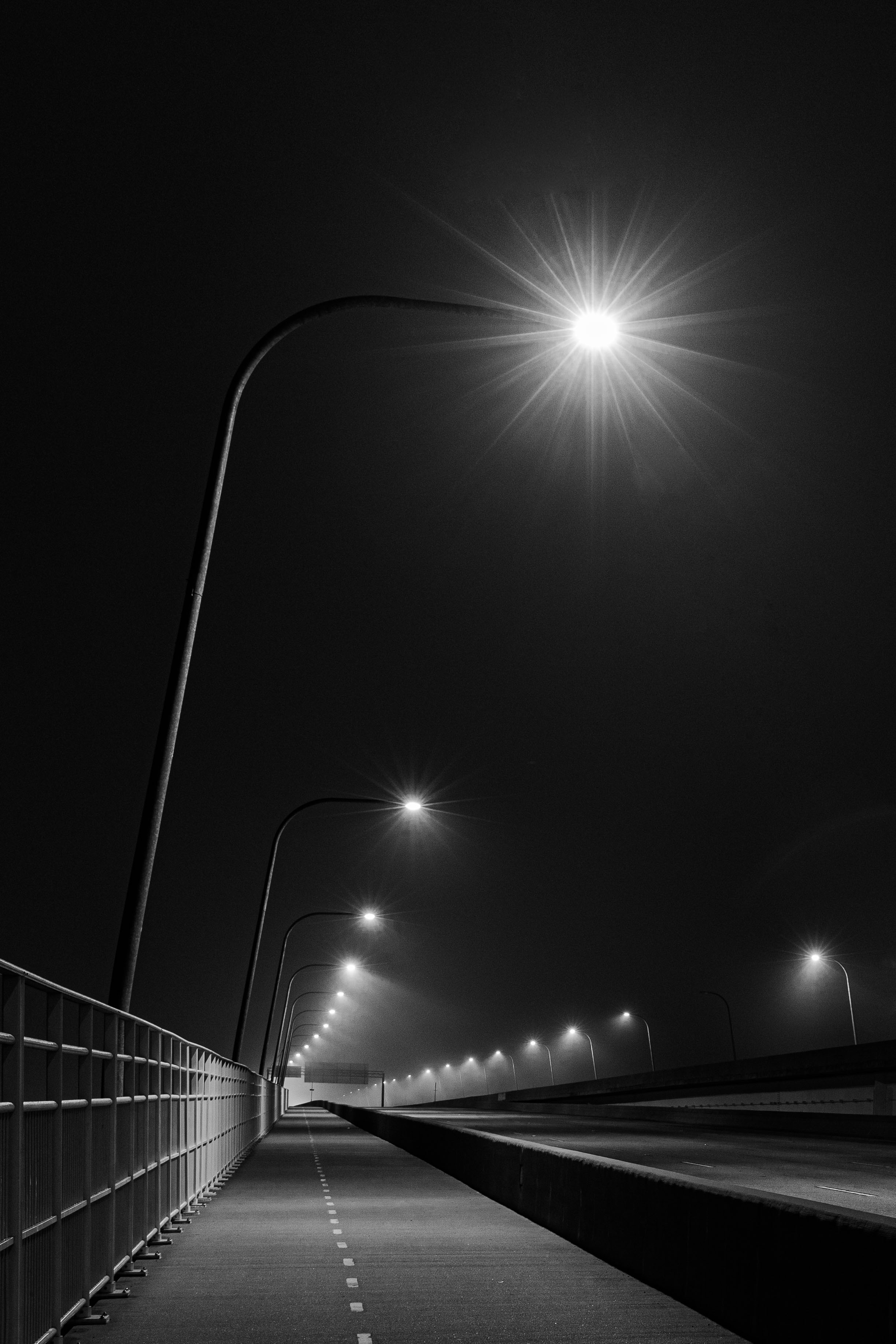
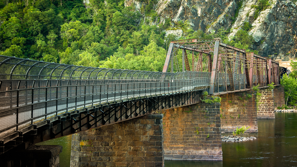
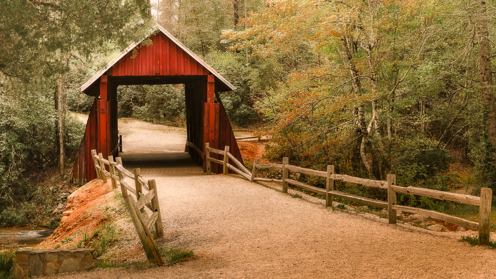
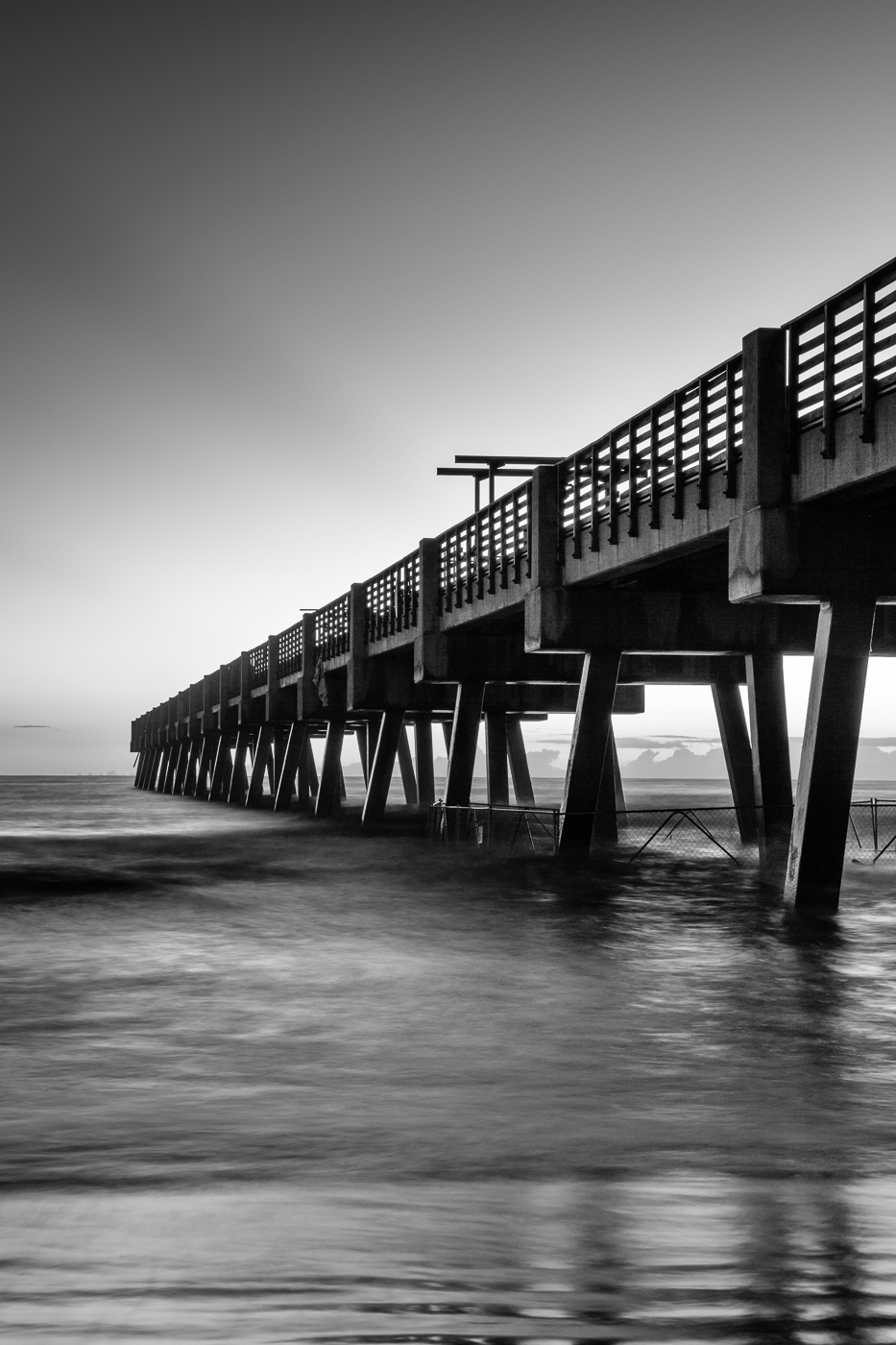
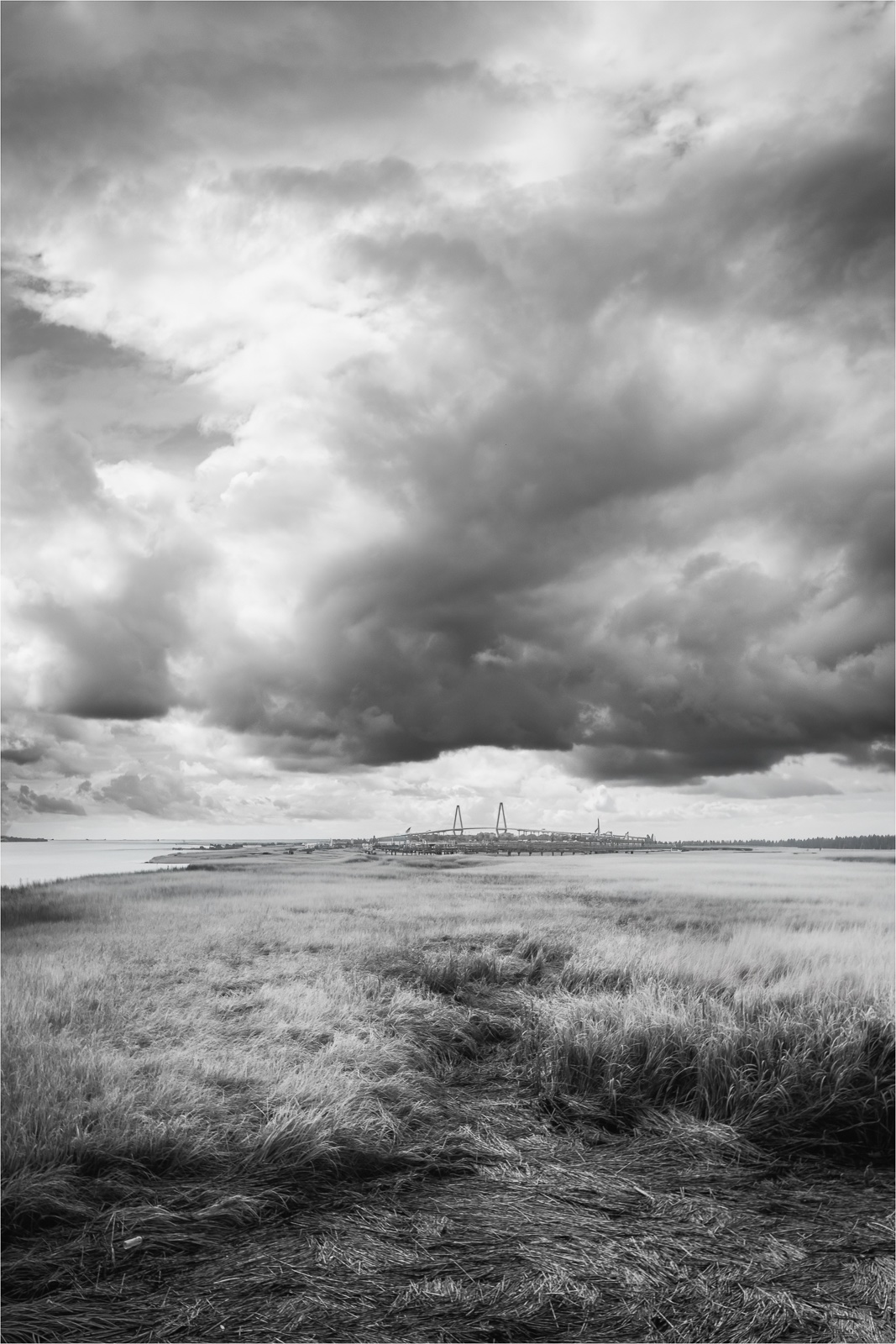
Well, since I live in NC this is a must on my to do list! Your homework worked out. The quality of light worked out well leaving a soft warm glow on the bridge. I like how you positioned the bridge in the frame as it does show the massive length well. My only suggestion is to crop up a little from the bottom so the beginning of the fence is in the left lower corner and it leads the eye to the bridge. Very nice. |
May 24th |
5 comments - 4 replies for Group 36
|
| 72 |
May 24 |
Reply |
Thanks for your comments Chris! |
May 24th |
| 72 |
May 24 |
Reply |
Thanks for your square crop suggestion Bruce. I plan to relook at the crop to see what works and is more balanced.
|
May 24th |
| 72 |
May 24 |
Reply |
Thanks for your feedback Maria. I'm going to relook at the crop and find a good balance. |
May 24th |
| 72 |
May 24 |
Reply |
Thanks for your feedback Isaac. I tend to agree the image needs to be cropped a bit so I will relook at it to find a more balanced crop. |
May 24th |
| 72 |
May 24 |
Comment |
Isaac, I don't think I ever saw a soft shell turtle up close. Thanks for sharing. The perspective is great allowing me to see the interesting nose and eyes. The green leaf is a bit distracting to me but it is part of the environment. Nice job. |
May 24th |
| 72 |
May 24 |
Comment |
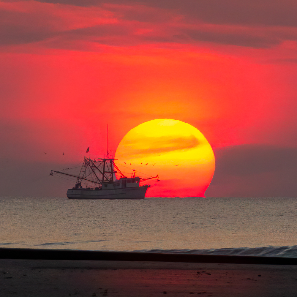
What a great experience Adrian. As everyone mentioned the addition of the splash adds strength to the image. The more dolphins in an image the better, so for me, I'm drawn to the original as it tells more of the story. |
May 24th |
| 72 |
May 24 |
Comment |
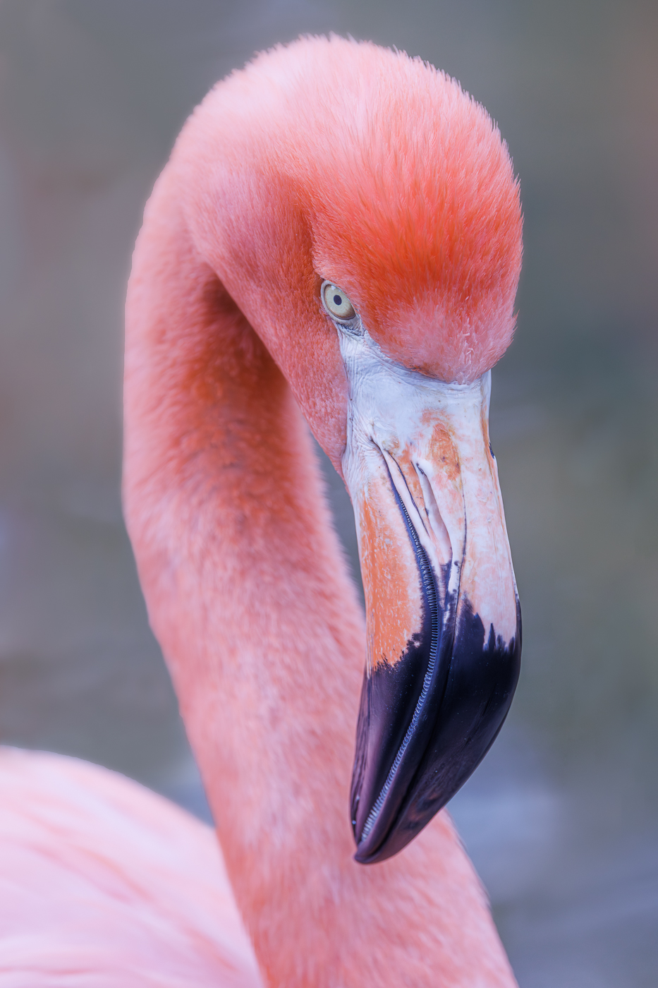
Hi Leah. Trying to get a clean background in a nursery is challenging. You did a good job with the f3.2. The Iris colors appear natural and not oversaturated. The exposure seems to be well balanced however the bright pedal looks like clipped highlights. Regarding DOF, focus stacking will provide deeper DOF but a shallow DOF or selective focus is creative and beautiful also.
|
May 24th |
| 72 |
May 24 |
Comment |
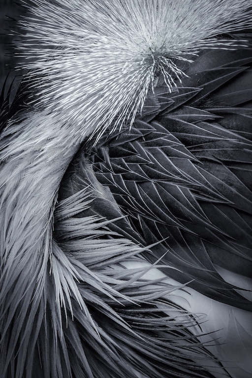
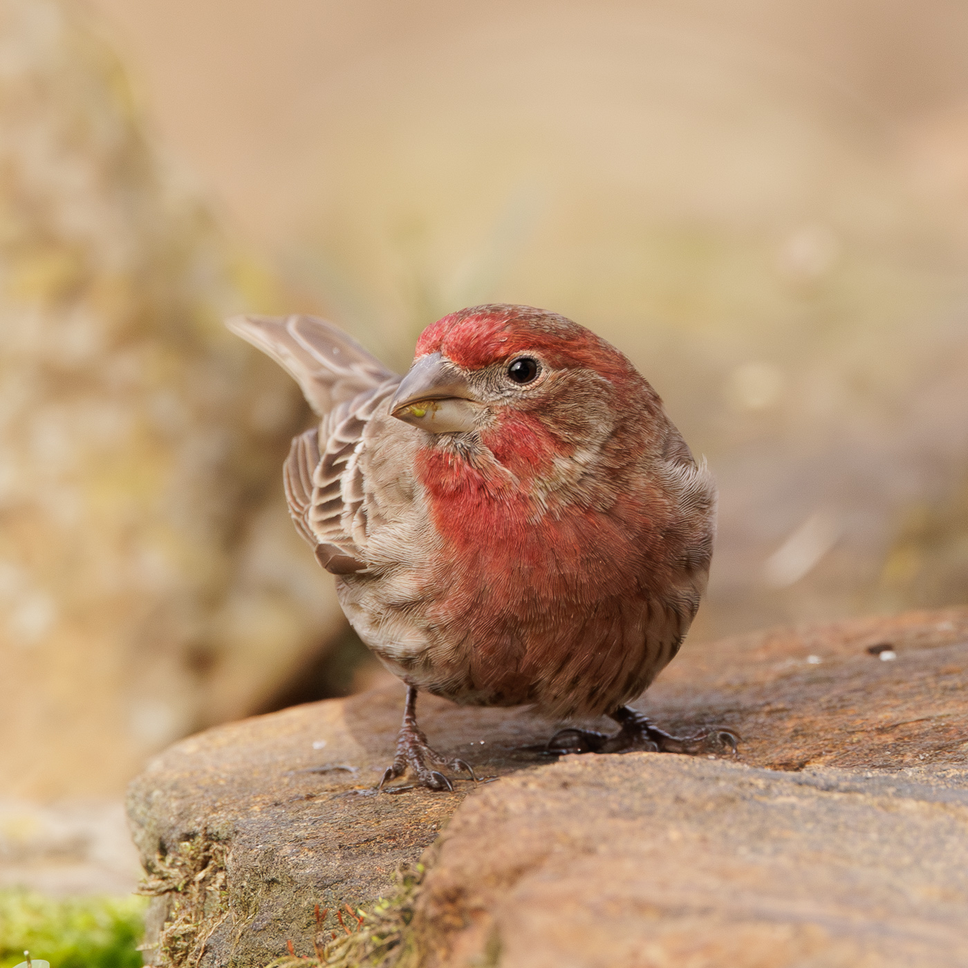
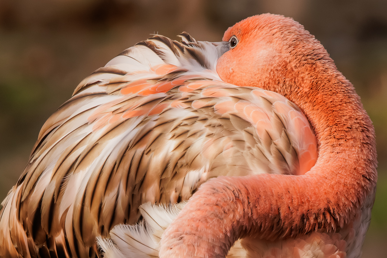
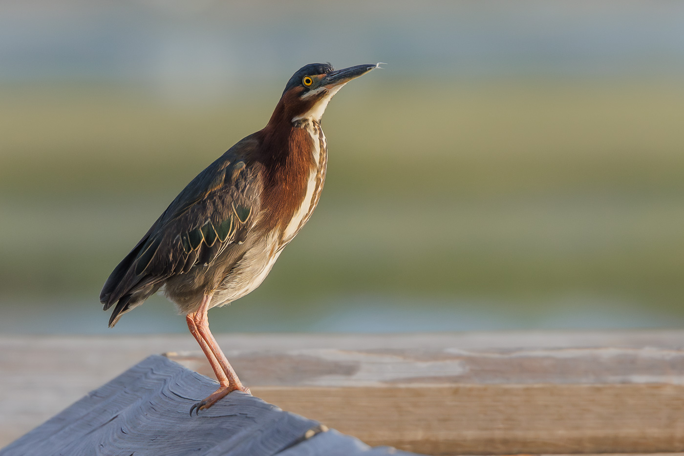
Hi Chris and welcome to the group. The beautiful blue feathers have great texture and sharp eye keeps my attention. The image is nicely exposed. The background is clean and pleasing to the eye and the tight crop gives the image an artistic feel.
For me, when I see colorful images, a warm red color typically stands out in an image and draws attention while the cooler tones recede. So, for me, if only one parrot could be in focus I would lean towards the red one. Nice job.
|
May 24th |
| 72 |
May 24 |
Comment |
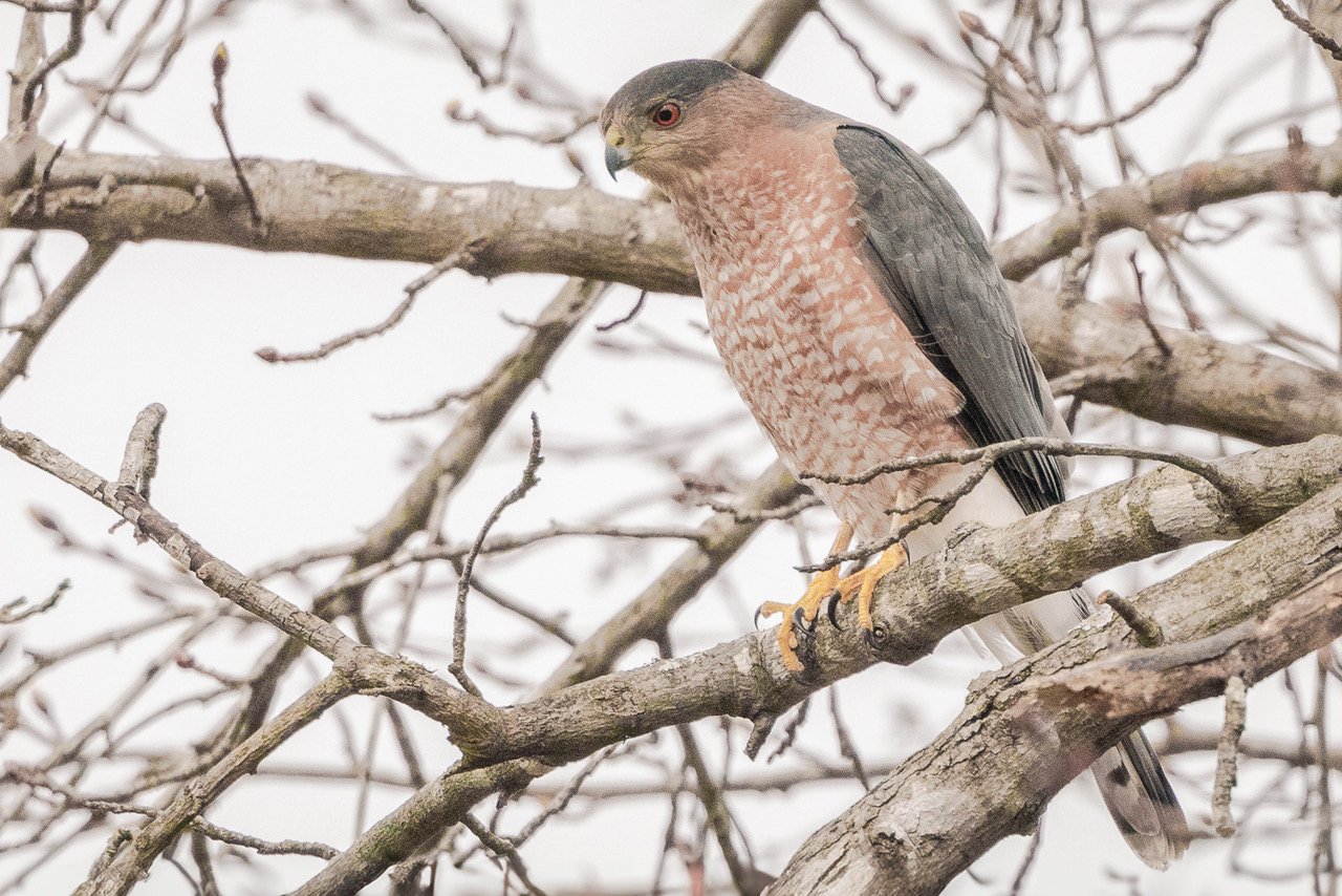
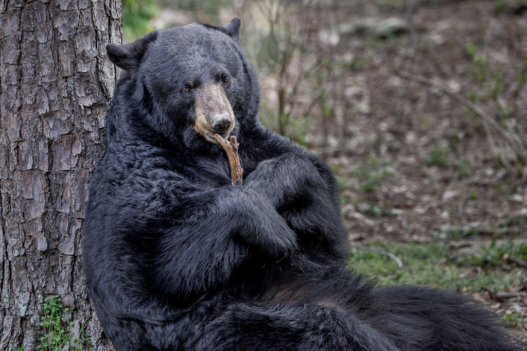
Maria, what a cool looking creature especially in this position. Thanks for sharing. My eye was immediately drawn to the bright background then to the long, sharp, curved claws clutching the branch. I agree with the others about lightening the eyes and brightening the face to make it a stronger visual focal point. |
May 24th |
| 72 |
May 24 |
Comment |
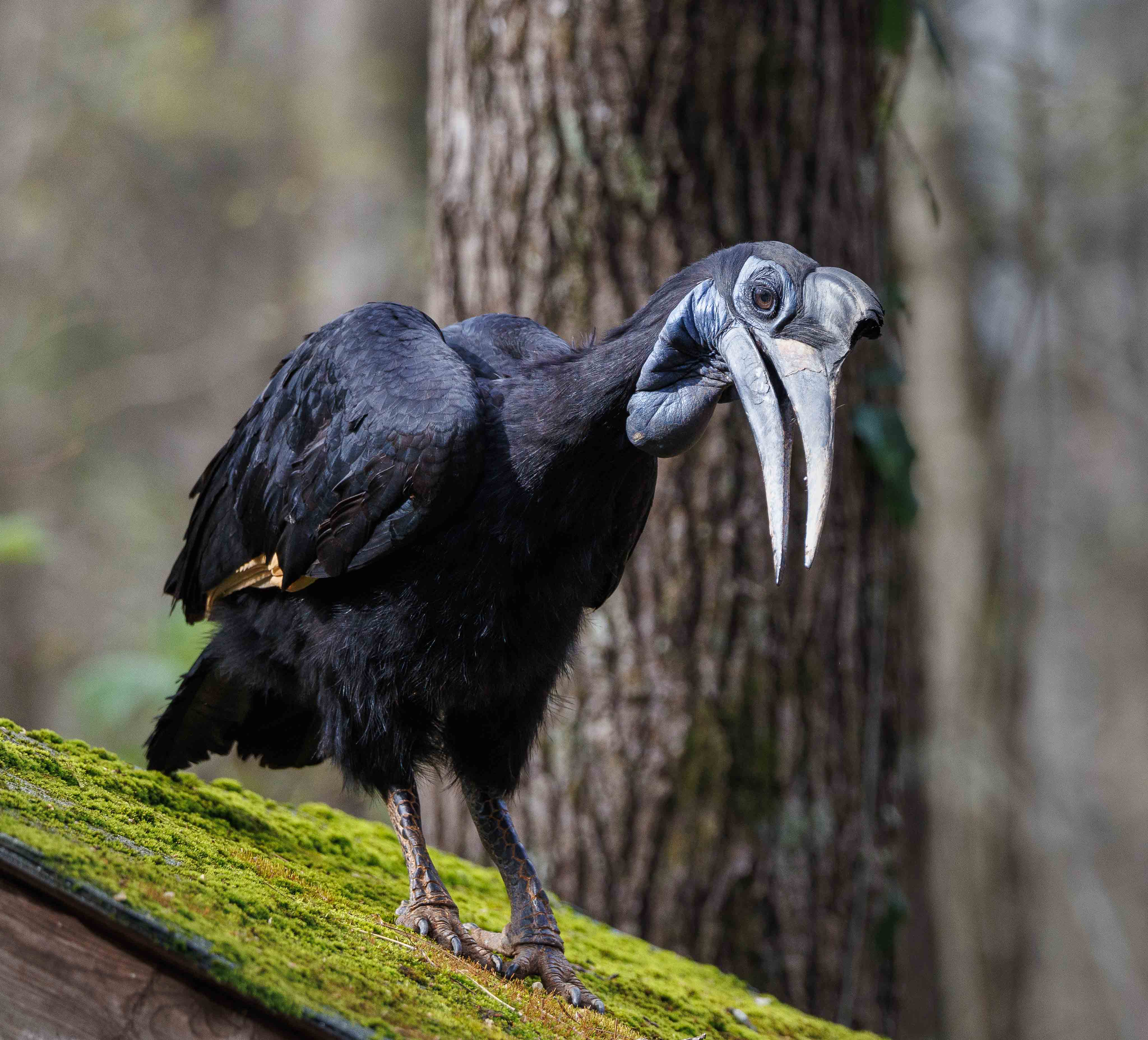
Very nice image Bruce. The eye is sharp with a nice catch light. The point of view allows the viewer to have a face to face interaction with the Cara Cara. The soft out of focus background and foreground is appealing. |
May 21st |
6 comments - 4 replies for Group 72
|
11 comments - 8 replies Total
|