|
| Group |
Round |
C/R |
Comment |
Date |
Image |
| 36 |
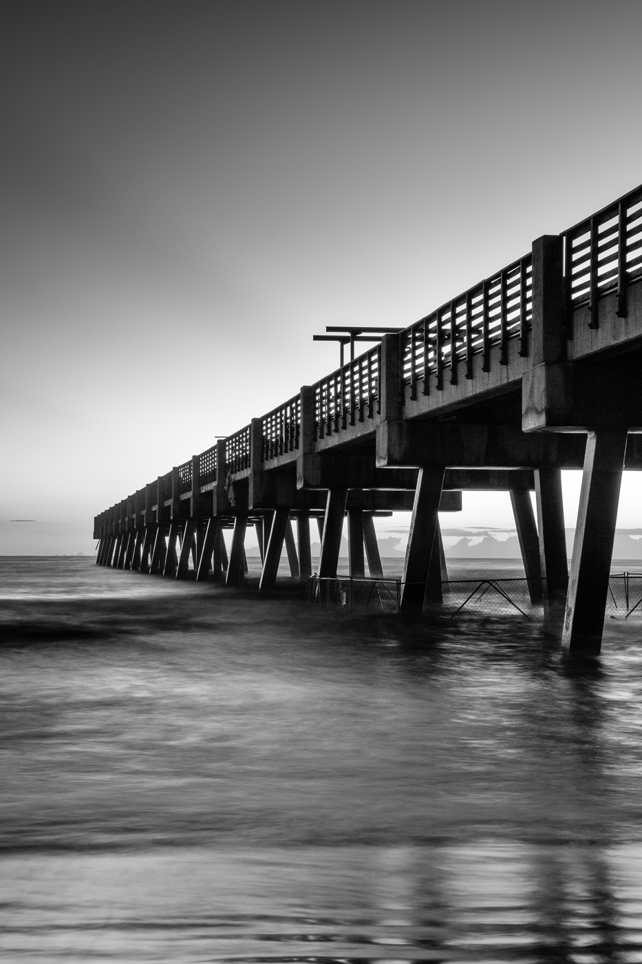
Aug 23 |
Reply |
Thanks Arne! |
Aug 24th |
| 36 |
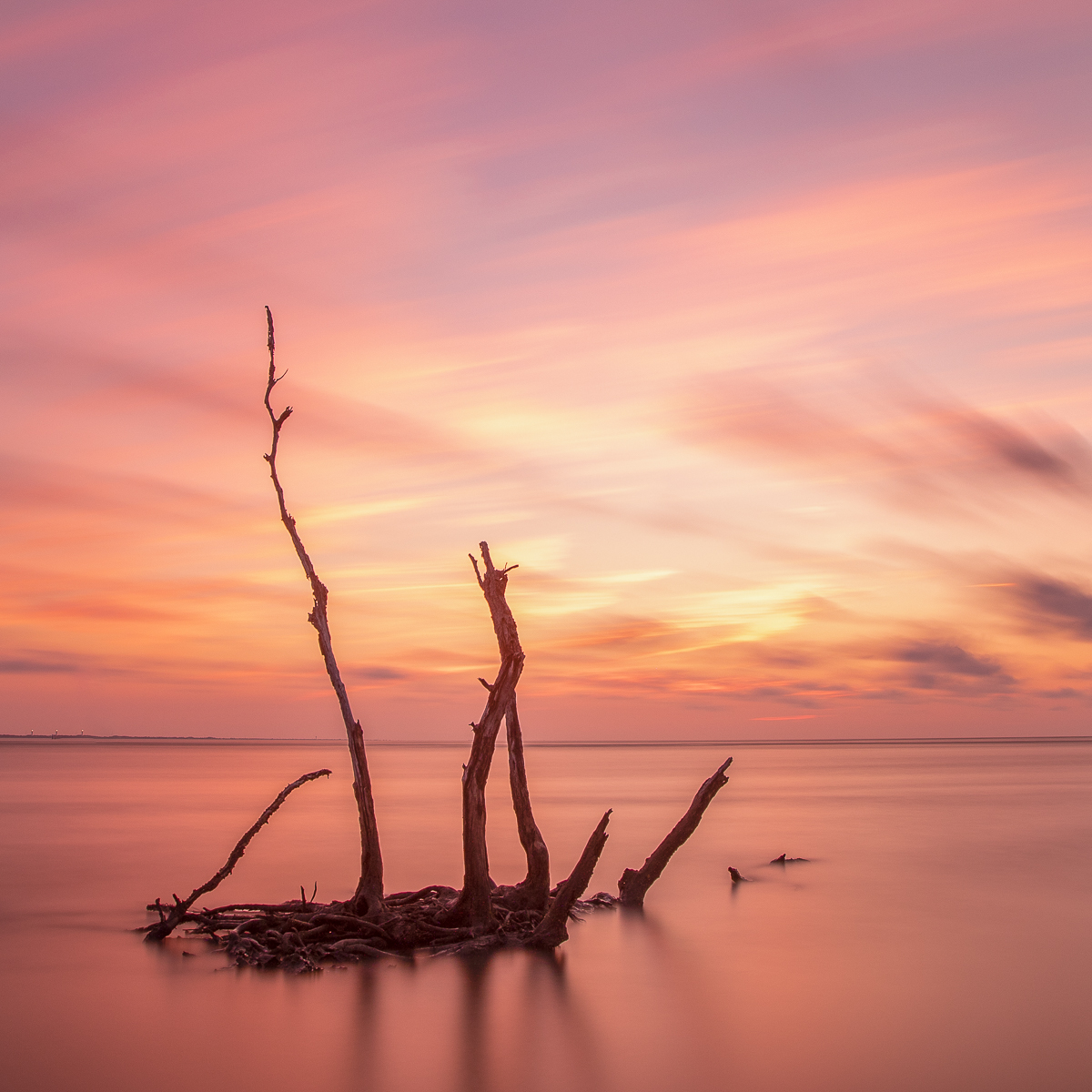
Aug 23 |
Reply |
Thanks Adi. I do like longer exposures but in this instance I wanted a bit more shape in the waves. |
Aug 24th |
| 36 |
Aug 23 |
Reply |
Many thanks Michael. |
Aug 24th |
| 36 |
Aug 23 |
Reply |
Thanks Larry. Much appreciated. |
Aug 24th |
| 36 |
Aug 23 |
Reply |
Hi Adi, I guess you can say rotated because you're correcting the distorted vertical or horizontal perspective. The first thing I do is a lens correction and then perspective correction with the auto function or guided function as needed. Hope this makes sense. |
Aug 24th |
| 36 |
Aug 23 |
Reply |
Hi Adi, I guess you can say rotated because you're correcting the distorted vertical or horizontal perspective. The first thing I do is a lens correction and then perspective correction with the auto function or guided function as needed. Hope this makes sense. |
Aug 24th |
| 36 |
Aug 23 |
Reply |
I just used the geometry panel in PS camera raw for a quick edit. If auto in the geometry panel doesn't work then I manually adjust. Sometimes I will also make the image a smart object and then go to the filter panel and lens correction to modify but I find that the geometry panel works very well. |
Aug 16th |
| 36 |
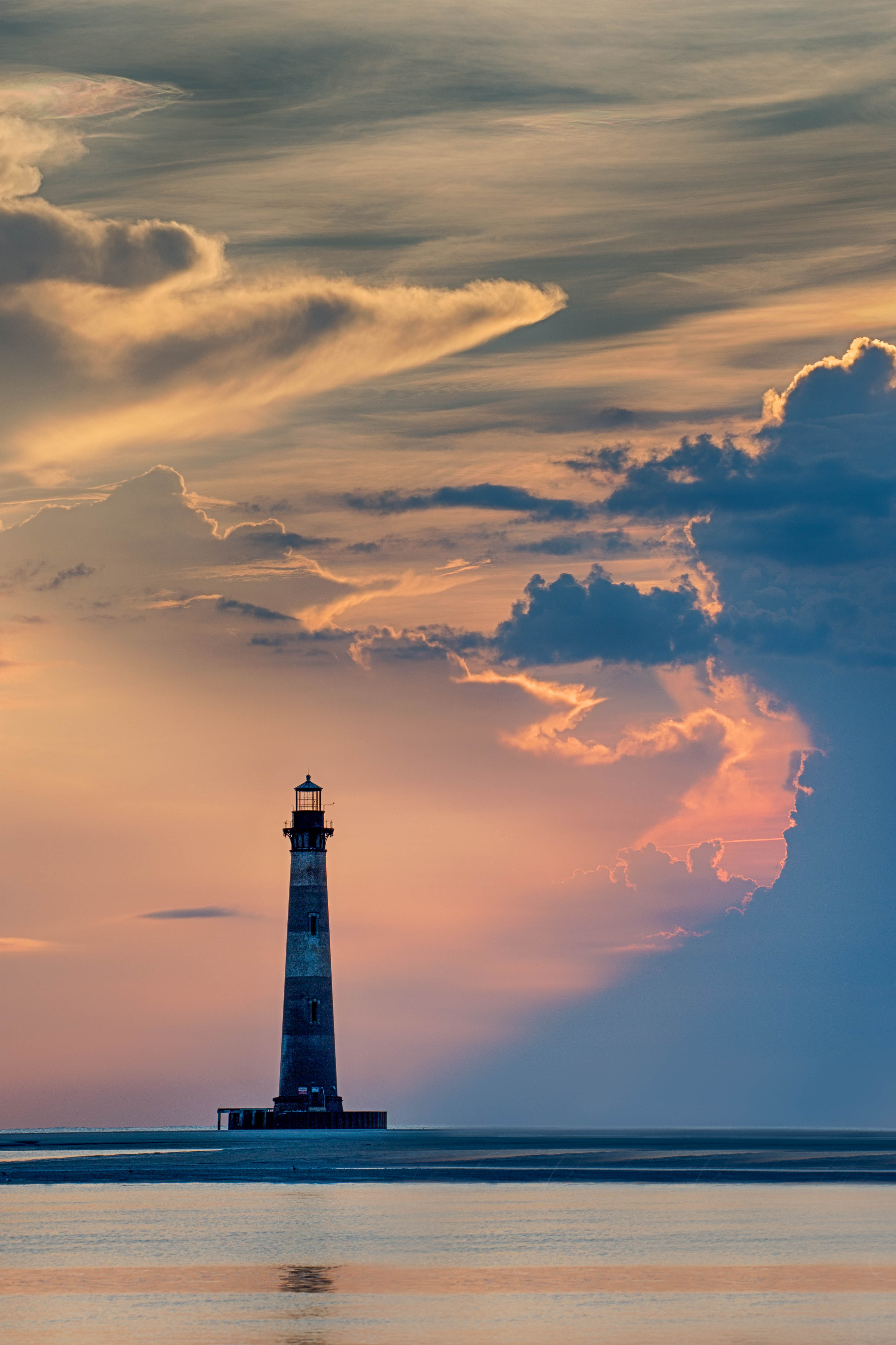
Aug 23 |
Comment |
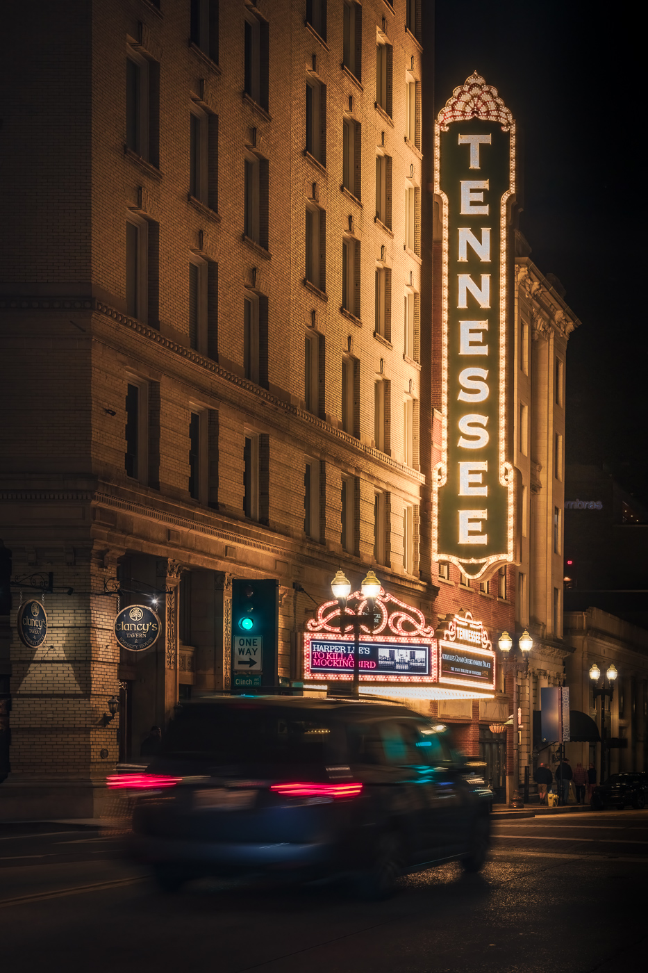
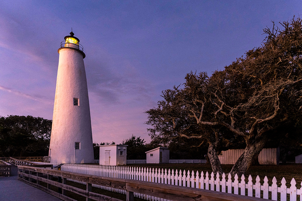
Adi, nice image. Good job with framing the subject without the bikes and lawn furniture. The leading line of the fence works nicely and brings the eye to the lighthouse. The lighting is soft and works well with this image. My only recommendation would be to correct the distortion in the fence. I wanted to see how a perspective adjustment would effect the image so I did a quick edit. Just a thought.. |
Aug 16th |
 |
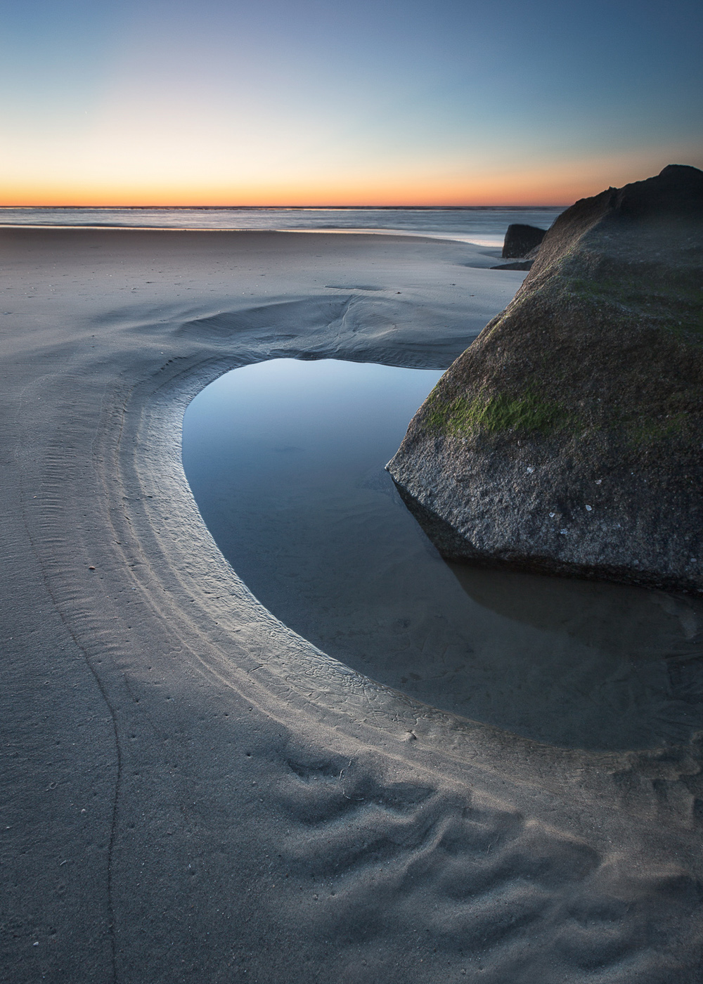
| 36 |
Aug 23 |
Comment |
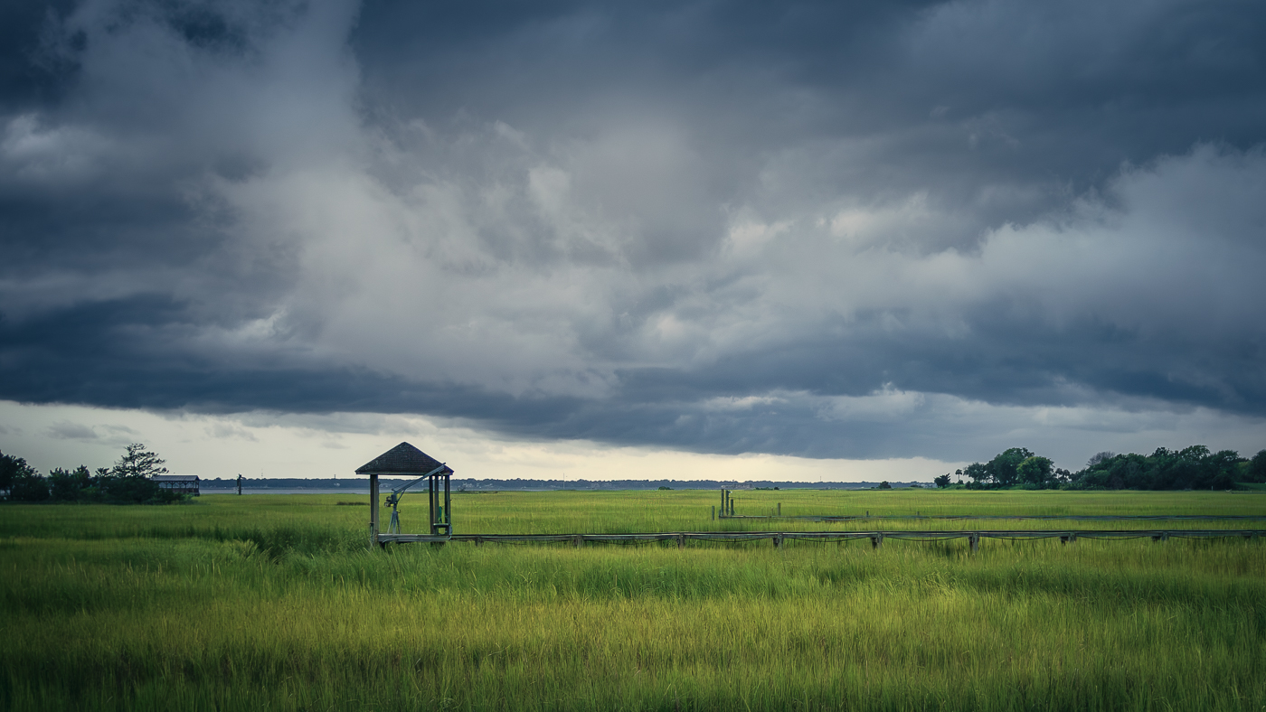
Kudos to you for taking the time before work to capture this image. It was a good idea to expose for the sky and the land then blend in post. The framing creates a nice window and creates depth. Not sure about the building and whether it adds anything to the scene. Regarding the sky, there is a lot of pretty sky but there may be too much as the other's suggested. However if this is square crop and you crop the sky you will lose some of the natural frame which helps to keep the eye focused in the center and is key to the image. Also, great job in post. |
Aug 16th |
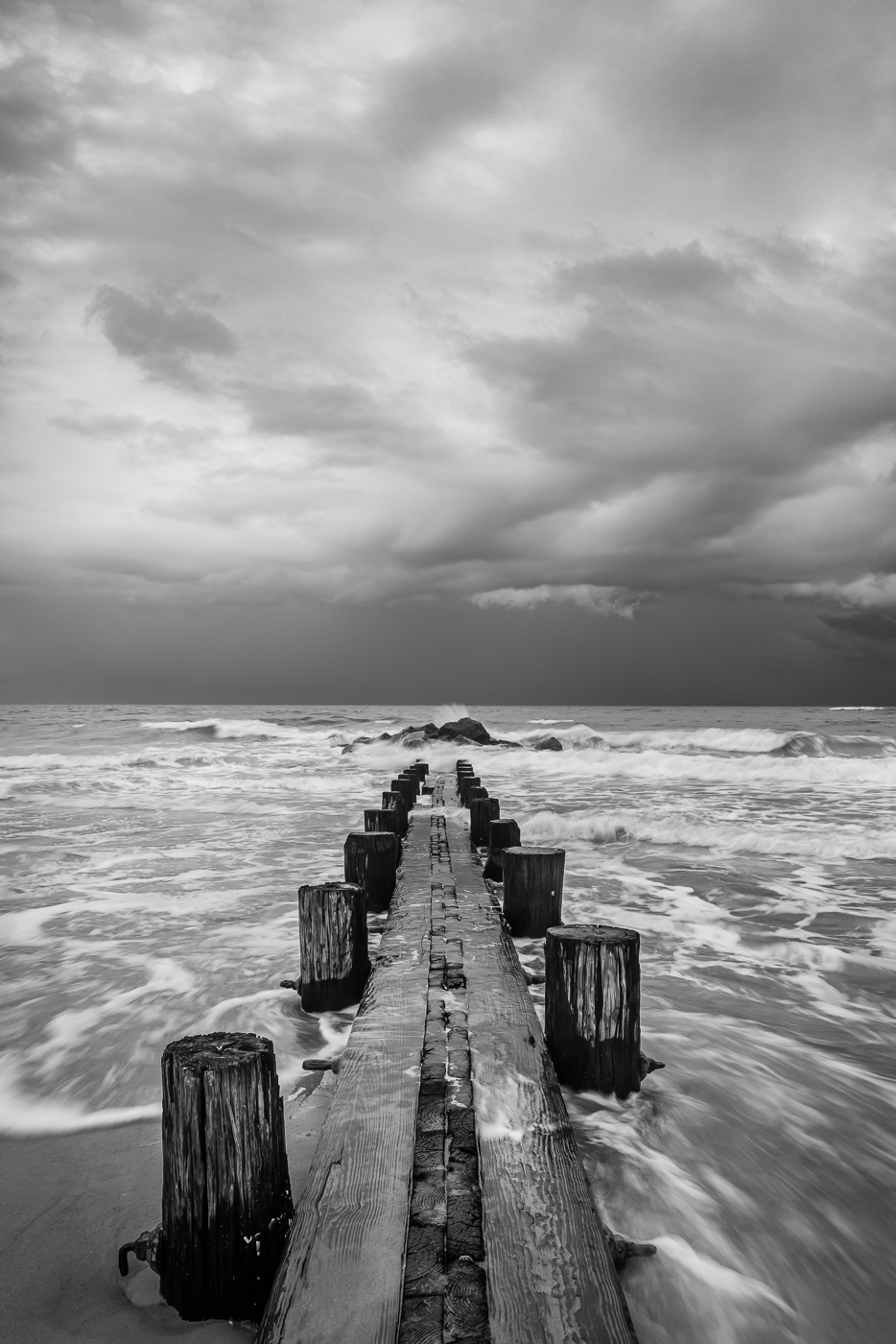
| 36 |
Aug 23 |
Comment |
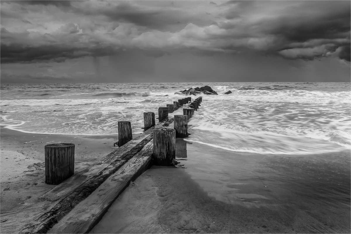
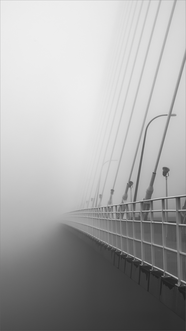
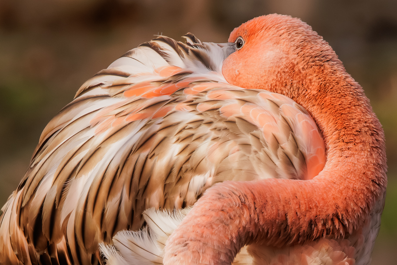
Another winner. I particularly like this one as there is a lot of empty space around the rock which makes it really stand out in all its grandeur. The dark cloudy sky with just a kiss of light on the rock creates a nice moody image. On my screen I'm seeing a slight halo around the edges of the rock. Other than that, beautiful image and definitely a triptych! |
Aug 16th |
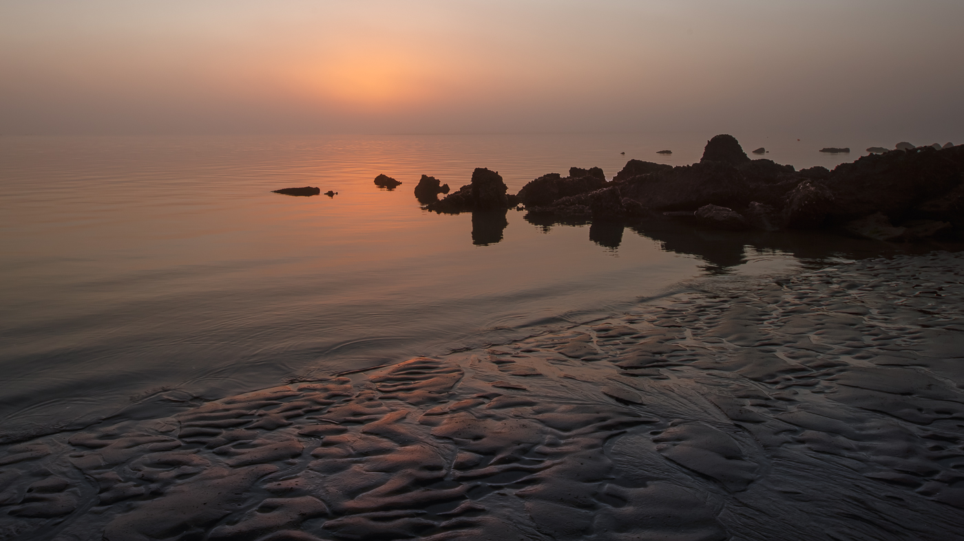
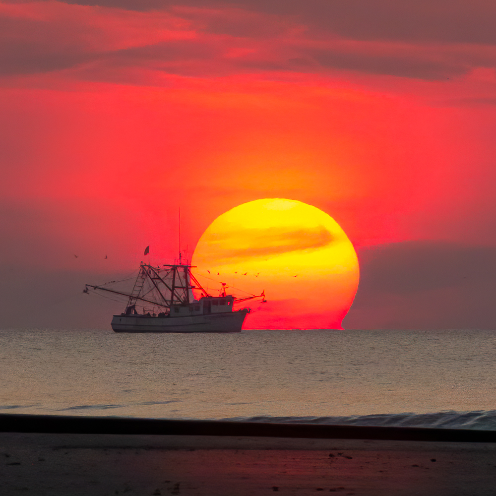
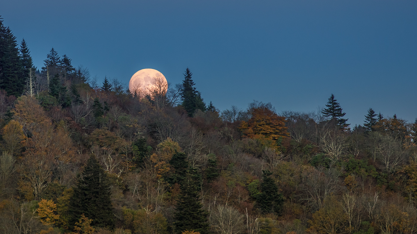
| 36 |
Aug 23 |
Comment |
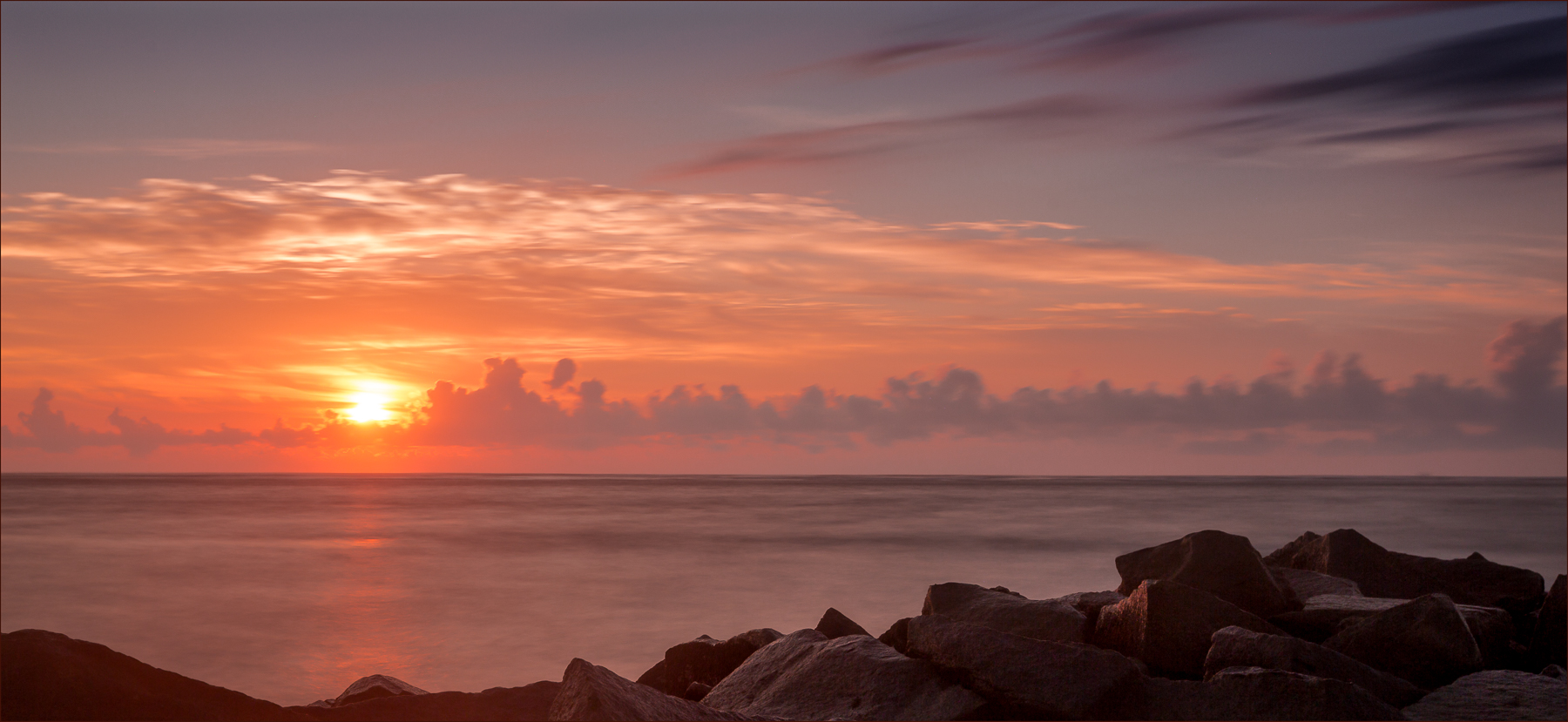
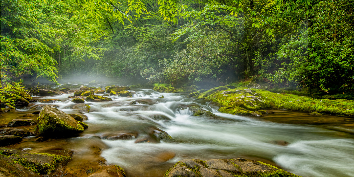
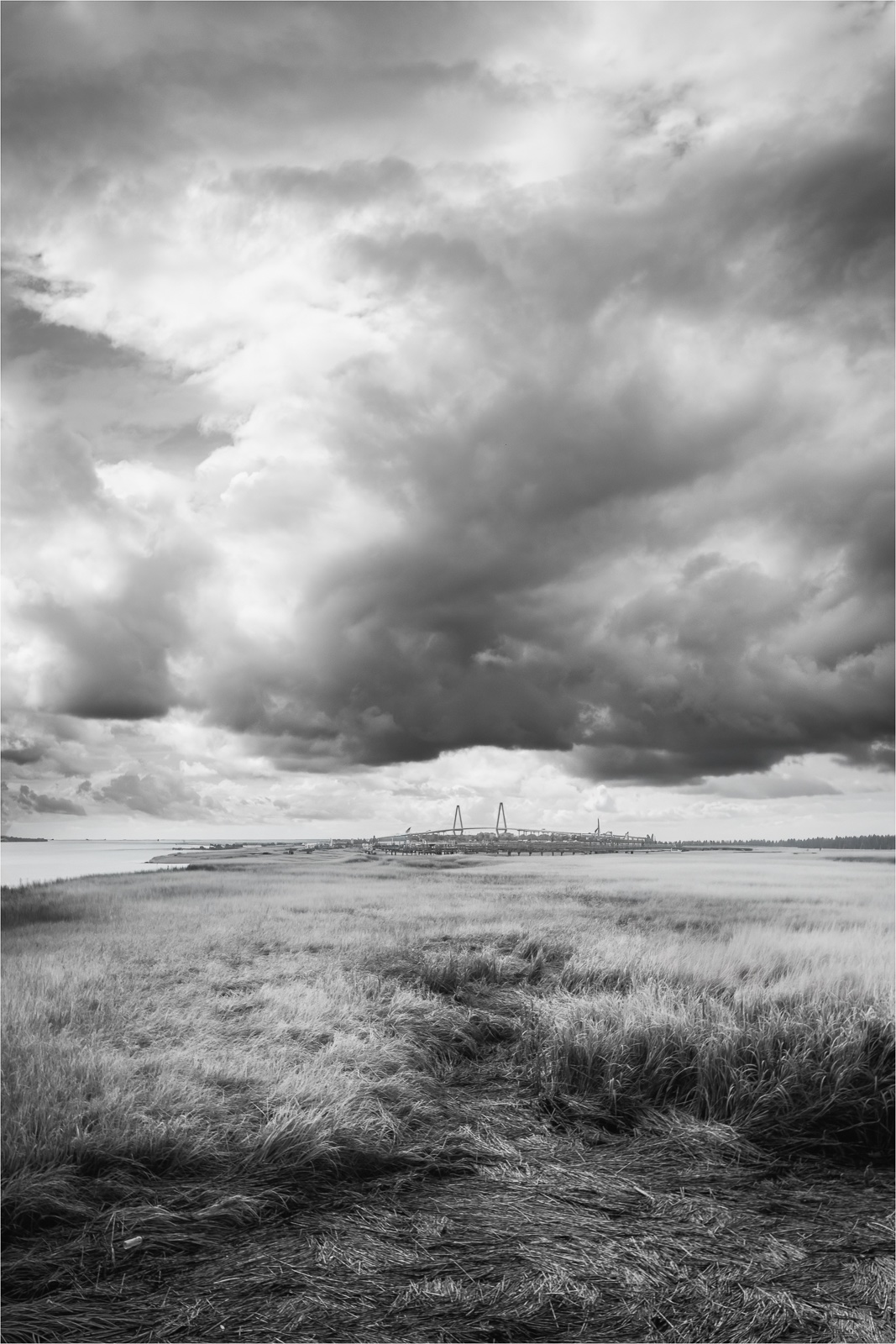
Brrr...great photo. Nice texture in the foreground snow and the use of the line that leads from the left side of the frame to the lighthouse. Well composed. The color contrast between the sky and the lighthouse makes the scene pop. |
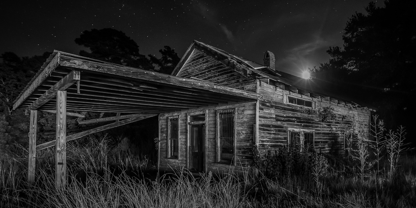
Aug 16th |
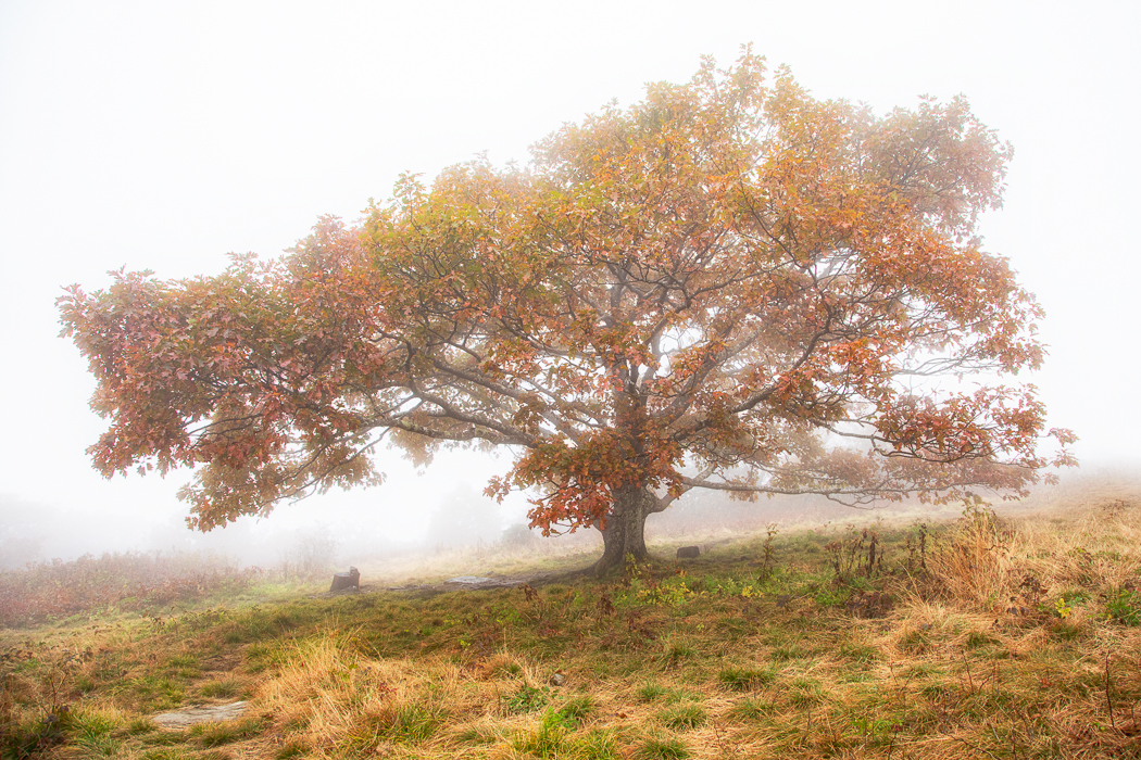
| 36 |
Aug 23 |
Comment |
The best thing about shooting in the winter is the early sunsets! I like how the snow lines the foreground and takes you right to the lighthouse. The colors of the sky and water scream COLD! What perfect timing to get the beacon light as it adds a nice touch as daylight ends. Very nice! |
Aug 11th |
5 comments - 7 replies for Group 36
|
| 72 |
Aug 23 |
Reply |
Thanks Adrian. I'm trying to create a muted green preset with pop so this feedback is good. |
Aug 11th |
| 72 |
Aug 23 |
Reply |
Thanks for the feedback Bruce.
|
Aug 11th |
| 72 |
Aug 23 |
Reply |
Thanks Marie. I agree the grass is a bit flat. I'm working to create a muted green preset so this is good feedback. |
Aug 11th |
| 72 |
Aug 23 |
Reply |
Thanks Isaac. I appreciate hearing the feedback about the grass. I'm working to create a muted green preset with pop as I prefer this shade of green overall. |
Aug 11th |
| 72 |
Aug 23 |
Comment |
Such a wonderful location to photograph and nice image. I like the composition with the road and the position of the 3 stone pillars. The color palette is also nice. For me, I find the position of the large rock to the right a bit distracting. I agree with the others about the brightness. |
Aug 11th |
| 72 |
Aug 23 |
Comment |
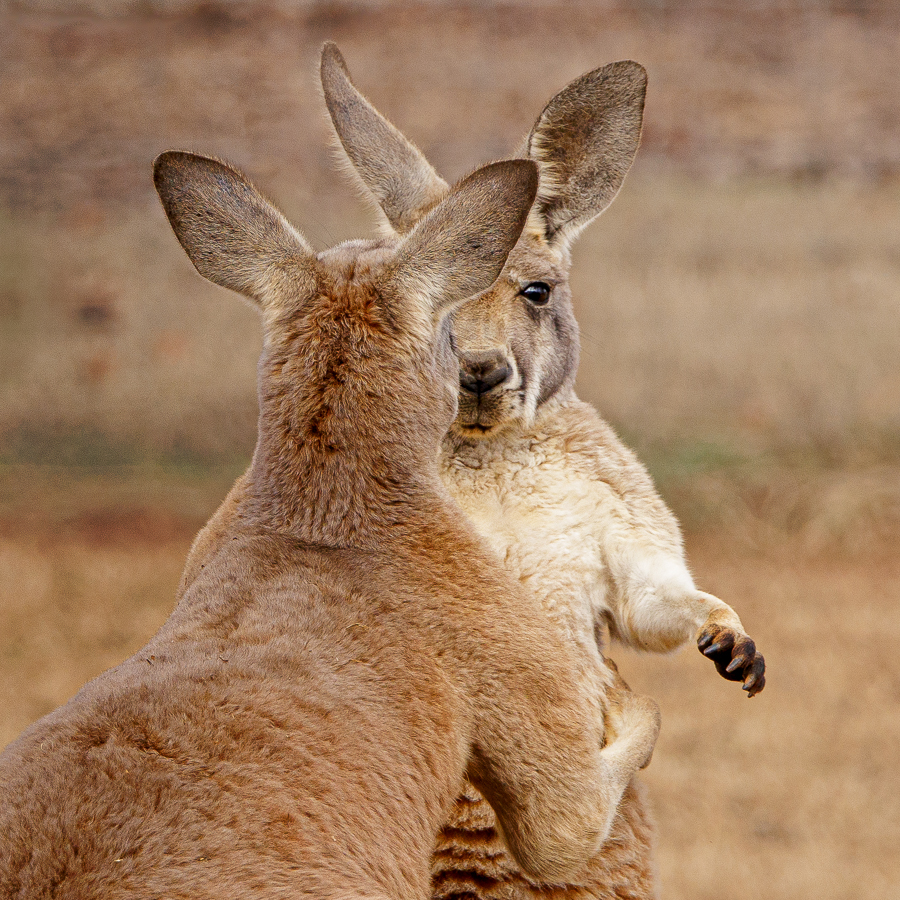
Very nice. One of my favorite things about baboons are their eyes. They are always so intense. Bruce's recommendation to brighten them is good. I would recommend adding a radial gradient to darken some of the background and help the baboon stand out from all the brush. |
Aug 11th |
| 72 |
Aug 23 |
Comment |
Marie. Have fun with your Z8. I'm a Canon shooter so I was excited when I got my R5. The bright sun weakens the color so increasing the saturation is recommended. As far as the crop, I like both Isaac's tighter crop and your crop with the 3 flower heads. Which one is more impactful? Probably the tighter crop as it gives the attention to the bee. |
Aug 11th |
| 72 |
Aug 23 |
Comment |
Great image. Nice color, sharpness, and reflection. As others have mentioned I would also recommend cropping in to make the fish more prominent. |
Aug 11th |
| 72 |
Aug 23 |
Comment |
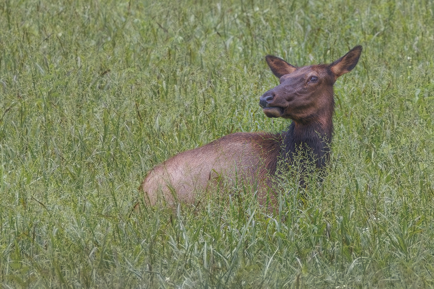
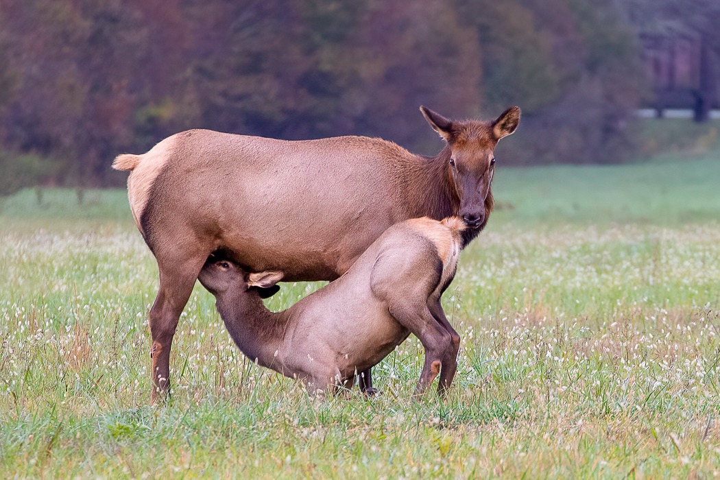
As humans we've taken over most of the world's land causing the wilderness to shrink and forcing wild animals to roan in cities. As much as I love seeing these beautiful creatures up close, their well-being is more important. People don't realize how much stress it can cause an animal when you get too close. However this Elk doesn't seem to mind the crowd as he struts along the road. Nice capture. |
Aug 11th |
5 comments - 4 replies for Group 72
|
10 comments - 11 replies Total
|