|
| Group |
Round |
C/R |
Comment |
Date |
Image |
| 36 |
Jul 23 |
Reply |
Thank you Arne. |
Jul 23rd |
| 36 |
Jul 23 |
Reply |
Thanks for the feedback Bill. |
Jul 23rd |
| 36 |
Jul 23 |
Reply |
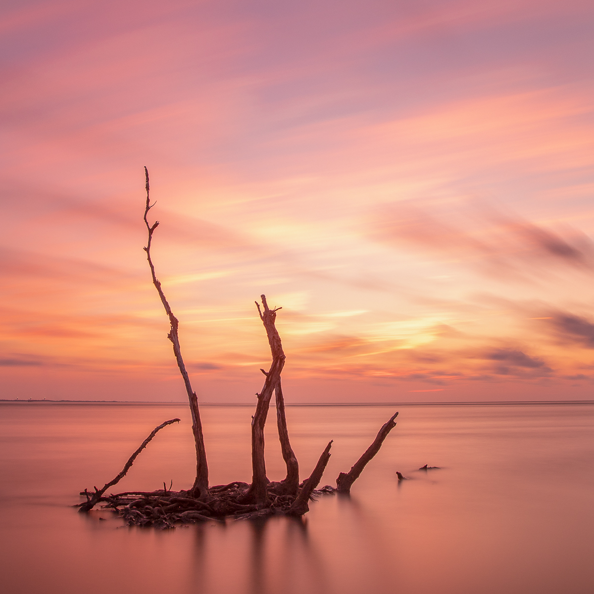
Thanks for your thoughts Diane. I see what you're saying about the diagonal line. There are definitely images when I start the line from the corner. However for landscapes I try not to place the line directly in the corner as it feels too designed to me. The natural glow of the sun is what attracted me to this image so I would be hesitant to increase the color saturation. I will relook at the image and see what a bump in saturation does to the image feeling. |
Jul 23rd |
| 36 |
Jul 23 |
Reply |
Thanks Michael. Appreciate your feedback. |
Jul 23rd |
| 36 |
Jul 23 |
Reply |
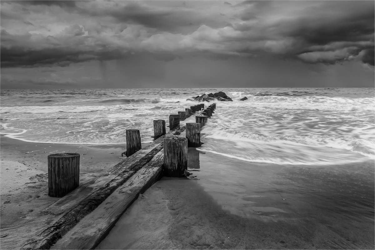
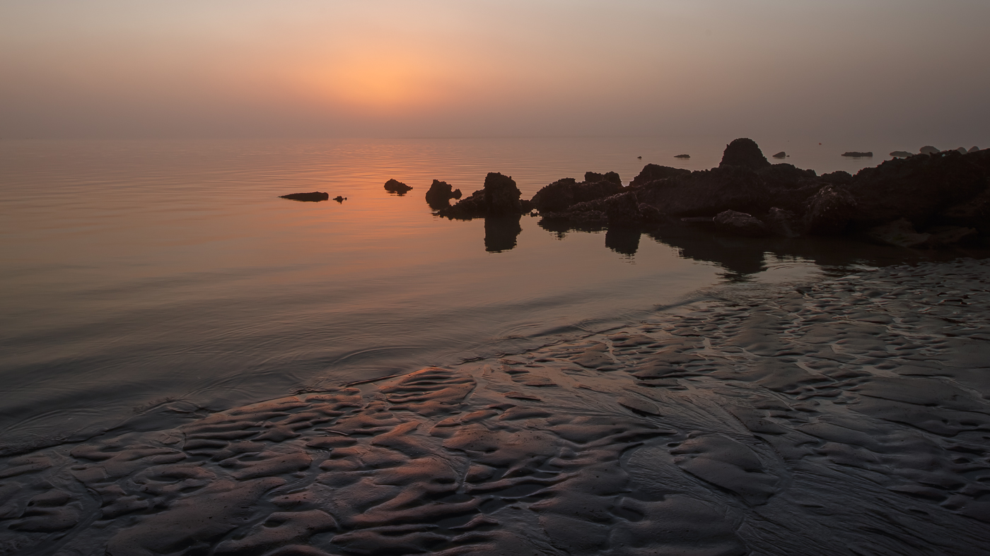
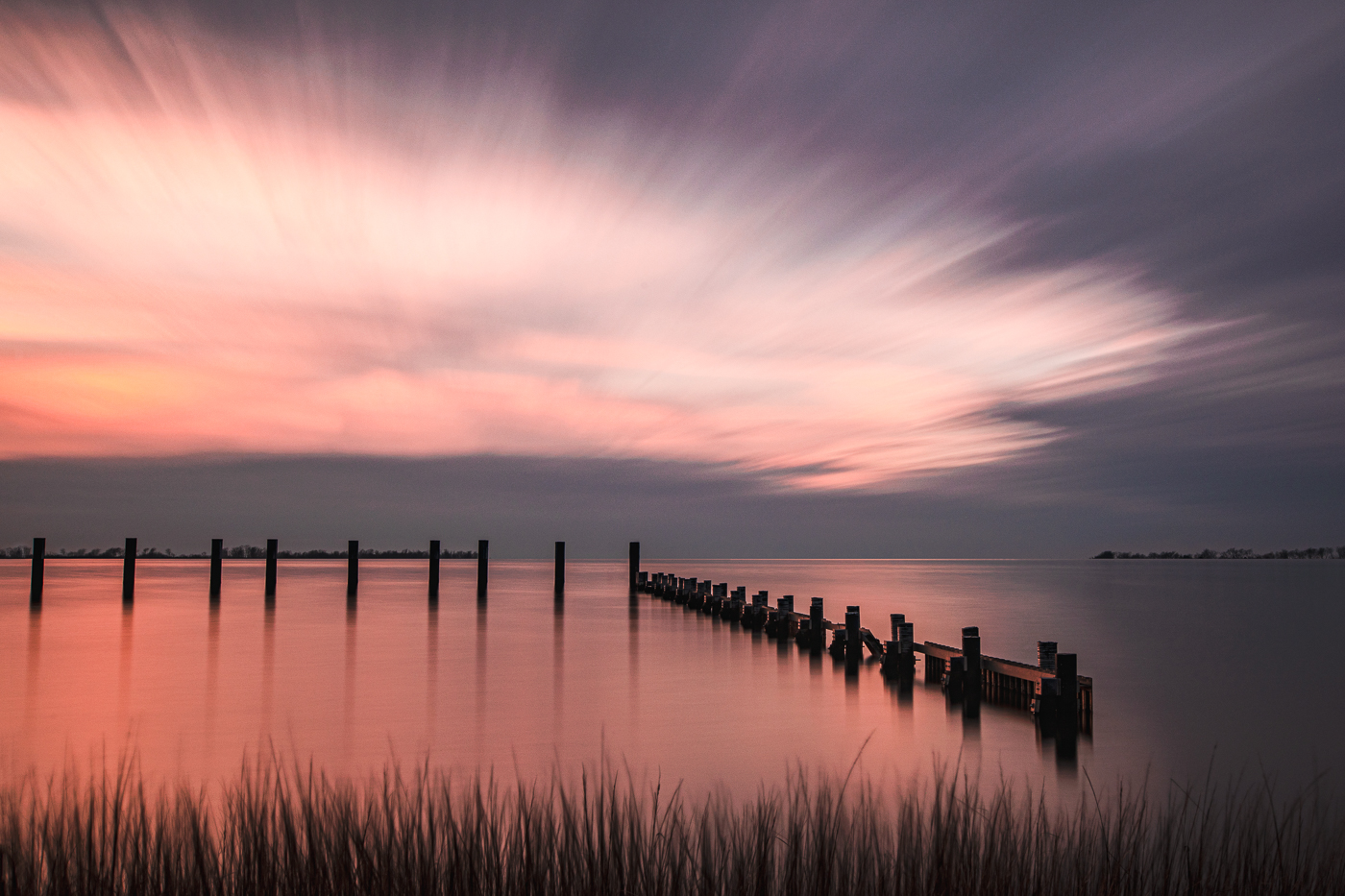
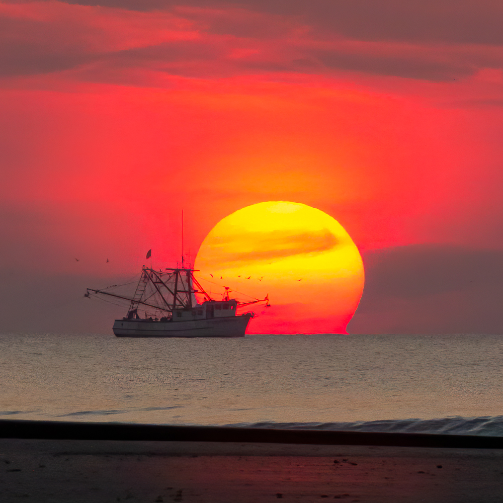
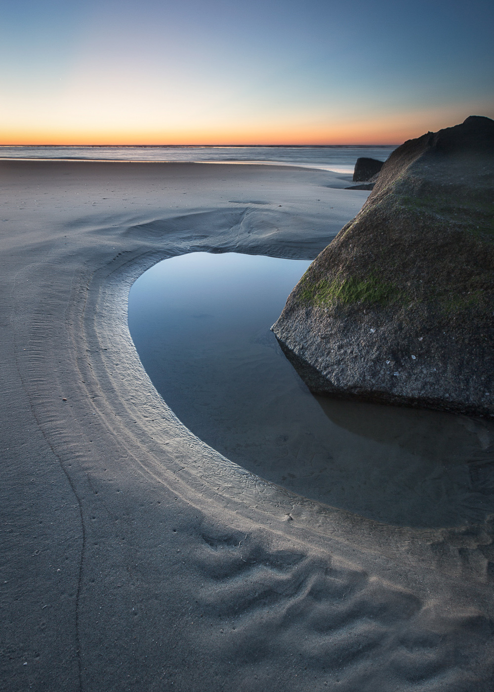
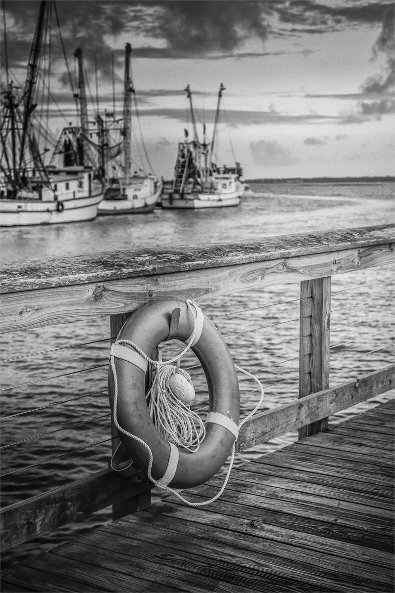
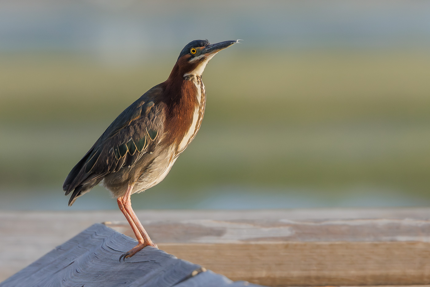
Thanks for your comments Larry. I lived 10 minutes from the beach and the difference in weather conditions are sometimes amazing. I see your point about the lower angle and I'll look to see if I have other images from that day with a lower vantage point so I can compare. I liked this angle because of the gentle shaft of light hitting the sand and water. |
Jul 23rd |
| 36 |
Jul 23 |
Comment |
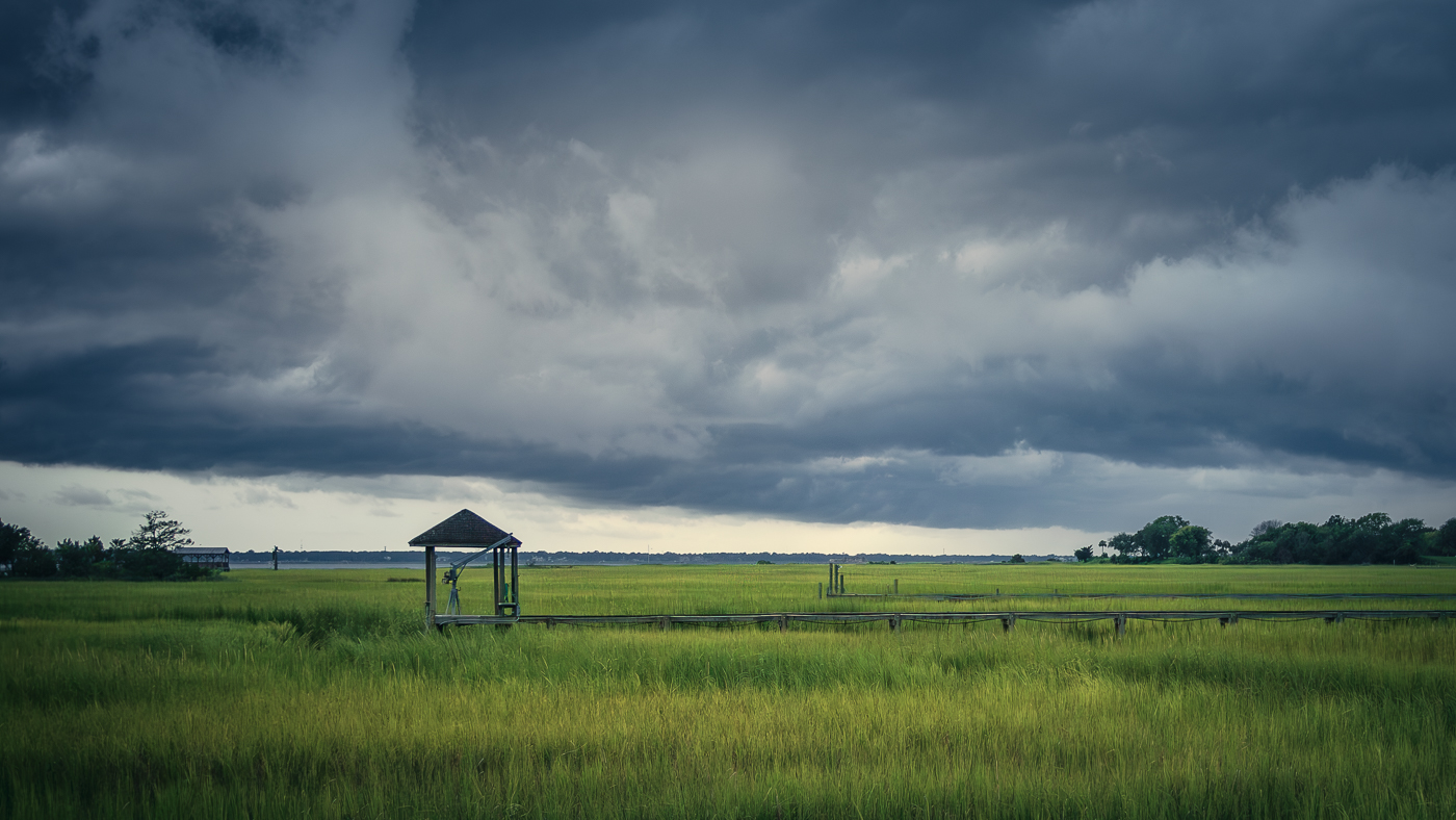
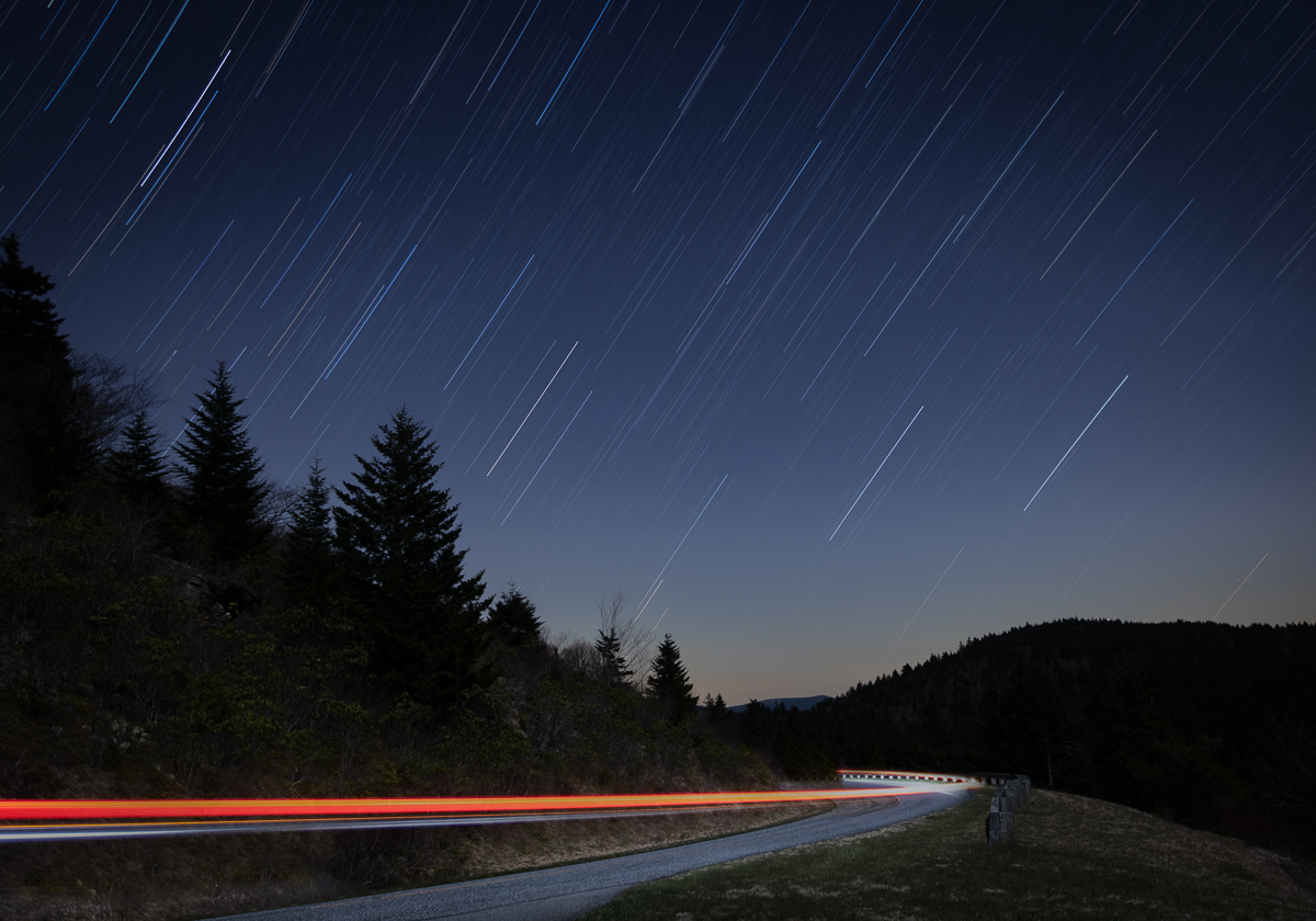
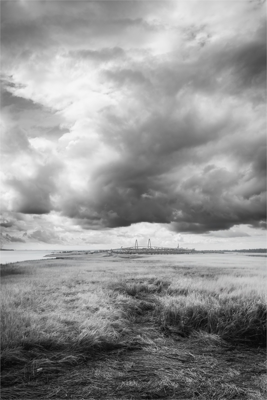
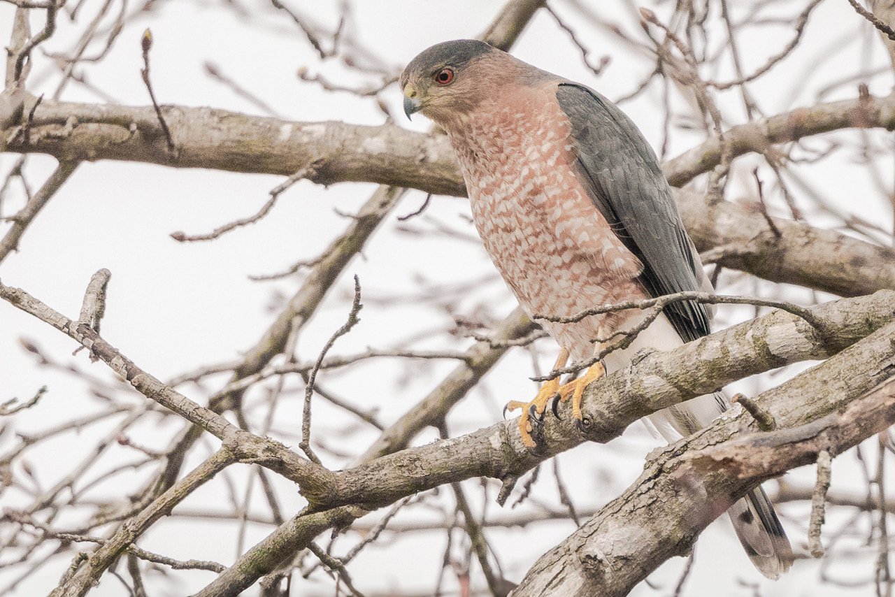
I like the idea of this image. The thing that attracts my eye is the use of the 2 vertical utility poles and the horizontal wires running through the image. It serves as a nice contrast to the image and conveys a feeling of movement. The long exposure clouds have shape and complementary color to the foreground. For this type of image a sharper foreground would tell the story better. I find the fence in the image to be somewhat distracting and takes away from the movement of the clouds. Very nice. |
Jul 22nd |
| 36 |
Jul 23 |
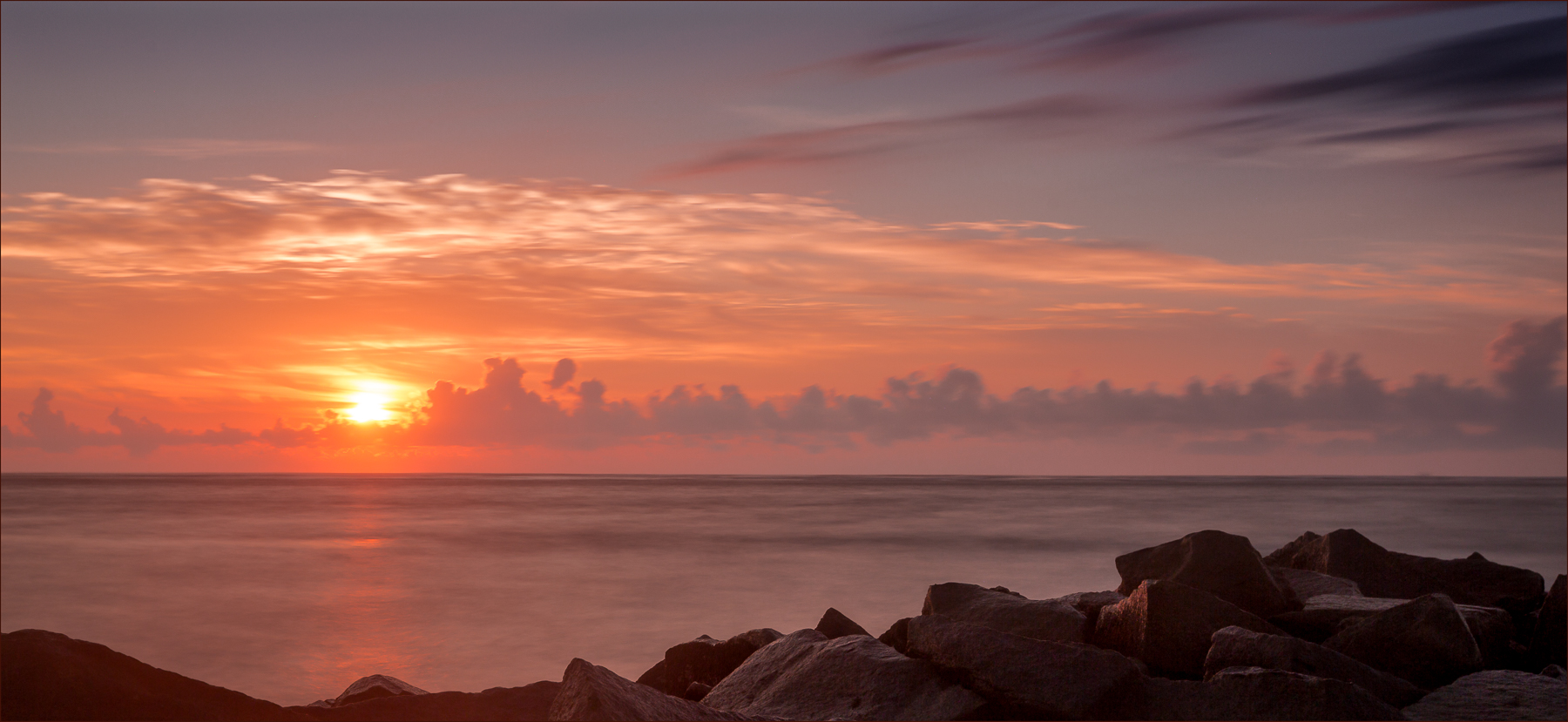
Comment |
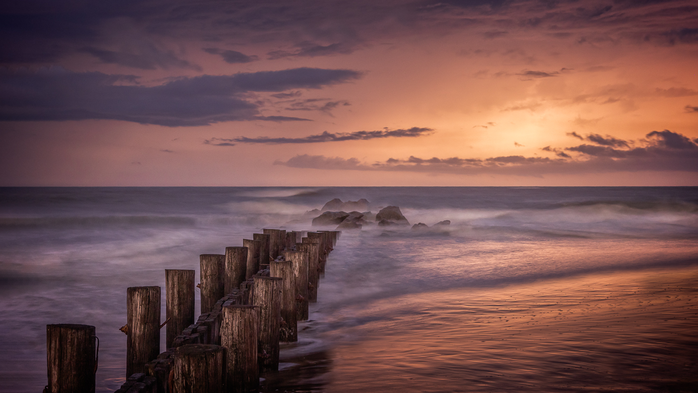
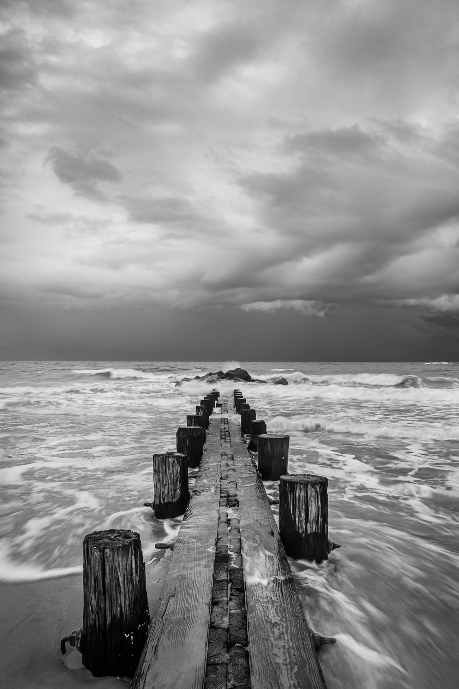
I used to love those crazy dark storm clouds when I lived in Charleston because they create nice drama in the image. Yes, a faster exposure for the sky would have worked but the blurred sky fits with the lighting and the rain. My eye is drawn to the foreground rocks and the triangle of white misty water which leads my eye to the storm. I like the texture and tone of the rocks with the misty, cotton candy effect from the long exposure water. |
Jul 22nd |
| 36 |
Jul 23 |
Comment |
Great job with using the drone. The colors are natural, the lake is nicely portrayed and there is just enough sky for this image. The road on the left is an interesting element that moves in the direction of the lake. I like that there are no cars on the road as it adds to the serene feel of the image. Nice image! |
Jul 19th |
| 36 |
Jul 23 |
Comment |
When I look at this image I see a wonderful location for fun and nature and I like the idea of this photo. For me the image works with or without people but their bright clothes and orange skin draws my eye right to them. I'm in agreement with Michael and Larry about the foreground grass as I would like to see more of the lake and the curve of the land where the people are walking. There is good sharpness throughout however the large rock formations feel crunchy to me. This could be too much contrast and dehaze or minimal shadows. Lastly, good for you with developing a style and putting your creative mark on the world! |
Jul 19th |
| 36 |
Jul 23 |
Comment |
Such a beautiful location and rock formation. The real beauty is your post processing to make this location stand out in all its grandeur. The soft light hitting the rock brings out the lush green terrain. I also like how the sky and the sea colors compliment the green tones. The white caps offer a sense of drama to the sea which just adds to the power of the subject. Beautiful image. |
Jul 16th |
| 36 |
Jul 23 |
Comment |
The beautiful rolling hills of Palouse.... I'm drawn to the soft pastel colors in this image and I'm surprised when you say there is a lot of saturation. For me, the colors make this image appealing and original. The way the light and shadows hit the land adds interest and the grain elevator is perfectly placed and adds a nice focal point to the rolling hills. Beautiful image. |
Jul 16th |
6 comments - 5 replies for Group 36
|
| 72 |
Jul 23 |
Comment |
Thank you everyone for your comments. I appreciate your feedback regarding the color and will return to it's natural state. |
Jul 23rd |
| 72 |
Jul 23 |
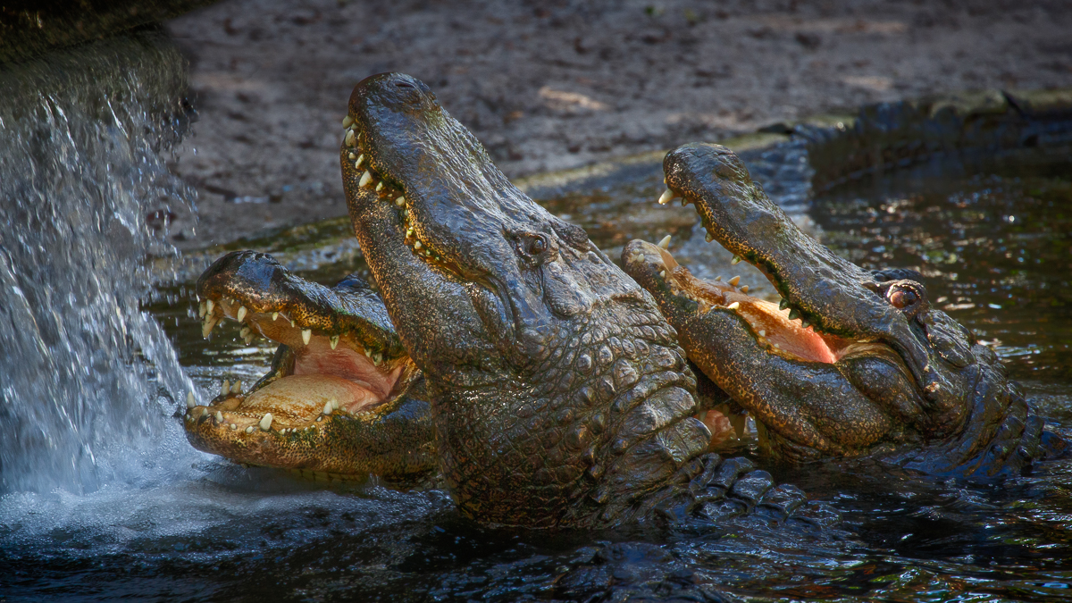
Comment |
The crocs teeth are definitely the show stopper. At first I thought there was something wrong with the left eye but realized it's probably due to the crop as the original is much clearer. As previously mentioned, I would also recommend darkening the body or adding a vignette to bring the attention to the teeth which are amazing. |
Jul 16th |
| 72 |
Jul 23 |
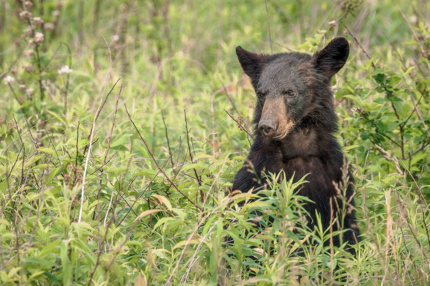
Comment |
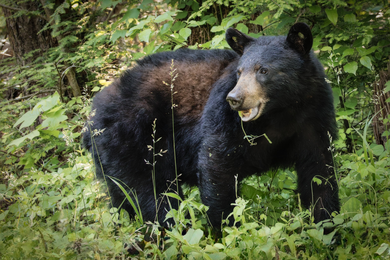
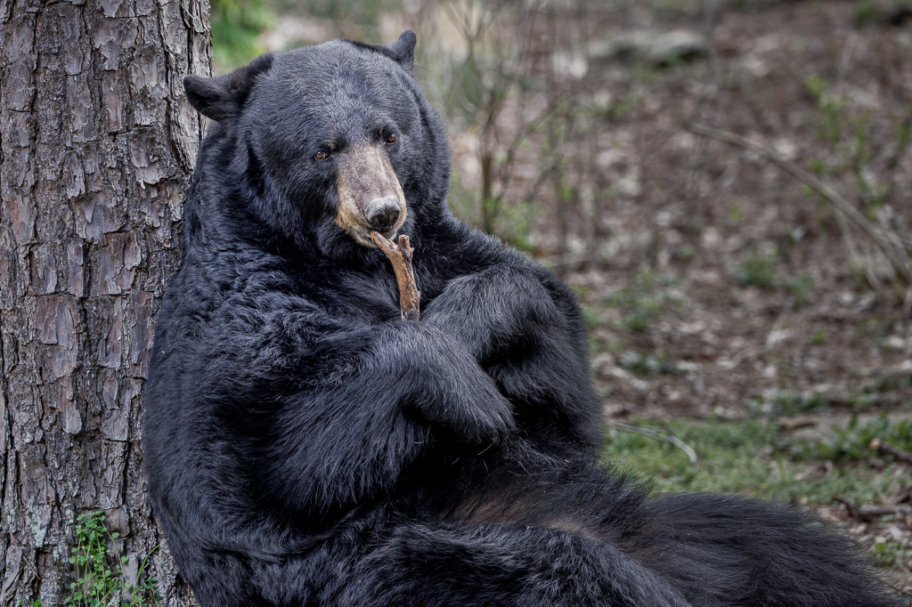
Such a magical moment. Glad you had the opportunity to be present. The bear looking in your direction and the nice separation of the legs makes this image work nicely. Great image. |
Jul 16th |
| 72 |
Jul 23 |
Comment |
How can anyone resist a mama duck and her ducklings... The crop is good and the post processing of the water adds a nice touch to the image. Very nice. |
Jul 16th |
| 72 |
Jul 23 |
Comment |
I'm always fascinated with the colors in underwater photography. Most people don't have the opportunity to view life underwater so thank you for sharing. The image is nicely lit and the colors are vibrant. Nice job. |
Jul 11th |
| 72 |
Jul 23 |
Comment |
Beautiful image, Maria. The lighting on the leaf and eye of the mantis is soft and inviting. The image is sharp and well composed. Very nice. |
Jul 11th |
| 72 |
Jul 23 |
Comment |
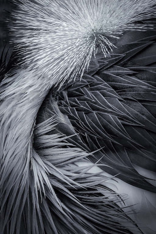
Bruce, this is a beautiful and sharp portrait. The soft light on the eagles feathers and eye is stunning. The yellow beak and eye compliments so nicely with the background. Overall, a perfect image. |
Jul 11th |
7 comments - 0 replies for Group 72
|
13 comments - 5 replies Total
|