|
| Group |
Round |
C/R |
Comment |
Date |
Image |
| 36 |
Feb 23 |
Reply |
Just an idea. |
Feb 19th |
| 36 |
Feb 23 |
Reply |
|
Feb 19th |
 |
| 36 |
Feb 23 |
Reply |
Thank you Bill. I was looking for feedback and much appreciate everyones suggestions. |
Feb 19th |
| 36 |
Feb 23 |
Reply |
Thanks for your feedback Adi. I will relook at the image and take in everyone suggestions! |
Feb 19th |
| 36 |
Feb 23 |
Reply |
Thanks Michael. I will try Topaz Sharpen. |
Feb 19th |
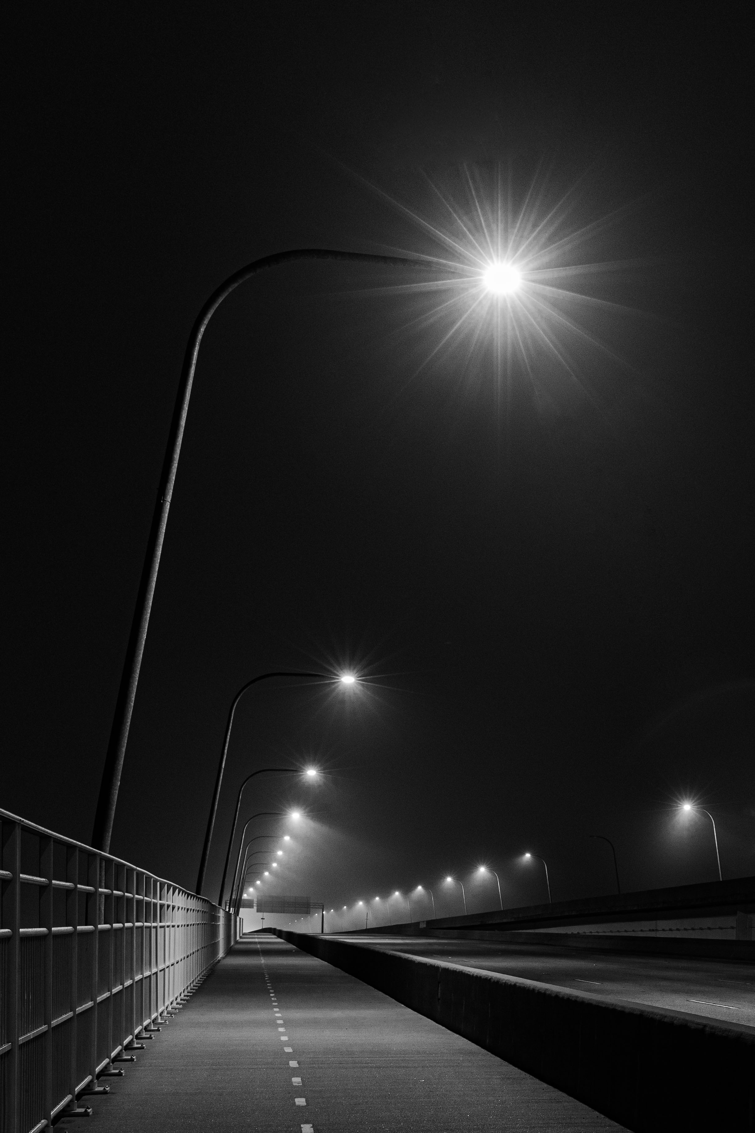
| 36 |
Feb 23 |
Comment |
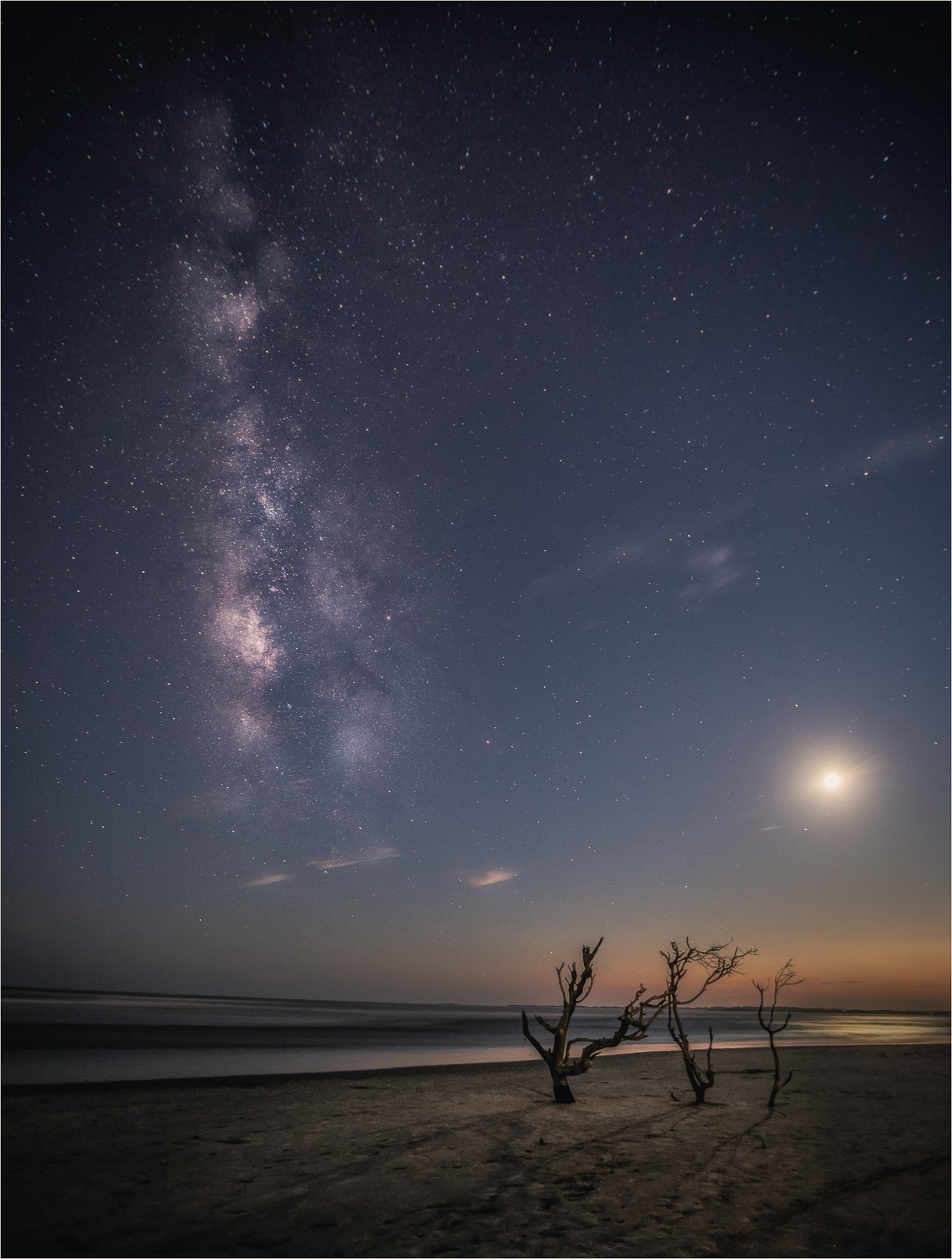
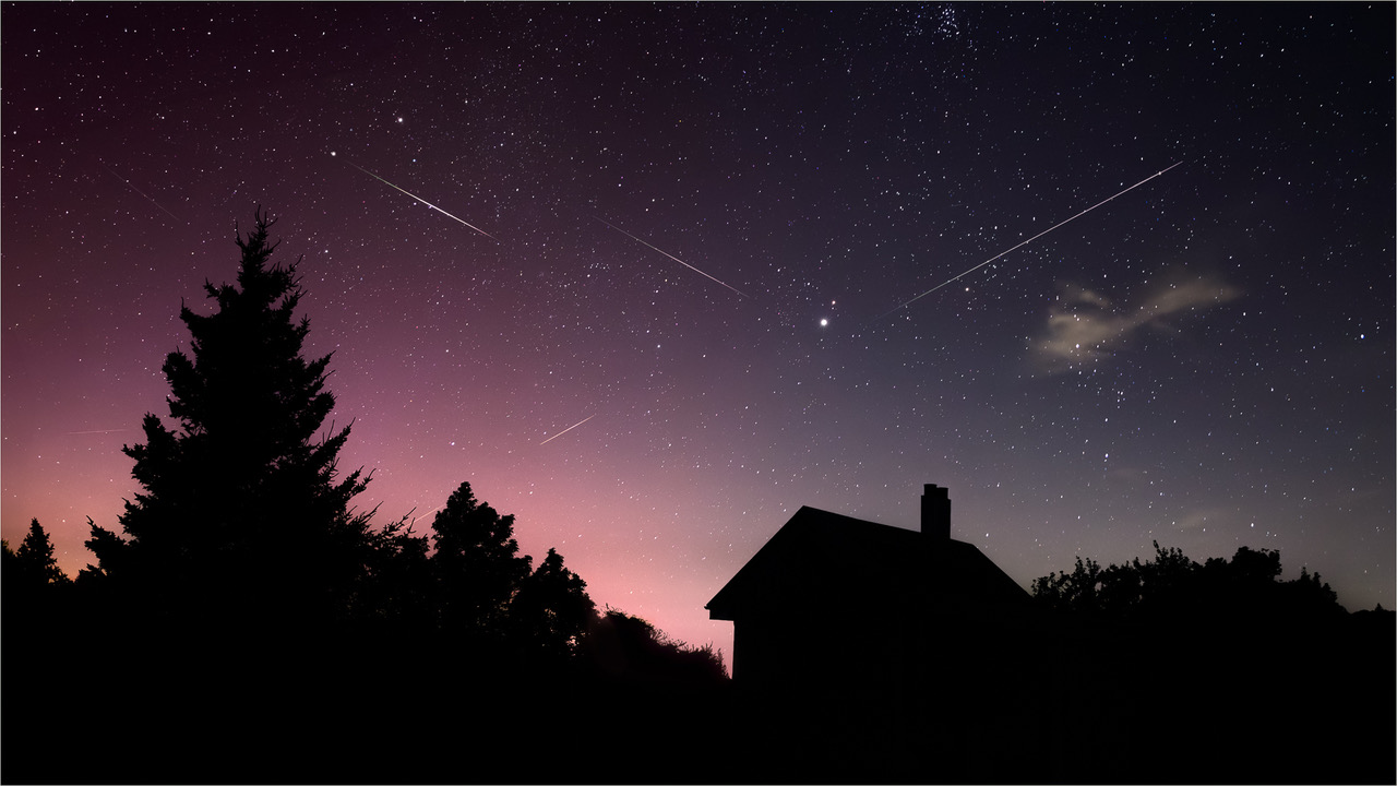
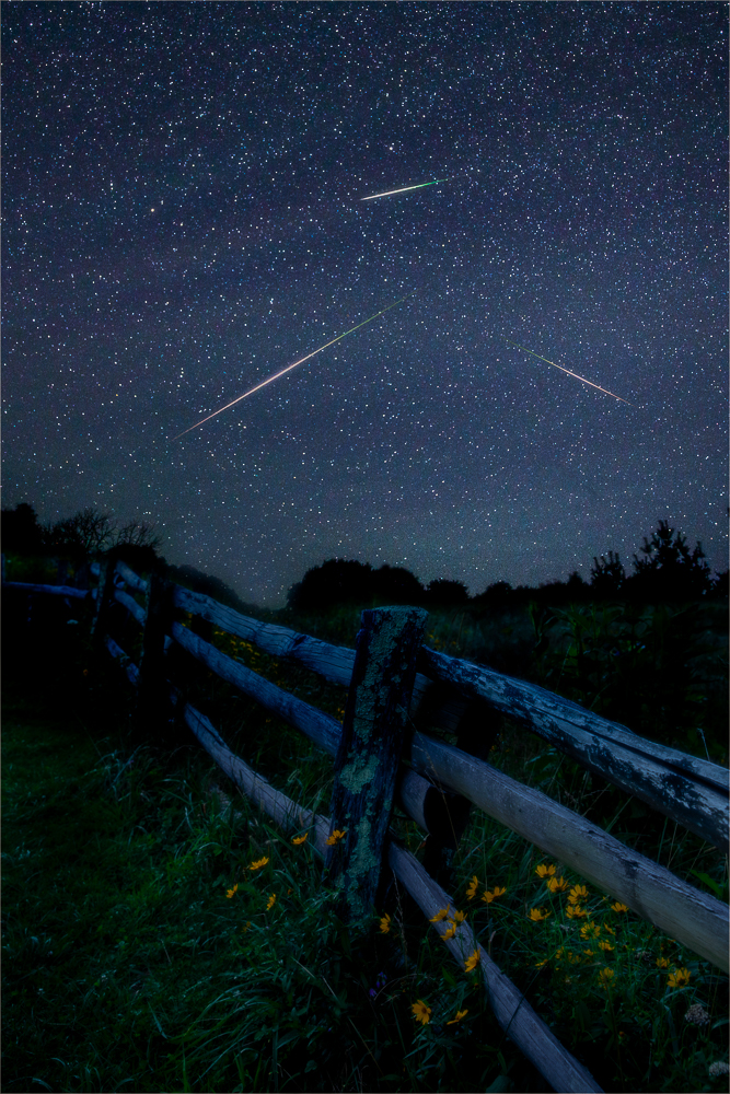
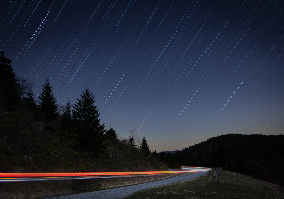
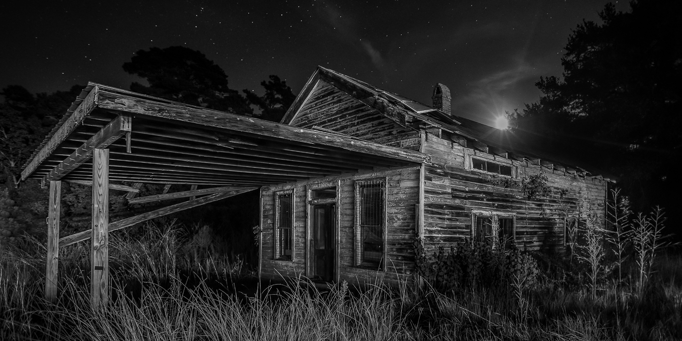
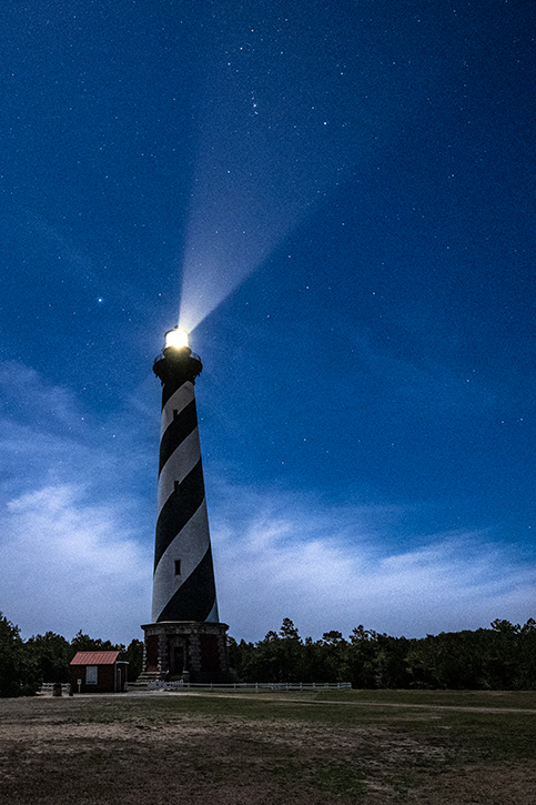
What a great way to catch the stars. Catching the light beam as it hits the stars was well done especially with a rotating beacon. There is some noise which could possibly be from the ISO however I'm surprised especially with the Z9. Sometimes through editing by raising the shadows and exposure more noise is produced. Of course DeNoise works well for this. For me the night sky white balance from the original image appears more natural with the scene. I wonder if a vertical crop would put more emphasis on the lighthouse and shining beam... Very nice image. |
Feb 19th |
| 36 |
Feb 23 |
Comment |
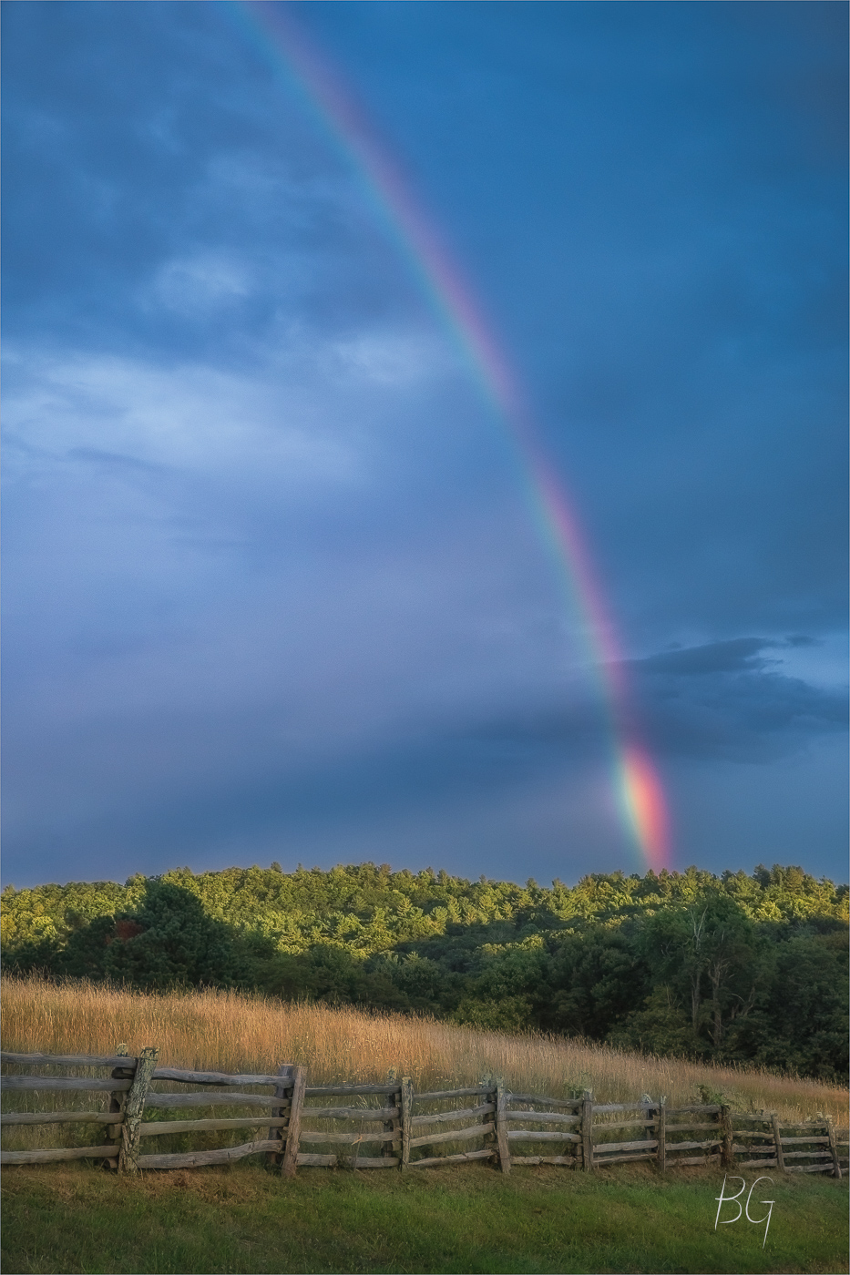
I always see these kind of opportunities when I'm on the road but unfortunately I'm usually driving. I guess I need a bumper sticker that says "I brake for photos". Possibly opening the window would have given you a clearer shot but you captured the essence of the scene. Thunder shower and rainbow are a wonderful sight to see and my eye goes to the brightest part of the rainbow. My only recommendation would be to darken the foreground a bit. |
Feb 19th |
| 36 |
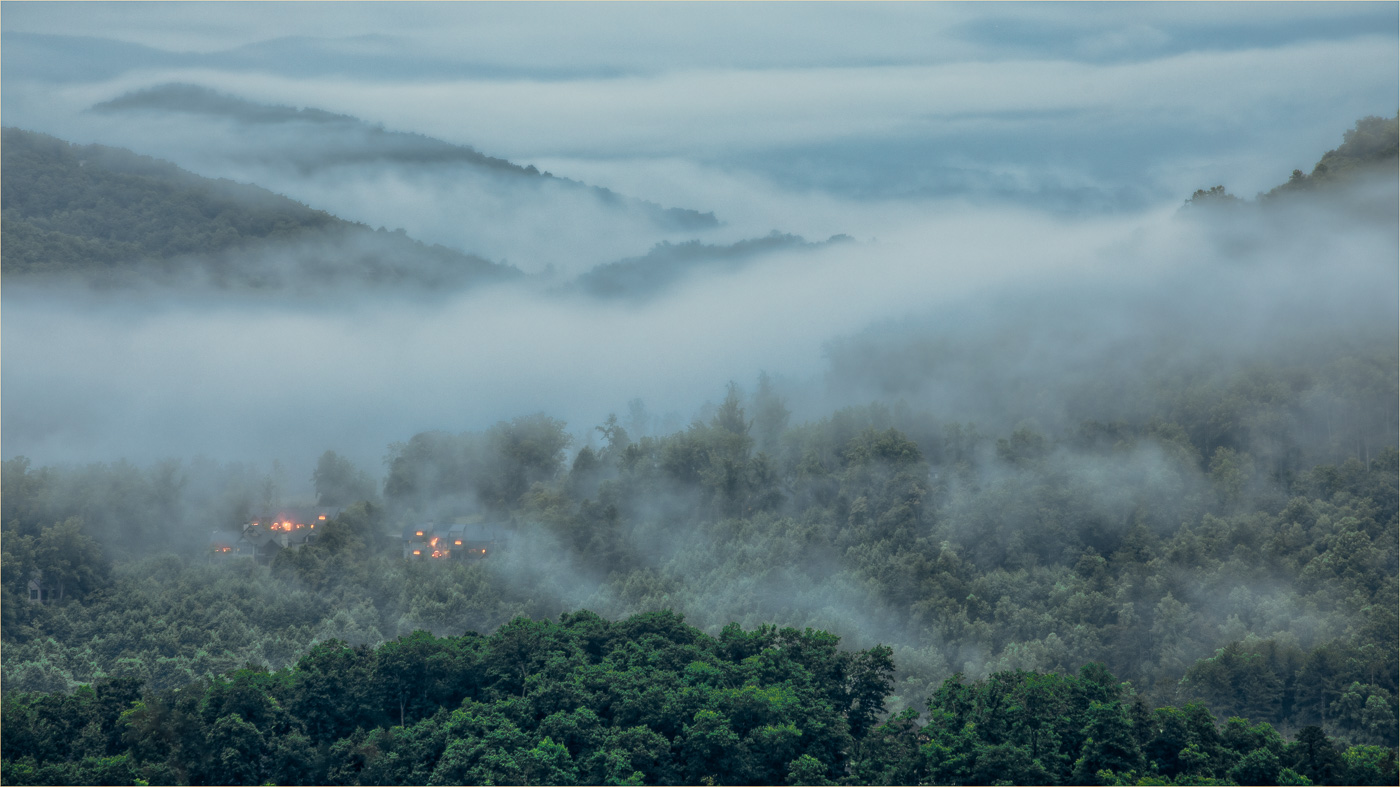
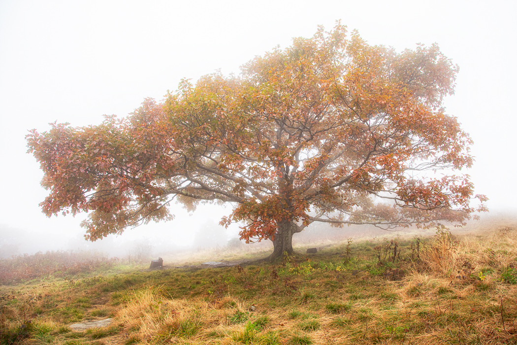
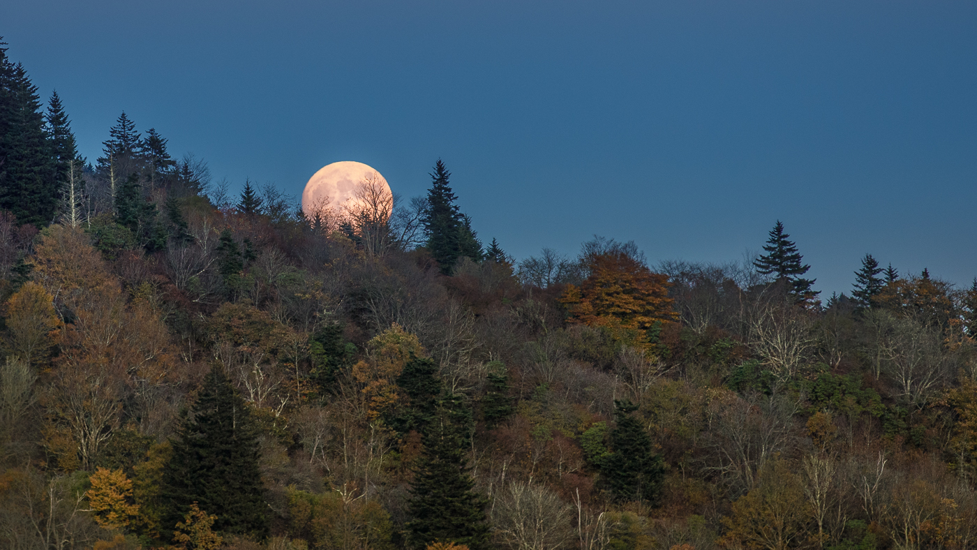
Feb 23 |
Comment |
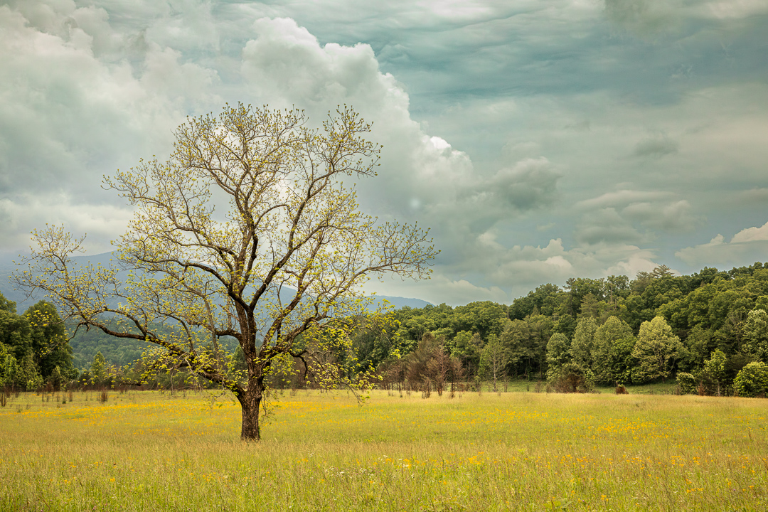
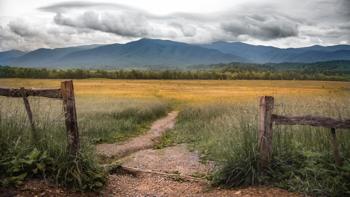
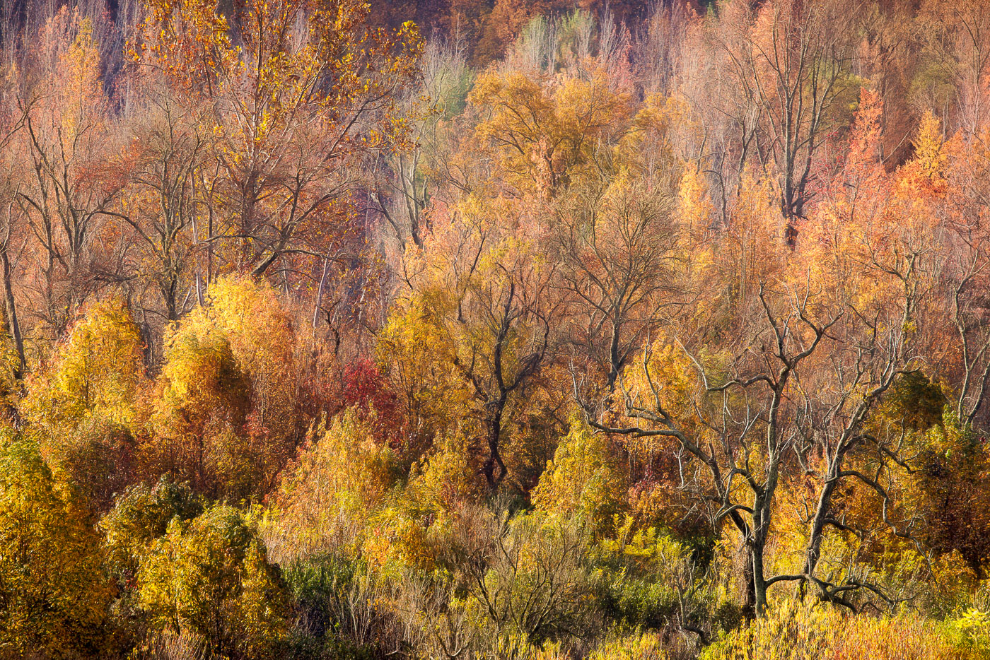
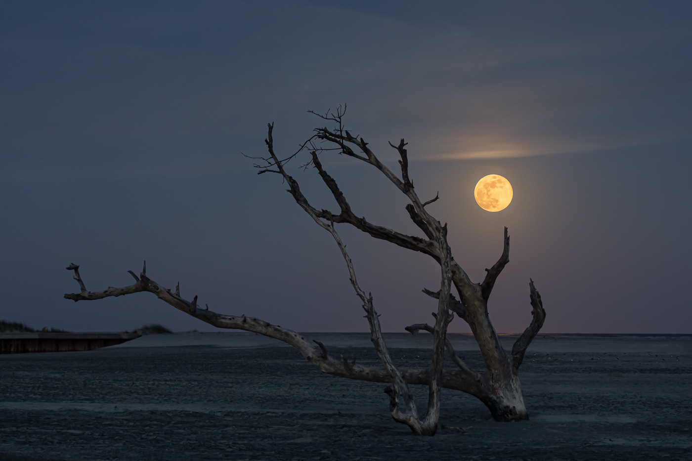
Beautiful image Diane.The golden glow on the trees and the parallel diagonal lines of the clouds and tree lined hill adds interest to the image. The colors definitely enhance the image. I also like that you didn't enlarge the moon. There is a more sky than needed which could be cropped out but I would hate for you to lose the curve of tree lined hill on the left which works so nicely with the clouds. |
Feb 15th |
| 36 |
Feb 23 |
Comment |
Architecturally well done. The B/W adds a nice touch to the building and the sky is detailed enough and does not take away from the building. I'm not sure about the blurred people in front of the building. I love the idea of it but wish they were a bit more pronounced but still ghostly as the message wasn't very clear to me when I first looked at the image. In an architectural image I would like a sharper focus on the building however it could just be blurred people which is confusing my eye. Overall very nice image and great idea. |
Feb 15th |
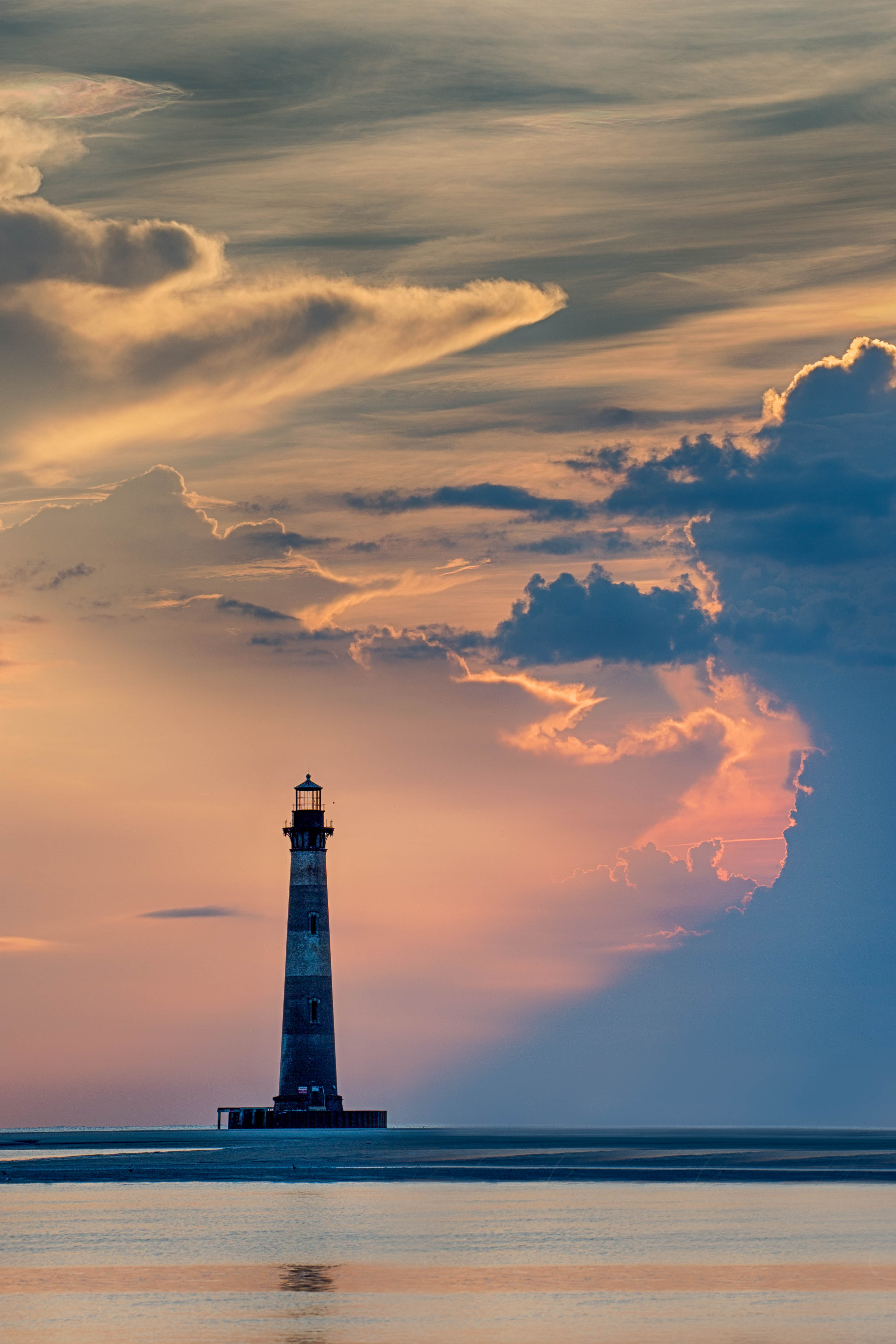
| 36 |
Feb 23 |
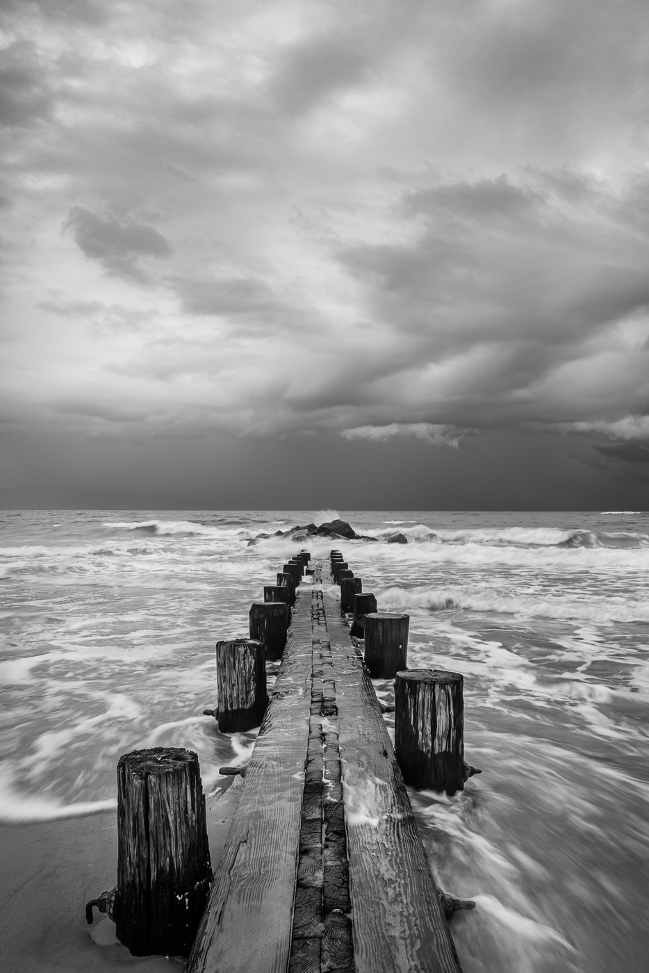
Comment |
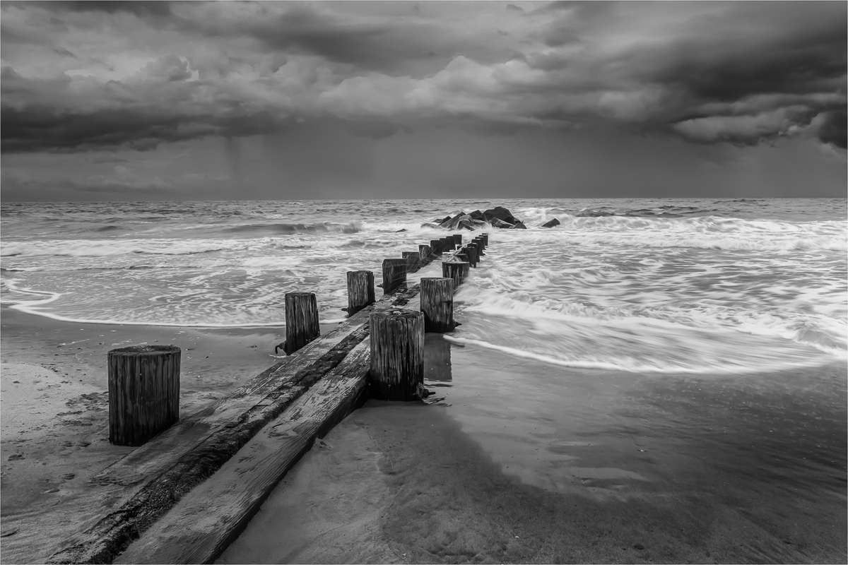
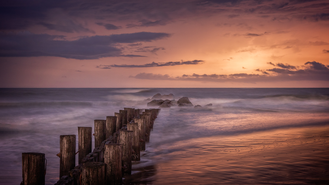
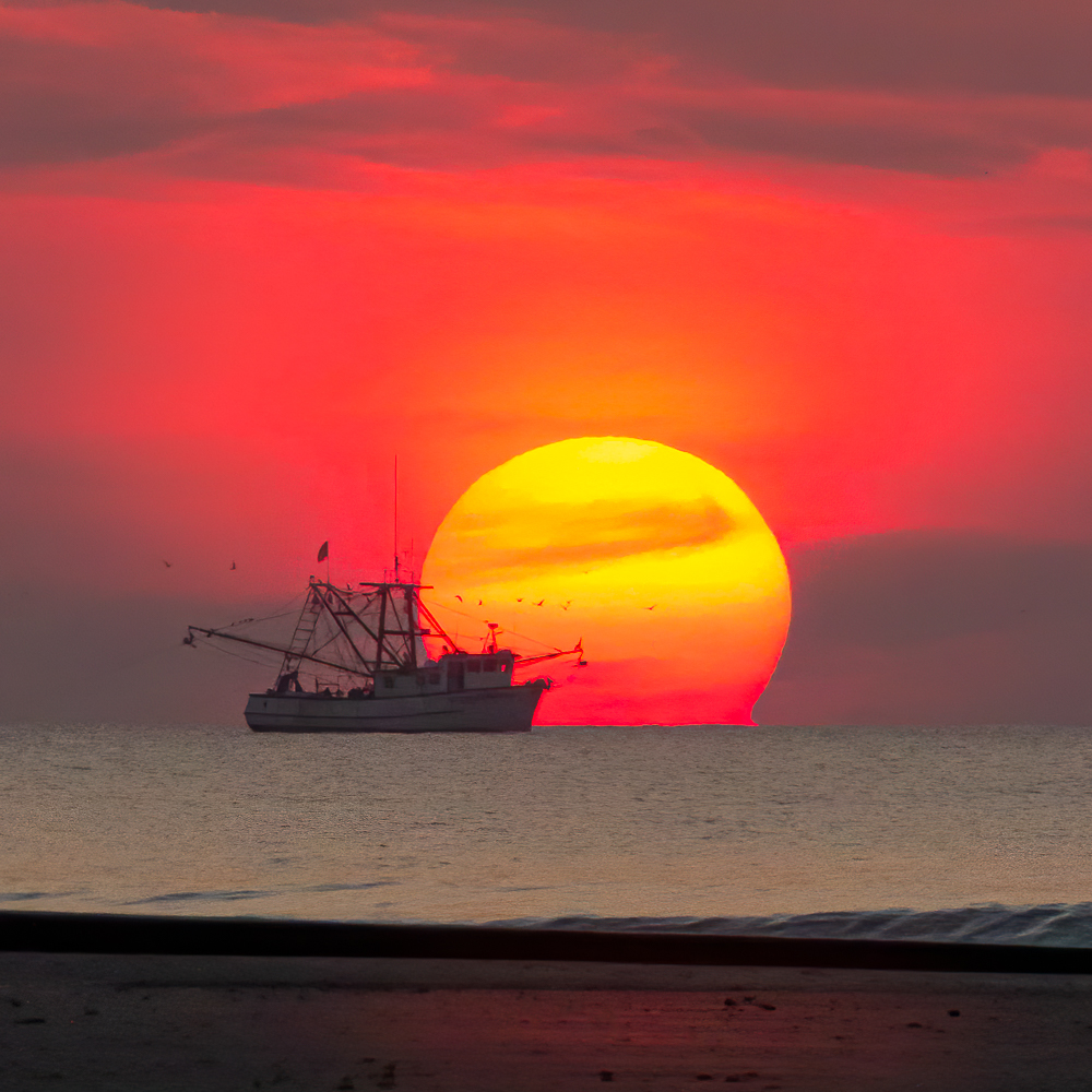
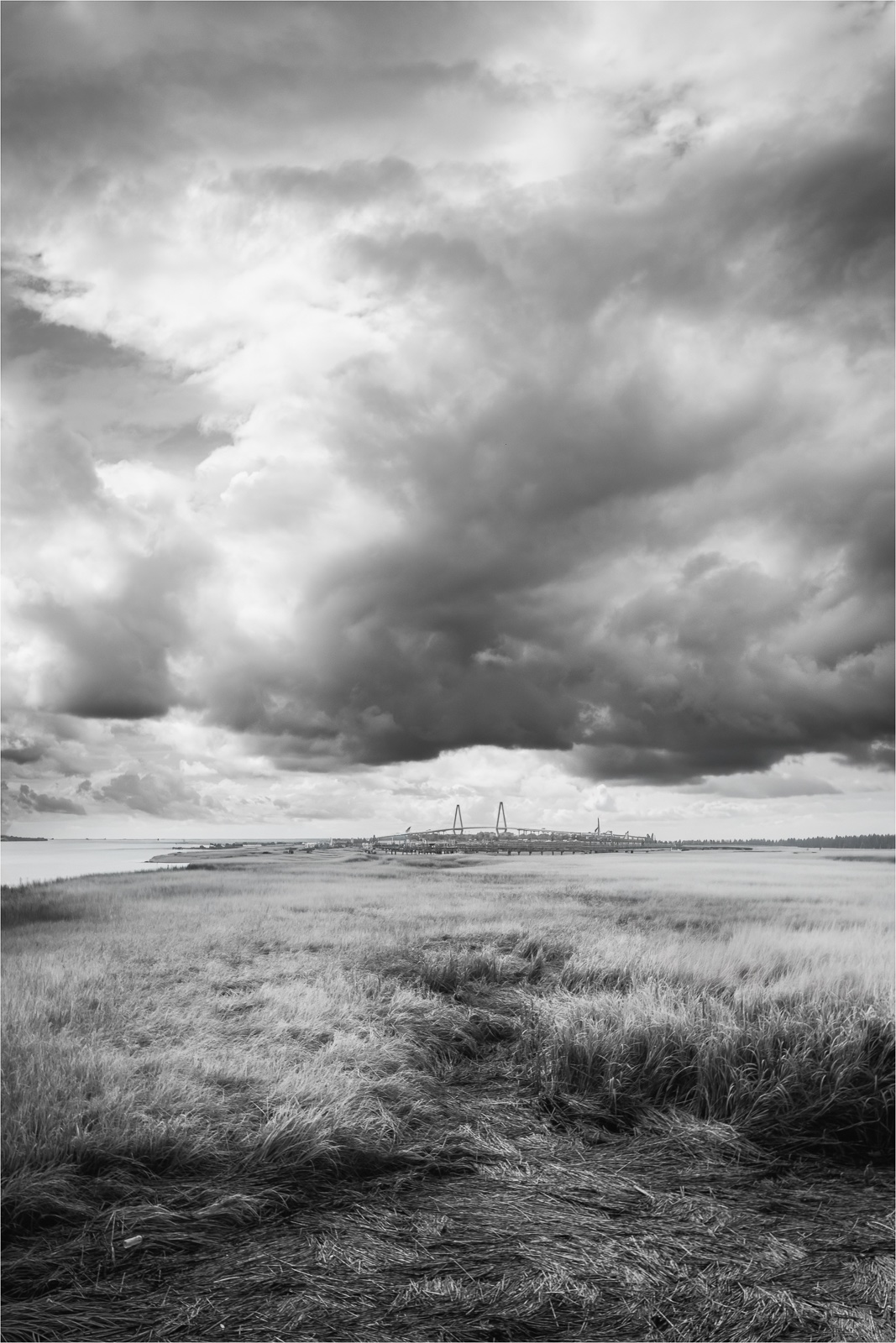
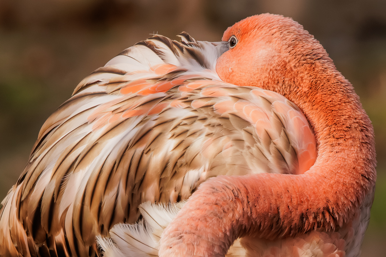
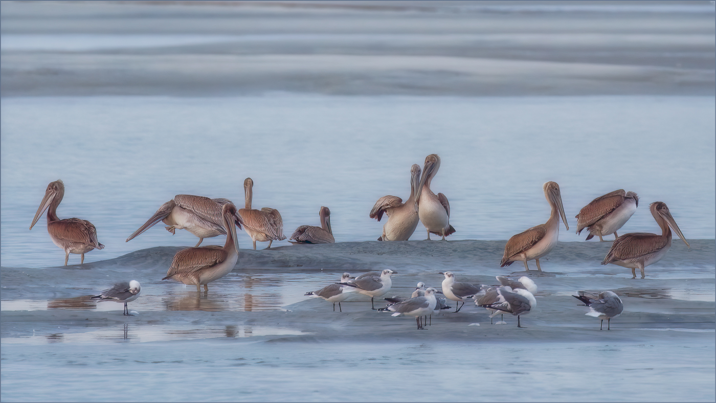
When I first looked at the image, I saw the whole image and not the individual parts which I like. Breaking down the parts, the sharp horizontal line of the horizon and the vertical height of the lighthouse work well together. The tree adds a nice balance to the lighthouse along with the fence on the left and the sand dune hill with grasses on the right. The color in the sky, water, and golden glow on the lighthouse complement each other. I like it just the way it is. Nice image. |
Feb 15th |
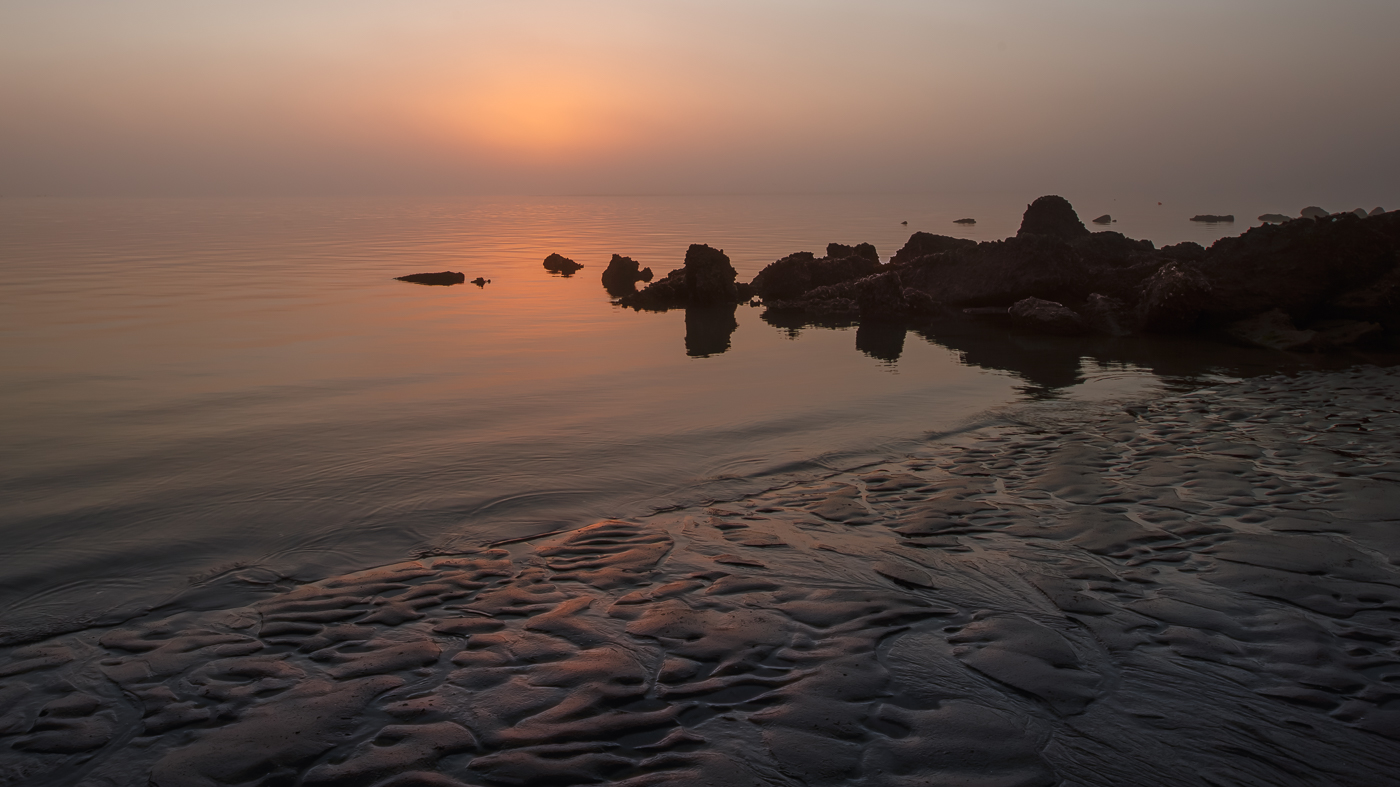
| 36 |
Feb 23 |
Comment |
The image was composed with purpose. What draws me into this image is the perfect placement of the starburst and the reflection of light on the brick. The lighting accentuates the buildings nicely and the partly cloudy sky adds nice texture to the background. At first I wasn't sure about the trees but after looking at the whole image for a while instead of just the parts, the trees don't distract me from the subject. Well done! |
Feb 6th |
| 36 |
Feb 23 |
Reply |
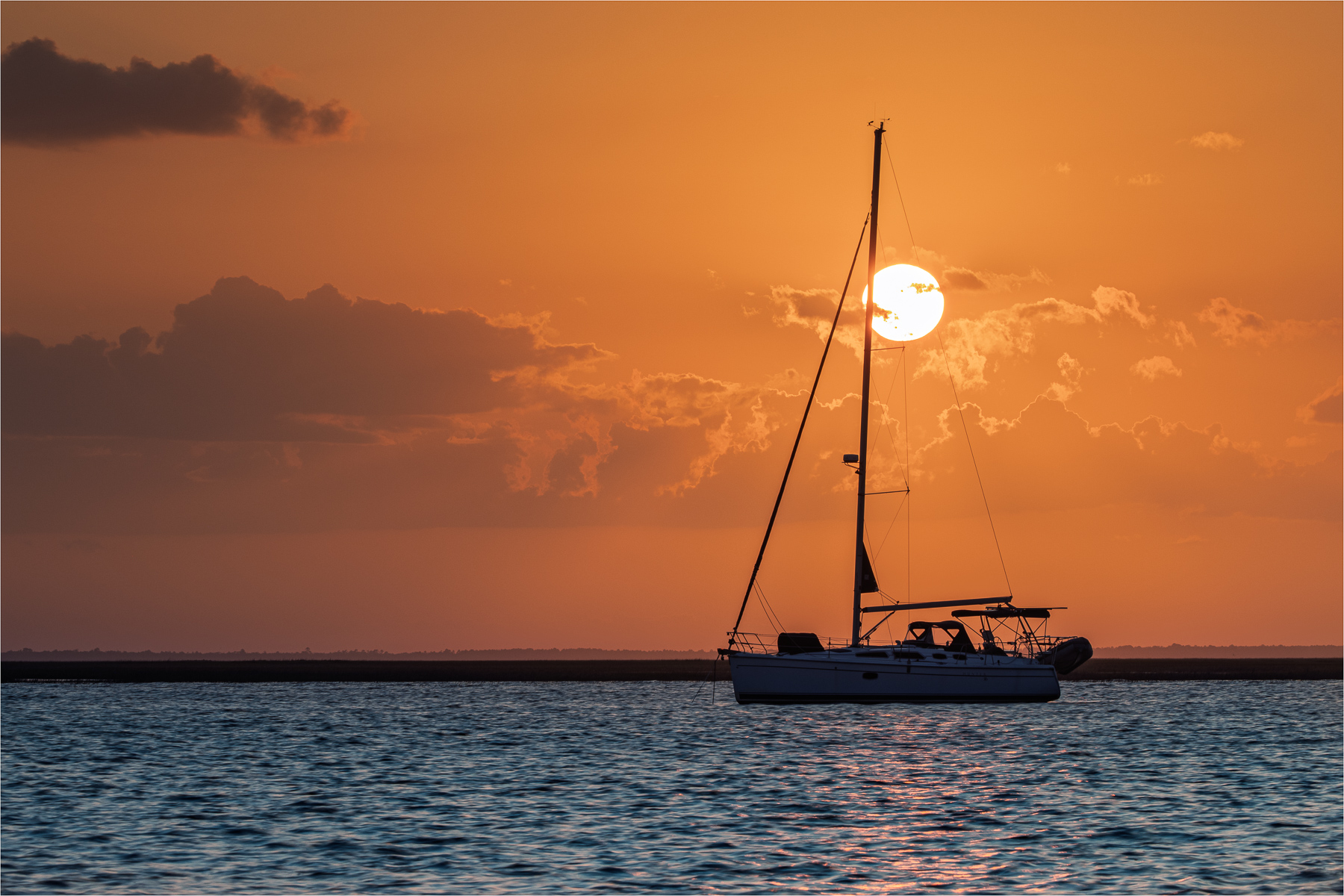
Thanks for your comments Larry. This image has been sitting in my files for quite some time and I always liked it but never felt it was powerful enough and I was looking forward to everyone's critique. I like your idea of a radial crop and I think it makes the image have more visual impact. As far as equipment, the sweet spot for my 70-300mm lens is usually f/11 so I'm not sure about the focus. Also, I had a 22mp camera so cropping may be a challenge. I will relook at my images from that day and see if I can perform some editing magic to make it a keeper. Many thanks for your feedback! |
Feb 6th |
6 comments - 6 replies for Group 36
|
| 72 |
Feb 23 |
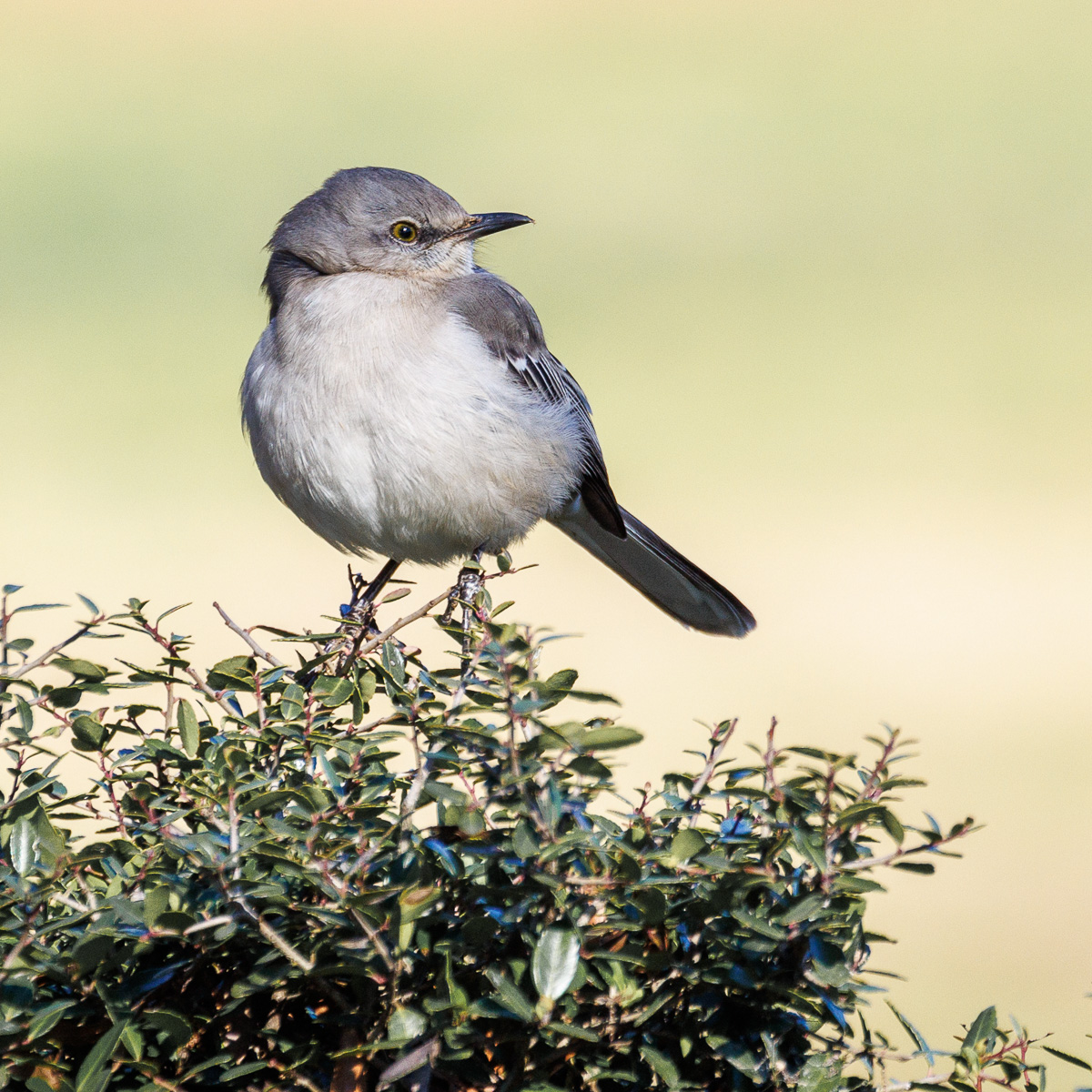
Comment |
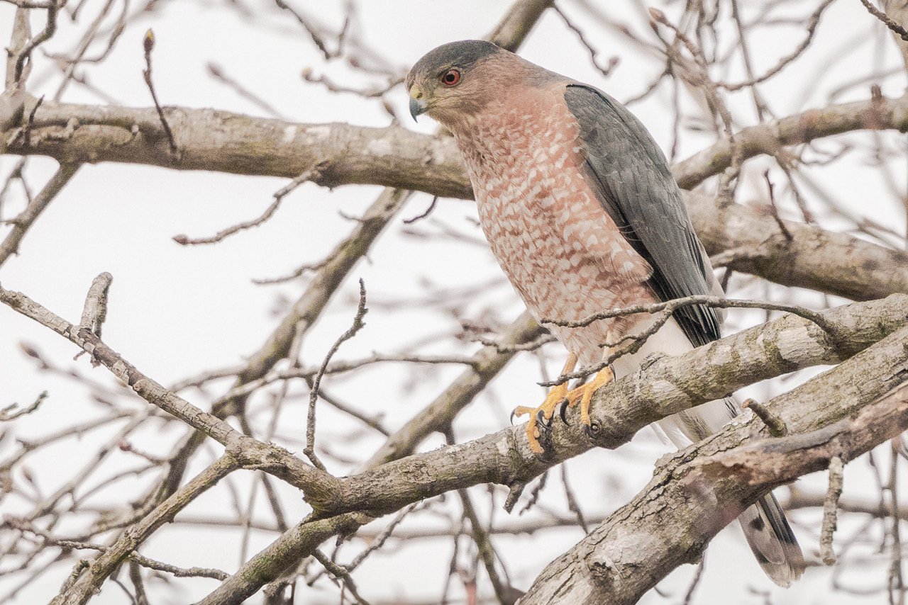
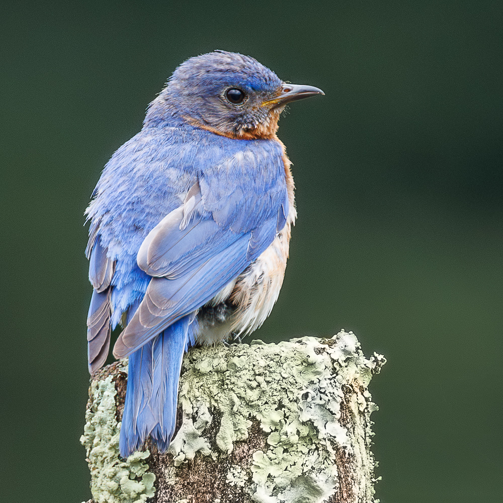
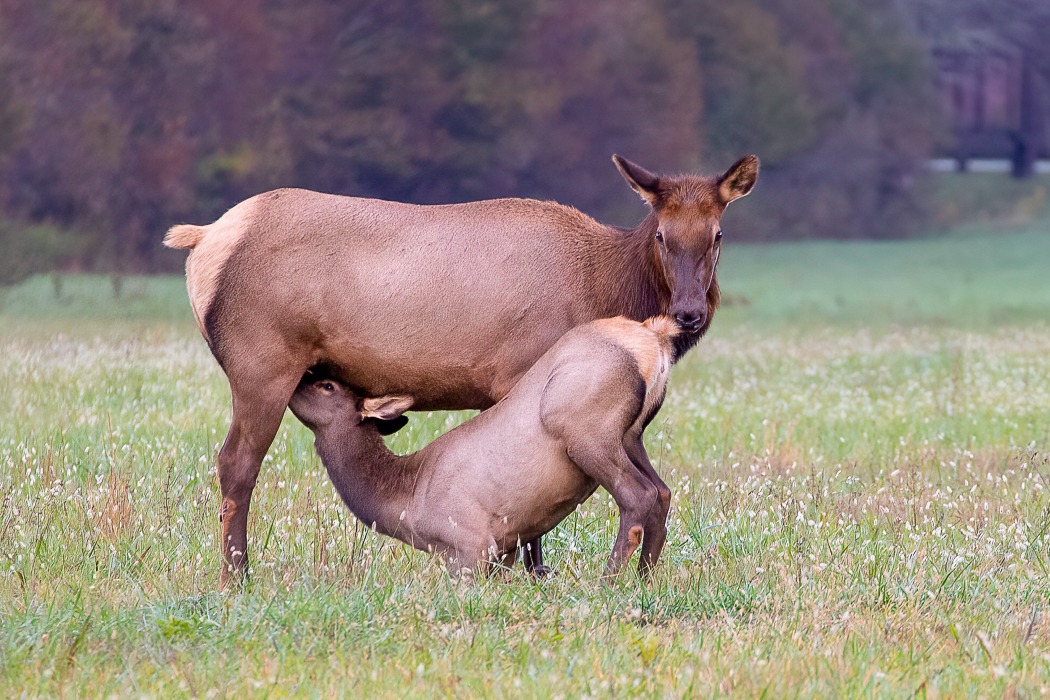
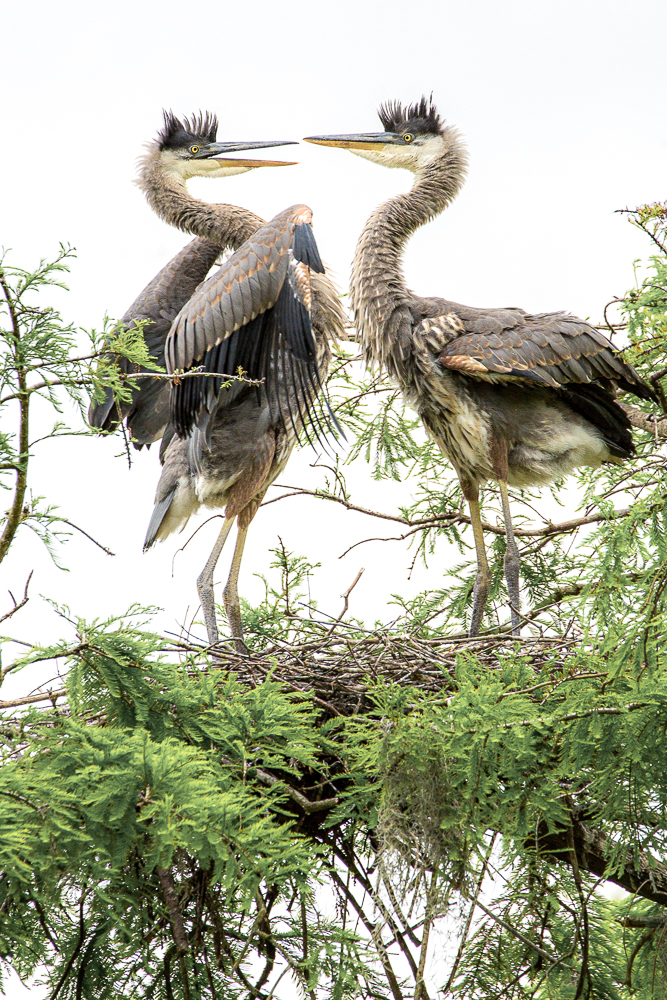
Thanks Marie. I watched him for a while and thought the same thing. He was so content just sitting on the branch.
|
Feb 19th |
| 72 |
Feb 23 |
Reply |
Thanks Mary. I was lucky with the light direction to catch the light in his eye. |
Feb 19th |
| 72 |
Feb 23 |
Reply |
Thanks Isaac. I do like the darker background. |
Feb 19th |
| 72 |
Feb 23 |
Reply |
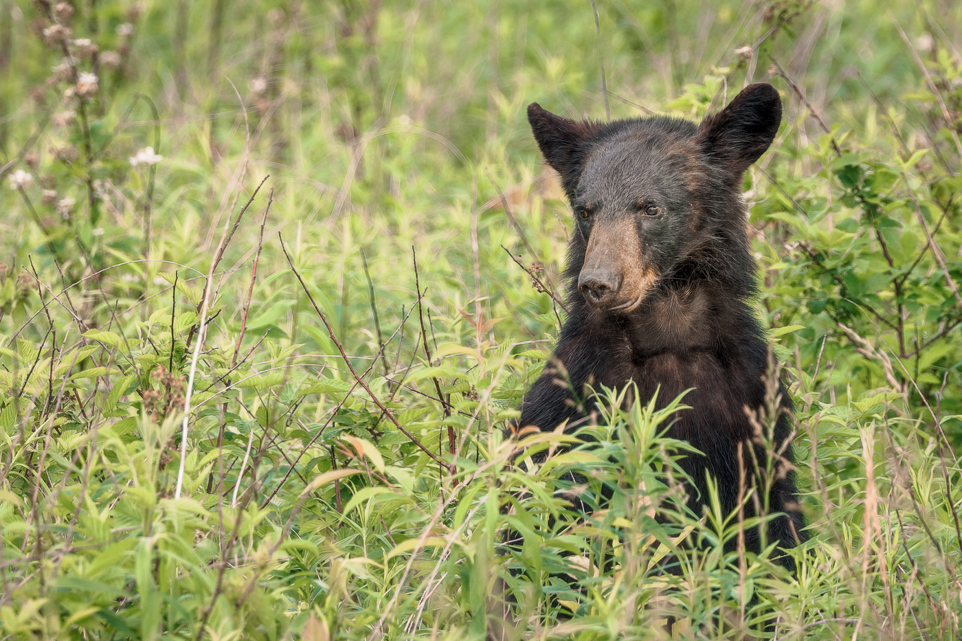
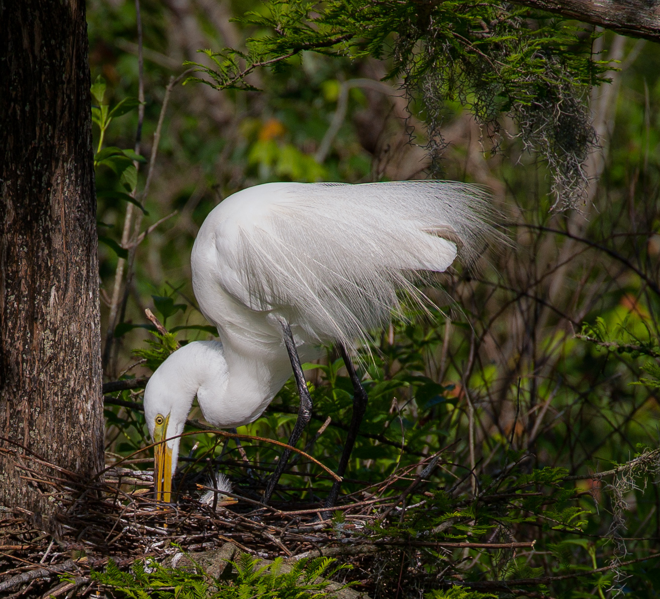
Thank you Maria. I'm not a birder but find it more and more interesting to photograph these little guys and learn what they are. |
Feb 19th |
| 72 |
Feb 23 |
Comment |
I never thought about compositing a nature image but it's a smart idea to better tell the family story. Did you intentionally shoot this for a composite? My only suggestion is matching the lighting conditions and color of the branches below the mama vulture. Nice job. |
Feb 19th |
| 72 |
Feb 23 |
Comment |
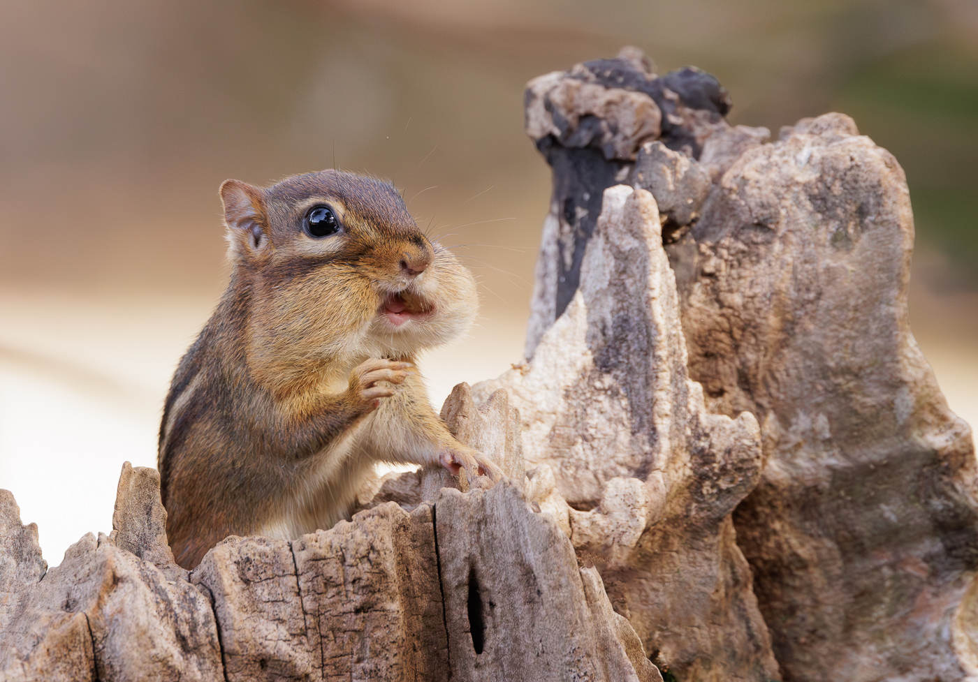
Beautiful image. The image is sharp throughout, the yellow color and dark background make the snake pop. The subject is nicely wrapped around the branch giving the viewer a perfect view of the snake. This image makes me appreciate the beauty of the snake without getting too close. |
Feb 19th |
| 72 |
Feb 23 |
Comment |
Marie, I definitely favor the color image. The blue sky and brown trees adds to the this snowy image with a cold focus. I do like the B/W image and the artistic effect, but the image feels more natural and serene in color. I also love the Hahnemuhle Photo Rag Metallic paper! Beautiful image. |
Feb 19th |
| 72 |
Feb 23 |
Comment |
Beautiful image. Everything was done very well. Great contrast with background and amazing detail throughout. |
Feb 19th |
| 72 |
Feb 23 |
Comment |
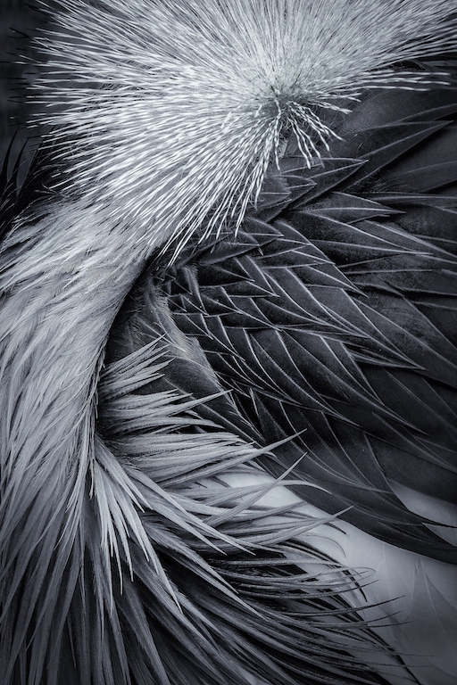
Amazing capture. The detail in the image keeps me looking! I definitely don't want this guy clawing at me! |
Feb 19th |
6 comments - 3 replies for Group 72
|
12 comments - 9 replies Total
|