|
| Group |
Round |
C/R |
Comment |
Date |
Image |
| 36 |
Jul 22 |
Comment |
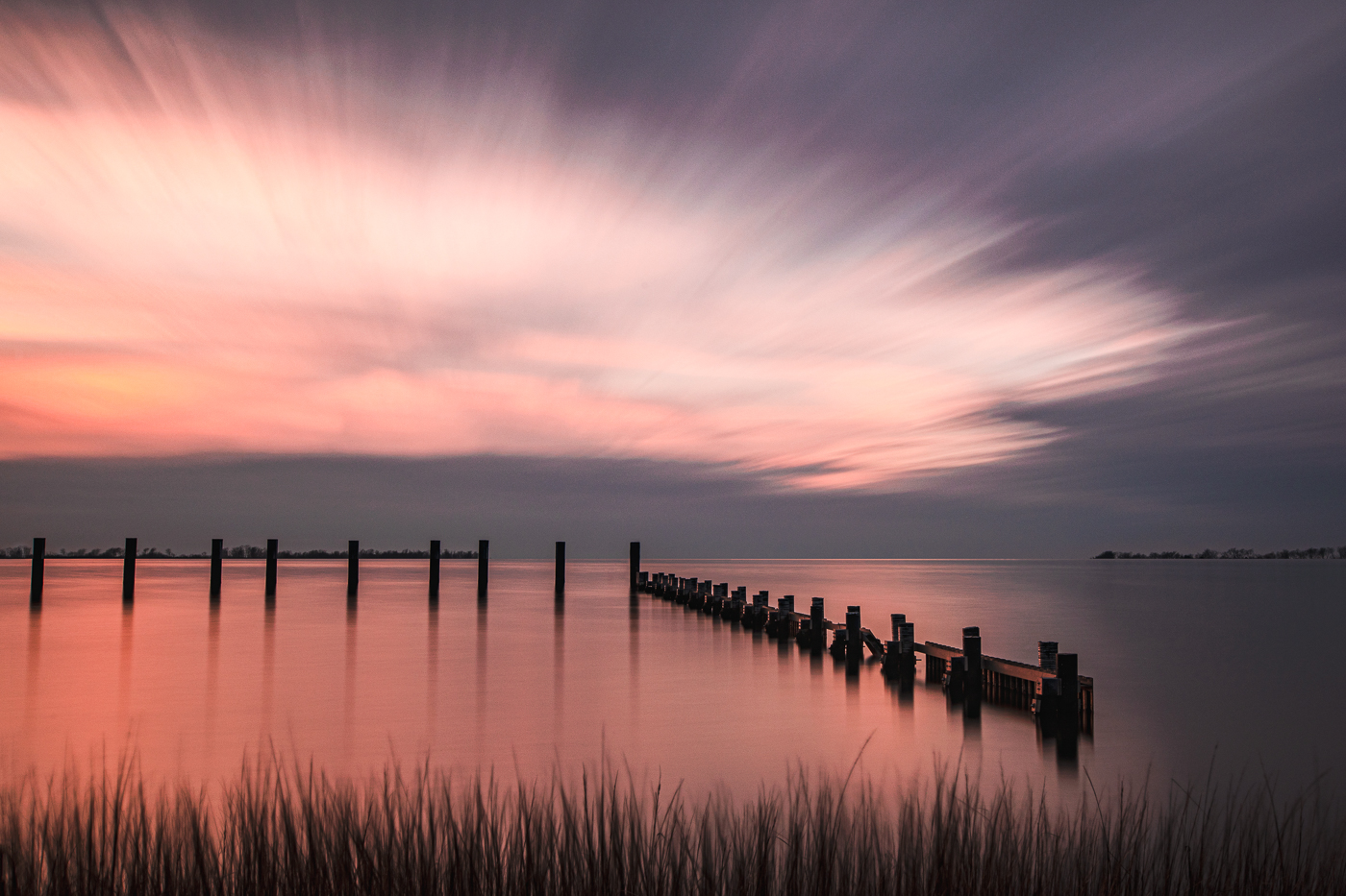
Thank you everyone for your comments. I fixed the branch so it no longer touches the horizon. |
Jul 24th |
| 36 |
Jul 22 |
Comment |
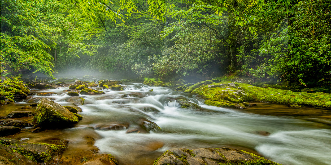
Richard, you nailed the movement of water. Sometimes Triple Falls can be hard to photograph because of the harsh dappled light that hits the falls making it challenging in a single exposure. Nice job capturing the curves and the touch of tree color. |
Jul 13th |
| 36 |
Jul 22 |
Comment |
Wow! Good thinking to add the water and you did it well. As everyone mentioned in architectural photography lines and shapes are critical and a quick fix in PS. Great job and good luck with your contest. |
Jul 13th |
| 36 |
Jul 22 |
Comment |
I agree with Michael and Larry about the wires, poles, branch. I'm an advocate for removing distractions from an image. Anything that breaks my connection and pulls my eye away from the subject I try to remove. Unless its a photojournalism image then everything stays. The composition is good. It's a nice combination of foreground, middle ground and background. The post processing style is the creator's preference, it almost looks vintage. I never worked with Luminar but have fun with it. |
Jul 7th |
| 36 |
Jul 22 |
Comment |
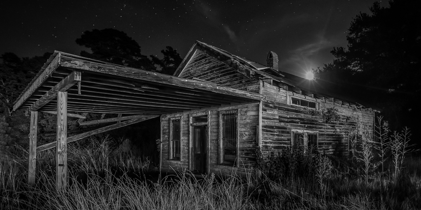
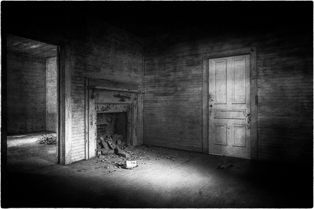
I love old ruins like this and you did a nice job with the composition. The old truck brings me into the image and the monochrome finish holds my attention. I'm on the fence about the sky. Does it become more of a distraction or does it give value to the image? The sky gives me a sense of place but I also like cropping it out as the deserted buildings, car, and broken wagon work nicely without it. Maybe a 16:9 crop would also work for this landscape as it could give it a more cinematic look. Just a thought. Very nice image. |
Jul 7th |
| 36 |
Jul 22 |
Comment |
The angle of Iron Mike makes the subject look grand and threatening and the stormy clouds show the raw power of nature. Great composition. Larry, I know what you're saying about "inky black" clouds. Southern storms just seem to look that way! I like that you cropped the image in a bit and although the B/W is nice, the color image has more impact for me. I especially like this image as my nephew is 82nd Airborne!
|
Jul 7th |
| 36 |
Jul 22 |
Reply |
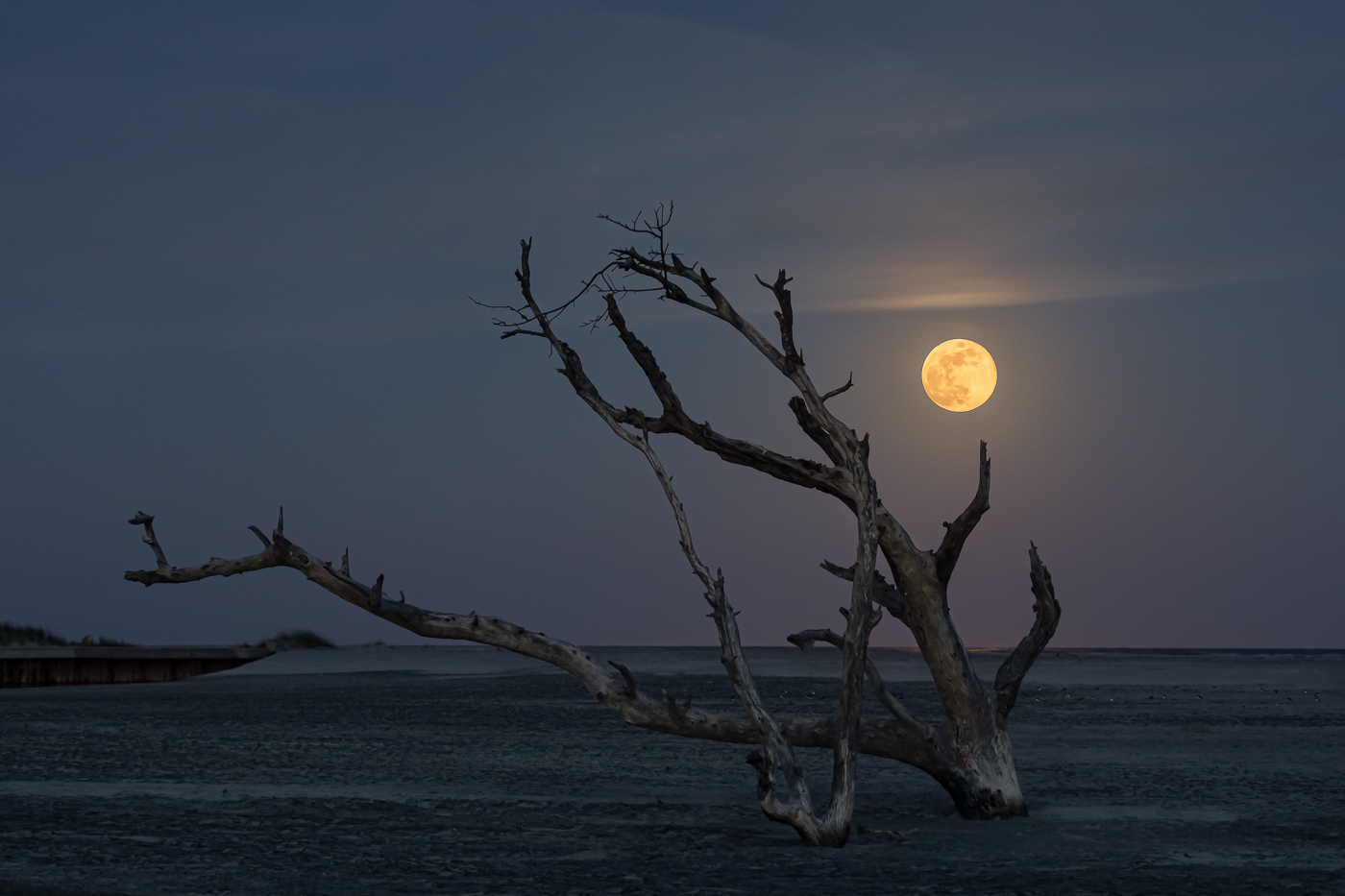
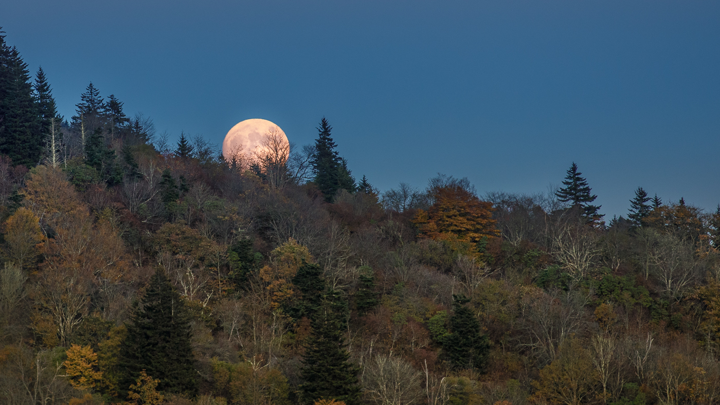
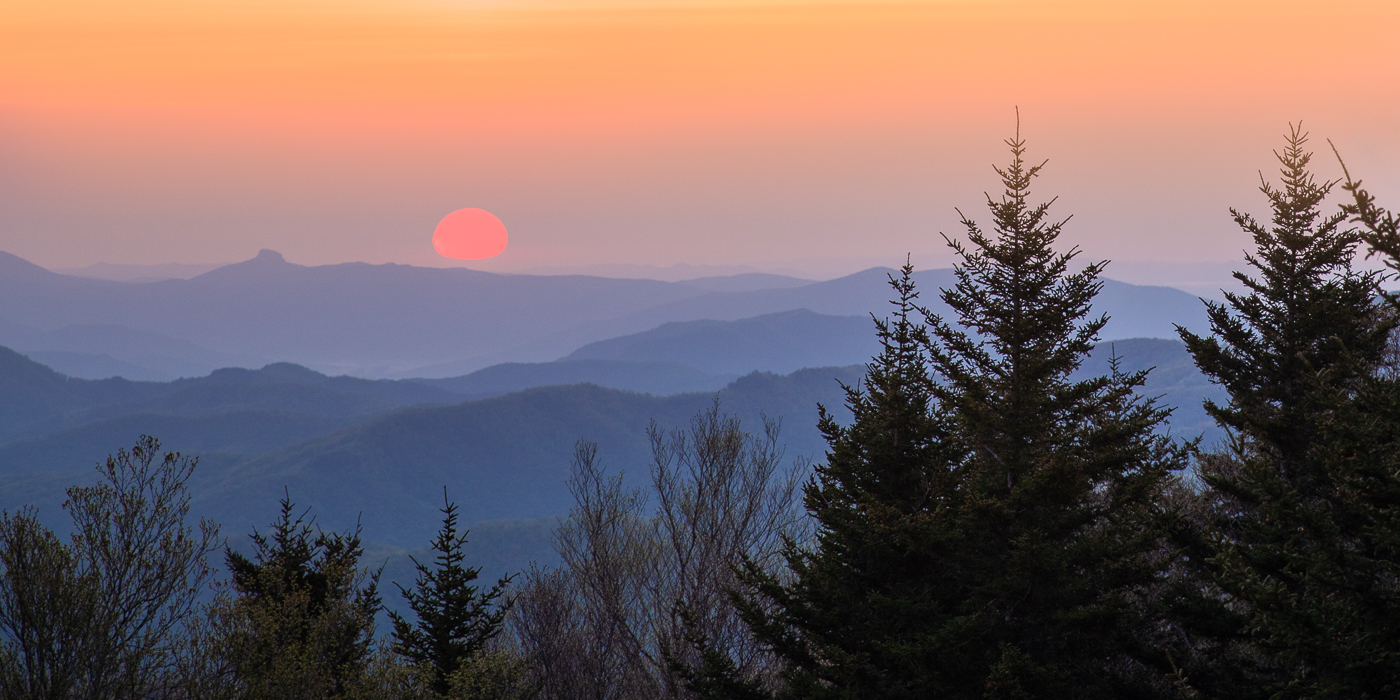
Larry, thanks for the suggestions and your points are well taken. I'm going to try and remember what I did because I flattened the image after I added the moon. Typically I use the quick selection tool and feather the edges a bit with select and mask to remove any residual dark sky color from the moon. Then I copy and paste the moon on the main image. Sometimes I'll also use the blend if feature in PS to enhance the blending. Since the moon rises so quickly, I needed to adjust the size of the moon to fit over the white blob. Sometimes, if possible, I will clone out the bright moon and replace it with the properly exposed moon. Ideally I prefer to get the correct exposure for both and try to plan when the sun is just below the horizon as the moon rises. |
Jul 6th |
6 comments - 1 reply for Group 36
|
| 72 |
Jul 22 |
Comment |
Isaac, I ran into the same issue at the San Diego zoo. The panda would not turn his head but I still loved photographing him trying to focus on body parts. I do prefer a view with open eyes however if the panda's paw and claws were visible as he held the bamboo I think it would make a more interesting shot. Nice job. |
Jul 13th |
| 72 |
Jul 22 |
Comment |
When I first looked at the image my first impression was to also crop out some of the foreground until I read your description and looked at the image again. By waiting for the hikers to enter the frame you achieved your vision for this image. In the color image, the hikers are more visible and the soft blue color adds a feeling of calmness to the scene. The B/W image gives off a different emotion making the scene more simple but intense. I like them both. |
Jul 13th |
| 72 |
Jul 22 |
Comment |
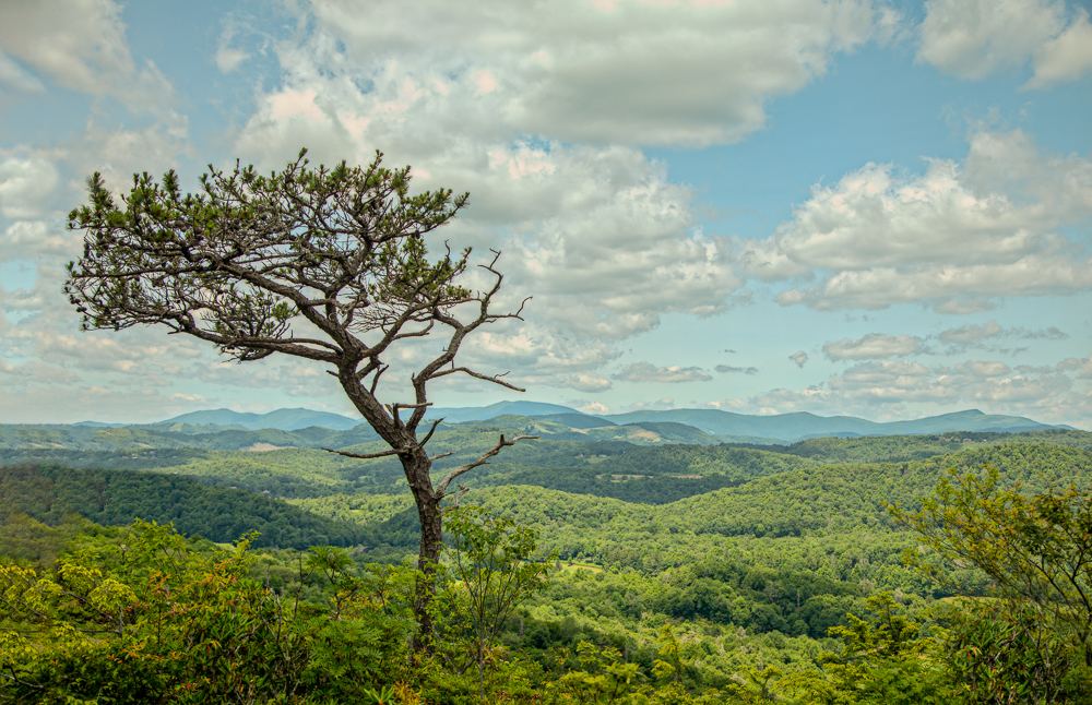
Beautiful image Marie. As mentioned already there is more visual weight on the right. However accentuating the height of the tree (evergreen?) gives the viewer that awe-inspiring feeling that these trees give when you look at them. There is always the option of a square crop however not really ideal in landscape. For me, I would probably just crop from the bottom and left of the image and leave the big tree top. |
Jul 12th |
| 72 |
Jul 22 |
Comment |
No knee replacements for me "knock on wood". Hope you have a fast and easy recovery!! Nice image on this bright and sunny day and I'm sure the participants loved all the images you gave them. My only comment is the image lacks room for movement. It would be nice if there was ample space for the cyclist to continue moving however you may not have had any room to do this. |
Jul 12th |
| 72 |
Jul 22 |
Reply |
Thank Isaac. I was actually surprised to get a fairly clear image with the crop but I think it's time to invest in more glass so I don't have to crop as much. My ISO was 200. |
Jul 12th |
| 72 |
Jul 22 |
Reply |
Thanks Bruce. Good advice!
|
Jul 12th |
| 72 |
Jul 22 |
Comment |
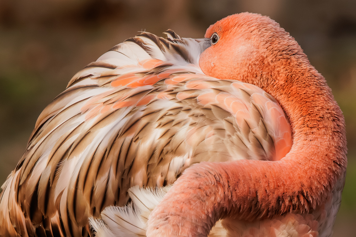
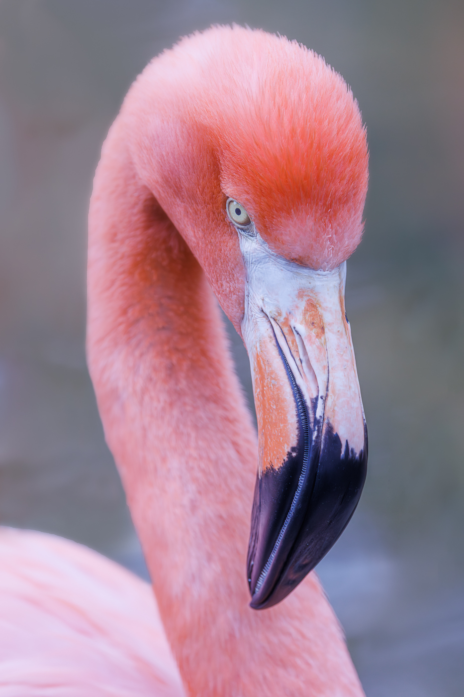
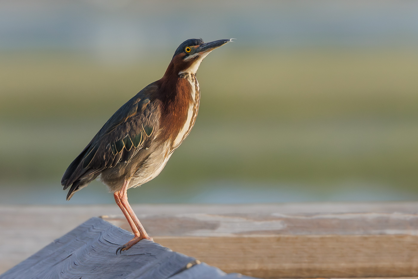
I actually like animal portraits and really like an animals just hanging out and doing nothing especially if there is interesting light and colors. The bird is beautiful and sharp as it stands and drys his wings but for me the image feels a bit flat. |
Jul 12th |
5 comments - 2 replies for Group 72
|
11 comments - 3 replies Total
|