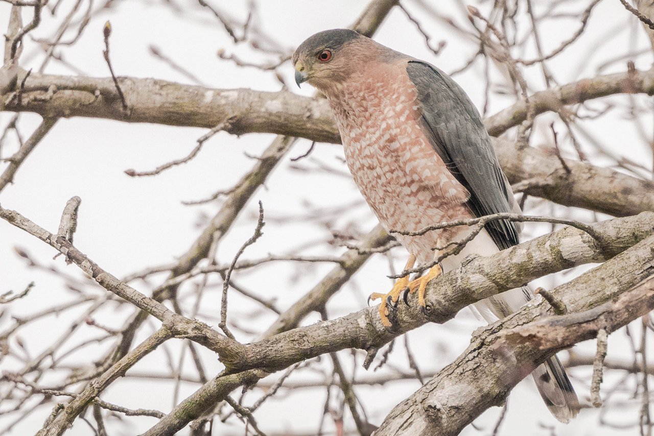
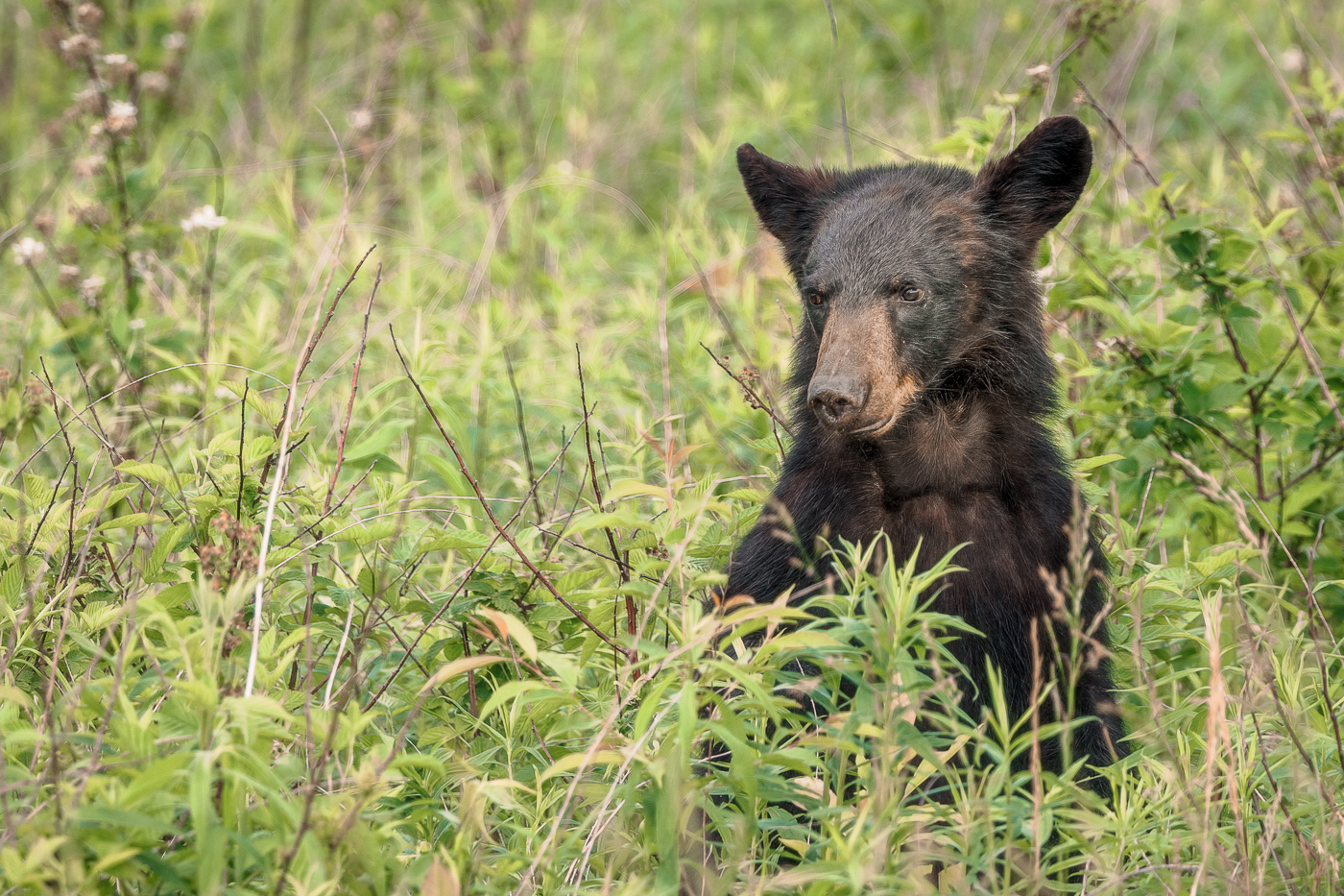
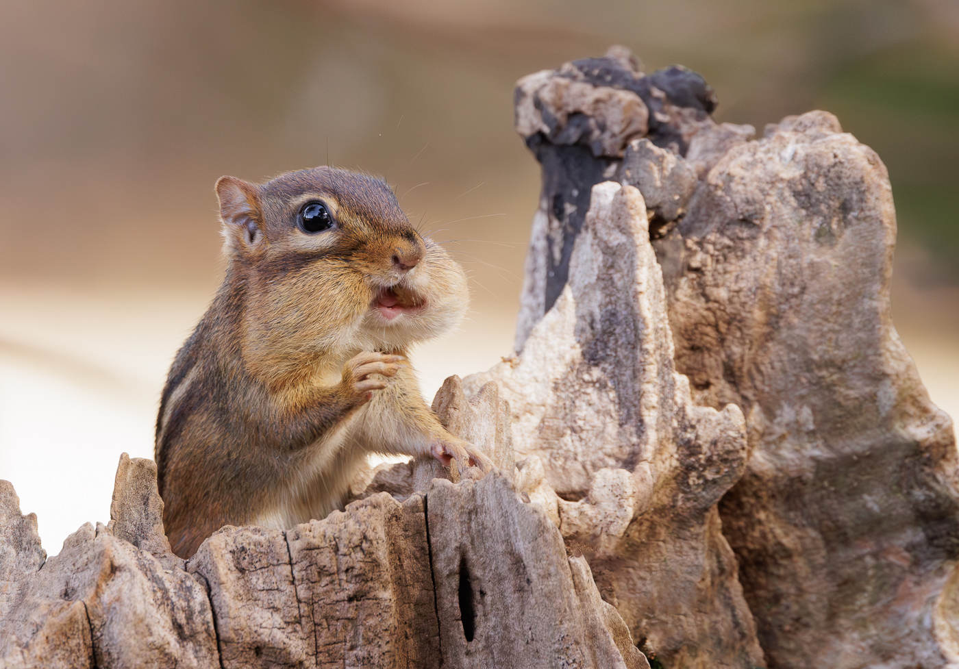
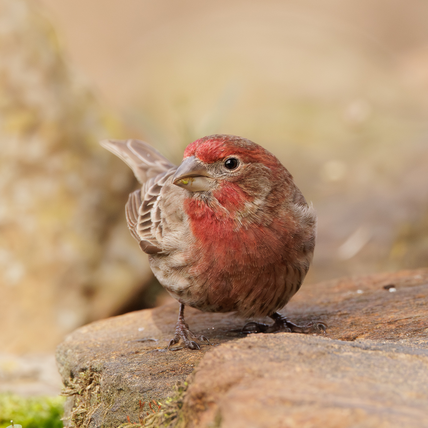
Activity for User 1439 - Barbara Gore - bgorephoto@gmail.com
Avatar
Close this Tab when done
575 Comments / 329 Replies Posted
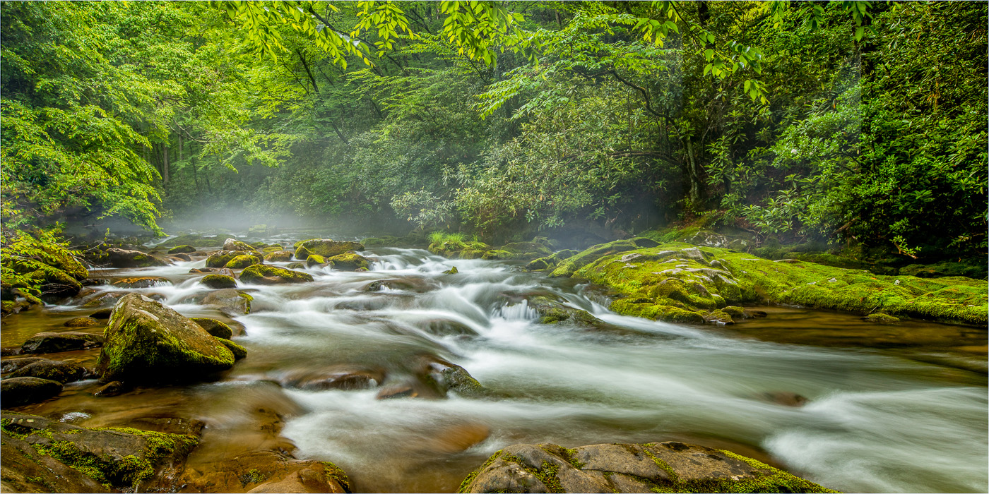
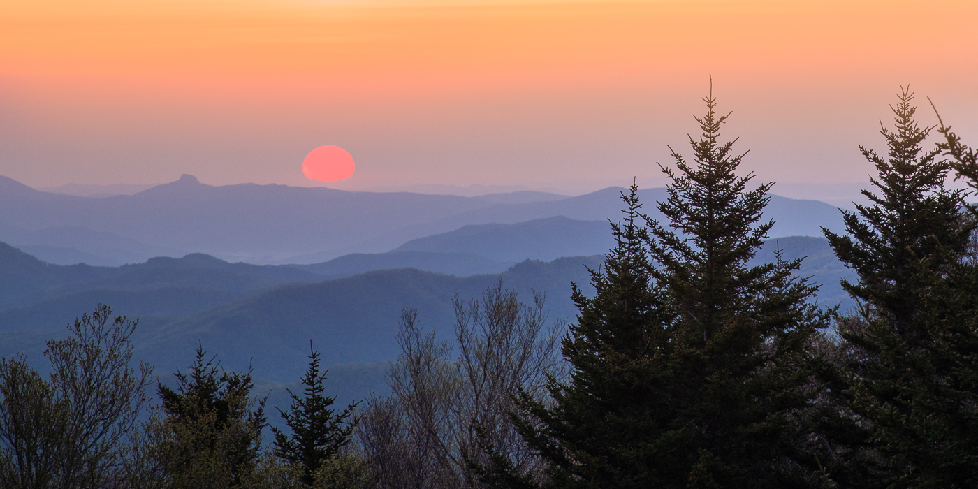
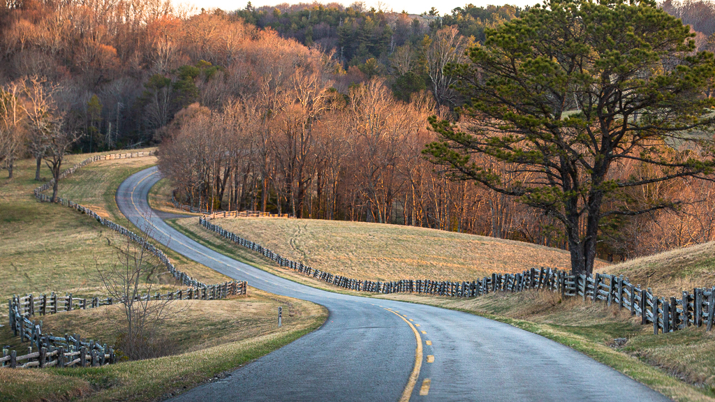
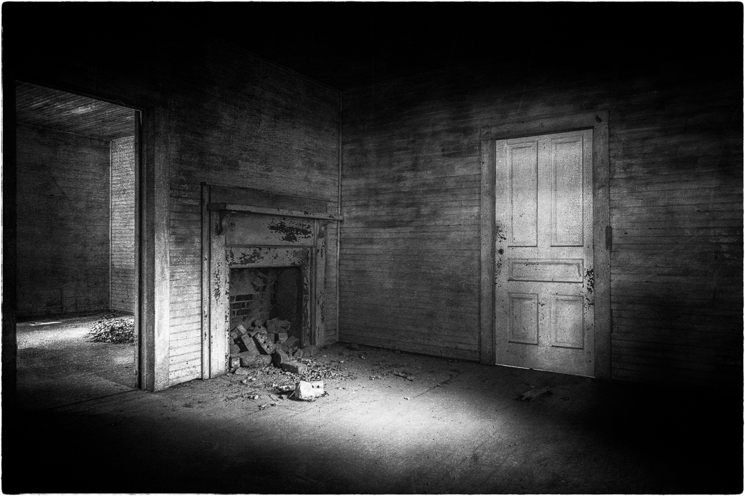
104 Images Posted
| = Current Round | = Previous Round |
| Group 36 | |||||||||||
|---|---|---|---|---|---|---|---|---|---|---|---|
 May 26 |
 Apr 26 |
 Mar 26 |
 Feb 26 |
 Jan 26 |
 Dec 25 |
 Oct 25 |
 Sep 25 |
 Aug 25 |
 Jul 25 |
 Jun 25 |
 May 25 |
 Apr 25 |
 Mar 25 |
 Feb 25 |
Jan 25 |
 Dec 24 |
 Nov 24 |
 Oct 24 |
 Sep 24 |
 Aug 24 |
 Jul 24 |
 Jun 24 |
 May 24 |
 Apr 24 |
 Mar 24 |
 Feb 24 |
 Jan 24 |
 Nov 23 |
 Oct 23 |
 Sep 23 |
 Aug 23 |
 Jul 23 |
 Jun 23 |
 May 23 |
 Apr 23 |
 Mar 23 |
 Feb 23 |
 Jan 23 |
 Dec 22 |
 Nov 22 |
 Oct 22 |
 Sep 22 |
 Aug 22 |
 Jul 22 |
 Jun 22 |
 May 22 |
 Apr 22 |
 Mar 22 |
 Feb 22 |
 Jan 22 |
 Dec 21 |
 Nov 21 |
 Oct 21 |
 Sep 21 |
 Aug 21 |
 Jul 21 |
 Jun 21 |
 May 21 |
 Apr 21 |
| Group 47 | |||||||||||
 Apr 26 |
 Mar 26 |
 Feb 26 |
 Dec 25 |
 Oct 25 |
 Sep 25 |
 Aug 25 |
 Jul 25 |
 May 25 |
 Apr 25 |
 Mar 25 |
 Feb 25 |
 Jan 25 |
|||||||||||
| Group 72 | |||||||||||
 Dec 24 |
 Nov 24 |
 Oct 24 |
 Sep 24 |
 Aug 24 |
 Jul 24 |
 Jun 24 |
 May 24 |
 Apr 24 |
 Mar 24 |
 Feb 24 |
 Jan 24 |
 Nov 23 |
 Oct 23 |
 Sep 23 |
 Aug 23 |
 Jul 23 |
 Jun 23 |
 May 23 |
 Apr 23 |
 Mar 23 |
 Feb 23 |
 Jan 23 |
 Dec 22 |
 Nov 22 |
 Oct 22 |
 Sep 22 |
 Aug 22 |
 Jul 22 |
 Jun 22 |
 May 22 |
|||||