|
| Group |
Round |
C/R |
Comment |
Date |
Image |
| 14 |
Feb 25 |
Reply |
Hello Kamal,
You are a busy, world traveler. No worries!
Thanks for the endorsement and your kind words.
Karen |
Feb 26th |
| 14 |
Feb 25 |
Comment |
Hi Darcy,
Thanks for the advice and suggestions. I will definitely try a B&W and see about removing that 3rd'Shroom!
And, Maggie could have cared less about those 'shrooms. They didn't smell like chicken - or cheese!
Take care!
Karen |
Feb 22nd |
| 14 |
Feb 25 |
Comment |
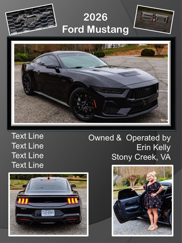
Hi Erin,
I doubt you would have stepped on them - they were pretty big and there were LOTS of them everywhere!
I guess I missed the mark with my storytelling on the "scary 'shroom." I might take him out and try converting to black and white.
Thanks for your feedback!
Karen |
Feb 19th |
| 14 |
Feb 25 |
Reply |
Hi Leslie,
Thanks for your suggestion. I was hoping that folks would see that 'shroom in the back as the scary one chasing the other two in the foreground. Guess I need to do more work!
I appreciate your feedback.
Karen
P.S. I like the word "photographable!" Spell check didn't kick it out! |
Feb 19th |
| 14 |
Feb 25 |
Reply |
Hi Tom,
Good point on those greens. Maybe if I darken them a bit it will look even more "scary"!
Thanks!
Karen |
Feb 19th |
| 14 |
Feb 25 |
Reply |
Thank you, Greg. We'll see what our Evaluator says. You just never know!
Karen |
Feb 19th |
| 14 |
Feb 25 |
Comment |
Hi Kamal,
Here's another perspective on the crop discussion!
I want to see more of the colorful boat and those fish. I think I would crop from the bottom, just below that blue stripe. That way, we see more of his net and the fish he is catching. Then, I don't think we need as much sky at the top.
I like that you removed the birds, but you might want to work on the black one a bit more. I can see a slight shadow where you removed him.
It's a wonderful, colorful environmental portrait. Thanks for sharing!
Karen |
Feb 19th |
| 14 |
Feb 25 |
Comment |
Hi Erin,
Great capture - especially through "hockey glass" - which is anything but clear!
That player on the left does serve to anchor our focus on the star of the photo (and probably the game!) Since the viewer's eye is normally drawn to "light" areas, try this: Crop in on the left so that you eliminate the white ice, but still show most of that player's uniform and number 12. You can come almost to the dark vertical bar on his helmet. That might help the viewer's eye to circle between your main subject and his opponent and back again without stopping on that white edge.
Great job under tough circumstances!
Karen
P.S. How about a title of "Intensity on Ice"? |
Feb 19th |
| 14 |
Feb 25 |
Comment |
Hi Tom,
How creative and what a beautiful image!
I love how you have highlighted those awesome details in such a small feather.
Fabulous - thanks for sharing!
Karen |
Feb 19th |
| 14 |
Feb 25 |
Comment |
Hi Greg!
I am green with envy - on the trip AND your photos!
I have a simple suggestion on your layout. Try swapping the top middle and top right photos. That would put your three "signs" in a sort of triangle with the street scene in the middle. That might make it look more cohesive with the rest of the layout.
Beautiful, colorful collage. Thanks for the warm, beach images on the cold, winter evening!
Karen |
Feb 19th |
| 14 |
Feb 25 |
Comment |
Hi Darcy,
What a beautiful image! I love butterflies!
The only thing I might change is that tiny bit of pink that Erin mentioned, plus another little pink speck on the left.
Wonderful colors and sharp focus.
Great shot!
Karen |
Feb 19th |
| 14 |
Feb 25 |
Comment |
Hi Ingrid,
My first thought was "Where is the Bear?" Our camera club just had an Evaluator who emphasized the importance of the title setting up your image - telling the viewer what you want them to see. Just something to consider...
I do like the anchoring rock and the meandering, icy river. I have a tough time looking through the "fence" created by the willows in the foreground.
Thanks for sharing!
Karen |
Feb 19th |
8 comments - 4 replies for Group 14
|
8 comments - 4 replies Total
|