|
| Group |
Round |
C/R |
Comment |
Date |
Image |
| 14 |
Sep 24 |
Reply |
Hi Darcy,
Thanks for the kind words. I think that "bright element" might be the last remnants of an ugly parking area that I cloned out. I'll go hit it again. I'm glad you all have good eyes!
I appreciate the feedback and encouragement!
Karen |
Sep 21st |
| 14 |
Sep 24 |
Reply |
Hi Greg,
I hadn't thought of the "Thomas Kincade" effect, but the lighting does lend itself to his style. Thanks for that comparison and your feedback.
Karen |
Sep 21st |
| 14 |
Sep 24 |
Reply |
Hello Tom,
Great observations! I will tweak it a bit more before submitting it.
Thanks for your feedback!
Karen |
Sep 21st |
| 14 |
Sep 24 |
Reply |
Hello Leslie,
Thanks for your lovely comments!
Karen |
Sep 21st |
| 14 |
Sep 24 |
Comment |
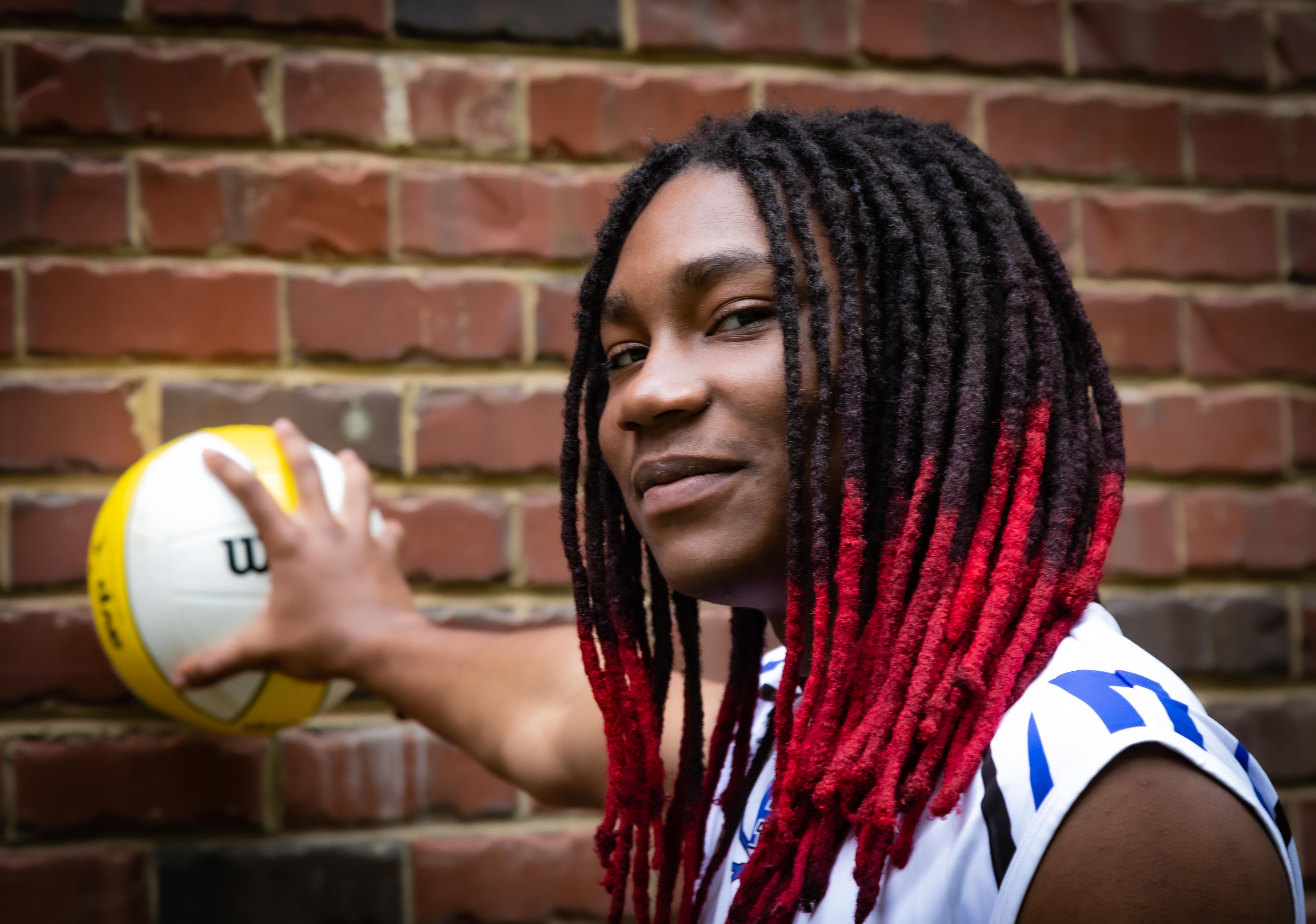
Hi Kamal,
Another great image and trip into a different culture and lifestyle. I love the facial expression you captured. The selective focus certainly draws the eye to your main subject.
You might consider cropping out the black fence on the right. This would serve two purposes:
1. Remove this dark distracting element, and
2. Move your subject into right third of the image and out of the center, thereby improving your composition.
Another nit-picky point: maybe tone down the bright pink in the upper left corner.
Great shot! Thanks for sharing.
Karen |
Sep 21st |
| 14 |
Sep 24 |
Comment |
Hi Erin,
Beautiful image. I like the composition; I don't think a crop would help. The tall flowers on the left balance the beautiful butterfly.
I like that you cloned out some of the blue flowers in the background. I think I would take that last one out as well, so it doesn't detract from the beautiful oranges and yellows.
Think about adding a vignette and maybe a stroke to help focus on the main subject.
Nice job!
Karen |
Sep 21st |
| 14 |
Sep 24 |
Comment |
Hi Tom,
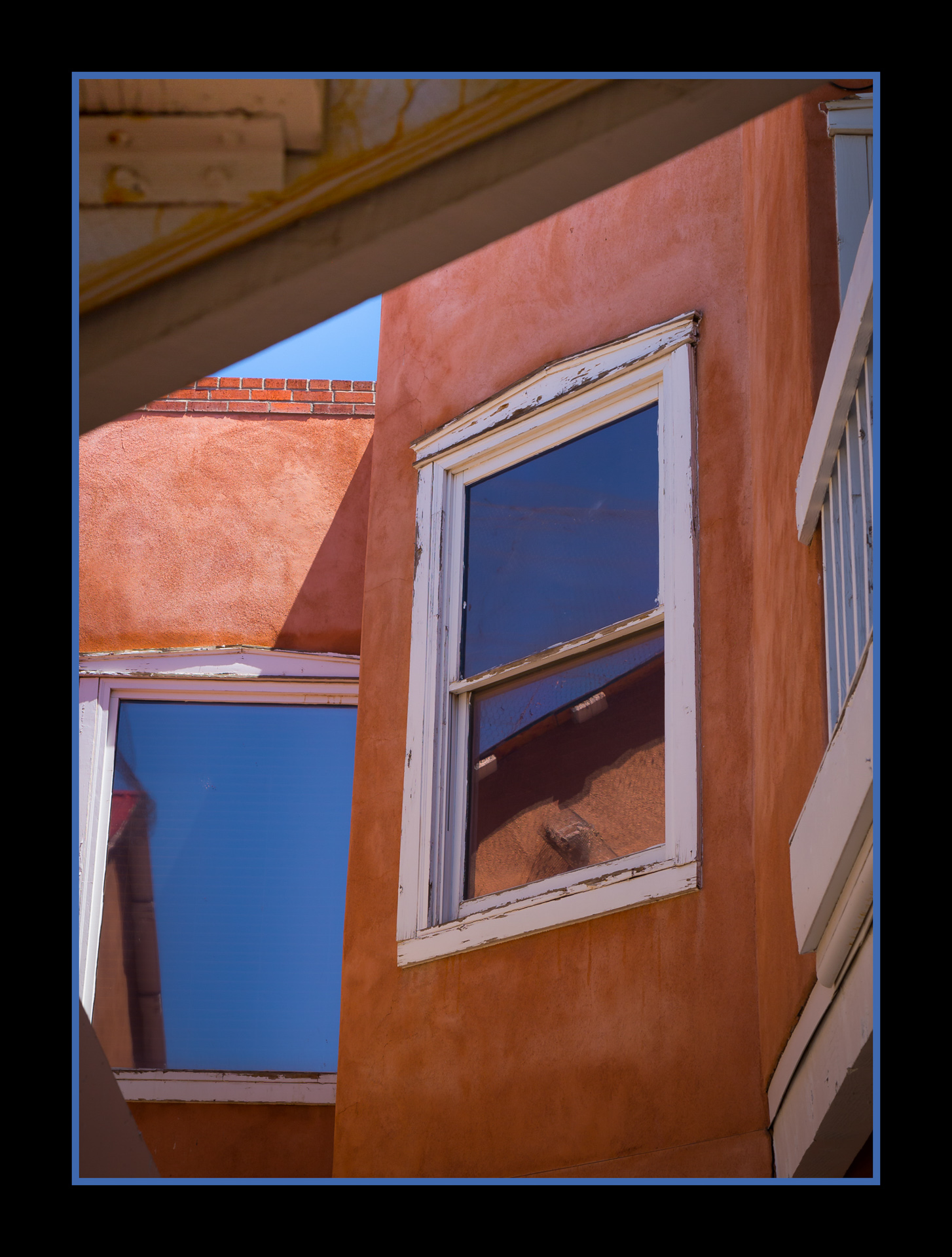
I have to admit, my first impression was that this image didn't check many of my boxes. I actually think I like the original better. (Not what you want to hear, I'm sure.)
Then on a 2nd look, I do like the interplay between light and dark - just tone down the couple of hot spots as Greg mentioned. I would like to see if more off-center, but it is hard to tell, since PSA's black background competes with the definition of your edges. A stroke would help for sure (also, as Greg mentioned.)
You have a great concept here, keep on creating!
Karen
|
Sep 21st |
| 14 |
Sep 24 |
Comment |
Hi Greg,
Nice capture and very effective post-processing to bring out those colors. The addition of the fish is a great plus to balance your composition.
Nice job!
Karen |
Sep 21st |
| 14 |
Sep 24 |
Comment |
Hi Ingrid,
Yep - it is certainly an abstract. I love how you were able to envision and capture this. It certainly challenges the eye to keep roving throughout the image. And, I agree with Darcy - I'm glad you told us what it is; I would never have figured it out!
Well done!
Karen |
Sep 21st |
5 comments - 4 replies for Group 14
|
5 comments - 4 replies Total
|