|
| Group |
Round |
C/R |
Comment |
Date |
Image |
| 14 |
Jun 24 |
Reply |
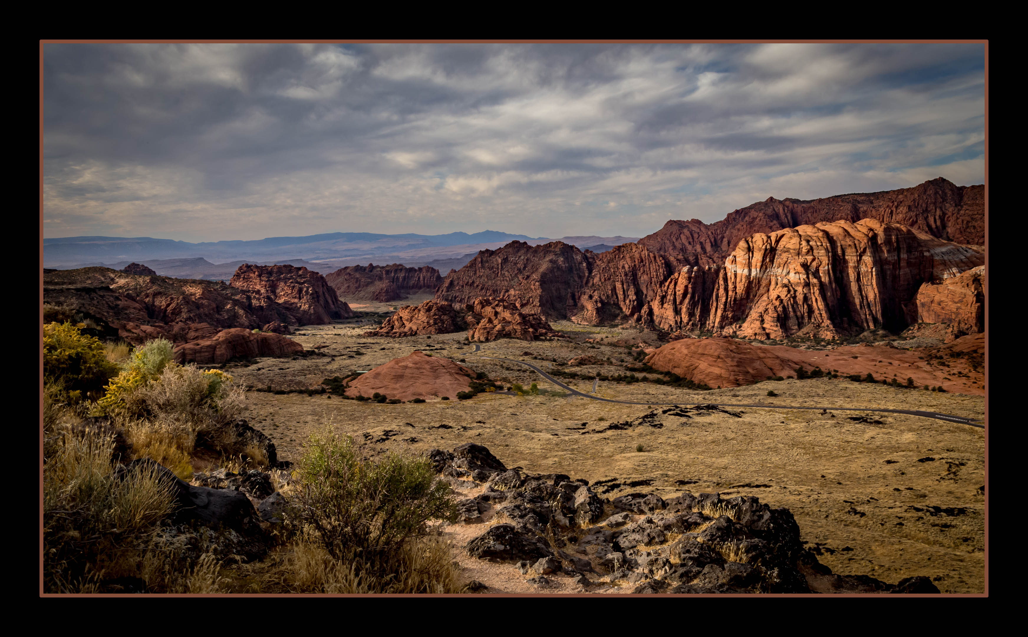
Ahh - that dark spot in the sky. I didn't see it until I looked more closely at Greg's re-do. I will definitely address that!
Hapless hikers?! Maybe my new title...
Thanks for your feedback.
Karen |
Jun 26th |
| 14 |
Jun 24 |
Reply |
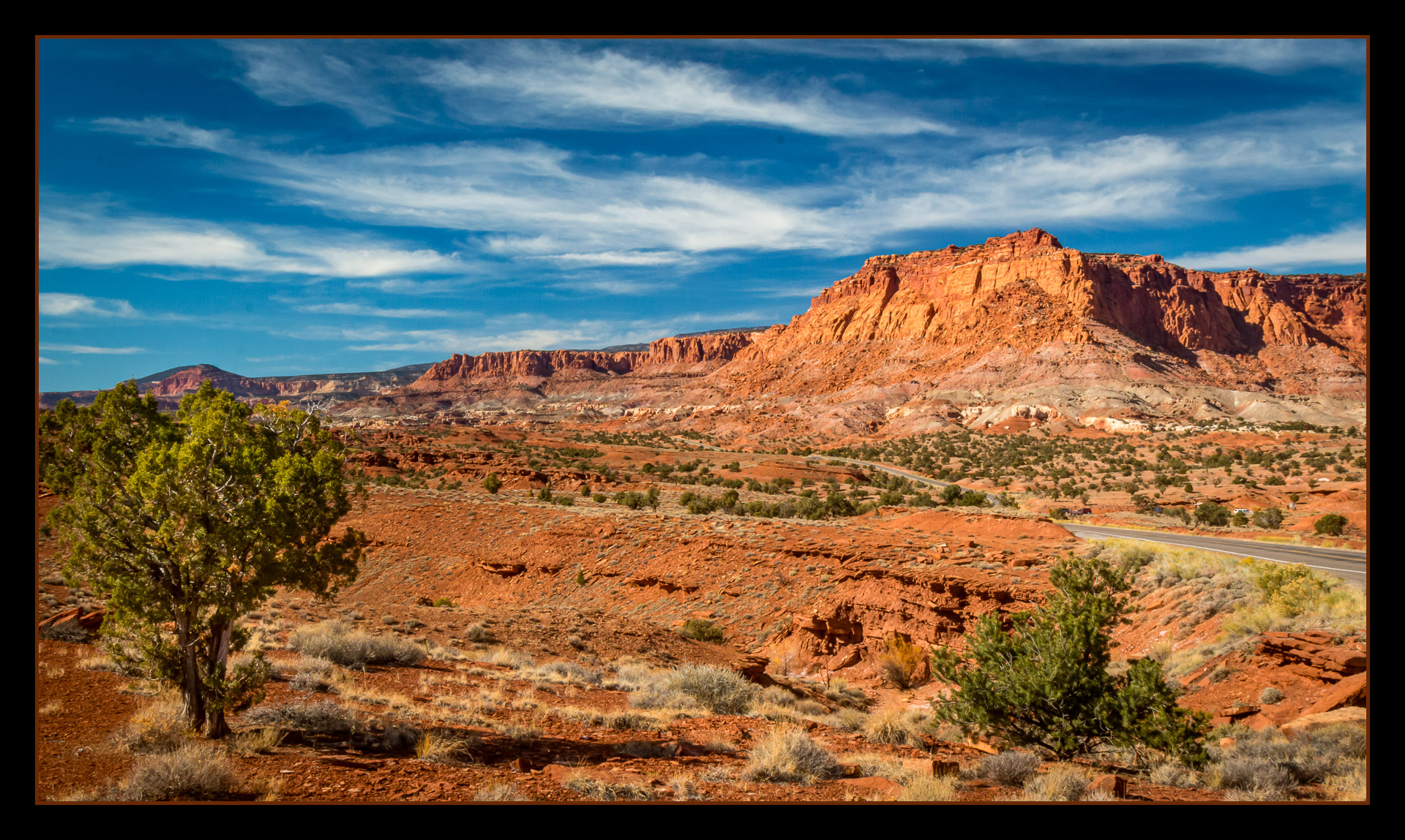
Thank you. I'm glad you like the panoramic crop. It does seem to add more impact to the image.
Thanks for the feedback.
Karen |
Jun 26th |
| 14 |
Jun 24 |
Reply |
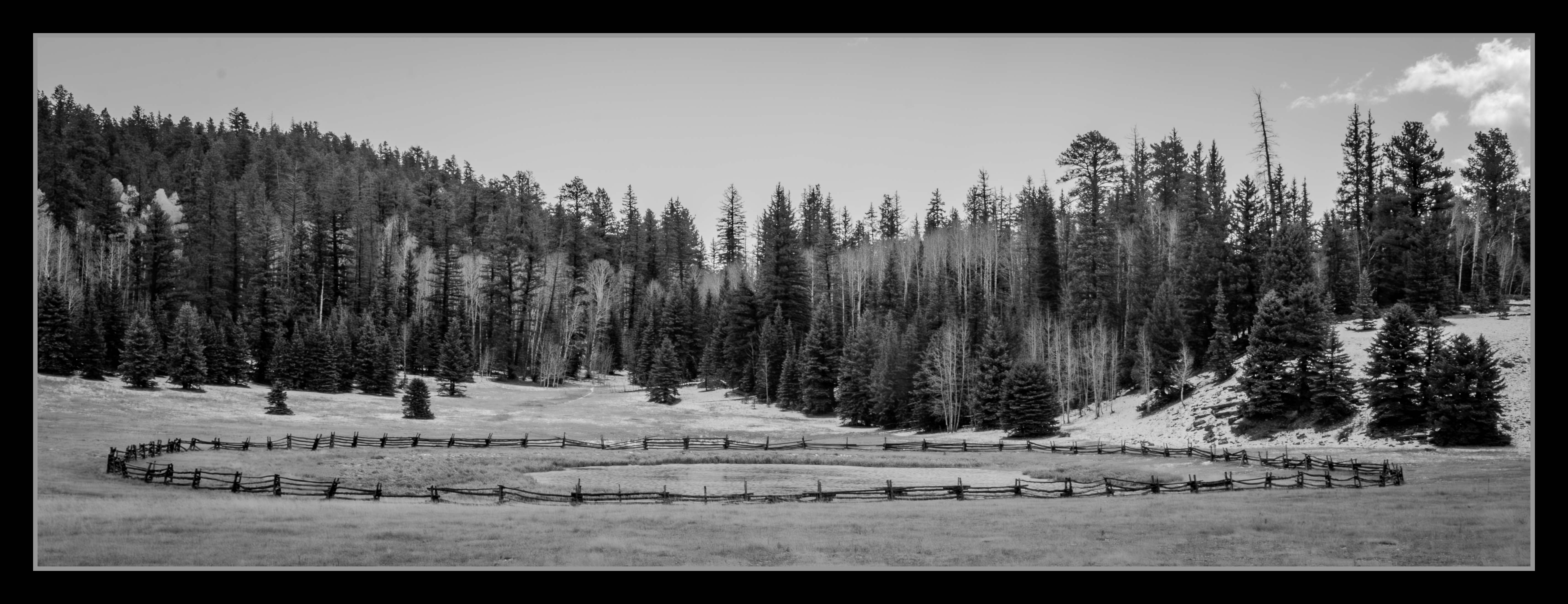
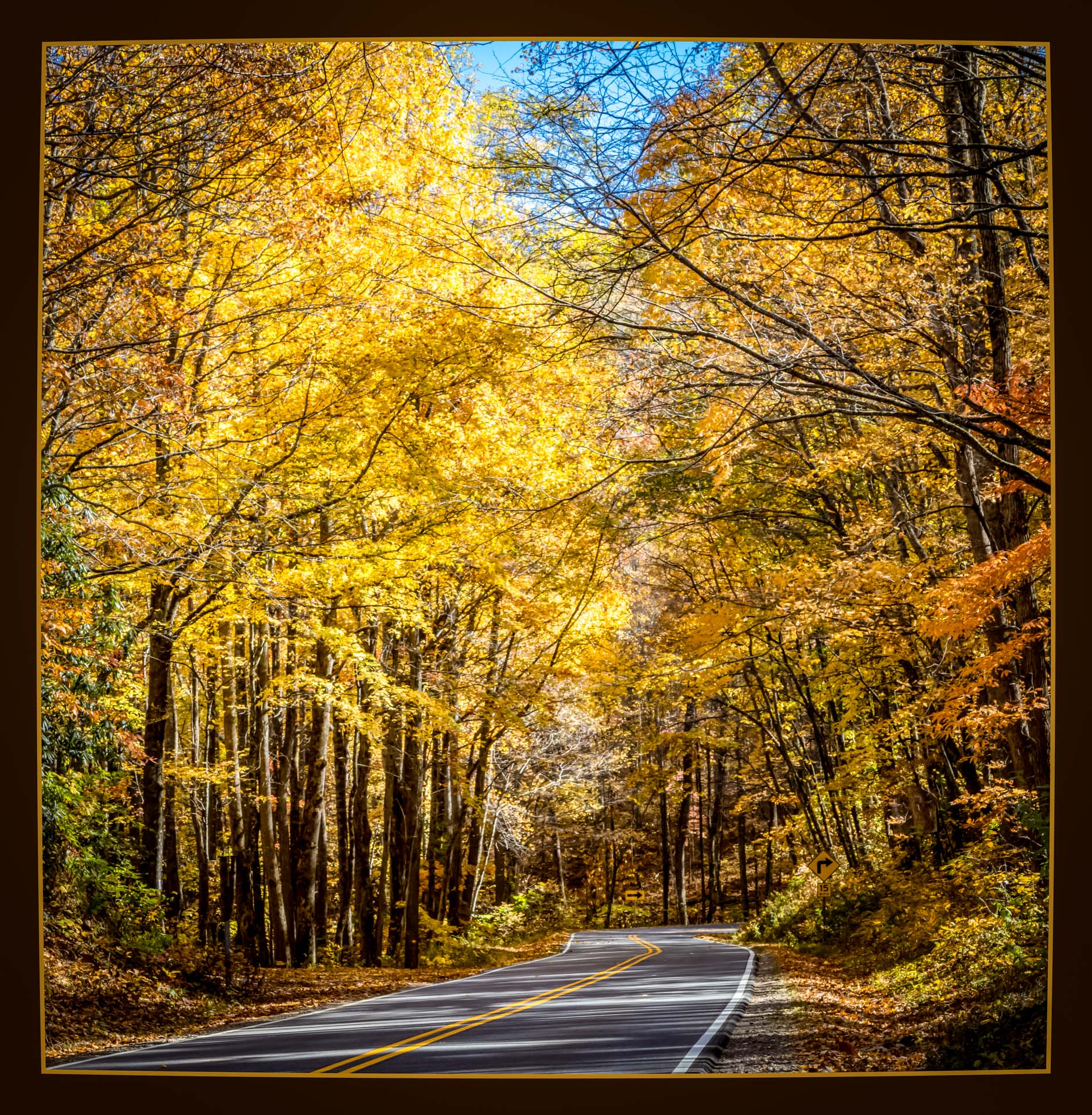
Great suggestions from everyone. I DO keep wondering about that fence. Maybe I need to incorporate that in the title somehow. (Our Evaluator didn't like my title, since it mentions "Fall" and you think of COLOR when you think of Fall. DUH on my part!)
I appreciate your comments.
Karen |
Jun 26th |
| 14 |
Jun 24 |
Reply |
Great ideas to highlight the snow - especially since it's in the title!
Thanks, Erin.
Karen |
Jun 26th |
| 14 |
Jun 24 |
Reply |
Thanks for the suggestion and the example! We do display on 50% grey at our club, so that's the reason for the black frame. I'll get to work!
Karen |
Jun 26th |
| 14 |
Jun 24 |
Reply |
Hi Leslie,
Thanks for stopping by and for your suggestion. I'll work on that pond!
Karen |
Jun 26th |
| 14 |
Jun 24 |
Reply |
Great suggestion!
Thanks, Tom.
Karen |
Jun 26th |
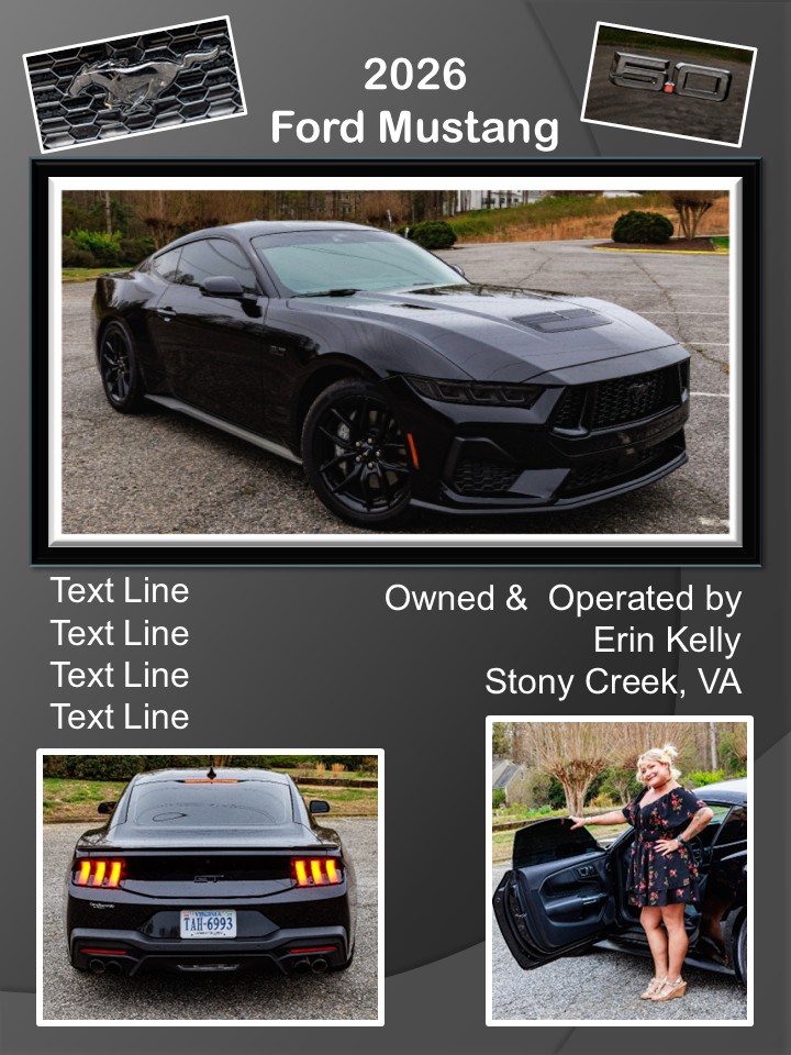
| 14 |
Jun 24 |
Comment |
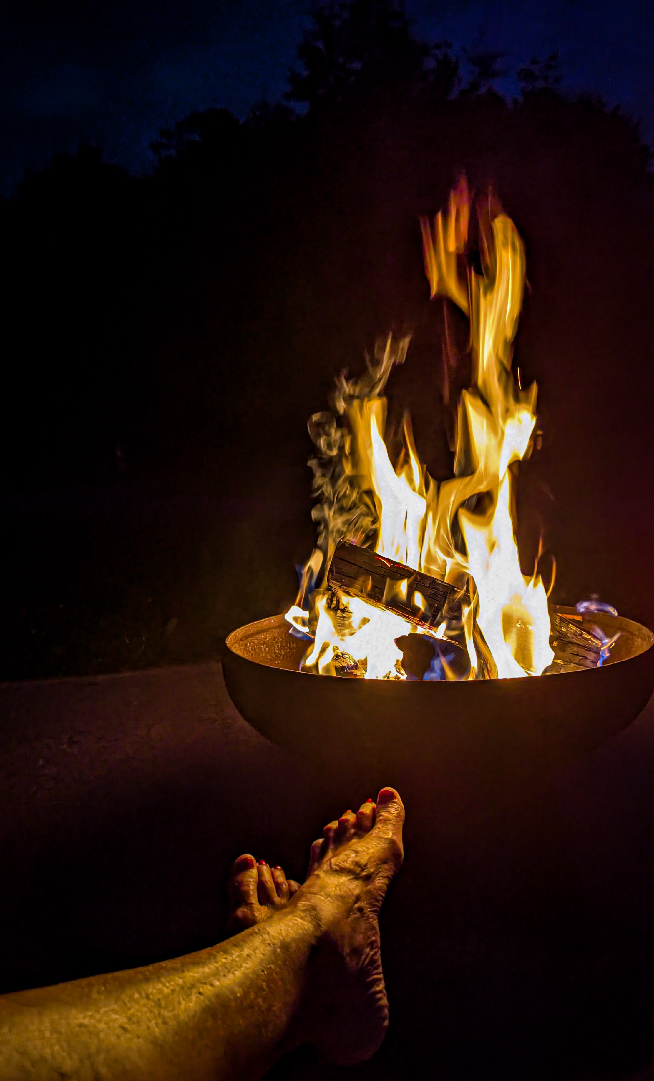
Hi Kamal,
First of all, congratulations on your Showcase selection!
This is a great capture! Cute model. Awesome chair!
I really like the cropped version, as that was one of the suggestions that immediately popped into my head. If you have more time, you might want to take out the tall grasses in the foreground.
Super! Thanks for sharing.
Karen |
Jun 19th |
| 14 |
Jun 24 |
Comment |
Hi Erin,
Oh, this just made ME smile. What a great portrait of your daughter! I do like the idea of a vignette. If you do, you might crop it a bit wider and taller. (Gee, I can't believe I'm typing this - I usually tell people to crop MORE!) This would give you some room around her to darken the background.
Just a thought...
This one is certainly a keeper!
Karen |
Jun 19th |
| 14 |
Jun 24 |
Comment |
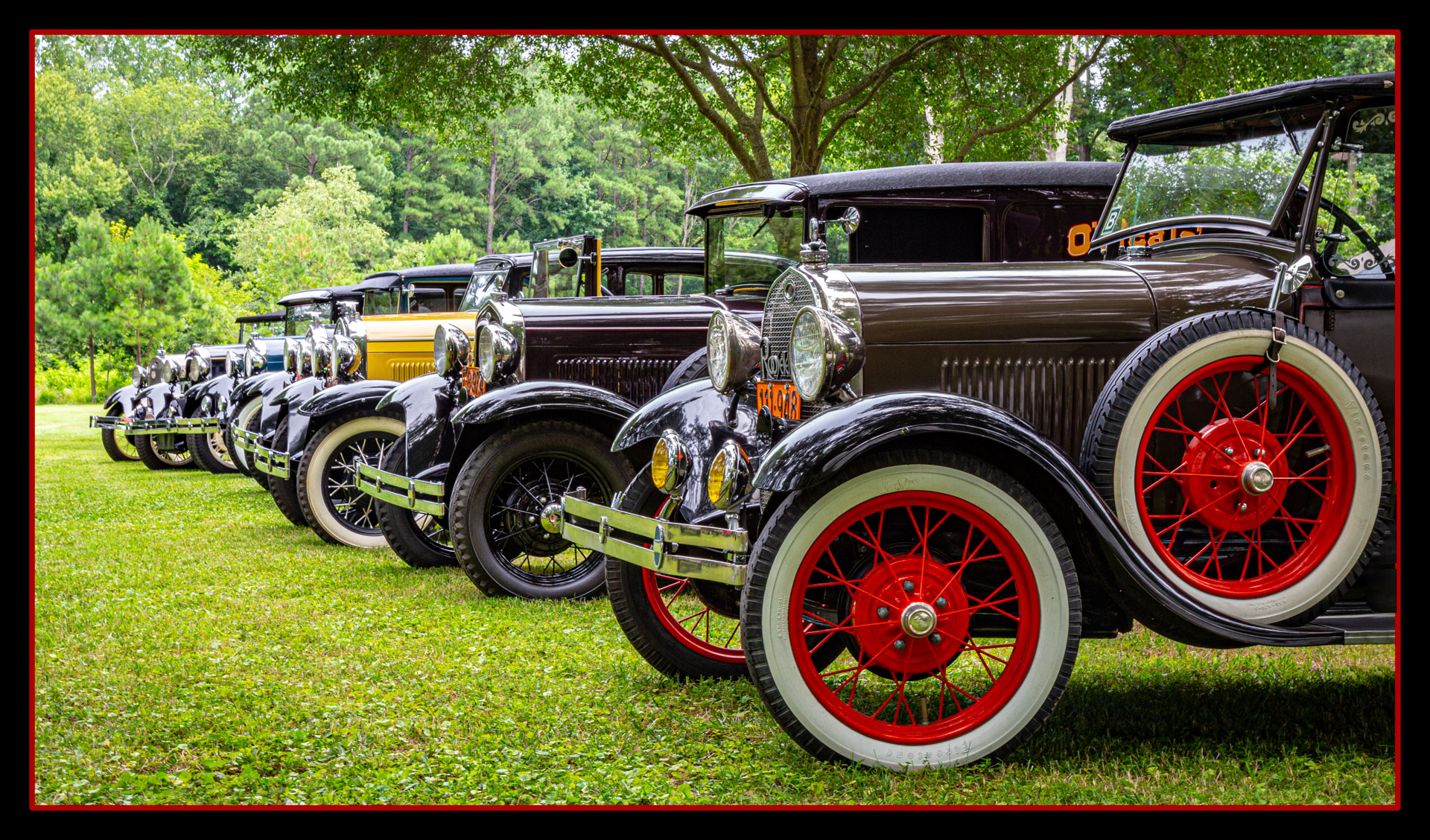
Hi Tom,
Thanks for offering up a different type of image for us this time. The colors are vivid in your focal point and interesting to the eye. I too, was bothered by the black area to the right. It's too bad that was there to detract from an otherwise great image.
Thanks for sharing.
Karen |
Jun 19th |
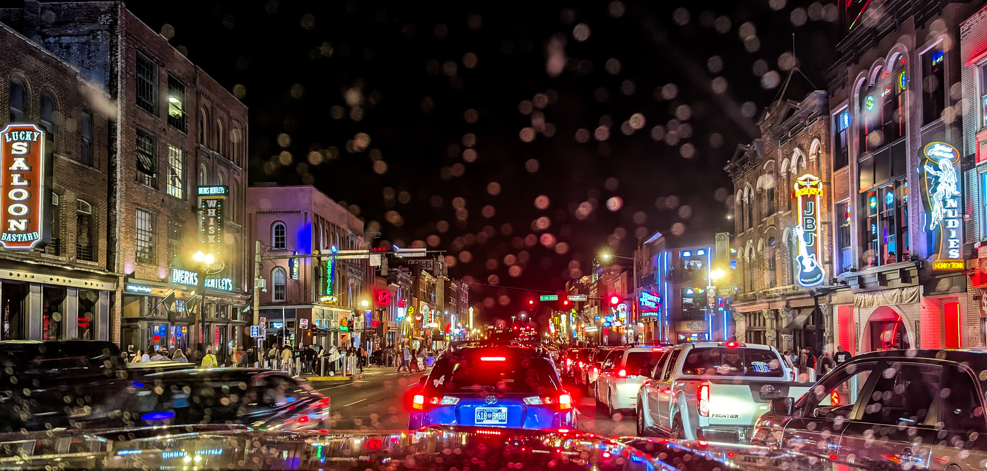
| 14 |
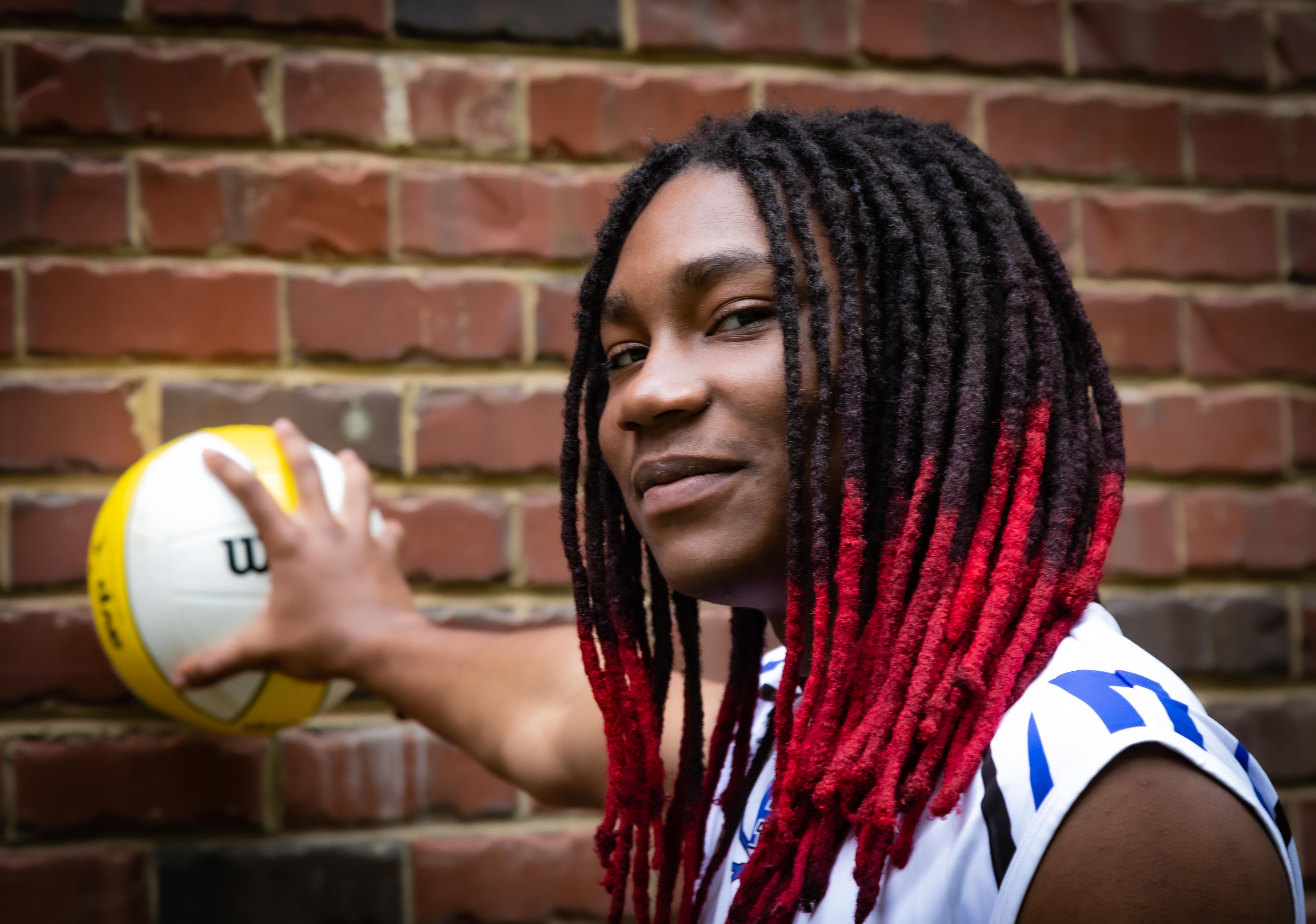
Jun 24 |
Comment |
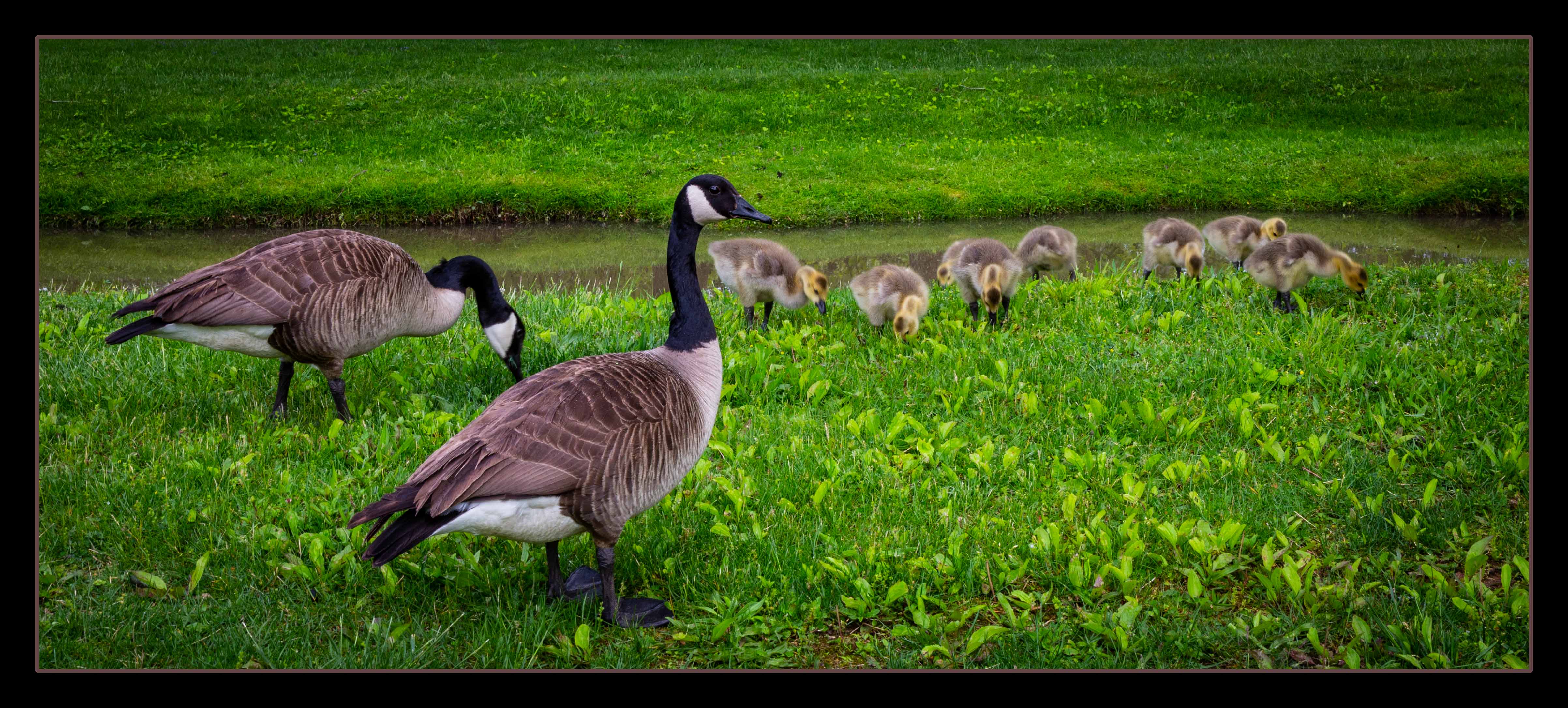
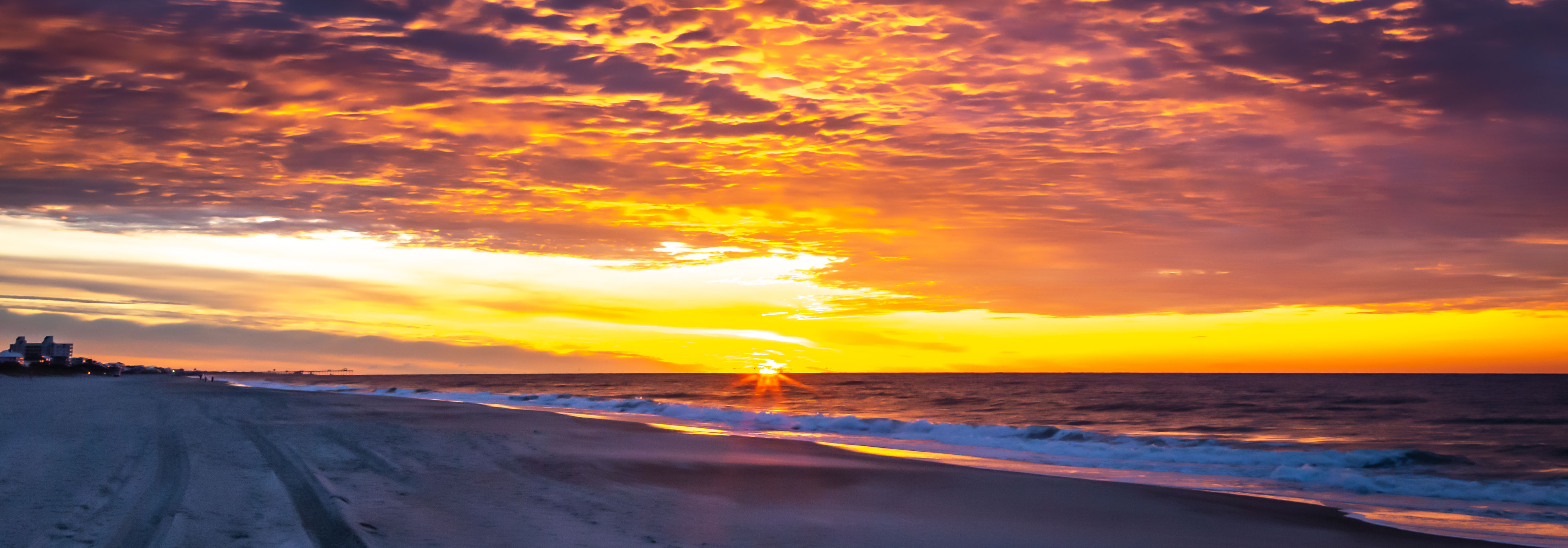
Hello from Hilton Head, SC
...where we are surrounded by signs to beware of the alligators! I would NOT be this close.
Since it wouldn't be smart to reach in and remove those reeds, I agree with the others to try the new AI remove tool in Lr and see if you can reveal all of his lovely face.
Great capture, brave man!
Karen |
Jun 19th |
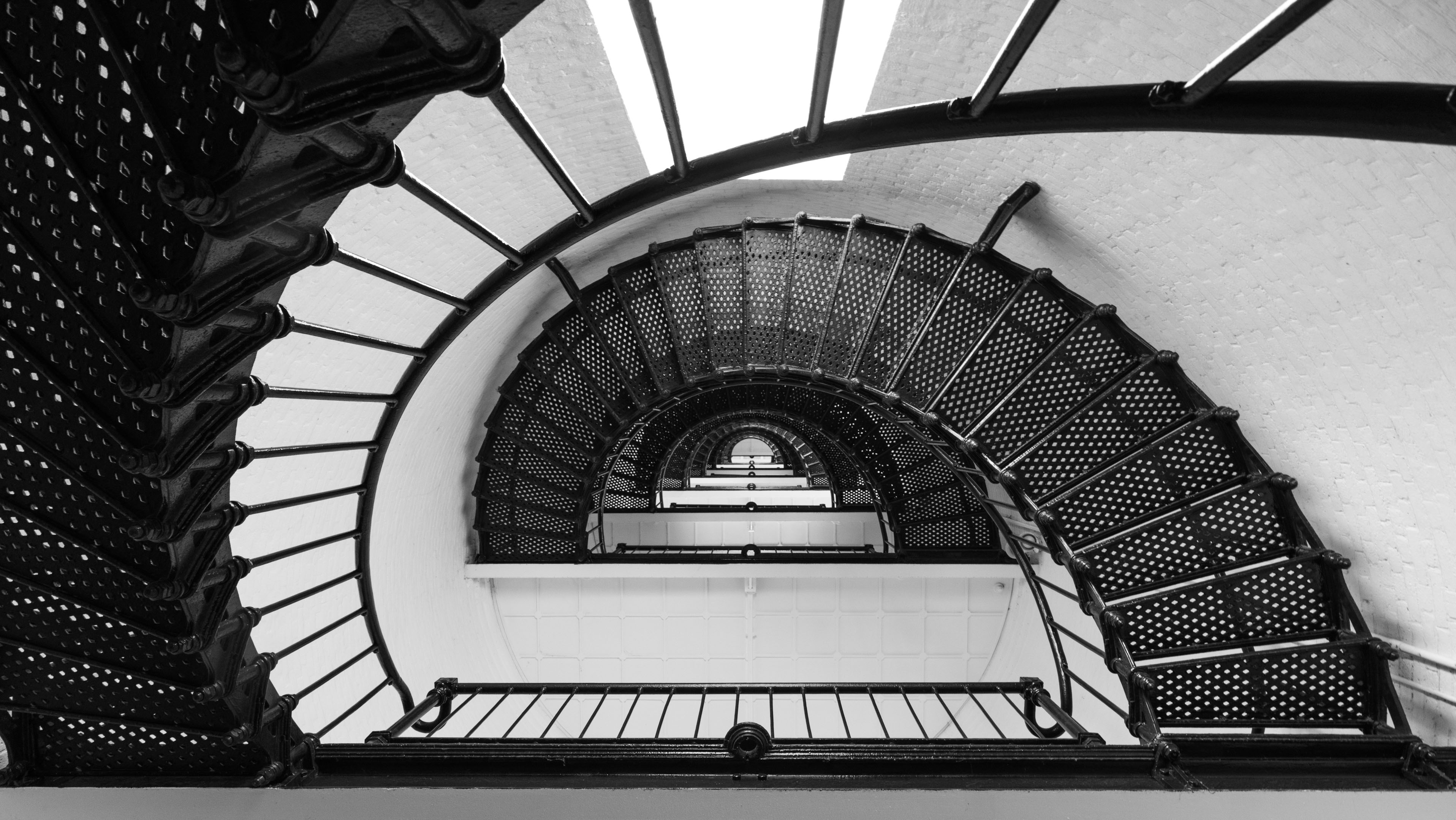
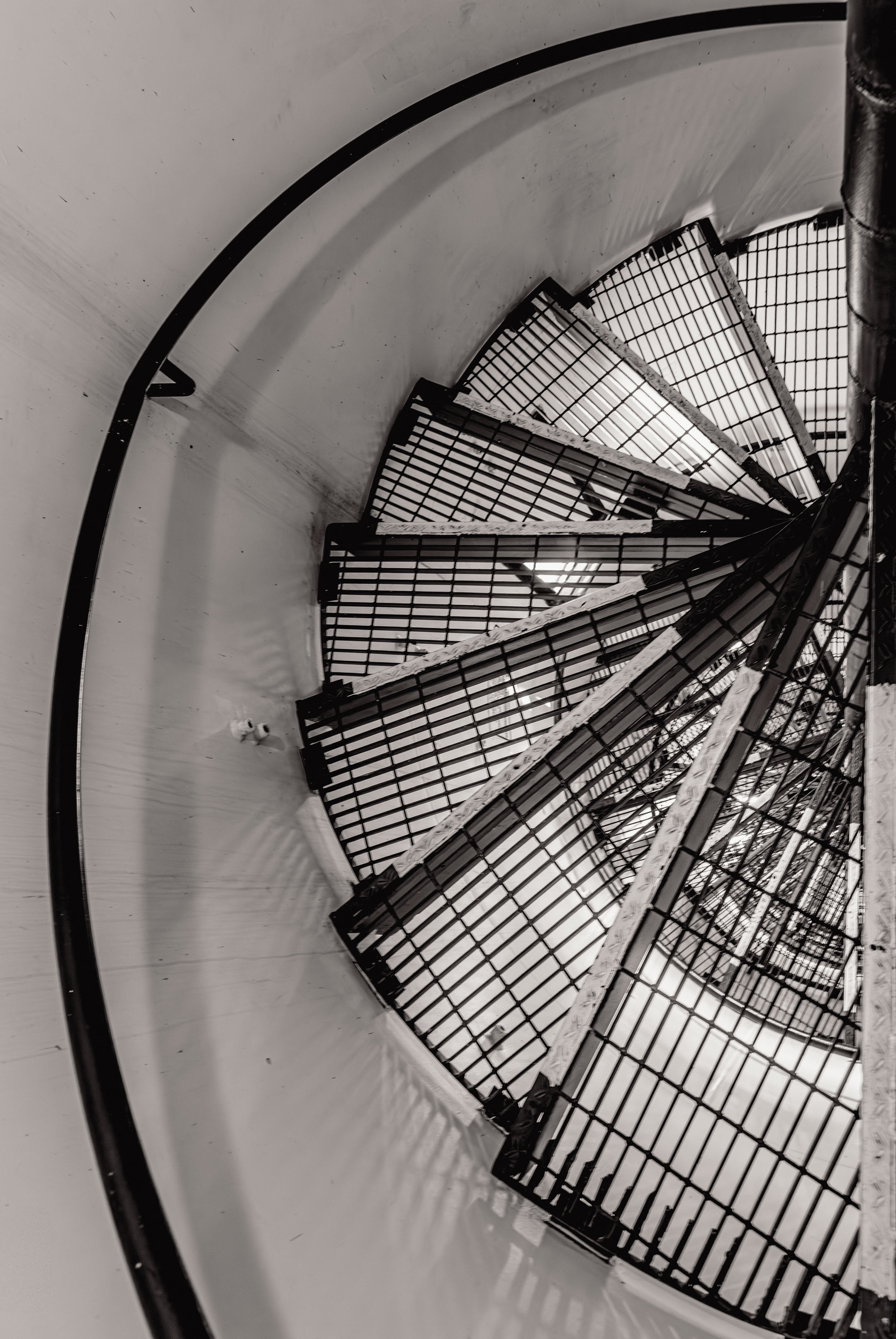
| 14 |
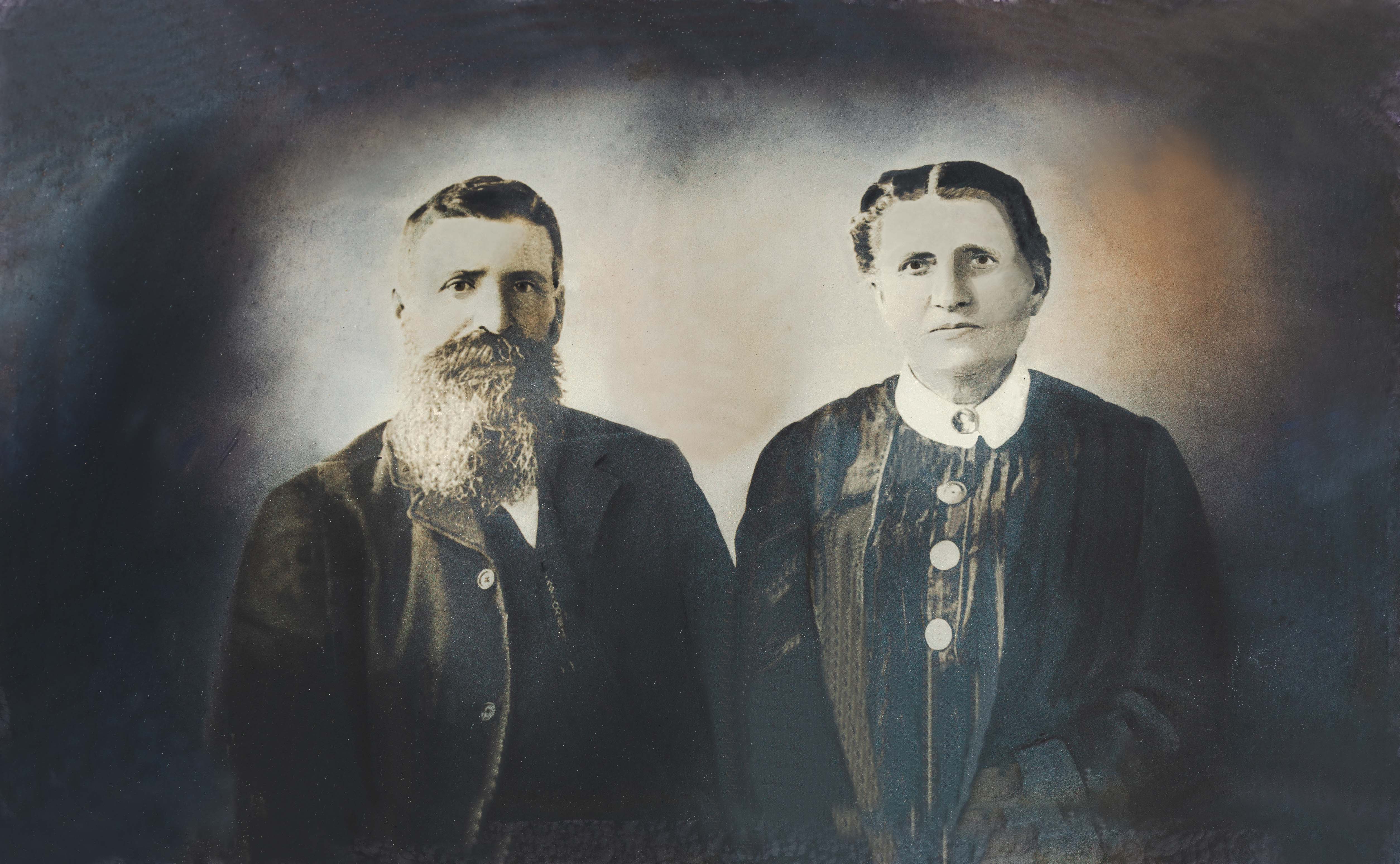
Jun 24 |
Comment |
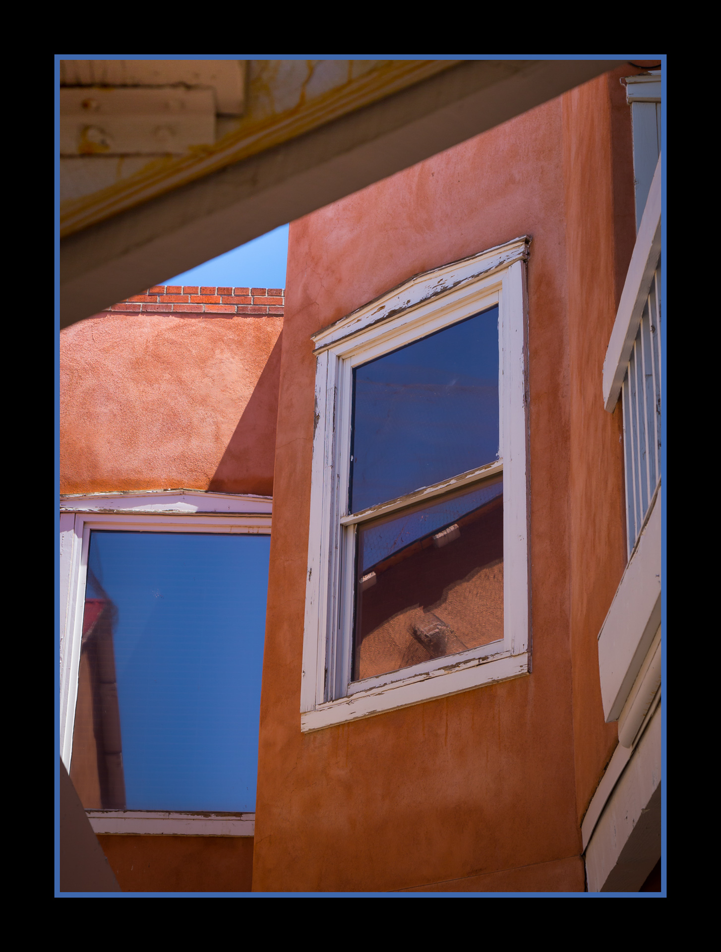
Hi Darcy,
I love symmetry, and I'm in awe that you were able to capture this. You are soooo close to perfection! A slight crop in from the left seems to be in order to get the L-R symmetry perfect. Top to bottom might just be impossible the way our cameras see angles, but a crop from the bottom might also help.
This is a beautiful architectural image. Great job!
Karen |
Jun 19th |
| 14 |
Jun 24 |
Comment |
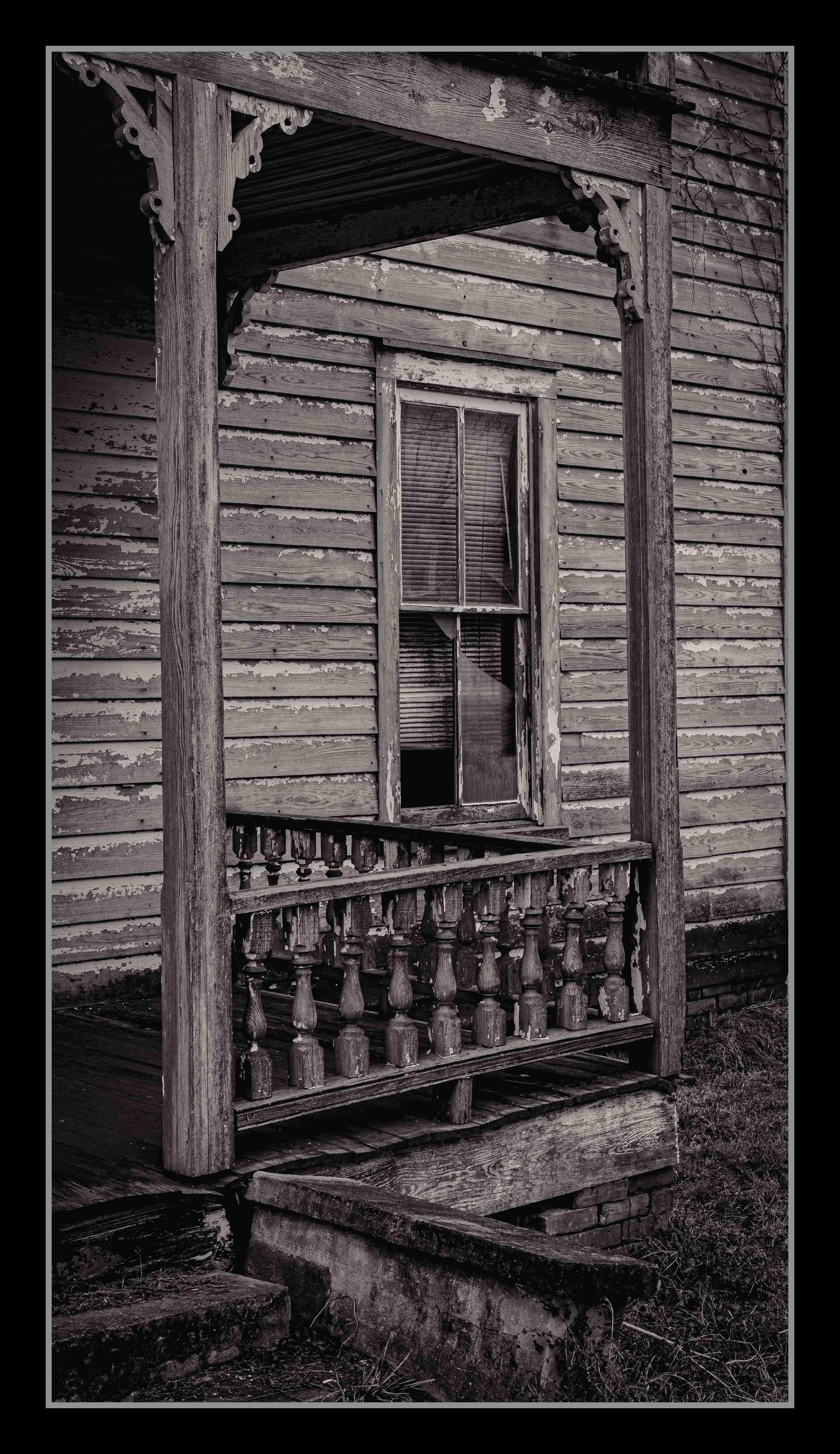
Hi Ingrid,
Beautiful image. I love how the contrasting textures makes this image so interesting. I agree with all the aforementioned suggestions. Nothing more to add.
Great job - thanks for sharing.
Karen |
Jun 19th |
6 comments - 7 replies for Group 14
|
6 comments - 7 replies Total
|