|
| Group |
Round |
C/R |
Comment |
Date |
Image |
| 14 |
Jul 22 |
Comment |
Hi Kamal,
I have to admit, my first thought was "oh, this begs to be in B&W" even before I read the comments. I think a conversion to B&W would bring out some of the textures and details in the boats. And, yes, I'd cop to eliminate the object mentioned before.
Great job to achieve this clarity while hovering!
Karen |
Jul 16th |
| 14 |
Jul 22 |
Comment |
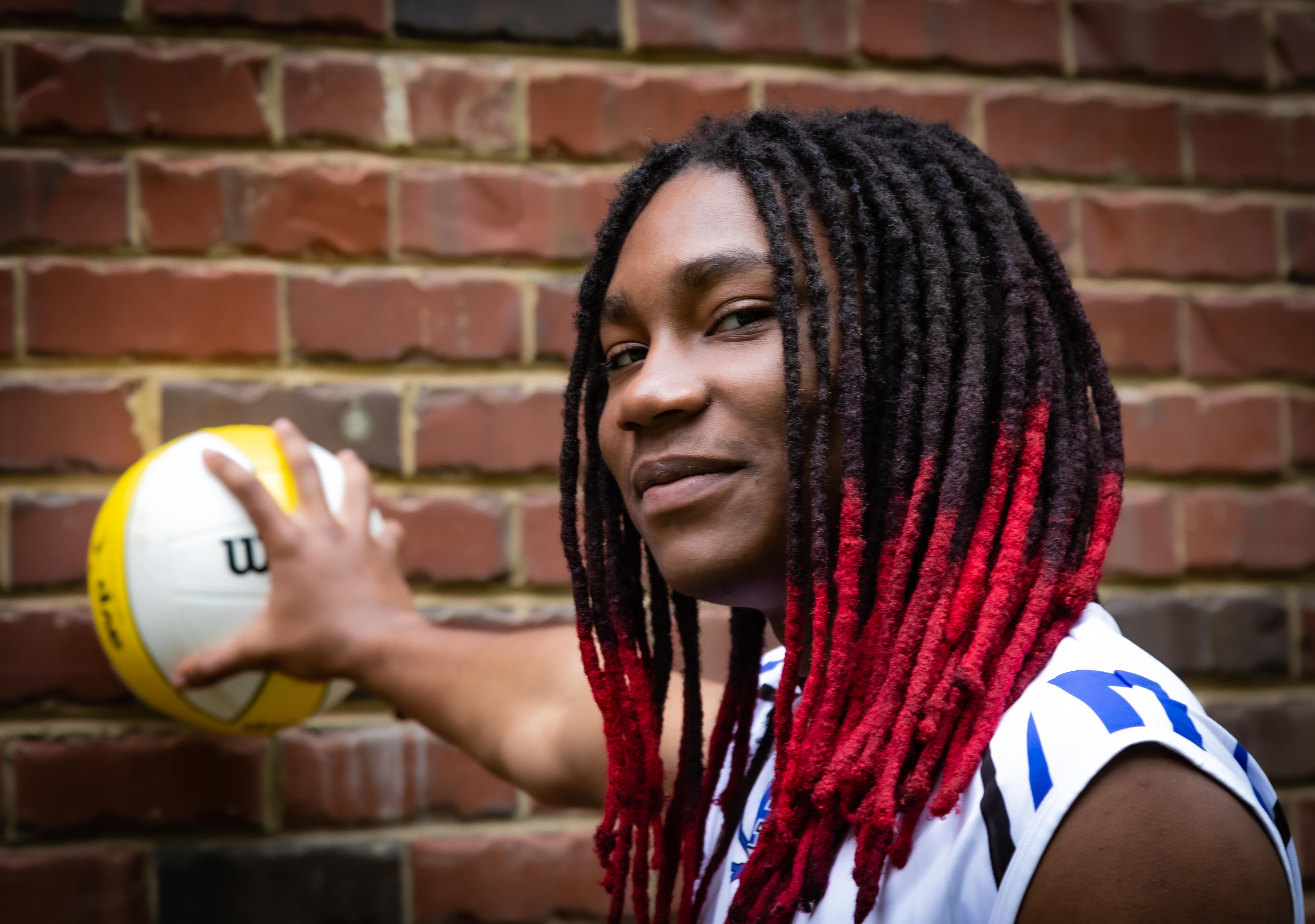
Hi Xiao,
What a wonderful, powerful image! I like your treatment to remove distracting elements and bring more light and color onto your model's face. The texture you've brought out in the background and around his feet is terrific.
The only thing I find a bit distracting (and this is a "nit") is the over saturation of the shadows in his shirt. The blue is just a bit "too blue" and keeps drawing my eye there.
Great job!
Karen |
Jul 16th |
| 14 |
Jul 22 |
Comment |
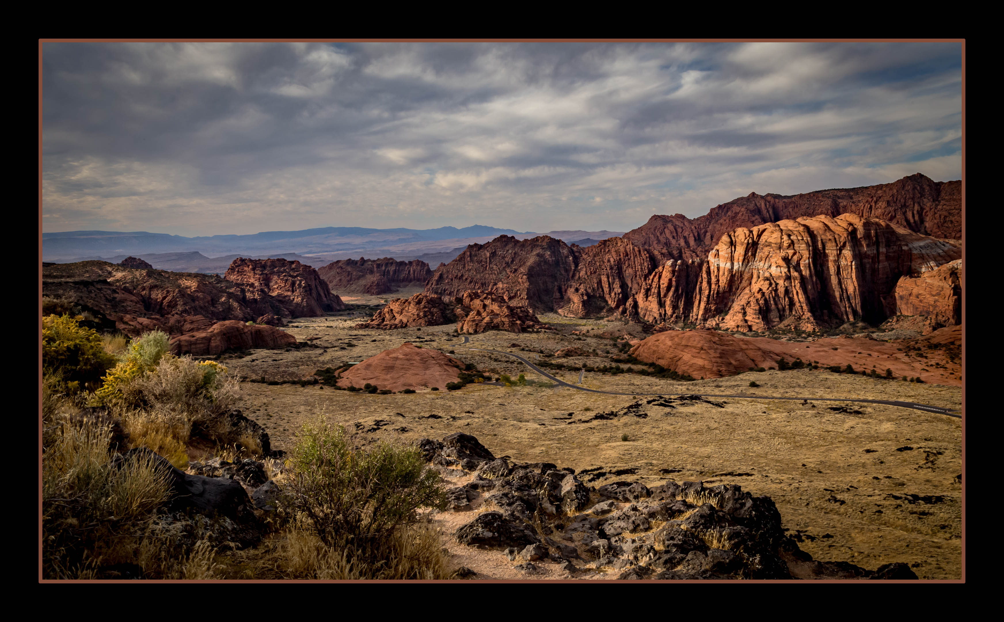
Hi Greg,
I'll add to the jealousy factor as I have been fortunate enough to stand on that very spot! But my images are nowhere NEAR as dramatic!
Beautiful shot with the contrast you captured between the texture of the canyon walls and the dust reflecting the light filtering in. I agree that it seems a bit over-saturated, but I think the dramatic effect you've created moved this photo into the "artistic/abstract" realm, rather than just the "landscape capture" of your original shot.
Well done - and yes, I'm jealous, too!
Karen |
Jul 16th |
| 14 |
Jul 22 |
Comment |
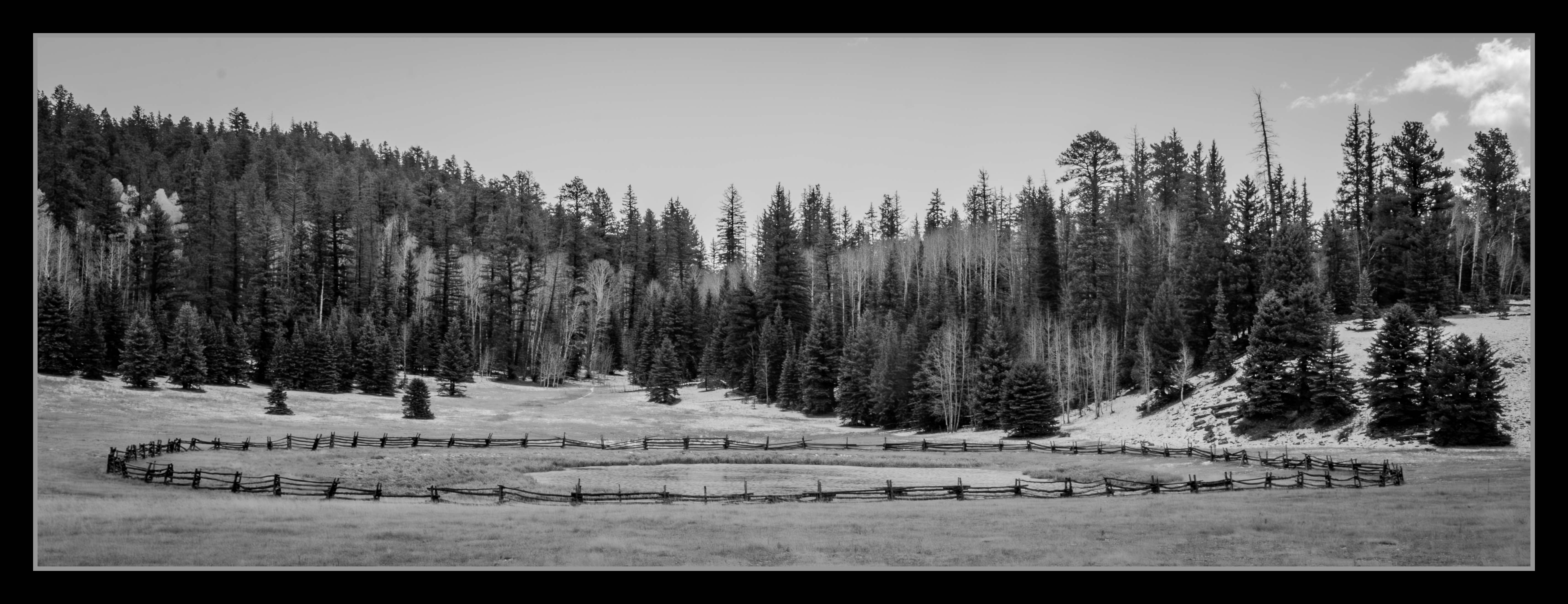
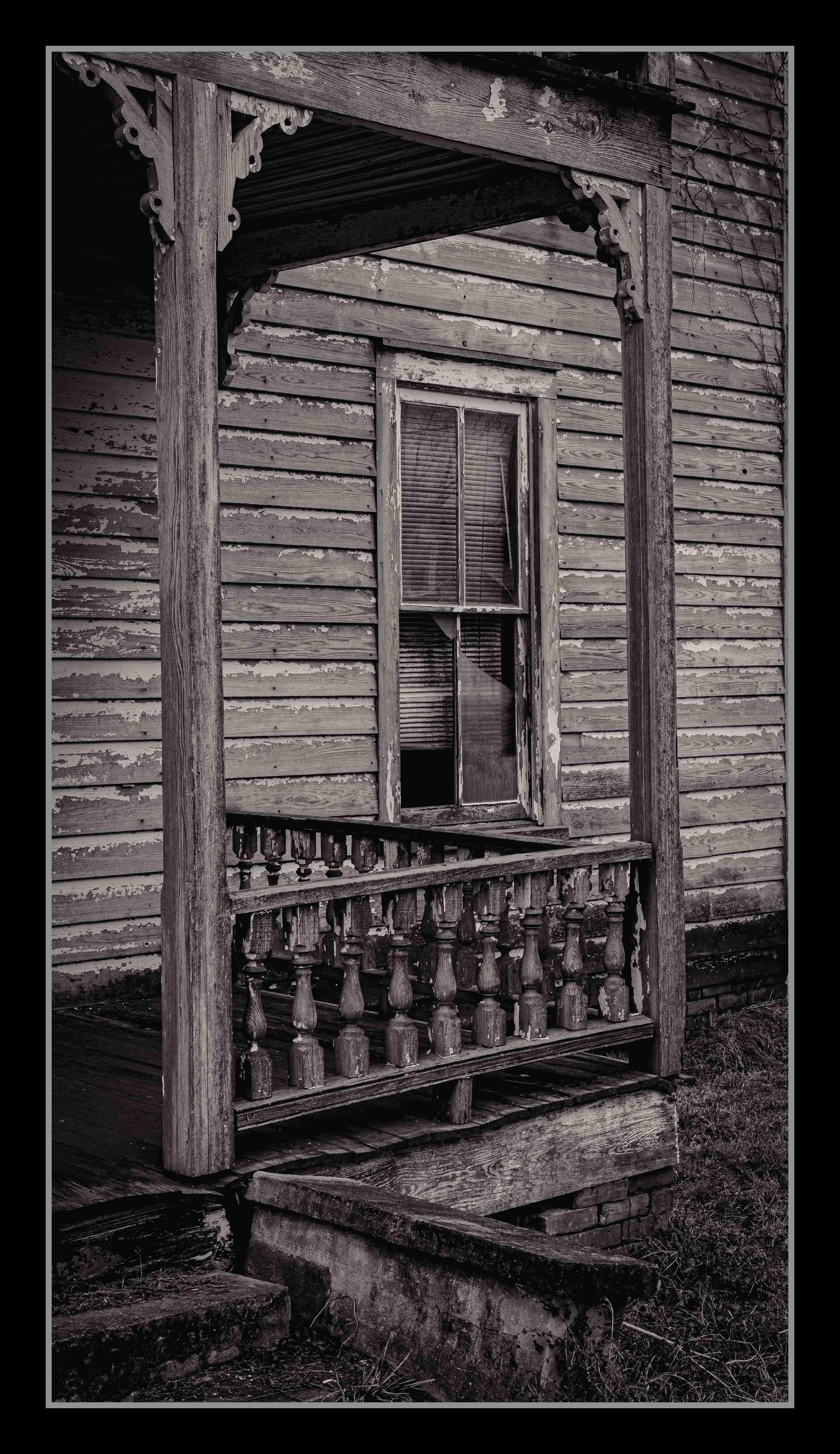
Hi Darcy,
I'll add my agreement to leaving the tree to anchor the image. It's a lovely forest shot with a wonderful treatment of that moving water! Nice job!
Karen |
Jul 16th |
| 14 |
Jul 22 |
Reply |
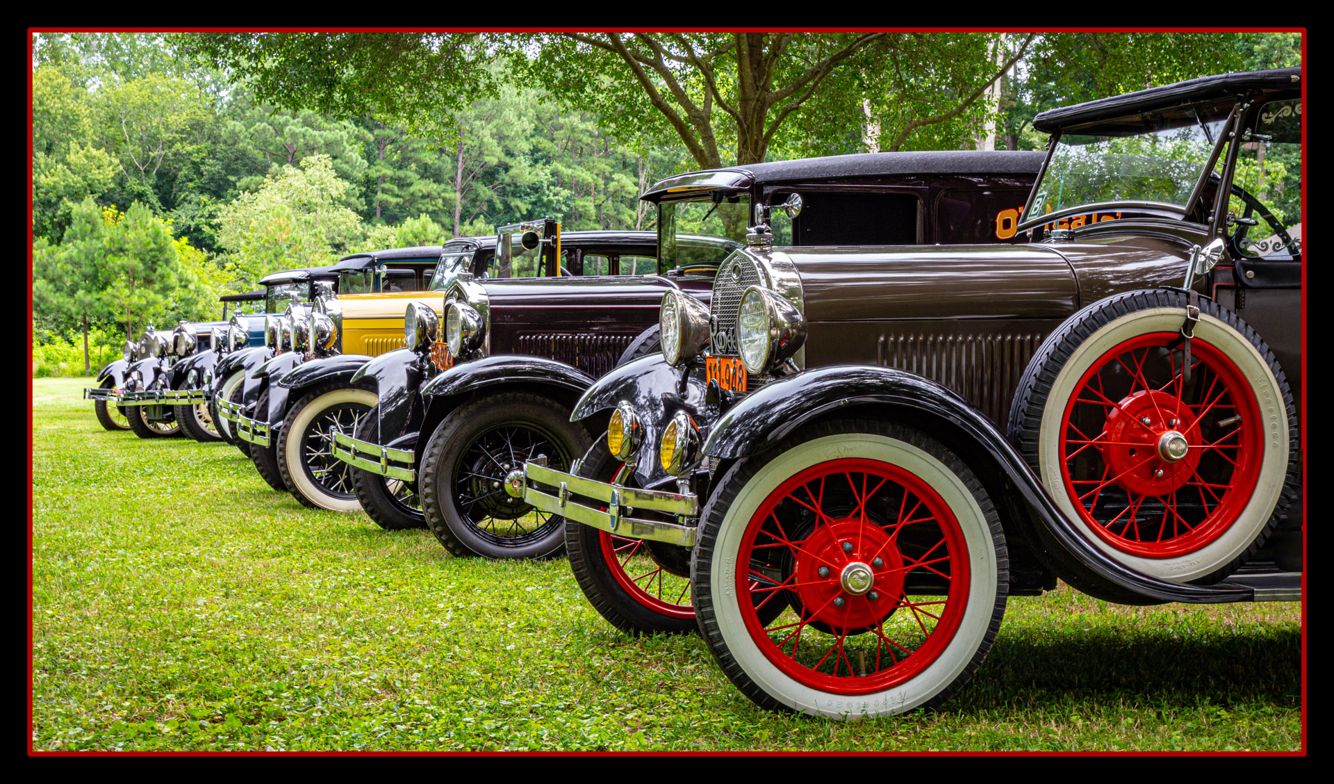
Hi Tom,
Hmm - now that you've pointed out that yellow bonnet it truly is distracting from my lineup. I'll have to see if my PhotoShop skills are up to the task of downplaying that color.
Thanks for the suggestion.
Karen |
Jul 16th |
| 14 |
Jul 22 |
Reply |
Hi Darcy!
Oh, no sacrifice on those desserts! We southerners like our sweets and have some excellent (and prolific) bakers!
I will definitely add a vignette before submitting to my camera club for evaluation.
Thanks so much!
Karen |
Jul 16th |
| 14 |
Jul 22 |
Reply |
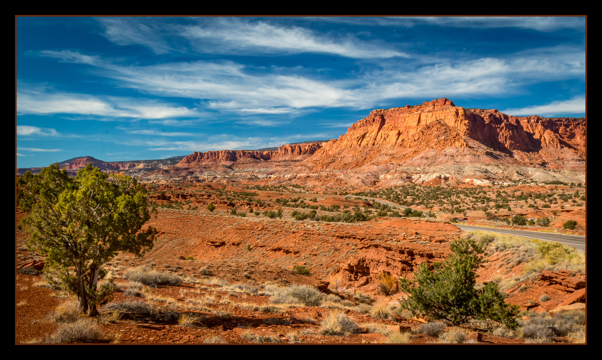
Hello Greg,
Thanks for your suggestions. We use a black border for our camera club competitions because they display against a grey background. Good point that I should choose a different color for our Digital Group since we use black. And I almost always use a slight vignette - I can't believe I forgot it this time. Thanks for pointing that out.
I appreciate your comments!
Karen |
Jul 16th |
| 14 |
Jul 22 |
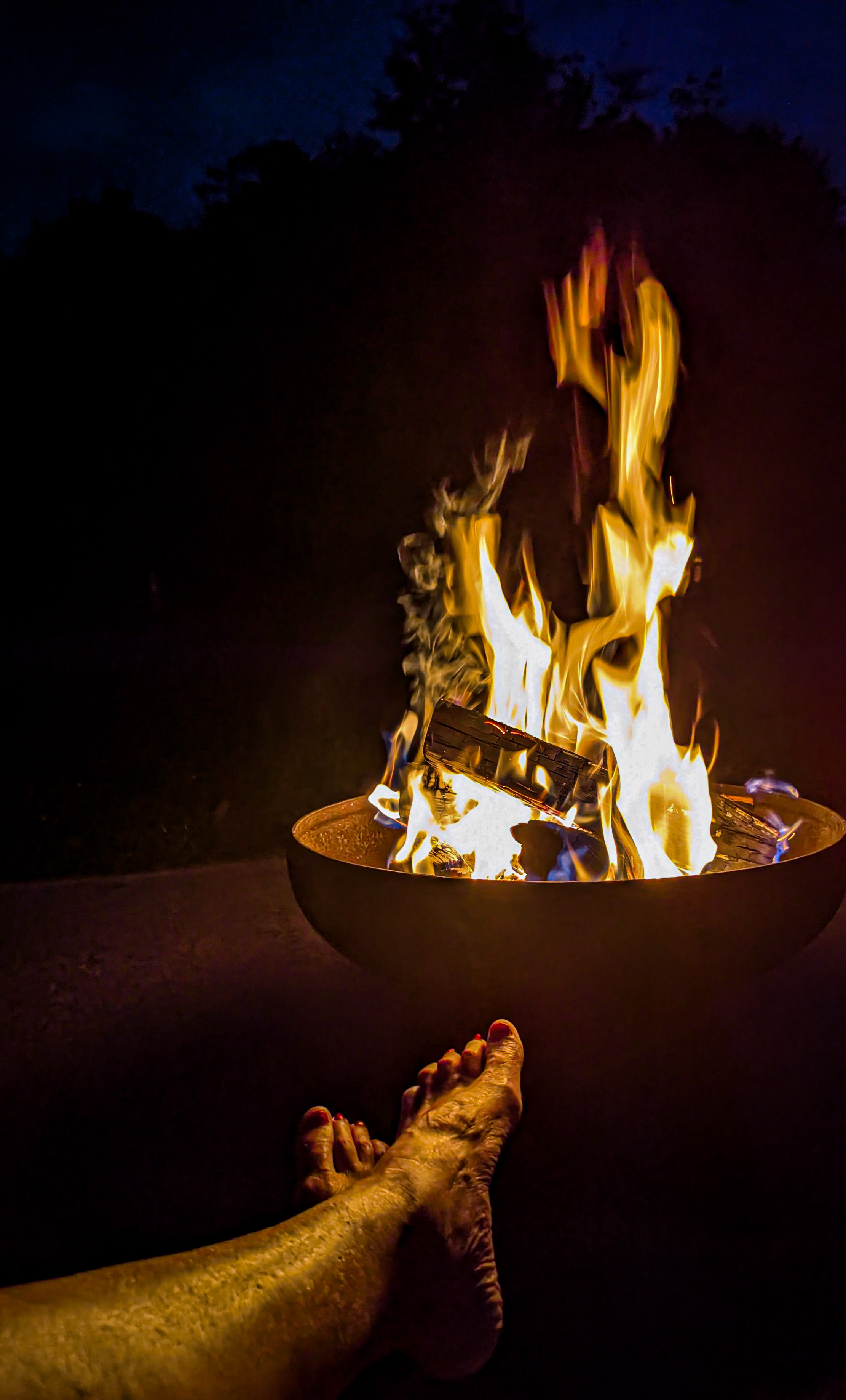
Reply |
Thanks, Ingrid.
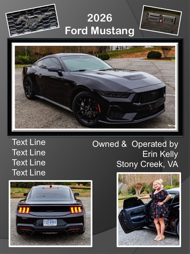
Oh - I have LOTS of different angles, including close-ups of those fabulous hood ornaments. This one was just one of my favorites. And I did enjoy a dessert - or two!
Thanks!
Karen |
Jul 16th |
| 14 |
Jul 22 |
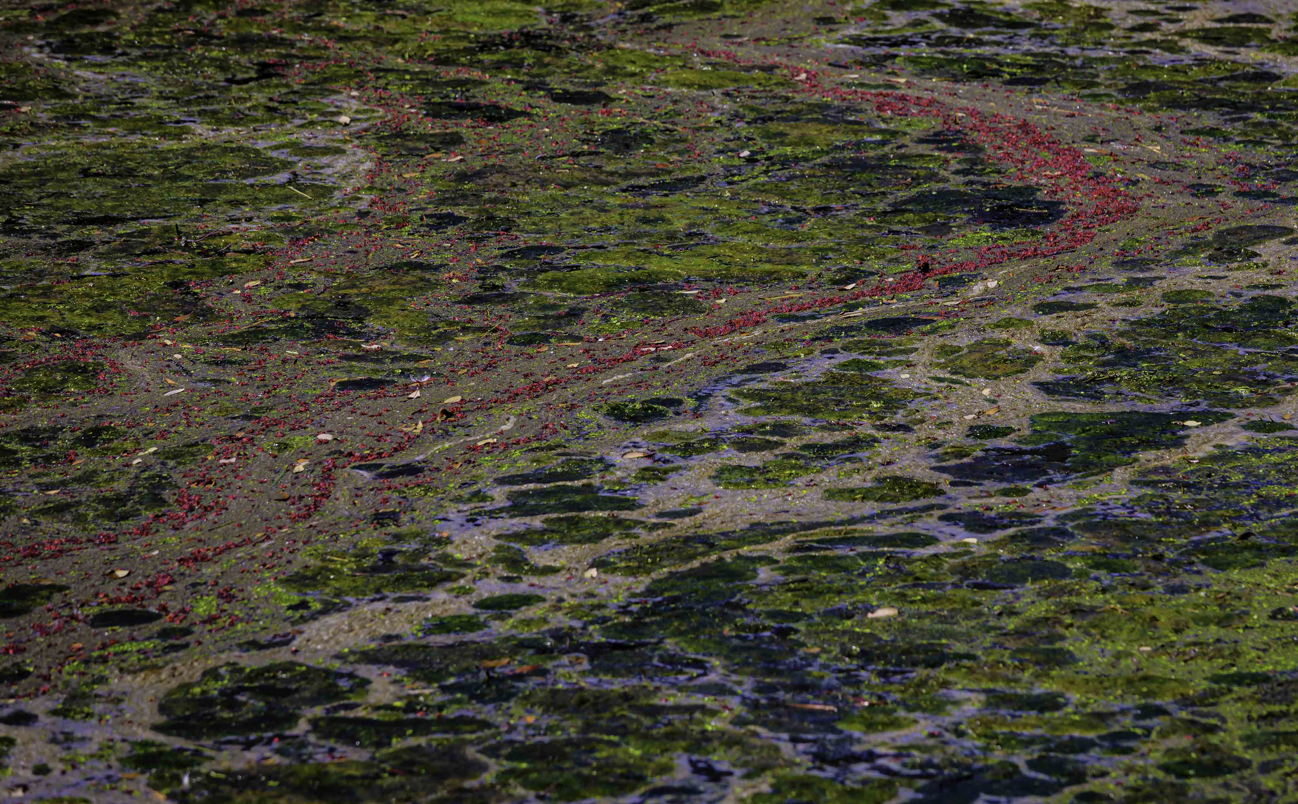
Comment |
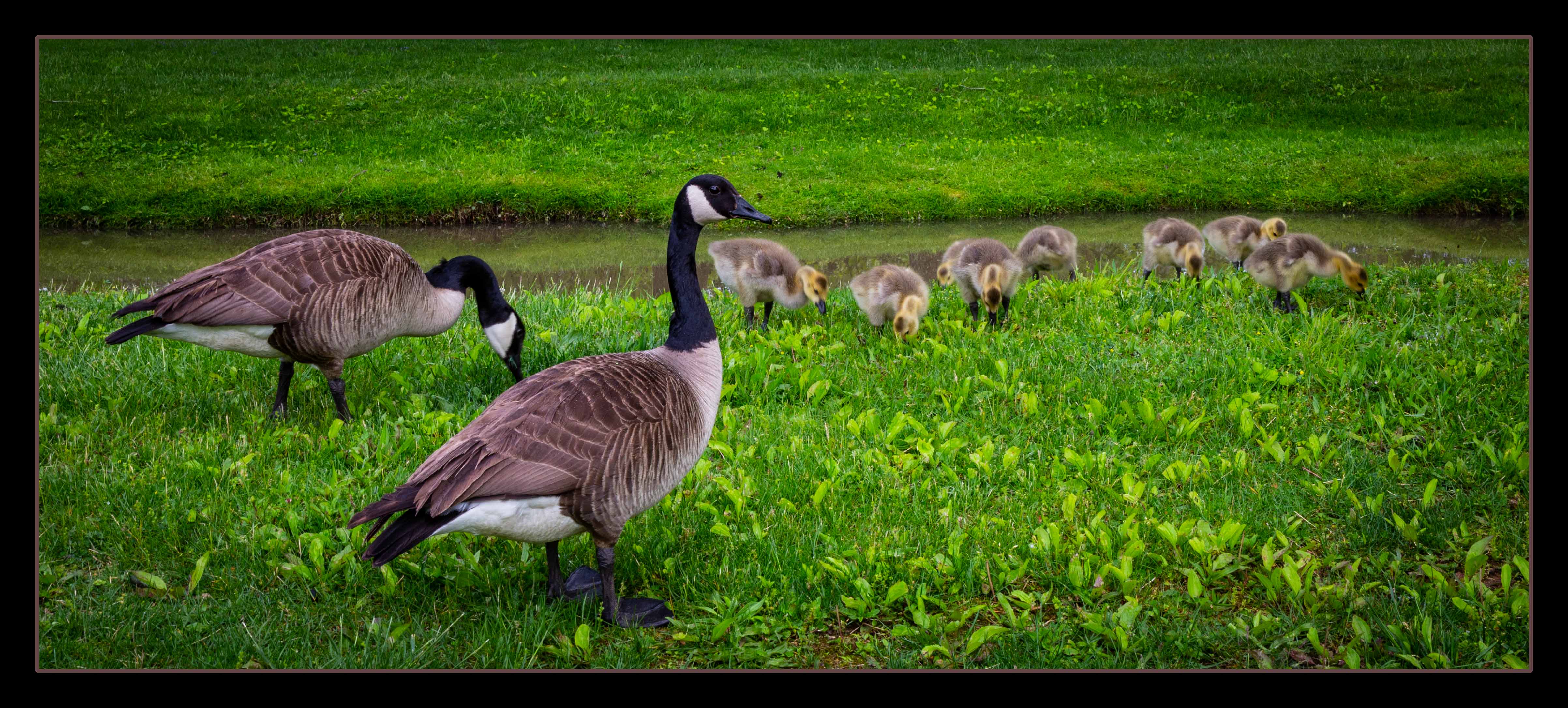
Hello Ingrid,
What a lovely shot. I think the others have covered most of the things I noticed.
The only other thing you might try is to eliminate just a bit of the foreground - maybe just above that splotch of blue just off center to the right. That way the lovely green algae is unbroken across the bottom.
Great shot and certainly "calendar-worthy"!
Karen |
Jul 16th |
5 comments - 4 replies for Group 14
|
5 comments - 4 replies Total
|