|
| Group |
Round |
C/R |
Comment |
Date |
Image |
| 14 |
Mar 22 |
Reply |
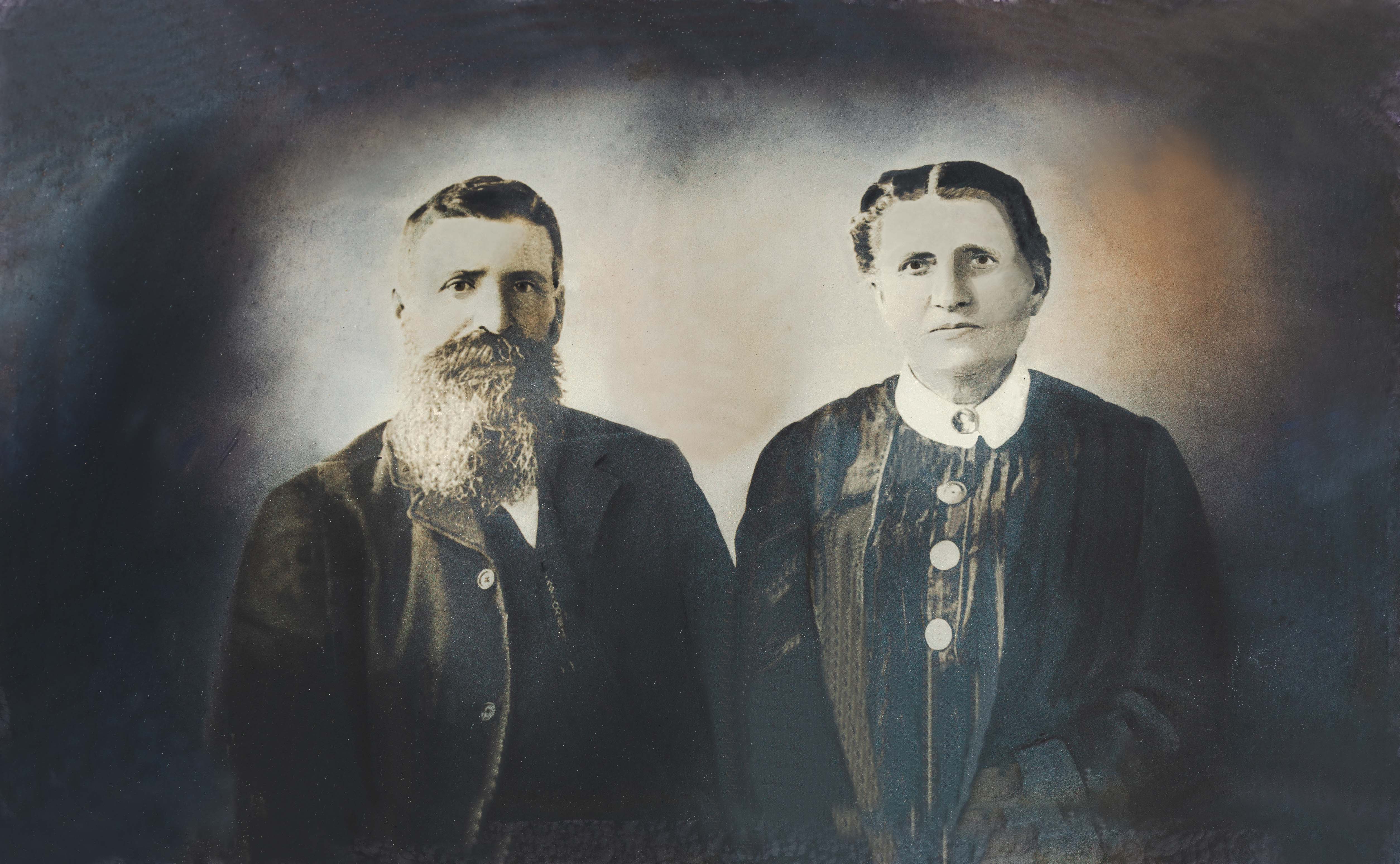
Thanks to all of you for the comments.
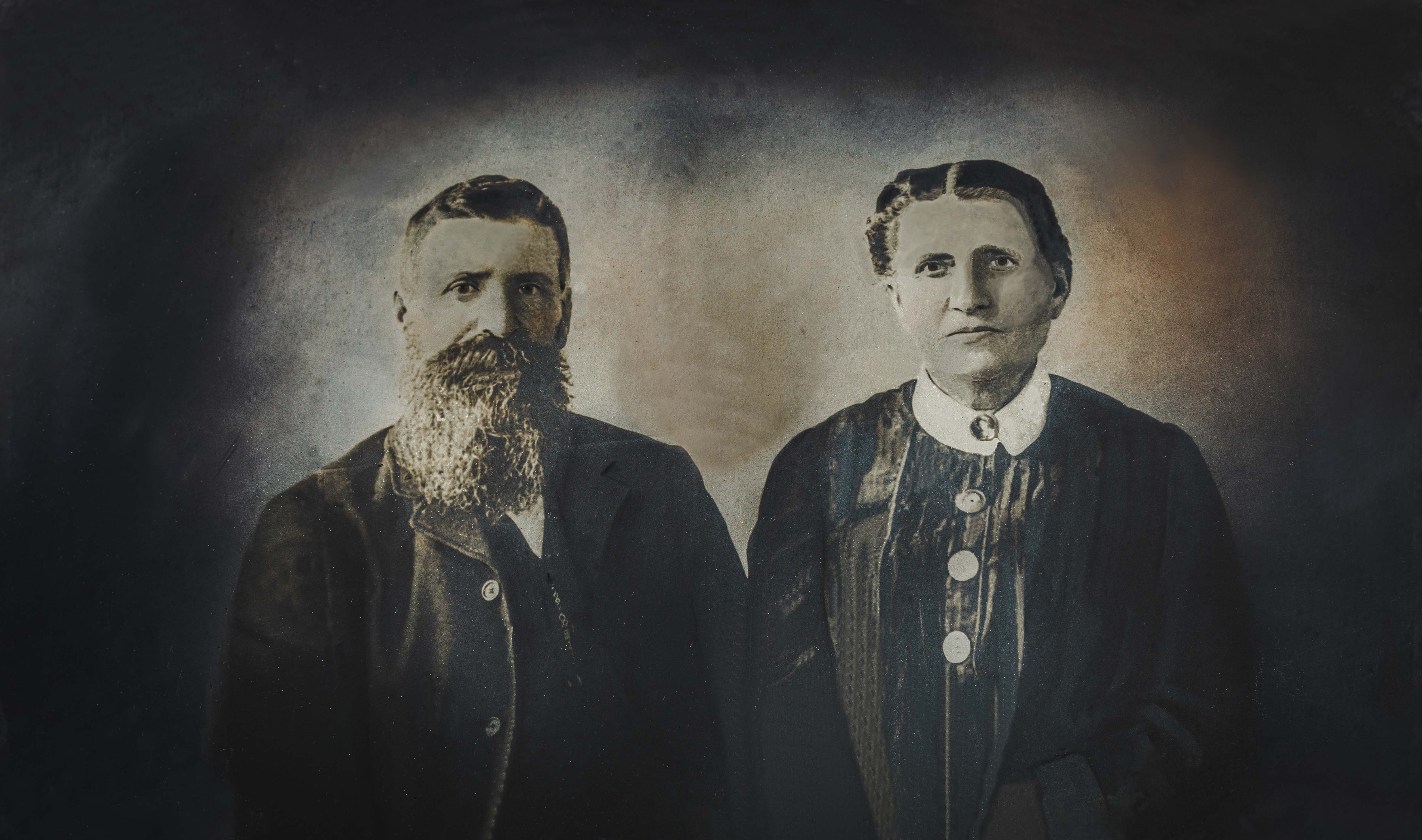
I tweaked it just a bit more to restore to its original aspect ratio, darken the edges, and lighten their faces just a bit.
I'll keep you posted on whether the Adelmans make it back into their beautiful frame for another century!
Take care!
Karen |
Mar 14th |
 |
| 14 |
Mar 22 |
Reply |
Hello Kamal,
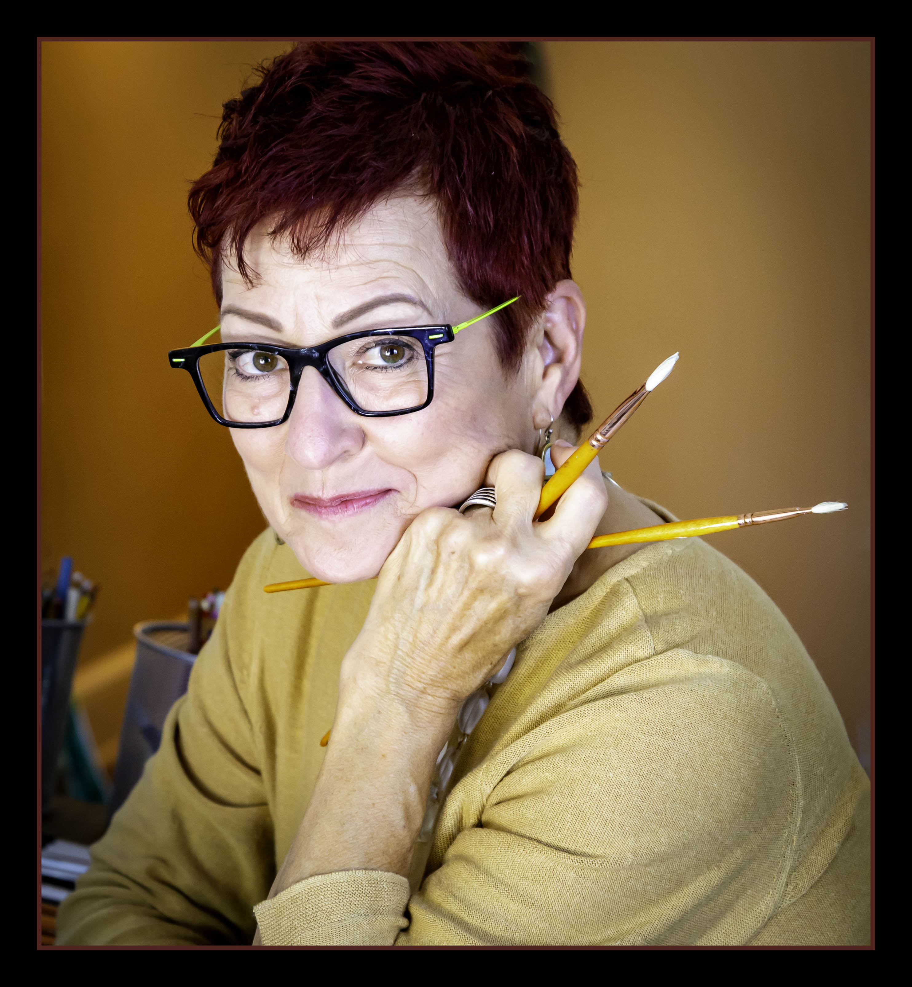
Thank you. This was pretty new to me, also. It was a good way to practice some Photoshop skills and working with layers trying to duplicate those skin tones.
You should give it a try sometime. It is quite a sense of accomplishment when complated.
Thanks for sharing your thoughts.
Karen |
Mar 14th |
| 14 |
Mar 22 |
Reply |
Hi Darcy,
Thank you for your comments and encouragement.
You are right about that frame. IT is a work of art! And that domed glass frame weighs a TON. It wouldn't take much for them to patch, paint and restore it for a new PAPER version of this heirloom. I wish they were my relatives!
I appreciate you sharing your thoughts.
Karen |
Mar 14th |
| 14 |
Mar 22 |
Reply |
Hi Ingrid,
I think the majority has spoken about including the sepia tones. They do seem to enhance the authenticity of the photo.
So, for the "rest of the story" I put the images out on my SmugMug site for the Great-Great_Grandson (who is almost 70) to view, figuring he would call me. Today, I received an email that he had purchased something - would you believe a METAL PRINT?!? AACCKKKK!
I agree with you that it should go back into that beautiful frame, so I might suggest that his sister get a print on some nice paper and DO just that!
It was an interesting exercise. Thanks for your feedback!
Karen |
Mar 14th |
| 14 |
Mar 22 |
Reply |
Hi Tom,
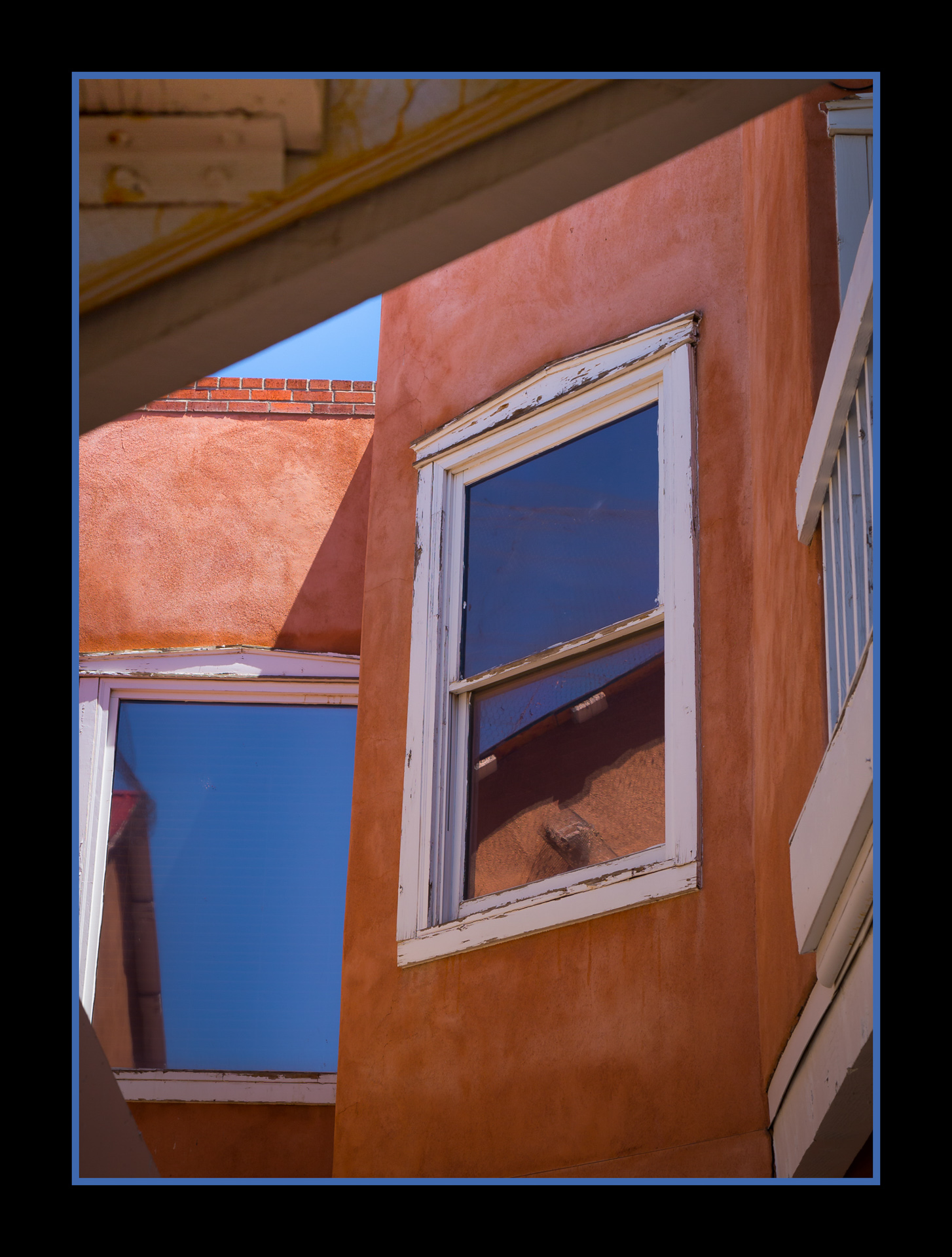
Thanks for the in-depth analysis. I should have submitted the cropped version of this because all that "stuff" around the edges really would not appear if this photo went back into that original frame. I can turn it into a pretty decent 8X10 or 5X7 if they want to give copied to all the Great-Great-Grandchildren.
I appreciate the feedback. It was a fun (albeit time-consuming!) project.
Karen |
Mar 14th |
| 14 |
Mar 22 |
Reply |
Hi Greg,
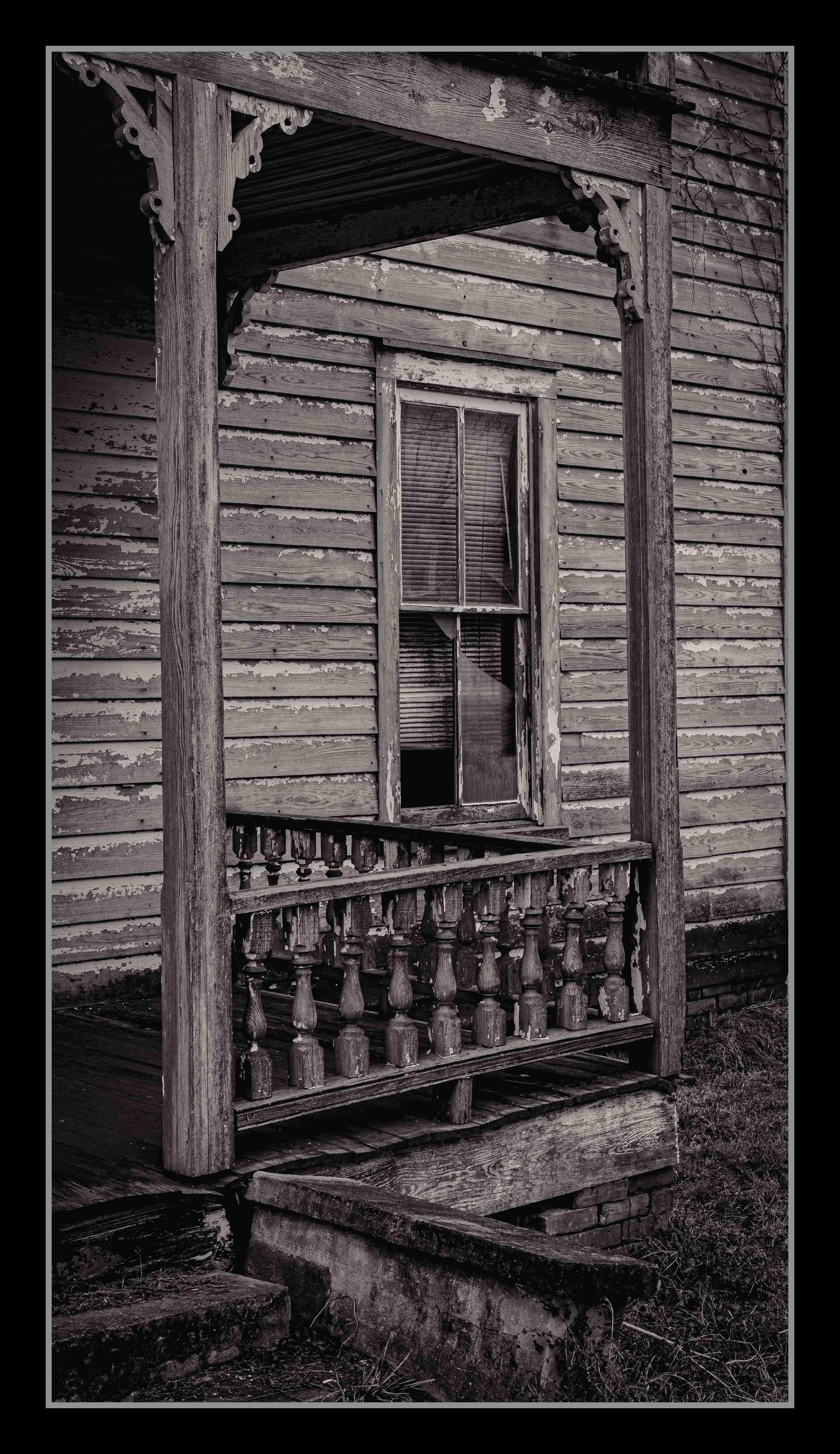
Thanks for the encouragement and for the suggestion to darken those blacks. I expanded the canvas well beyond what was needed if they wanted to replace it in its original aspect ratio. But you're right - I should darken them in case they want to print different sizes. Or I just should have cropped it tighter.
I appreciate the feedback and the suggestion on the Nik software. I have been meaning to look into that.
Karen |
Mar 14th |
| 14 |
Mar 22 |
Comment |
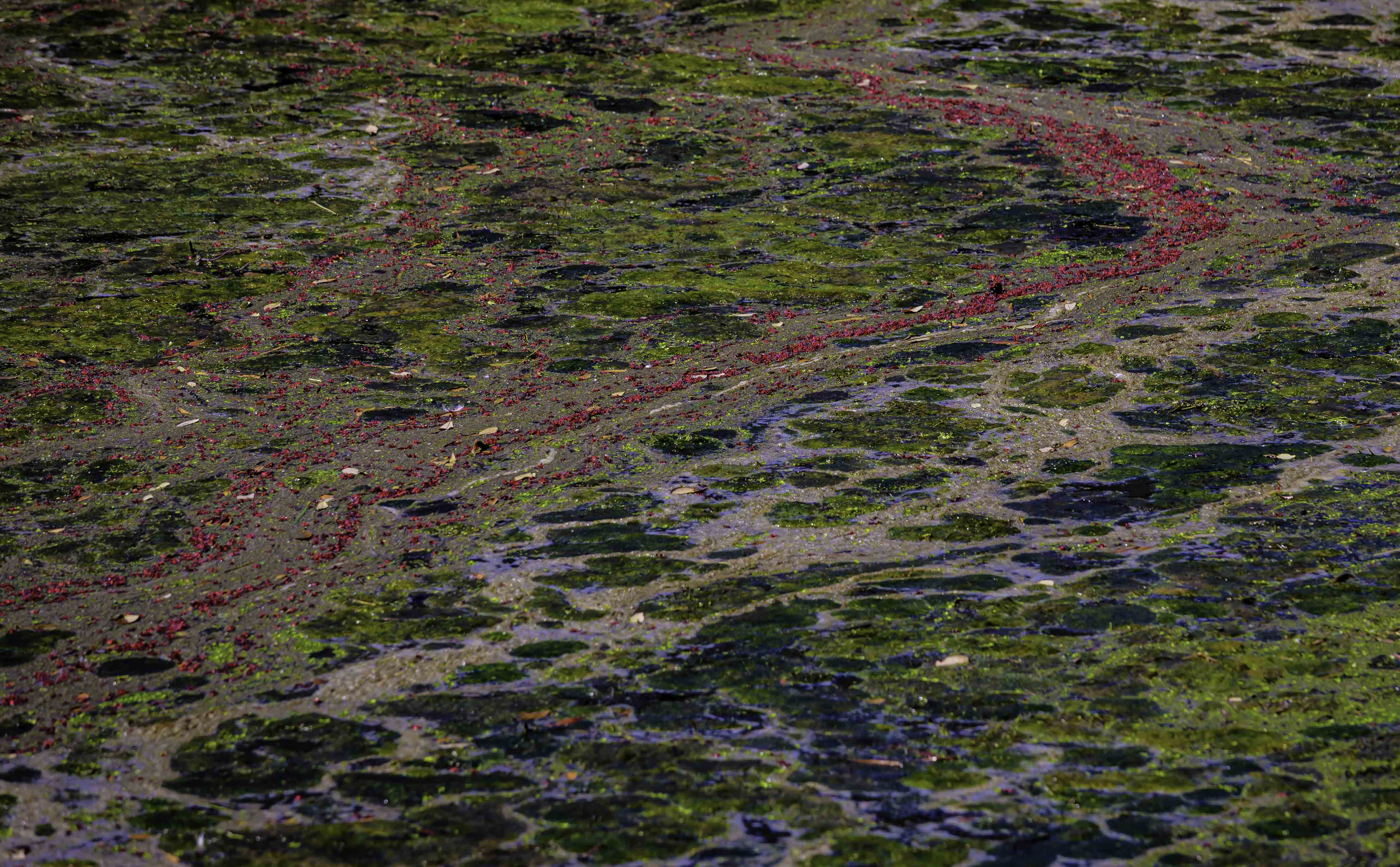
Hi Kamal,
Wow - this does appear to be an abstract at first glance - which only inspires the viewer to REALLY examine the image. I love how you were able to capture the artistry of those nets in the water.
Tom was spot on, as usual by identifying those two bright spots in the water that you fixed beautifully in the second edit. They immediately drew my eye away from the subject. I think the nets closest to the boat on the right are still a bit too bright, but you may not be able to pull much more detail from them.
Great job from "on high"!
Karen |
Mar 14th |
| 14 |
Mar 22 |
Comment |
Hi Tom,
You certainly achieved an ethereal look and feel with this beautiful image! I love the colors and the way they blend together.
Have you considered rotating it just a bit, so that it is presented on more of an angle? I agree with the others that it might be more appealing if it were a bit off center.
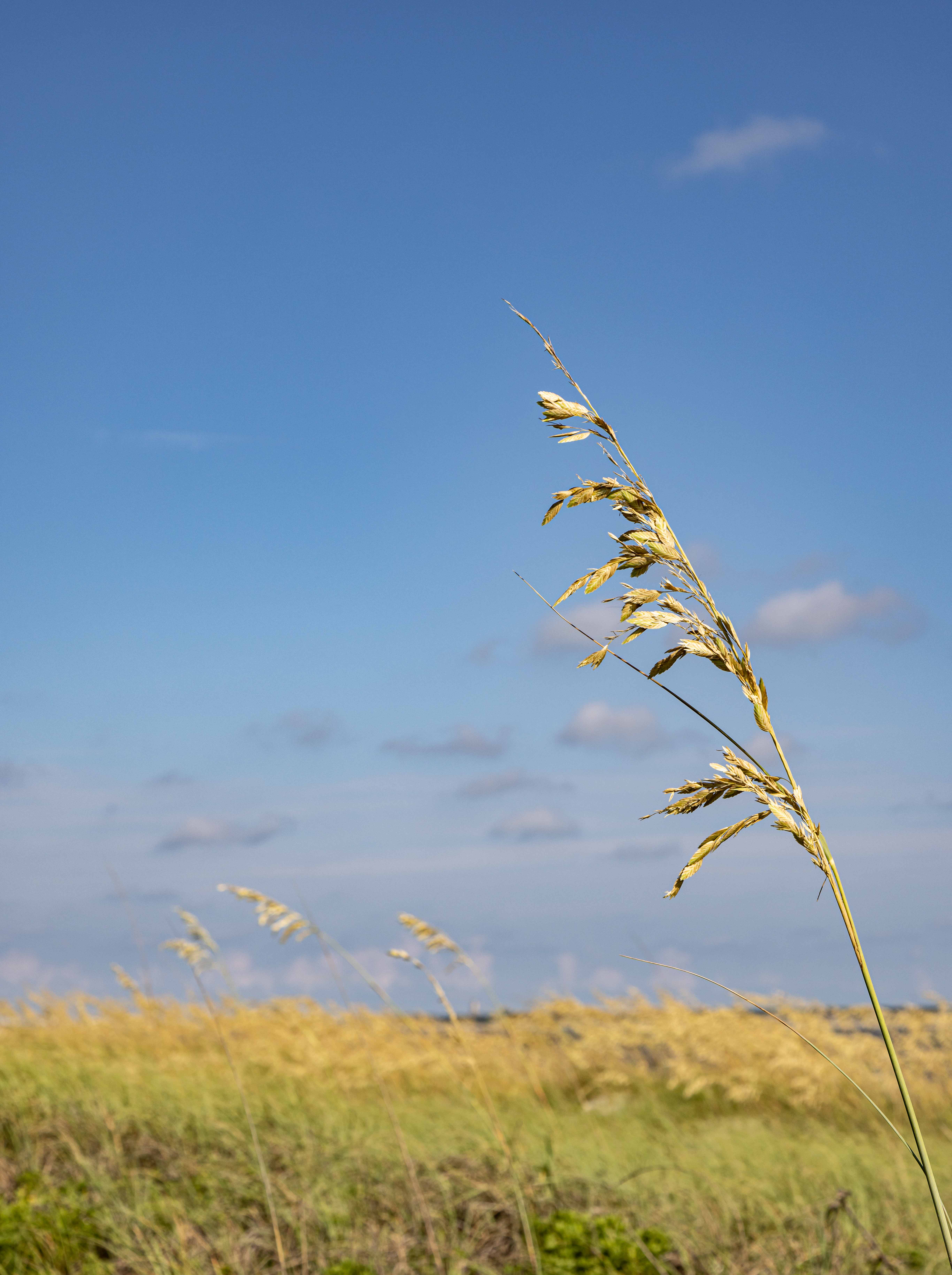
What a fun experiment to aid your recovery!
Karen |
Mar 14th |
| 14 |
Mar 22 |
Comment |
Hi Greg!
Wow - I was there also but did not attempt an HDR. What a difference that makes in the clarity you were able to achieve.
In the "pickiness" category, 2 tiny little things that you might consider changing:
- there is a bright white speck in the clouds in the upper right.
- that little shrub just to the left of the arch keeps drawing my eye away.
Like, I said - picky! It is a fabulous image!
Karen |
Mar 14th |
| 14 |
Mar 22 |
Comment |
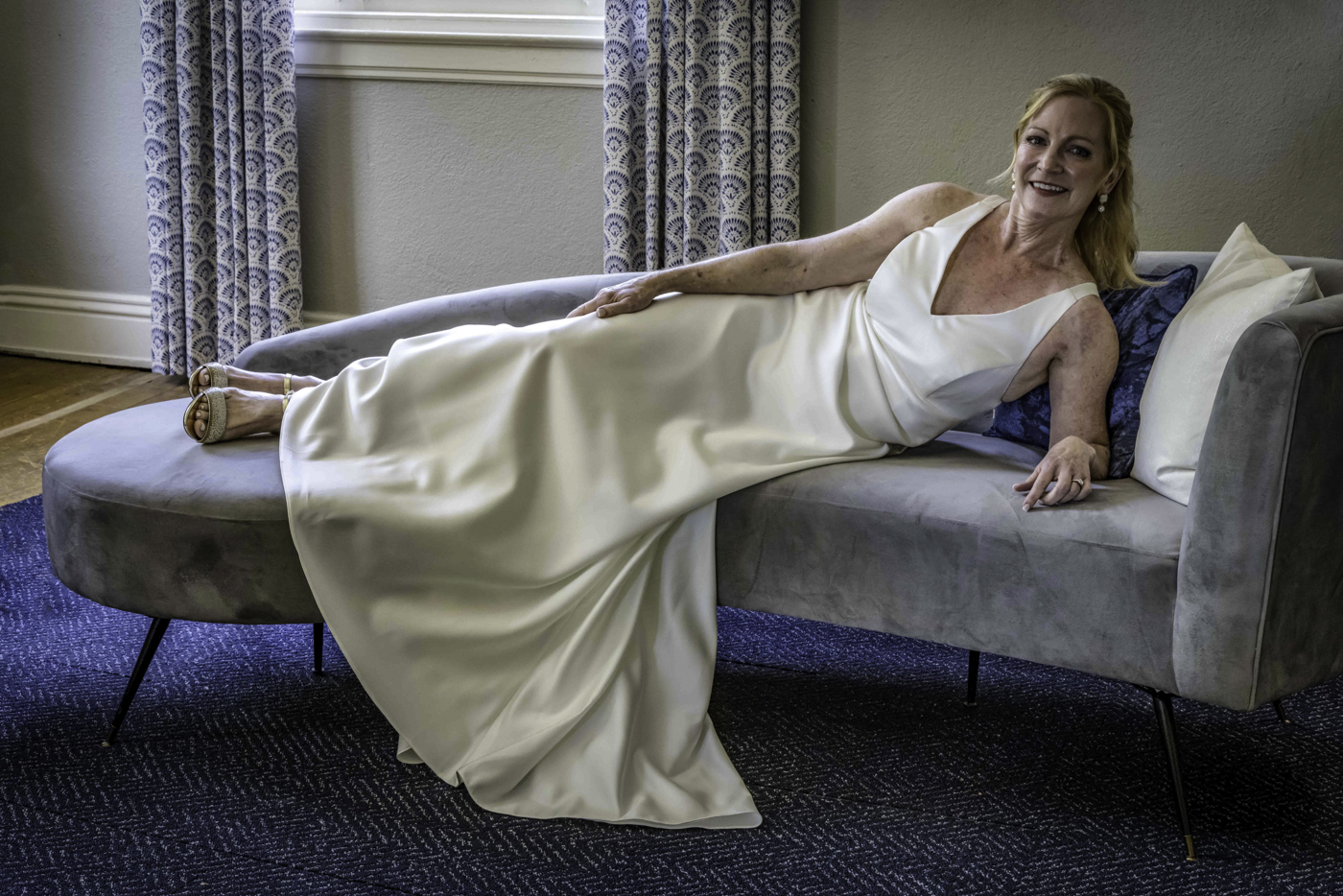
Hi Darcy,
Beautiful image! The colors are great, and I love the placement within the frame.
I agree with the others about those lights just above the plants - easy to clone out. And there is one small spot on the pot to the left, that I would probably make disappear.
You can tell what a good image it is, by the pickiness of our comments! Way to go!
Karen
|
Mar 14th |
| 14 |
Mar 22 |
Comment |
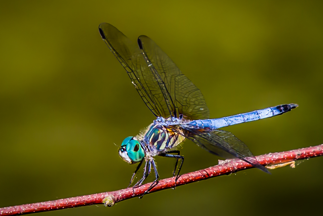
Hi Ingrid,
Stunning image! I love how the "stars of the show" are in such sharp focus, with the supporting actors/petals are beautifully muted. Since the image really isn't intended to be totally realistic, I like the turquoise and how it blends so well with the purple.
Great job - thanks for sharing!
Karen |
Mar 14th |
5 comments - 6 replies for Group 14
|
5 comments - 6 replies Total
|