|
| Group |
Round |
C/R |
Comment |
Date |
Image |
| 14 |
Aug 21 |
Comment |
Thanks, Ingrid. That will definitely challenge my emerging Photoshop skills, but I'll give it a try! |
Aug 17th |
| 14 |
Aug 21 |
Reply |
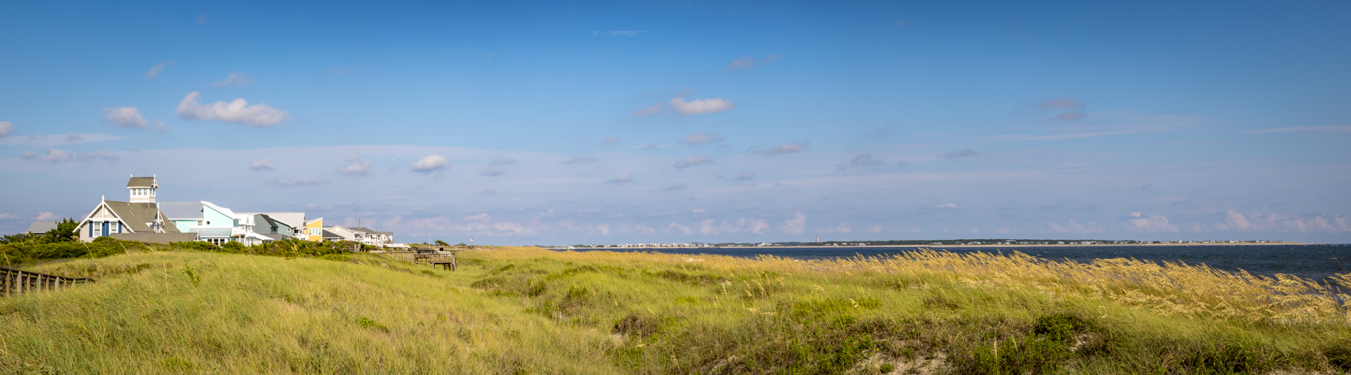
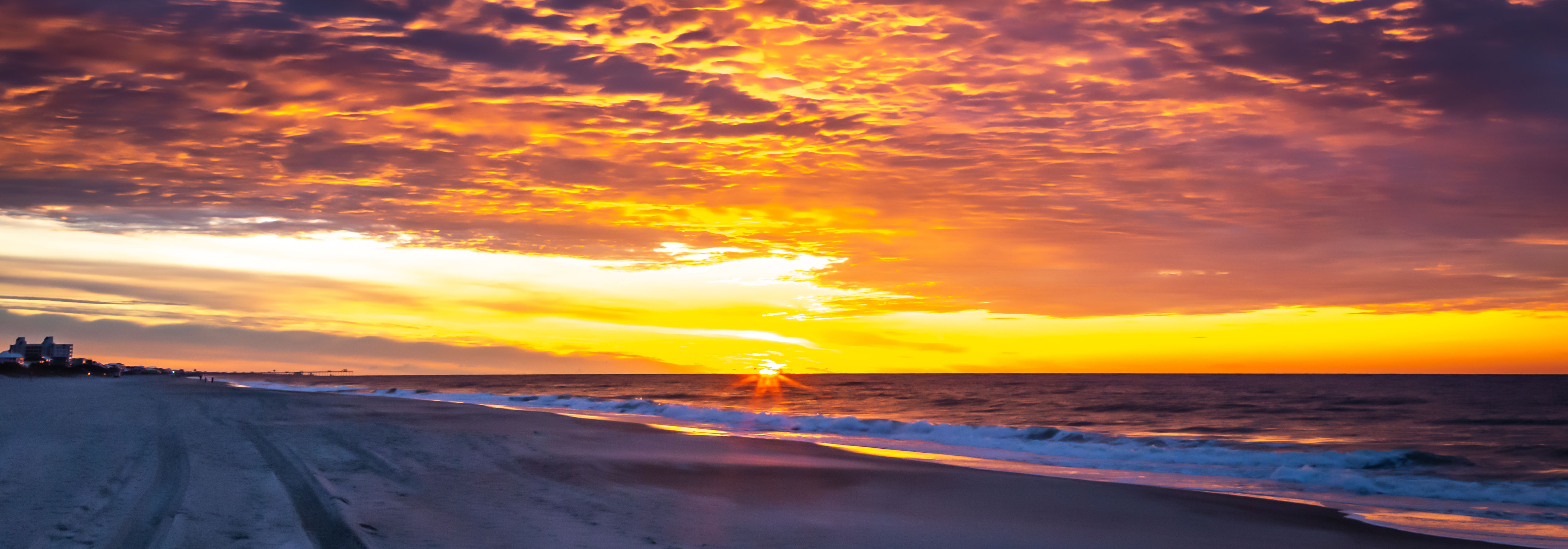
Good suggestion on finding some foreground interest. I was hoping the houses along the shore would provide that. Back to the beach - um, drawing board! |
Aug 17th |
| 14 |
Aug 21 |
Reply |
It was definitely a magical moment. Guess I'll just have to go back and try again - LOL! |
Aug 17th |
| 14 |
Aug 21 |
Reply |
Thanks, Greg. I think I'll start over with another image.
Karen |
Aug 17th |
| 14 |
Aug 21 |
Reply |
Thanks. I was afraid that this wasn't as sharp as it could be. (But neither are my eyes, anymore!)
Maybe I'll look at some of the other images from this shoot.
Karen |
Aug 17th |
| 14 |
Aug 21 |
Comment |
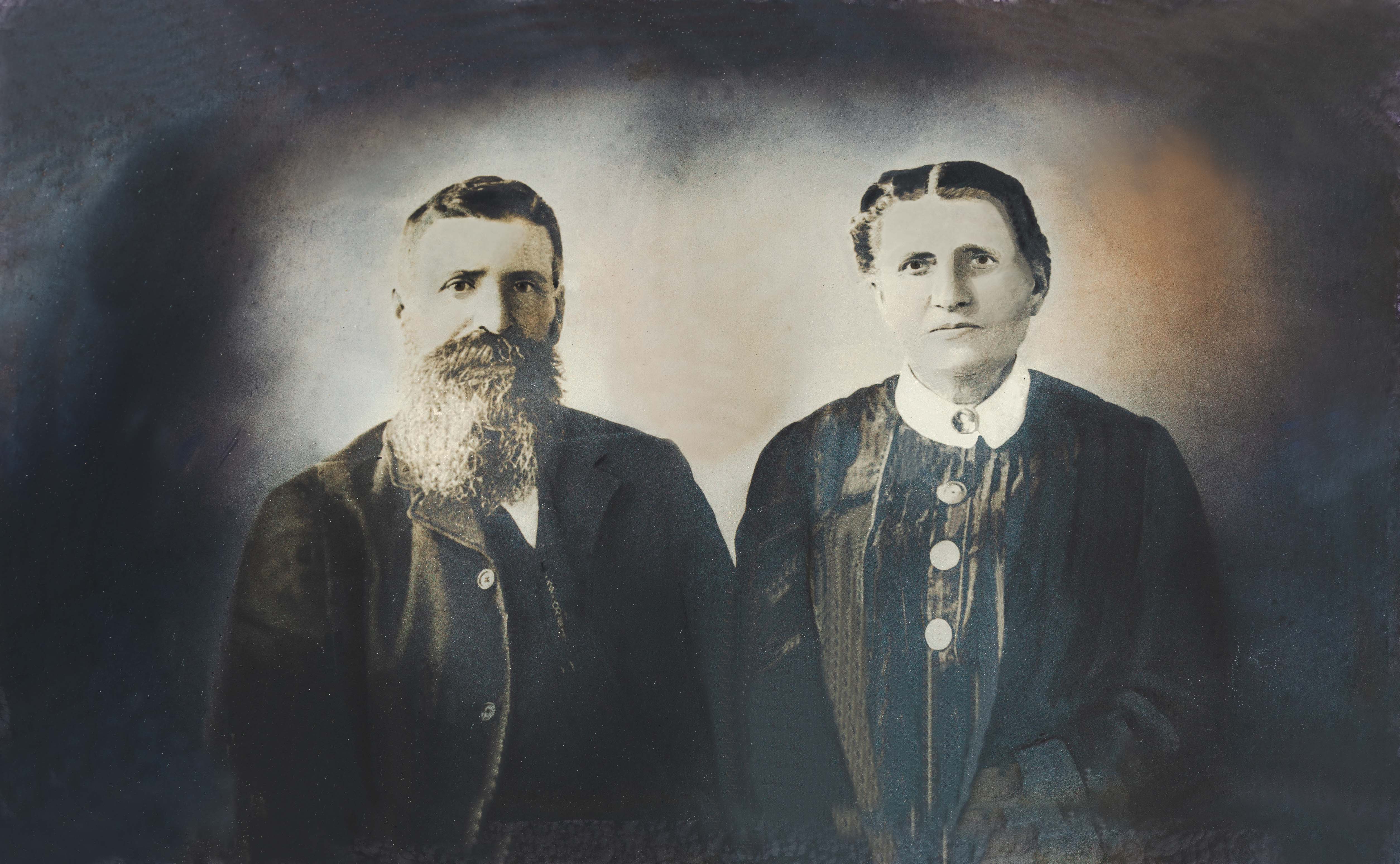
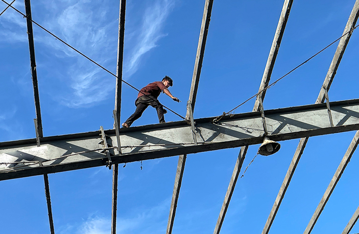
Hello Kamal,
I read the other comments and loved seeing the progression of the edits you've made to this SCARY image! I like heights, but THIS... not so much!
I like the cleaner look without the heavy cross beam at the bottom in the original image. Which got me to thinking, what if you rotated it just a bit? I turned it so that the guide wire comes in from the corner to lead your eye to the young man. Assuming this is not PJ, I lightened the shadow on his face a bit, too. Just a couple of ideas to consider.
Great job with that phone camera!
Karen |
Aug 17th |
 |
| 14 |
Aug 21 |
Comment |
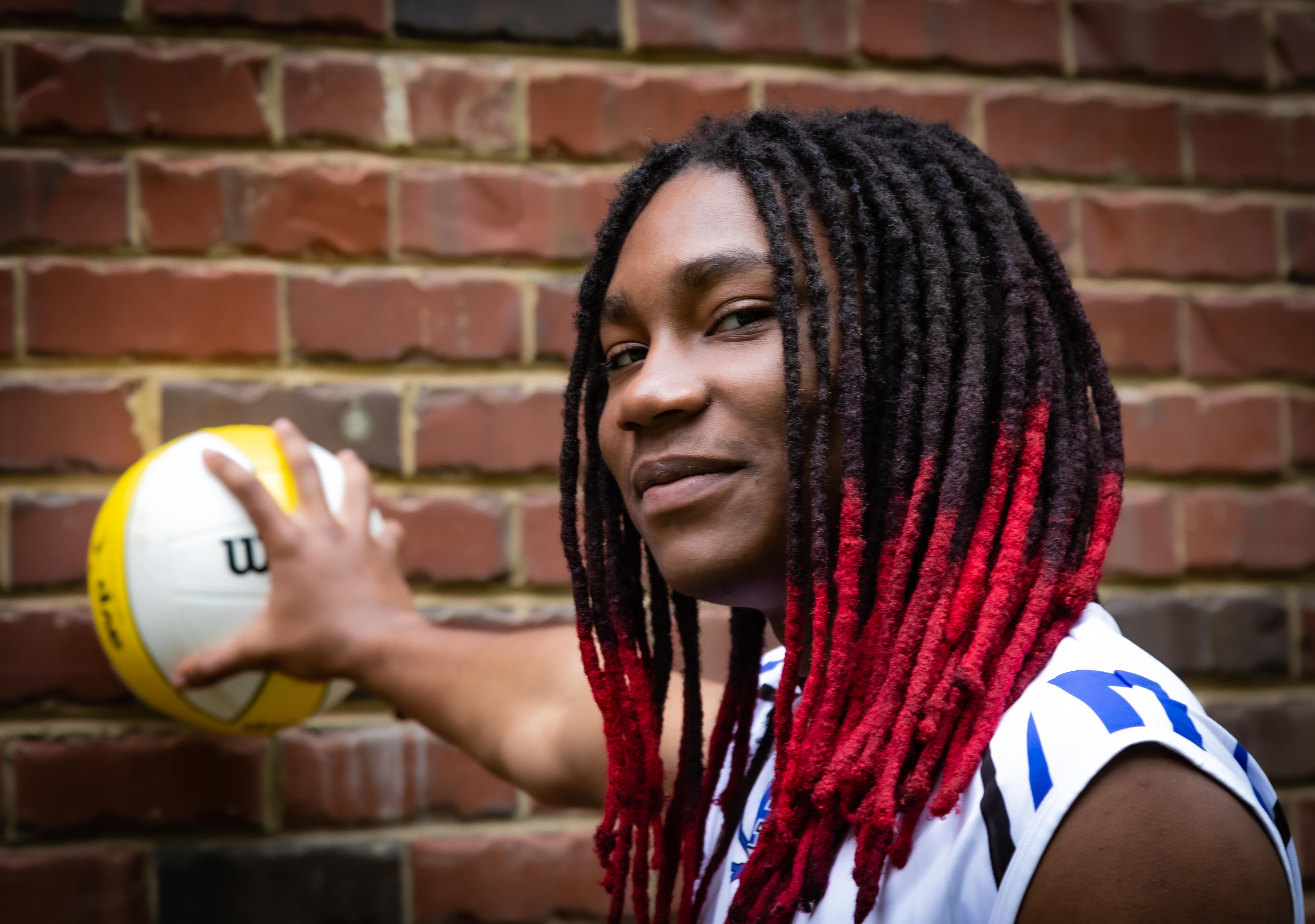
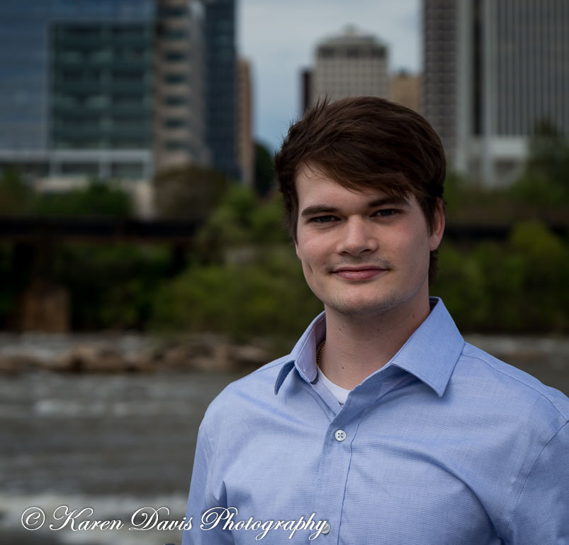
Wonderful, contemplative portrait. And the 3rd time is definitely the charm.
Your adjustments to the rose help to tone the starkness of the white down just a bit so that it doesn't compete with the model. I agree with Darcy on the "dizzying" pants. Maybe toning them down a bit, too. These are minor tweaks. Great job on this terrific portrait!
Karen |
Aug 17th |
| 14 |
Aug 21 |
Comment |
Hi Tom,
Beautiful capture - wish I were there!
I agree that there might be just a tad too much foreground. It draws my eye down, instead of up toward that approaching storm. And, I think I would lighten/desaturate the roofs a bit.
Just a few tweaks to see if you like it better, but all-in-all a beautiful image!
Thanks for transporting us there!
Karen |
Aug 17th |
| 14 |
Aug 21 |
Comment |
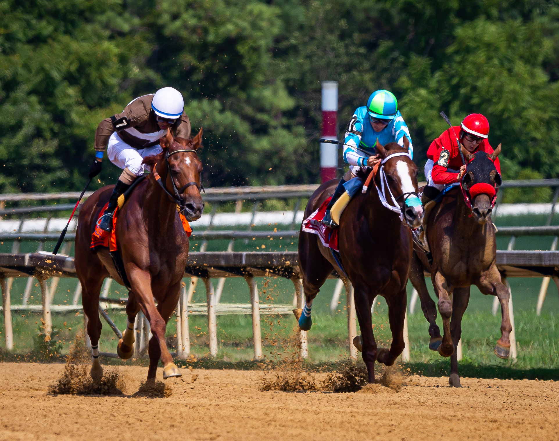
Hi Greg,
Great capture! While I like the original, your modifications in the edited version really capture the spirit and personality of the cowboy, who is, after all, the star of the show (with apologies to the horse!) I like the warmth which blends well with his 4-legged buddy.
In the future - if you're ever fortunate enough to have another opportunity like this! - you might consider a slightly wider depth of field to give the horse just a BIT more of the limelight/focus.
Great job!
Karen |
Aug 17th |
| 14 |
Aug 21 |
Comment |
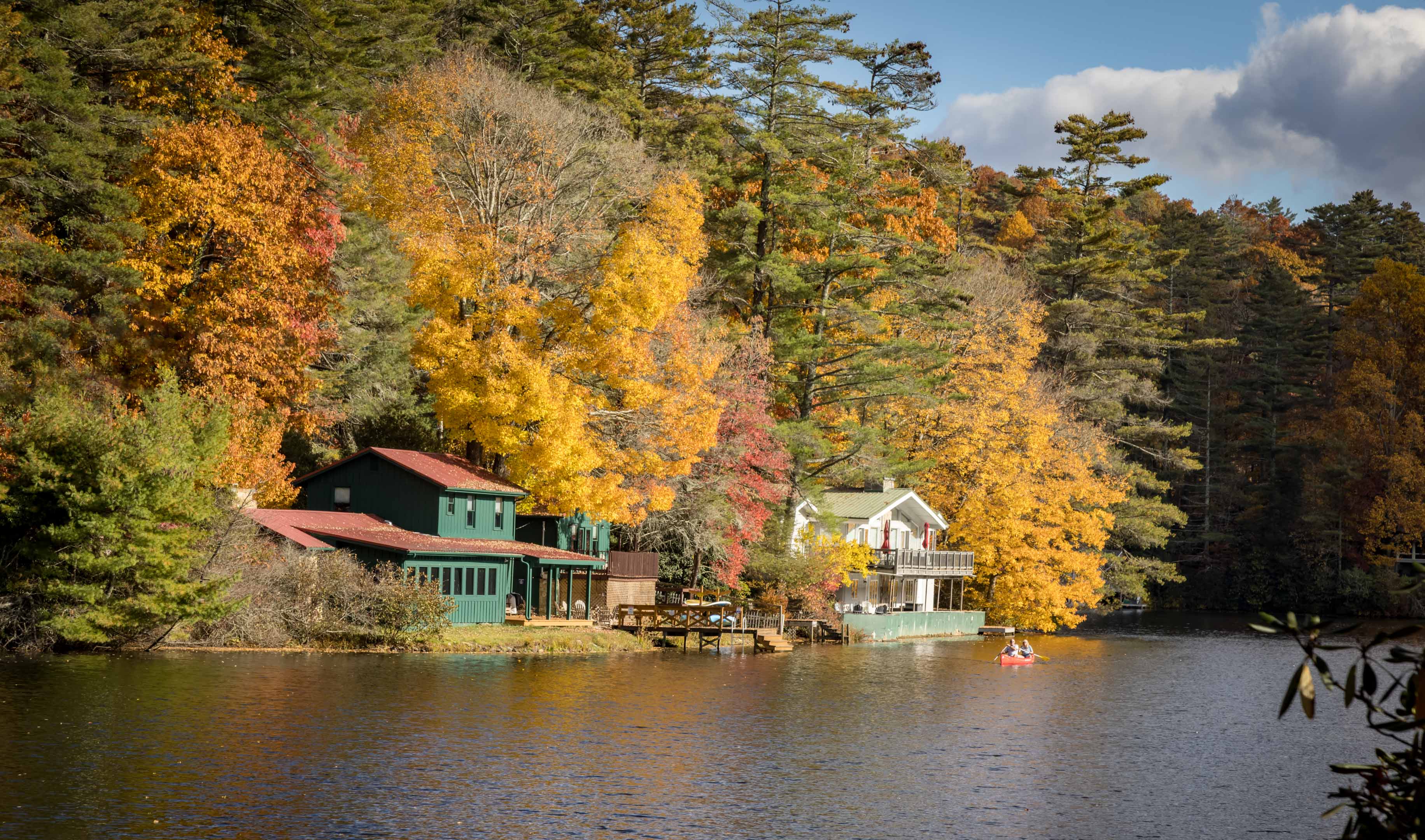
Darcy - another WOW!
Love the detail in the foreground. The only thing you might do (as previously suggested) is bring down the whites/highlights in the fog to see if you can grab just a bit more detail.
Excellent capture!
Karen |
Aug 17th |
| 14 |
Aug 21 |
Comment |
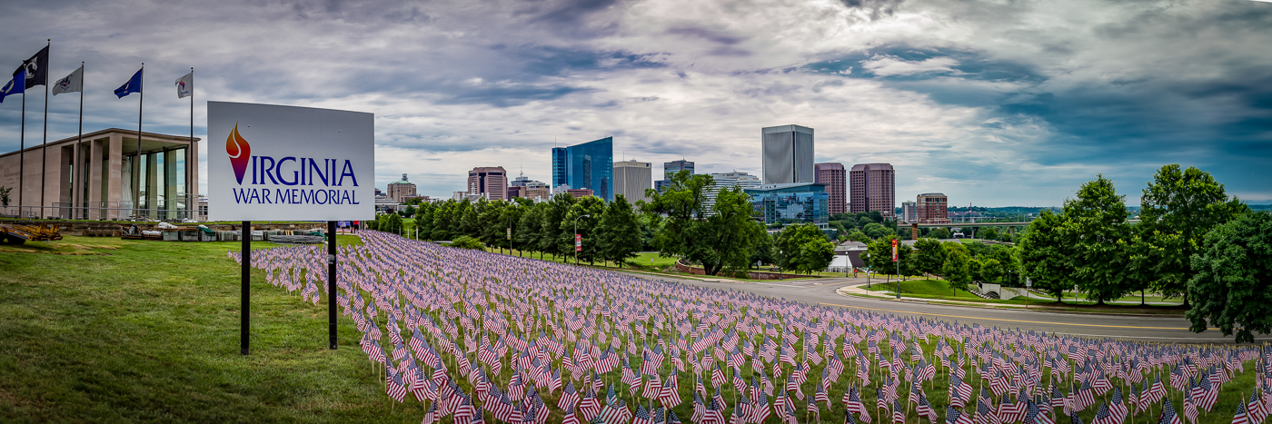
Ingrid - WOW! Beautiful image!
About the only thing I would add is my vote to darken that upper right hand corner to balance it with the left. I love how this images just draws one in.
Excellent job!
Karen |
Aug 17th |
7 comments - 4 replies for Group 14
|
7 comments - 4 replies Total
|