|
| Group |
Round |
C/R |
Comment |
Date |
Image |
| 14 |
Apr 21 |
Comment |
Thanks for the welcome and the comments, everyone!
I have never entered a PSA competition. My edits were more for my own PhotoShop practice, than actually preparing this for a competition. (And, I thought the Organization might like to have the image to promote the event this year.)
I will play around some more with contrast and exposure (definitely my overall post processing).
Glad to be part of the group!
Karen
|
Apr 11th |
| 14 |
Apr 21 |
Comment |
Hello Quang,
What Greg said about the softness of water and strong leading line out to the horizon.
And, I like Xiao's crop which I agree helps one focus on the larger, more interesting building with the lights. That crop also takes your center of interest into the lower third of the image, which to me, is more appealing than being directly in the center.
I could definitely see this one framed on someone's wall! Great work!
Karen |
Apr 11th |
| 14 |
Apr 21 |
Comment |
Hello Syed,
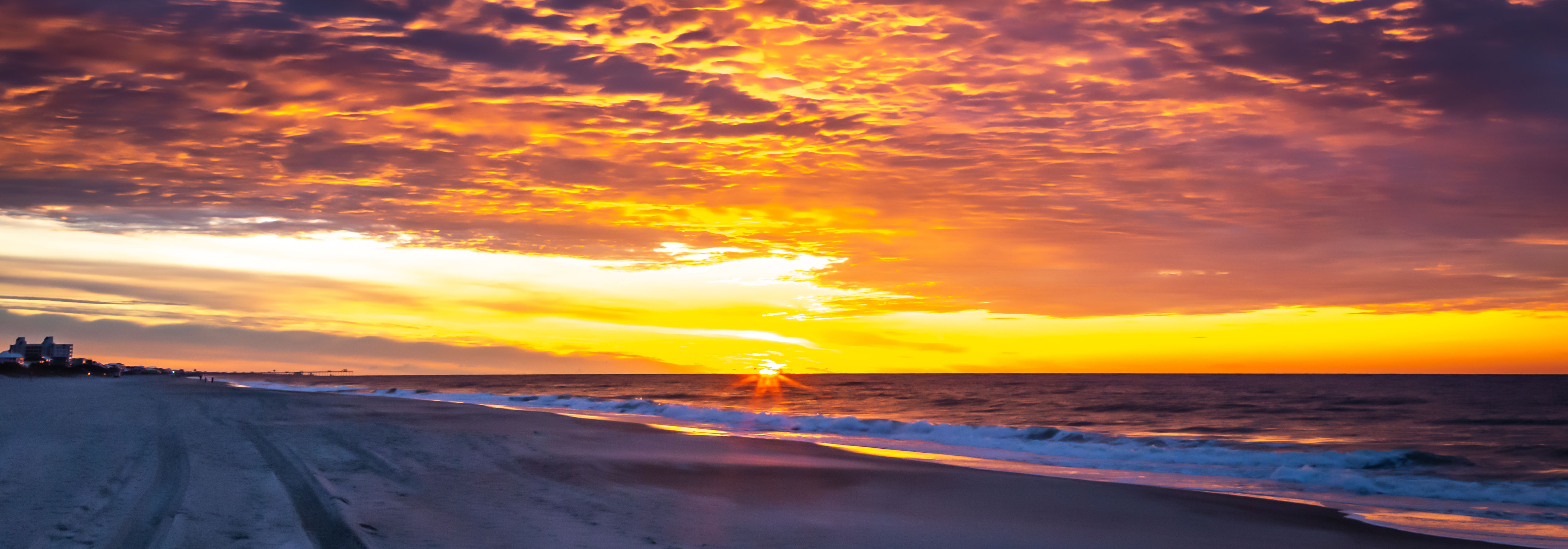
What a great panoramic shot! I agree with the previous comments about those parallel lines. It's cool how the waves follow the line of umbrellas on the beach.
But, do you really need the 2nd layer of breakers at the top? As I scrolled down, my computer screen automatically "cropped" the top of the image forming a narrow panorama of the breakers on the beach and those umbrellas. Since your image is entitled "The BEACH at Phuket" (here I go with titles, again!), if you show us less water, we are more apt to focus on the BEACH.
One other nit picky thing - that red umbrella to the far left (I know, I just said that I love red!) is a bit distracting. It keeps grabbing my eye and pulling it away from the overall effect you are trying to achieve. Maybe just a slight crop in from the left would eliminate it and give you the same amount of space from the edge to the umbrellas on both sides of this image.
Makes me wish I was there!
Karen |
Apr 11th |
| 14 |
Apr 21 |
Comment |
Hello Xiao,
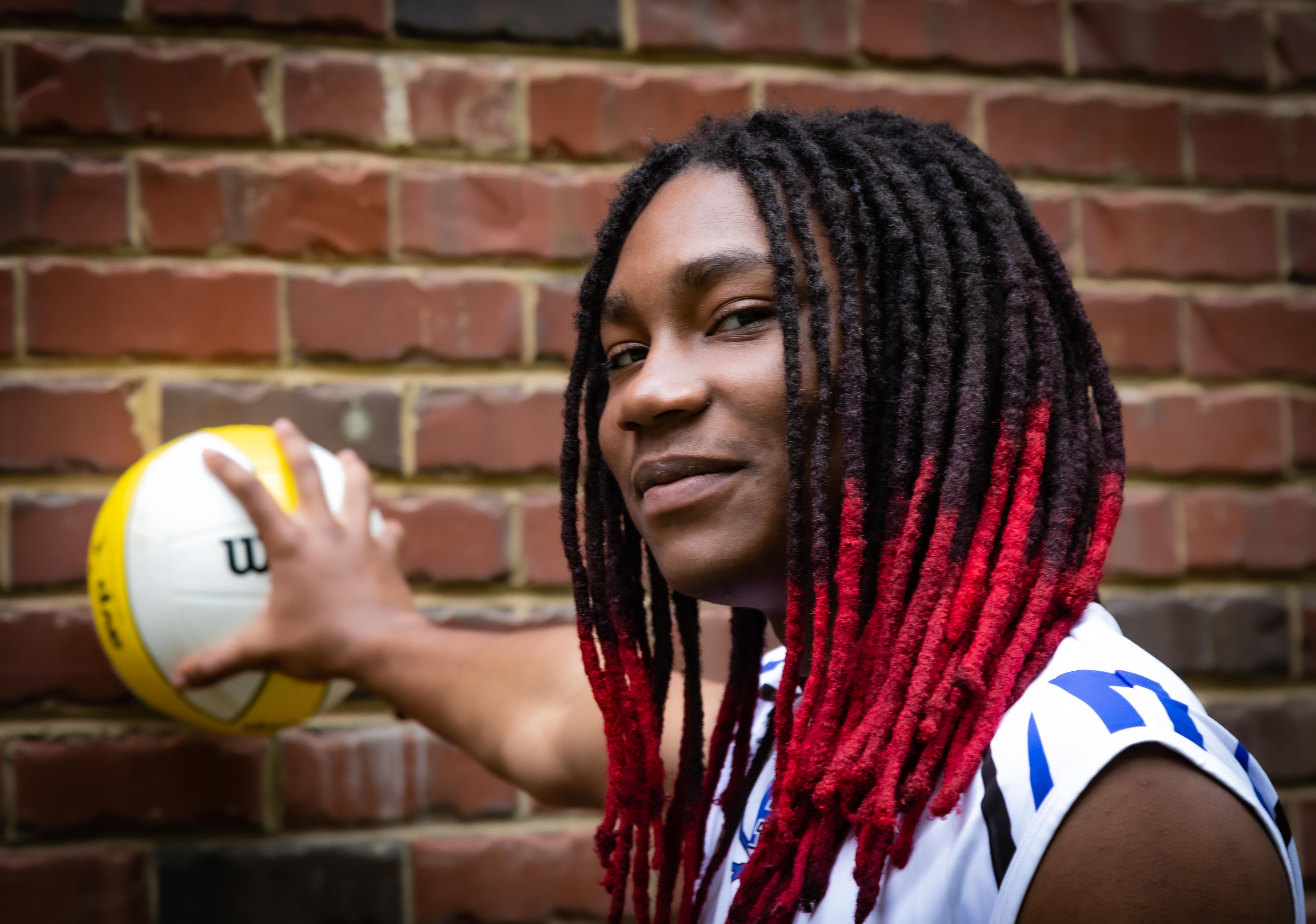
LOVE the work you did on this image! The original is OK, but the removal of the yellow tint, the brightening, and of course, the straightening of the column makes this a dynamic street shot.
My issue is with your title. I love red, so my eye goes straight to the red book. Why not name this "The Red Book" to direct the viewer's eye to where the subject's eye is focused? Then, the viewer can move their focus (pun intended!) around the shot to take in the details already noted about the model.
One other thing: it's a bit too centered for my taste - maybe crop a bit from the left to throw the subject more off-center?
Great capture!
Karen |
Apr 11th |
| 14 |
Apr 21 |
Comment |
Hello Tom,
These images definitely evoke emotional reactions! Here are mine:
#1 (To the color original) Uplifting shot of the spires emerging fro the trees toward heaen.
#2 (Top of the B&W pic and I scroll down) Oh - this gives a gloomy sinister feel.
#3 (Title) Hmm - "Cathedral Glow" suggests hopefulness, but not what I was feeling.
I think the "glow" is a bit too bright. You do lose some of the detail in the architecture. And I agree on the hotspots at the bottom. Those should be easy to tone down in Ps.
Definitely a keeper because of the emotional "wow" you were able to create!
Karen |
Apr 11th |
| 14 |
Apr 21 |
Comment |
Hi Greg,
Nice to meet you and your work!
This is a great capture of the connection between you and the subject. I agree that the eyes really pop in the B&W, but I think the story is not only about the vendor, but who he is and what he does. With that said, I would love to have been able to see a bit more of his wares so that the oval of the tray appears in its entirety. (I like curves - they tend to keep your eye in the image!) And, that oval shape is suggested (by not entirely seen) in the end of the kayak, the oars, and the round bucket.
This image makes me wish I had been there!
Great work!
Karen |
Apr 11th |
| 14 |
Apr 21 |
Comment |
Hi Darcy,
Beautiful image!
Being a "newbie", I liked reading the other comments to see if what I thought was shared by others.
I do like the diagonal placement, but agree that the crop might be a bit too tight. The focus seems good, but there is some haloing as Tom mentioned - although I don't have a clue how to fix it.
You've inspired me to try some "flower portraits"!
Karen |
Apr 11th |
8 comments - 0 replies for Group 14
|
8 comments - 0 replies Total
|