|
| Group |
Round |
C/R |
Comment |
Date |
Image |
| 9 |
Jul 22 |
Comment |
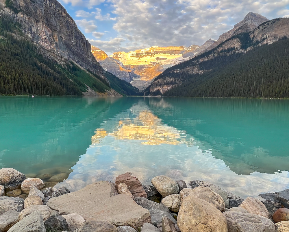
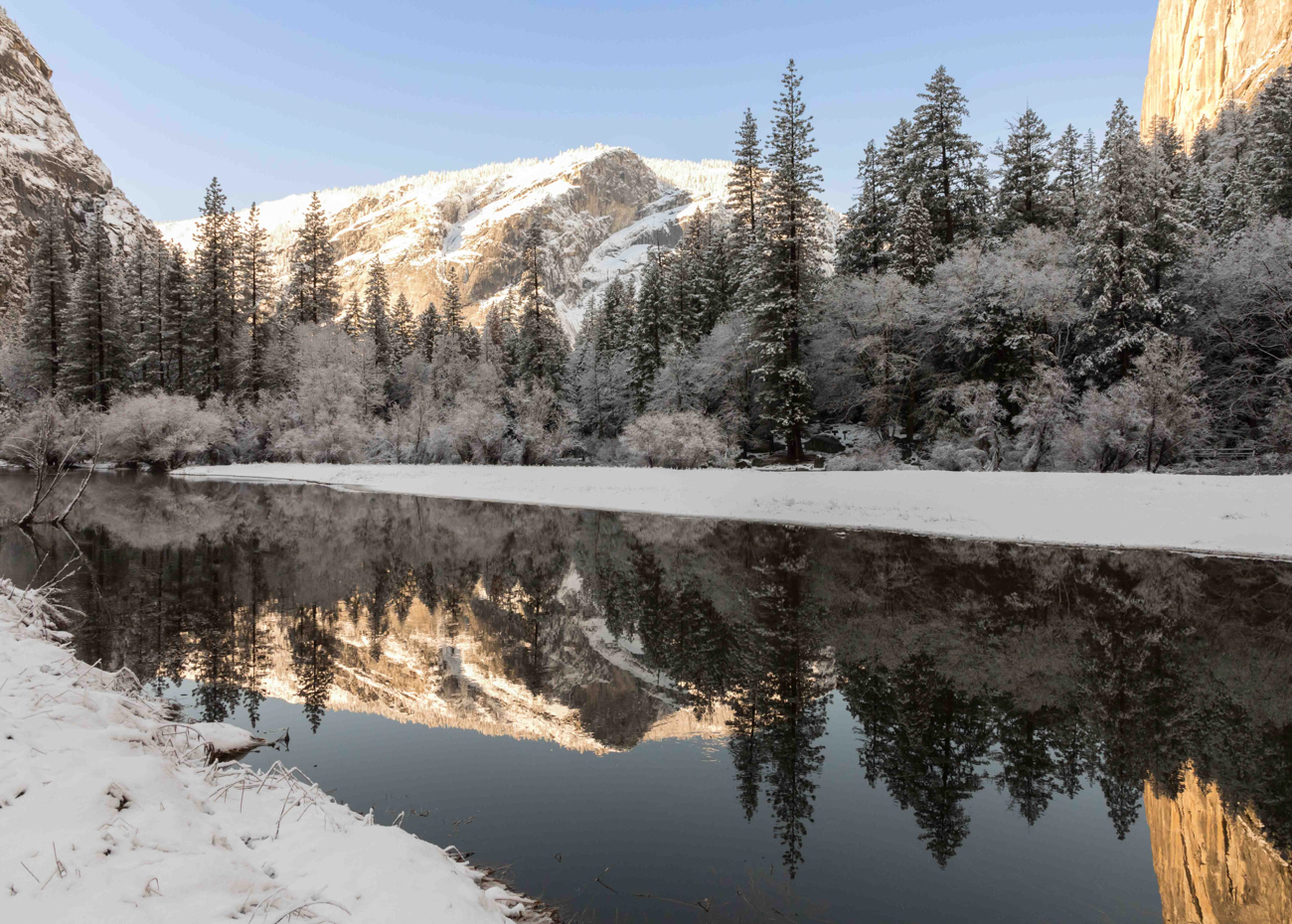
David - I love this shot. I think my July photo (Group 78) was taken standing in exactly the same location, but with a different perspective. Beautiful job! |
Jul 26th |
1 comment - 0 replies for Group 9
|
| 78 |
Jul 22 |
Comment |
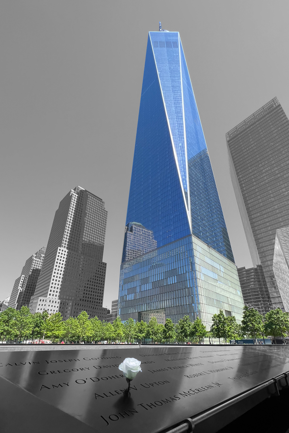
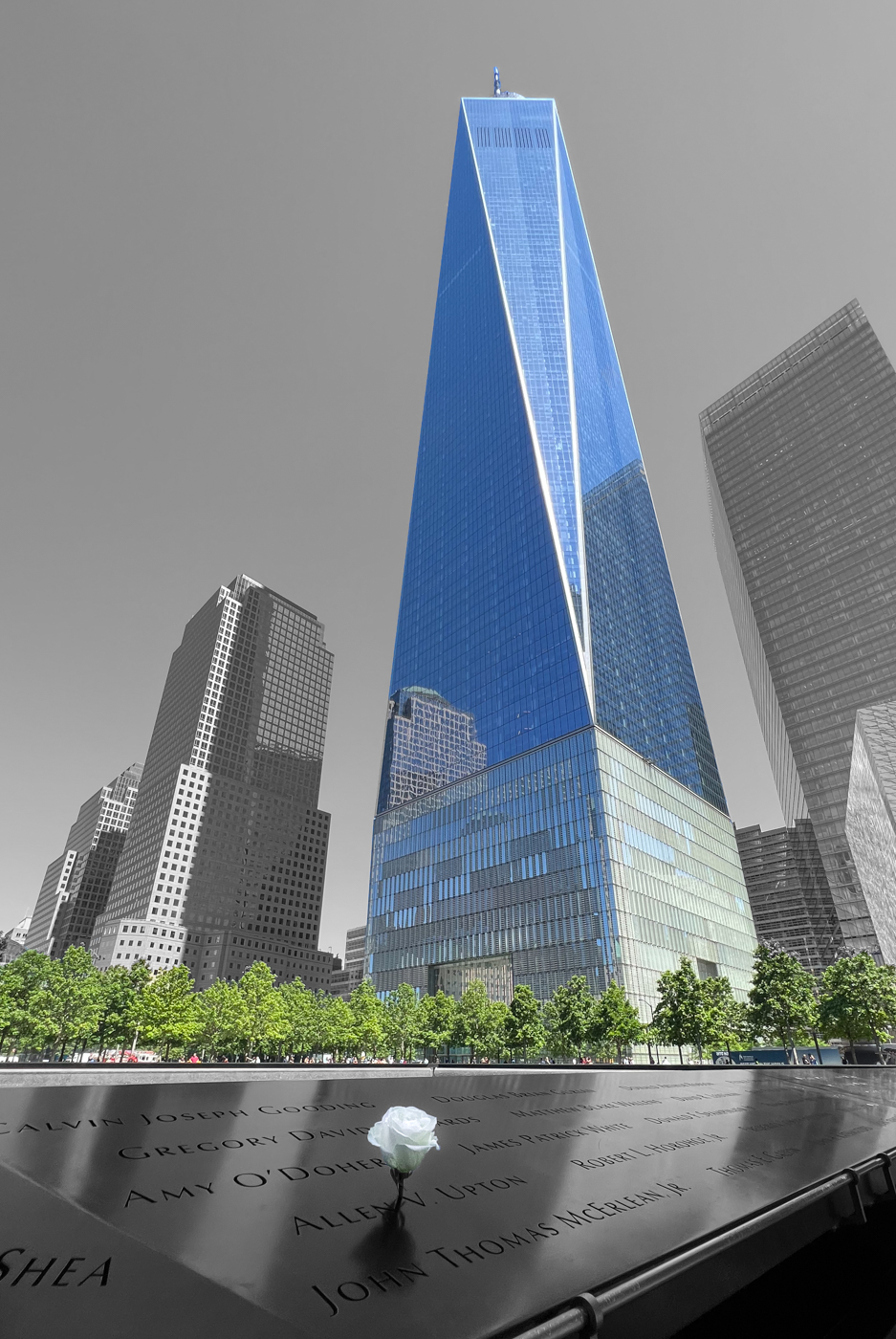
Per Brenda's request - my "final" version based on in put received... While I liked the darker sky idea, looked a little "too" surreal for my taste. Thanks everyone for your input along the way! |
Jul 24th |
 |
| 78 |
Jul 22 |
Reply |
Intersting that you say that Terry. I showed this version to a friend, and his observation was that it looked CGI. Didn't believe it had started as a real image capture. That can obviously be a plus or a minus, depending on your perspective, but I agree that it crosses that (hard to define) line between looking realistic vs artificial. |
Jul 18th |
| 78 |
Jul 22 |
Reply |
Really like this - thanks! |
Jul 11th |
| 78 |
Jul 22 |
Reply |
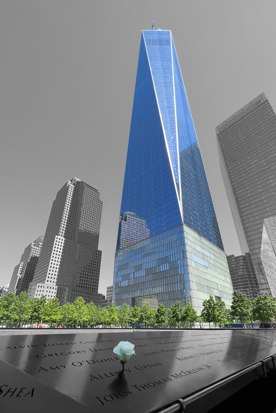
attached with name removed. I had done this originally - agree that it is cleaner photographically, but somehow it felt wrong to remove even a part of one of these people's names... Still not sure. |
Jul 7th |
 |
| 78 |
Jul 22 |
Reply |
Thanks Jim!
|
Jul 5th |
| 78 |
Jul 22 |
Reply |
Thanks Jack! Appreciate your comments. Can you direct email me re: etiquette / process of being in more than one group? Not at all looking to leave 78, but have really enjoyed this forum, and potentially interested in participating in more than one group! |
Jul 4th |
| 78 |
Jul 22 |
Reply |
TY - you were spot on! |
Jul 4th |
| 78 |
Jul 22 |
Comment |
Thanks all - appreciate the feedback and different perspectives. I had chosen to go with the mono (for the sky non-WTC buildings) specifically to contrast the rebirth at that location (using color in the trees, people and new building). Terry, I am impressed by your selective re-straightening of the other building, but (as I stare at both of them!) I do think the tilt conveys a feeling of impending collapse, uniquely appropriate to this image. For any other skyline, would agree with your treatment! Had missed the hue in the flower, agree it's a distraction. Reprocessed to go for a clean white... |
Jul 4th |
 |
| 78 |
Jul 22 |
Comment |
Agree with comments above - look forward to seeing modified image. I love the dog's expression. Looks like the image needs to be rotated slightly CCW - would adjust to put the house vertical. Great shot. |
Jul 2nd |
| 78 |
Jul 22 |
Comment |
Wow. I would not have known this was a composite. It's a great image. For the first time (I think) since joining this group, I can honestly say this is one location I do NOT want to be! What did they put in the water to attract the sharks (other thank divers?!). Delighted to see that you got to tick one more off your list. Really not much photographically to add, but might crop a little off the right. Thanks for sharing this one |
Jul 2nd |
| 78 |
Jul 22 |
Comment |
Agree, I would have probably also tossed this one early on, but am duly impressed with your recovery. Can you give us some context to go wtih the title? Assume we're looking at a train station, but with the noise, can't tell if looking in or out. Where was this shot taken? When straightening for architecture, I like to use the LR transform settings. You've leveled it to the horizontal white line below the clocks - I would add another horizontal level at the top above the middle clock. Curious to see how this looks with DeNoise first as per Terry's comments. Thanks! |
Jul 2nd |
| 78 |
Jul 22 |
Comment |
I feel like I'm chasing right behind Terry this am :). Agree with his suggestions - nothing else to add. A great capture, and I really love how you've managed the originally washed out sky. Definitely keep the boat! Beautiful image. |
Jul 2nd |
| 78 |
Jul 22 |
Comment |
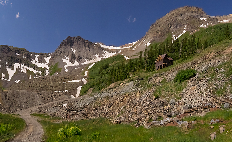
Hi Jim, great scene - challenging as you've pointed out due to the lens distortion. The focus for me is as Terry pointed out the road leading into the mountains. Looks like there is a parking area in the lower left that distracts a little from the start of the leading line. Iried cropping a little more off bottom. I really like the cabin as it gives perspective on the scene. The barrel (in its current form) is not doing as much for me, and I might consider removing it. Agree with Terry - would put back some color adjusted clouds... Beautiful location, will admit I had to look up where Ouray is. Adding it to my list! |
Jul 2nd |
 |
| 78 |
Jul 22 |
Comment |
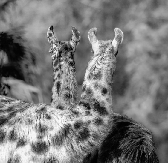
Hi Brenda, What a great idea for your club! I love llamas - I think they are extremely photogenic, largely due to the expressions on their faces, and what they do with their tongues. I also like the symmetry of the crossed necks, but tend to agree with Terry - backsides are hard(er) to work with. Exceptions for me are when the subject is looking off towards something in the distance (either included, or implied). My take on this image is that the focus is the way their necks cross - in that context, how about cropping in more aggressively? It's ok for me I think to pause for a minute to recognize that they are llamas - the rest of the bodies (and background) seem less relevant. Also, playing around a little in LR - personally, I liked this B&W/infrared filter. |
Jul 2nd |
 |
8 comments - 6 replies for Group 78
|
9 comments - 6 replies Total
|
