|
| Group |
Round |
C/R |
Comment |
Date |
Image |
| 78 |
May 22 |
Reply |
I do - love the image! Nice work :) |
May 24th |
| 78 |
May 22 |
Comment |
Jason- I LOVE it - thank you! |
May 23rd |
| 78 |
May 22 |
Comment |
Thanks all - appreciate the feedback and suggestions - I do think it is more appealing with with reduced contrast and a less aggressive crop. Great to have 6 extra sets of eyes on my work! |
May 18th |
| 78 |
May 22 |
Comment |
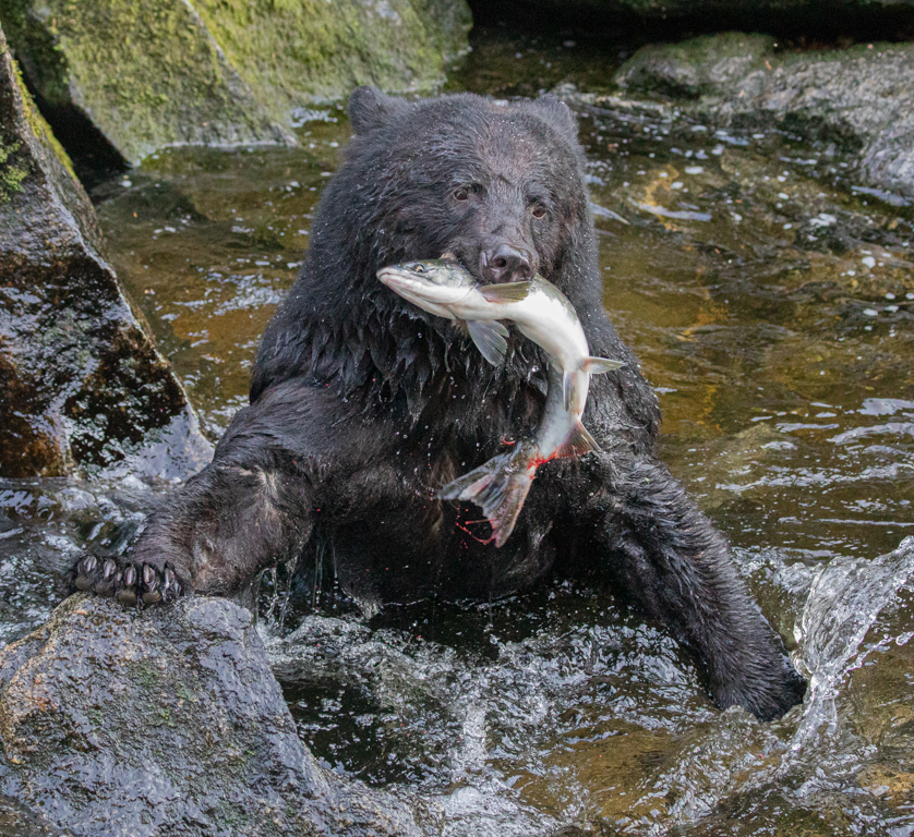
Sunil, I really appreciate this image. Nothing to add photographically - it captures the essence of the what we are (not so) slowly doing to our planet. Heartbreaking to watch. Thanks for sharing. |
May 4th |
| 78 |
May 22 |
Comment |
Thanks Terry, appreciate your observations |
May 3rd |
| 78 |
May 22 |
Comment |
Thanks Jason, I really like the way the light is coming in behind the horse around the edges, and also like the tree in the background. Wish the horse was facing the other way (never is, right?). The way the horse is pointing off to the left edge with the extra space behind him makes it feel a little off balance to me. Don't see an "as shot" - was this cropped, and is there perhaps a bit more to add in front of the horse?
If not, much as I like the tree I might crop closer to the horse and let it be the focus of the picture... The "atmospheric" blur that you have with the background light on the subject make for a very nice image I think... |
May 1st |
| 78 |
May 22 |
Comment |
Thanks Stephen! |
May 1st |
| 78 |
May 22 |
Comment |
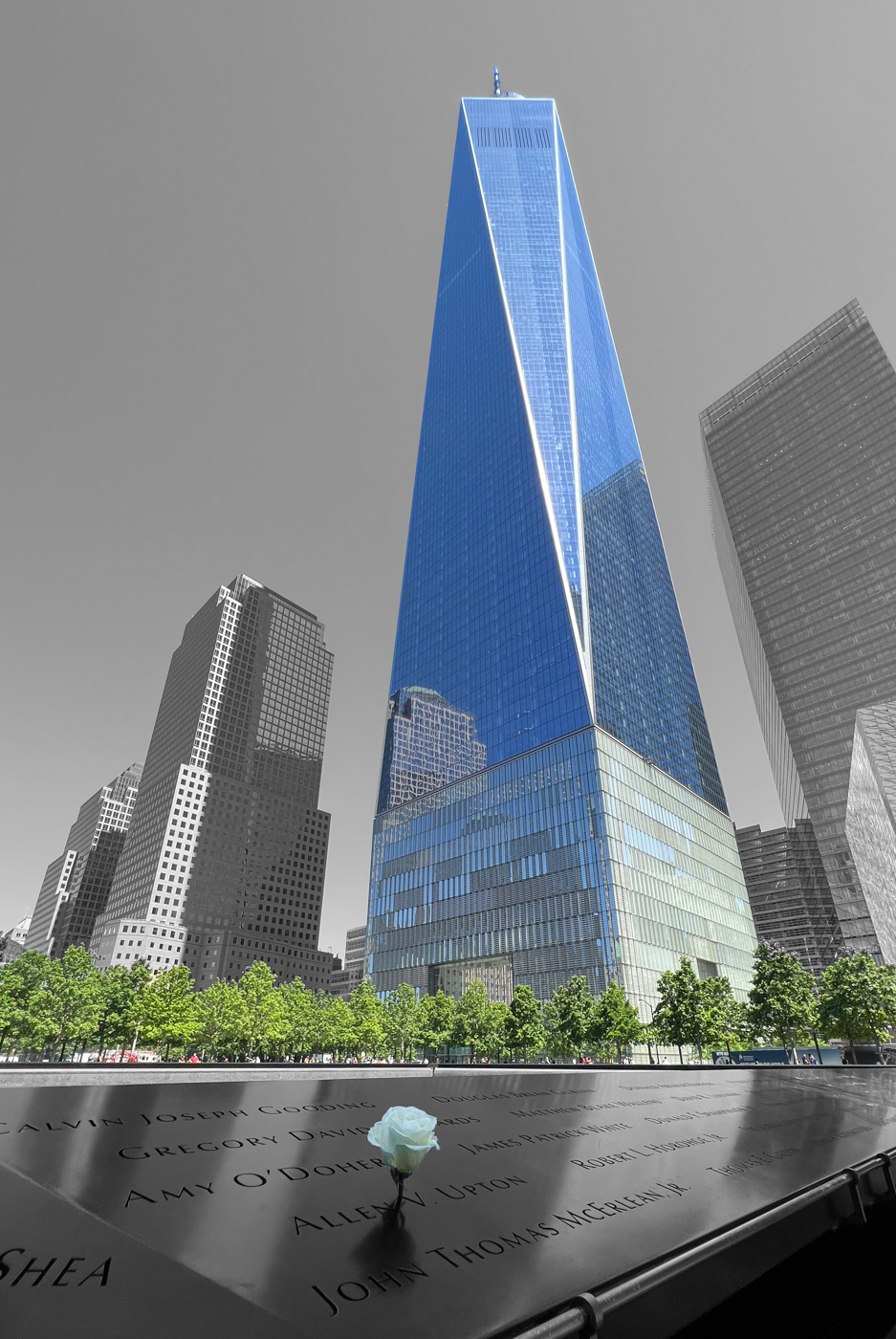
This is really cool - I too would love to know more about the exhibition. I think your crop is great and the way you've increased the light outside the room (? chamber) to highlight the frame of the door is great. I particularly like the contrast between the warm tones outside, and the cold metal on the upper half of the inside. Doesn't stand out so much on the floor / lower half, however the way the floor catches the light. What do you think about going to monochrome for the interior (excluding the subject)? her tones match the outer light as well, but she's clearly standing inside something that's very distinct. Removing the hues from inside may strengthen that contrast... |
May 1st |
 |
| 78 |
May 22 |
Comment |
I'm with Stephen - I really like the guy and his expression is the focus for me. B&W is excellent. I appreciate your desire to focus my gaze on the man. Though the blur is interesting, I think it does add back a little distraction. How about a more severe crop, and perhaps a simple vignette to bring you in even closer? |
May 1st |
 |
| 78 |
May 22 |
Comment |
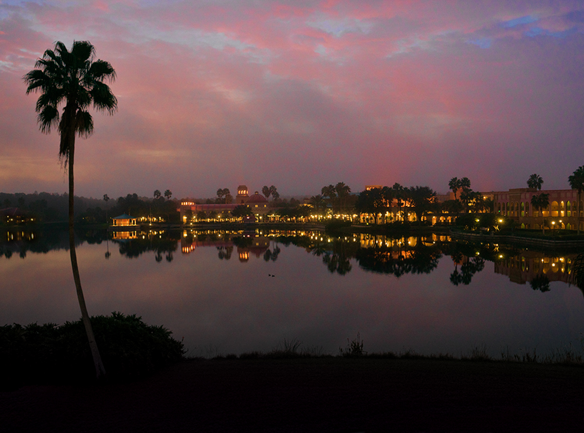
Nice image, Jim. I particularly like the way the palm tree frames the left side of your composition. I might crop out a little more to the left of it, and drop the exposure on the lights that are left of the tree - they seem to pull my gaze away to the edge... I'd also consider dropping the exposure on the bottom - it's dark and noisy, and may look better as a silhouette. Rough initial attempt at these changes attached, I'm sure you and others could do it better :). Other thought, if one were so inclined, would be to clone the tree, mirror invert it and stick it on the right side for some symmetry... |
May 1st |
 |
| 78 |
May 22 |
Comment |
Love it - I think your crop and adjustments are great. wrinkles and such don't bother me - it's who they are :)
Given that you're going to reshoot them, I have a creative thought / suggestion. When I look at this image, there's almost a heart shape appearing in the negative space, formed below their hands and between the two riders. With a teeny bit of planning and minor adjustment - left horse facing straight to get the ear out, and the two riders a few inches closer to bring the bottom border together, you could adjust their hands to really bring that shape into place. Not sure if the horses would cooperate with you, but might be really neat particularly in the context of the title/story that you're telling.... |
May 1st |
10 comments - 1 reply for Group 78
|
10 comments - 1 reply Total
|