|
| Group |
Round |
C/R |
Comment |
Date |
Image |
| 78 |
Aug 21 |
Comment |
Thanks Helen, Like the idea of including a bit more of the wall - I always try to at least consider thirds.... In this case It's a tradeoff of getting a bit more detail / focus on the orca. TY! |
Aug 10th |
| 78 |
Aug 21 |
Comment |
Thanks Jason. Interesting. I read Hebrew as well (since early childhood) (right to left) and wonder if that makes me less prone/able to see one way vs the other as being 'better'... |
Aug 9th |
| 78 |
Aug 21 |
Comment |
Thanks Jason, Just reviewed your comments on flipping other images this month. Really not sure which way is more aesthetically more pleasing to me on this one. I always make sure animals (particularly birds/bugs) are 'looking' in towards the center of the image, and generally I tend towards putting the animal on the right side looking left. Will keep thinking about this one... Thanks!
|
Aug 9th |
| 78 |
Aug 21 |
Comment |
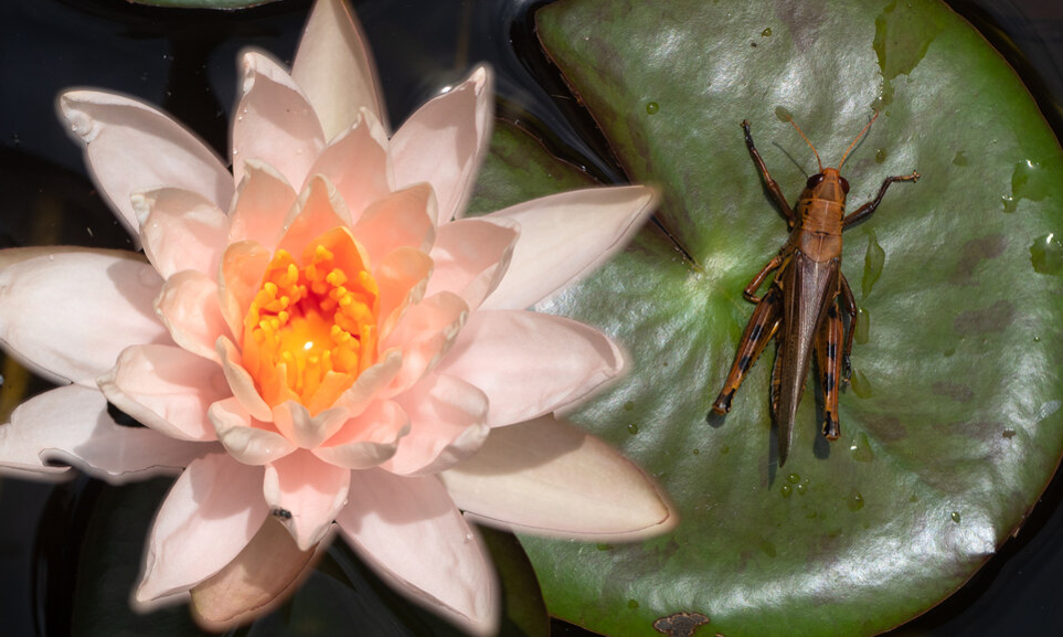
Jason, great composition. I don't personally have a problem posing dead insects. I know others will even go so far as to 'chill' bugs to slow their metabolism down and make them more compliant subjects. I was supposed to go to Austin for a workshop with a guy that does posed macro work with insects, but it was delayed by pandemic.
Only comment I have on the image itself is that I think the lily pad in the upper left is a bit distracting. Seems to pull my eyes away from the two focal points - the flower and the grasshopper. You've already cropped two sides of the right lily pad, which seems ok, since the focus on that side is the insect. Might crop more boldly (see attached) and focus on the two pieces of the image. I don't like that I've cut off the top tip of the flower, BUT - if this is a composite photo, perhaps you can rotate the flower a little (or shrink it) to get it fully in the pic? Curious what others think... Nice job! |
Aug 9th |
 |
| 78 |
Aug 21 |
Comment |
Terry, I'm inspired. All I need to do now is quit my day job and put my full efforts into photography and learning from the masters! Beautiful idea, amazing image. Nothing to add here - thank you for sharing this. |
Aug 9th |
| 78 |
Aug 21 |
Comment |
Hi Helen, Great image. I feel like I'm trailing behind others on the "flip it" bandwagon. This one I'd personally leave with the gardener on the right, but would love to read/see an article on why one way is/should be better than the other.
I tend to agree that the image is a little stronger with some context to place it... Having just that strip at the top as suggested by Jason helps, but personally I like the monochrome. Nicely done |
Aug 9th |
| 78 |
Aug 21 |
Comment |
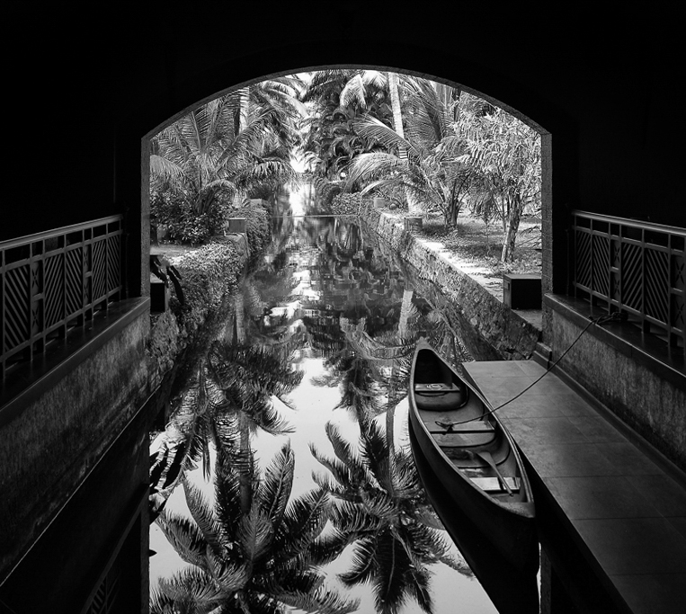
Beautiful image Sunil. Monochrome is great. Love the leading lines, and the crisp image of the resort viewed from the shadows and in the reflection. One suggestion... Looks a little skewed due to the perspective and camera location. i might 'cheat' a little and transform the image to straighten the two vertical sides of the portal. See attached.... |
Aug 9th |
 |
| 78 |
Aug 21 |
Comment |
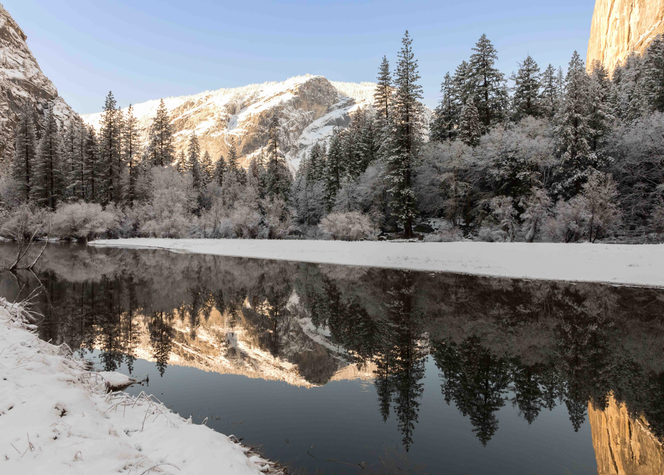
Great shot Jim, the crisp lines are great. Jason's got me perseverating on L-R reflections now, both on this image and mine. Not really sure which my brain 'likes' more, but it's a great image either way. Nicely done! |
Aug 9th |
| 78 |
Aug 21 |
Comment |
Hi Brenda, nice creative approach. I like the golden tones. agree with Jason, woudl try to get the focal point on the lantern(s). depending on the lighting / angles, woudl be neat to get reflection in front of the lantern. Looks like a great time putting this one together! Have fun, look forward to seeing future versions. |
Aug 9th |
9 comments - 0 replies for Group 78
|
9 comments - 0 replies Total
|