|
| Group |
Round |
C/R |
Comment |
Date |
Image |
| 80 |
Oct 24 |
Comment |
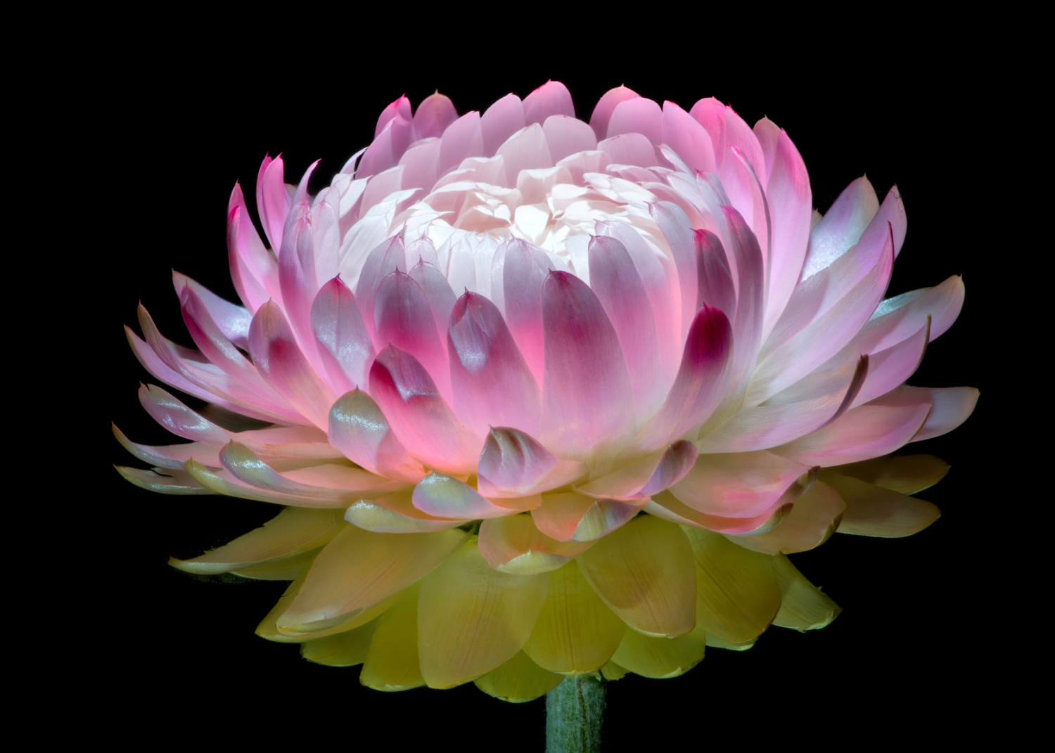
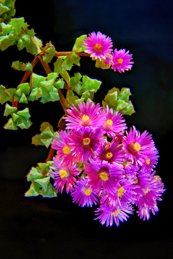
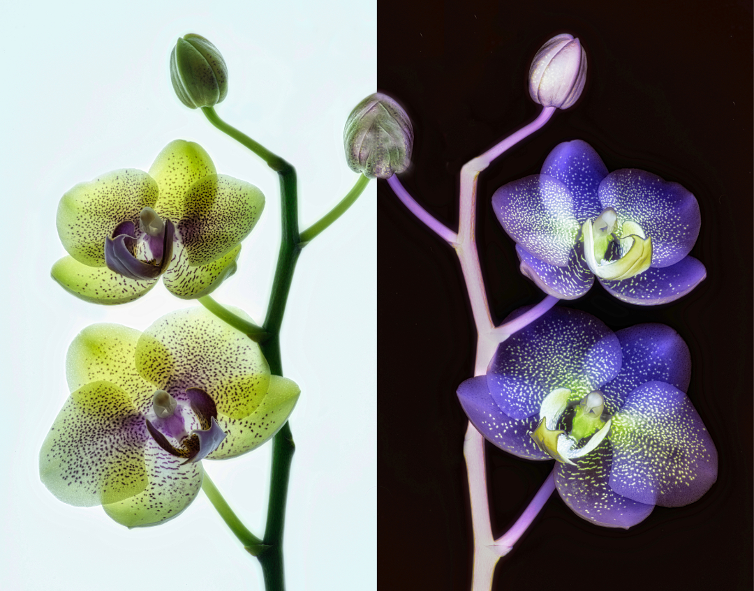
Very cool flower. The greens and lavenders are vivid and work great against each other. The tilt also worked well. I would erase the two bottom stems and put the focus on the main flower. Background bokeh is also very nice. Well done. |
Oct 18th |
| 80 |
Oct 24 |
Comment |
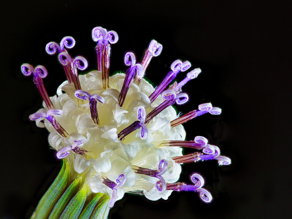
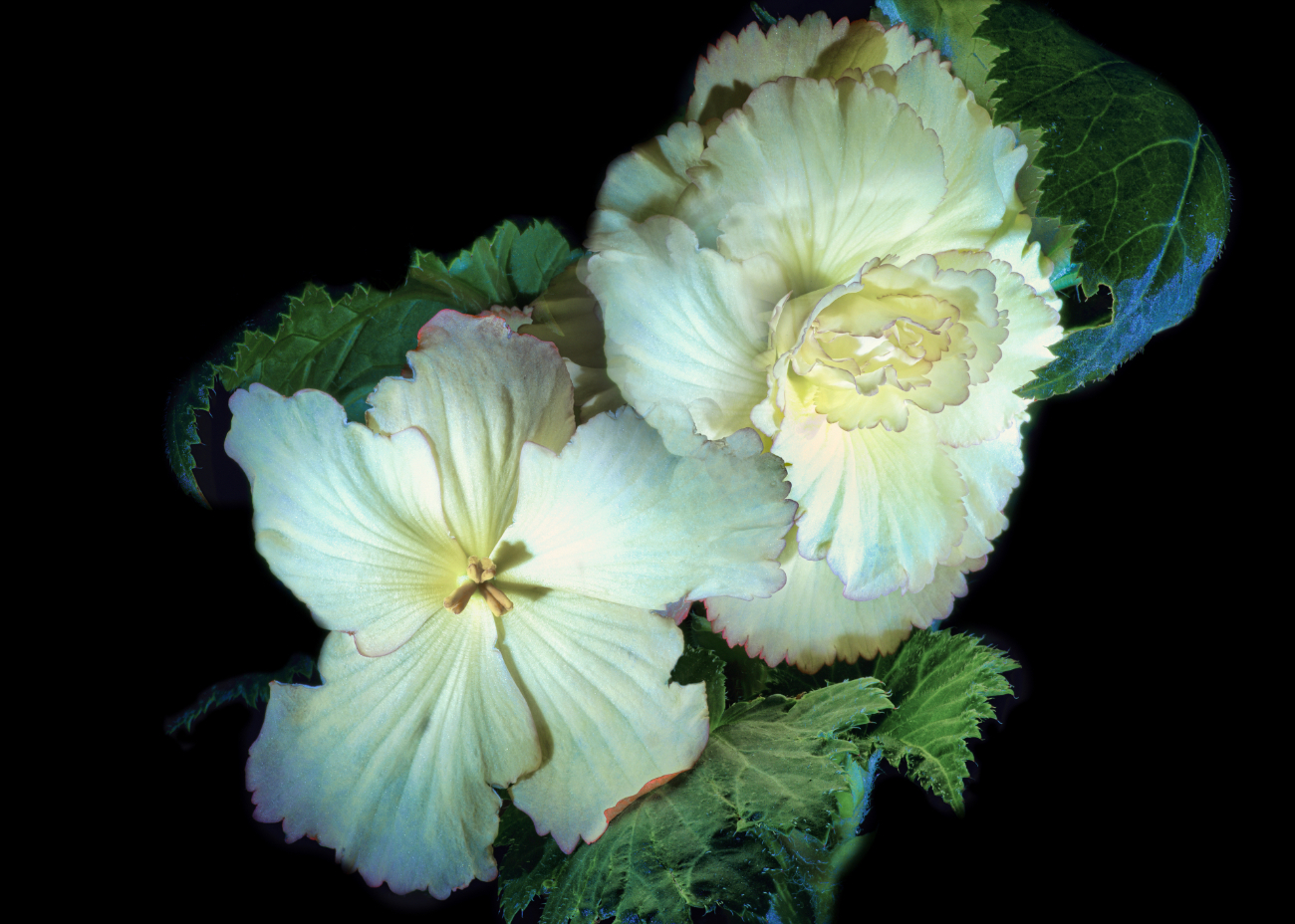
Kamal, well done! You've taken a great step forward is being creative with your subject. The flower is beautiful and I agree with Marti that it could be toned down just a little bit. As far as the background, maybe try shooting a stucco wall or something else with texture in it, blur it a bit and make that your background. Nice job. |
Oct 18th |
| 80 |
Oct 24 |
Comment |
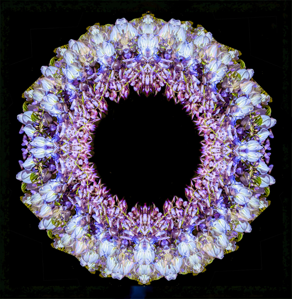
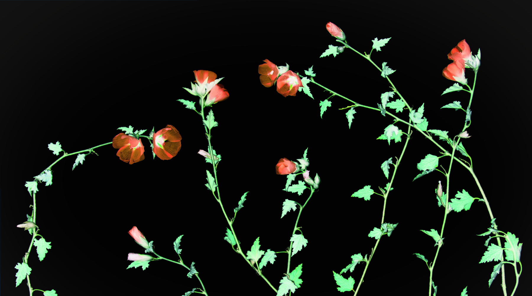
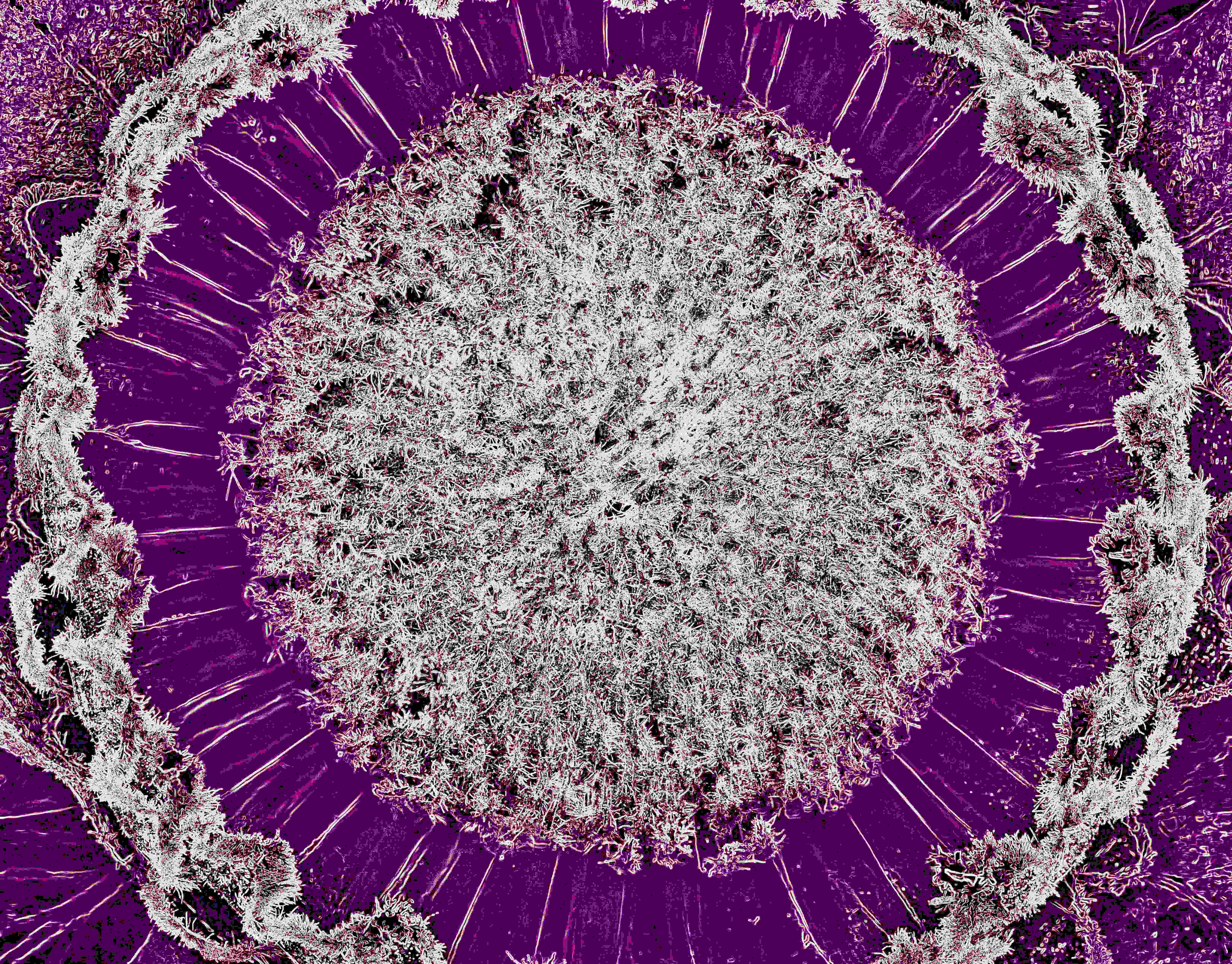
Okay, just had a flashback to the sixties! Reminds me a great deal of the projections they use to do behind the rock bands at the Fillmore Auditorium in San Francisco. The colors are perfect for this sort of thing, though I think the original is just as interesting. Even though it's a swirl pattern the symmetry is what makes it. Nice job. |
Oct 18th |
| 80 |
Oct 24 |
Comment |
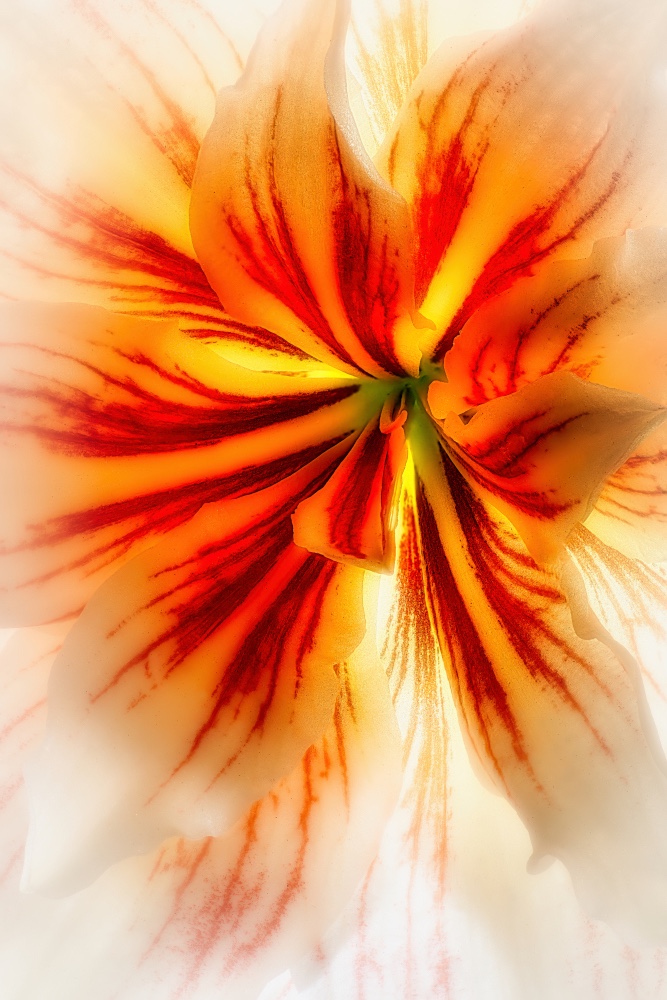
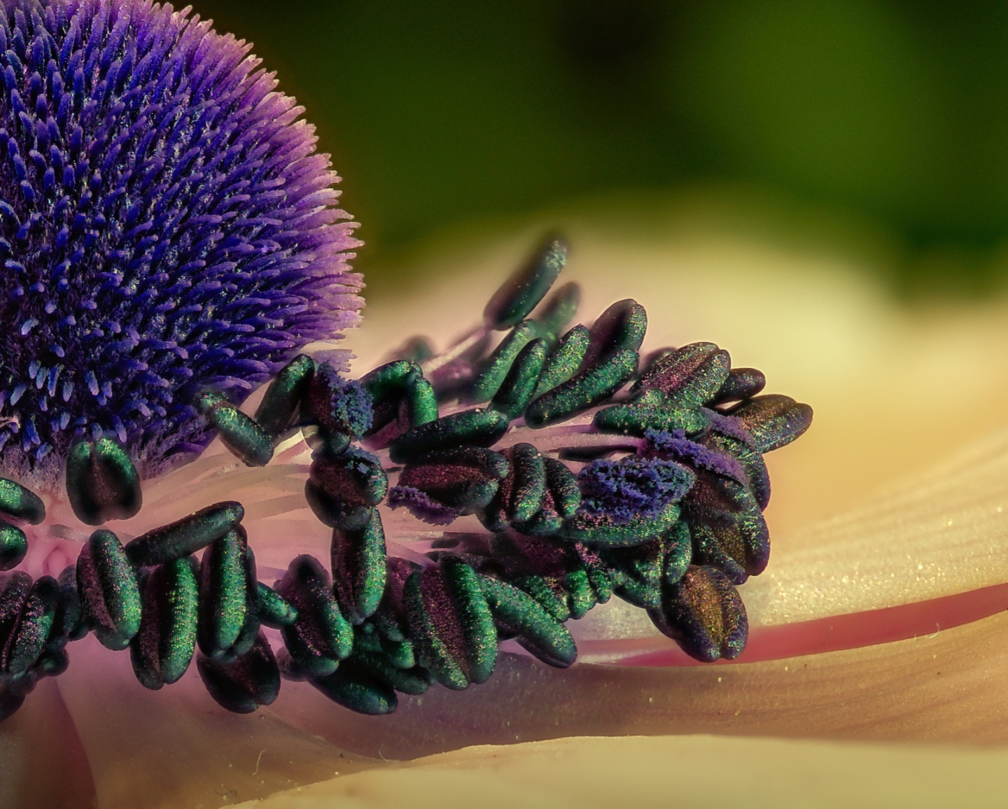
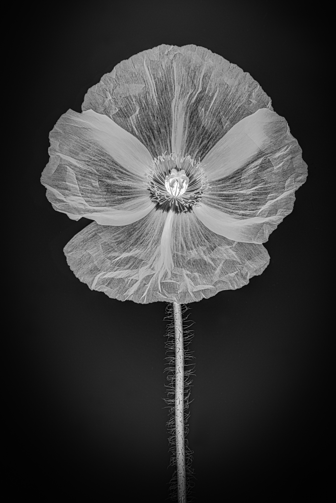
Nadia, what a beautiful iris! The color is quite striking and the overall composition works well. What really sets this apart is the lighting, it's catching the edges of the petals perfectly so much so I thought highlighting that particular asset may work by focusing on one of the best parts of the flower. |
Oct 18th |
 |
| 80 |
Oct 24 |
Comment |
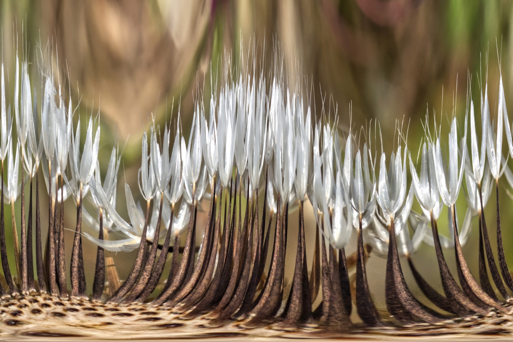
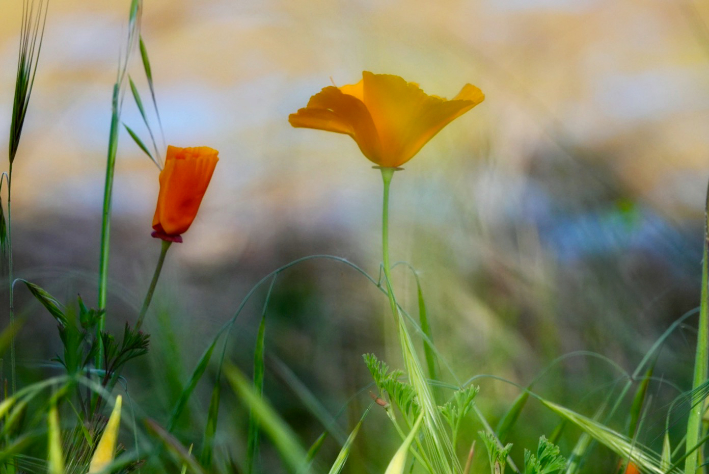
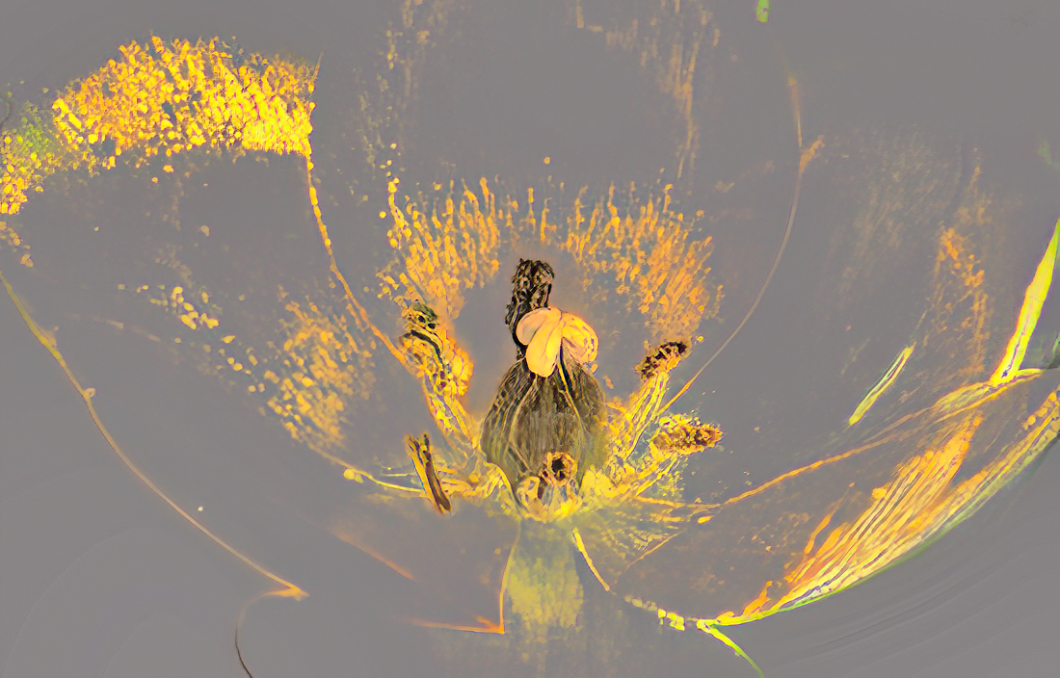
Marti, grasses are so complex there's so much going on within them. You did a nice job with the macro on this and I do agree the exposure can be popped up of a bit on the subject. To do this I'd play around with the curves tool to see if you can bring out the purples and greens. As a side note, I have found that macro images in general look much more interesting if they're simple. I have experimented with grasses and although I've had some positive results most haven't been that great. Anyway, very nice job. |
Oct 18th |
| 80 |
Oct 24 |
Comment |
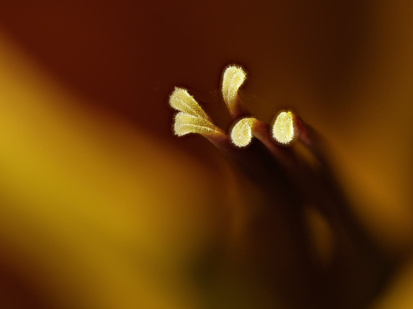
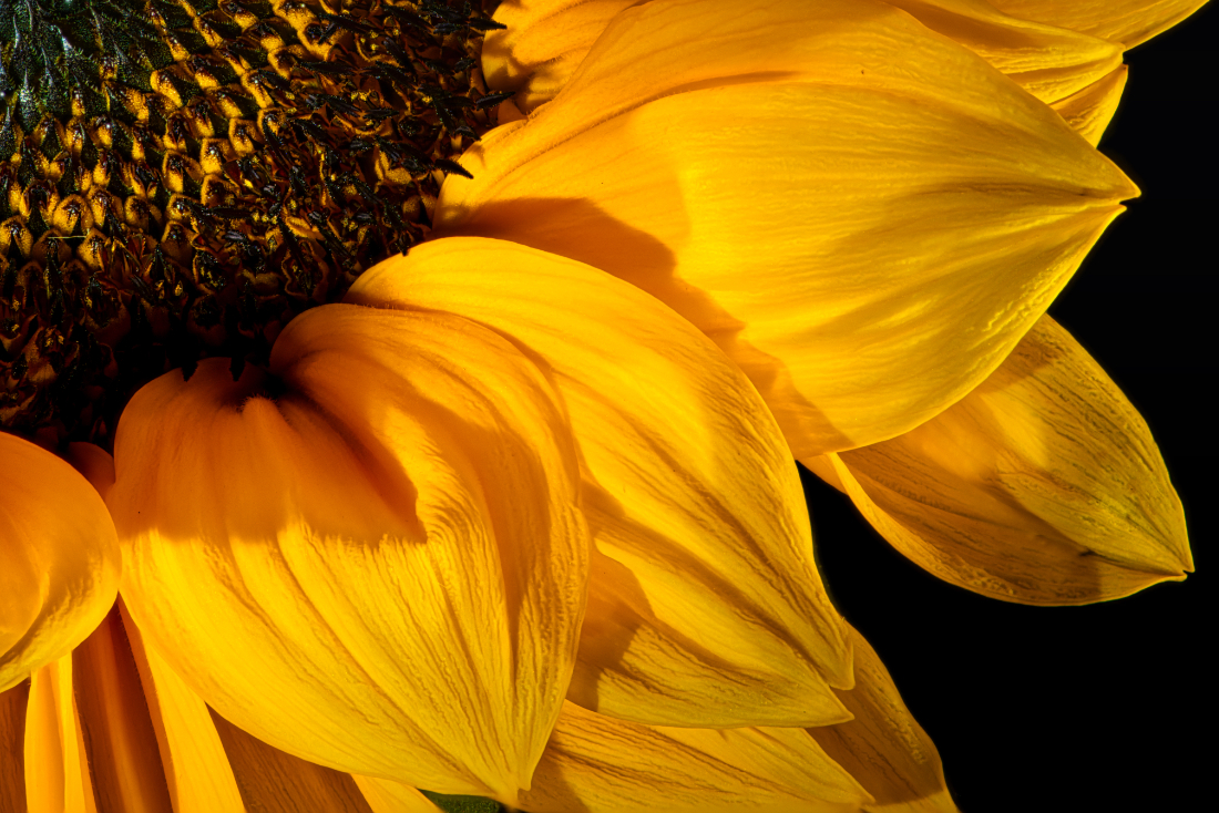
Bob, I really like what you've done here. The colors themselves are brilliant and I like the concept of the blur. The focus on the subject flower is excellent and the detail in the petals is also very good. I almost think adding even more blur would be an interesting experiment. Nicely done. |
Oct 18th |
6 comments - 0 replies for Group 80
|
6 comments - 0 replies Total
|