|
| Group |
Round |
C/R |
Comment |
Date |
Image |
| 80 |
Aug 23 |
Reply |
That first reply was meant to be a thumbs up emoji, but I guess this format does not support emojis! |
Aug 20th |
| 80 |
Aug 23 |
Reply |
� |
Aug 20th |
| 80 |
Aug 23 |
Comment |
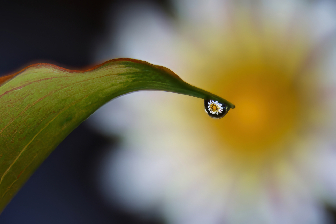
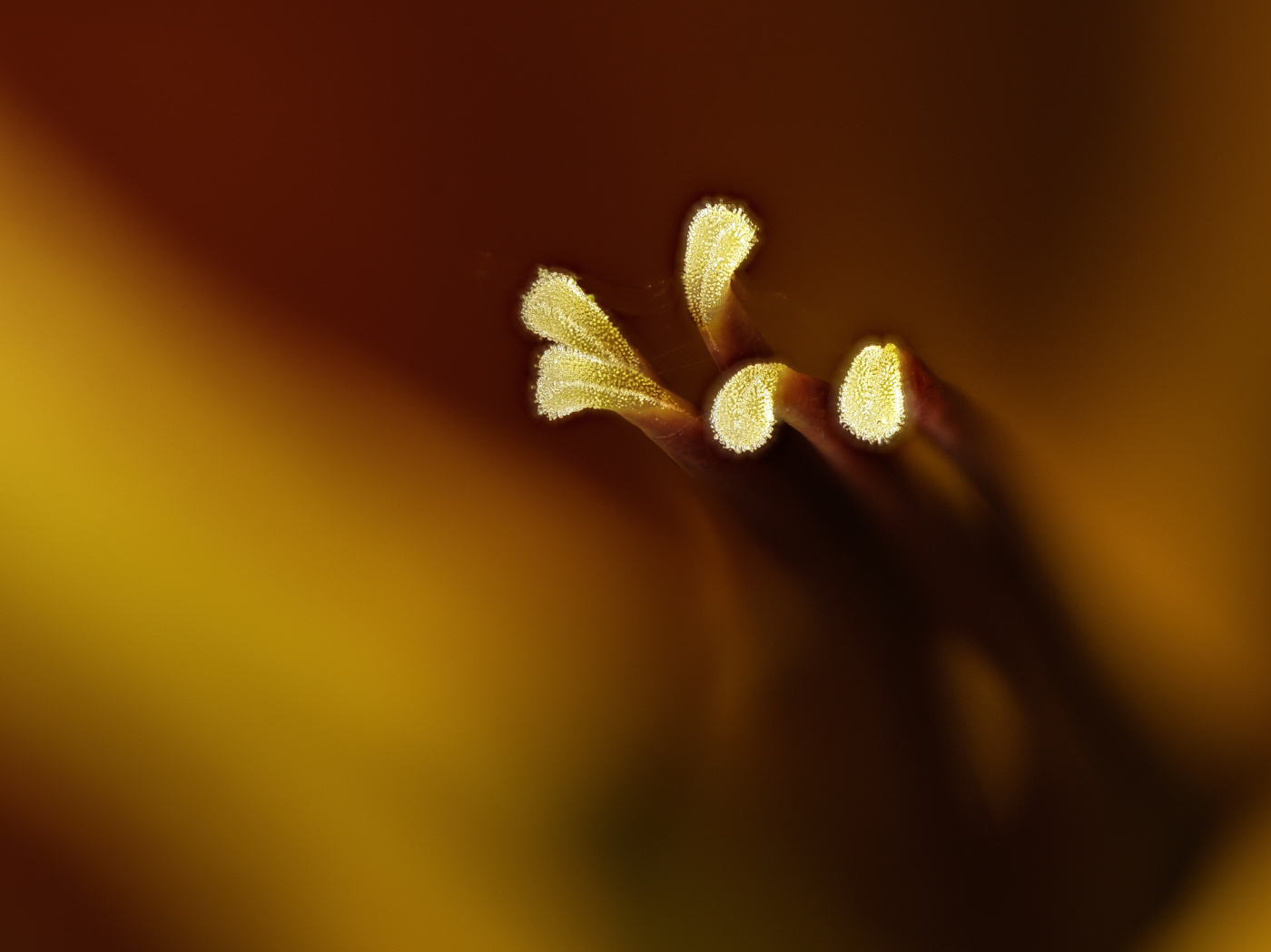
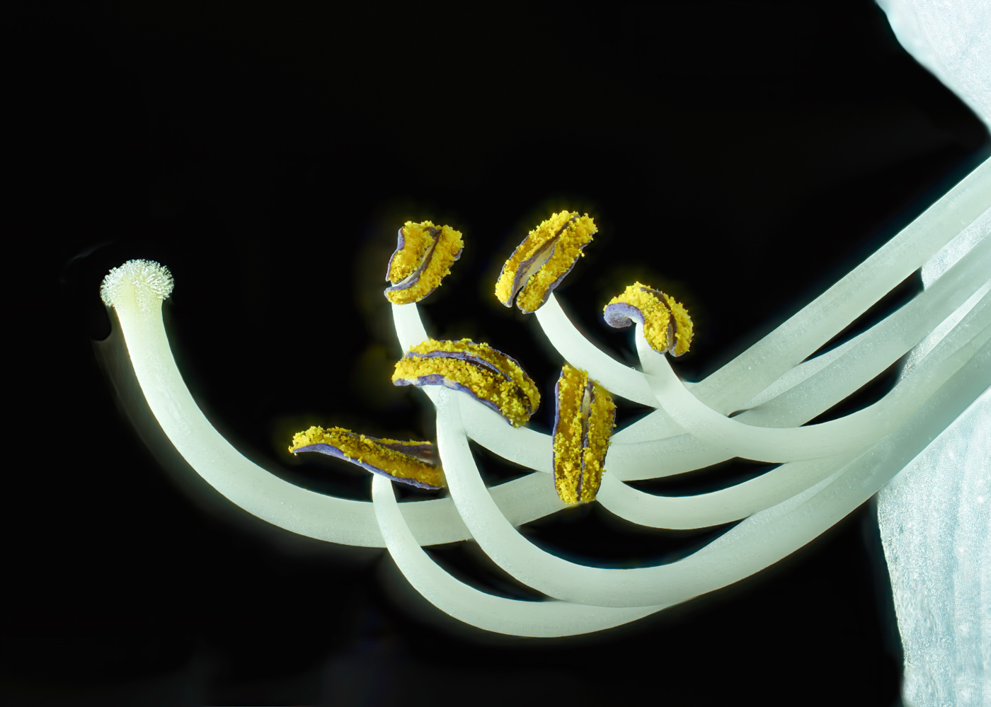
Kamal, a lovely blossom, beautifully in focus and I love the light hitting the edges. I do agree with Bob here, in that the technique you used is almost an inverse of the original - making the center the darkest area and not the lightest. Maybe trying doing an inverse of the image and that will bring out the center? |
Aug 19th |
| 80 |
Aug 23 |
Comment |
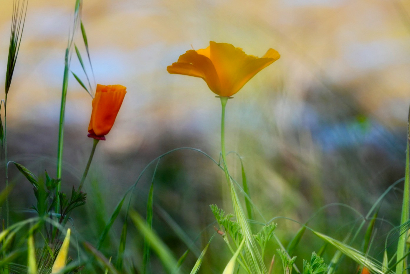
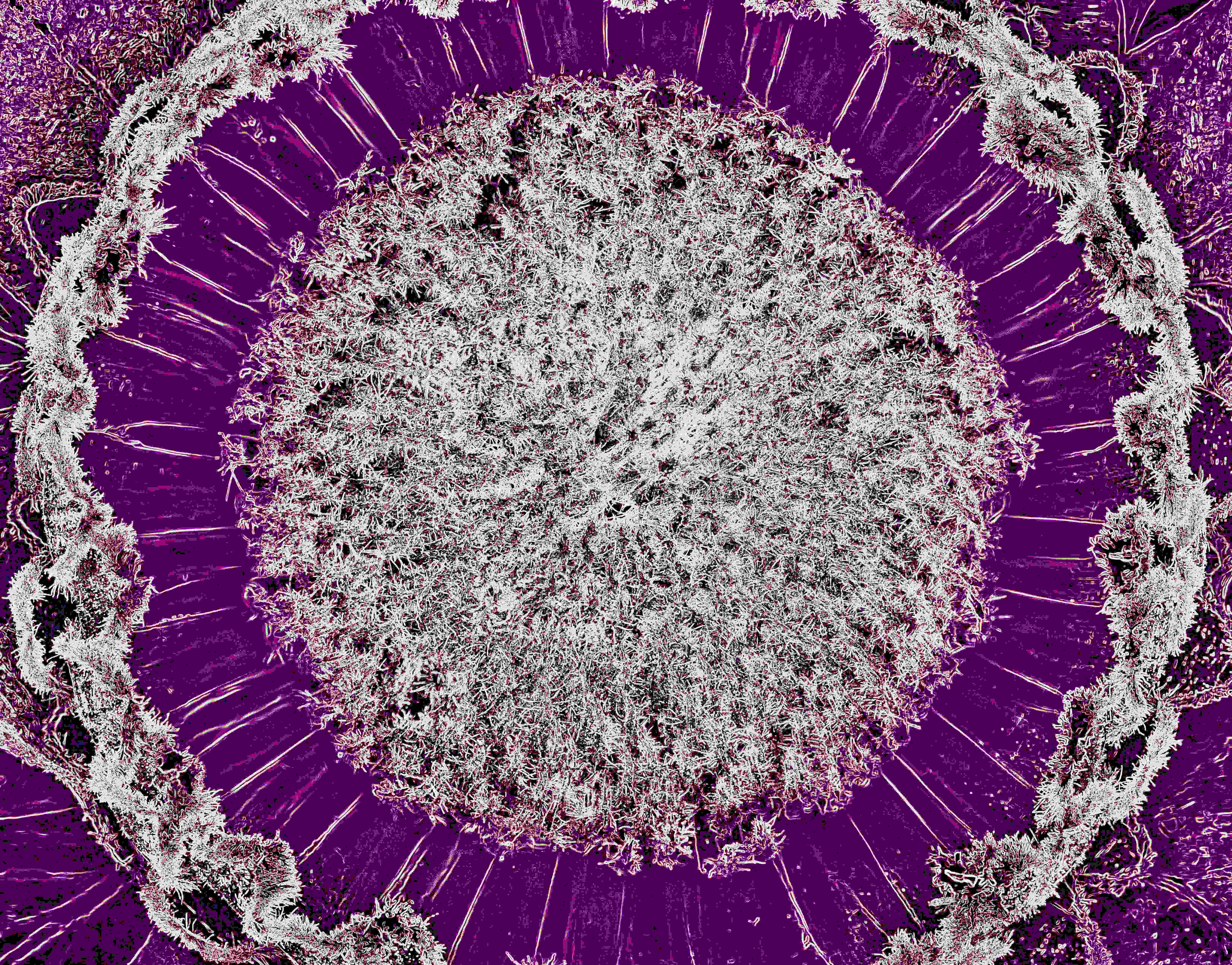
Doug, this technique definitely gives a surreal look to the image. The colors are quite pleasing and I can see that this might take some experimentation to get images that are really interesting and I think you've done it here. Have you used this on other subjects? Thanks for introducing me to this technique! |
Aug 19th |
| 80 |
Aug 23 |
Comment |
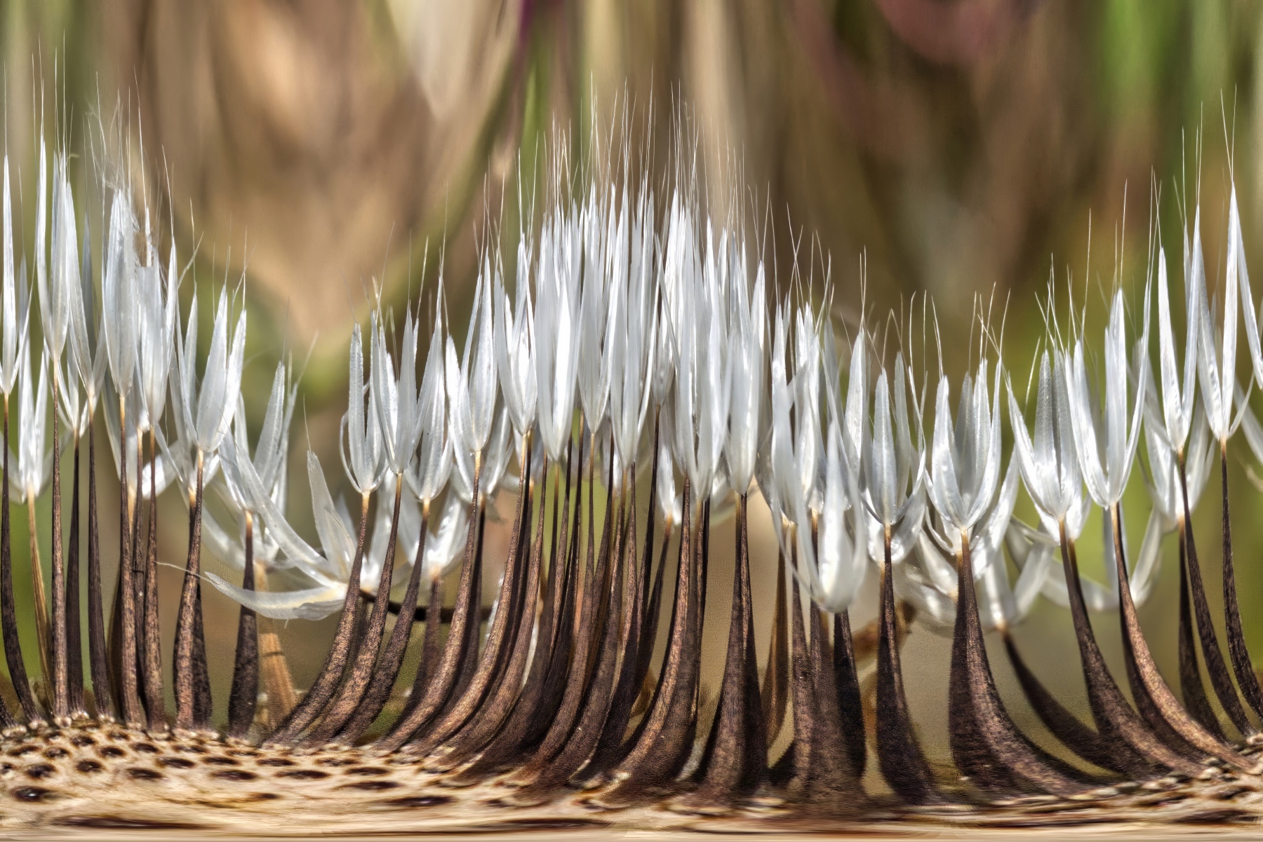
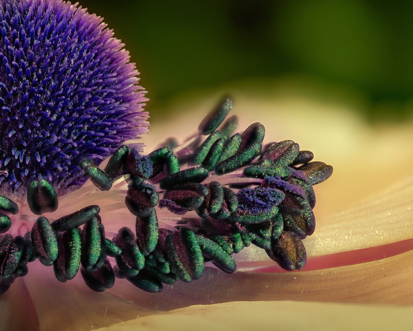
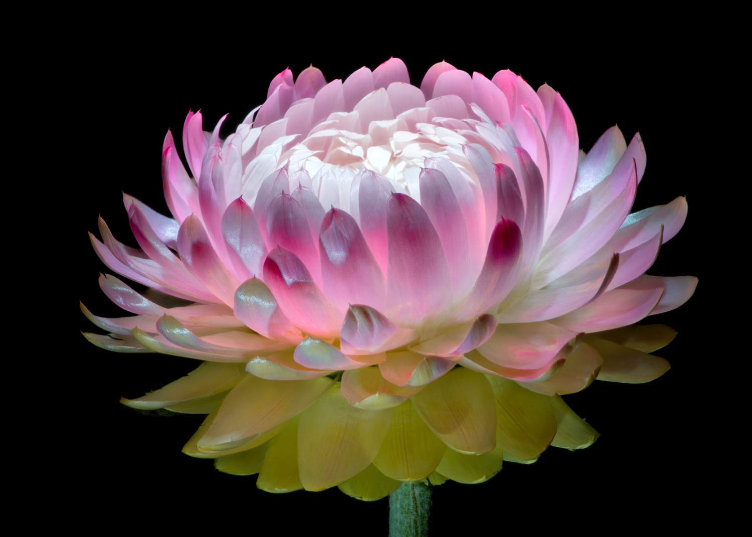
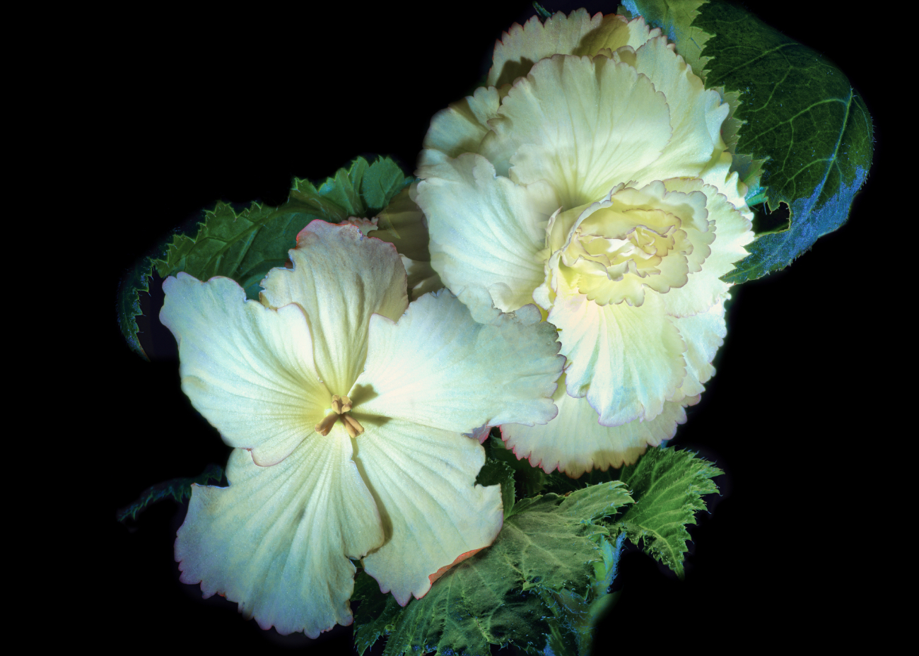
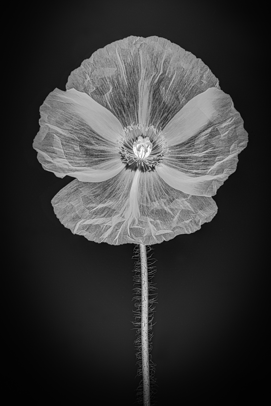
Nadia, just wonderful. The monochrome works very well with this image. It does a better job than the original of pulling out the inner folds and textures of the blossom. It's very interesting the look at because the detail is so vivid. My only critique would be to darken the bud directly to the left of the flower. Other than that, perfect. |
Aug 19th |
| 80 |
Aug 23 |
Comment |
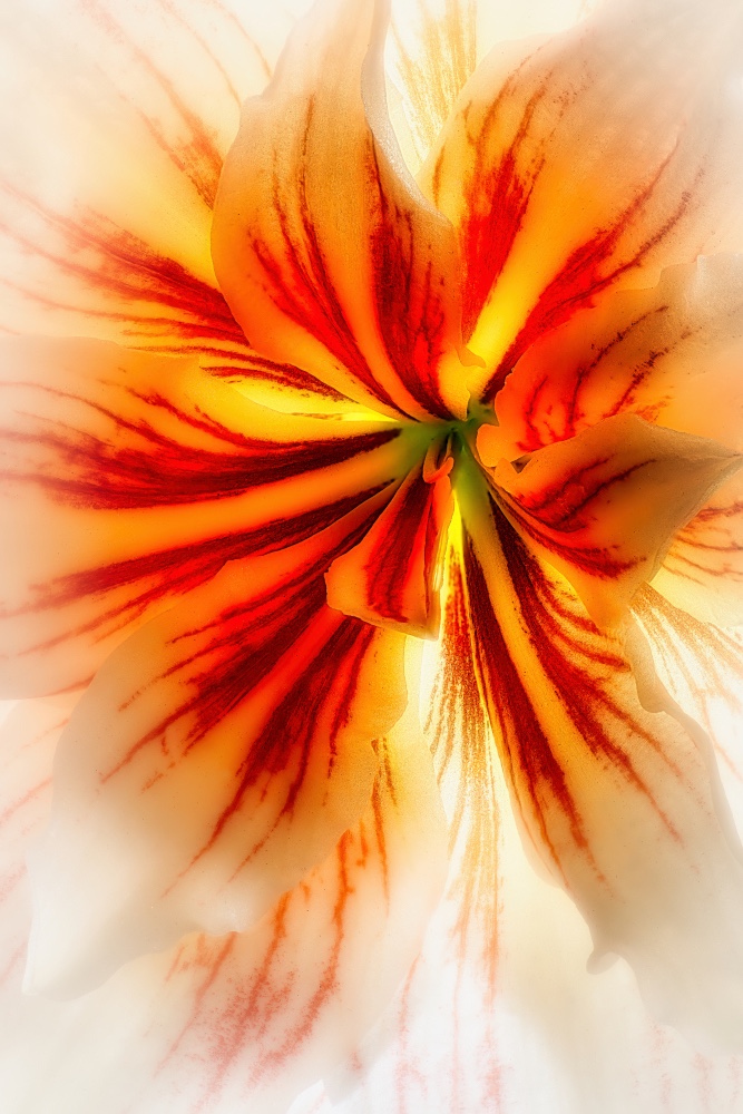
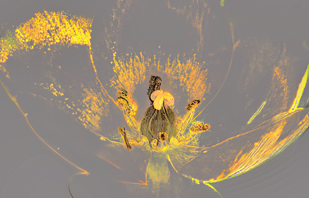
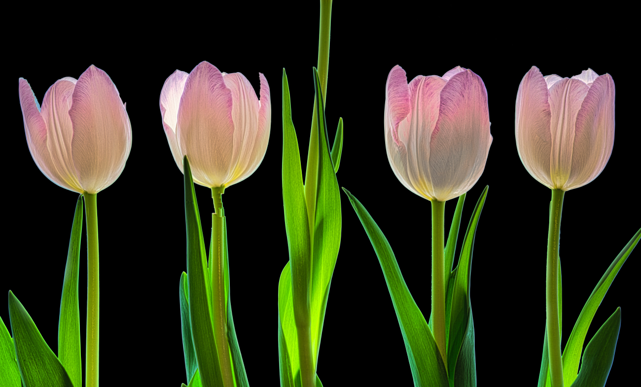
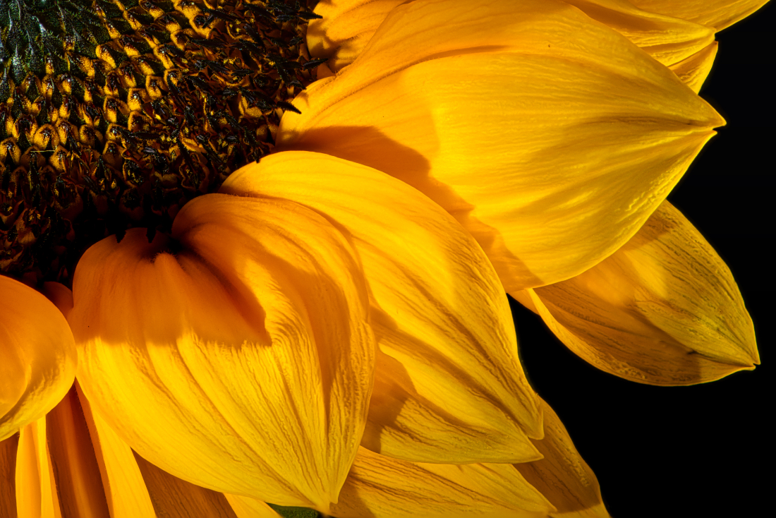
Jacob, I love sunflowers, such interesting subjects. The coloring is great and the sky wonderful. There are a few things that throw me off in this image, though. I can see the house on the right-hand side and I think it would be much cleaner without any buildings in the photo. Also the most interesting part of the Image is the central part of the Sunflower, which is under exposed so it's difficult to make out. I'd do some work in whatever editing program you use to bring out the highlights in the center of the flower and highlight the light coming back through the petals of the Sunflower. |
Aug 19th |
| 80 |
Aug 23 |
Comment |
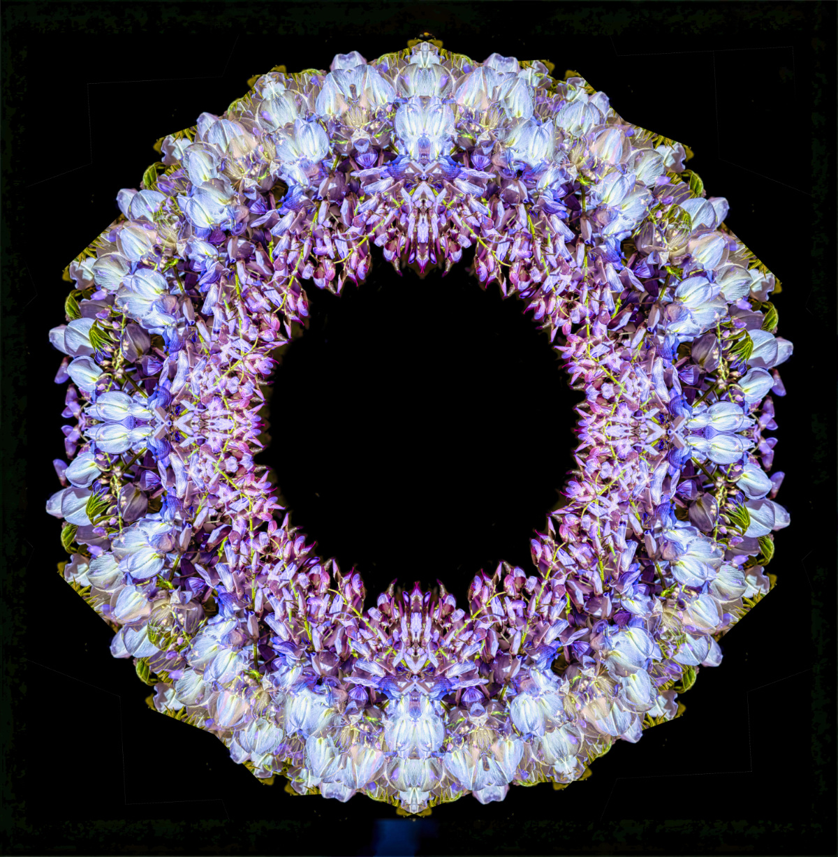
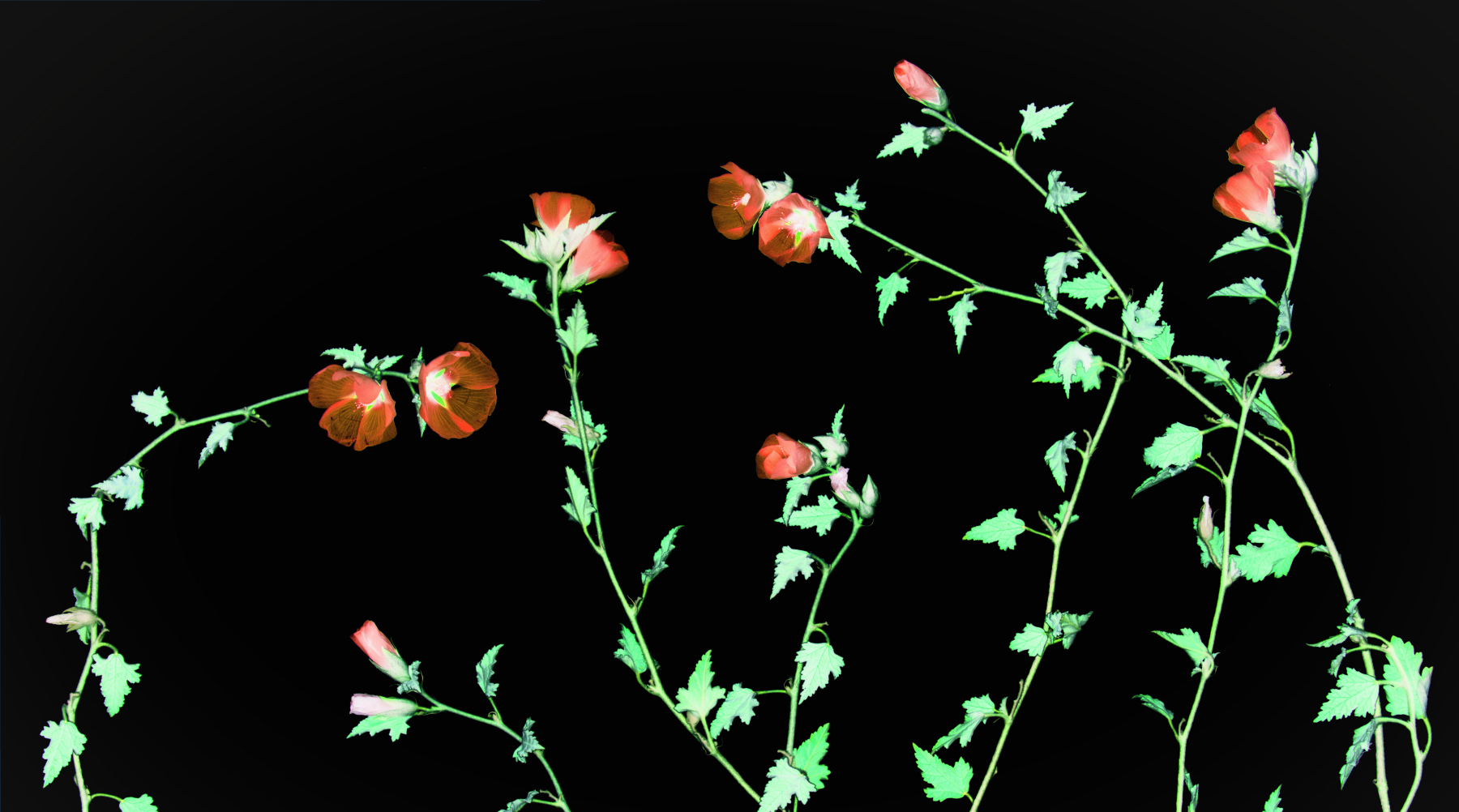
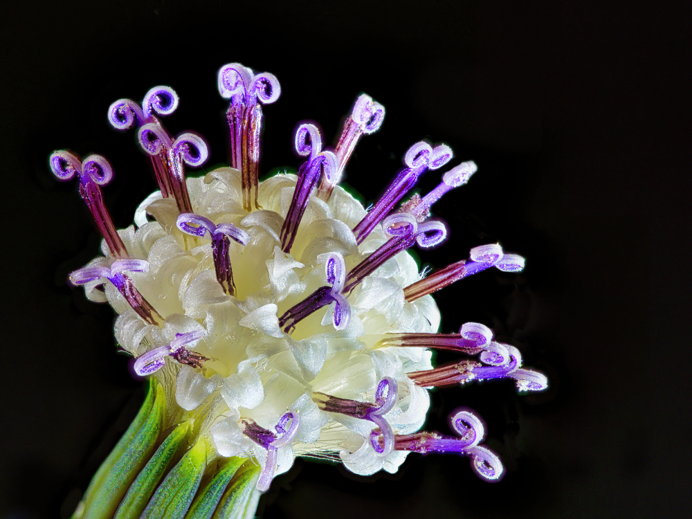
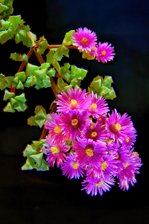
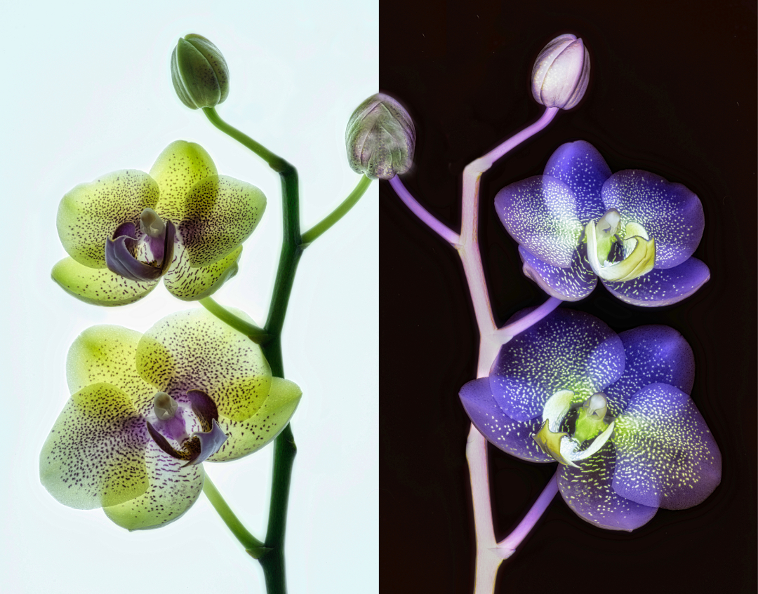
Bob, very cool. The symmetry makes this visually pleasing, I can almost see it as a wallpaper design from the 1920's. Colors are bold and I do like the fact that the leaves form a frame for the center focus. My only critique would be my eye doesn't like that the blossom continues upward out of the frame. It almost seems like it would be more interesting if the leaves continue to frame it at the top. But that's minor. Nice job. |
Aug 19th |
5 comments - 2 replies for Group 80
|
5 comments - 2 replies Total
|