|
| Group |
Round |
C/R |
Comment |
Date |
Image |
| 93 |
Mar 24 |
Reply |
Thanks, Paul. We're good. |
Mar 28th |
| 93 |
Mar 24 |
Reply |
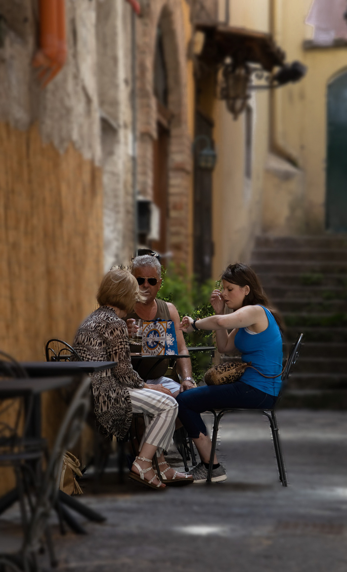
Paul, I hardly feel qualified to comment on street photography. I never do it, myself, and it's rare that I encounter an image in which the subject "grabs" me. But I'll do my best.
Here the center of attention seems to be the woman to the right. She appears to be on the phone and checking her watch; to me she seems to show a bit of concern in her expression. Is she late? Trying to decide whether she has time to meet someone? Her companions seem ewither to be indifferent to her, or perhaps giving her some "space" for her conversation? Had it been possible to capture the shot from a bit further to the right, we would have been able to see the full face of the woman in the center. That perhaps could have added a more dynamic feel to the scene.
I find the perspective distortion a bit off-putting, so I corrected it as best as I could in LrC using the transform panel (vertical: -7; horizontal: +6; rotate: -0.7) and then cropped to fit.
I find the stairway and doorway upper right to be problematic. The framing with the wall on the right (to me, at least) places the scene in a constricted space. To me, then, the stairway and doorway suggest a point of exit, or path forward, out of the situation. The effect is strengthened by the overall brightness of the area, which pulls my eye up to the corner. But (again, to me) there's nothing about the scene that suggests that the party feels a need to move forward or out. So, I cropped in from the right, and while I was at it, down from the top to dispose of a little bit of messiness up there, and then darkened and reduced the contrast in the upper right corner.
I'm not sure what you meant by "applied a blur mask." I'm guessing that you duplicated the layer, applied a blur (Gaussian blur, I suppose?), and then added a mask on the blurred level, masking out the people. Whatever means you used, it seems that the blur effect is pretty much uniform across the entire image except where you masked it out. This is not consistent with the gradual falling off of sharpness created by a shallow depth of field. The result is that (to me, at least) the effect feels contrived.
I don't know of a way to achieve the desired effect using this strategy. One technique I tried but found unsatisfactory was to blend in the blurred level to a greater or lesser degree depending on distance from the simulated subject focal plane. When I examined closely the result, I didn't like it in the areas where there was a medium mix in of the blurred layer. What I concluded was that for the areas for which I wanted the most blur I needed to use a Gaussian blur with a higher radius than I used for the areas for which I wanted less blur. I actually did attempt this once, using four different blurrings, and I found the result mostly satisfactory. However, I tried submitting it in competition, and the judge commented that it looked "strange" to him.
There is a Ps tool that I've experimented with: it's called the "Depth Blur", and is under the Filter > Neural Filters menu. I had to download it. You pick the place in the image that should be sharpest and then it seems that it tries to make sense of what is close and what is far and then blur to the extent appropriate. I generally don't find the results satisfactory, but I've seem work that others have produced where it the reslts felt entirely natural. As they say, your mileage may differ.
I hope my critique isn't disheartening. I think you made a valiant effort with an image that you found flawed to start with. For what my opinion's worth, I think you approached it with the right attitude and good strategies, but I think there was a limit to what you could accomplish with the material with which you were working. |
Mar 28th |
 |
| 93 |
Mar 24 |
Comment |
I hope I'm managing to squeak in under the deadline wire ... Congratulations for diving into Photoshop and practicing at it, and herewith encouragement to continue. I found it to be pretty intimidating and there is a steep learning curve (for some folks it's more of a learning wall), but it is possible to achieve a degree of mastery that one finds satisfying and allows one to achieve marvelous things if one so wishes.
Not one shy with unsolicited advice, I'll offer: Get some basic concepts under your belt (selecting, masking, adjustment layers and the most commonly used ones). Get a general sense as to what you can expect from a few different blending modes (say, normal, screen, multiply, and soft light). Learn the difference between fill, opacity, and flow. Learn how to use a brush. Once you've got a basic working knowledge, my advice is to avoid trying to learn how to do everything. Instead, when you are editing an image, ask yourself what you would like to accomplish, and if you don't know how, try to figure it out. In order words, stay goal-directed. You'll be surprised, I think, at how quickly you'll accumulate skills and confidence.
There are some really good resources, free or inexpensive, to help you get answers to "how to". There's YouTube, of course, and several sources for inexpensive "survey" courses.
And, of course, every once in a while, don't hesitate to ask "what would happen if ...?"
Oh, and there's no dearth of alternative ways to achieve the same thing. I "dodge and burn" in a very idiosyncratic way, quite different than what most folks teach, but I like it and it works for me. Other folks use practices and workflows that I've tried and just can't find a way to get comfortable with. Works for them, and doesn't for me, and neither of us is wrong.
And you don't have to master everything. I'm borderline incompetent when it comes to making selections. I've just learned to either find another way to do what I need, or to be prepared to spend a lot of time recovering from my clumsiness. There are numerous tools I've never even used once, and I don't feel the least bit of guilt for that. What matters to me is producing the work I want, not the how I do it. |
Mar 27th |
| 93 |
Mar 24 |
Reply |
forgot to attach an image. |
Mar 24th |
 |
| 93 |
Mar 24 |
Comment |
There's a reason I don't shoot wildlife: it's too darned HARD!
The capture was technically well executed, and I think you made the best of the situation here, but were facing a nunmber of challenges here. The most difficult of these challenges is that there's so much happening here. I keep hearing other photographers talk about "simplify, simplify, simplify." In this image I'm not sure whether the "story" is about the bird, about the starfish, the mollusks, or the eencrusted rocks. Each of them is an interesting story, but I can't seem to disentangle them well enough to make sense of the overall plot.
In my (for what it's worth) opinion, there are a couple of steps you could take in post that might help: bumping the mid-range fine-detail contrast and pulling out a bit more color. For the latter, rather than playing with saturation, I used a low-saturation magenta-ish solid color layer, hard mix blending mode, 15% fill. For the former, a 50% gray layer, again hard mix 15%. And then I did have to go back in and paint out some of the saturation here and there.
I also felt that cropping in helped by dispensing with some of the competition for attention.
One thing works against you here with a small digital image. The texture of the crusts on the rocks, viewed in a small JPEG, looks a lot like the weird stuff one gets when one oversharpens. Now I can tell that that's not what happened here, and I suspect that (if you haveenough pixels for it) this problem would go awsay entirely when printed large.
I gotta hand it to you for trying. I would have shaken my head and might have gone home with nothing to show for the outing. |
Mar 24th |
| 93 |
Mar 24 |
Reply |
Ah ... I've now read your narrative. Sky, it seems. Very observant of you! |
Mar 24th |
| 93 |
Mar 24 |
Comment |
Great image! I spent my early childhood growing up in sourthwest Kansas, with wheat fields and open stretches of uncut grasses; that probably explains my fondness for grasses in general.
I think you did a wonderful job with the depth of field, creating an intimate portrait of these stems and seeds. The background is sufficiently present to provide a hit of place, yet subdued enough to avoid capturing my attention overlong.
The palette works very well, with the mottled greens and oranges "up front" contrasting against the blue, which seems so refreshing. Water, I'm guessing? White balanace seems spot on! |
Mar 24th |
| 93 |
Mar 24 |
Reply |
And this reply is in regard to the water. I do understand that all that water doesn't "contribute much" to the image, and I don't disagree. It is that very characteristic that suits my purpose, as it (I hope) conveys to the viewer a sense that there's a vast gulf separating him/her from the islands. I tell myself (somewhat successfully) that there's enough texture in the water to keep it from being monotonous. Anyway, it is what it is, and what works for one person doesn't have to work for another.
Thanks for you interest and insightfuol critique. I always appreciate and benefit from your comments. |
Mar 19th |
| 93 |
Mar 24 |
Reply |
Thanks, Dawn. I'll try to answer your questions about the capture. To start with: yes, it was my intention to create a panorama. As I imagined the image, though, I envisioned both more sky and water, so that the array of islands would form a more narrow band mid-frame. That's why I was shooting with the widest focal length I had at my disposal. Though I also needed to have a LOT of spare pixels around the area I intended to include in the final frame. I was standing on (well, crouching on the deck of) a very windy and rapidly pitching and rolling platform, so I knew there would be a lot of mismatched framing from one exposure to the next.
Furthermore, what I wanted in the final image was a glassy sea, such as one would get with a long exposure, which was of course out of the question on a bucking and rocking speedboat. I have had success in the past with this technique, which I have recently learned is called "frame averaging". It's also often used, I gather, in astrophotography.
I intuitively went for as fast a shutter speed as I could dial in, though I'm at a loss to explain my choice of ISO and aperture; it would have made sense to drop the ISO to 100 and lower the aperature to F8 or F11. I didn't want to risk any vibration or motion blur. I needed the islands to be as sharp as possible.
Ordinarily, when one captures a single-row panorama, one orients the frame vertically, establishes a vertical axis of rotation, and then takes a succession of overlapping images, maintaining an overlap from one to the next of at least one-third of the width of a single frame (I usually go for more, just to be safe). In my case, I just carried this to an extreme: lots and lots of images overlapping by a WHOLE LOT. I placed the shutter in highspeed continuous mode, pointed the camera well to the left of my area of interest, and then SAT on the shutter release while I slowly panned to the right, trying my best to keep the horizon positioned more or less roughly level (hah!) and in the same position in the frame (hah hah!).
So that was the capture. Stacking was not all that difficult ... just time-consuming. After NR-ing the captures in LrC I opened them all as layers in Photoshop. Yup, took a very long time. Then selected all the layers and used Photoshop's Edit > Align Layers function. Another long time. Cropped in to eliminate the peripheral areas with incomplete overlap. Combined all the layers in a group. And then converted the whole group to a Smart Object (Layer > Smart Objects > Convert to Smart Object). More long time. At this point I had a single layer that was a smart object embedded in the file. I then averaged the stacked layers (Layer > Smart Objects > Stack Mode > Mean). I then moved the smart object out of the file (Layer > Smart Object > Convert to Linked). Another long time. At this point I had two files: my smart object with the layers stack (over 28GB) and a file with a single rasterized layer.
Of course, averaging using the mean was ok for the water but it was entirely wrong for the islands and the sky. Using the median, instead, worked better for the sky. So I duplicated the single smart object layer (Layer > Smart Objects > New Smart Object Via Copy) and changed its stack mode to median.
I realize now that I omitted a step in my description. Neither of these blends was satisfactory for the islands. So I then used LrC Photo Merge Panorama to get a third blend. This file was a DNG, which I then opened in Ps and duplicated that over on top of the two smart object layers.
At this point it was just a matter of more conventional masking and adjusting. Selecting for the islands was a tedious process, of course.
Sorry that this writeup turned into a monograph ...
|
Mar 19th |
| 93 |
Mar 24 |
Reply |
Tell me more about tripod covers? |
Mar 19th |
| 93 |
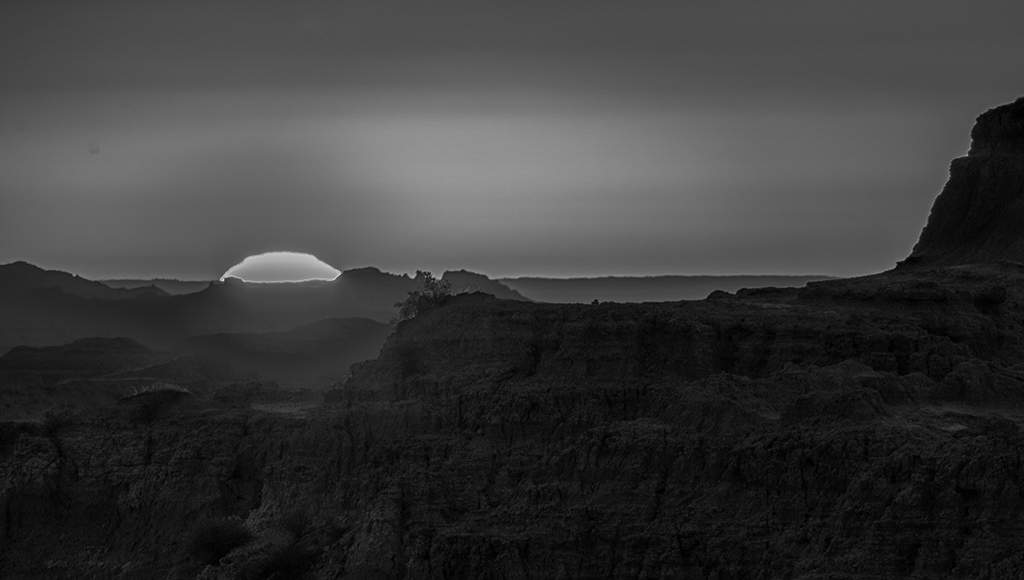
Mar 24 |
Comment |
I'm rather taken with this image; I think it has a lot going for it. I'm going to go out on a limb here and say I think you've been advancing artistically by leaps and boiunds in recent months.
It was daring indeed to try to get a shot of the Sun like this, and I'm sooo glad you resisted the temptation to make a sunburst. You had only a few seconds to dial it in right, and you did.
All in all I like what you did in post, with one strong reservation. I think you did a great job bringing out just enough, but not too much, detail in the foreground, and bring out the light as it began to fall across the lands.
However, what you did in Ps with that "radial filter" does not seem to have worked out so well. Not sure what you meant. So far as I know, the term "radial filter" is only meaningful for ACR /LrC; did you maybe use a radial gradient mask on an adjustment layer? Regardless, the result is a discernable dimming of the light (opposite of "glow") surrounding the Sun. I made it more obvious by converting to BW, pulling the highlights cledar down and lifting the whites. By the way, I highly recommend doing a safety check on a color image by examining what it looks like in BW; this can reveal many a sin not otherwise obvious.
Regarding the crop: I'll respectfully and amiably disagree with Ed on this. I think the rising ridge on the right is really important. It stops the eye from sliding out of the frame in that direction, and it provides a counterweight to the visual impact of the Sun. I also find it serves a valuable artistic purpose. For me, it places me in, rather than at the edge of, an amazing rugged world. The suspense is gripping: will I be thrilled at what I see when this world is fully illuminated? Terrified? Horrified? Well done! |
Mar 19th |
 |
| 93 |
Mar 24 |
Reply |
Ahh ... those are ripples in the sand! All is clear, now. I do like this version a lot, too. |
Mar 10th |
| 93 |
Mar 24 |
Comment |
Very, very nice, Dawn! Dunno what else to say. I like the exposure time. At first I wondered if, perhaps, there was overmuch water in the foreground, but then I saw the ripples ... I'll be curious to read how you managed to capture such clear ripples in the water with a long exposure. The analytic portion of my brain asked whether I'd prefer less open space to the left, but I (or the unemotional part of my brain) concluded that it was all needed to act as a counterweight to the heavier rock formations. |
Mar 10th |
5 comments - 8 replies for Group 93
|
5 comments - 8 replies Total
|


