|
| Group |
Round |
C/R |
Comment |
Date |
Image |
| 93 |
Feb 24 |
Comment |
Beautifully composed, expertly catured, and deftly processed. I find nothing to fault. For me, though, what makes this special is the feeling I get of having stumbled upon the heart of the forest, from which all the magic flows. I wonder whether, should I happen to look away, would I find it still there when I turned back to look again ... |
Feb 24th |
| 93 |
Feb 24 |
Comment |
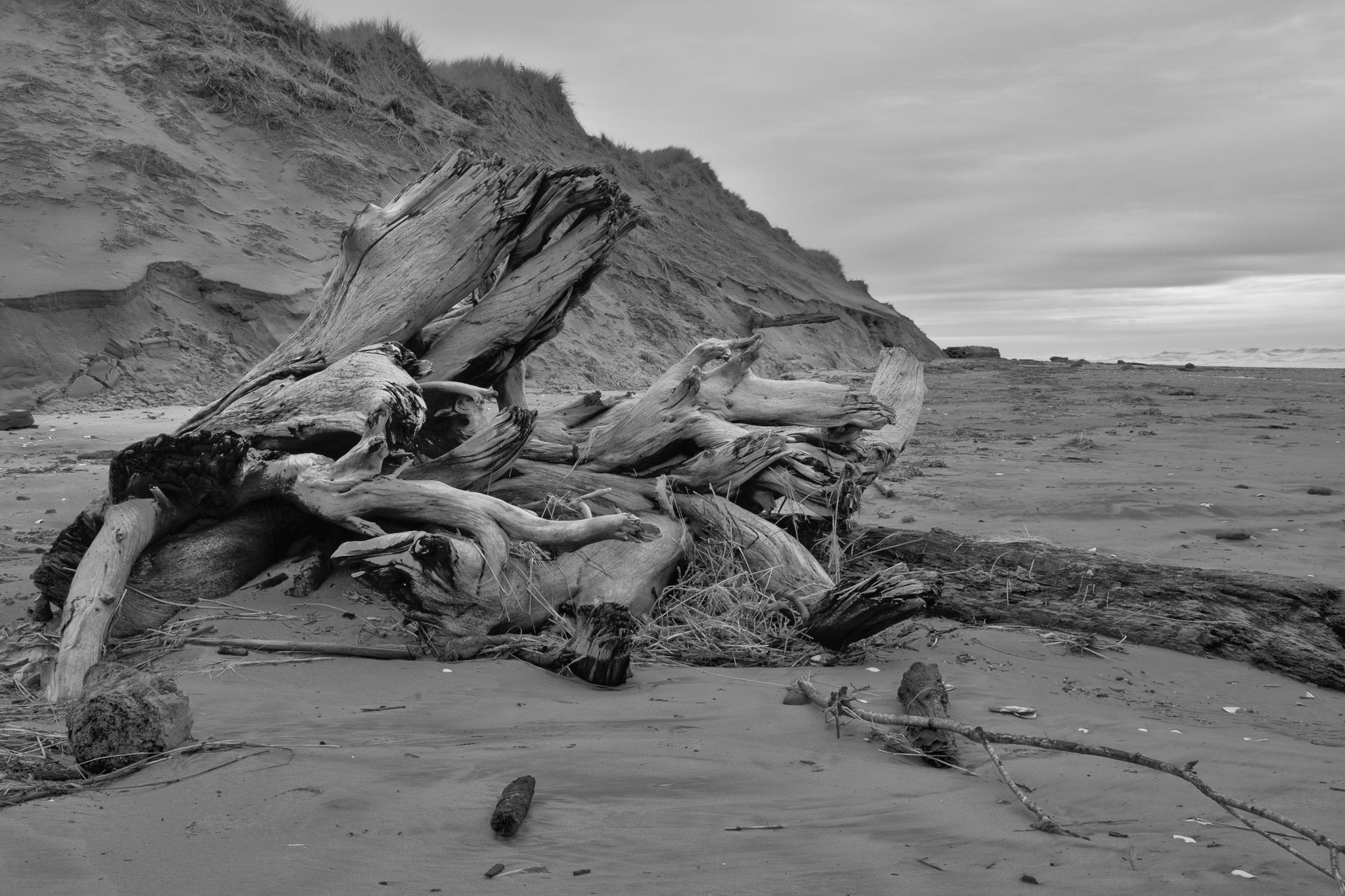
I do luv me some low-key! I find it difficult to put into words just what this image tells me; in my book that's a Good Thing. To me, it evokes a mix of melanchology, serenity, and playfulness. Not a mix one would come across often.
It's always a bit risky to try to make an image that includes another work of art. The best strategy often seems to be to find a way to juxtapose something else in dialog with the work of art. Here I find in fun to contrast and compare the the flock of birds (i.e., "real nature") with the abstract sea cfreature ("art"). I'm especiually amused by the metaphor I'd put into words as "Art Chasing Nature." But then, after viewing it a bit longer, I realize that the flock of birds on the right can be combined with the sculpture on the left to create a larger organism. Maybe "Art Plus Nature: The Whole is Greater Than the Sum of Its Parts." Logts of fun here.
I do suggest that there are a couple of tweaks that I'd make were this my image (which it aint). I'd crop in a little further from the sides, placing the sculpture on one golden spiral center, and the flock of birds (with reflection) on another. I'd cool it down just a tiny, tiny bit. I'd very slightly pull down the darkest of the dark tones. On either side above and below the far shoreline I'd pull the shadows up just a little bit. I'd tone down the bright ripples at the bottom edge. And finally, I'd use the tone curve to (globally) boost the contrast in the darkest tones.
I'm ambivalent about your decision to include such a narrow band of the near shore at the bottom. I think it was wise to keep it to to minimum, but I found it worrisome that it was so extreme.
I like the image a lot.
|
Feb 24th |
 |
| 93 |
Feb 24 |
Reply |
Oh ... and good choice of shutter speed ... |
Feb 24th |
| 93 |
Feb 24 |
Comment |
There's miuch to like here. The color palette is gorgeous.
I think you made great use of the long focal length to narrow the field of view to just where the action is. My personal preference might be to crop in a bit from the sides. Your 2-to-1 aspect ratio works nicely, and it afforded the opportunity to include the second rock formation on the right, but I have a feeling that your intention is to tell the story of the powerful waves and the spindraft. I'm not sure that the extra material on the right adds enough interest to warrant diluting the impact of the main story.
I'm guessing that you were not using a polarizer. I find the gloss on the rocks on the left to be distracting. It's not easy to replicate the effect of a polarizer in post, but I did pull down the highlights there a bit, and I felt that that helped. I also found the brightness of the orange rockface directly above the crest to be disconcerting, so I darkened and slightly desaturated it. One further tweak, which migbht be controversial: I applied a (small) bit of dehaze to the hillside in the distance to make the buildings a little bit more discernible, in the idea that this would make the distanceds and scale more apparent.
As always, take it all with a big grain of salt
|
Feb 24th |
 |
| 93 |
Feb 24 |
Comment |
There is so much about this subject to justify your attempt at it. I wonder if you might consider converting to black and white and then processing it to add contrast locally here and there. |
Feb 24th |
 |
| 93 |
Feb 24 |
Reply |
Yes, that was difficlt for me at first, too. I think what made the biggest difference was this: when I show an image to someone, the first questions folks will ask are "what?" and "where?", and rarely "why?" but I try to refrain from telling them backstory, the what, when, where, etc. and instead ask them what it evokes for them. Sometimes, of course, they just can't answer. I find that guys tend to have a harder time with this than gals.
At first I found it disappointing that others don't experience the image the way I "intended" it. I felt that I'd somehow failed. But I often found that different folks reacted differently to the same image, so it became easier for me to accept it whem their reactio was different than my "intent." With practice, I learned to "intend" the image to evoke something in *me*, and then hope it evokes something., anything, in others.
There are, of course, numerous strategies one can use that generally tend to affect viewers' response. I have learned a lot from watching YT videos by Alister Benn. Color is perhaps the most potent (and obvious) tool in the toolbox. That's why I so often work in B&W these days, so as to eliminate the distraction that color creates. So much can be done with luminosity (or lack thereof) and where and how it is placed in the image. |
Feb 19th |
| 93 |
Feb 24 |
Reply |
Thank you, Darcy. I am grateful for you "emotional impact" feedback. I find it's all too rarely that reviewers are willing (or perhaps able) to identify and communicate an emotional response to an image. Now, of course, that can often be simply that, for that reviewer, the image does not in fact evoke an emotional response. That's entirely dependant upon the image and the reviewer's own personality and life experience.
For myself, I don't aspire to evoke the same response in the viewer as the one I experience, but I do hope that my image does evoke something of a response. It's always interesting to hear (if provided) what the viewer experiences. So often it is surprising to me, often quite different that my own response.
I'll try to return the favor. |
Feb 17th |
| 93 |
Feb 24 |
Reply |
Oh, one point I forgot to make: to my mind, it is important that the river be relatively brighter in that area than either up- or downstream from there. That is the way the light would be bouncing off it at the angle of the Sun where the canyon is opening up. |
Feb 10th |
| 93 |
Feb 24 |
Reply |
Thanks, Dawn. Regarding the brightness of the river: I see what you mean, and it's been generally a tricky thing to adjust to my liking. I think it *is* in fact too bright for online viewing, but just right for printing. Let me explain; I keep my (calibrated) monitor brightness turned down pretty far, as I edit for printing, not for online viewing on a backlit medium.
My whole workflow is designed to, first, process the image so that it displays on my monitor as I wish the final result to appear, printed; then, second, to softproof to get as close as I can to the same appearance (viewing it on my monitor); and then, third, to print, assess where I find the result unsatisfactory (or, as more likely, find processing errors and omissions), and then rethink and repeat from step one.
I rarely, if ever, edit twice, once for print and again for online viewing. As a rule, a version processed for print renders reasonably satisfactorily when viewed online. This is one occasion where, had I viewed it online using a monitor *not* darkened, I would have realized called for some tweaks.
I appreciate the care with which you critique my images. You're always "spot on."
|
Feb 10th |
| 93 |
Feb 24 |
Reply |
Thanks, Paul. Much as with modern handheld software-reich cameras, the drone has software to automatically take a series of exposures in rapid succession. And the gimbals on these modern drones are pretty darn good, even on the mid-range consumer models. Combine that with the capabilities in post-processing, and an HDR image isn't that difficult unless it's quite dark or there are high winds. |
Feb 8th |
| 93 |
Feb 24 |
Comment |
Very nicely done. I like the way the view of the map through the open vaults initially suggests a stormy sky. If I may quibble about one detail: I think most of us naturally are drawn to text, especially high contrast text in a bright area, and I found it very frustrating that I didn't have the whole text until, after maybe 30 seconds of scrutiny, I figured out it was "Barcelona." I think many of us would be pleased to hold the viewer's eye for that long, but I suspect that's not where you would have wished it. Still, a very clever and well executed idea. |
Feb 4th |
| 93 |
Feb 24 |
Reply |
I second that emotion! |
Feb 4th |
5 comments - 7 replies for Group 93
|
5 comments - 7 replies Total
|


