|
| Group |
Round |
C/R |
Comment |
Date |
Image |
| 93 |
Jan 24 |
Comment |
It's in interesting image in that the subject matter is intriguing: one wonders what it's like to be fishing in near total darkness.
Big, big kudos for getting the Sun and the surrounding clouds without blowing them out. I wonder, though, whether it was your intention to make the Sun such a prominent feature. I find that it sorta shouts at me, while the rest of the image whispers. I do note that it serves to call attention to the nearby geese. |
Jan 27th |
| 93 |
Jan 24 |
Comment |
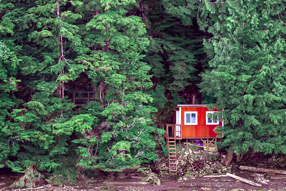
I really like this image. It tells a story, but one that leaves a lot to the imagination and provokes questions: does someone live there? or stay stay for short periods? who? it's so small -- only one person? and what was it like to build it? I like the way you composed it. Contrasting in color, there's no question that the cabin is the subject, so you've been mable to emphasize its smallness in comparison to the vastness of the forest behind. The short ladder up to it from the beach, and the handrail barely visible in the woods to the left, contribute to the sense of remoteness, that it's only marginally accessible.
I think your edits serve you well, but (as always) I'll make a couple of suggestions. It's really difficult to get the color of confiers right. To my eye, here the hue is too green and too light and oversaturated (only aby a little bit, mind you, but when it comes to foliage even a little bit can make a big difference). I used the new "Point Color" tool in LrC to darken, shift a bit towards the blue, and to reduce the saturation. After that, it was just tweaks, I used a serties of masked filters to: (a) separate the highlights and shadows in the gap behind the cabin; (b) darken the beach; (c) darken the upper right corner and left edge; (d) aggressively increase the texture in the area of the ladder and the cabin; and (e) pull down the highlights in the driftwood on the beach. |
Jan 27th |
 |
| 93 |
Jan 24 |
Reply |
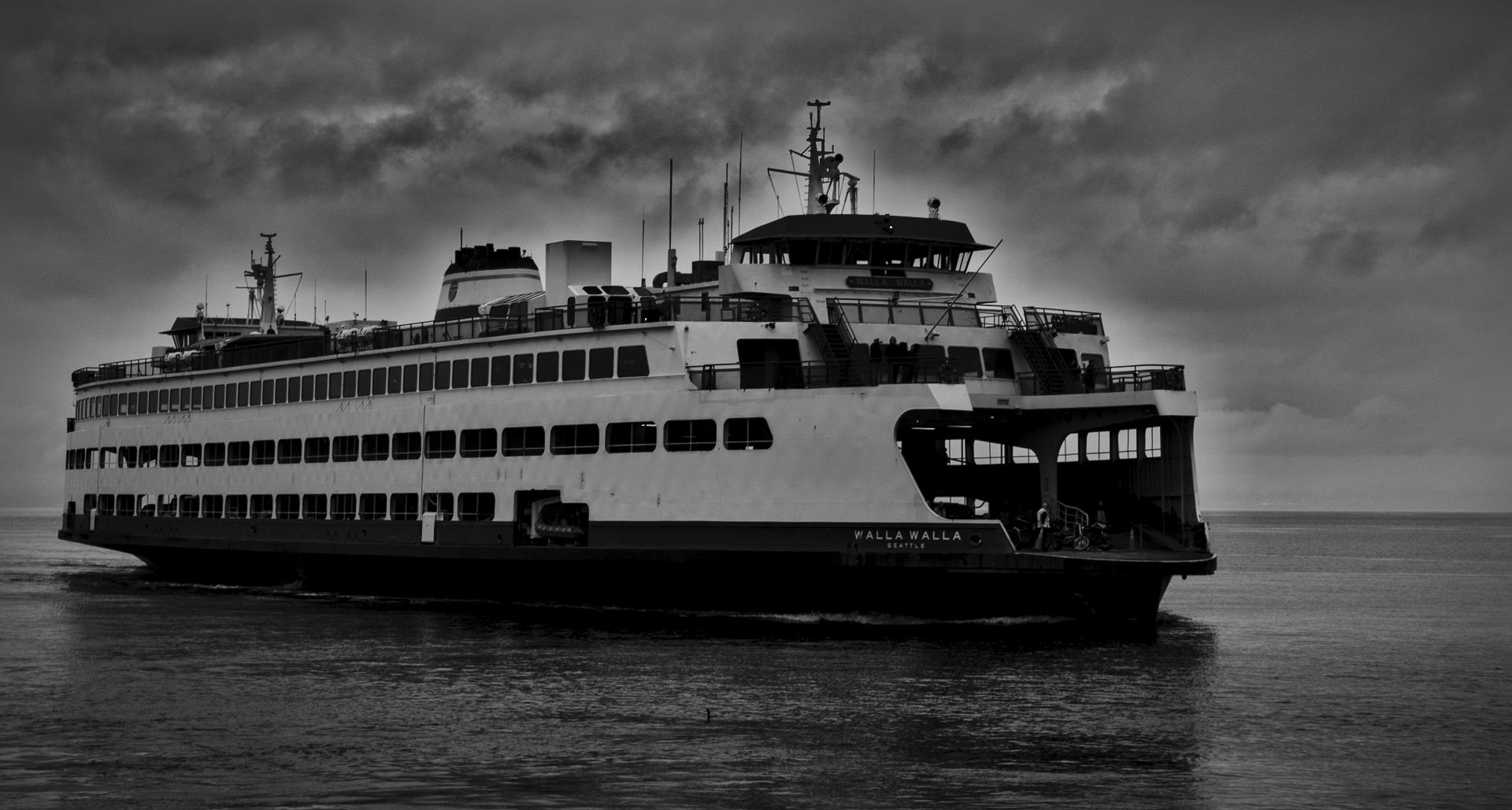
I have a suspicion that at some point in your edits you introduced a broad halo around the ferry, such as I often have to worry about when I use dehazing tools. This is much more apparent if one applies an extreme contrast curve (not that I suggest one do that here, only that it's a diagnostic tool I sometimes use to find artifacts I'd otherwise overlook). |
Jan 27th |
 |
| 93 |
Jan 24 |
Comment |
A very interesting a moody portrait of the ferry. Referring to your title, I don't find that it does much to convey the sense of fog (other than the gloominess, of course); perhaps I would experience it differently had I knowledge of a background lost to view due to the fog.
I find that I long for at least a little bit of light, a few tones about the 50% grey, so I tried selecting the ferry and pulling up the whites just a tiny bit. I then duplicate the mask, inverted it and nudged the dehaze up just a tiny bit. The effect is a bit unrealistic, but it (to my mind) served two purposes: it darkened the sky and water a tiny bit to make the lighter tones of the ferry more meaningful, and it created a more ominous look in the sky, sort of a dark fairy tale feel. Not saying this is superior, just a refleciton of my tastes. |
Jan 27th |
 |
| 93 |
Jan 24 |
Comment |
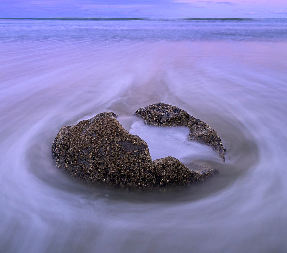
You *do* love your pinks and magentas, doncha! I'm right there with you. What I like most about this image is that it's so intriguing and mysterious. I find myself viewing it almost as those it's an egg cracking open, or a stone flower opening up. Great job on the exposure timing.
For myself, I find the light sky a strong draw away from the subject of main interest, so I experimented with cropping waaaaay down. Creates a very different mood. Not saying it's better, just diffefrent. |
Jan 27th |
 |
| 93 |
Jan 24 |
Reply |
I see that my masking was a bit clumsy. Much more obvious an a smaller rendering than it was full screen on my monitor. |
Jan 27th |
| 93 |
Jan 24 |
Comment |
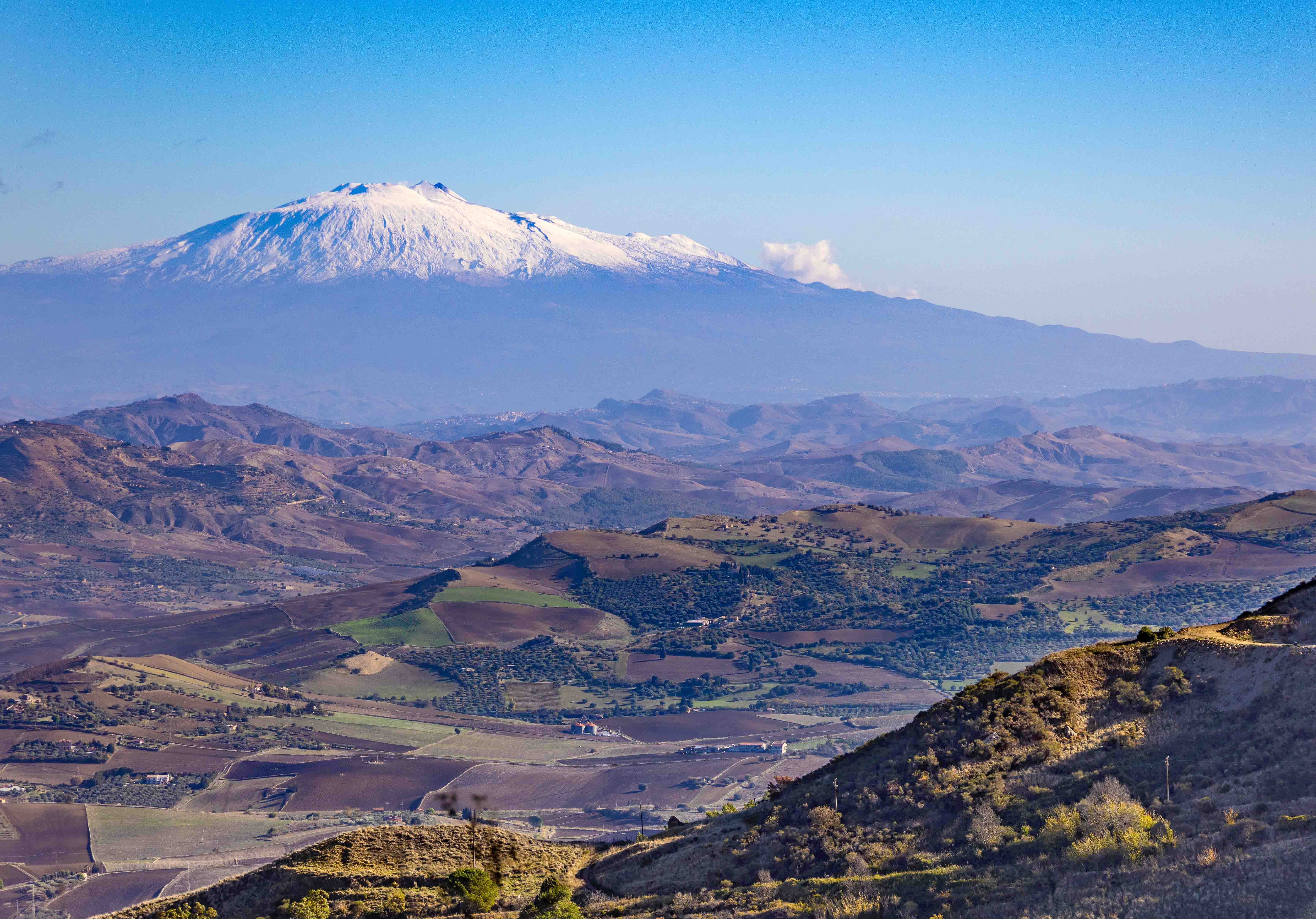
This does a nice job of portraying the mountain and a sense that it looms over the countryside. The capture seems technically well executed. It was good fortune to not have much atmospheric haze to contend with -- enough that the viewer is provided with a dropping off of clarity into the distance, but not so much as to render the mountain indistinct.
I find that I'm distrubed by the immense weight of the lower right hand corner. While the lightness of the mountain might have provided some balanace, in this case I just don't think it stood a chance. The matter is aggravated by the fact that the foreground is substantially crisper than the valley beyond, making it all the more emphatically "in your face." I experimented with masking it in LrC, lifting it a bit and reducing the dehaze a bit. I then moved on to the first ridge, making it a bit weightier but bumping the dehaze and separating the higlights and shadows a bit. The strategy here was to create a more even "stepping off" as the view moves from the foreground to the mountain in the distance. Helped a bit, I think. But, as always, these comments just reflect my personal, and maybe idiosyncratic, tastes. |
Jan 27th |
 |
| 93 |
Jan 24 |
Reply |
Thanks, Darcy. Yes, I agree with both of you regarding the upper right corner. Interesting about the birds. Never saw that. But I'm not very good at pareidolia. |
Jan 13th |
| 93 |
Jan 24 |
Reply |
Boy, I wish I *could* have a place in Iceland. I fell in love with it in 2019 and will keep going back as much as I can. And thanks for the nice compliments. |
Jan 9th |
5 comments - 4 replies for Group 93
|
5 comments - 4 replies Total
|


