|
| Group |
Round |
C/R |
Comment |
Date |
Image |
| 93 |
Oct 23 |
Reply |
Spot on! |
Oct 31st |
| 93 |
Oct 23 |
Reply |
Oops -- apologies, didn't meant to put words intyo your mouth, just wasn't paying close enough attention.
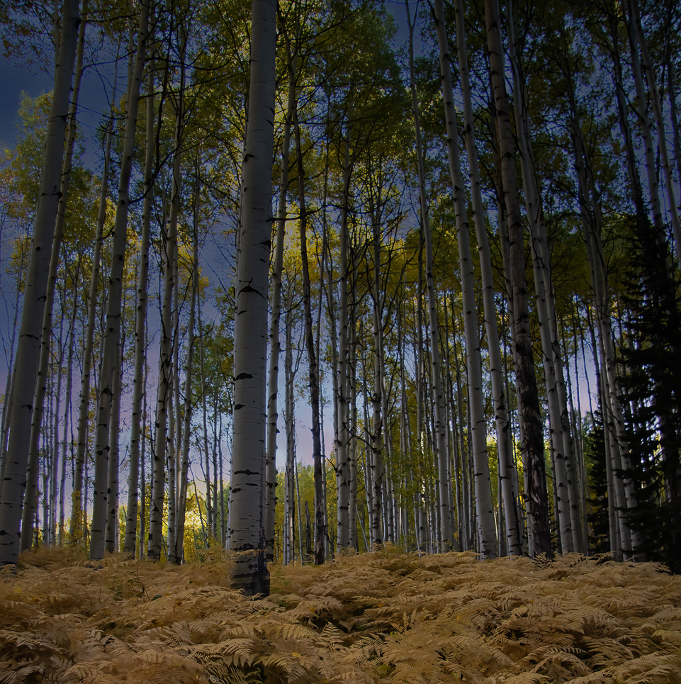
And ... do you see the image as flawed by being "underexposed"? Or that you could have obtained a better capture by a brighter exposure? Or that ... ? To me the exposure (i.e., the tonal range and distribution of tones within the range) in the final image is just about right. |
Oct 31st |
| 93 |
Oct 23 |
Reply |
I've now read the others' comments, as well as your narrative. I surmise that you've used the term "yellow" generously. The ferns look just right to me. I understand the comment that it seems a bit underexposed, but to me it evokes a "late in the day, but not quite evening yet" mood that is quite pleasant. It might be possible, with a bit of effort, to achieve a greater spread in the darker tones, but were this my image I'd be very very cautious were I to attempt it. Sometimes the mood trumps the technical considerations (or so say I). |
Oct 29th |
| 93 |
Oct 23 |
Comment |
I found this image intriguing for several reasons. The first impression, for me, was of the color contrasts, which I found seductive. Then, of course, I started taking in the variety of textures; the title certainly points one in the right direction, but I think I'd have been taken by them even without the title. Finally, I started wondering about the light, where was it coming from, why was it falling on the trees further back, but no those in front, etc. I susect these are all factors that would engage the viewer whether an experienced photographer or not.
I'm not convenced that the story of the ferns depends on having so much of the image devoted to them. I tried making a square crop, and for myself, I kinda like the result.
The decision as to whether to "correct" for perspective distortion is a very personal one. For myself, I generally find an outdoors image (as opposed to an architectural one) feels more natural if one doesn't try to align lines that are vertical in nature so that they are vertical in the image. Still, I usually give it a try, just to check. In this case, I feel strongly that you made the right call. For what *that* is worth .. |
Oct 29th |
 |
| 93 |
Oct 23 |
Comment |
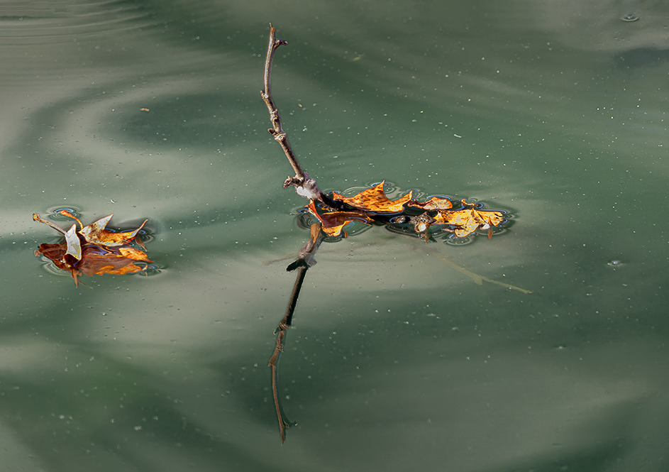
Darcy, I really like what you did here. I often try to make an image of something "commonplace" that we so often will walk past without noticing it, just to say "hey, folks! look!" but I rarely succeed. I've tried to disset your image to understand why it works for me, and the best I've been able to come up with is balance: between tones, between hues, between smooth and rough, between simple and complex. Well done!
I always like to encourage folks, not you the least, to experiment, to take some risks in post. Here I illustrate what *could* (not necessarily *should*) be done, just to show that it's possible to add a bit of one's own sensibilitiues above and beyond what the camera (supposedly) "saw". Take it as no more than that.
FWIW: other than the crop, all adjustments were made using the new Point Color tool in LrC, subject to a little bit of gradient and/or brush masking. Nothing fancy. In my opinion, that tool is one of the most useful additions to LrC since I started editing three years ago. |
Oct 29th |
 |
| 93 |
Oct 23 |
Comment |
This is a lovely scene. The image suits the title to a "T".
I like how you handled the color. For myself, I might want to tone down the microcontrast and saturation in the distance just a little bit, to bolster the sense of depth.
As a side note (not a commentary, just "small talk"): I have in the past found I don't much care for oranges-blues contrast such as in your foreground. However ... four weeks ago I had cataract surgery in my right eye, and now I see colors differently through my right eye than my left; boy does that wreak havoc on editing anything other than black and white. Anyway ... I find that when I view your image through my right eye (the "correct" one) I actually rather *like* the color contrast. Whoda thunk, huh? |
Oct 29th |
| 93 |
Oct 23 |
Comment |
I like the near-minimal composition, and (in my opinion) the gull is a good addition. I think it was a good idea to crop in to eliminate the distraction on the right.
If you're so inclined, you might find that you could boost the warm light a bit in LrC using the new Point Color feature found, together with the old HSL sliders, under the Color Mixer planel.
I would love to have seen this with a very long exposure to give the water a glassy look. Of course, that would lose the gull unless you composited it back in (something that you might not approve of).
The title is lost on me. Perhaps it'll become clear once I read your narrative... |
Oct 29th |
| 93 |
Oct 23 |
Reply |
OK, so now I've read your narrative and others' comments. I called that one wrong about the light, huh? As for the white balance, I've learned from others I trust (e.g., Alyn Wallace) that it's best to set the camera to Daylight (or comparable) and adjust in post.
Seeing that you shot at ISO 4000, did you rry using Lightroom / ACR enhanced NR?
You skill in post is evident. |
Oct 29th |
| 93 |
Oct 23 |
Comment |
Very impressive, Dawn. The decision as to what color to make the sky is a very personal one, so my thoughts on it are largely irrelevant, but I like your choice.
I have more or less given up on astrolandscapes, as for me it entails driving three hours before and after and a couple of hours hiking in and back out, to get to locations that would make serviceable composition, and the fact is, I'm just not good enough at it to enjoy it, and it's too much work for me to try to improve. You have my admiration for attempting and succeeeding at it.
I'll read your notes after I post my comment, but I'm guessing you used a bit of light painting. If so, you were conservative (a virtual in my opinion). At first I thought the lighting was moonlight, but the lack of light on the distant ridge/hills/mountains convinced me otherwise. (I just took a look at the "original", and now I'm convenced this was all natural light; well done!)
In terms of composition, I might have wished for wider faming of the rocks. Were you using a tracker? If so, it might jhave been possible to stitch together overallping side-by-side images. |
Oct 29th |
| 93 |
Oct 23 |
Reply |
Have now read others' comments. I, too, find the branch upper right to be distracting, but I wasn't pleased with the result (too narrow for my taste, felt cramped) when I tried to crop it out. Perhaps gently burning it down and reducing the micro-contrast would help. I agree re the bright spot.
I think this would do well in competition in my club (which is saying sumpin'), but you wouldn't be permitted to clone out the bright spot, and maybe not allowed to burn down the branch/. Then again, it doesn't have to be about competition, does it? |
Oct 29th |
| 93 |
Oct 23 |
Comment |
Well, I find this to be intriguing and engaging. I know almost nothing about wildlife photography, only what I pick up from judges' critiques in my club's competition, but enough to grasp that it's very difficult and not for me.
From the points I've picked up, it seems you've nailed them all: thee subjects are sharp, especially the all-important eyes; there's a nice shallow depth of field so that the background is not distracting (helped here by it being dark); the subjects are looking into the camera.
As racoons are mostly nocturnal animals, I'm amazed that you were able to set up the shot without scaring them off. |
Oct 29th |
6 comments - 5 replies for Group 93
|
6 comments - 5 replies Total
|