|
| Group |
Round |
C/R |
Comment |
Date |
Image |
| 93 |
Sep 23 |
Comment |
Another one of your great B&W's! Dawn did a good job explaining "darken the blue". It's a strategy with a long respectable lineage (think of Ansel Adams' "Monoloith, The Face of Half Dome" with red filter) and one strategy I often employ. I'm not sure how effective it would be on this imag,e though, since most of the drama in the sky derives from the darker clouds.
One has limited options when framing up the composition at a time like this, but I think it unfortunate that the tops of guys' hats nearly coincide with the horizon. |
Sep 27th |
| 93 |
Sep 23 |
Comment |
I agree with the others as to your angle for the shot that accentuates the perspective. To me, it's not so much about the leading lines, as they don't really take me to something interesting, but it's more about the unusual way of seeing -- something that I like when I come across it in an image.
I took a short moment to try to reproduce the steps you took with the sky, but didn't succeed at getting the same outcomes. I'd suggest you might want to temper the effect slightly on the dark cloud at the left edge.
And I'm just curious, what Topaz function did you use?
|
Sep 27th |
| 93 |
Sep 23 |
Reply |
O, I forgot to mention that I think the dog really "makes it" |
Sep 25th |
| 93 |
Sep 23 |
Comment |
A nicely intriguing image! For me, the silhouetting works very nicely. Although my eye immediately goes to the Sun, there's nothing distinctive about it to hold my eye, which then moves down and explores, at length, the family enjoying themselves and the end of the day. I find it especially effective that the child (or so I assume) is framed by the Sun's reflection. I find this evokes a wonderful mood, at once pensive and joyous. I like it when an image can evoke simultaneously two feelings that one doesn't necessarily usually encounter together.
A little LrC tip: if you want to tone down the "bleed" around the Sun, try brushing in a little dehaze. I also added just a tiny bit more light on the side of the seastack by applying a radial adjustment with a bit of negative dehaze.
|
Sep 25th |
 |
| 93 |
Sep 23 |
Reply |
Oops ... forgot to attach ... |
Sep 25th |
 |
| 93 |
Sep 23 |
Comment |
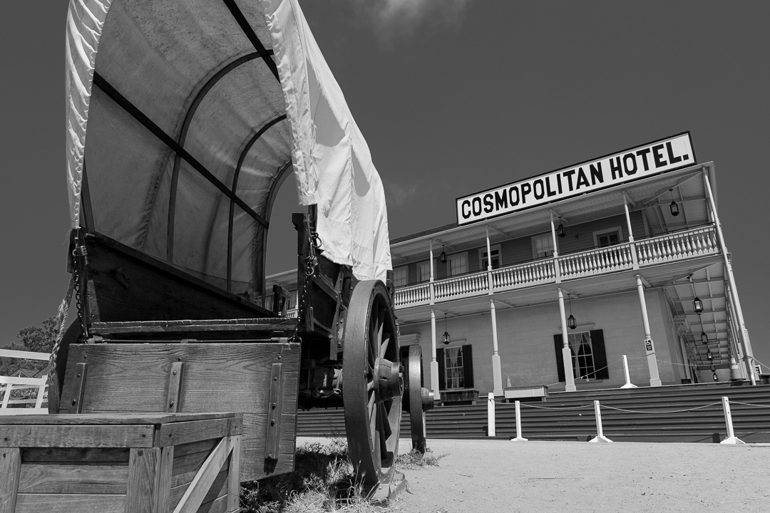
I find there's a lot of visual interest here, and I think the B&W treatment really brings it out. I feel a bit of confusion as to what you intend that I understand as the subject. On the one hand, the title suggests the hotel itself is the subject. But on the other hand, the stage "covered wagon" occupies wholly half of the frame, and the white canopy is the brightest area of the image. Also, perhaps it's just me, but I sense a bit of irony, juxtaposing as you do the notion of cosmopolitanism and luxury, against a rustic but semi-staged context.
If I might make a couple of suggestions? I went back to the original color image, and this time for the B&W conversion I pretty aggressively pulled down the blues, and somewhat raised the reds. This makes the sky darker and accordingly it feels a bit more dramatic, even though it's very nearly featureless. This also helps the signage stand out, but I took a different approach there. I toned down the bright white of the wagon canopy, and brought up the whites and highlights of the signage and the hotel frontage. The end rasult, I hope, is to emphasize the hotel, and particularly the hotel's name, and reduce the attention that the wagon draws. I also pulled up the shadows in the darkest area of the shadows under the wagon, where they were clipping. |
Sep 25th |
| 93 |
Sep 23 |
Comment |
Wow! Another one! You had some great opportunities, and made the maximum good use of them. I think I like this image the most, yet. It's very dramatic, yet tastefully so. RThe palette is gorgeous (or so say I). I really like your treatment of the light. If I might make a small suggestion? I find the golden light on the cloud at the right edge to be in competition with the rose-gold light that wraps around the peaks. You might want to experiment with toning it down a very little bit, perhaps by reducing the saturation and maybe even applying a bit of negative clarity.
I think I recall remarking on another of your images, but it bears repeating: I very much like your decision to center the reflection line. YOur placement of the weightiest elements on the right angle of the partitioning triangles makes for a pleasing sense of harmany and balance. |
Sep 25th |
| 93 |
Sep 23 |
Comment |
An interesting image! The many layers help the viewer enter and move through the image all the way from the brush in the foreground to the mountains in the distance. I feel that you've used the canvas well. I suspect getting the composition to suit you was challenging. I'm guessing that you made it a point to frame the mountains using the trees closest to the viewer, and the rightmost of the foreground group arches over and frames another one a bit further away, near the right edge. I think I might have wished for that one (on the right edge) to have a ligttle more space to the right; as it is, it feels a bit off balanace to me. Ordinarily, that much bluebird sky might seem problematic but, to me, that's solved by the very strong foreground trees jumping up into that space -- effectively "filling" it, even though they actually represent only a small fraction of the pixels in the upper half of the frame.
The first few times I viewed this image, early in the month, I felt a vague unease, wondering if the image had been too aggressively sharpened, or perhaps a bit more clarity applied than felt right. With time, though, that sense has abated.
I'm guessing this was a midday exposure, so kudos for capturing the whole dynamic range The colors all feel natural to me.
|
Sep 25th |
6 comments - 2 replies for Group 93
|
6 comments - 2 replies Total
|


