|
| Group |
Round |
C/R |
Comment |
Date |
Image |
| 93 |
Aug 23 |
Reply |
I'm glad it felt helpful, Jeffrey. I always worry that I might come across as critical. |
Aug 28th |
| 93 |
Aug 23 |
Reply |
If I may, I'll jump in with one more thought: I try to err on the side of how I *felt*. Case in point next month ... |
Aug 27th |
| 93 |
Aug 23 |
Reply |
Hi, Dawn. Just out of curiosity, were you there with a workshop? On your own?
As for the processing. No, I don't mean for a moment that you *should* be more aggressive. That's always a matter of personal taste and perhaps a bit of personality. And I'm not sure "aggressive" is what I had in mind. Here's what my experience has been like: with every edit I worry that I'm going too far. And sometimes I am, and it's obvious to me if I step away for a day. However, more often than not, if I let my imagination run free, I can imagine the image looking different than it does at the moment, different in a way that I can imagine I would like so much more; if I let myself pursue what I see in my mind's eye, I'm usually pleased with the results. So, it's mostly a matter of allowing myself the freedom to exceed what I think are my notions of good taste, only to discover that I'm not nearly as straitlaced as I'd like to think I am. I will acknowledge, though, that I have over the last couple of years developed some technical editing skills, and the process I'm describing is NOT one of try-this-try-that-see-what-I-like; it's really about "I can imagine what I want, and now I think I know how to achieve it."
As for printing ... what a subject ... I print my own. I have a Canon PRO-1000, and print pretty much exclusively on Canson Infinity Platine Fibre Rag. I find there's really nothing like the experience of holding one's photographic image in one's own hands. Showing an image to someone else on a screen can't hold a candle to handing them a print, especially if printed large. And framing one's work and hanging it on a wall says volumes about one's one commitment to one's art. I firmly believe that my game improved by leaps and bounds once I started printing. While a printer (and paper and ink) can be expensive, I believe a printer is as important an investment as a camera body or a good lens or a trip to someplace special. I wholeheartedly encourage you to invest in a good printer. Your work deserves it, and you'll be delighted at how much you'll grow once you start. |
Aug 27th |
| 93 |
Aug 23 |
Reply |
Oh, and I almost forgot ... if you do consider printing it large, you might want to try taking out some of the noise, especially in the sky. A it looks like there might be two or three dust spots? |
Aug 26th |
| 93 |
Aug 23 |
Comment |
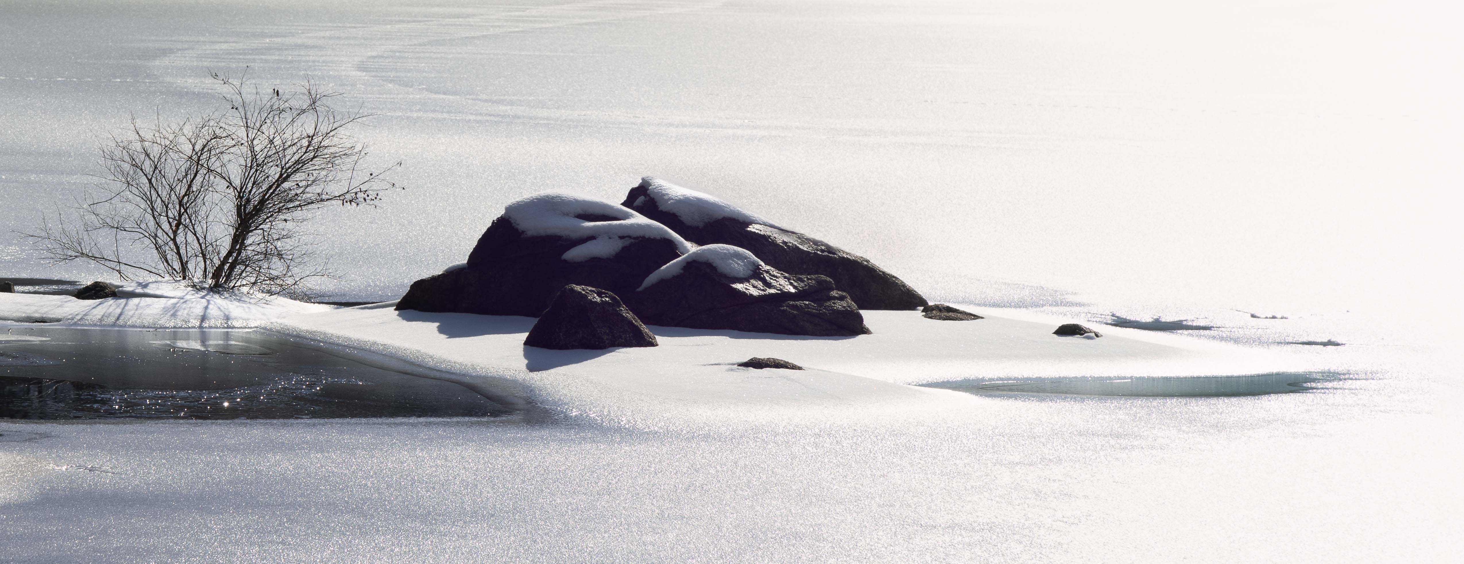
Neil, I suspect this image is one that will be best served by printing itk and priting it large. When I try to appreciate it on the small screen I find it "too simple", but when I imagine it large it feels expansive and just right.
The colors are gorgeous.
If I might quibble? I find the one bright reflection closest to shore to be distracting: too bright and concentrated. I can see a rationale for it being there but, were I editing it, I'd probably burn it down and desaturate it, or clone it out. |
Aug 26th |
| 93 |
Aug 23 |
Comment |
A great shot, a great story, and (as always) your treatment in post is impeccable!
|
Aug 26th |
| 93 |
Aug 23 |
Comment |
Dawn, I'm really enjoying this Patagonia series, and hope to see more. This was a spectacular moment, and you did a great job capturing it. I like your treatment in post, as well. You showed a great deal of restraint. One of these days I'd love to see what happes when you throw caution to the wind ...
One tiny little quibble: on first glance I found the bright patch of snow above and left of "Sasquatch" to be a bit too hot. That sensation passed quickly, but you might want to think about backing it down just the tiniest bit.
Congrats on your acceptances in the PSA Exhibition, and your well-deserved HM for Yellowstone Trees. |
Aug 26th |
| 93 |
Aug 23 |
Comment |
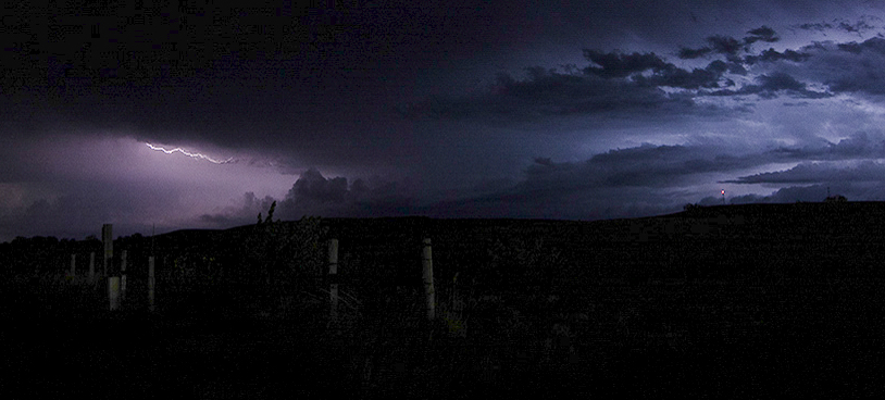
It's a very nice capture, Darcy, and kudos for such success on your first attempt!
I wonder whether, in your quite udnerstandable keen interest in the lightning, you may have overlooked the beauty of the wider scene. There's some gorgeous color in there! I'd invite you to consider another take on this capture, including the blues off to the right. (I also love the contrasting golden light of the moon off to the left. I experimented with including it, but found that it was so much brighter that it distracted from, rather than complementing, the rest of the frame.) Having included the right side, I gave thought to the red beacon light and ultimately decided that I liked including it, rather than healing or cloning it away.
I concur with Ed and Dawn regarding pulling out a bit more detail in the foreground. Not too much, mind you; i think there needs to be a bit of mystery to accompany the dreamy light in the sky. Have you experimented yet with the new "Enhanced Noise Reduction" feature found on the "Detail" panel in LrC? (Plenty of YT vids on the subject...) I have had great success with it, making it possible to pull up blacks and shadows that I had previously considered beyod recovery.
|
Aug 26th |
 |
| 93 |
Aug 23 |
Comment |
My initial reaction to the image was that it lacked impact, that the subject alone was not sufficient to engage and hold my interest. Still, I think the subject holds promise.
After giving it some thought, I think perhaps the composition and subject is not a problem, but that it might have benefitted from more advantageous light. It seems that the pagoda was in shadow, but there's some directional ambient light. I wonder how it might have looked with some warm reflected light (if that ever happens at that location).
I see that Neil suggests framing the image so that the sculpture is further to the left. I'd hate to lose the contrast between, on the one hand, the neat array of regularly shaped stone in the retaining wall to the left; and on the other hand, the jumble of irregular rocks around the base. For that reason, I'd probably consider moving a bit to the left and posigtioning the pagoda a bit further to the right in the frame (assuming there's nothing unsightly over there ...).
I'm curious as to what consideratio led to your decision to include so little of the reflection. Again, perhaps something unsightly? |
Aug 26th |
| 93 |
Aug 23 |
Comment |
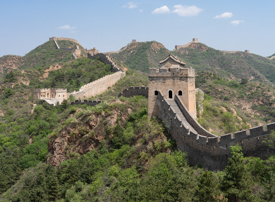
Hi, Jeffrey. I think this does a good job of conveying both the scale of the engineering project AND the way this must have posed a formidable and imposing barrier to invaders. I visited the Wall nort of Beijing in 2018 (on May 2, didn't know better!) and was very impressed.
If I may, I'll offer a suggestion about the crop, and walk you through my though process. I see you cropped down from the top. I agree that not all that sky contributes; the question is how much to keep. I might have trimmed more than I did, but I didn't want to cut in the middle of the puffy clouds, and cutting in to exclude them entirely feels to me to be too severe. To my eye, the sweep of the wall to the right is broader than is helpful. I find that it pulls my eye strongly over to the right edge. I trimmed in far enough that the ascending sweep to the right reaches the edge slightly less high than the turret; the result, I feel, is to assign more significance to the turret and help keep the eye mmore toward the center. On the left edge, I cropped in a little bit for no better reason than that "it felt right" to me.
I concur with the others' suggestion that some dehaze might help, BUT ... I think dehgaze needs to be used with great caution. In this case I tried applying globally; I found that getting the desired effect at the tops of the ridge resulted in a rather "crunchy" and unattractive foreground, so I instead ,applied it using a linear gradient pulled down from the top.
One needs to exercise caution, but I found that it works (my opinion) here to reduce the luminosity of the blues. I think it makes the sky a bit less "blah", and it also helps make the clouds stand out a bit.
Finally (yeah, I do eventually run down) ... This was captured with the Sun very nearly overhead. The light under those conditions really makes it difficult to create a sense of dimensionality. Still, the Sun was slightly offset to the right, and I found that I could accentuate the light coming from that direction to sculpt a bit more sense of space.
I like the image. I hope this walkthrough comes across a "helpful suggestions", not as "fault finding." I like to encourage folks to give thought to post-processig to bring out the best in the images that they worked so hard to capture in the first place. |
Aug 26th |
 |
| 93 |
Aug 23 |
Reply |
Thanks, Jeffrey.
I see your point. Please see my reply to Stephen above. |
Aug 11th |
| 93 |
Aug 23 |
Reply |
Thanks, Stephen.
I see the merits of your suggestion. If I were to proceed along those lines, though, I think I'd go for soething still more severe. |
Aug 11th |
 |
6 comments - 6 replies for Group 93
|
6 comments - 6 replies Total
|


