|
| Group |
Round |
C/R |
Comment |
Date |
Image |
| 93 |
Jul 23 |
Reply |
Re the very bright white upper reaches: I get your point (Ed made the same), but I'll stand my ground on this one. The experience of the moment was one of astonishing whiteness. |
Jul 28th |
| 93 |
Jul 23 |
Reply |
Re the very bright white upper reaches: I get your point (Darcy made the same), but I'll stand my ground on this one. The experience of the moment was one of astonishing whiteness. |
Jul 28th |
| 93 |
Jul 23 |
Reply |
Thanks, Paul. No, I don't use NIK. I make heavy use of the Tony Kuyper's TK8 panel for constructing various masks, but I very rarely use canned actions to create an effect that I can't produce on my own. I want to always understand what I'm doing and why and how it works. I do have a couple of Blake Rudis' panels, but I rarely use them. |
Jul 28th |
| 93 |
Jul 23 |
Reply |
Chuckle re "do you ever ...". I'll refer you to my submission for August. |
Jul 28th |
| 93 |
Jul 23 |
Comment |
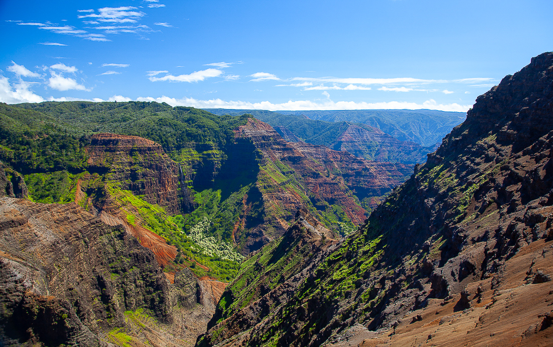
One of these days I might manage to get there. This image certainly inspires me to try. I'm a bit bothered by the blocked up shadows. This looks like it was a situatio that called for exposure backeting.
On a side note: have you ever experimented with editing in the LAB color model? It's possible to achieve really garish effects but, used with care, it can help bring an image to life by spreading out the colors just a bit. I attach a crude (ten minutes of work only) example. It's a bit excessive, but it shows what I mean by "spreading out." |
Jul 28th |
 |
| 93 |
Jul 23 |
Comment |
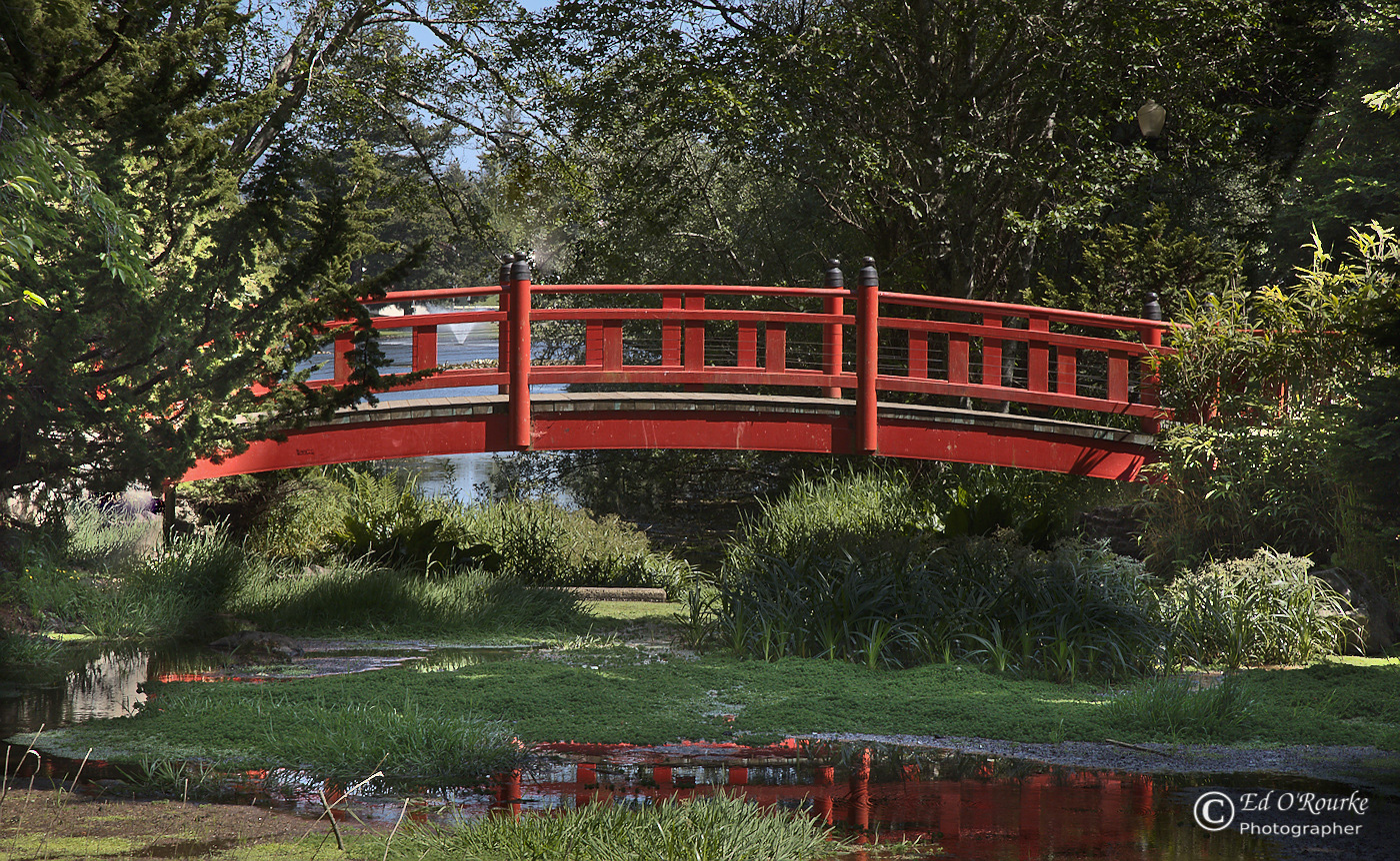
I like the image a lot, Ed. At first I was a bit ambivalent about the contribution made (or not) by shooting straight on and thus including the reflection. Ultimately, I can to the (personal) conclusion that I agree with your choices.
and
I'm a little bit bothered by the absence of context left and right of the ends of the bridge. The effect, to me, is to create the sense that it is floating in mid-air. Of course, I realize that that might very well be what one experiences in person ...
Personally, I'd like a bit more of a view into the darker areas of foliage, and a bit more contrast in the details of the bridge (the star of the show). |
Jul 28th |
 |
| 93 |
Jul 23 |
Comment |
As always, veery well composed. The capture seems technically spot on. The story is lovely. And the landscape is appealing, and mood-wise sympathetic to the story.
I find it unfortunate that the mare is facing away from us. Did you try using generative AI to turn her around? JUST KIDDING! Really, just kidding. |
Jul 28th |
| 93 |
Jul 23 |
Reply |
I have now gone back and read some of the other comments. (I almost always wait until after I've drafted my own.) I'd like to offer my own commentary on Jeffrey's remark about "breaking the rule of thirds." (As a side note, I tend to prefer attention to the golden ratio nover the rule of thirds.) My take on "breaking the rules" is that there's absolutely nothing wrong with doing so, but ... I think the maker needs to have a compelling argument for disgregarding the advice. In this image, I suspect you were quite taken with the reflections, and wanted to showcase as much of them as possible. A reasonable motivation, but I fear it didn't carry the day, for me. |
Jul 28th |
| 93 |
Jul 23 |
Comment |
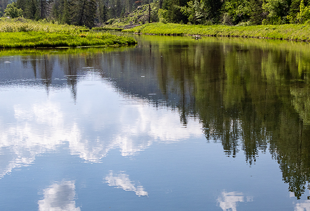
Darcy, this gives me the sense that this was a lovely experience in person. To me, though, this is not one of your stronger images, so I've tried to think through the "why" of it. I conclude that the main problem is that there is just an awful lot of sky reflected, which is far less interesting visually than the reflections of the trees. Also, the stream flowing into the scene -- an important part of the story -- is easily overlooked, as it's so close to the edge, and somewhat lost in among the narrow band of details along the top of the frame. I would have wished for a bit more of the woods; I feel a bit "shortchanged" as it is. I tried cropping in a bit.
The technical execution of the capture seems spot on to me. |
Jul 28th |
 |
| 93 |
Jul 23 |
Comment |
I really like this, Dawn. I have a personal fondness for images that divide the space up geomatrically like this. I have two minor quibbles. The line of the far shore is a teensy bit of level. Now that might be a faithful rendition, as might have happened were the far shore not perfectly paralle to the plane of the camera, but it *feels* wrong to me. Sometimes I'll tell a lie in an image to make the image feel more truthful. Also, I'd have like to be able to peer into the shadows in the distance, so I pulled a linear gradient down from the top and lifted the black a bit, and added a little bit of clarity. |
Jul 28th |
 |
| 93 |
Jul 23 |
Reply |
A further thought: sometimes nin this kind of situation, less is more. I will often cfreate mutple compositions, some wider and some tighter. |
Jul 28th |
 |
| 93 |
Jul 23 |
Comment |
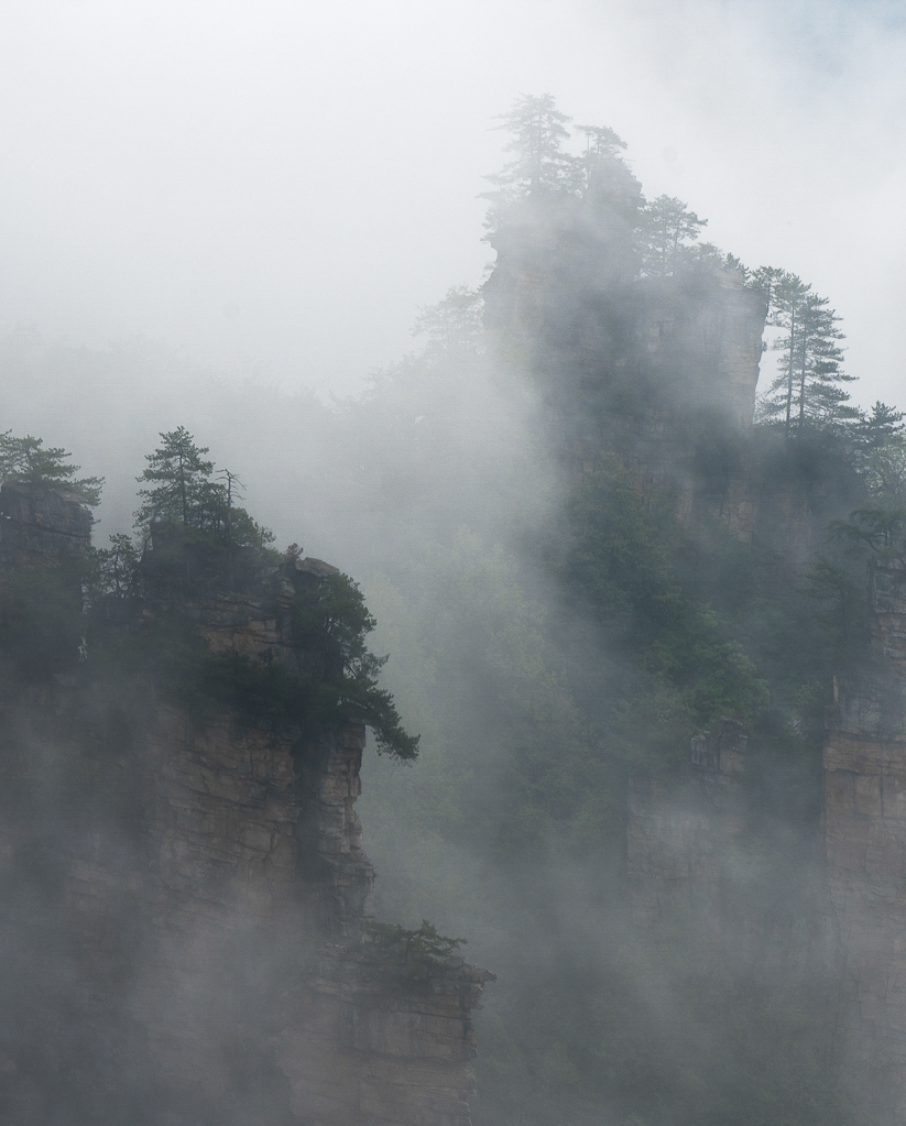
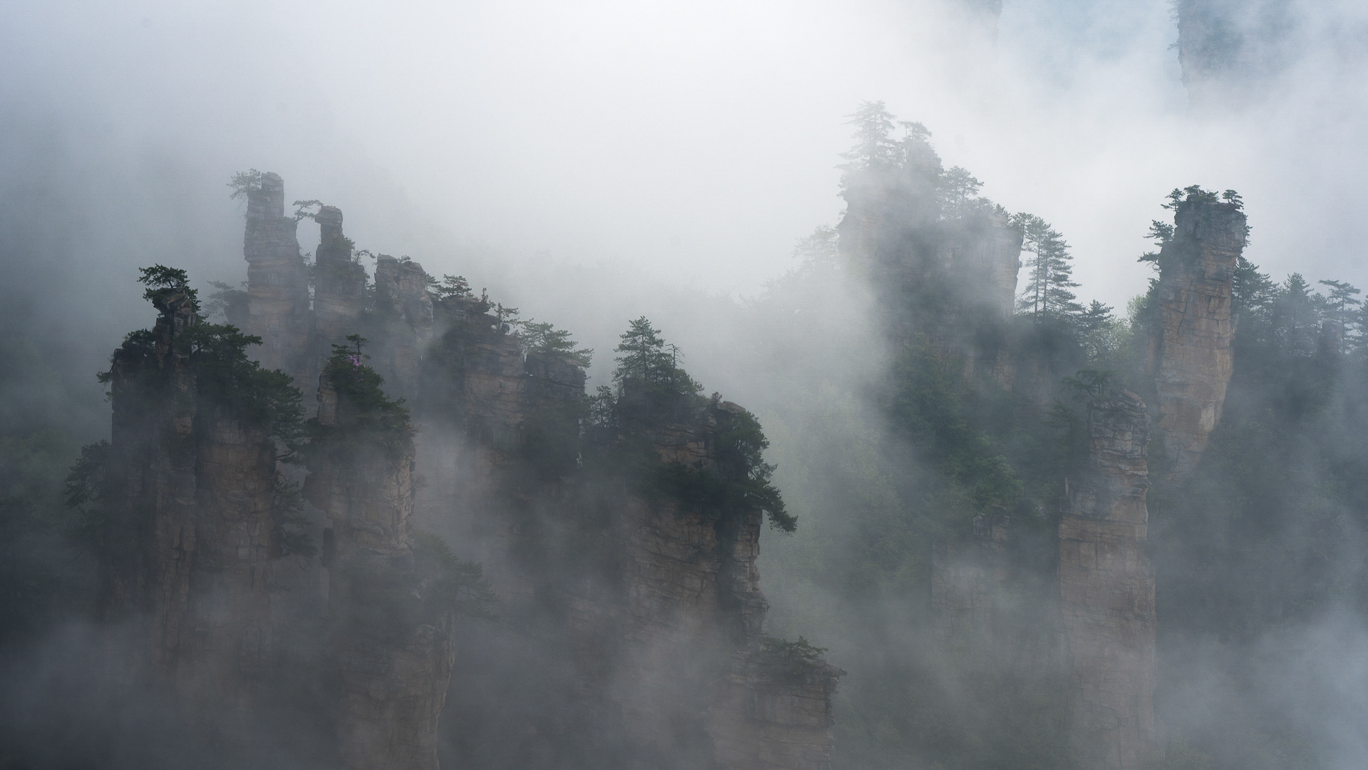
Jeffrey, I like this a lot. I also believe it has a lot of potential which you have not yet exploited. I think you would have a much more dramatic image were you to pull the white point and black point in, yielding something close to true white and black, taking care to not blow out the highlights or block up the shadows. Also, this is the kind of situation where gentle use of dehaze can help. What I'm striving for here is to give the viewer something concrete and sharp to hold onto, while still maintaining the sense of mystery and concealment that the mists provide. |
Jul 28th |
 |
6 comments - 6 replies for Group 93
|
6 comments - 6 replies Total
|


