|
| Group |
Round |
C/R |
Comment |
Date |
Image |
| 93 |
Jun 23 |
Comment |
An amazing "environmental wildlife" image! Itpretty astonishing that your were able to get such expressive looks -- from three of them, no less -- and compose an image, expose it properly, and with everybody sharp! I'm impressed.
As I commented to Paul, I know next to nothing about reviewing wildlife photography, and what I have learned I learned from listening to judges provide feedback in competition. Looking at this image, I can't think of any criticism I'd imagine it receiving from a judge in competition. |
Jun 28th |
| 93 |
Jun 23 |
Comment |
I'm always astonished when I see an image like this, astonished at the ability to capture a moment, sharp like this, well composed and exposed, and so on.
While I have little to no desire to create images of wildlife, I think I can appreciate a good one like this when I see it.
What little understanding I have as regards how to critique wildlife photography comes from the feedback I hear judges provide in competition at my local club (which does rather well in interclub). I suspect that in competition a judge might find fault with the closeness of the two horses' heads to each other. I myself found I wondered at first glance whether the more distant horse were nuzzling the nearer one, or if that were a trick of the perspective. I suspect a judge would give high marks for the sharpness, good depth of field, and the story.
|
Jun 28th |
| 93 |
Jun 23 |
Comment |
Actually, Darcy, I suspect the original RAW file is not at all overexposed. I don't see any loss of detail in the bright areas. Looks to me like a good job of ETTR (expose-to-the-right). One can always pull the resulting image down in post (so long as the data is there), much more easily than one can do the opposite.
It really takes a while to get used to the depth of field constraints with a long lens, especially when focusing on something not far away. For example, at f/8, 400m, on an R7, if one focuses on a subject 30 feet away, then sharpness falls off as quickly as half a feet nearer or further! Even shutting the aperture down to f/22 only expands the depth of field by about double to triple. (A really good app to help get a feel for this is PhotoPills; chedck out the "DoF Pill".)
But don't let that discourage you from experimenting with the lens like this. You'll almost certainly want to learn how to focus stack, taking multiple exposures focusing closer and further away, and them merging them in Photoshop. It helps to be on a tripod, but if you're able to keep the camera in more or less rthe same position from exposure to exposure (and the subject isn't moving), it's not too difficult to do. There are TONS of good videos on YT and tutorial blobgs on the internet on both the capture and the blending. It really isn't hard. And ... with the R7, you get a feature called "focus bracketing": you set it up in the menu, then enable it, focus at the nearest point you want in focus, press the shutter release, and then it will automatically rpaidly take as many exposures as you configured, moving the focal point away from you on edach one. I find that I can easily take twenty or thirty brackets handheld and successfully blend them in Ps.
One last tip: since you're investing in the Canon "R" ecosystem, one of the advangtages is that most of the RF mount lenses suited to landscape photography have the filter ring sizes of 77mm or 82mm, which means one can invest on a single set of filters, with a mounting ring on each lens, and then just pop them on and off as wanted. I like the Kase magnetic circular ones, but want to replace them with Maven filters when I'll not spending my $$$ on travel.
So ... back to the image ... I find that with an image like this, composition is key, and very difficult. Usually there's no obvious subject, so the story usually needs to be about mood or atmosphere, or about a small number of elements similar to each other that stand out from the rest of the image. Usually the simpler the better. Balance is important, and careful checking around the borders is critical. I often find that a square crop works well. A strategy I sometimes use, especially if I don't have a lot of time in the field, is to plan on having to crop in post, and so I give myself some extra room all around to work with later. And ... unforuntately, uniform sharpness is usually mandatory, ubnless one has a way to make it fall off symmemtrically both horizontally and vertically -- not at all easy.
|
Jun 28th |
| 93 |
Jun 23 |
Reply |
After uploading that image and looking at it again, I found myself wondering how much value the top fifth or so was contributing, so I experimented with trimming it off (this also reduces the distraction from the patch of blue sky). Having done that, it seemed it felt claustrophobic, so I trimmed a bit off the left. Not sure I like it any better, but thought I'd sharre it ... |
Jun 28th |
 |
| 93 |
Jun 23 |
Comment |
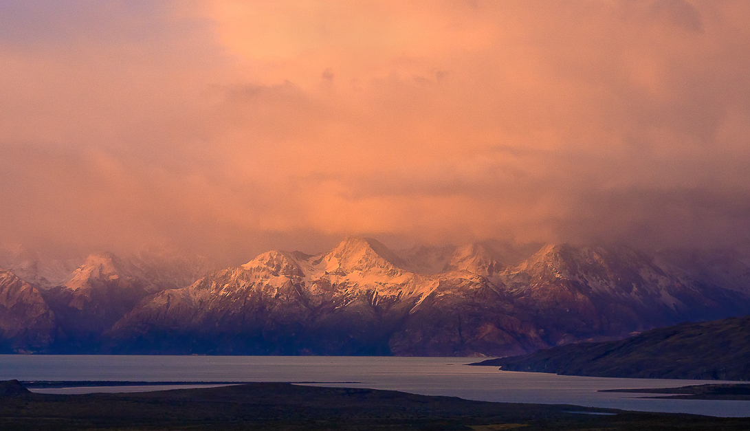
What an amazing moment in a spectacular location! I think you did a great job capturing it. I find that the palette definitely evokes, through the red-oranges, a sense of intensity and excitement that I can easily imagine you must have experienced.
As is so often the case, I "fiddled" with the image, with a couple of objectives in mind. First, I find myself bothered by the inpenetrable darkness of the foreground. I don't particularly feel aI need to clearly discern details, but I'd like to have a sense that I *could* if I looked hard enough. To that end I carefully opened them up a tiny bit, taking care to not impact anything else. (Curves adjustment layer, no change, screen blend mode, darks-4 mask, blend-if feathered in to protect the purest blacks and most of the midtones and brighter, painted in into the foreground only).
Second, I found that the bright spot in the sky kept holding my eye, though it was far from the most interesting part of the frame (i.e., the mountains and the light on them). Toned it down just a bit (clone stamp from nearby on a transparent layer, darker color blending mode).
Third, I feel that the light on the mountains is really the specular story here, so I accentuated it (semi-saturated light yellow solid color layer, hard mix, 15% fill, painted in into the desired area, protecting the darks using blend-if).
AS ALWAYS: This is not to say "You got it wrong and here's how to fix it." I'm just sharing some post-processing tips and another maker's approach.
(Afterthought now that I've read your narrative) I can totally relate to your challenges with the wind and concerns for the safety of your gear -- and the decisions you had to make as a consequence.
|
Jun 28th |
 |
| 93 |
Jun 23 |
Comment |
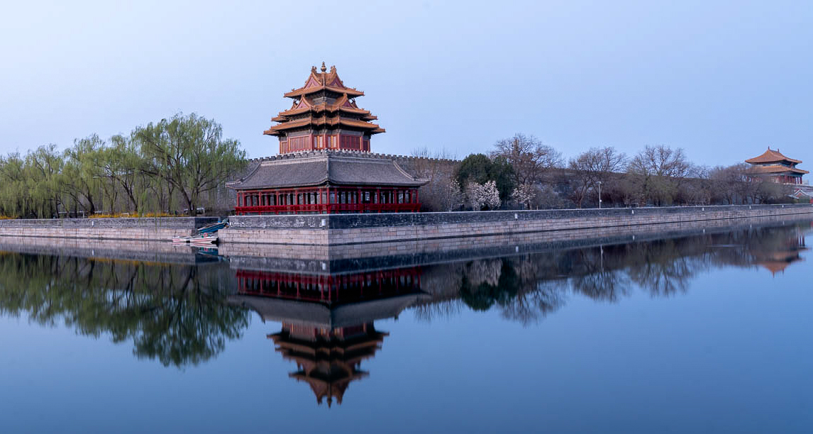
A very nice, peaceful image. It evokes a very different feeling than the one I had when I stood at that location: fatigue and anxiety due to a very hot afternoon, swarms of crowds, concerns that I'd get separated from my group, and so on. I would have loved to have the experience this suggests.
I have a thought regarding the symmetry. First of all it is, of course, very pleasing. It is my experience that, when I'm presented with "near perfect" (in whatever respect), any small deviations from that "perfection" are troubling. When I encounter these in an image, I find myself wondering whether they reflect an explicit intent on the part of the maker, or perhaps not of concern to the makers, or perhaps not mnoticed by the maker. In my own work, I sometimes try to mitigate these concerns by "backing off" of such symmetry a bit.
In this image, there's a mismatch between the left and right edges, in that the right edge shows the turret at the northwest corner, but the left edge is cut off before revealing a corresponding endpoint on the opposing corner. To my eye, this feels unbalanaced, and it's not clear that this is ingtentional. By cropping in from the left, I feel I dispense with that concern, as it's clear that the lack of full horizontal symmetry in intentional. It also gave me an opportunity to place the turret on a golden-ratio dividing line, which helps to create a sense of stability and balance.
PLEASE NOTE: I am NOT saying that your decisions were wrong; I'm only sharing how a different maker might make different choices.
I also added more contrast in the less saturated areas along the wall and turret, taking care to not flow over into the sky or water. |
Jun 28th |
 |
| 93 |
Jun 23 |
Reply |
I understand, Darcy. I did boost the saturation of the blues, and not the cyans or greens. It's possible this produced a shift in perceptual hue. To my eye, this "feels right" (whatever that means).
There may have been other factors at works here, that are beyond my understanding. It was an extremely bright day, very few clouds in the sky, so there may have been some reflected light from the celestial dome. One thing I find interesting: if one examines the blue at a point about 40% down from the top and 10% in from the right, it has the hue that we're more accustomed to seeing. As I applied my saturation adjustment globally, I would have expected it to have impacted the blues uniformly.
It does occur to me that there might be other explanations; I have no idea how plausible they might be. Perhaps the "glass" of the helicopter window was not chromatically neutral. Or perhaps there was a subtle (too subtle to distinguish from its surroundings) reflection in the window.
It's all kind of an interesting mystery. To accompany it, consider this: there is something of a pinkish cast in a patch of ice along the bottom edge, near the center. It was disturbing enough that I actually tried to dampen it a bit in post. |
Jun 16th |
| 93 |
Jun 23 |
Reply |
Thanks, Neil. Yes, I think that's the most serious flaw in the image: the viewer really has no way tell whether those are gigantic or this is a macro shot and they're really small. As a maker, I feel it's not fair of me to expect the viewer to read a narrative as part of the experience. That's why I usually comment or critique before I read an accompanying narrative.
Still, I'd like to believe that the image is evocative, through its luminousness and sinuous geometries, independent of familiarity with the story of its capture. |
Jun 12th |
| 93 |
Jun 23 |
Reply |
Thanks, Paul, you made me laugh! Actually in no danger on this flight at all. The greatest risk was that I'd annoy my husband by obstructing *his* view.
Actually, with the helicopter swiveling around as it was, yes, motion blur was a bit of an issue. Not real bad, but a trip to Topaz did make a difference. I do always try to use restraint, though, when sharpening. I have yet to find a tool that doesn't create "hallucinations". Sometimes I'll blend multiple layers using different models and/or differing degrees of sharpening. |
Jun 4th |
5 comments - 4 replies for Group 93
|
5 comments - 4 replies Total
|


