|
| Group |
Round |
C/R |
Comment |
Date |
Image |
| 93 |
Mar 23 |
Reply |
Yes, you are making sense to me. I must say, mthough, that my camera (an R5) and I often disagree as to what looks natural. I always shoot "daylight white" or whatever it's called, and adjust in post as needed.
Now that I think of it, many folks in my club and I disagree as to what looks natural. But I'm never wrong (wink). |
Mar 6th |
| 93 |
Mar 23 |
Comment |
Stunning, Dawn! I can almost hear the snow. Very well done.
At first I thought I regretted the missing tops of the close trees, but after studying the image for a while I changed my mind. I now feel that clipping the top of them gives them an immediacy, a sense of them being very close and REAL. Again, well done. |
Mar 5th |
| 93 |
Mar 23 |
Comment |
Thanks, Paul, yes, it is exciting and energetic. The guy was a co-leader of the workshop. He was the one who got these "man in the image to provide drama and skill" assignments. For me, it's a bit cliche. |
Mar 5th |
| 93 |
Mar 23 |
Reply |
Also: greens and violets are very interesting colors. In this image, you'll notice the green mosses up high. Juxtaposed against the coolor tones, the greens feel warmer, more alive. The same color, had it been surrounded by yellows and oranges, would have felt calmer and more serene.
Analogously (though not present in this image) violet can act as either a warm or cool tone, depending on where it is placed.
One thing I've only recently started to grasp is this;: when the general level of saturation is relatively low, it takes only a very small shift in hue towards warmer or coolor hues to create a big difference in feeling. |
Mar 5th |
| 93 |
Mar 23 |
Reply |
Thanks, Darcy. An interesting question. In my opinion, definitely YES, and I believe it can really add something to an image if well handled. It can add energy or drama to an image. What I like most of it, though, is that it can be used to subtly guide the eye and heighten the sense of depth. In general, all other things equal, cool colors tend to recede and warm ones advance. |
Mar 5th |
| 93 |
Mar 23 |
Comment |
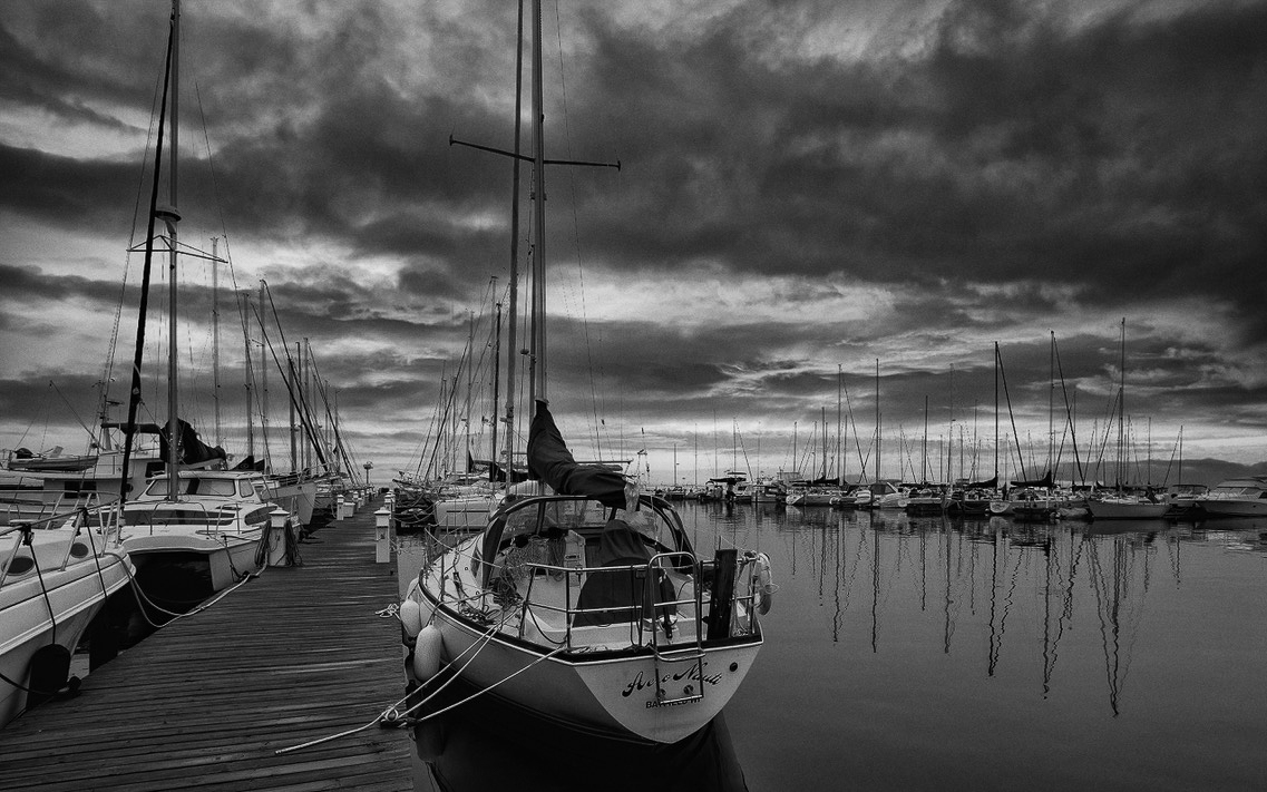
Nice and ominous, Paul! I like moody scenes like this.
The B&W conversion was well executed, as usual.
I like the repeating verticals, especially the ones in the distance on the right.
There may be a bit more on the right than necessary. I tried cropping in a little bit, resulting in the main mast landing on the golden ration division instead of the rule-of-thirds line, but I'm not sure I like the result. On one hand it feel more balanacved, but it loses some of the foreboding feel.
I'd be curious what you think? |
Mar 5th |
 |
| 93 |
Mar 23 |
Comment |
Hi, Darcy. The first thing that I noticed about the image is that it is dynamic, in that the geometry suggests that the foliage is exploding out from the center. This works nicely to give the scene some energy. I think the second cactus in the distance mis important, as it elevates the image above a simple "portrait" by giving it a setting, a sense of place.
Personally, I actually like the footprints. Yes, they're messy, and it might be a good idea to de-emphasize them, perhaps by selectively reducing the local contrast, but I think they, again, help to give the scene a place, rather than existing in some abstract plane that might extend infinitely around.
I'm interested in your thinking around the bluishness of the shadows in the snow. Some folks would complain of a color cast; I've known judges to be severe in this respect. On the other hand, it's my belief that this is honest, not a processing error. What's happening here is that in the shadows, where there's less direct light from the light source (the Sun), there is instead diffuse indirect reflected light from the sky, i.e., blue. In "real life" our eyes usually automatically adjust the white balance in this situation, and many folks feel that we should process our photographs in an analogous fashion. I, on the other hand, prefer to show the viewer something that, in real life, their eyes would trick them into not seeing. Hope that makes sense? |
Mar 5th |
| 93 |
Mar 23 |
Comment |
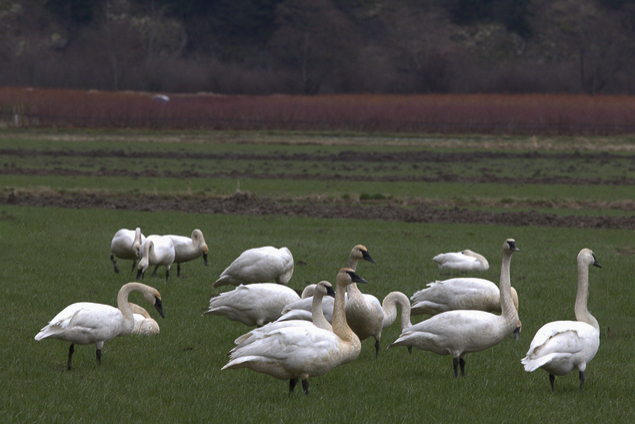
Hi, Ed, it was entirely by accident that I ended up reading folks' comments before posting my own, but this has simplified the task for me. First, I hadn't specifically noticed the motion blur, as I generally don't expect the greatest of sharpness in these small files, esp. when cropped in as in tyhis case. Now, I don't "do" wilkdlife photography of any sort, so I'm really not qualified to speak on the subject (though I have sat through many a contest judging; my local club has a very strong bird photography contingent). I find that, without context, a wildlife image fails to generate lasting interest unless the subject is truly unusual or doing something engaging. I like Darcy's crop and clone; I tried one of my own, a bit wider, but I think her image works better. I also flipped the image horizontally; I'm told that wildlife images "read" better left to right.
Oned other thing, the birds seem a bit overexposed, so I pulled them down a bit.
And I use the Topaz suite a *lot*. Modestly, though. It's easy to produce some really ugly artifacts, "hallucinations" I've seen them called by one author. |
Mar 4th |
 |
| 93 |
Mar 23 |
Reply |
If I dissect it, I suppose I can point to a few characteristics that made it so appealing to me. Alister Been speaks of the five evocative "triggers" luminosity, contrast, color, atmosphere, and geometry. This has all five. |
Mar 4th |
| 93 |
Mar 23 |
Reply |
Thanks, Neil. Most of the "green stuff" is moss. There is a variety of moss that grows only in Iceland that has this really vivid color. And, yes, the rock is (geologically speaking) very young. Possibly less than a million years old.
How did I know I had to make *this* image? It was intuitive. I was astonished by what I've dubbed the Narrows; it was sooo beautiful and dramatic. I looked at it and imagined being there. I'd not have forgiven myself had I not made this image. |
Mar 4th |
| 93 |
Mar 23 |
Reply |
Thanks, Neil, very interesting. I'm still trying to figure out where the Sun might have been to create such intense specular highlights while the sky was so dark. I confess I overlooked the information that it was 7am or earlier. So I suppose it must have been low near the horizon, and maybe a bit out of frame to the left?
Like you, I often give the "auto" adjustment a whirl, just to get a quick sense of one possible starting point for the edit. Sometimes I like what I see, sometimes not. Glad to see you know better than to take LrC advice as gospel. A lot of folks, uncomfortable with editing, just stop there. |
Mar 4th |
| 93 |
Mar 23 |
Reply |
Okaaayyy ... have read the narrative, I'm really curious how you processed the BW conversion ... would love to see the original and hear a bit more from you on that. |
Mar 4th |
| 93 |
Mar 23 |
Reply |
For my second attempt, which I feel was a bit more successful, I took the image over to Ps. I duplicated the background layer, applied a Gaussian blur (8px), and masked it in from the bottom using a gradient. To me, this deemphasized the foreground a bit. Even so, I still feel I need to crop a little bit up. Doing so allowed me to place the nearest boat centered on a golden ratio spiral. |
Mar 4th |
 |
| 93 |
Mar 23 |
Comment |
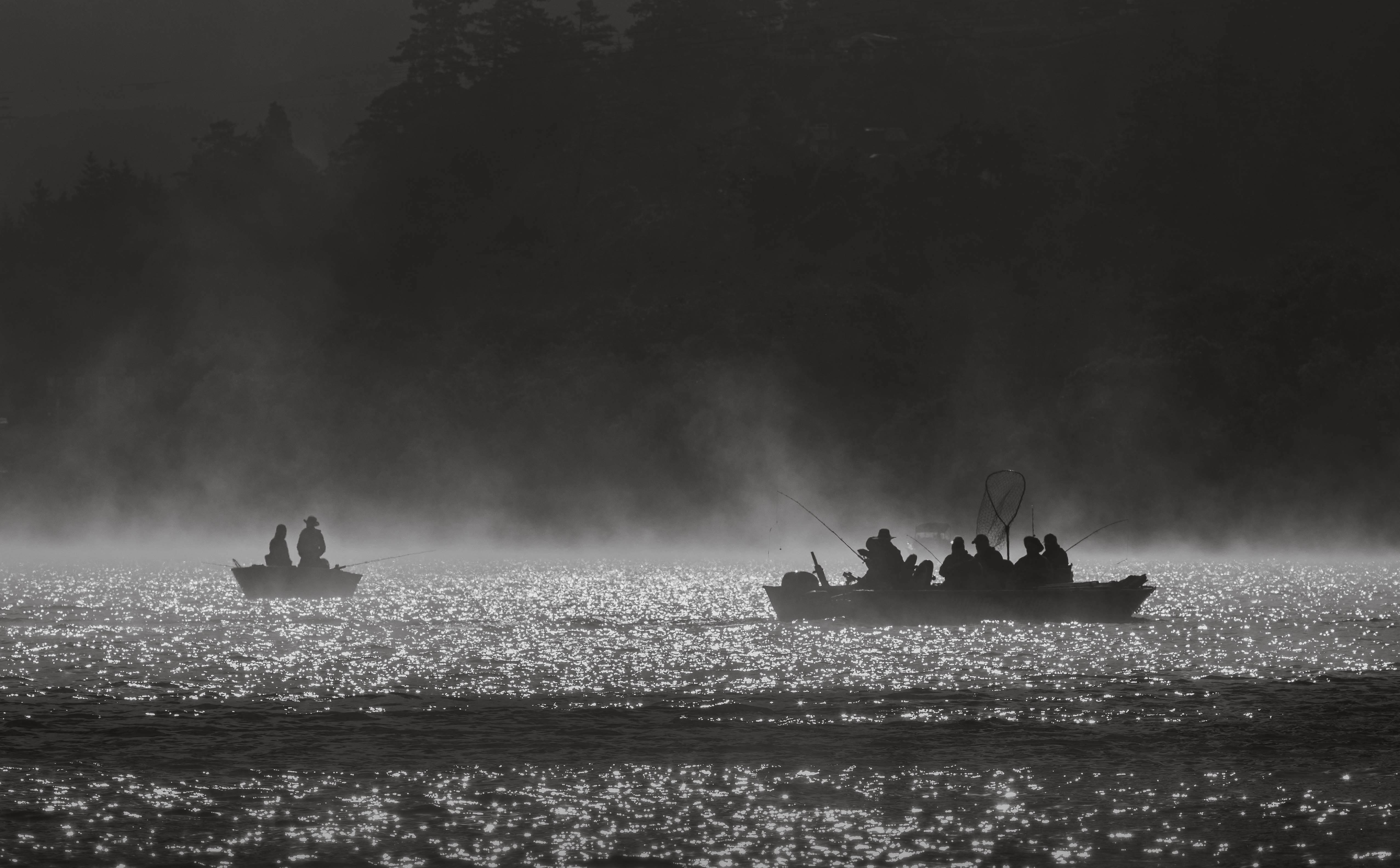
Wow. I find this really stunning! Very evocative. In my images I strive to evoke a mood or complex of emotions that would be difficult to put into words; here I think you've succeeded in doing just that. One looks at this and it's hard to imagine how in the world that could be possible. I don't mean that it's implausible, only that's it's ... well ... I don't have the words. (and I'm rarely at a loss for words)
I look at the fishermen, afloat on some magical river, and imagine that their catch must be exgtraordinary.
So many pieces work in harmony here to pull this together: the mist, the dsark sky, the dark forest on the far shore, the fishermen and their boat seen only in silhouette, and the glittering specular highlights on the water.
I very much look forward to reading your narrative to learn how you processed this.
I do find the dark band crossing the bottom to be a bit problematic. Although it helps to define the river (there's a current), for me it acts as a barrier to entry and separates the bottom quarter of the image from the rest. I tried a couple different approaches to see if I could solve to my satisfaction. First, I tried cropping up a ways. I didn't crop all the way up to the dark stripe, as to do so would have created a harsh lower edge inconsistent with the feel of the rest of the image and would have placed the fishermen too close to the bottom for my comfort. |
Mar 4th |
 |
6 comments - 8 replies for Group 93
|
6 comments - 8 replies Total
|


