|
| Group |
Round |
C/R |
Comment |
Date |
Image |
| 93 |
Feb 23 |
Reply |
Indeed. These days, Multiply Blend Mode is my go-to "burn" method. So much versatility. Add "Blend-if" and the degree of control is great, and easy to do. |
Feb 27th |
| 93 |
Feb 23 |
Comment |
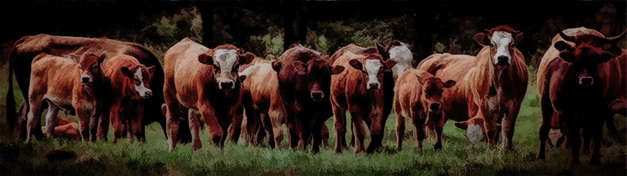
Paul, you have a knack for creating interesting images out of seemingly mundane subjects. Add a touch of humor, as in this one, and you've got a winner.
I like that you had the background in drak shadow; I haven't read your narrative, but I wouldn't be surprised if you also darkened it further in post; if so, your treatment was tasteful.
For myself, I'd have liked for the cattle to "pop" out a bit further, and might have wished for a bit more dimensionality. I was plerased to discover that LrC's new AI "select subject" feature works well here, and I was able to target them for adjustment. I found the bright forehead of the one cow with head down to be distracting, so I burned it down a bit. I was a bit clumbsy at it as I hurried and did it in LrC; in Ps it would have been possible to do a much better job.
I really like your choice of format, eliminating everything that wasn't essential to telling the story and emphasizing the numerousness (is that a word?) and unison.
The French have an expression "the train passes and the cows turn their heads". |
Feb 26th |
 |
| 93 |
Feb 23 |
Reply |
I hope that's a good thing. Sometimes I fear it might get on folks' nerves. I always mean it to be constructive, and I always find I learn a lot from working with other folks' images, where I have less personal investment ... |
Feb 25th |
| 93 |
Feb 23 |
Comment |
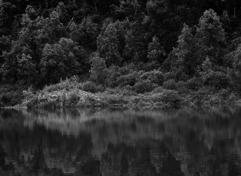
I think you made a great choice in opting for the B&W treatment. Recently, when I think about how to capture and then process an image, I think about both subject matter interest and visual interest. For a scene like this, the initial subject matter interest is in the textures, in the shoreline, and in the reflections, which also reveal variaiton in the texture of the water's surface.. Unfortunately, as we've all seen same, the initial excitement, especially for the reflections, tends to wear off quickly, and we need something else to keep us interested in the image. This is where a B&W conversion can help ... we are then able to manipulate the luminosity and contrast to create a mood which then, in and of itself, can become the point of interest. We can also accentuate (by creating local contrast) areas into which we wangt to draw the viewer and hold their attention.
You've succeeded in the B&W conversion in crerating a lot of visual interest around the shoreline and the edges of the trees. The mood is peaceful, and perhaps a bit somber. (The bright rock/log/structure shoreline right is very distracting and I'd recommend making it go away.)
It's always very tempting, when presented with msuch clear reflections, to frame the image to showcase them in their entirety. I wonder, hoewever, if it suffices to merely suggest that they are there, devoting less of the frame to them, giving greater "pride of place" to the shoreline and the varied flora beyond.
I've tried making a couple of tweaks, cropping modestly from the sides and bottom, and adjusting for a still darker mood. I realize that's a matter of personal taste, and it probably just reflects more about who I am than anything. Your images tend to be more cheerful ...
|
Feb 25th |
 |
| 93 |
Feb 23 |
Comment |
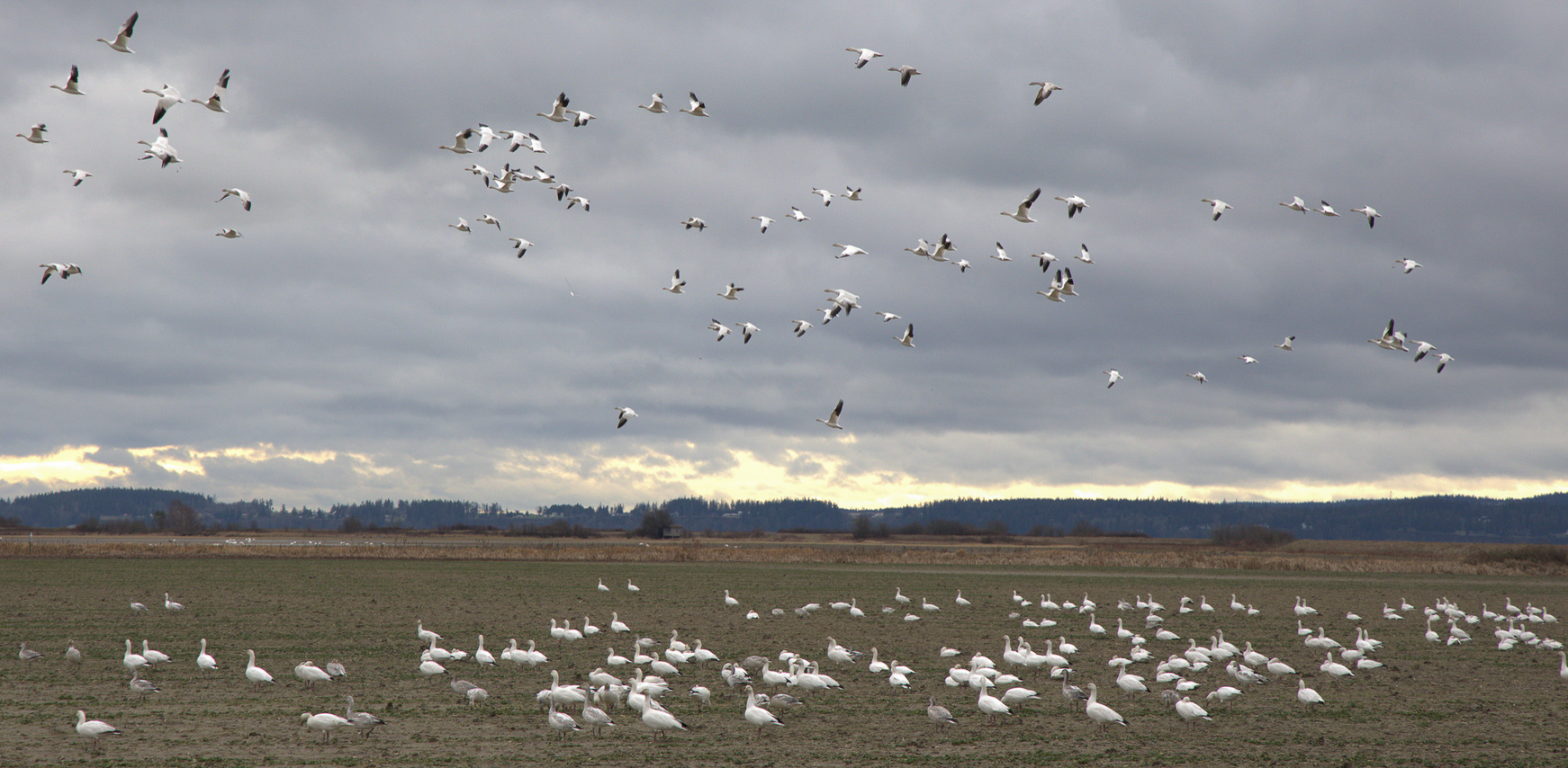
An interesting concept, here, conveying the sense of mass migration. I think you did a pretty good job of it.
I find that the birds in the sky don't individually stand out against the sky enough to create the sense that there's a large number of them. In an attempt to address that, I manipulated the sky a bit, pull down the midtones, and then compensating by reducing clarity. It's times like this that I really appreciate the value of LrC's new AI selection feature, which made it possible to adjust the sky and NOT the birds in flight.
I think your panorama-ish format helps to accentuate the horizontal aspect, which in turn contributes to the sense of motion. In fact, I think it would not hurt to get a wee bit more extreme by trimming up from the bottom up to near the edge of the standing birds, and down from the top in a similar fashion. I find the "clump" of birds in flight at the left edge distracting, so I cropped in to make 'em go away. |
Feb 25th |
 |
| 93 |
Feb 23 |
Comment |
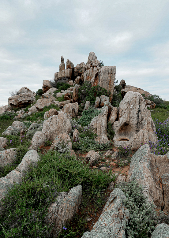
I have a sense that it was a challenge to frame this one up. Given the title (which presumably is the name of the location) I suspect the intended focal point is the "castle" formation at the summit. Using the wide angle perspective has worked against that intention, though, assigning a great deal of significance to the rocks in the foregrounds. They are certainly interesting rocks (at least to me who loves stone in all its variations), and they do form lines that lead the eye upwards. Still, I personally feel that thney command more of my attention than they can justify as a part of the larger scene.
I wonder if you might have been served better by a narrower perspective, trimming off quite a bit of the sky and foreground, and coming in from the sides as well.
This may just be me, having not been to the locatoin, but I find myself questioning the color. The rocks seem "hot" to me -- a bit too reddish to feel "right" -- and the foliage also seems a bit too saturated, especially in the yellows.
|
Feb 25th |
 |
| 93 |
Feb 23 |
Comment |
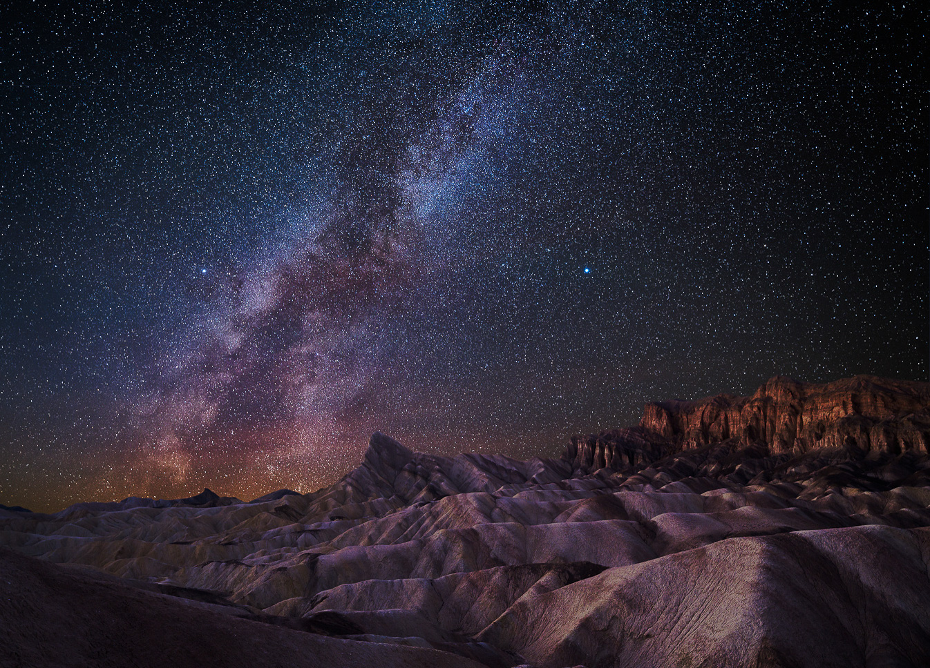
Congratulations, Dawn! A technically well-executed MW image AND a nicely balanaced composition that also creates a sense of place.
I find that there is much that is a matter of taste when it comes to processing a night-sky landscape image. Some folks prefer warmer hues, others prefer cooler. Some like a bit more clarity, especially in the details of the MW, others feel that thsat's going too far. Some folks opt to reduce the number of small pinpoint stars, so as to give more subjective weight to the few that remain; others like the billions-and-billions look. I don't believe there's a right or wrong preference, so long as the result feels internally consistent and the viewer doesn't end up questioning whether they've been manipulated by the maker.
My personal prefereence is for a little less density in the field of stars and a bit more detail in the MW. Given the location, I would opt for a slightly warmer presentation of the land.
I also feel that it would do no harm to trim just a little bit off the left and bottom edges and thereby reduce in space devoted to the mostly featureless flat area lower left.
All-in-all a gorgeous image. Well done. |
Feb 25th |
 |
| 93 |
Feb 23 |
Comment |
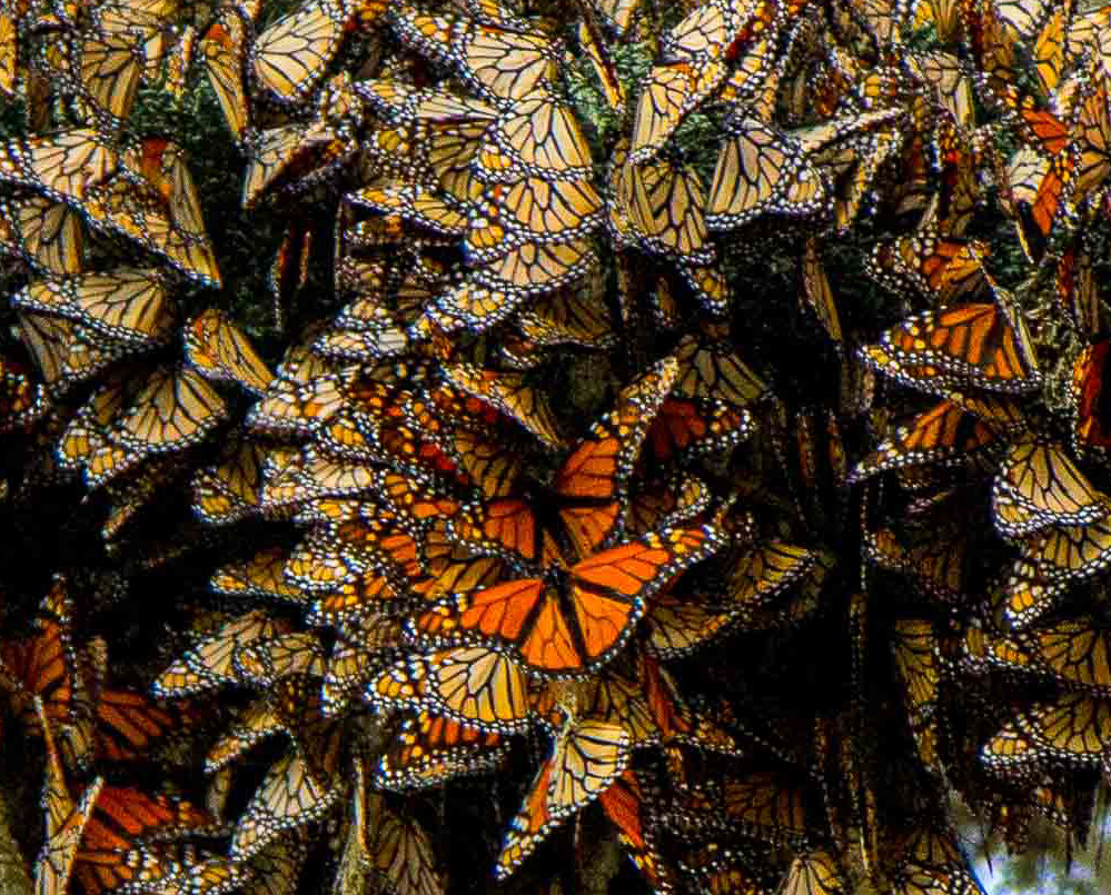
Wow. It must have been a powerful experience to witness this.
If I might make a souple of suggestions? I've come to think of interest in an image as based on the intersection between subject matter and visual interest. Ideally, I think, there will be a strong mconnection between the two, so that the visual interest will pull the viewer into the image in the first place and will support the subject matter interest that is the story.
In this image, the subject matter interest is unmistakeable. The visual interest (for me, at least) is first generated by the color constrast of the saturated orange-reds against the field of grayer greens; there is a measure of interest in the sweeping curve I'm assuming is a branch of the tree on which the Monarchs are resting; and there are strong distracting points of bright sky.
Technically, I think you made a great choice with the shallow depth of field, and the exposure seems spot on.
Composition-wise, one hears all the time advice to trim away everything that doesn't strongly support the subject or story. I wonder if in this case you wouldn't have been better served by a tighter crop? One that dispenses with the comparatively featureless and (appropriately) soft gray-greens? This would also help to odispose of the brighter sky patches. I think, too, that this could be done without diminishing the marvel of the masses of butterflies, even if the image no longer showed as large a massing. In fact, by cropping in so tight that there is no discernable limit or edge to the mass, the viwer is left to imagine that the mass extends indefinitely in all directions.
|
Feb 25th |
 |
| 93 |
Feb 23 |
Reply |
Thanks, Darcy. FWIW, it got a very low score in competition last night. The judge (correctly) objected to the fact that there's really nothing much that asks to guide the eye into the image. I do have ore pixels at the bottom, so I might investigate to see how much effort it would take to rework a wider crop. |
Feb 14th |
| 93 |
Feb 23 |
Reply |
Hi, Stephen, thanks! Regarding the shuther spped, it might have been that I could have gotten away with a slower shutter. However, I have sometimes found that if I want to stop water droplets in their motion I'm best off to go as fast as I can. Keep in mind that that's a two-meter swell, and the total height of the spray was probably close to ten meters, and that entire volume of water rose to that height and fell again in only a few seconds; the individual droplets at the extreme would have been moving pretty fast.
As for the mushy areas where the water was moving towards me, after rethinking my comment, a faster shutter probably wouldn't have helped. Perhaps a larger sensor to get even finer detail might have helped, but maybe not. Sometimes the issue isn't a technical one, it's one of position and perspective. |
Feb 13th |
7 comments - 4 replies for Group 93
|
7 comments - 4 replies Total
|


