|
| Group |
Round |
C/R |
Comment |
Date |
Image |
| 93 |
Dec 22 |
Reply |
Thanks for weighing in, Paul. |
Dec 27th |
| 93 |
Dec 22 |
Reply |
Thanks, Dawn. You might find interesting my reply to Paul regarding the edits for the ripples. |
Dec 26th |
| 93 |
Dec 22 |
Reply |
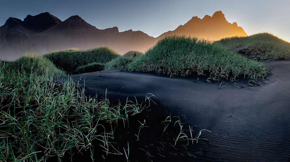
It certainly *felt* very alien. The diffuse glow hitting the water vapor between the dunes and the mountain lasted for about fifteen minutes, but starting well before I took this shot ... what caught my attentio was when the light kissed the top of the grasses, and the sun rose higher rapidly, and the light was lost. So if my recollection can be trusted, I had about three or four minutes to take this shot before the light was gone.
I'm not sure I can trust my recollection, though. It was cold. I was tired. And I still had a long and difficult trek in the wet sand back to meet the rest of my group. And I was concerned that I might be holding them up. So I hurried. |
Dec 26th |
| 93 |
Dec 22 |
Reply |
Any better? |
Dec 26th |
 |
| 93 |
Dec 22 |
Reply |
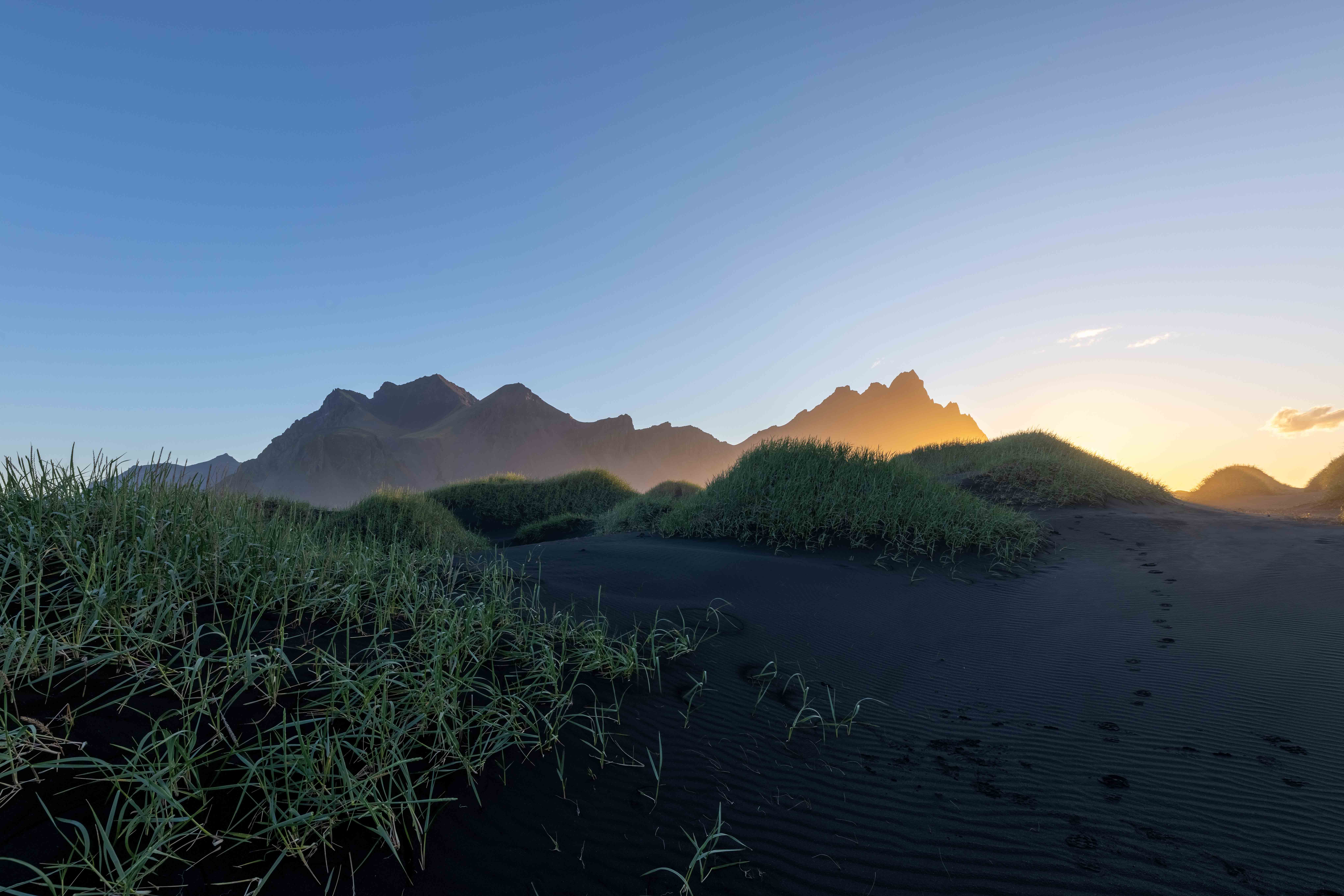
Thsanks, Ed. I, too, have found the sunglow a bit problematic. After reading your remark, I took a look at the original HDR merge, which I'll add here, and then I was reminded that the glow was actually centered further to the right, and makes much more sense if more of the frame to the right is included. Unfortunately, I couldn't find a crop that I liked that extended any further to the right, as the expanse of black sand on the right was just too broad.
However, looking at that original HDR merge revealed something to me. In my efforts to give more structure to the mountain face, I had gradually, and without realizing it, greatly darkened the eastern summit. I think that contributed to the di squieting effect. As a result, I've gone back in and restored it to more like it was originally. I'll also post that revision. Will be interested in your take. |
Dec 26th |
 |
| 93 |
Dec 22 |
Reply |
Thanks, Paul. Well, yes, I did use Topaz Sharpen AI, but mostly to try to get a bit more texture/structure in the mountain. It really didn't have a lot of impact on ripples. I haven't checked, but I might have even maked the sharpening in only on the mountain.
To bring out the ripples, the step that had the greatest impact used luminosity masking to select the lighter areas in the ripples, and then pulled them up using a curves adjustment layer (with no actual adjusgtment) in *screen* blending mode, then placed that adjustment layer in a group and painted in the effect on a mask.
Note that I mprobably painted in, one way or another, forty or more small adjustments in luminosity (or color balance, or desaturation, or contrast, or ...) here and there, so it's really hard to blame the result on any one particular technique. |
Dec 26th |
| 93 |
Dec 22 |
Comment |
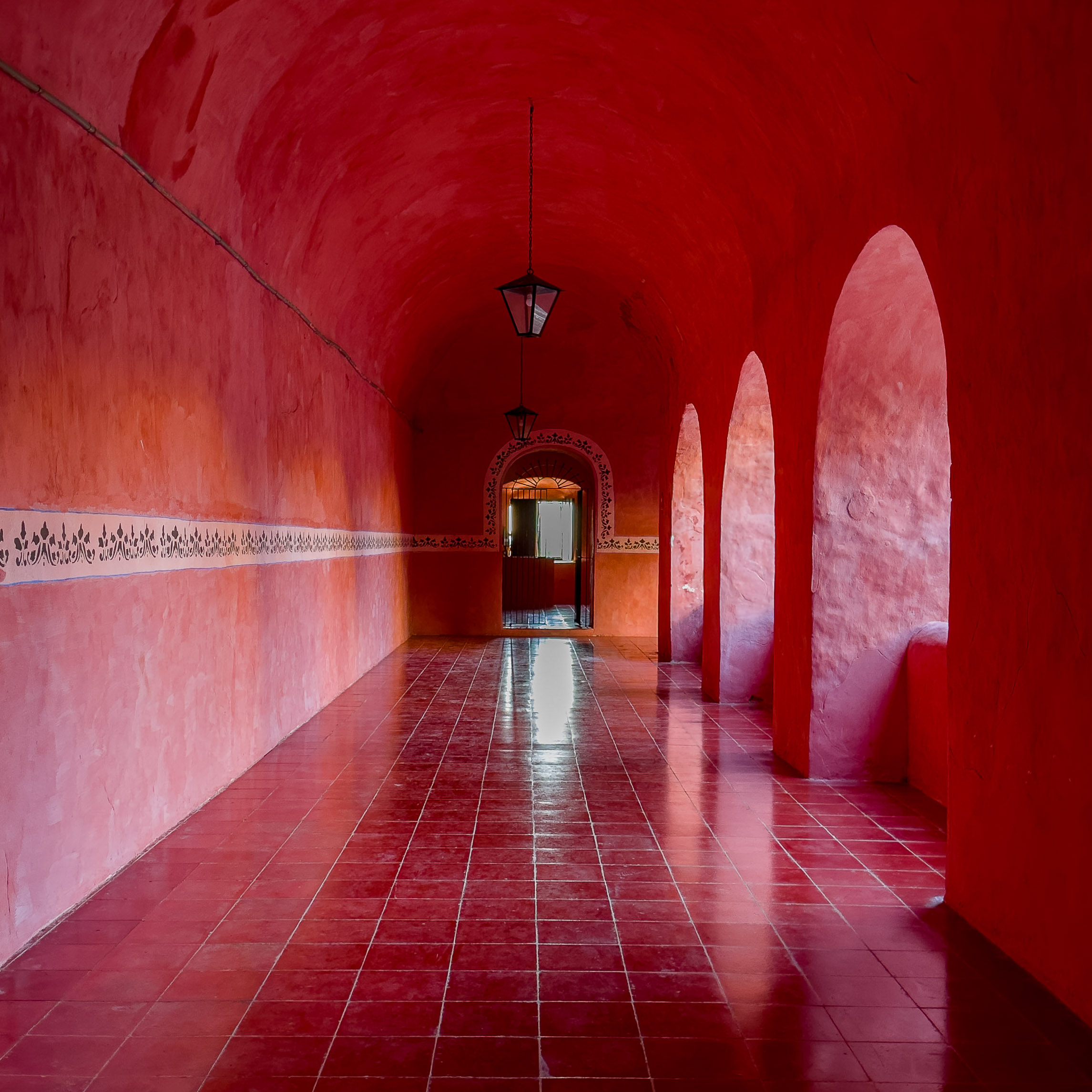
A VERY interesting study in light, shadow, reflection, and geometry! And, yes, color (Red! Carnelian! Lots of it!).
I can see that you took a great deal of care in positioning yourself: dead center in the walkway, elevated at exactly the height of the tile border, etc. To my eye, then, this begs for a square crop, thus accentuating the geometry, and providing the opportunity to remove a bit of the more or less uniform (and thus less visually interesting) ceiling.
I found that the bright reflection on the floor was distracting. I dropped in a tall, narrow radial gradient centered on the sill of the doorway, and slightly reduced the exposure, highlights and shadows, and nudged up the clarity and dehaze. The effect, I think, is to give the reflection less "glare", and to add a little visual distinction towards the doorwayt and (maybe) create a bit of intrigue ... what's beyond the door, anyway?
|
Dec 26th |
 |
| 93 |
Dec 22 |
Comment |
Very amusing! And kudos for figuring out how to pair ornaments with landscapes! I actually had to study it for a few seconds to confirm for myself that it wasn't a composite! I get a kick out of images where the eye / brain connection asks "What's wrong with this picture?"
Dunno what's just out of frame, but it think this might have benefitted from framing it a bit wider. |
Dec 26th |
| 93 |
Dec 22 |
Comment |
A Visual interest created by the variety of textures and geometries.
At first (for a few seconds) I thought you had belnded a B&W conversion with the color version of the ornaments, but I quickly realized my mistake. I kinda enjoyed the fool-the-eye trick.
If I may quibble? I think it unfortunate that the red bauble is right on the edge of the frame. If you don't have any pixels to add o the right, then mebbe clipping just a wee bit of it off? |
Dec 26th |
| 93 |
Dec 22 |
Comment |
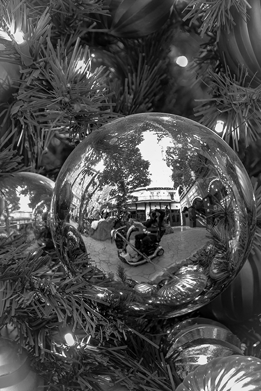
Very nice composition, and I think you did a great job on the B&W conversion. While it's less "feastive" than the color version, I think it does a better job of giving us the sense of the shiny bauble, glittering and fragile glass that it is.
I did find I wished for a bit more to distinguish the bauble from the tree, so (surprise! surprise!) I did tinker with the image. Kept it in LrC (no fancy Ps trickery). Dropped a 100% feathered radial gradient on the bauble, only slightly larger, bumped the contrast, bumped the whites, dropped the blacks, and nudged up the clarity and dehaze. This makes the bauble glisten a bit more. Then duplicated the mask and inverted it (now this is everything *except* the bauble), dropped the contrast, and nudged downwards the dehze slightly. This makes the tree less visually imposing.
Also: I think I have learned here that you have some mobility limitations. If so, I'm impressed with your ability to get around and create the diverse set of images you've shared here. Kudos. |
Dec 26th |
 |
| 93 |
Dec 22 |
Comment |
I've really enjoyed spending some time with this image. There's a lot for the eye to explore, and I really am a sucker for night or low light photography, especially when done well as in this case.
The banged-up food truck (I'm guessing that's what I'm seeing) is a cornucopia of visual teasers, though I wonder if the image would benefit from dropping the brightness of the front face of the truck.
For what it's worth: my very favoritest area of the image is the little puddle lower left. |
Dec 26th |
| 93 |
Dec 22 |
Comment |
Kelly, I really like the distribution and clustering of color in this image. To me, it does a great job of suggesting the transition into "peak foliage".
If I may, in the hopes that these come across as helpful, I'll make a couple of suggesations. While the foliage is an interesting subject, it does not provide (in my opinion) enough *visual* interest to justify the large amount of the canvas it occupies. The stream and stones offer up some additional visual interest, and can serve as a leading line into the woods beyond. If the terrain permits, and you have the mobility/agility for it, getting down lower and wider might serve you well in situations like this.
This also appears to be a situation where exposure bracketing might have been in order, as the shadows are frustratingly blocked up. |
Dec 26th |
| 93 |
Dec 22 |
Reply |
Thanks, Paul! Yes, the ripples fascinated me, too. Almost like water. |
Dec 21st |
6 comments - 7 replies for Group 93
|
6 comments - 7 replies Total
|