|
| Group |
Round |
C/R |
Comment |
Date |
Image |
| 93 |
Nov 22 |
Reply |
I always compose my comments before I read the maker's narrative or the other comments. Now that I've done so, and read you narrative, I should say that I think you made a good call with the work on the stem, and with the vignette. |
Nov 5th |
| 93 |
Nov 22 |
Comment |
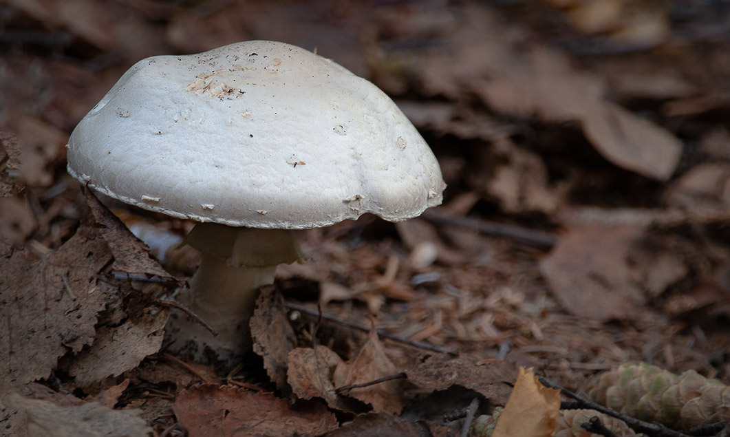
This makes for a nice "portrait" of an interesting subject. And congratulations on makign a macro image. I find the very thought intimidating, and have never ventured to do so.
A couple of thouights on the result: I think the image would benefit from a bit of "oomph" to make the mushroom "pop" a bit. You know me, I can't resist the temptation to "fiddle", and I found it relatively easy to get the effect I was looking for.
In LrC, I plopped a radial gradient on top of the mushroom cap and boosted the Dehaze somewhat aggressively (+20) and droppped the temperature lightly (-7). I also briushed in an adjustment along the lower edge and up by the lower corners, where I dropped the Dehaze (-29) and then compensated for the luminosity effect by dropping the exposure (-0.46) and the highlights and shadows (-19 each). To my eye, this pulls the murhroom forward visually and helps to make the floor litter a little less interesting to the eye.
(Again, to my eye) the mushroom feels "crowded" up in the corner; I would wish for just a little more "breathing room" between it and the edge of the frame. Sometimes one can use CAF in Ps to add a bit of canvas; and then again, sometimes one just can't get Ps to do a decent job of it. This time I was pleased with the outcome.
I hope you like the effects, but these are matters of personal taste, and my opinions are purely subjective. Just "cuz" they're mine doesn't necessarily make them right.
|
Nov 5th |
 |
| 93 |
Nov 22 |
Reply |
I'm glad it works for you. Sometimes I worry that I come across as a bit "too full of myself." |
Nov 5th |
| 93 |
Nov 22 |
Comment |
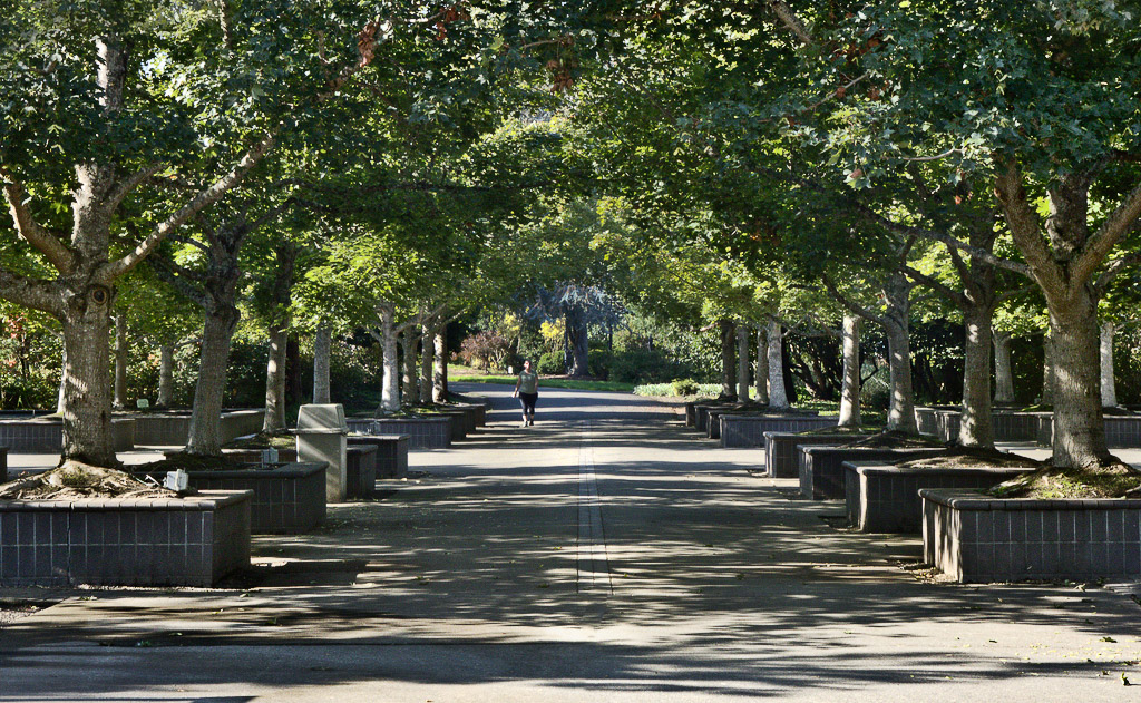
This image makes me feel nostalgic. I feel comfortable and safe, wrapped coccoon-like in the tunnel under the foliage canopy.
The story is definitely enhanced by the inclusion of the human figure. I can easily imagine myself as that person, or as waiting to greet that person when they arrive at where I'm standing.
As usual, I "fiddled" with it; I hope you don't mind. I felt the image might benefit from lifting the luminosity a bit, and scupting with contrast to get a greater sense of depth. Ifound that I could heighten the sense of the tunnel by trimming some of the band of foliage off the top. I also got rid of the distracting black line front and center.
It's quite possible, of course, that you prefer the darker and more narrow feel. These are all matters of taste. Take my "fiddling" please as merely a subjective suggestion or experiment. |
Nov 5th |
 |
| 93 |
Nov 22 |
Reply |
I forgot to mention: you might have found this a good situation in which to intentionally use a more shallow depth of field, allowing everything to go soft towards the rear. We always hear "everything needs to be sharp, front to back", but (IMNSHO) I think there are times when that's just not true. |
Nov 4th |
| 93 |
Nov 22 |
Comment |
To me, the interest factor here is one of subject interest. Although the markers further back in the sunlight are quite bright, they lack any detail to sustain the pull on my eye, so I move very quickly to the important intended subject, the marker front and center, where there is detail (in the engraving) to engage my eye, and once I've read the marking I find there's no mistaking where you want me to be engaged. It works very well.
I "fiddled" around a bit -- no surprise there, I suspect! I felt that it wouldn't do any harm to gently add a bit of edge contrast to the engraving on the subject marker. I did this in Ps using a high-pass filter, but one could probably get the same effect in LrC with the Clarity and/or Texture slider.
I think there are a couple of tweaks to the composition you might want to experiment with. The layout of the array of markers on the left side of the frame is such that they form radiating lines that converge at the rear of the image. This effect is almost impossible to avoid with this sort of arragement; no matter where you had stood you would likely have found the effect present to some degree. Unfortunately, here this exerts a strong tug on my eye away from the subject. I found through experimentation that I could mitigate the effect significantly by cropping in far enough from the left to eliminate the leftmost such radiating line. Having had some success with that, I also came in a tad from the right to get rid of the fragment of marker on the right edge. Finally, I felt that there was perhaps a bit more of the bank of tree foliage in back than really necessary, so I came down a bit from the top edge. (Turns out, I kinda liked the emotional impact that this last step had. It feels to me more compressed, even a bit more gloomy.)
I'd also suggest you consider whether the bright and saturated grass supports your story well. To me, it doesn't so I reduced the saturation a bit, and burned down the brightest markers a bit, too.
All a matter of taste, of course. You might very well not like the adjustments at all. Take it all as subjective suggestions for experimentation, to see what pleases you.
|
Nov 4th |
 |
| 93 |
Nov 22 |
Reply |
There does appear to be a technical issue with the image that I'd strongly suggest you nvestigate and learn how to avoid or correct: some extreme chromatic aberation. At first I only noticed it around the human figure, and misinterpreted it as a halo artifact introduced in post-processing. But then I realized it's pervasive in the grasses, and I don't know of a way to create those symptoms in post, so I'm inclined to discount that explanation.
|
Nov 4th |
 |
| 93 |
Nov 22 |
Comment |
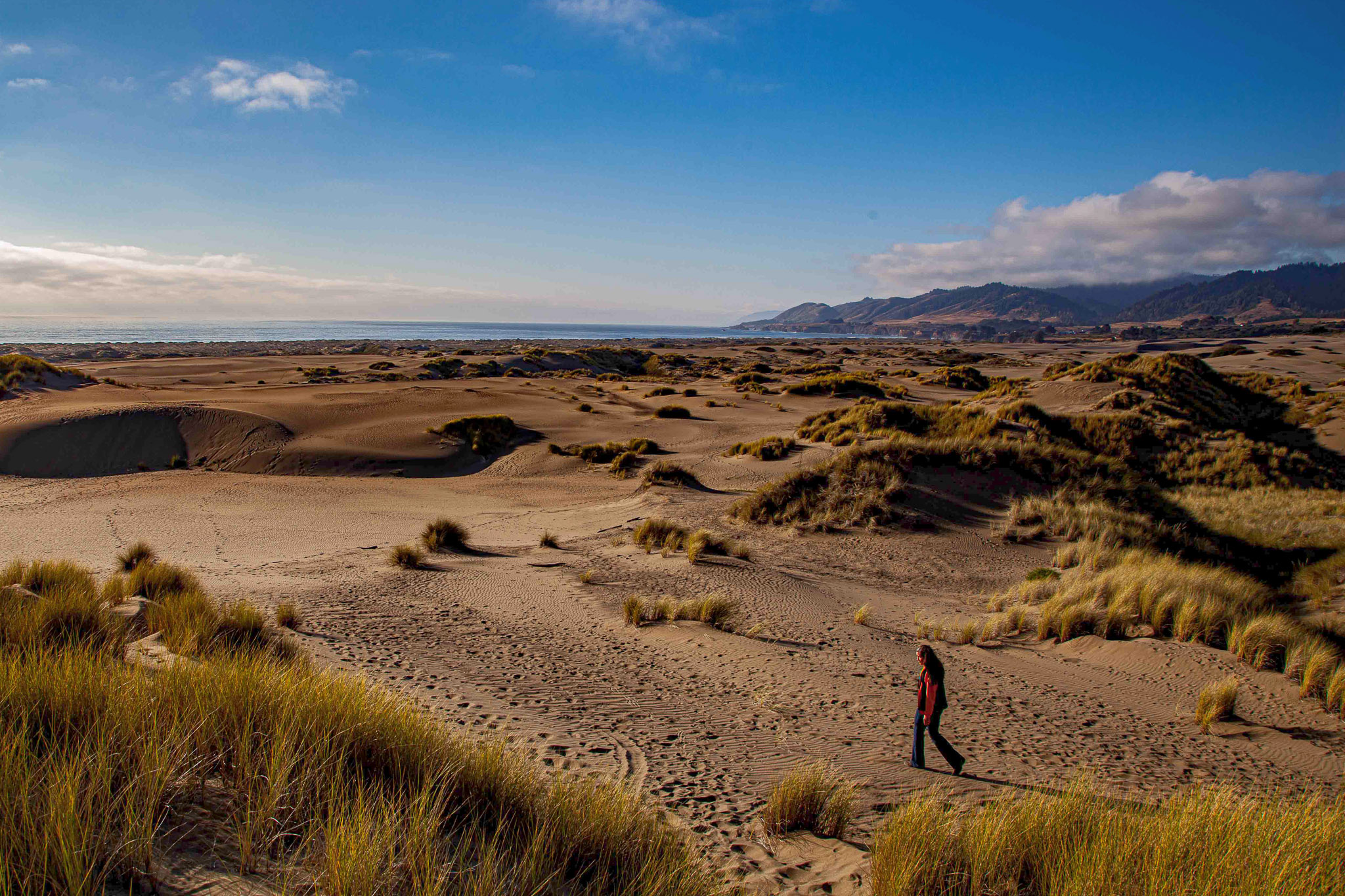
To my eye, the visual elements here with the greatest impact are the strong light/dark contrasts, the warm/cool tone contrasts, and, of course, the presence of the human figure.
There's a conventional wisdom that it's generally a good idea to avoid placing a strong horizontal division (such as the horizon) on or near the vertical center of the frame; ditto for the analogous vertical line situation. There are times when I find it works well to place the horizon (or similar dividing line) dead center for visual impact, but I generally find it works better to place it on or near either a division into equal thirds (the so-called "Rule of thirds"), or a division by the golden ratio. To my eye, this image benefits by cropping down from the top far enough to end up with the horizon on a golden ratio division. These days, the 3:2 aspect ratio is widely used, and seems to work well for a mid-range focal length image like this; if you do consider cropping down, you might want to also consider coming in from the left so as to maintain your original aspect ration.
I really ike the gold/blue contrast, and the dark/light contrast. I find the blocked up shadows to be frustrating, though I can appreciate the dramatic impact that they impart. If you're only intending to share the image digitally at small size and low resolution, the clipping probably won't be too much of a drawback. If you ever intend to print, though, you might want to revisit your edit to see if there's anything you can do to remedy them, as you'll find them to be a serious problem. I experimented with your JPG and found I was able to mitigate the issue somewhat in Photoshop by adding a do-nothing curves adjustment layer, in Screen blend mode, masking it using a Darks-4 mask so that the impact was limited to the darkest shadows, and then going one step further and masking out the impact on the center area of the image. Now I realize you might not like the effect, as the result is less dramatic; take it as a subjective suggestion only, please.
|
Nov 4th |
 |
| 93 |
Nov 22 |
Comment |
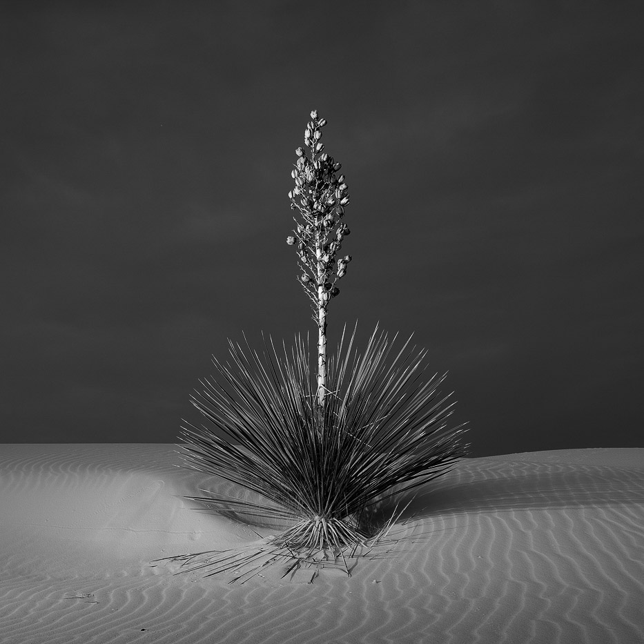
Yup, that is indeed a yucca! I'm guessing that this was captured in White Sands National Park. (Reminder, I don't read the narrative 'til after I've commented.)
The conventional wisdom is that the eye is always drawn first to the brightest area of an image and I suppose that that is very nearly always the case. I find, though, that there are other factors that come into play -- in particular, those that affect how long the eye remains drawn to a particular area.
In this image, the brightest area is not, in fact, the sands; it is the blossom stalk, which is also quite visually interesting due to the detail and texture, and by virtue of standing out in strong contrast against the darker backgbround.
Having explored the blossom stak for a whilte, my eye is drawen to the darker splay of leaves. I'm reminded that, probably for reasons that would have made sense under more dangerous conditions as we evolved as a species, our eyes are often far more interested in the darker areas, so long as there is detail there to explore, as is the case here.
My eye naturally follows the leading lines down to the base of the plant, where it is delighted by the small element of symmetry, and ultimately discoverrs the rippled texture of the sand.
All in all, there is much here to delight and engage the eye. The stark simplicity of the composition and color palette serve to support, rather than distract from, the central visual elements.
I also enjoyed eventually discovering the slight diagonal asymmetry.
This image makes me feel centented and happy.
I find no fault at all with your decision to place the plant dead center in the composition. If you haven't already done so, you might want to experiment with a classic square crop, which adds a bit of extra elegance to this kind of image. Granted, that would cut off a bit of the plant's shadow, which you mmight find an unacceptable loss.
Also: did you consider experimenting with a black and white conversion? Although the color in the image is lovely, you might find you like the impact that can be achieved when you remove color as a distraction.
|
Nov 4th |
 |
5 comments - 4 replies for Group 93
|
5 comments - 4 replies Total
|


