|
| Group |
Round |
C/R |
Comment |
Date |
Image |
| 93 |
Oct 22 |
Reply |
Thanks for asking. Sorry I was so sluggish in getting back to you. My workflow was as follows:
1) Stack and align the layers in photoshop
2) Select the full set of layers
3) Convert to Smart Object (Layer -> Smart Objects -> Convert to Smart Object)
4) Convert the one smart Object layer to a Linked Smart Object (Layer -> Smart Objects -> Convert to Linked ��)
5) Open the Linked object by double clicking on the layer that links to it
6) In the linked object, enlarge the image canvas (Image -> Image Size) to the desired size (I find it easiest to specify the size in percent), and (Important!) check "Resample" and select "Automatic" in the adjacent drop-down.
7) At this point, if you check the canvas size (Image -> Canvas Size) you will see that it has adjusted to match the change in image size.
8) Save and close the linked object. This can take a long time, depending on the number of layers and size of the image.
9) Back in the original file (which now contains a single layer that links to the resized stack), it's necessary to also enlarge the canvas to make it big enough to contain the entirety image from the linked-to stack (Image -> Canvas Size; use the same adjustment factor as applied to the Image in the step above).
10) Finally, I could "average" my stacked layers In the containing file (the one with the link to the stacked layers), select the Linked Smart Object layer, and specify the stacking mode (Layer -> Smart Objects -> Stack Mode -> Mean).
11) I my case, since I needed to stack using two different modes, now I duplicated the layer that linked to the stack, and changed the stack mode on the duplicate layer, and then of course I had to blend the two layers together.
|
Oct 30th |
| 93 |
Oct 22 |
Comment |
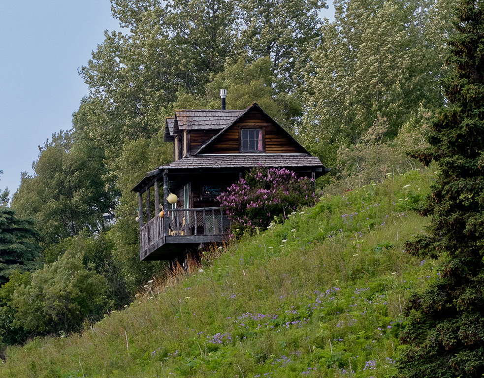
This tells an interesting story of this house precariously perched on the hillside. The title perplexed me a bit, as the window doesn't seem to figure prominently as a visual element of interest. I'm speculating that, to you, the story here is one of looking out of that window.
To my eye, the image is a bit flat, but I didn't find it difficult to put some life into it: I pulled down the exposure a bit, cooled it a tiny bit, pulled the blacks way down, ditto for the whites, bumped the shows a bit, and cracked up the saturation and luminance of the reds and oranges. This last step did serve to give more visual weight (to the reddish-brown face of the house with the window, which I think gave some visual emphasis to the window.
I find this a good case study in the use of diagonals, which as generally experienced as harmonious and generally pleasing. I like the use of the tree on the right as a framing device, keeping the eye from following the diagonal up and out of the frame.
|
Oct 30th |
 |
| 93 |
Oct 22 |
Comment |
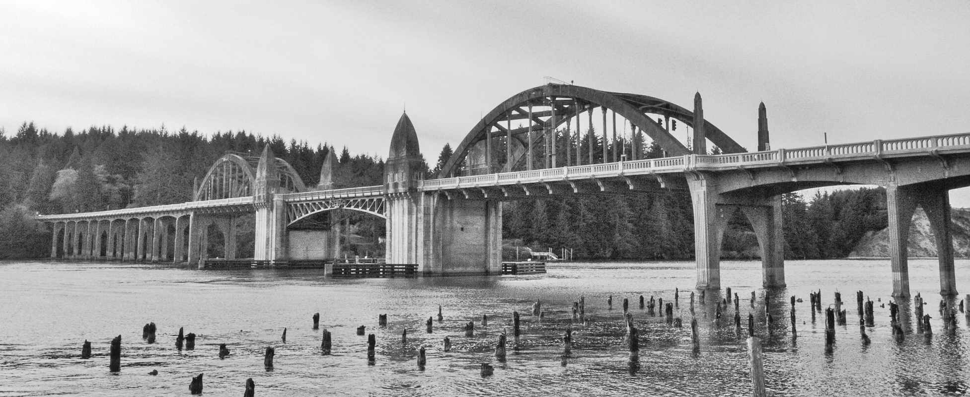
An interesting juxtapositioning of subjects: the bridge, which I'm guessing to be of WPA vintage, and the pilings that are the only remains from something (piers, maybe?) now long gone.
I suggest you might want to consider trimming away about half of the sky. To my eye it occupies more "real estate" than the value it contributes. Going for a more panoramic format would also accentuate the length of the bridge.
At first, I took this for a black and white image, as it is so nearly monochrome. Once I realized it was in color, I experimented a bit; if that's something that interests you, you might find you could make the image more impactful in black and white.
|
Oct 30th |
 |
| 93 |
Oct 22 |
Comment |
Wow! This has it all: light, contrast, color, geometry and atmosphere! A very fortunate opportunity, and you made very good use of it.
Must have been tricky to expose; I haven't read your narrative (I prefer to review these images on their own merits without benefit of the narrative, which I read after making my comments), but I did notice when I downloaded that there were three "originals" and I'm guessing you bracketed the exposure.
If I may quibble just a little bit, I'd suggest you might benefit from toning down the brightly lit area to the right, and trying to pull a bit more detail out of the deep shadows near the bottom of the frame. If something (peris, maybe?) long gone.you're feeling like getting risky, you might also find it fun to play with using the clone stamp tool in "Color" brush mode, and brushing in (very gently!) some of the red-orange glow from the right into the point and to a lesser extent into the lit areas on the distance rock walls.
It's a really gorgeous image.
|
Oct 30th |
| 93 |
Oct 22 |
Comment |
Very fun! One needs to be careful with this treatment, as it can easily seem "gimmicky", but I think you pulled it off pretty well, here. I'm guessing you had to make a few decisions as to what you would leave in Technicolor, in particular how to treat the chair, and to my mind you got it all right.
The black and white conversion was well executed, too. There's one area that I find a tad troubling: to my eye, there's the appearance that you dodge the water in the region around the chair, presumably to heighten the contrast with the chair. That's fine, no problem, but it's apparent to the viewer. Or, if you didn't in fact do that (perhaps that's just light reflecting off a brighter area of the clouds that we can't see behind the umbrella), then there's the unfair illusion that you did. In either case, I suggest the image would benefit were you to smooth out the transitions in luminance to the left and right of that area.
You wight want to consider cloning out the post and rope lower right hand corner, or at least making them contrast less with the sand behind. I suspect that if you were to invest the time and effort in cloning them out you'd find the grasses on the right and left form a nice framing device that is diminished in effectiveness as it is.
|
Oct 30th |
| 93 |
Oct 22 |
Comment |
All in all, a very engaging image. My eye is drawn first to the brightest clouds, but doesn't stay there, moving instead almost immediately to the lit streaks below, which I'm assuming are sunbeams cutting through the clouds and striking the mists. My attention is held long enough, I'm engaged enough, to wonder as to what those streaks are. From there my eye wonders down to the trees silhouetted against the brighter water, and then further down to those lining the lower edge of the frame. I glance at the darker forested regions but my eye is frustrated by the lack of discernable features and moves on. Eventually I do also engage with the more distant mountains, especially those on the left side of the frame.
I think I might wish for the shadows to be opened up just a bit in the forested areas, as there is some detail there. I think those areas could make more of a contribution to the overall level of interest. I think it made sense, though, to keep the silhouetted trees as dark as you did.
I'm surprised by your decision to go for a black and white conversion. Not that I object, just surprised. It certainly results in a telling of a different story than the customary one of lushness.
|
Oct 30th |
5 comments - 1 reply for Group 93
|
5 comments - 1 reply Total
|


