|
| Group |
Round |
C/R |
Comment |
Date |
Image |
| 93 |
Sep 22 |
Reply |
I'd love to see an edition that shows more of it ... |
Sep 16th |
| 93 |
Sep 22 |
Reply |
As a genwral rule I do try to stay in the f/8 to f/11 range for "normal" focal lengths, but I don't consider it a hard and fast rule. There are times when I need a slower or faster shutter. Sometimes I know I'm going to need to focus stack; if I'm going wide and need to focus stack anyway then I'll likely open up the aperture further. |
Sep 16th |
| 93 |
Sep 22 |
Reply |
And ... if you could see a rainbow then it definitely isn't a flare ... |
Sep 16th |
| 93 |
Sep 22 |
Reply |
Ahh ... thanks for the correction, then! I was guessing the Sun more like at 2 o'clock relative to the direction you were facing. My mistake. |
Sep 16th |
| 93 |
Sep 22 |
Comment |
A nicely evocative portrait of a biker. Well done. It helps that he's positioned so that there's a bit of side lighting. Would have liked to see him without his dark glasses.
As for the flag, yes, I think it belongs there, but it's unfortunate that it's coming out of his head. I agree with Dawn about getting the rest of the shadows. |
Sep 16th |
| 93 |
Sep 22 |
Comment |
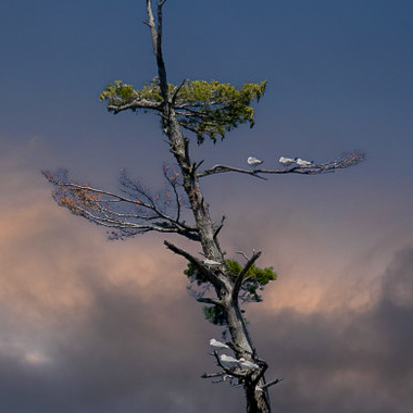
I really like the palette here.
Art first glance, I didn't take in the terns; I misunderstood and thought the image was about the dramatic sky.
To pull the attention in more, you might want to consider a tighter crop that dispenses with the lower portion of the tree. A square crop seems to work nicely, in my opinion. (I also felt that there was a little too little room between the top of the tree and the edge, so I solved that by cropping in so that both the top and bottom of the tree exist and enter the frame on a rule-of-third intersection.
The result is kinda "moody" so I thought I'd run with that and make it even less contrasty. It's a matter of taste -- you might not like the effect.
Is it a just a bit soft? It's hard to tell with these compressed files. |
Sep 16th |
 |
| 93 |
Sep 22 |
Comment |
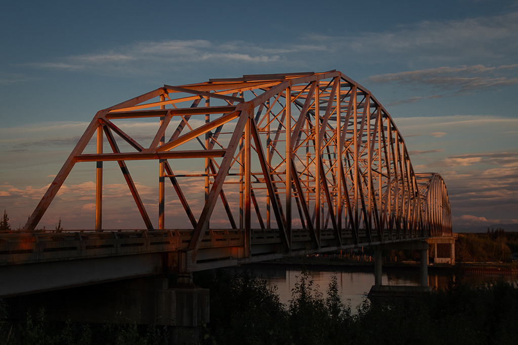
Great shot! I love the palette, and it's a beautiful use of the golden-hour light. You did a job job of getting detail in the darkest area, and I think you made the right decision to not try to bring them up in post.
I dare say you could get away with a bit more color grading ... but exercise restraint ... |
Sep 16th |
 |
| 93 |
Sep 22 |
Reply |
I see now that you did use a CPL. Good move (in my opinion).
Also: I forgot to note one more nearly trivial fiddle I indulged in: I shaved just a bit off the top.
|
Sep 15th |
| 93 |
Sep 22 |
Reply |
Neil, Dawn, I suspect that's a lens flare. For a rainbow to manifest, one would need the Sun to be bouncing off atmospheric water droplets in the direction of the rainbow, and all indications are that there were none.
Removing a lens flare in post can be painful, but is often a rewarding exercise; once you've done it a couple of times and know that it actually can be done, it's a lot less daunting. There are several YT vids on how to do it. |
Sep 15th |
| 93 |
Sep 22 |
Comment |
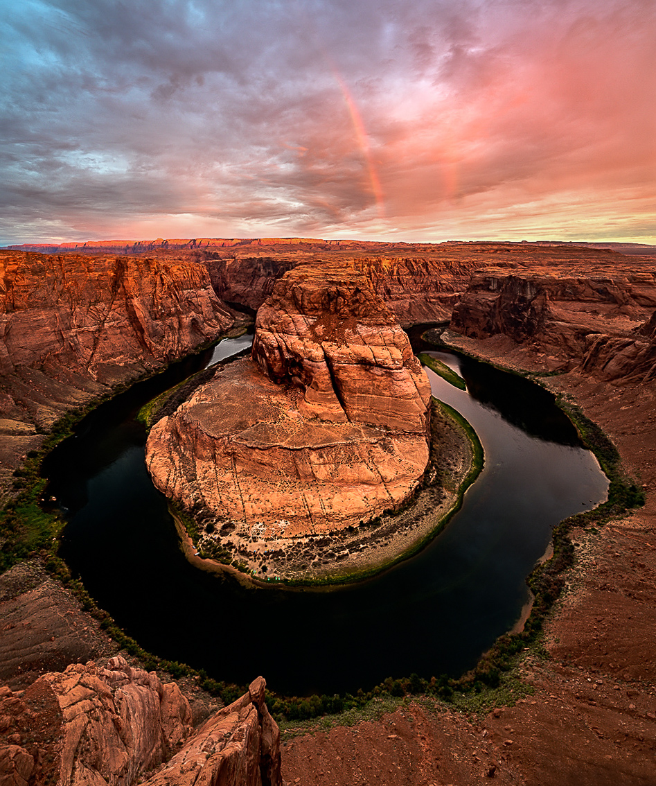
What a moment that must have been! (Note: I haven't yet read your narrative or others' comments ...)
Judging from the apparent direction of the light, I'm speculating that this must have been taken in high summer, in which case you would have had to get up very edarly and trudge across the sand in the dark. Oh, and trying to set up in a fairly sketchy location -- in a hurry. Kudos for the hard work.
I really like the colors and tonal balanace here. The sky really helps, without stealing the show. Sometimes one goes to all that work and gets little to show for it.
I like the deep dark of the River; it really helps with setting off the stone. I find a couple of tonal issues that are fairly easily addressed. The central area is really where one wants the eye to settle, so I think it bears bringing it up a bit, maybe adding some clarity. The brightness at the horizon competes with the central area for my attention, but doesn't exactly (in my estimation) justify itself, so I think it would help to tone that area down a bit. Similarly, the bright reflection on the left benefits from getting toned down.
I don't doubt that the image is actually level, but it *feels* slightly tilted. Sometimes one is better off lying to the viewer and "correcting" a true horizon so as to make the viewer feel better. That's a matter of opoinion, of course.
I've never been there, but my understanding is that it's a challenging location to compose. I suspect you may have been "seduced" by the drama in the sky (which I see you subsequently sacrificed) and therefore went with a vertical orientation, but that seems to have been at the expense of some breathing room on the sides. Assuming you were already as wide as you could get, I think you'd have been better off in landscape orientation.
Question: did you consider jusing a CPL?
|
Sep 15th |
 |
| 93 |
Sep 22 |
Comment |
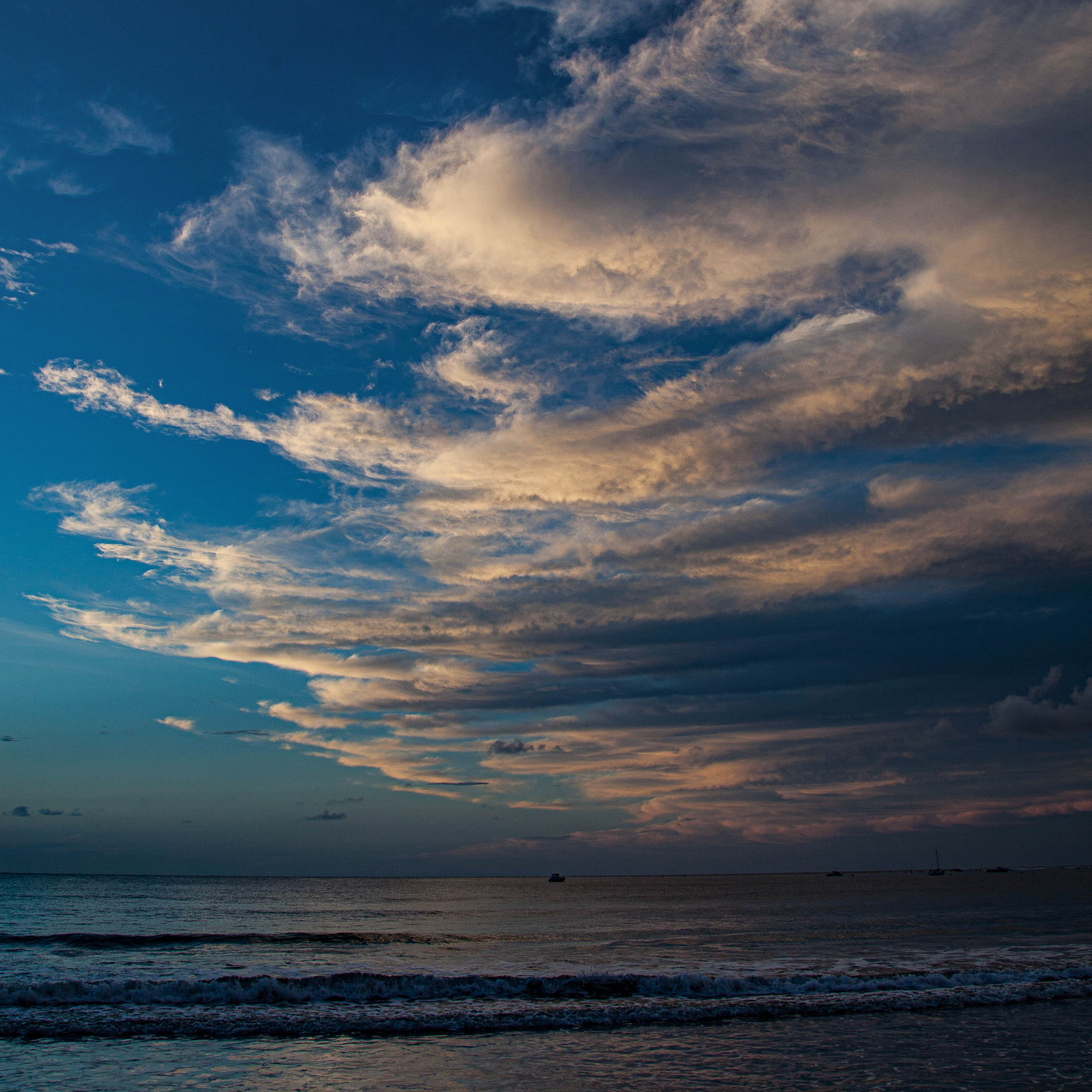
The colors are goregous, here, esp. the illusion of purples created by the miixing of blues and reds in the water.
Images that are comprised solely of sky and water are, I find, extremely difficult to make compelling. I think it helps if one can establish a sense of depth. and to try to convey a "you-are-there" sense. One way to achieve this is to pay attention to the markers that give our eyes and brain clues as to relative distance. This can be done in the water by accentuating texture of close and de-emphasizing it near the horizon. Something similar can be done in the sky, and with this particular image I think doing as much pays off.
You might want to experiment with a square crop. |
Sep 15th |
 |
| 93 |
Sep 22 |
Reply |
... and ... just for fun ... I took it over into Ps. Not claming the result is a good image, it was just fun ... |
Sep 15th |
 |
| 93 |
Sep 22 |
Comment |
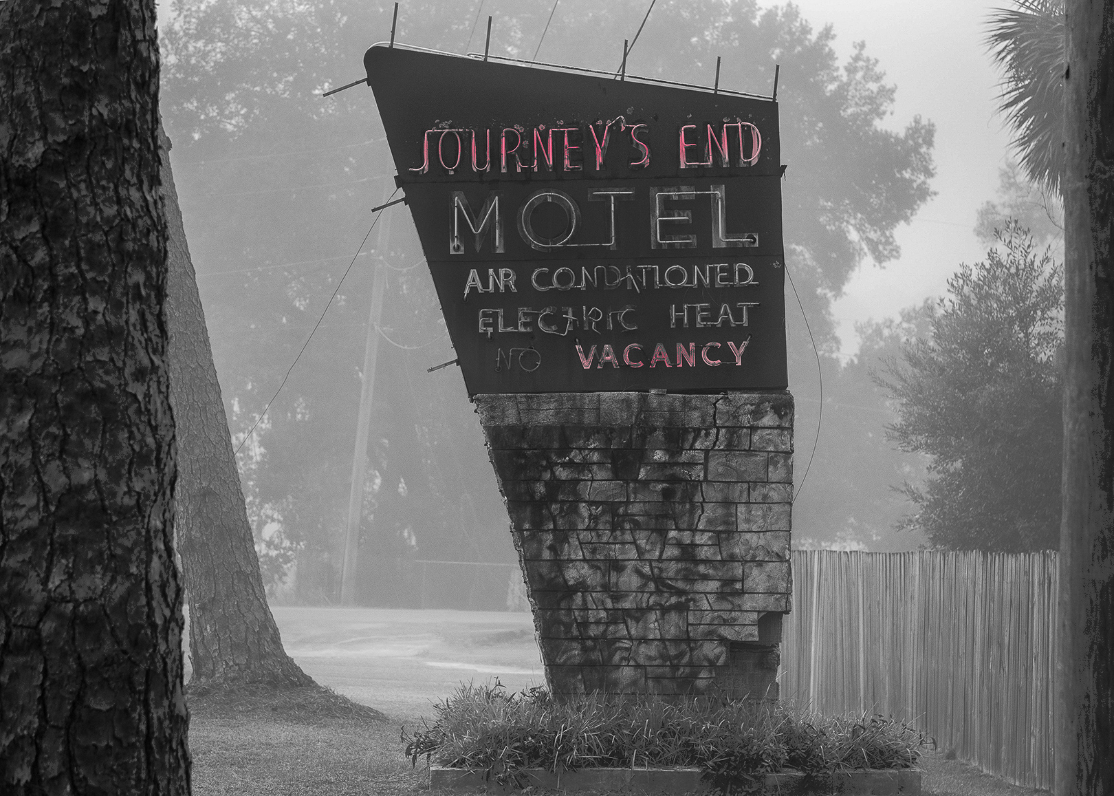
I ienjoy the joke, but I confess I didn't get it right away.
I like the B&W version, and I suspect this couldn't be made to work in color. I think the image benefits from heightening the separation of the sign from the background, darkening it, and applying some clarity to the lettering. Now you may feel that I lost something in berightening up the back as much as I did; in my defense, I keep saying "walk towards the light ..." (aLL edits in LrC).
In terms of composition, I'd have liked to havee had a hair more breathing room at the top, and (if possible) some separation between the tree trunk far left and the leaning trunk of the tree further behind it.
One nitpick ... having decided to remove one of the guy lines, I think it would be wise to remove the other two. |
Sep 15th |
 |
| 93 |
Sep 22 |
Reply |
Thank you, Neil. High praise. Thanks. I do intend to print and frame large, though likely not at that scale!
I, too, thought of Rothko, not at the time of capture, but immediately when I opened the image in LrC. |
Sep 11th |
6 comments - 8 replies for Group 93
|
6 comments - 8 replies Total
|


