|
| Group |
Round |
C/R |
Comment |
Date |
Image |
| 93 |
Aug 22 |
Reply |
I like (for what that's worth). I dare say you could get away with bringing up the shadows wven further (if that's to your taste). |
Aug 18th |
| 93 |
Aug 22 |
Reply |
Yup, it's always easy as a reviewer to suggest alternative compositions ... real life is rarely accommodating. Another thought for you: I wonder what a reeaaallly looonnngg exposure would look like ... |
Aug 17th |
| 93 |
Aug 22 |
Reply |
My "fiddling" would probably be disallowed in a photojournalism or street photography competition. |
Aug 17th |
| 93 |
Aug 22 |
Comment |
As usual, reviewing after viewing only the image and its title, but not the accompanying description.
I find the image sustains my interest, primarily through the subject matter. The brightness of the table and its contents pulls me eye there first, so I quickly conclude that "pasta making" is the subject. My eye does, of course, soon explore the person in the image, especially the face. The look of intense concentration helps with the story, and establishes the pasta maker (the person, not the machine) is a secondary character in the story. I speculate that the image might have been more compelling had the lighting been such that attention is drawn first to the person and only afterwards to the machinery and so on. I "fiddled" with the image a bit to try to achieve that effect. While I was at it, I brushed in an adjustment to tone down the intensity of the shiny reflection, which my eye kept returning to.
I like the balance in the composition, with the person standing on a golden-ratio vertical. The arrangement creates a nice triangular array of visually interesting elements, brighter than the background.
I find the perspective tilt of the background to be quite disturbing, and I doubt that that was intentional. While "fiddling" I leveled them. The result, I feel, is to heighten the emphasis on the subject. I also found the bright bottom of the table to be distracting, as well as the cluttered right-hand edge, so I cropped them out.
|
Aug 17th |
 |
| 93 |
Aug 22 |
Comment |
As usual, reviewing after viewing only the image and its title, but not the accompanying description.
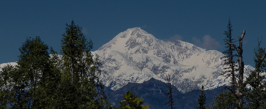
What a wonderful view of Denali. I like the title; indeed, it is not often one sees Denali unshrouded. I like it, though, that there are a few wisps of cloud. The trees provide a nice framing device.
I like the format. I think a wide, nearly panoramic, format helps to suggest the vastness of majesty of the mountain. I think you made a good decision to crop the sky aggressively. I wonder what motivated you to trim some off the bottom. I find the result leaves me feeling a bit "cheated" near the center of the bottom edge.
Good job on the white balance!
It appears that you were, as usual, very conservative in your post-processing. I'd suggest that there are a few simple edits, that could be done in Lightroom, that would make the image more engaging. Here's what I've done: First, I pulled up the shadows aggressively, and the blacks a bit as well, while pulling down the highlights a bit. I then moved to the Luminance panel and pulled down the blues aggressively to darken the sky once again. I used the Tone Curve to pull in the white point and to add more contrast just in the brightest highlights. Finally, I brushed in two local adjustments: one to add more dehaze to the darker area of the mountain, and one to add more clarity to the brighter area.
|
Aug 17th |
 |
| 93 |
Aug 22 |
Comment |
As usual, reviewing after viewing only the image and its title, but not the accompanying description.
I like this. I find it engaging. Yes, my eye goes first to the bright white breakers but, finding nothing of interest there, immediately moves to the more intriguing dark subject, where there is much to explore, due to the wide range of tones. My eye then moves up to the dark birds silhouetted against the clouds and sky and then finally returns to the brighter surf.
I like the layering of alternating dark and light bands.
I think the B&W conversion works well to yield a good distribution of tones. I find, though, that I'm startled by the very bright areas atop the rocks. I'm speculating that this is either vegetation or guano. I wonder whether the image would benefit from toning it down a bit. It's unfortunate that the detail is lost in the third breaker. I jumped to the conclusion that the capture was overexposed, but I took a look at the color edition, and there's detail there, so it must have gotten lost in the B&W conversion.
A couple of thoughts about the composition. I find the sea stacks to be a bit crowded; I would wish for about five to ten percent more space to either side. Also, I wonder whether moving somewhat to the right or left (if that was possible) would have allowed you to get the breakers in a more diagonal perspective; with luck you might have been able to use them to create a leading line up to the sea stacks.
This is a great subject. I'd suggest it's worth spending time there, and multiple visits if that's possible, under differing lighting and surf conditions.
|
Aug 17th |
| 93 |
Aug 22 |
Reply |
Neil, I cannot agree with you on one point: you are definitely NOT unqualified to comment!
You might, perhaps, feel that you aren't well versed in post-processing methods using Photoshop, but you obviously have a keen eye and I value your response and thoughts regarding the result (which ism after all, all that matters). |
Aug 10th |
| 93 |
Aug 22 |
Reply |
Check your email for a Dropbox link (no account needed) |
Aug 9th |
| 93 |
Aug 22 |
Reply |
There's two aspects to it ... getting the stars brighter and making the sky darker. My steps (in Photoshop) were:
1 - Start by making a lights-1 luminosity mask, and apply it to level adjustment, where I push the white point way to the left
2 - The effect of the above extends down into the lighter sky and foreground, so ... place the above in a group with a black mask, then paint in on the mask the adjustment jonly as far down from the top edge as makes sense
3 - Paint contrast into the sky using a gray brush ... the technique is as follows: add a transparent layer on top, using Hard Mix, and Fill less than 30% (I used 24%), and then paint with the gray brush.
4 - Again, paint contrast into the sky (specifically to impact the stars) using a white bush this time. This helps to brighten the stars a bit further.
That was it for accentuating the stars ... if you want I can send you a link to the .PSD file.
A side note ... in competition last year, one of my images was severely criticized by the judge for having "too many stars..." I think I get his point ... I think you did very well for a full moon!
|
Aug 8th |
| 93 |
Aug 22 |
Comment |
As usual, reviewing after viewing only the image and its title, but not the accompanying description.
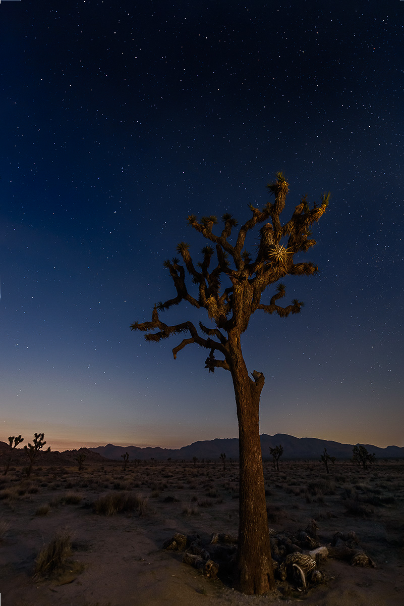
Well, I am an unrepentant self-confessed "sucker" for night landscape photography; I love the way we are able to see, through the magic of the sensitivity of our film or sensor, that which we cannot see with our own eyes. I find there is great beauty to discover in what we can only dimly perceive on our own. This is a great example of the genre.
I find this to be well composed, with the lone tree comfortably positioned along a golden-ratio division of the frame. I especially like the small, highlighted clump of foliage that mimics a starburst.
I believe there's room for variety in individual tastes as to how much and in what way to process an image, and I think that's especially true when it comes to nighttime images. After all, by its very nature, such an image isn't exactly "what the maker saw." I find nothing to fault in your processing; it's tasteful and does a great job of conveying both a sense of nighttime, an awareness of the stars in the sky, AND a sense of that which is only barely seen. My personal tastes run in the direction of a bit more aggressive processing. I happen to like to make my skies darker, the stars brighter, and to create a greater sense of presence in the foreground, usually by increasing edge contrast. I share the result here, not to say I find your edit to be flawed, but merely to showcase an alternative and to encourage you to embrace some freedom when processing your nighttime images.
|
Aug 8th |
 |
| 93 |
Aug 22 |
Comment |
As usual, reviewing after viewing only the image and its title, but not the accompanying description.
Definitely an intriguing image! As it is untitled, I took me a moment to understand what I was seeing. To me, that's a Good Thing so long, of course, as the visual elements are sufficient to keep me engaged; here, they are. Someday I hope to get to the temperate rain forest of the northwest, where I'm guessing you shot this. I do love the idea of the "mother tree".
No idea what challenges you faced with what lay outside the immediate frame, but I find this feels a bit claustrophobic. I'd have wished for a bit more space left and right of the dark, so long as it were similar to what is there.
I like the way the background, essential for context, is muted and not distracting. I'm wondering whether you did anything in post to effect that; if so, it was done deftly. Still, I think it's possible to go a bit further.
As I often do, I "tinkered" with the image. I added a little bit of steeper contrast using a curves adjustment. Masking to exclude the darker areas (thus selecting the background), I dropped the dehaze noticeably and compensated for the impact on luminance by raising clarity a bit; this further deemphasized the background. I brushed a very gentle boost in both clarity and dehaze into the root mass and trunks of the trees that appear to grow out of this mother tree. I lightly globally boosted the red saturation to better showcase some of the texture in the root and shifted the greens a bit towards the yellow to tone down what felt a bit bluish.
|
Aug 8th |
 |
5 comments - 6 replies for Group 93
|
5 comments - 6 replies Total
|


