|
| Group |
Round |
C/R |
Comment |
Date |
Image |
| 93 |
Jul 22 |
Reply |
Glad nobody who rides could hear that thought! Obviously you didn't know, but tipping a bike is a not uncommmon form of vandalism. |
Jul 25th |
| 93 |
Jul 22 |
Comment |
Ed, I had to study this for a while to understand whhat it was about it that engaged me. At first I thought it might be related to the fact that I'm a once-upon-a-time Harley rider, but I eventually discounted that. I thought perhaps it was something about the (apparently) small midwestern town that resonated with me, as I spent my jchildhood on very small southwestern Kansas towns. And then it hit me: there's a feel of anticipation, of something-just-about-to-happen, that is subtle, and yet pervades the image. Well done.
I see that Dawn suggested cropping the top, and I concur. Glad to see you agree, too.
I wonder about some other possibilities for composition. One doesn't get to see any of the engines! That, and any artwork, are the first things about a bike that catch my eye. Also, if you watch a biker approach another guy's (or gal's) bike for the first time, he'll often get down much lower to look at it, rather than from above. I'd love to have seen a shot taken from *in* the street, down low, looking down the two line of bikess. Maybe really wide angle?
|
Jul 25th |
| 93 |
Jul 22 |
Comment |
This is an engaging "street photography" image. The addition of the title makes it humorous, as well. I like the use of the diagonal juxtaposition, which often works very well. I find the dark green fabric on the balcony to be a bit distracting, but not disastrously so.
One doesn't get to arrange the players in this kind of photography, but I find it unfortunate that the two center figures in the lower group overlkap the way they do. The look on the rightmost cyclist's face, and the bemused downward look of the guy next to him suggest that ksomething odd has just been shared. |
Jul 25th |
| 93 |
Jul 22 |
Reply |
Oh I absolutely get that. I compete in my local club (which is a very strong one). I find it very difficult to manage my emotional investment in the scores. The one thing that has really helped me on that front is participating in DSG 29. In that group I get very useful feedback, but more than that, I find that the responses to my images (and to those of others) varies greatly from viewer to viewer. That's helped me to internalize the message that judging is highly subjective in many respects. (I also have to remind myself that I'm in this to produce images that *I* find engaging and meaningful.)
It's also helped that I screwed up my courage and asked another photographer whose work (not landscapes) and thought processes I admire to mentor me, and she's been generous enough with her time to do so. |
Jul 23rd |
| 93 |
Jul 22 |
Reply |
Thanks, Ed. |
Jul 23rd |
| 93 |
Jul 22 |
Reply |
Thanks. That's encouraging. |
Jul 23rd |
| 93 |
Jul 22 |
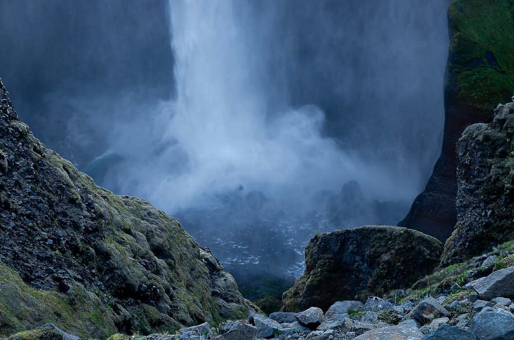
Reply |
Thanks, Kelly. Well, the water is only as soft or sharp as one sets the shutterspeed. Didn't have the option to go really fast (it was quite dark), but I didn't want to go with the silky look, so this was what I came up with. (And maybe my mind wasn't working so good, what with the cold, the wind, and the sleep deprivation ...) |
Jul 23rd |
| 93 |
Jul 22 |
Reply |
Thanks, Dawn. Maybe take a look at a new edit I attached to a reply to Darcy further down?
I was there last month. Ten days camping, shooting all night, trying to sleep for a few hours in the morning, and hitting the road again. It was an incredible experience. Westfjords, North Iceland, Eastfjords, and this short venture up into the Highlands. (You'll get to see more from the trip over the next few months.) I've absolutely gotta go back! So many places off the beaten track that are just spectacular. Give myself time to wait out bad weather. |
Jul 23rd |
| 93 |
Jul 22 |
Reply |
Thanks, Neil. Re the soft water, yes, you're right. A really fast exposure would have been far more dramatic, and more in line with the emotional experience. Unfortunately it was quite dark (this was around 3 in the morning), so the fastest I could possibly pull off was about 1/60th, and when I look at those captures, I'm just not happy with the texture. Neither fish nor foul, if you know what I mean.
As for the distracting rocks, I've got a new edit, attached it to a reply to Darcy further down. Wonder if I've solved that problem? |
Jul 23rd |
| 93 |
Jul 22 |
Reply |
Thanks, Darcy. I have a newer edit that I hope helps with the rocks. Note that I think it necessary that they have a lot of "gravitas" to help convey the massive scale. Will be interested in your thoughts, if any.
And no, I hadn't noticed the face. I'm not very good at pareidolia. |
Jul 23rd |
 |
| 93 |
Jul 22 |
Reply |
You're probably right about that. Not sure there's a good solution for that. Do you ever compete in print, where there are fewer constraints? |
Jul 23rd |
| 93 |
Jul 22 |
Reply |
Oh, one more thing. I get it, one can only shoot what's there, but it might have made a more compelling image had you been able to shoot the boat entering from the right, rather than exiting to the left, or even better, entering left a moving towards the right. |
Jul 23rd |
| 93 |
Jul 22 |
Comment |
Haven't read the narrative or comments yet ...
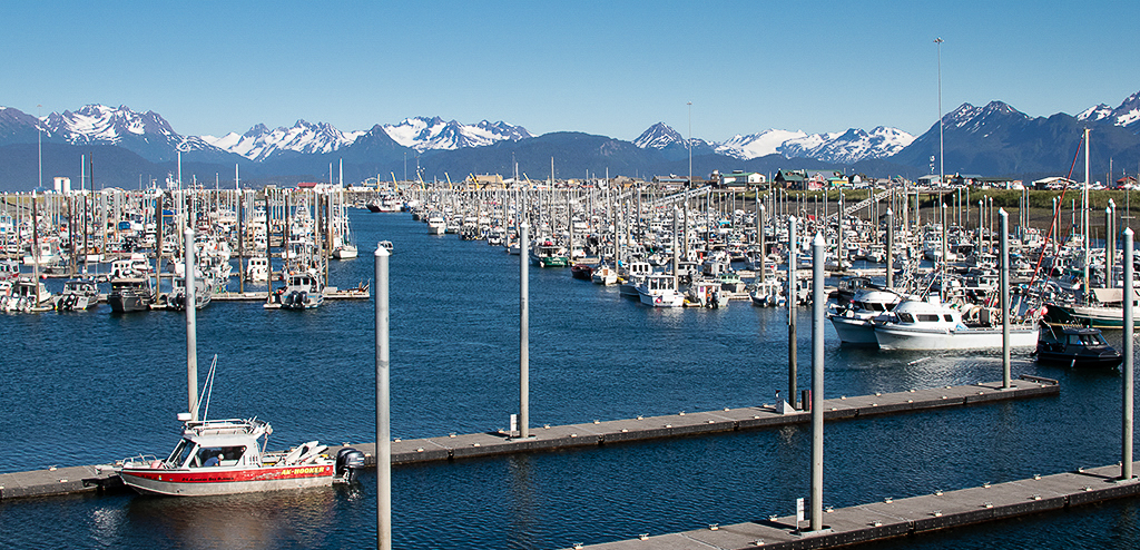
There are mseveral things I like about this image. It certainly tells a story of a place that is very much into life on the water. I don't think I've ever seen a marina that crowded. I also like the diagonals. A "straight-on" shot of the sea line would likely not have worked well.
I think it was a good decision to crop much of the sky out, as it didn't contribute to either the balance or the story. I think, too, that it was good to trim a bit off the lower edge, but (to my eye) you may have been a bit too aggressive. I suspect you wanted to eliminate the distracting people lower left corner, but (for myself) I'd have dealt wcontent aware fill. The very bright spot that remains, however, is distracting. I'm guessing that this is a reflection of the sun reflecting in turn off the top of the white boat. Wasn't easy to get rid of, but it is possible.
It appears you pushed the blues a bit (which does look good), but I'd suggest a subtler approach which you might like: using a linear gradient pulled up from the bottom, fading to mothing at the far edge of the marina, I gently added dehaze and clarity, and pushed the satuation a wee bit. The effect is subtle, but I think it helps to create a sense of depth by making that which is closer to the viewer sharper.
It also seems you dehazed the mountains a bit, which seemed in order, so I did the same.
(I starteds with your original, not your final). |
Jul 23rd |
 |
| 93 |
Jul 22 |
Comment |
Looks like a lovely location. Nice snapshot. |
Jul 22nd |
| 93 |
Jul 22 |
Reply |
Boy, do I get it, Ed. Given the material I post, one might not guess it, but I struggle with that a great deal. Yet, I'm the most proud of the images where I managed to "break loose." |
Jul 21st |
| 93 |
Jul 22 |
Reply |
FWIW, I concur with the decision to remove the "bump." For a scene like this, the fewer distractions the better. |
Jul 21st |
| 93 |
Jul 22 |
Comment |
Again, I'm reviewing each image after viewing only the image and its title, but not the accompanying description. Once I post my comments, I'll turn to the description and others' comments.
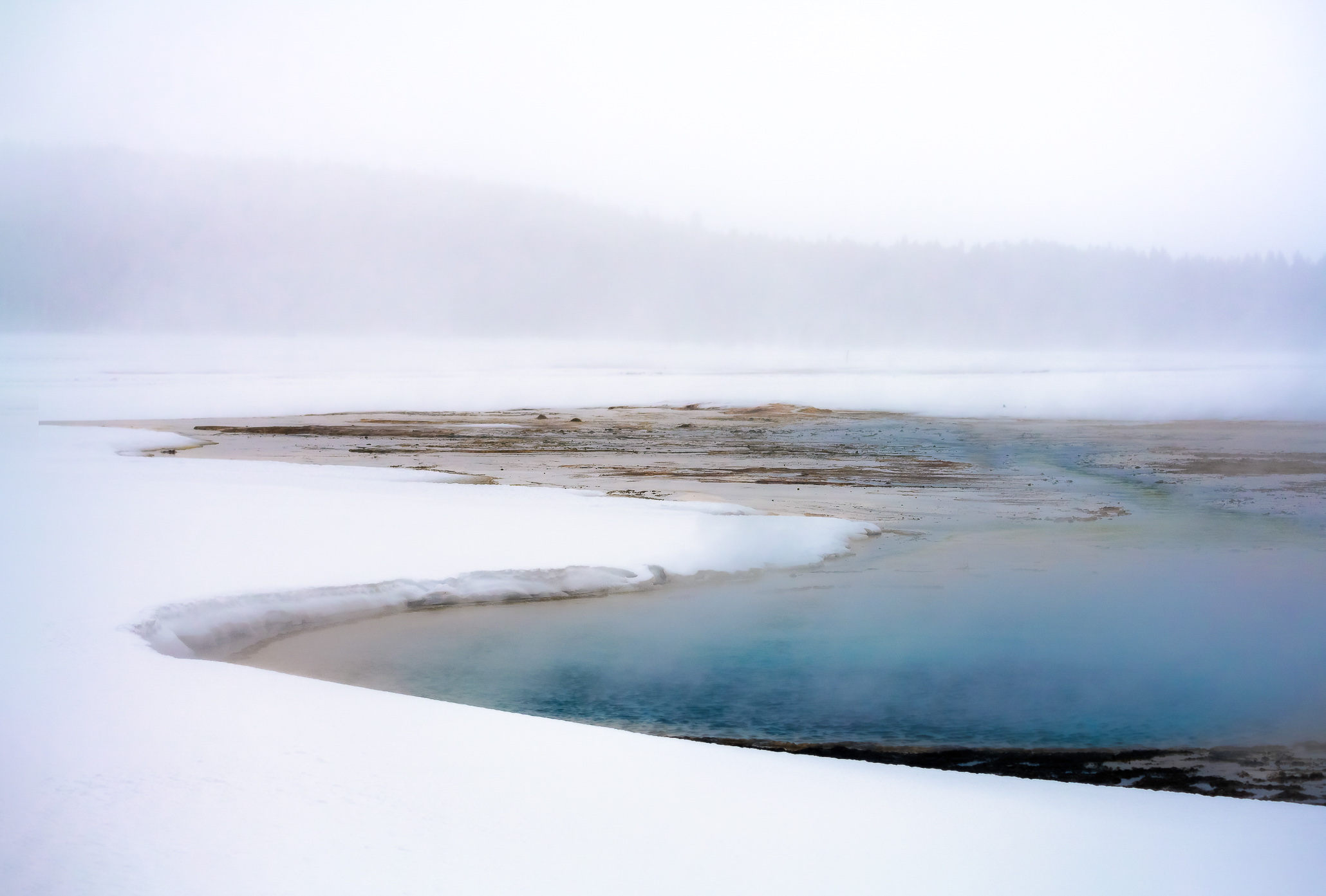
I'm sorry it took so long for me to get back to this. As I said, I like this image a lot. The high key character immediately grabbed my attention. Its mystery, the dreaminess, greatly appeal to me. I also like the contrasts between the grittiness of the surface and the ethereal hint of trees beyond, and the vast field of whiteness.
In terms of technical achievement, I find no faults at all with the capture. Making the steam visible (and keeping it so in post) is always tricky, I think you exercised just the right amount of courage in pushing the blue in post, without going too far. I'm not sure I would have had as much self-restraint.
I would suggest that there were a couple of things you could have done in the field to frame this for a stronger image. For myself, I find it disturbing that the further of the two "arms" of the pool intersects the left edge. I'd prefer a little bit of separation over there. Similarly, I find the lower edge just a bit crowded. I realize of course that there might have been other elements that you needed to exclude from the frame. To get an idea of this, I found it easy to expand the canvas and content-aware-fill. Of course, this would not be permissible in certain competition or for publication.
Regarding the title: I found it confusing, though I did eventually figure it out.
A great image, and one of my favorites of your posts.
|
Jul 21st |
 |
| 93 |
Jul 22 |
Comment |
Love it! More when I have the time to be thoughtful. |
Jul 5th |
6 comments - 12 replies for Group 93
|
6 comments - 12 replies Total
|


