|
| Group |
Round |
C/R |
Comment |
Date |
Image |
| 93 |
Jun 22 |
Reply |
Very interesting. It simply did not occur to me to do this, and I think it works well in creating a compelling image. I think, Neil, that you may have set yourself a difficult goal here: to depict effective camouflage. |
Jun 29th |
| 93 |
Jun 22 |
Reply |
Thank you, Dawn, this is helpful information. Not saying I will adjust (judge is out on that), but this confirms that a discerning eye observed the same as I, and that you (as did I) found what you saw to be (at least somewhat) problematic. One of the lessons I am learning in these forums for feedbacvk (this group, DSG 29, my local club, and my mentor) is this: if it crosses my mind that something is problematic, it will almost certainly do so for at least some other viewers, and therefore I need to make a conscious decision as to whether I wish to address the matter. I think that sometimes (as may be the case here) my artistic intentions are best served by intentionally letting the "problem" stand, but it is important to consciously make that decision and to not ignore it.
|
Jun 29th |
| 93 |
Jun 22 |
Reply |
Thanks, Neil. Regarding your question ("is it the light contrast ... something else?"): well, I think, yes, the light contrast between the two walls provides the basic framework, but I do think that was just the starting point. A lot of what I do in post is about sculpting some depth into the image. I still have all the adjustment layers, etc., so I could go back and analyze them, but I just don't have the time right now. I do recall, though, that I was very conscious of this while I was working this image. There are three tools in my toolbox that I use most often for this. After a quick glance at the file, I can see that I used all three: contrast painting, saturation/desaturation painting, and sharpness painting. That that which is furthest from the viewer will (all other factors equal) have less local contrast, less saturation, and will be less sharp than that which is closer. This image is a bit tricky in that there is no direct lighting. Reflected and ambient lighting will tend to reduce local contrast a bit depending on the strength and diffuseness of the light, so I needed to pay attention to that as well. |
Jun 27th |
| 93 |
Jun 22 |
Reply |
Thanks, Dawn. A very astute observation, and I'm interested in it because I was aware of the apparent blue shift. (I say "apparent" for reasons I explain below).
The travertine was really difficult to process. In "real life" it has a very strange look to it. Not exactly opalescent, but it has a sheen that varies quite a bit from one spot to the next. I suspect this is a consequence of the way it forms. At any rate, my objective was to try to bring out some of that "strangeness".
There's more than one thing going on here. Keep in mind that my edits to the surrounding areas were significant; thus, comparing the aparent hue in the two images "in situ" may be misleading due to the effects of simultaneous contrast. In actuality, when I go back and check I find that the edited hues (of the travertine) are a teensy bit more magenta than in the original, but (and here's the big impact) more saturated and less luminous. If I recall correctly (and I haven't gone back to check), I did some of this work in the Lab color space.
I'm curious whether, when looking at the edited image without reference to the original, you find the hue of the travertine to be troubling. |
Jun 25th |
| 93 |
Jun 22 |
Reply |
Ed, I may have created the wrong impression. I don't think it's necessarily "wrong" to include people in a landscape-style image. I did just that in my submission this month. I think, though, that incorporating people into the scene calls for some thought about their role in the story, the role of the scenic elements, and whether there's a connection between (or competition between) the two. |
Jun 13th |
| 93 |
Jun 22 |
Reply |
Darcy, I neglected to applaud your adventurousness and initiative in even exploring the white vignette. Kudos! It's precisely by venturing out into the unknown and trying something new, to solve a problem we've never solved before, that we acquire the courage and ability to create the images that we imagine. |
Jun 12th |
| 93 |
Jun 22 |
Comment |
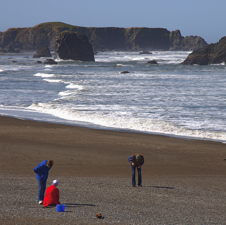
I have an ambivalent reaction to this image. I confess to a personal bias against inclusion of people or "the hand of man" in scenic vistas unless there's a deep connection between the people and whatever it is about the vista that's engaging. For me, at least, its the amazing seastacks that create the vista here, not the sea or the shore, and the people are not engaged with the seastacks (or the scenery at all, for that matter). On the other hand, the story of the people searching the beach for something (treasure, maybe?) is an engaging story.
After contemplating this for a while, a concluded that there are a couple of factors that contribute to setting up the disconnects here. First of all, the people are rendered rather diminnuitive. While their bright colors stand out somewhat against the beach, there's not a strong luminosity contrast to pull the eye to them. Second, the strong diagonal formed by the water's edge serves to bisect the image. The browns of the seastacks and of the beach are similar in both tone and hue (not surprising; the beach is probably composed of pulverized seastack material), so the sea stacks function more (to me) as a framing device than as subject matter. The combined result, I feel, is two weak subjects competing for attention.
I experimenting with an alternate square crop, and I found that I liked the result. Perhaps you will, too. A square format is almost always more harmonious. Eliminating the emphasis on the breadth of the scene, I think, reduces the severity of the bifurcation effect. Reducing the total real estate serves to make the people larger, and more significant. To my eye, at least, the result is to tilt the scales in favor of making the peopole the subject, and relegating the seastacks to a supporting context role. this would be consistent with your title.
|
Jun 11th |
 |
| 93 |
Jun 22 |
Comment |
well, Paul, I think this is the most evocative, yet, of your Barn Series. It is certainly gloomy! I really like it.
You know I like to "fiddle" with folks' images posted here, but I found nothing here to "fiddle" with! I like the tonal distribution, it feels to have the right degree of sharpness and contrast.
I really like the composition. Great placement of the building against the moody sky, the building orientation feels "just right", and it really helps having the dead tree on the left.
I agree re the ultrawide lens.
You just keep getting better at these. |
Jun 7th |
| 93 |
Jun 22 |
Comment |
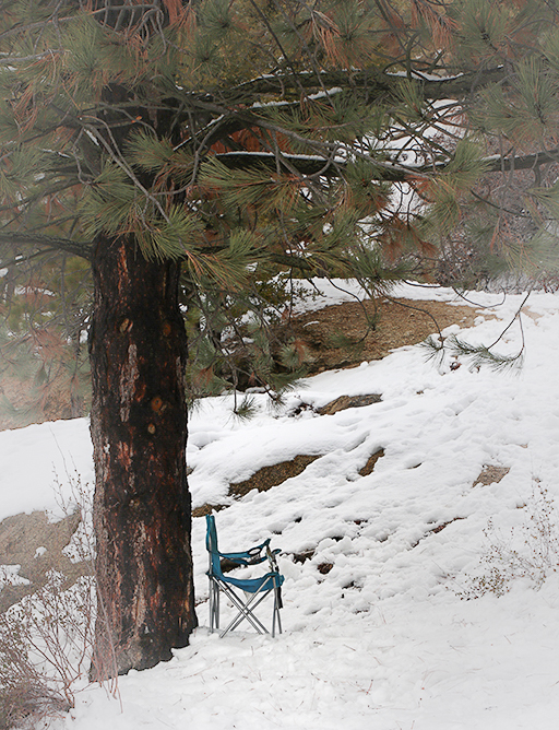
An intriguing image, Darcy. I like,
I think it was a good idea to clean up the snow a bit and to emphasize the chair. Good job on the masking.
I kinda like your idea to apply a white vignette. It's an interesting effect. To my eye, it's a bit harsh; you might want to experiment with an alternative method. I added an inverted radial gradient, and aggressively dropped (-59) the dehaze slider and less aggressively (-33) dropped the clarity slider, which had the effect of lightening the vignette but it also softening it; to approximate the degree of lightening that you desired, I still had to pull down the highlights and whites just a bit. I think the effect approximates our cognitive process, when we "tune out" the perimeter of our field of vision.
To further draw attention to the chair, I dropped another small radial gradient over it, pulled up clarity (27), texture (14), and whites (33).
I'm not sure you neded the full height of the tree to tell the story, but I also think you need more than one horizontal branch. I found cropping down to approx. 5x7 left enough of the tree to tell the story but kept it from becoming the story itself.
Interested to hear what you think ...
|
Jun 7th |
 |
| 93 |
Jun 22 |
Comment |
Well, Dawn, you know how much I enjoy "fiddling" with other folks' postings. But you left me nothing to "fiddle." Nothing to crop. Nothing to tone differently. No effects to add. Sigh ...
The image does a great job of catching the eye, with the brightest and highest contrast right where the action is, but then with a very nice story of the late light coming in from the left, catching the spindrift (I REALLY like!), and then lighting up the wall on the right.
I think you got the exposure time just right. Everything sharp. Love the backlit detail in the foreground.
I suppose there's one detail I might "fiddle". You might consider cloning out the contrail. I find it an unwelcome intrusion of the hand on man into the scene.
Good job. |
Jun 6th |
| 93 |
Jun 22 |
Comment |
Kelly, you've been able to convey some of the joy you experienced. I left the image sitting open on my monitor for the afternoon, so that every time I passed itm I'd glance at it, and I had a similar uplifting of spirits.
I think it helps to take a minute and study how you did it. To my eye, it's primarily the yellows, standing out against the analogous range of hues from green to blue. That makes sense, as yellow is usually associated with happiness and optimism. I think it was a good idea to emphasize them.
One needs to be very careful with the calibration sliders. To my eye, the result here is an unnatural color in the sky, almost a cyan cast. For a moment there I wondered if you had also used a CPL (the blue is quite a bit more saturated on the right than on the left), but you don't mention one, so I'm chalking the issue up to the calibration adjustment.
You title and your narrative both tell me that the gate is important. I gather that the fact that it is *open* is key to the emotional content you want to convey. I gather this is what one would call "gesture". I like the idea. If you were to tackle this composition again, I'd suggest working to emphasize the gate more, ideally shooting from between the two arms (not dead center, though!) so as to accentuate the gesture. This would also simplify the image, as there wouldn't be the confusing overlap. Shooting from lower might help, too. I'd also think experimenting with amn even shallower depth of field, making sure to get the closest arms of the gate in sharp focus. Just a couple of ideas.
Congratulations on paying attention to the emotion you experienced, and bringing it out in the image.
|
Jun 6th |
| 93 |
Jun 22 |
Comment |
Ditto, Paul's comment. Very nicely composed in the crop. Excellent detail, color balance spot on. Nice shallow (but no too) depth of field.
I didn't identify the subject right away (yup, very well camouflaged). To that end, I experimented with a couple of edits that wouldn't be permitted in nature competition or submission for publication. I painted in a little contrast over the gecko and softened and blurred it into surrounding area. (Method: add a transparent layer, hard mix, 15% fill, paint 50% gray with low flow and soft brush.) I also desaturated a tiny bit the most saturated areas around the perimeter. The combined effect is very subtle, but I think it helps pull the eye in towards the center and makes the gecko stand out a tiny bit more.
While I was at it, I noticed something odd: a grey-green streak in the white below the gecko's head, paralleling the head. My guess is I'm seeing some texture in foliage in the background, but it unfortunately looks like an artifact, so I clone-stamped it out.
|
Jun 6th |
 |
6 comments - 6 replies for Group 93
|
6 comments - 6 replies Total
|


