|
| Group |
Round |
C/R |
Comment |
Date |
Image |
| 93 |
May 22 |
Reply |
Thanks, Neil. |
May 20th |
| 93 |
May 22 |
Reply |
Thanks, Neil, it sems to me that you're well qualified to comment. I don't think one is obligated to understand, or for that matter even to care, what was done in post in order to review and respond to the final product.
I'm quite interested in two aspects of your comment. First, you allude to changing the image to show a column of light ... and second, that it does not look real. Do you suppose I could impose on you to take a look at the original, without referring to the final, and assess whether or not, and if so, how strongly you have a similar reaction?
The reason I ask is this: I captured the image for the very reason that it looked magincal, not real, at the time. My subsequent processing was all aimed at reproducing that sensation on the two-dimennsional result (and trying to rectify some technical flaws). I do sometimes go overboard, sometimes intentionally, and sometimes not. This was not one of the occasions where I did so intentionally, so I'm paying close attention to what the image evoked in you.
Thanks |
May 20th |
| 93 |
May 22 |
Reply |
So now I've gone back and read your narrative. You wrote that it's not intended as an abstract image, and so I might suggest you experiment with simplifying it by cropping the right side ...
Thinking more about the image, it also occurs to me that part of what makes it challenging to the viewer is exactly that: part of it is an abstract, and part of it is more of a nature image.
Also, I may not have expressed well enough one thought: I really like the orange! It's very evocative. |
May 18th |
| 93 |
May 22 |
Comment |
Hi, Paul. For this round I'm undertaking to review each image after viewing only the image and its title, but not the accompanying description. Once I post my comments, I'll turn to the description and others' comments.
As I've admitted when commenting on the other bird images in this round, I confess that I don't find myself emotionally involved in bird images. That's just a reflection on me, not on the image.
This image does catch the eye, primarily (I suspect) because of the gorgeous oranges, the striking dark brown / orange contrast, and the sinuousness of the curves. That is, it seems to be the reflections that draw the eye.
The image also captures a point in time in the changing of the seasons that is fleeting, when the ice is thin. Or at least I'm guessing, having not read the narrative, that such is the case.
As much as I enjoy, and my eye as drawn to, the reflections, I find my eye is confounded by the geese themselves. I think this is because the composition is messy. The birds are all (as is natural) contorting their necks into confusing positions. Of the three birds on the left, one is only partially visible. This really confuses the eye at first. Of the two birds on the right, the one in front is facing directly away from us, and the eye is struck by the bright orange feet, which again are initially confusing.
Now, I get it; nature doesn't always give us a nice, neat scene to capture, so I don't fault the maker for the messiness of a scene, and sometimes the complexity of, or disorder in, a scene is the story one wishes to tell. I find, though, these days, that when I contemplate a complicated scene, I try to remember that my *brain* is seeing something quite different than what the brutally honest camera will record. I've learned a couple of tools to help me set aside my cognitive understanding of a scene: one is to squint; the other is to close my eyes for a few seconds, and then open them only briefly (say less than a second), and then close them again.
As is my wont, I did "fiddle around" with a variety of crops, and each seemed to have merit, but none was wholly satisfying to me. The ones I found I liked the best were abstract, constrained to the reflection; these of course tell a very different story than the one you intended.
|
May 18th |
| 93 |
May 22 |
Reply |
This might give you an idea as to what I had in mind for a crop. It would have been nice to have had a bit more at the bottom, but that wasn't in the cards. |
May 18th |
 |
| 93 |
May 22 |
Comment |
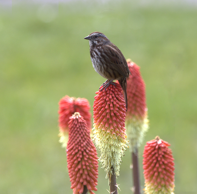
Hi, ed. For this round I'm undertaking to review each image after viewing only the image and its title, but not the accompanying description. Once I post my comments, I'll turn to the description and others' comments.
As I've admitted when commenting on the other bird images in this round, I have to confess that, while I appreciate the effort involved, and the technical challenges, I don't find myself emotionally involved in bird and/or flower images. That's just a reflection on me, not on the image.
I do recognize the technical achievement that this image represents. Everything of interest is quite sharp. The depth of field is shallow enough to obscure the background, and I like it that there are two flowers just a bit further back so that they fall outside the field that's in focus.
It appears that you (or your camera) focused on the flower on which the bird is sitting, at the flowers' structure is pin sharp, while there is (to my eye at least) a bit of softness to the bird. I did experiment with taking it over to Topaz Sharpen AI, on a duplicate layer, and then painting in the sharpened layer only on the bird, and I think I was able to pull off a bit of improvement without making it look over-sharpened. Note that it was really important to *not* sharpen the flowers. I also painted in a bit of contrast on the bird, just a bit, not much. As I don't compete in Nature category, I'm not sure I know the rules; I'm pretty sure those edits would be disallowed.
I agree that it was wise to crop to make the bird the star of the show. I'm guessing your decisions also reflected a desire to eliminate distractions. To my eye, the image now feels a bit claustrophobic; I'd have like a little "breathing" room on either side. You might consider (again, not permitted in Nature group) re-cropping a bit wider and then cloning out the dried stem on the right and the nub of a flower on the left.
|
May 18th |
 |
| 93 |
May 22 |
Comment |
Hi, Dawn. For this round I'm undertaking to review each image after viewing only the image and its title, but not the accompanying description. Once I post my comments, I'll turn to the description and others' comments.
I have to confess that, while I appreciate the effort involved, and the technical challenges, I don't find myself emotionally involved in bird and/or flower images. That's just a reflection on me, not on the image.
I imagine that this image is a technical achievement. Everything of interest is quite sharp. There's a bit of motion blur to the wingtips but, considering the rate at which they move, I suspect one would need a strobe to capture a hummingbird without blur.
It's well composed, and I like your crop.
The title establishes that the subject is the hummingbird. (I suppose the subject *could* have been the exotic flower, with a story about it being food source ��) With that in mind, I would suggest that the story is undermined slightly by the prominence of the flower. The flower is as saturated, if not more saturated than, is the bird. The contrast between the flower's filaments and the dark background draws the eye immediately to the flower.
To my eye, the story is better supported by painting in a bit more saturation for the greens, and for the blue-violets, in the bird, while desaturating and darkening the red-magentas in the flower. This would not be permitted, of course, in a Nature category competition.
|
May 18th |
 |
| 93 |
May 22 |
Reply |
Great! Looking forward to seeing what choices you make. |
May 17th |
| 93 |
May 22 |
Reply |
As a general rule I do almost all my edits in Photoshop. To paint contrast, my "try this first" technique is quite simple (if one's comfortable with Ps and with luminosity masks): I add a transparent layer, set the blending mode to "Hard Mix" at 15% fill, select a soft brush with 100% smoothing and low flow (6% or lower), and paint in the mtype of contrast I'm looking for. A 50% gray brush adds contrast in the mid-tones; a white brush, in the brighter tones; and a black brush, in the darks. Sometimes the impact is broader than I'd desire. In that case, in order to constrain it further, I may proceed as follows: turn off the layer; create a luminosity or zone mask that targets the tonal range I want tpo liit the adjustment to; apply the mask to the layer I just painted, and turn it back on. Adjust to suit.
However, as you asked about using a radial gradient, I thought I'd experiment in LrC to see if I could achieve a similar effect, and indeed I could. For the subject in the center/, yes I applied a radial gradient; then (and this is important) I *intersected* it with a luminance range mask, limiting it to the mid-tones and feathering out to the sides; it really helps when doing this to tick the "show overlay" check box while creating the mask, and then to uncheck it to mask the adjustment. Having created the mask to suit, I then pulled down the shadows slider slightly and pulled up the highlights slider slightly. One can always go back in an fiddle with the mask after dialing in the adjustments.
For the lines above and below the grey band, I used a brush to define the mask. My usual technique, which I used here, is to be a bit aggressive initially with the brush, and then to more carefully erase (hold down the ALT =or OPT key) the part that I overpainted. Again, I intersected the resulting brush mask with a luminance range, to get the final mask. For the dark line, it was just a matter then of pulling down the blacks. For the lighter line, I needed to nudge both the whites and highlights.
Hope you find this helpful. I encourage you to experiment, either in LrC or in Ps. I found both tools intimidating at first, but it doesn't take long to get some basic familiarity.
|
May 17th |
| 93 |
May 22 |
Reply |
*blush*
Thanks, Ed. One of the many rewards I receive fro participating here (and in Study Group 29) is exposure to a wide range of responses to my images. I find it very helpful to hear from perspectives that see shortcomings in them, and I also find it very reassuring to hear from folks such as you, who bolster my confidence that I'm heading in the right direction.
I'm new at this (two years and counting), so I'm still developing, but one thing is becoming apparent: what appeals to me in an image, what I try to evoke in the viewer, is complex, and can leave one viewer quite excited and another entirely unmoved. All in all, I think that's a good thing. |
May 17th |
| 93 |
May 22 |
Reply |
Dawn, I agree regarding the "sliver" of grass. To me, that helps to emphasize the broadness and flatness of the delta. In my comments below, I suggested cropping much of the blackest clouds out, and an unanticipated consequence was that the panoramic format further accentuates that effect. I overlooked the significance of the shadows cast by the clouds, and I was perhaps a bit heavy handed in brightening up the landscape. I might rethink. |
May 17th |
| 93 |
May 22 |
Comment |
Hi, Neil, welcome! For this round I'm undertaking to review each image after viewing only the image and its title, but not the accompanying description. Once I post my comments, I'll turn to the description and others' comments.
The title gives me a sense as to how you mean for me to read this image, what you felt was important enough to make the image. It seems clear that it is first and foremost about the clouds, which is well, as they do dominate the image, especially by virtue of the very heavy weight of the dark, nearly black clouds spanning the top of the frame. Technically, it's unfortunate that they are underexposed, and no detail is recoverable. I'm guessing that you were (quite rightly) protecting your highlights. It might be that the scene presented more dynamic range than your sensor could span; if so, then this would have been a good occasion for exposure bracketing.
Your title also tells me that *place* is important here. I think you did a good job with your composition of conveying a sense of the flatness and broadness of the delta. The impact is rather muted due to the darkness.
You'll quickly learn this about me: I happen to really enjoy post-processing, and I frequently "tinker with" others' posted images. I do this for two reasons: I like to point out treatments that the maker might find attractive and worth exploring; I also find I often learn more editing other folks' images than I do with my own, as I'm not as invested in preconceived notions as I am when working my own images. I hope I don't offend.
In this case, I made all my edits in LrC. To my eye, the image benefits greatly when one gives the viewer better access to the foreground. To this end I made two local adjustments. First, I added a linear gradient coming up from the bottom, nudging up the exposure, shadows, and dehaze, feathering out just above the horizon. I then added a more complex mask near the horizon: a skinny horizontal radial gradient, intersected with a luminance range limiting it to the darks, and then subtracting the sky with a brush. With this mask I aggressively lifted the shadows and blacks.
In your original, there's a framing effect created by the black clouds on top and the dark delta on the bottom, which helps to keep the eye within the frame. My adjustments to the foreground ruined that effect. Inasmuch as the black clouds carried (to my eye) much too much weight, I cropped down from the top, but was careful to retain enough to suggest that still darker ones are just out of
sight above. I find that I like the panorama format, as it serve to emphasize the breadth of the scene.
At this point I had to give some thought to the clouds themselves, as they are the main character here. Having mostly eliminated the indistinct dark ones, the remaining ones show a lot of variety and interest. Perhaps this is just a consequence of the JPEG compression, but I find them to look a bit "harsh", as sometimes happens when one over-sharpens, or gets heavy-handed with dehaze. When working with clouds, I try to always remember that a bird needs to be able to fly through them. I tried to subdue the harshness by adding one last radial gradient, gently nudging downwards the contrast and nudging upwards the shadows and whites, and gently nudging downwards the "presence" sliders.
Now you might not care at all for these "tweaks". I'll read your narrative to learn more about your intention. If you were trying to convey a sense of peril, of looming danger, then my edits would certainly have worked against that aim.
|
May 17th |
 |
| 93 |
May 22 |
Comment |
Hi, Darcy, for this round I'm undertaking to review each image after viewing only the image and its title, but not the accompanying description. Once I post my comments, I'll turn to the description and others' comments.
This is very much the kind of image I really like. Very moody, very intriguing. Technically well executed in support of the effect. I find the "real world" subject only suggested, not clearly documented. That is an effect not easy to pull off well and one that I really enjoy when I encounter it.
I'm vaguely reminded of the abstract expressionist movement, as well as of paintings by Mark Rothko.
I really like the very subtle color palette with just a hint of warm / cool contrast.
I think there are a couple of "tweaks" that might make the image a bit more impactful. I find the dark splotchy areas lower left to be distracting; is almost as though they form a bit of an anchor to a "reality". In the attached I took them out. A similar story with the texture in the upper portion of the frame. I tried cropping to remove, and I found that I much liked the resulting balance with the upper portion occupying much less of the frame.
I also think a little bit of heightened contrast painting on the central subject helps, and I liked the effect when I accentuated the dark edge above, and the light edge below, the gray band that stretches across the frame.
These "tweaks" are all about subjective effects, and you might not care for them at all.
|
May 17th |
 |
| 93 |
May 22 |
Comment |
Hi, Kelly, for this round I'm undertaking to review each image after viewing only the image and its title, but not the accompanying description. Once I post my comments, I'll turn to the description and others' comments.
First, I really like the image. It was a good idea to get down low as you did! The title suggests that you are interested in conveying the sense of upward sweep, so I do have some suggestions.
To my eye, it benefits from cropping to move the trunk a little further off-center, but one wouldn't want to lose any more than necessary of the intriguing root system on the left.
I also felt it would help to reduce the extent to which the foliage canopy is interesting to the eye. To this end, I reduced the saturation in the foliage, bumped the brightness and dropped the contrast, and further slightly lightened the darkest foliage upper right.
I then turned my attention to the tree itself. I wanted to emphasize the upward sweep of the root system. I started by painting in some contrast.
My "go to first" tactic for this, which worked well here, is to add a transparent layer, Hard Mix blending mode, about 15% fill, and paint in (using 100% smoothing and very low flow) with a 50% gray brush to separate the mid-tones, a white brush to add contrast in the highlights, and a black brush to add contrast in the darks. Sometimes, as in this instance, I also add a "dehazing" layer (can be achieved a variety of ways) and mask it in where wanted, again in this case on the trunk and roots.
Returning to the canopy, I added a very gentle Orton effect, painting it into the canopy.
Finally, I had observed throughout that I was bothered by the sky peeking in and by the bright spot where the Sun is. I used the clone stamp tool, darker color mode, and lightly stamped in some foliage from elsewhere. I was a bit ham-fisted, but I didn't want to take a lot of time at it. One could, with patience, do a much better job than mine.
|
May 17th |
 |
| 93 |
May 22 |
Reply |
I agree regarding the leaves that got cropped out. Unfortunately, they're unsalvageable ... |
May 9th |
| 93 |
May 22 |
Reply |
Thanks, Dawn. Turns out you were seeing the original. I messed up the submission, but Ed fixed it for me. The "final" image now appears. Would be interested in your thoughts on it. |
May 8th |
| 93 |
May 22 |
Reply |
Thank you, thank you! |
May 8th |
| 93 |
May 22 |
Comment |
Folks, I just realized that I "screwed up" and failed to attach my "final" image in my email to Ed. As I suspect there's no way to replace it now, here it is: |
May 7th |
 |
| 93 |
May 22 |
Reply |
Hang on ... having trouble getting the right image to upload ... |
May 7th |
| 93 |
May 22 |
Comment |
Thanks, Dawn. Yes, here's the original. You will find that the tonal adjustments are individually fairly minute, though they do add up to what I think was a significant enhancement. I felt during the processing that it was important to not overdo things (well, that's always important, but ...) so as to not lose what felt magical to me. Yes, there's a vignette. And a lot, I mean a lot, of dodging and burning, color stamping, etc., but I hope that one would have to be comparing the result to the original to be able to discern where I did what. |
May 7th |
8 comments - 12 replies for Group 93
|
8 comments - 12 replies Total
|


