|
| Group |
Round |
C/R |
Comment |
Date |
Image |
| 93 |
Mar 22 |
Reply |
Will do, but probably not today. Still under water trying to rebuild my household computer and gather materials for the tax preparer. But I won't forget. |
Mar 28th |
| 93 |
Mar 22 |
Comment |
Welcome! A nice initial showing by way of introducing yourself!
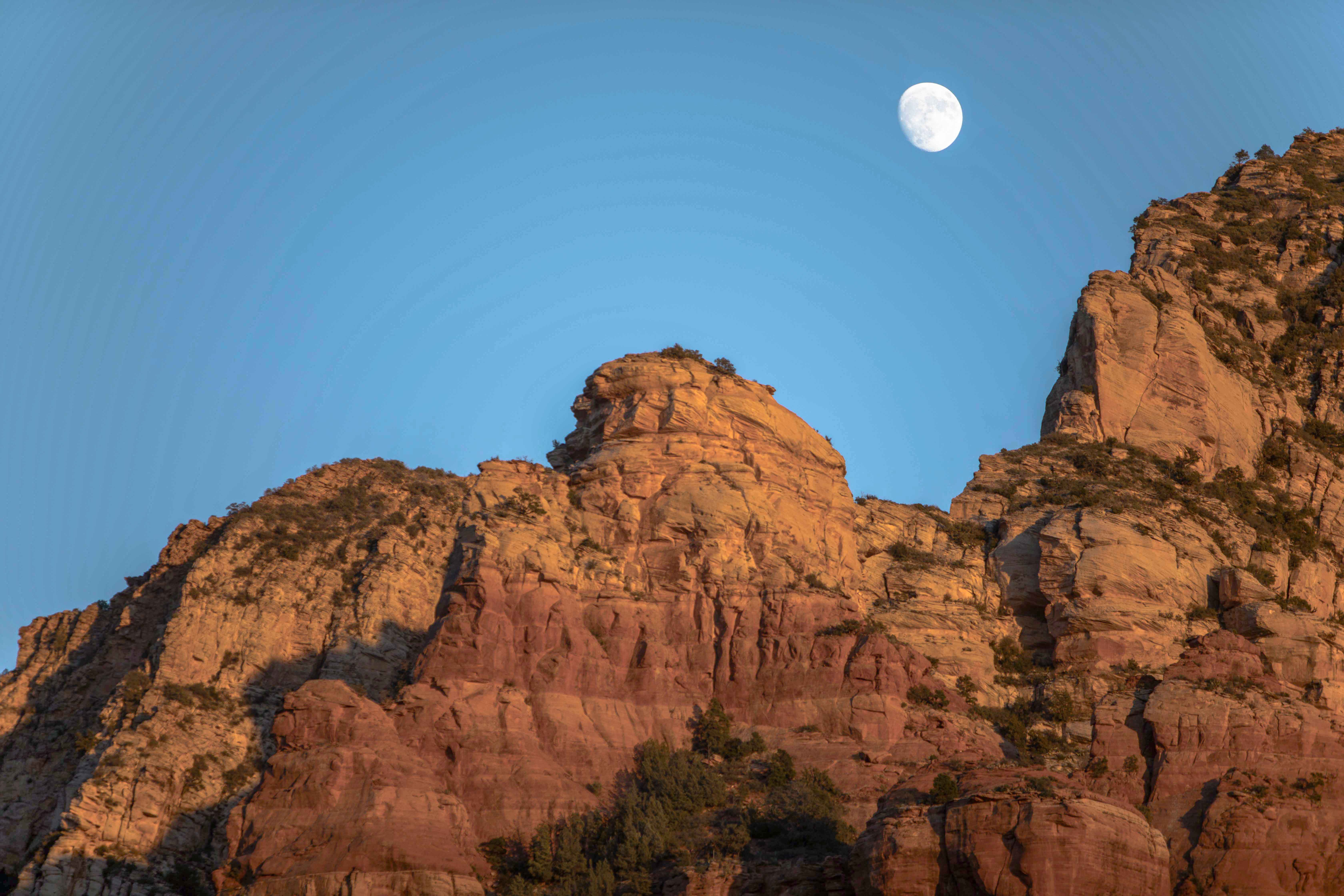
That was definitely worth spending time to capture. The warm rock / cool sky contrast is always appealing. Good job getting detail in the Moon without losing much elsewhere. The composition works nicely: the diagonal sweeping up to the right imparts some optimism, which is consonant with the warm tones; the Moon is nicely nestled directly above the notch; there's a bit (might wish for a bit more) of foliage foreground to give me a sense as to where I'm standing to view the rock; and the oblique light is casting soft shadows that closely mimic the complex curves of the rock.
The nice thing about shooting raw is that there's a lot of opportunity to later deal with choices made at capture time that didn't turn out to be optimal. In this case, there's a simple adjustment that will pay big dividends, and that's to adjust the white balance. (Note that I say "adjust", not "correct".) For this image, I used the White Balance Selector tool in LrC (the little eyedropper at the top left of the "Basic" panel), and selected for the brightest area of the Moon. The effect was dramatic: the sky took on much more color, much more detail was revealed in the lighter rocks; and the foliage stood out a bit better.
Now, as other folks in the group have learned, I do greatly enjoy post-processing, so I "fiddled" with the image a bit more: to get a bit more contrast at the two extremes while flattening it a bit in the middle I pulled the shadows up, the highlights down, and the whites back up; I fine-tuned this a bit further using the tone curve. Using the HSL panel I shifted the hues towards yellow, first by shifting the reds and oranges to the right, and then the greens to the left; in the Calibration panel I increased the saturation assigned to the red primary to give the rocks a bit more pop (might not be to everyone's taste); and, finally, I compensated in the Lens Correction for a vignette effect that seemed excessive to me.
|
Mar 28th |
 |
| 93 |
Mar 22 |
Comment |
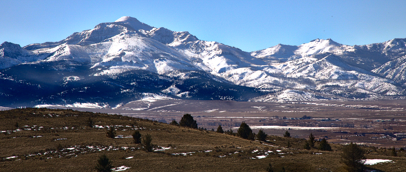
I, too, enjoy your seascapes, but I understand the desire to share "something new". I also understand the allure of this scene. I think you chose well. The transition from warm foreground to cooler mountains and deep blue sky is engaging. I agree with Dawn re cropping; in fact, I think the image benefits from an even wider cinematic format, such as the iMax 2.35x1 factor.
I was surprised to read that you used such a tight aperture. According to the PhotoPills Hyperfocal Table (you DO use PhotoPills, don't you?), with an aperture of f/8 and a focal length of 105mm, you could have focused on something as close as 46 meters and everything would have been sharp from there to infinity. As the nearest subject in the image is at least that far, you'd have had no trouble at all. That lens is really great, but I find mine does introduce a lot of diffraction at apertures tighter than about f/14. In addition, opening up the aperture would have allowed you to shoot handheld faster and reduce the risk of unintentional camera motion blur.
Again, like Dawn, I felt the image called for some aggressive introduction of contrast and some tonal adjustments. Although my tactics were slightly different than Dawn's, the strategy was the same. I had to fiddle around to figure out how to get the warmth I wanted on the more distant plain. In the end I achieved it in Photoshop with minute adjustments to the tone curve (pulling up the RGB curve and pulling down the blue one), selecting for the mid-tones, and then then painting in the adjustment where I wanted it. The effect is subtle, but I liked it.
|
Mar 28th |
 |
| 93 |
Mar 22 |
Comment |
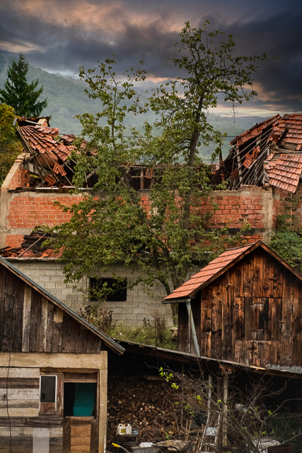
Very evocative and troubling. And an interesting blend of photojournalism and architectural/landscape photography.
The capture was well executed, sharp and well exposed.
Compositionally it's very strong. The sky is perfectly apt for the scene and really helps with establishing the mood. The narrow vertical arrangement contributes a claustrophobic feel, which heightens the sense of discomfort I suspect you'd want to viewer to experience. I especially like the staggered inward sloping roofs; the direct the eye downwards into the frame, and clearly convey a feeling of destruction.
I did not initially "get" the idea of life emerging in the form of the tree. That may say more about my gloomy outlook than about the image itself, but I tried to give it some more emphasis in the attached. I also darkened much of the image (you may feel I went too far) and exaggerated the contrast in the lines of the sloping rooftops. I felt that the bright white area lower right was distracting ad didn't add to the story, so I (rather clumsily) healed it out.
|
Mar 28th |
 |
| 93 |
Mar 22 |
Comment |
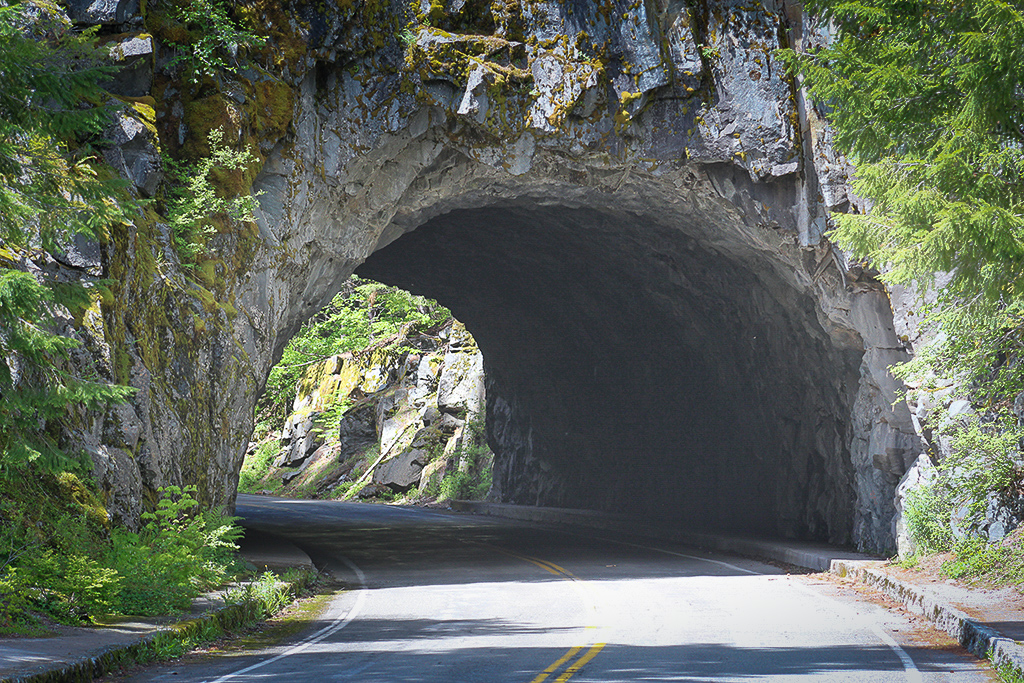
It's an interesting image, Darcy; one that pulls one into the tunnel and imagining the "beyond". The curve in the road especially supports this.
The capture was challenging, and I give you kudos for pulling it off. You might have found processing a bit easier had you bracketed the exposure at the time, but nothing's badly blown out or blocked up. In landscape photography, it's so often "about the light" and in this case the light was complicated. You have harsh direct light hitting the road in front and the rocks o the far side; you have foliage on the left with mottled light and shade; you have the interior of the tunnel only faintly illuminated; you have strong reflected light illuminating the foliage and rocks to the right of the entrance; and finally you have soft reflected light at the exit where it is striking the roadway and the righthand side of the exit.
I experimented (using your "Original") with several adjustments. My objectives were to show more detail in the interior, to softness the harshness of the light, to pull the eye further towards the rocks and foliage on the other side, and to bound the image so as to move the viewer's eye directly into the tunnel.
I think I understand where Paul is coming from with his crop suggestion, and I agree that it makes for a more interesting image. For me, though, I think it's important to keep that foreground; without it I feel I'm standing right up against the entrance, and I lose the sense of the story, which to me is about the future, not the present.
|
Mar 28th |
 |
| 93 |
Mar 22 |
Comment |
Very nicely done. First of all, it has immediate impact and eye-grabbing appeal. The split-complementary color scheme is harmonious, yet dynamic, and the warm tones impart of feeling of optimism and excitement. The numerous triangles also contribute to the dynamic feel, without creating tension. I find that my eye cycles around four elements: the lake, the red sky, the mountain to the right, and then the warmly lit rocks foreground right. The operative word is "cycled"; one doesn't grow bored.
Technically, the capture is well executed: good depth of field (what aperture did you use?), sharp throughout, well exposed (you might have benefitted from exposing a tad further to the right, but the image hasn't suffered), and good color balance. Very deft post-processing. I find the color adjustments spot-on. I experimented with pulling the white point in a bit. The result has a bit more "pop", but I prefer your image as is. The way I see it, a good image tells two stories: one is the tale of the place or time or event; the other is the emotions experienced by the maker and shared with the viewer. Sometimes an image needs to be a bit calm. I feel the emotional tale here is one of quiet joy. Good job!
The composition is nicely balanced. The bright (or relatively bright) carries a lot of visual weight, balanced by the darker and more massive hills and peaks to the right. The weighty rocks right foreground are balanced in turn by the pull of the brighter reds in the sky upper left.
I think it was wise to remove the tree. If you ever revisit the image, you might consider removing a few other little elements that might be distracting: the two wispy clouds near the mountain summit, the conifer peeking out from behind the rock that sits between us and the lake, the top edge of a rock sneaking in across the bottom of the frame, and maybe even the tiny little rock in the lake.
|
Mar 28th |
| 93 |
Mar 22 |
Reply |
Thanks Paul! You might find interesting my long-winded commentary on my thought process, such as it was. |
Mar 15th |
| 93 |
Mar 22 |
Reply |
Thanks Paul! You might find interesting my long-winded commentary on my thought process, such as it was. |
Mar 14th |
| 93 |
Mar 22 |
Reply |
Oops ... meant to reply to your comment, but made my usual mistake of posting a new comment. |
Mar 14th |
| 93 |
Mar 22 |
Comment |
Thanks, Neil.
First of all, to be clear: the "original" image attached to my post is NOT the file from which this image was extracted. It is instead a (worked) image taken from the same sopt, same direction, etc., a little bit later with a wider focal length. It does represent, however, the wider view that I saw.
As for the thought process:
I had visited the location (Sand Beach) last summer so I knew it had possibilities; I scouted it midday the day before to get a general feel for the place in winter (the beach looked likely to be the subject of interest) and checked the tide tables to know what to expect on that front (the tide would be going out at sunrise). I did have some hope for sea smoke, as the temperature was going to be around zero Celsius.
When I arrive for a shoot without a specific image in mind, I try to experience the scene, set aside concerns for "what would make a good image" and just pay close attention to what excites me. In this case, what got me very excited was the way the sea smoke was brightly illuminated and obscured the bottom of the island so that it appeared to be floating in mid air. I did also take a lot of interest in the patterns formed in the sand by the receding waves, but the island was the "main attraction" and my task was to figure out how to depict it as I experienced it.
Once I have a sense as to "what matters" to me, I then concentrate on how to make a image. I made several different exposures at different focal lengths. I generally don't evaluate an image on the back of the camera other than to check on whether I screwed up a setting or got the overall composition wrong. I also tend to shoot a little wider than the image I'm trying to frame, so as to have a bit of wiggle room for cropping later. I made exposures at a long focal length, just getting the island, but I was concerned that an image with only the island would be *too* simple to hold interest, so I also worked on one or two other compositions that included the sandy beach with waves and patterns in the sand. At the time, I also speculated that it might be "really kewl" if I had a way to smooth out the water, especially in the distance, but I figured that a long exposure would not have a nice effect on the sea smoke. But the main factor in deciding not to got for a long exposure was the temperature. I suffer from Reynaud's Syndrome, I was in pain, and I just couldn't face the prospect of having to fuss with filters. Still, I'm glad I thought about it at the time, as it ultimately influenced my post-processing decisions.
I generally give myself several days (or weeks) after capture before I sit down to process an image. This gives me some distance from the excitement of the capture and allows be to approach the second phase of image-making with fewer preconceptions. When I did start to sort out the files, I ended up working both interpretations ("island only" and "wider composition with beach and island") more or less concurrently. I ended up pretty happy with the wider composition (the so-called "original"), but I was disappointed that it different convey the "floating island" story with enough impact. I was not satisfied with the tight composition until I recalled that I had wished for a way to smooth out the water. That was my breakthrough moment. Once I figured out how to get a glassy effect (not as easy as simply blending in a Gaussian blur), I knew I was "getting there." The next step was to make the color palette more dramatic, to use the deep blues and bright golds to convey my excitement, and then to give the island more presence. I then decided that my solution to the "just an island" problem was to make that concept central to the image. Instead of apologizing for it, make it obvious that that was the intention; this was the impetus to create the "blurry vignette."
The result is an image that I very much like and which I was very hesitant to share, as it breaks so many conventional "rules". However, the one thing it has going for it is that it does really capture my emotional response to the moment -- my response when I first stepped out onto the beach and saw the sea smoke and the island and hadn't yet engaged my "engineer" brain.
Thanks for asking. |
Mar 14th |
| 93 |
Mar 22 |
Reply |
Thanks, Darcy! |
Mar 3rd |
6 comments - 5 replies for Group 93
|
6 comments - 5 replies Total
|


