|
| Group |
Round |
C/R |
Comment |
Date |
Image |
| 93 |
Feb 22 |
Reply |
THanks so much Ed! I find your comment supportive. I've trotted out this image with trepidation, and so far the general response has been good.
I replied to Dawn's comment above with some introspection regarding my process. I really want to maintain the otherwordly feeling that gets lost when I include enough information to explain what the viewer is seeing. |
Feb 13th |
| 93 |
Feb 22 |
Reply |
Thank you, Dawn. I agree with you about how the distant reflection in the original improves the balanace. Still, I find that eliminating it serves a greater purpose. My emotional response when I rounded a corner and my eyes fell on this scene was a disoriented elation. From an artistic perspective, I think the presence of the explanatory distant reflection mitigates the sense of disorientation that I find so appealing about this image.
Note that I'm not trying to convince you, only to share a bit about how my thought and creative process works.
I agree with you about the right hand edge too close to the stone. I have attempt to CAF about 50 pixels to the right, tgried several times, and utterly failed. Next I'm going to try relocating the stone a little bit. That will entail substantially less stampwork; unfortunately, it won't remedy the issue with the clipped curve. Oh well ... |
Feb 13th |
| 93 |
Feb 22 |
Reply |
Well, I'm glad you were pleased. I hope you don't think of it as a responsibility "to work on (your) post processing skills." I like to think of it as an opportunity to play ... some images are "perfect" right out of camera, and some photographers pride themselves on "getting it right in camera", but I like to think of post-processing as akin to the recording studio, where one gets to sculpt the sound experience so as to to create the experience for the listener (er, viewer) that the artist (i.e., maker) intends. |
Feb 10th |
| 93 |
Feb 22 |
Comment |
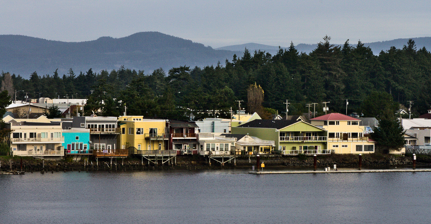
The image gives me a sense of a pleasant, idyllic setting. I think you've framed it well; the panoramic works well for mew; it includes just enough sky and river to frame the subject (i.e., the waterfront buildings). Any tighter would, to me, feel too tight.
The image is nice and sharp. I like the haze on the hills/mountains in the distance, as it helps with establishing depth.
It seems from your narrative that the colorful buildings are an important part of the story. I think you can do a bit in post to emphasize that. As always, I fiddled with it in LrC. I pulled in both the black and white points. I find the easiest way in LrC to mask an adjustment to a horizontal band is to view it in reduced size, and then add a radial gradient that's very elongated, so that it forms a band where I want it. This I did to mask in adjustments to the buildings: increased contrast, dropped the highlights a bit, and bumped the saturation aggressively. I also used a brush mask with reduce exposure, contrast and highlights to tone down the odd looking (to me) tree (?) that was catching the light and kept tugging at my eye. |
Feb 10th |
 |
| 93 |
Feb 22 |
Comment |
This is another interesting image. I like the way it showcases what I presume is a corral and a larger yard. (I say "presume" as I am totally ignorant about these things.)
I like the B&W conversion. As always, I tried fiddling with it a bit, and didn't feel I improved it. Looks to me like the tonal balance is good throughout. The histogram as fully spread, and forms a nicely rounded hump, which I think produces a tonal distribution that is mcomfortable for the viewer. You might find that you can create more impact if your histogram has more of a bimodal shape.
I can see that one challenge you're going to have with this project is to find a way to make each image tell a story about something unique about that particular barn, or its setting, or its condition, or ... you get the idea.
|
Feb 10th |
| 93 |
Feb 22 |
Reply |
You'll find linear gradients easy to use, and there's a whole lot you can do with them. Enjoy learning about them. |
Feb 4th |
| 93 |
Feb 22 |
Comment |
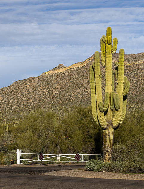
If I may, I'll make a few suggestions, some regarding the composition and some, the edits.
The subject here, as reflected in the title, is the majestic Sguarro cactus. It helps to compose the frame so that the subject stands out from its surroundings. Placing it against the background with similarly colored foliage didn't help your cause. I can't guess as to what was to the left of the frame, but perhaps by moving to the right you could have placed the cactus against different background. Placing it against the sky also can work well. For something like this, getting down low can sometimes yield interesting and effective composition.
An additional challenge you faced was the light. It seems that this was midday, the sun above and behind your right shoulder. As a result, you were shooting in the same direction as the direct light striking the cactus. The result is that all surfaces of the cactus facing you were lit pretty much the same. Again, if you could have moved to one side or the other you might have gotten some side-lighting that would have helped.
The diagonal slope of the hill in the background is an helpful touch.
I find it useful, when looking at how to frame an image, once I've got the general orientation and so on, to crop in (or zoom in at the time of capture) to eliminate that which doesn't help the story, and reduce the remaining peripheral elements to only just enough presence to establish context but waste no more canvas on them than necessary. In the attached I cropped accordingly.
In post-processing, I think you made good decisions. There are a few more things you might have done to make the image more effective. In the attached, all my edits were in LrC, but they could have been done in ACR, or with adjustment layers and masks in PS.
I drew down a linear gradient from the top, angled to match the slope, and darkened the sky by dropping the exposure, contrast, and highlights, but bumping the texture just a wee bit.
I pulled up a linear gradient from the bottom, again angled to match the slope, and pulled down the exposure by 0.67, and the contrast just a little.
Then, to make the cactus stand out a bit, I used an adjustment brush: slightly warmer, brought the exposure back up (only 0.50), added a hint of contrast, and bumped texture, clarity and dehaze. One needs to be careful with dehaze; to much, or in the wrong place, and it looks artificial. One shouldn't notice it, but the eye is drawn to areas that area more detailed, and dehaze is one way to get that effect.
Finally, the bright red diamonds on the gate are meant to get one's attention (so one doesn't drive through the gate), and they certainly have that effect in this image. Fortunately, that was easy to fix: pull the Red saturation all the way down, and pull the Red luminance pretty far down, too (not too far, though).
|
Feb 4th |
 |
| 93 |
Feb 22 |
Comment |
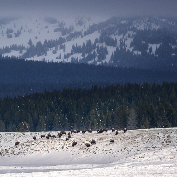
I like the layering effects here: the snowy foreground, the herd, the forest, the hillside, and the clouded-in top.
The letter-box format accentuates the vastness of the scene. I find myself wishing, however, for greater prominence given to the herd of bison, so I experimented with a square crop. I chose to eliminate some foreground, some sky, and the whole area to the left of the herd. This tells a different story, and it might not be at all what you had in mind. (I did also remove the loner off to the right of the herd.)
I did also feel I needed to cool down the snaow in the foreground just a bit. Again, I can see, from contrasting you final image to the originals, that you experimented with this, and came to your own conclusions. I'm not saying your choices were wrong, just that I'd make slightly different ones.
|
Feb 4th |
 |
| 93 |
Feb 22 |
Comment |
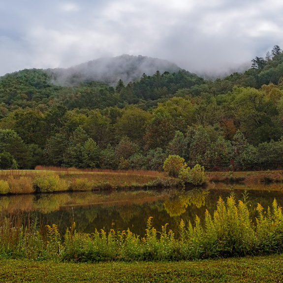
It's a lovely setting. I think your edits work well.
Regarding not getting the whole pond: in such situations, I usually choose to crop in far enough to reduce the sense of "almost but not quite all". There are several options, but I found I liked a square crop. I including the following considerations in choosing the placement: by removing much of the right hand side, I got a bit of mimicry between the hilltops and the tops of the goldenrods; I wanted to place the larger shrubbery far side of the lake on a golden-ratio intersection; I felt that the interest factor with the clouds coming over the hills was enhanced by removing some of the sky that competed for attention; after making those changes I felt I needed a little less grassy foreground.
You were concerned re "a lot of yellow-green". I didn't feel that it was problematic, but I experimented with it. I pulled up a linear gradient from the bottom and pulled the temperature down a bit and shifted the tint towards the magenta. Gently so as to keep the effect subtle.
|
Feb 4th |
 |
| 93 |
Feb 22 |
Reply |
Thanks, Paul. |
Feb 3rd |
5 comments - 5 replies for Group 93
|
5 comments - 5 replies Total
|


