|
| Group |
Round |
C/R |
Comment |
Date |
Image |
| 93 |
Nov 21 |
Reply |
It helps to remember that I ENJOY post-processing ...
Standing there, capturing the image, my eyes and brain perceived the brilliant reflections as illuminating the canyon walls; and the river emerged, seemingly out of nowhere, into our world where it swirled through the riffles and burst into light, Now, of course, the camera didn't pick all that up, exactly. My objective was to make it so.
Throughout the process I thought of the image as divided into several distinct regions.
After merging the panorama (three vertical shots overlapping left to right) and coming up with my initial crop, I started with adjustments in the LAB space. Modest increases in both A-channel (green-red) and B-channel (blue-yellow) hue separation helped give a little life to the WALLS, and strengthen the contrast with the TOP and SLOPES. The effect is difficult or impossible to achieve in the RGB space; the best I can describe it is to say it gives some "life" to the WALLS and has an effect similar to saturating the dark TOPS without making them darker.
I also made a second set of rather extreme adjustments in the LAB space, resulting in an image that looked radioactive. I placed this layer on the bottom of the stack, and none of its pixels are used in the image. Instead, I often used it when constructing color range and/or luminosity masks later in the process, as it made it much easier to select for one region or another.
Armed with the above, my next efforts were directed at making the demarcation between WALLS and TOP more distinct. This involved a lot of small HSL, Selective Color, and Color Balance adjustments, targeted at specific areas. I'd summarize the effect by saying it made the TOP darker and with less color, while it made the WALLS brighter (but not lighter), without much impacting the RIVER or either REFLECTION.
I then worked, color by color, to increase the contrast (RGB curves adjustments) but limiting the impact to each specific range of color using BLEND-IF. I followed this up with some more curves adjustments, limited to specific tonal zones, to push some of the more extreme tonal values towards the mid-tone range. The result of these adjustments was pretty garish, but it began to "light up" the WALLS to match my mental image of them, and they were distinctly vertical structures holding up the TOP and skirted at the bottom by the SLOPES.
I was still dissatisfied with the WALLS. I dehazed a bit. Instead of using ACR and a dehaze slider, I used Tony Kuyper's Dehaze action which basically works with a high pass filter, inverse colors, hard mix blend mode, and a lightness adjustment; I don't fully understand it, yet, but I really like the way it works, if used sparingly. At this point, I came to my senses and realized that there was no way that the light reflected in the river could illuminate the REAR WALLS, so I desaturated and burned in that area quite a bit.
At this point I thought I was done (HA!) and applied a soft rectangular vignette.
Returning to the image after a few days' rest, I realized I'd pushed the reds and blues too hard, and masked in some color balance correction in the more luminous areas. I also was very disappointed that I hadn't been able to pull more detail out of the RIVER REAR, so I worked on very carefully dodging that area to create some separation between the RIVER and the WALLS at the rear.
I also felt that the bottom portion of the image (in which the expanse between the WALLS widens) wasn't contributing much to the story, and diluted some of the sense of the narrowness. So I cropped the bottom, up to the point where I only kept a little bit of the SKY REFLECTION, just enough to help rationalize the CLIFF REFLECTION. I also felt that showing the TOP above RIVER REAR was distracting the eye from the point where the river emerges into view, so I cropped in to just below that point.
I soft proofed and printed this image and was dissatisfied. It was difficult to "read", the WALLS were too dark, and there was still too much of the WALLS at RIVER REAR. Easy enough to fix: lighten the walls, and crop again. The CLIFF and SKY REFLECTIONS now seemed garish in contrast with the walls, so I masked and painted in some desaturation there. A couple of minute targeted curves adjustments, and voila! An image!
|
Nov 23rd |
| 93 |
Nov 21 |
Reply |
Thank you, Ed! |
Nov 23rd |
| 93 |
Nov 21 |
Reply |
{Blush} Thanks, Paul.
The processing is a long story, but all the raw materials were provided to me by the Canyon itself; my challenge was just to find them and pull them out.
I've moved most of my early editions of this image off to slower storage, so I'm pulling them back in and will try to reply tomorrow with a (one hopes) concise narrative of my steps. (Sneak preview: start in the LAB color space) |
Nov 22nd |
| 93 |
Nov 21 |
Reply |
Thank you, Michael. You are encouraging. To tell the truth, I'm still amivalent about this image. Printed, at first glance, it's difficult to make sense of it. |
Nov 20th |
| 93 |
Nov 21 |
Reply |
Thanks, Ed. I'm always a tad nervous that I come across as a mister-know-it-all, as I am far from knowing all that much, and I actually learn more from studying other folks' images than I do from my own. And, I just happen to enjoy post-processing.
I get it about the course. Sounds interesting. Might I ask, what course it is? And is it generally available?
|
Nov 19th |
| 93 |
Nov 21 |
Reply |
Indeed. And you done well with what you had! |
Nov 12th |
| 93 |
Nov 21 |
Comment |
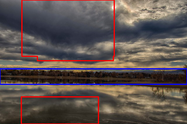
Interesting experiment. Panning this way does allow one to create a sense of scale without the discomforting distortion effect with ultrawide focal length. You have a bit of a challenge with this setting, though, because the shape of the lake and foreground shoreline tends to create the *illusion* of distortion.
I wonder what the result would be had you captured a second row below (but overlapping) this one. (I'm assuming there wasn't something unattractive up close that you wished to avoid.) |
Nov 12th |
| 93 |
Nov 21 |
Reply |
Cropping in from the left, I think, still leaves the viewer with a sense of the breadth of the sky, and allows him/her to imagine that the drama still visible continues further to the left.
Cropping in from both the top and bottom so as to give the far shore more weight and placing the tree line on a golden ratio divider to again give it more prominence, gives the viewer a place for the eye to wander and explore, and ultimately become aware of the distant mountains, the "god beams" coming down leading the eye to the copse of trees, and maybe even to notice the spit of land that extend right to left and helps to underscore the row of structures along the more distant shore. |
Nov 12th |
 |
| 93 |
Nov 21 |
Comment |
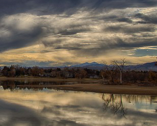
Paul, this certainly does showcase HDR. I gather, too, that what moved you about the scene was the combination of big sky, dramatic clouds, and clear reflections, and the image does tell that story.
I think, however, you could more effectively tell the story with some cropping, and shot on the 90D you'll have enough pixels to pull it off.
As I see it, there are two drawbacks with the image as is. First, the clouds, though dramatic, are pretty uniform on the left hand half of the image, and so they don't actually contribute much interest value. Second, the vast sky, together with its reflection, squeeze the narrow band of interesting far shore down so tightly that it loses its value as a source of viewer interest. See attached (to be continued ...) |
Nov 12th |
 |
| 93 |
Nov 21 |
Reply |
Sending you some golden "god beams". Wishing you the best of times with family and friends. |
Nov 12th |
| 93 |
Nov 21 |
Comment |
Good choice of shutter speed, although perhaps a tiny bit too fast to capture any sense of texture in the spume. Sometimes a situation benefits from stacking two (or even three) different shutter speed exposures. Granted, a bit more hassle in post, but sometimes it pays off.
To my taste (and it's a matter of taste), I find this image looking almost "oily". I wasn't able to reproduce your steps, but I gather you were striving to get more contrast and texture in the rocks. This yielded the "wet rock" texture the Paul likes.
When working with waterfalls I generally strive to make the flow of the water function as the story, and so I try to get as much contrast (with tone, color, or texture, but ideally with tone) between the water and the surrounds as possible. With this capture, that's a bit difficult, but I found I was able to make the two upstream flows a bit more apparent, and to "rationalize" the area where the water spreads out before falling over the lips in several places. I emphasized the three main flows, and de-emphasized the somewhat messier smaller flows.
I noted your crop, which I suspect might have been in part an attempt to deal with the brighter stone up front lower right hand corner, to eliminate the potentially distracting stones lower left, and to get rid of the tiny bright spots of spume up front. I elected to, instead, burn down a bit the lower right hand corner, and left hand corner in place (as the stones didn't bother me), and didn't crop at all. I dealt with the light brighter spots by burning them away. I did rotate the image just a little bit, clockwise, simply because it felt better to me (whatever that means). |
Nov 12th |
 |
| 93 |
Nov 21 |
Reply |
Good luck, indeed! I hope for you that you find it as engaging and satisfying as do I. I can highly recommend Sean Bagshoaw's ($) video tutorials if you find that a good way to learn. |
Nov 8th |
| 93 |
Nov 21 |
Reply |
As a side note: I was intrigued by something. One expects, with a long exposure, that the subjects in motion will be smoothly blurred. I observed here, though, that the effect is somewhat "jerky", much as though you had blended a succession of very closely spaced captures. It took me a while to realize that the effect was caused by the flicker of the lights, which our eyes don't see but which was faithfully recorded by the camera.
I find the result to be a nice additional aspect of the image. |
Nov 8th |
| 93 |
Nov 21 |
Comment |
I do luv me a good midway time lapse!
I find it well composed and I really like the shutter speed you selected. It seems that most such images I've seen have used really long exposures so that one sees only large colorful ovals. Your choice gives me a much better sense of the ride itself, and conveys a sense of speed I think would be lacking in a longer exposure.
I'd suggest that you could, if you wish, be very aggressive in your treatment of color. The midway is intended to be GARISH, after all!
I found that the lower edge was confusing and, as a result, kept distracting my eye as it tried to make sense of it. I also find that placing the "Yoyo" hub dead center made it more static than I think you'd want; again, it's supposed to be thrilling.
I hope you don't mind my taking the liberty of experimenting with your image. I find I learn much by processing others' images, as I'm not constrained by my personal recollection of the moment of capture.
|
Nov 8th |
 |
| 93 |
Nov 21 |
Comment |
An interesting tree, indeed ... AND an interesting rock, as well. More about that in a moment.
I agree with you that B&W serves the subject better than color. The color is distracting; it is bright and saturated; it evokes in me a sense of a pleasant day outdoor, but the subject (the tree) begs for a treatment that is anything but optimistic and comfortable; and, as you note, the sky is just too prominent.
The challenge when processing i B&W, however, is to achieve some separation of the main character (the tree) from the supporting one (the rock). The challenge is all the greater as the tonal value of the rock and that of the tree (or at least its bark) are very nearly the same; further, the surface of the rock is finely textured, much like that of the bark.
I found it an engaging exercise to try to address the issue. I approached it first by making the blues and cyans as dark as possible, and the reds and oranges and neutral hues as light as possible, and then forcing as much separation of tone as I could. Having done that, I concluded that the lower portion wasn't carrying its weight, so I cropped down to a 4x5 aspect ratio, and then darkened around the perimeter.
The top of the rock feels crowded, and I might have been able to extend the top edge a little bit and filled it in PS; I didn't try. Of course, I wasn't there, so I don't know what options you had in the field but, were it possible, shooting from further to the right, and/or from lower down, might have helped.
|
Nov 8th |
 |
5 comments - 10 replies for Group 93
|
5 comments - 10 replies Total
|


