|
| Group |
Round |
C/R |
Comment |
Date |
Image |
| 93 |
Aug 21 |
Reply |
Thanks, Darcy. Yup, I use PHotoPills AND Photographer's Ephemeris AND Google Earth PRO. I used daylight exposure. I shoot RAW, of course, so I had lattitude to adjust as I saw fit. I really did get carried away. To my taste, a color palette intermediate between #3 and "final" would be preferable, and I did go back in to try to get it. The result is above in a reply to Michael's comment. |
Aug 25th |
| 93 |
Aug 21 |
Reply |
I do see your point. Cropping is so often a matter of personal taste, and it IS your image, after all. |
Aug 25th |
| 93 |
Aug 21 |
Reply |
Lovely! Congratulations and thanks for sharing the story. |
Aug 24th |
| 93 |
Aug 21 |
Reply |
Thanks, Ed. As I note in my reply to Michael above, after leaving this closed for a few days, once I returned I felt that the blue cast was WAY to intense, went back to my multiple sets of shots, and I think I was able to improve. |
Aug 24th |
| 93 |
Aug 21 |
Comment |
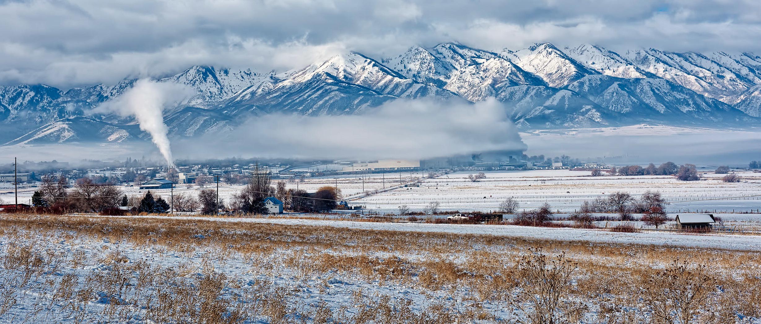
It's a very nice panorama, foregroud, midground, and distance are all pulled together nicely, but as you note, it's the developing inversion that intrigues the viewer, and anything that emphasizes it will help.
I find the rising steam to be a big distraction, but of course there's othing to be done about it.
I'm with Paul on cropping the foreground, and I also think that most of the sky doesn't contribute; I happen to be fond of the "iMax" format (2.35 x 1), so I tried it here, and I liked it. (I also cropped in a tiny bit from the left to make the chopped off tree go away.)
And, you know me ... I never can leave well enough alone ... so while I was at it a fiddled around a bit with a couple of gradients, one coming down from the top, and other up from the bottom, and brushed in some adjustments to the right hand end of the inversion. Oh, and pulled down the saturation on the oranges, and the luminance on those as well as the blues. Just a little bit of fiddlin' ...
|
Aug 24th |
 |
| 93 |
Aug 21 |
Comment |
It's a very interesting shot, with impact. My "analyzer" tries to understand why it works, and how it works. I think the overall dark tones, the very still water and clear reflections, and the compelling leading lines (not just the dock, but also the lily pads and the gap in the trees in the distance) that lead one to the bench all work to intrigue the viewer, to catch the eye and hold it. I find that the mood is tranquil, yes, but also somber, with dark and stormy clouds looming in the distance. The bench itself is unmistakably the main actor in the story, but it is unoccupied. In total, although I find it a powerful and moving image, I don't think it expresses the feelings implied by the title.
On a side note: I suspect there is a back story here that it would be great if you'd care to share ... |
Aug 23rd |
| 93 |
Aug 21 |
Reply |
Many are the times I've had to bend reality in favor of believability ... |
Aug 23rd |
| 93 |
Aug 21 |
Reply |
I forgot to note: I really like that you retained the soft muted color. |
Aug 23rd |
| 93 |
Aug 21 |
Comment |
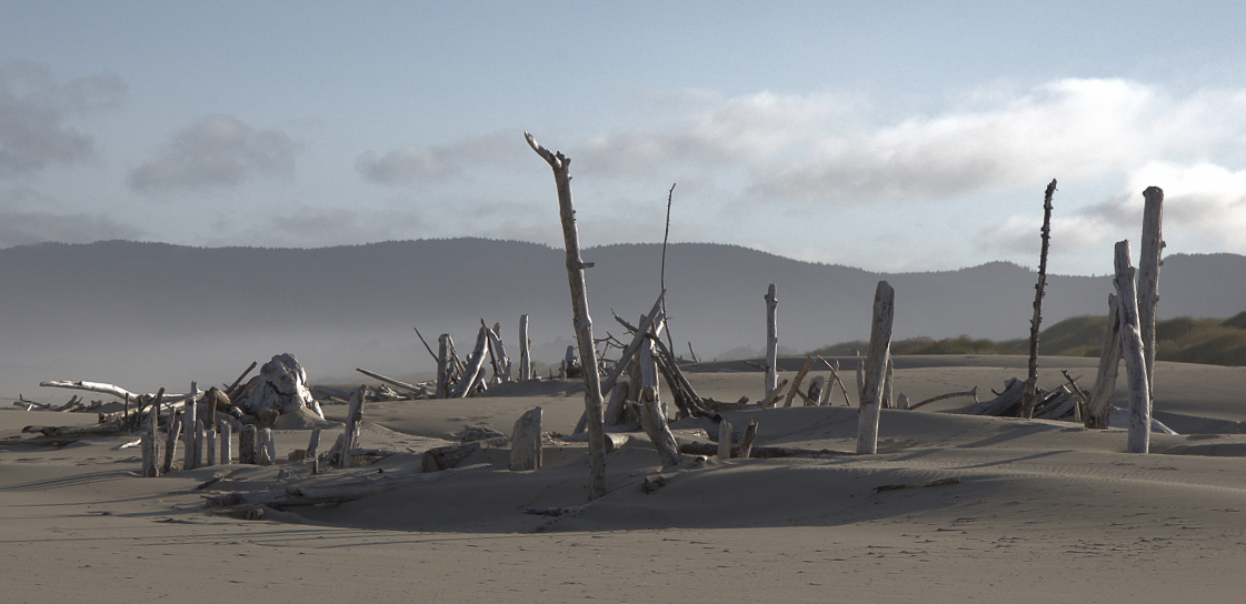
I really like this. Very moody. Post-apocalyptic. Rather unnerving.
I'm confident your camera was level, but the image *feels* like it's going to slip away to the left. That adds a measure of discomfort that isn't quite consistent, in my opinion, with the vague disquiet that appeals to me. Rotating a bit clockwise, and cropping a bit off the bottom to allow keeping the left end intact, addresses that for me. (I also cropped in a bit from the right to make the footprints go away, as they really break the spell.)
|
Aug 23rd |
 |
| 93 |
Aug 21 |
Reply |
I think it creates a different mood. For myself, I rather like the hazier image. The haze supports the gloomy mystery. |
Aug 23rd |
| 93 |
Aug 21 |
Comment |
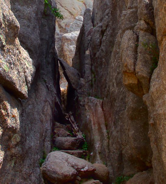
It's a very interesting image, but I tend to agree with Michael and Ed. To me, the real story lies, not in the blue sky and bright spires beyond, but rather in the claustrophobic staircase, with hope at the far end.
I cropped in very tight, and did some "deep edits" as well, to add some color and warmth to the stone, and to heighten the sense of closeness in the passage.
|
Aug 23rd |
 |
| 93 |
Aug 21 |
Reply |
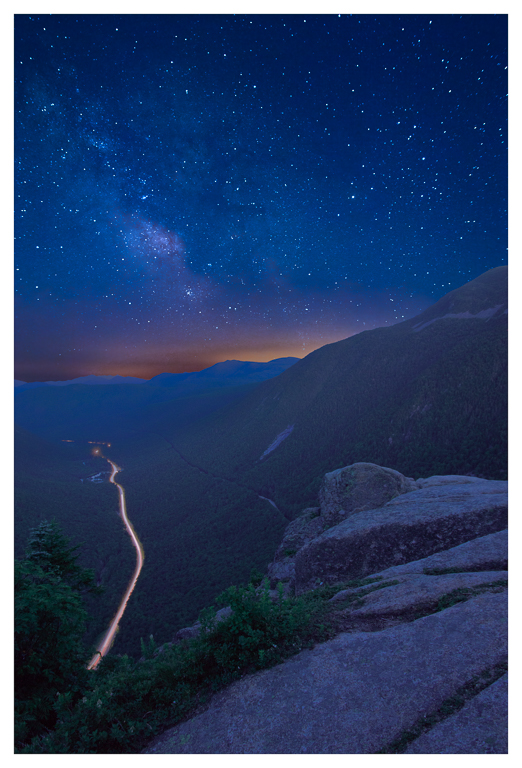
Thanks, Paul. ACtually, it was closer to three hours. That was my second venture to the spot. And I made another attempt a couple weeks later that didn't pan out either. I won't be trying again this summer, as the position of the MW is too far to the right to work. The funnest part, of course, is the drive home at 2 in the morning, usually in fog.
I'm curious what you think of my revision that I posted in reply to Michael's comments. |
Aug 11th |
| 93 |
Aug 21 |
Reply |
Seein' as I'd already invested 20 hours in getting the shot to start with, didn't seem unreasonable to put a bit more effort into it ... So ... I returned to the original three stacks, and ten hours of edits later ... |
Aug 10th |
 |
| 93 |
Aug 21 |
Reply |
Michael, I agree! Sometimes one has to let an image alone for a while, so that when one returns to it one sees it with a less subjective eye. And "a while" in my case sometimes needs to be a few weeks ...
|
Aug 8th |
4 comments - 10 replies for Group 93
|
4 comments - 10 replies Total
|


